Henry Miller once wrote that one’s destination is never a place, but a new way of seeing things. Any traveler with a passport full of stamps and a suitcase full of regrets about overpacking will nod along. Our latest case study runs on that same fuel: the itch to go somewhere, see something, smell something unfamiliar. Meet Soaplanet, a soap brand identity and packaging design project built entirely around that itch.
The project came together through Tubik designers Arthur Avakyan and Yaroslava Yatsuba, with art direction from Sergii Valiukh. Three creative minds, one globe-trotting soap brand, zero boring bars of soap involved.
The Brief: Turn Bath Time Into a Boarding Pass
The scope covered the full branding menu: logo design, color palette, a custom illustration system, packaging design across multiple soap fragrances and box formats, plus marketing visuals and branded merchandise. In packaging design terms, that’s the whole itinerary—flight, hotel, and souvenir shop.
The core concept treats soap as a passport stamp you can hold. Each fragrance line ties to a country, a mood, a set of visual cues pulled from that place’s landmarks, textures, and color stories. Good packaging design does exactly this: it sells an experience before the product ever touches skin. Consumer packaging research backs this up too—shoppers form purchase judgments on packaging within seconds, often before reading a single word of copy. Soaplanet leans into that window hard.
Logo Design: A Globe, Minus the Clutter
The logo distills the travel concept into a single clean line-art globe with the brand name folded into its contours. No globe clichés, no dated postcard stamps, no cursive script pretending to be vintage. Just a crisp mark that scales from a metal tin lid down to a discount card without losing its shape—a real stress test for any logo design, and one plenty of brand identities fail quietly at retail size.
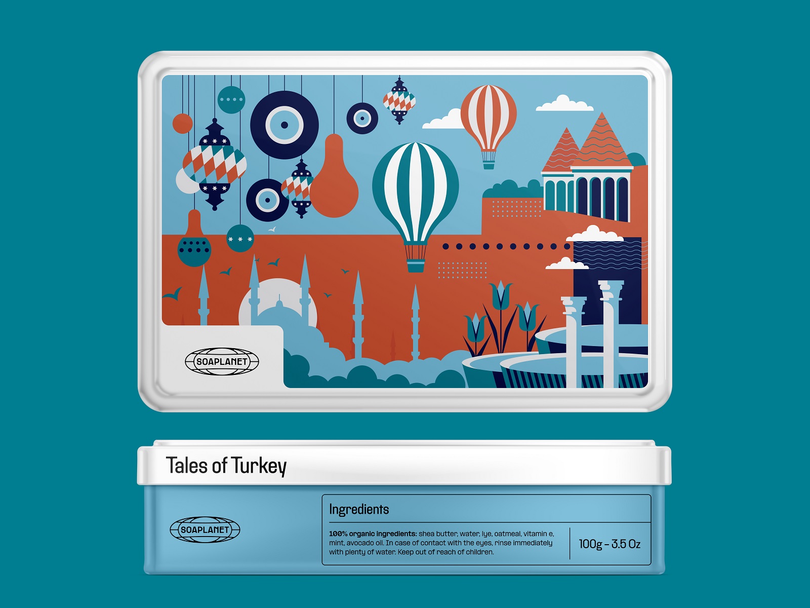
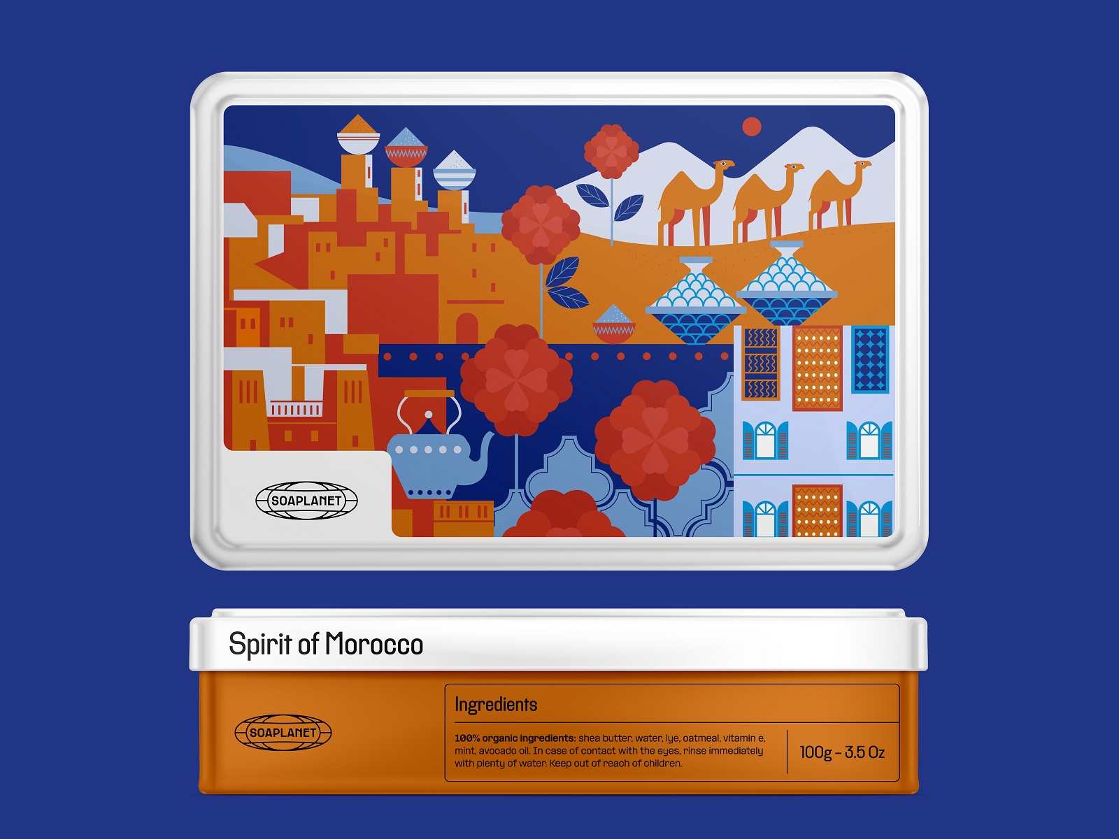
Illustration System: Passport Stamps, Reimagined
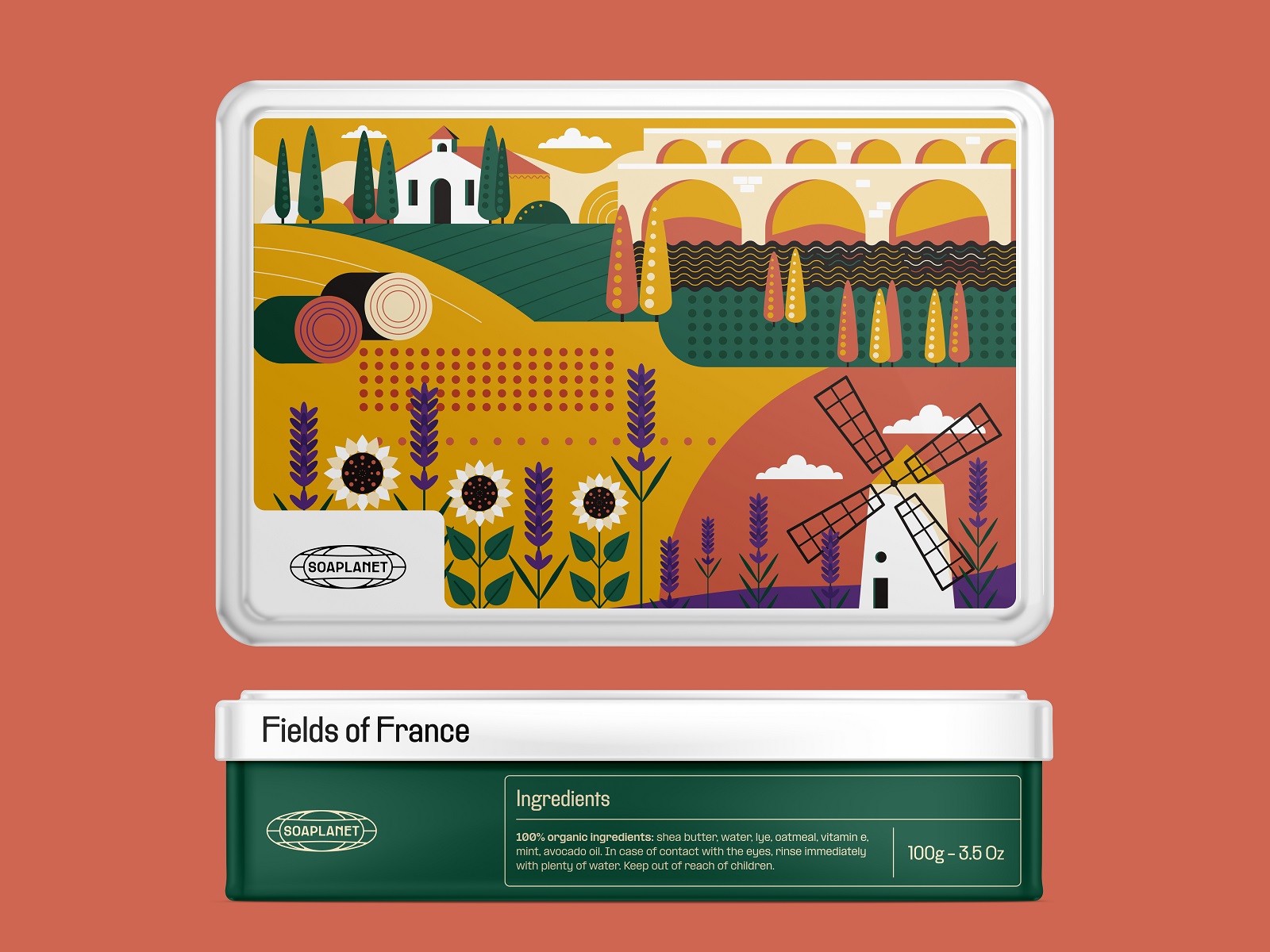
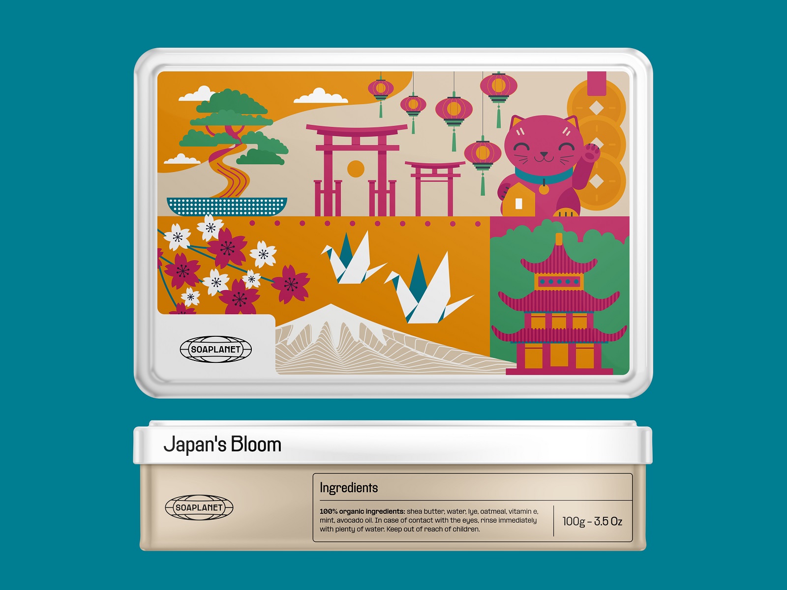
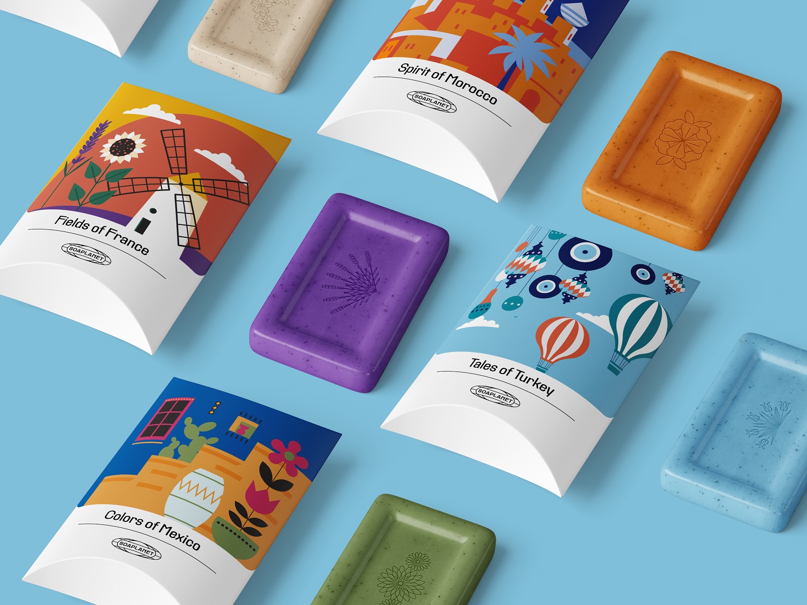
The real workhorse of this identity is the illustration set. We built a library of 2D illustrations, each one distilling a country down to its most recognizable shapes: landmarks, terrain, local flora, cultural signatures. Color palette choices shift country by country too, matching each place’s real-world atmosphere rather than defaulting to a single brand-wide scheme. That flexibility matters in branding for retail products—a rigid one-palette system breaks the moment you need to launch a tenth fragrance for a country nobody thought to illustrate yet.
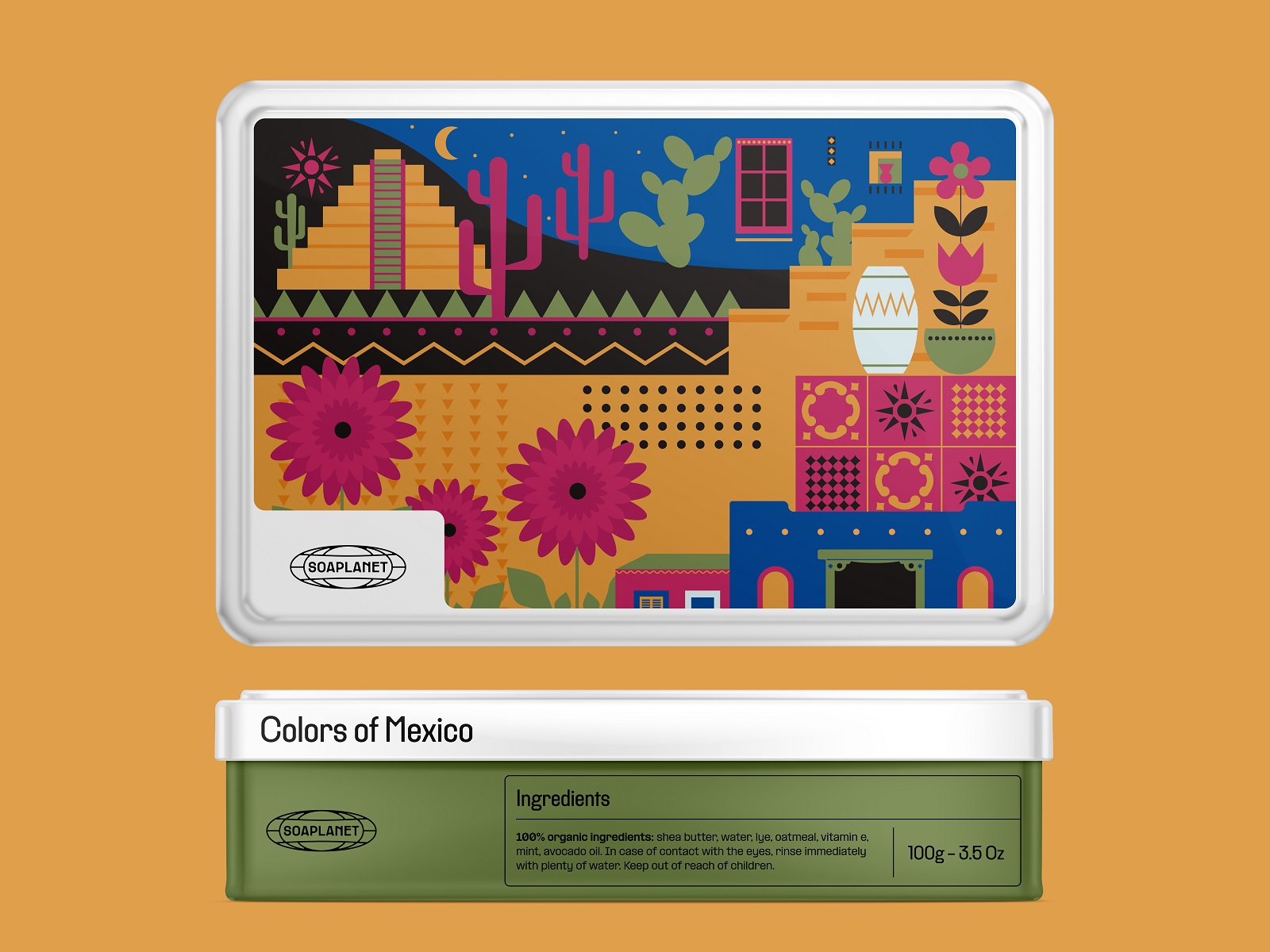
Packaging Design: Metal Tins to Paper Wraps
The metal boxes for soap bars get the full illustration treatment—a complete scene wraps the lid, paired with typography that echoes the logo’s geometry. Elegant, tactile, gift-shelf-ready.
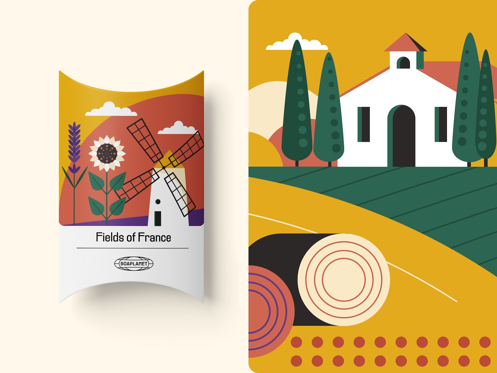
The paper packaging for individual bars plays a smaller, smarter game. Less surface area means the illustrations simplify down to essential shapes and fewer details, while the lower half stays clean and open for product text. This is packaging design 101 that plenty of brands skip: know when to edit your art, not just shrink it.
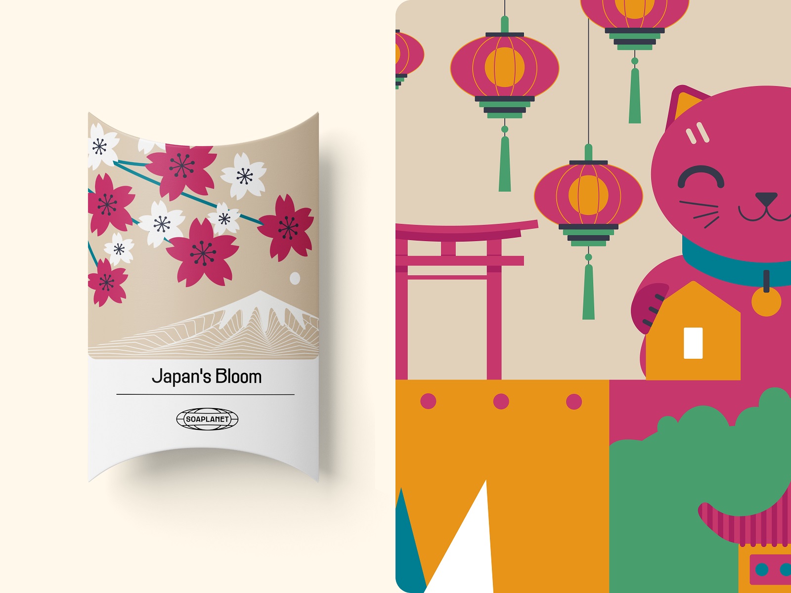
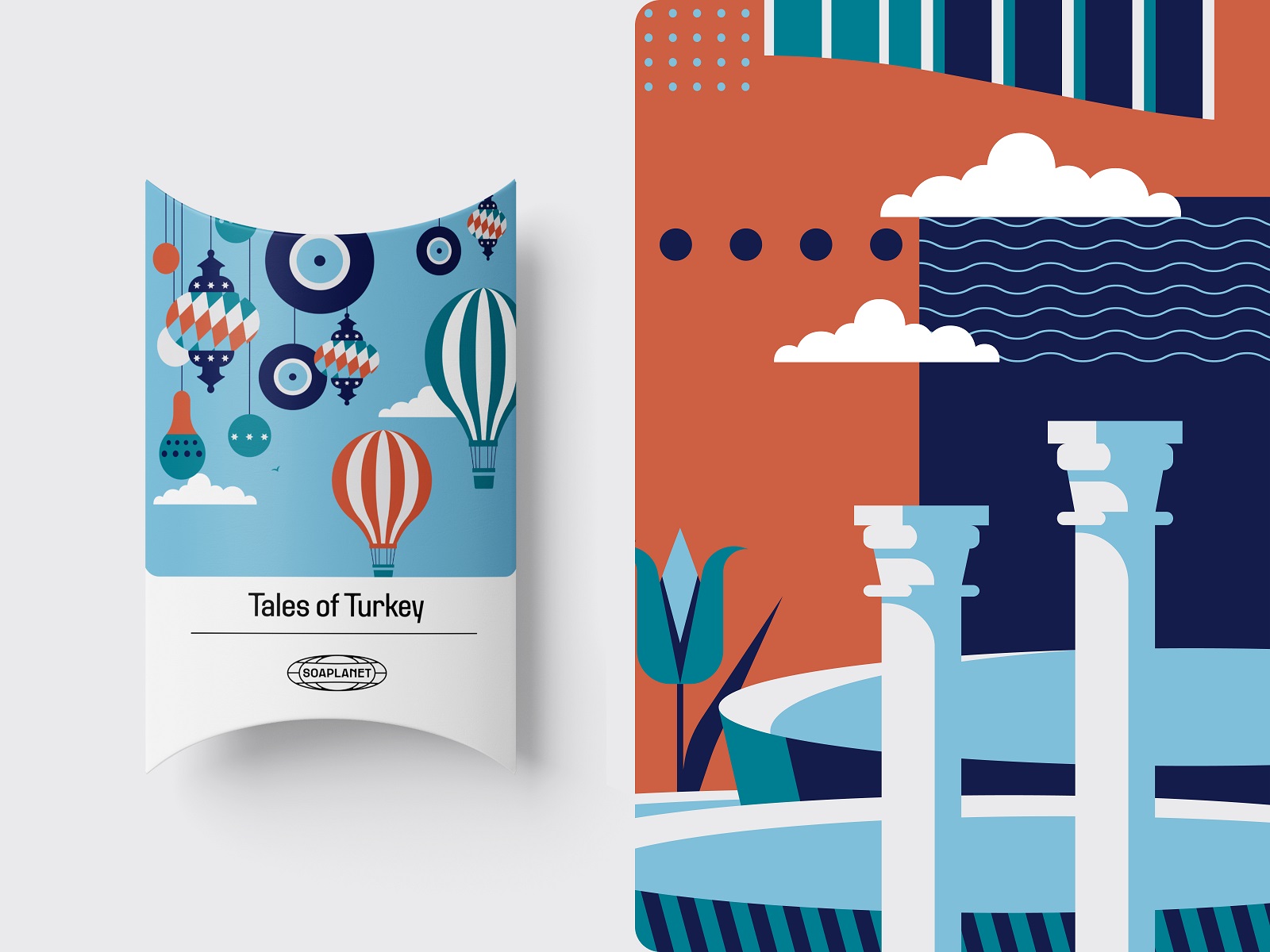
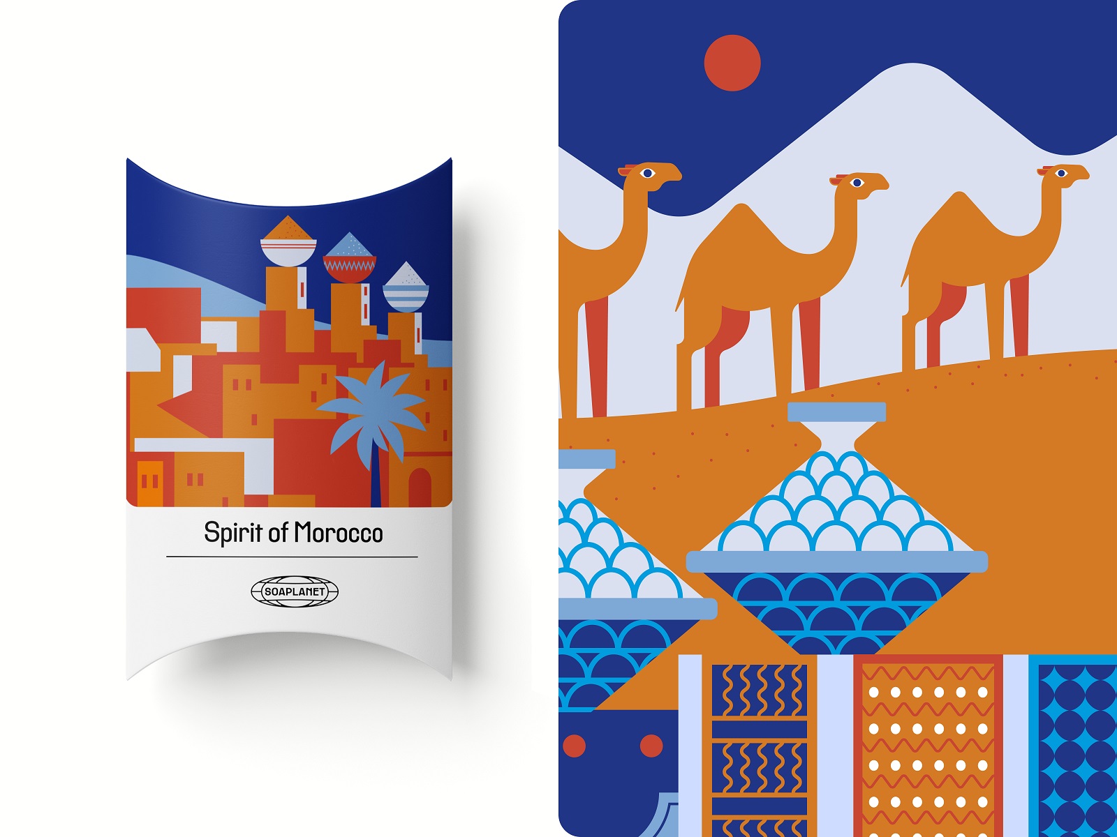
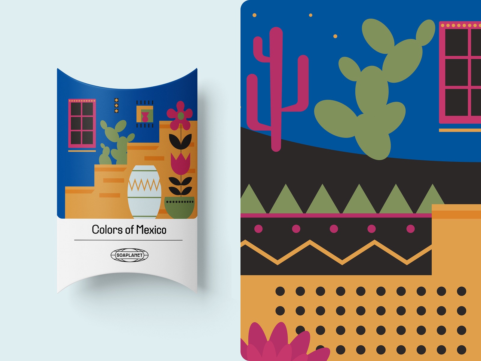
Branded Extras: Tote Bags and Discount Cards
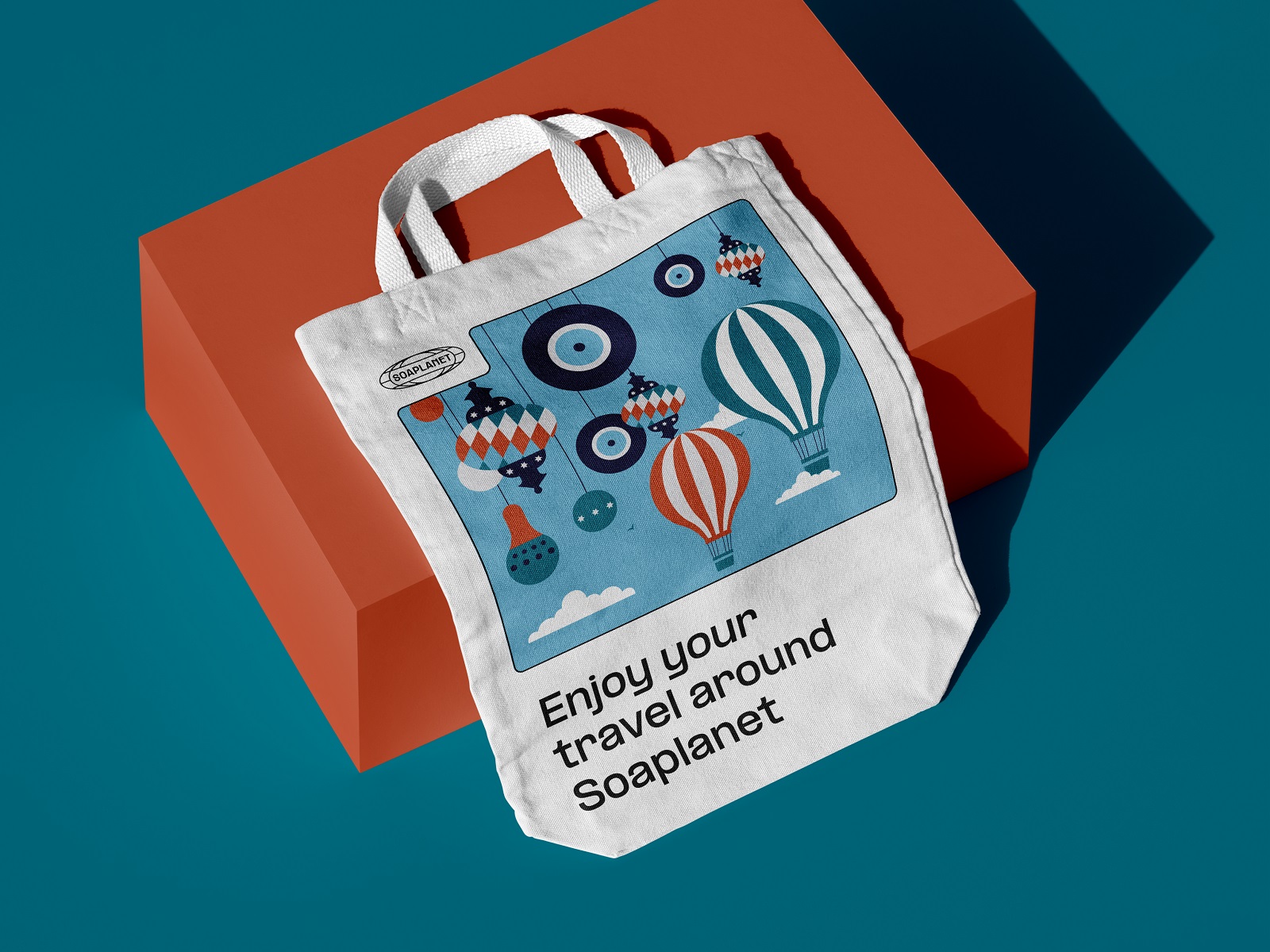
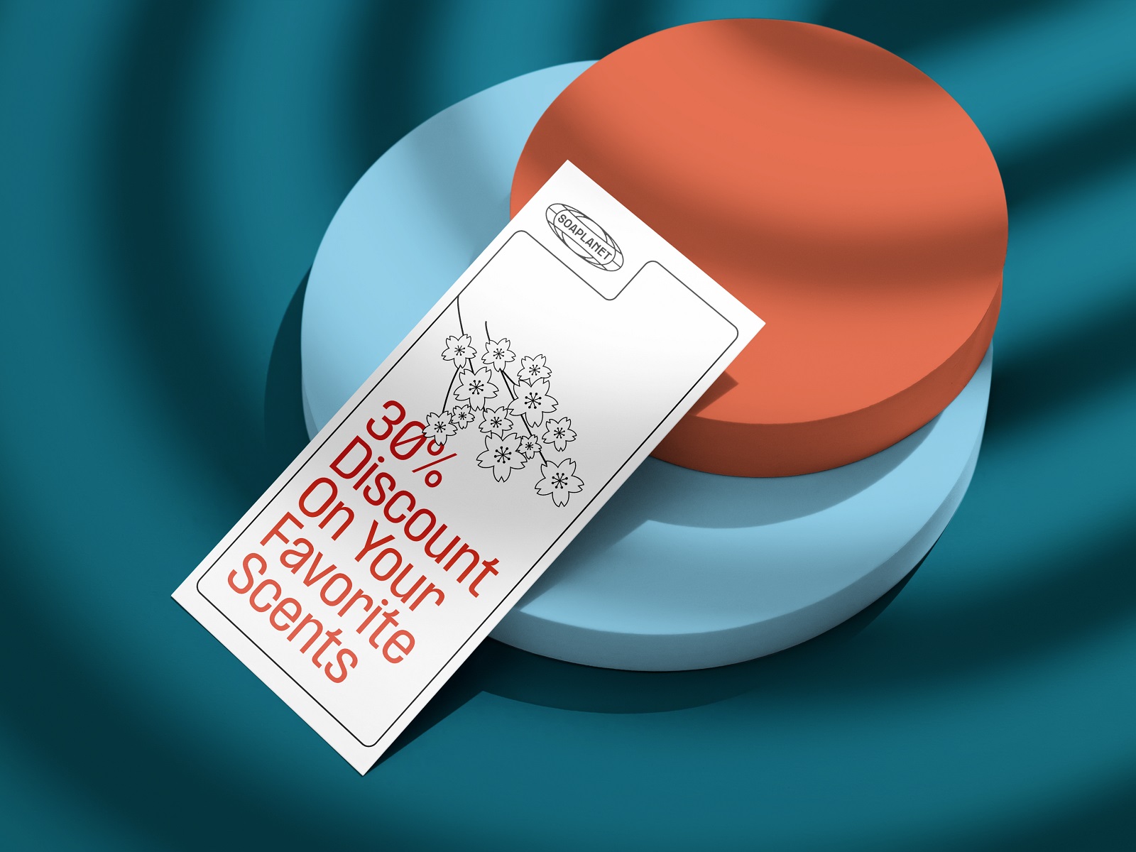
The identity extends into a vibrant tote bag, a discount card, and smaller graphic touches stamped directly on the soap bars themselves. Every touchpoint reinforces the same visual language, which is the actual test of a strong brand identity system—not how good it looks on a mood board, but how consistent it stays across a tote bag, a tin, and a five-centimeter bar of soap.
Soaplanet proves that even a bathroom shelf product can carry real narrative weight when graphic design, illustration, and packaging strategy pull in the same direction. Travel branding, product packaging design, visual identity—pick your keyword, the lesson holds: give people a story to unwrap, and they will keep coming back to buy the next chapter.
Recommended Reading
If this one scratched the itch, our other case studies and design musings should finish the job. Fair warning: it’s a bit of a rabbit hole.
Joosi. Packaging Design and Marketing Graphics for Juice Brand
Ready Set Recover. Web Design and Illustrations for Surgery Recovery Platform
Pizzatta. Artistic Pizza Packaging Design
Page Turner. Identity and Packaging Design for Bookstore Chain
Nibble Health. Identity and UX Design for Healthcare Fintech Service
SwitLuv. Theme Packaging Design About Love for Sweets Brand
Fulfill. Illustrations and Web Design for 3PLs Marketplace
Roebuck. Mobile Design and Illustrations for Educational App
Garden Gates. Identity and Packaging Design for Garden Center
Bikker. Identity Design and Illustrations for Biking Service