Vegetables sell themselves in July. The other eleven months, a brand does the selling for them. That is the real brief behind this food branding and packaging design project for Vegar: an extended marketing design system built on vibrant custom illustration that makes stock-photo lettuce look embarrassed. Designers Arthur Avakyan and Yaroslava Yatsuba treated every can, box, and billboard as a small argument for shelf space.
Here’s the paradox at the center of the brief: a vegetable producer has to convince you that something canned, frozen, or trucked in from miles away still tastes like it left a garden five minutes ago. Illustration solves what photography cannot—one drawing can carry an entire season.
The Process
The work moved through four stages: a brand identity design approach anchoring the logo, a custom illustration system flexible across formats, a packaging design architecture for cans, packets, boxes, and bottles, and a marketing design language strong enough for a billboard or a phone screen.
The palette runs on colors vegetables already own—tomato red, pepper orange, leaf green, the kind only sunlight mixes. Black and white carry the text and backgrounds, and that choice matters more than it looks: frozen peas in February still need to feel like July, and a flexible, high-contrast palette is what makes a can on a snowy shelf taste like summer.
The logo design pairs the brand name and founding year with a single growing leaf, a symbol doing more work than most full illustrations manage. A leaf implies soil, season, and care without a word of copy. The mark passes the only test that counts for a food brand: stamped in black ink on plain cardboard, it still reads warm. Color is a bonus; monochrome is the real exam.
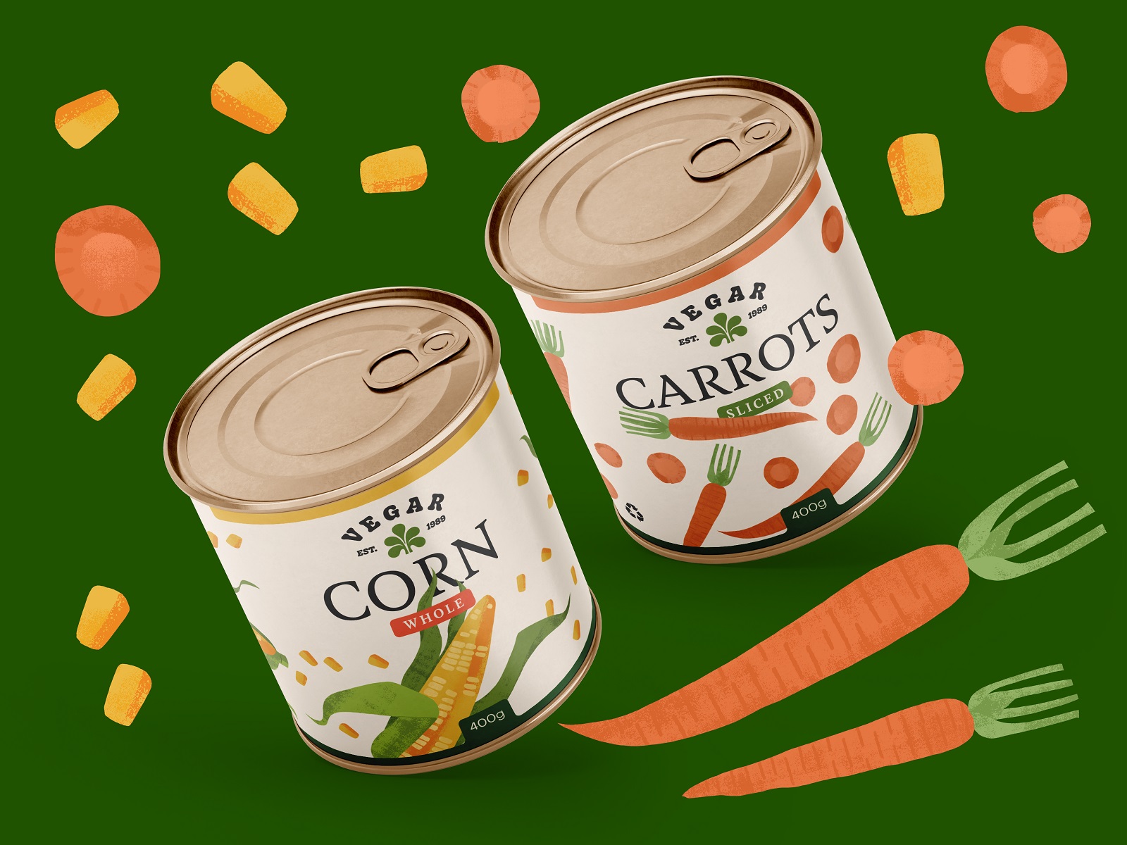
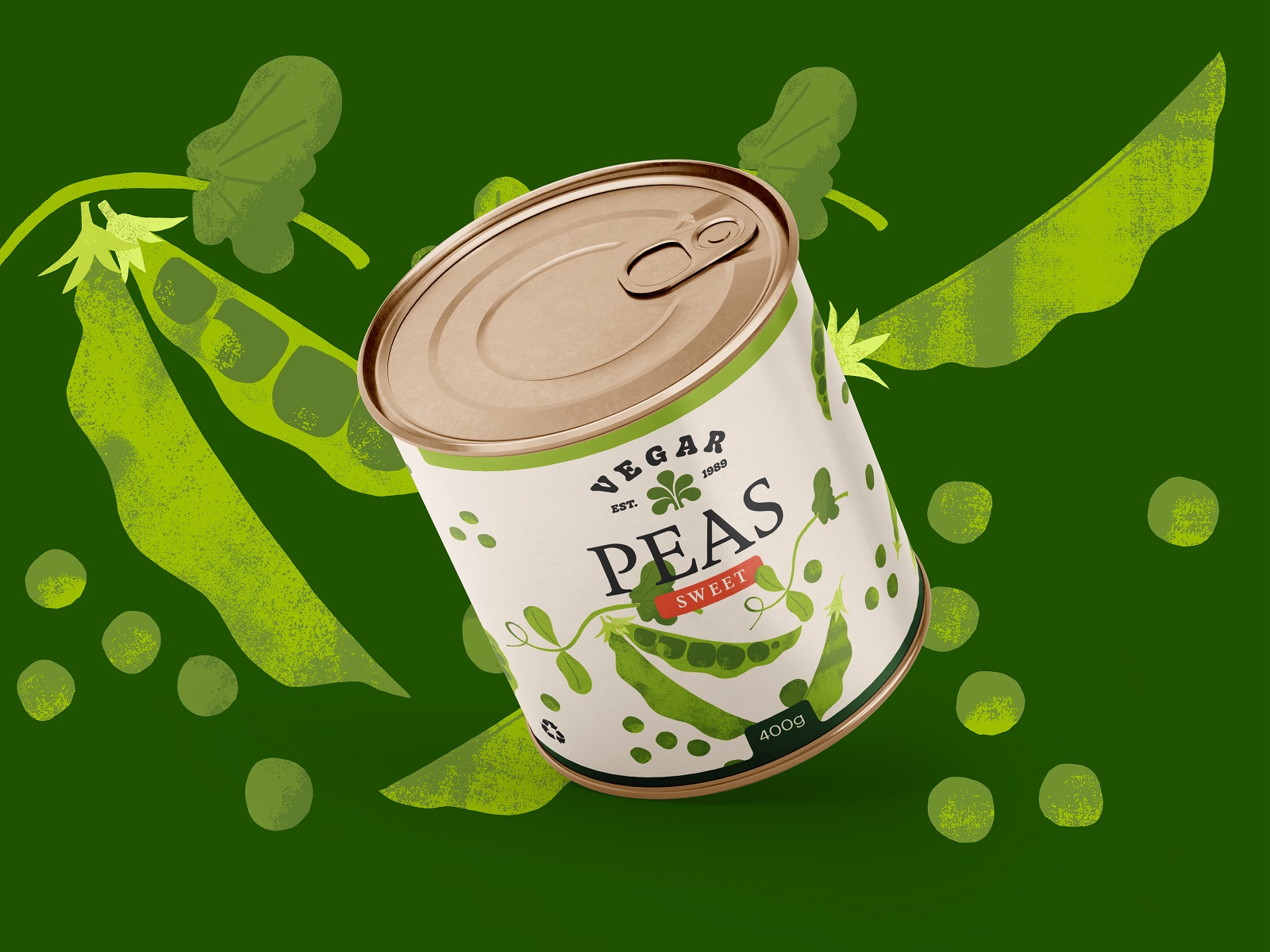
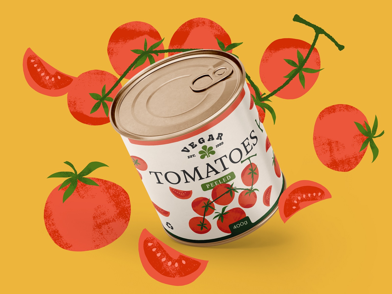
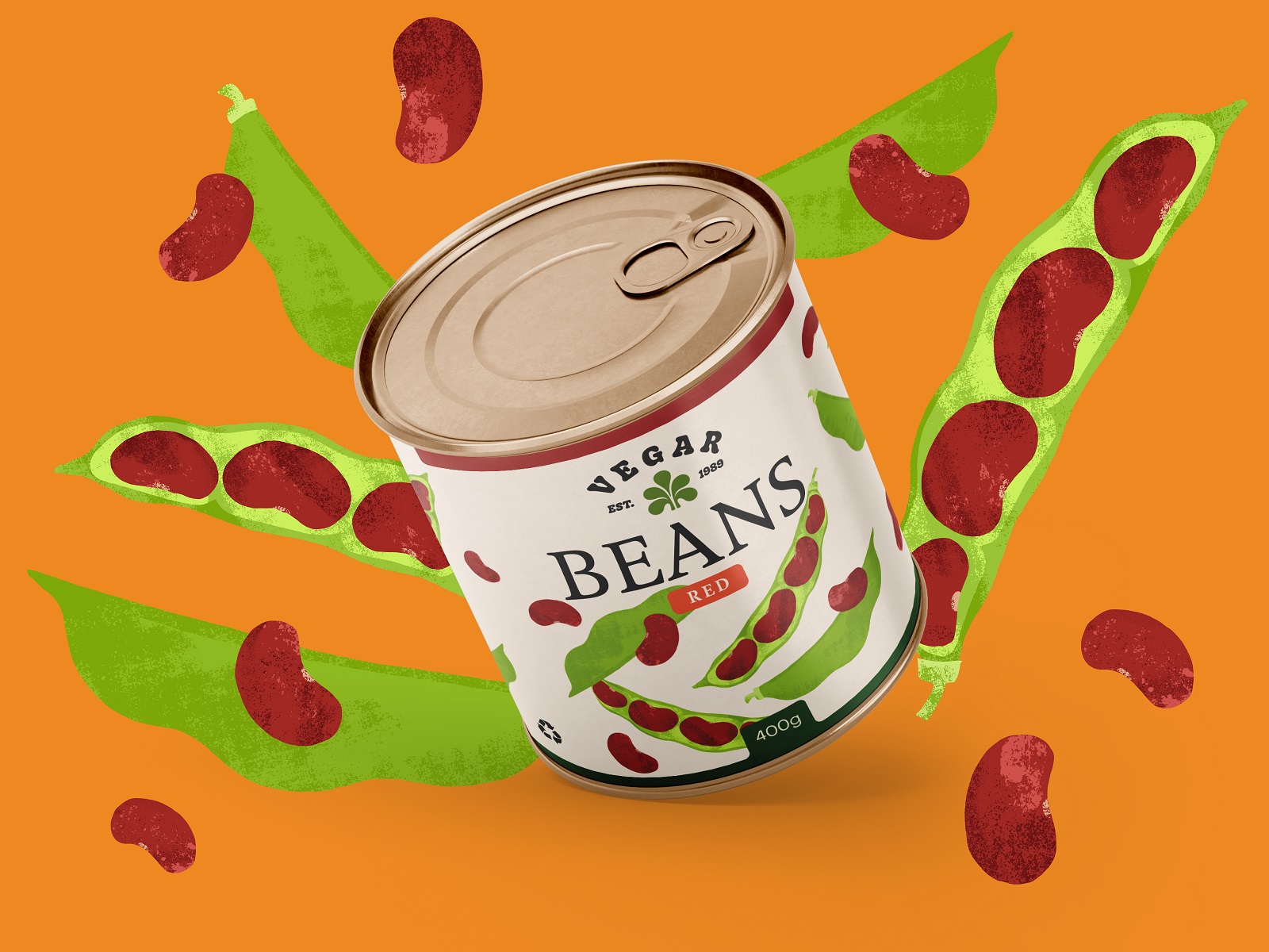
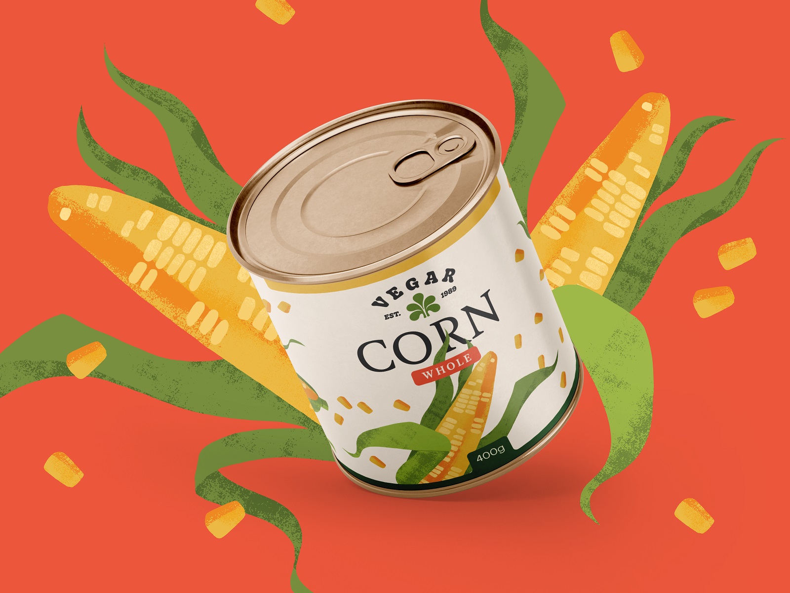
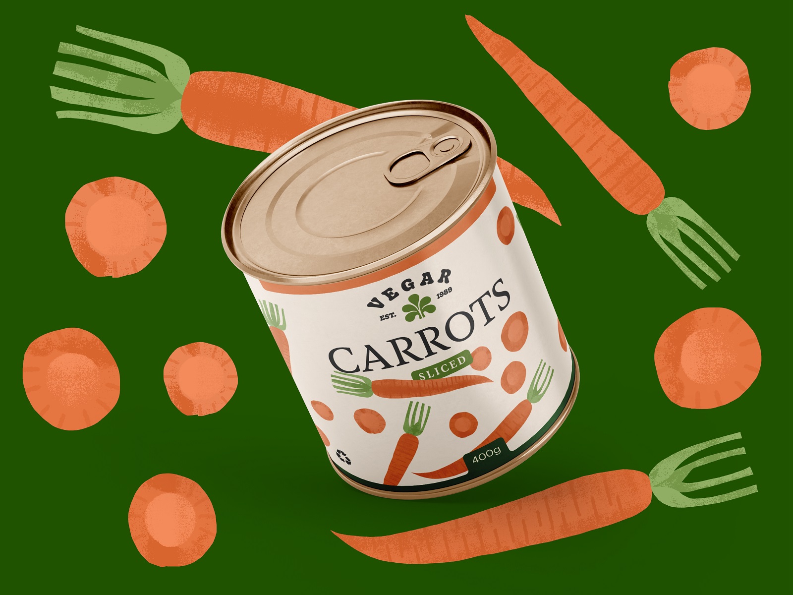
Cans are the toughest packaging brief in the business—a curved surface, a few square inches, and a shopper who decides in under a second. This design earns that second: bold enough to catch an eye three aisles over, organized enough to answer every question—contents, weight, a recipe idea—before boredom sets in. A thumbnail on a grocery app gets the same respect as the shelf.
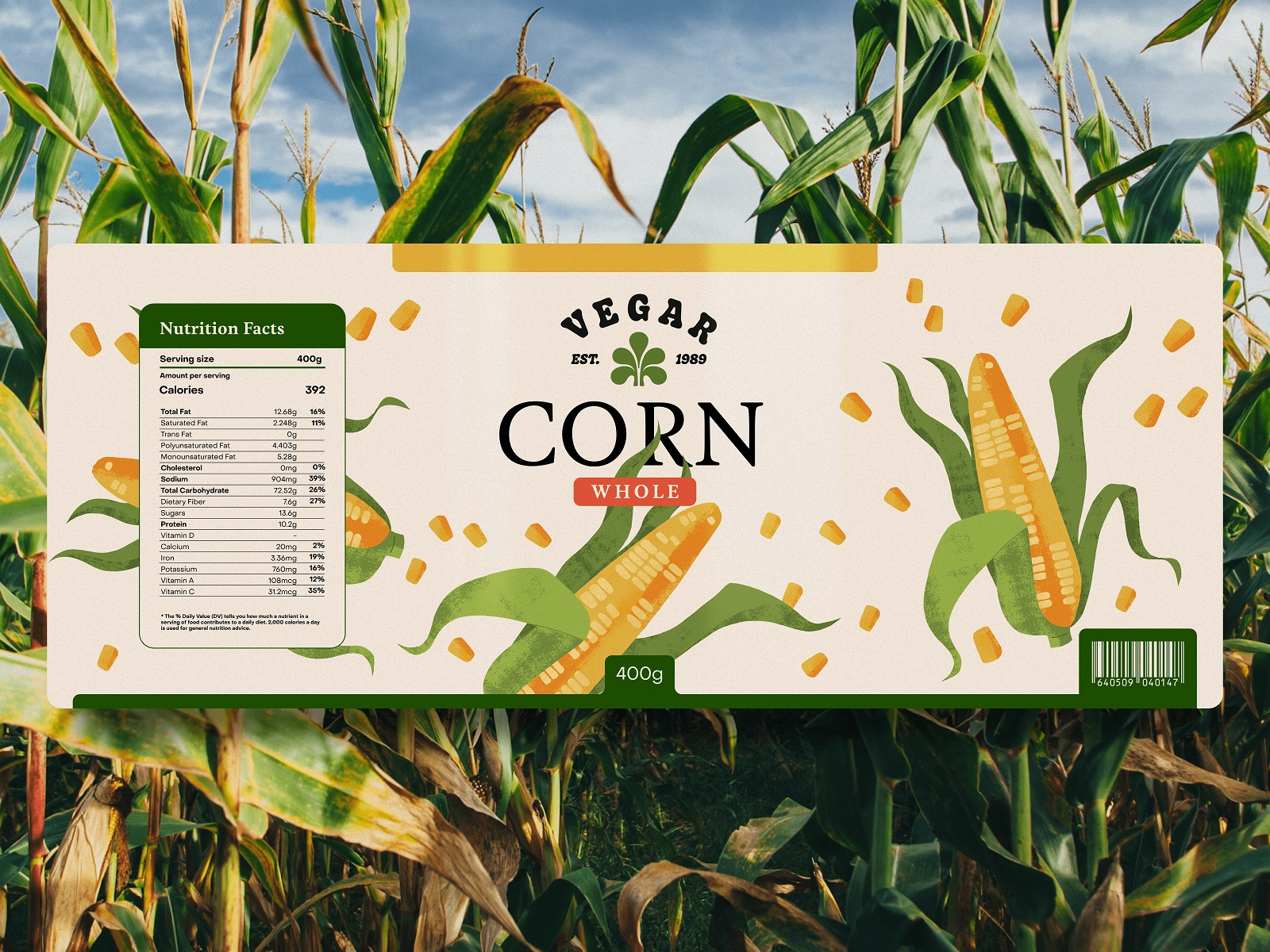
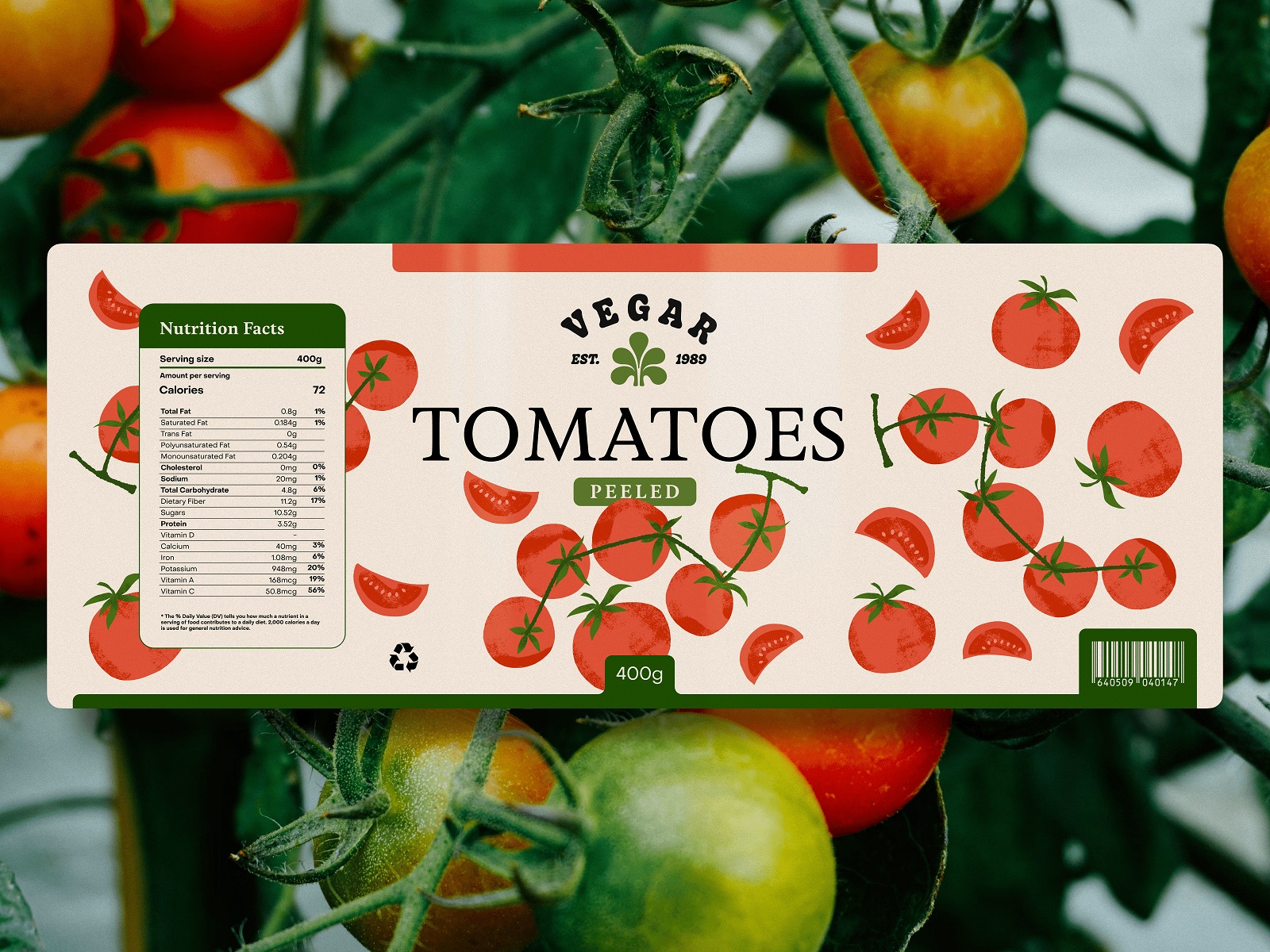
Fresh-pick boxes play by different rules. A flat cover label gets one shot to look hand-picked, fresh off a real field, so the illustration style leans rustic without sliding into kitsch—proof that freshness is a feeling designers construct, one illustration at a time.
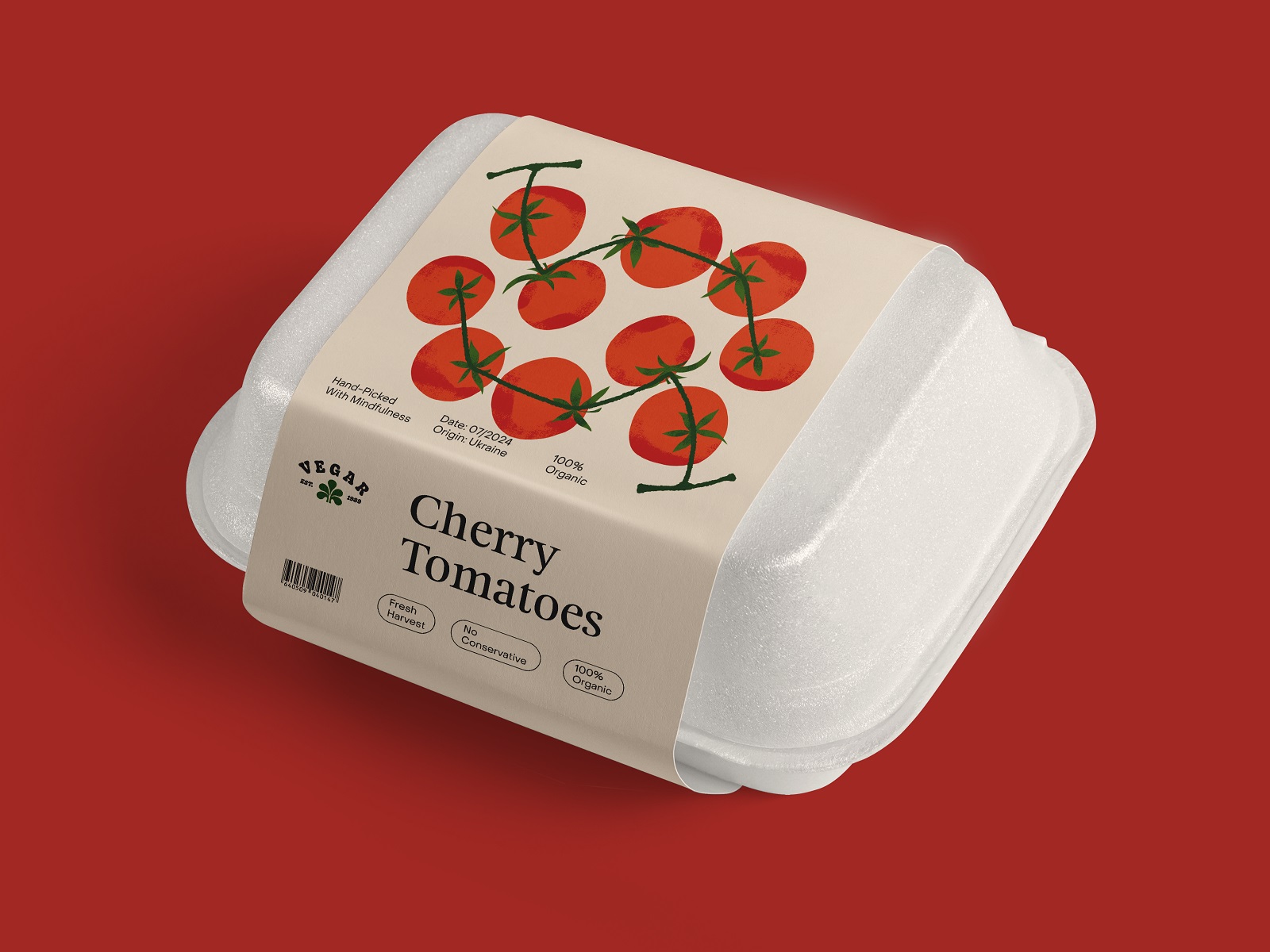
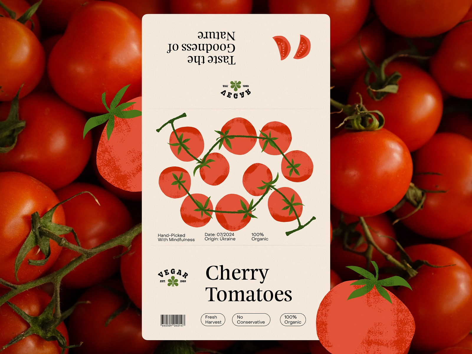
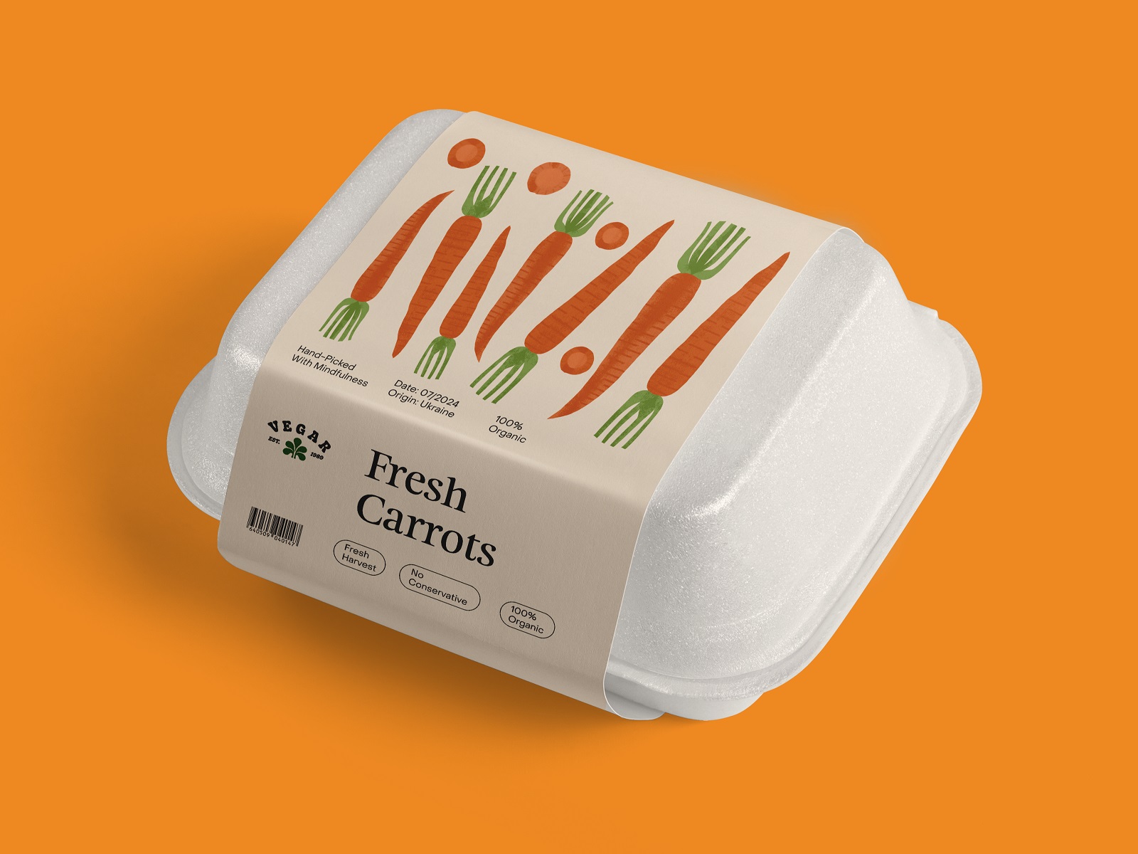
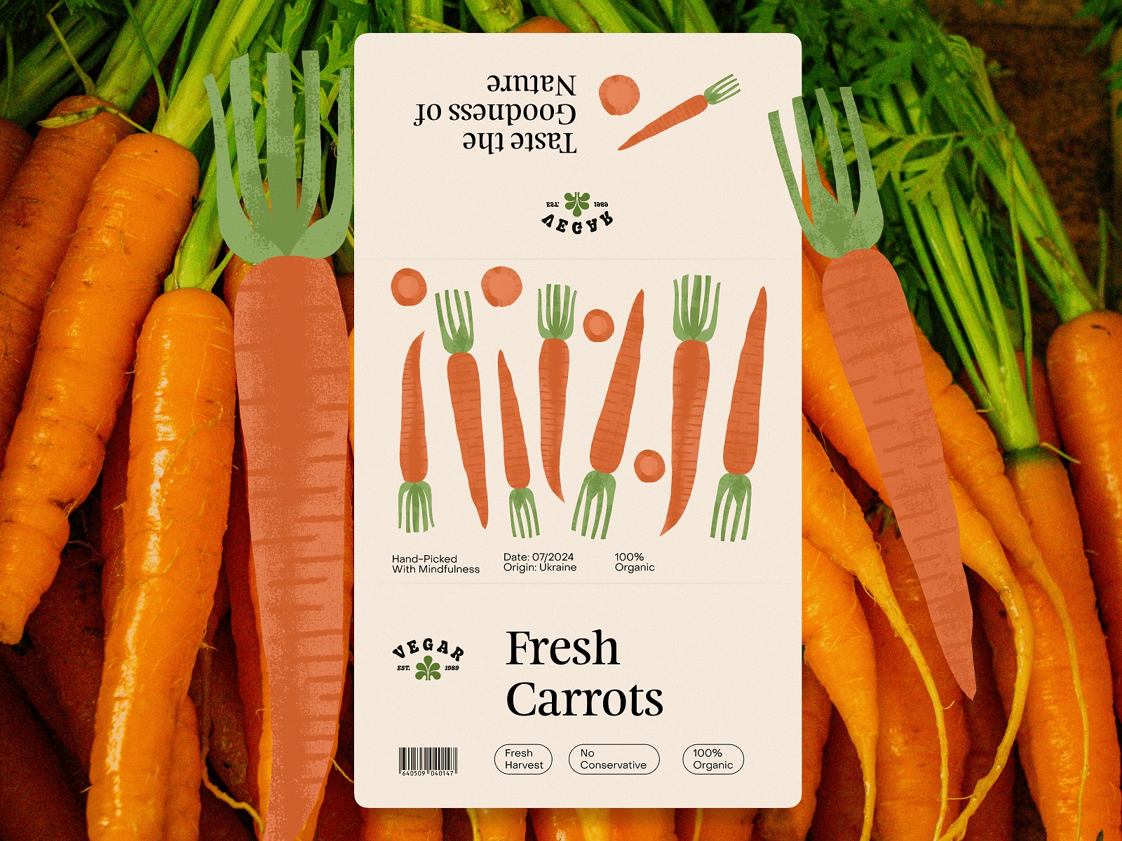
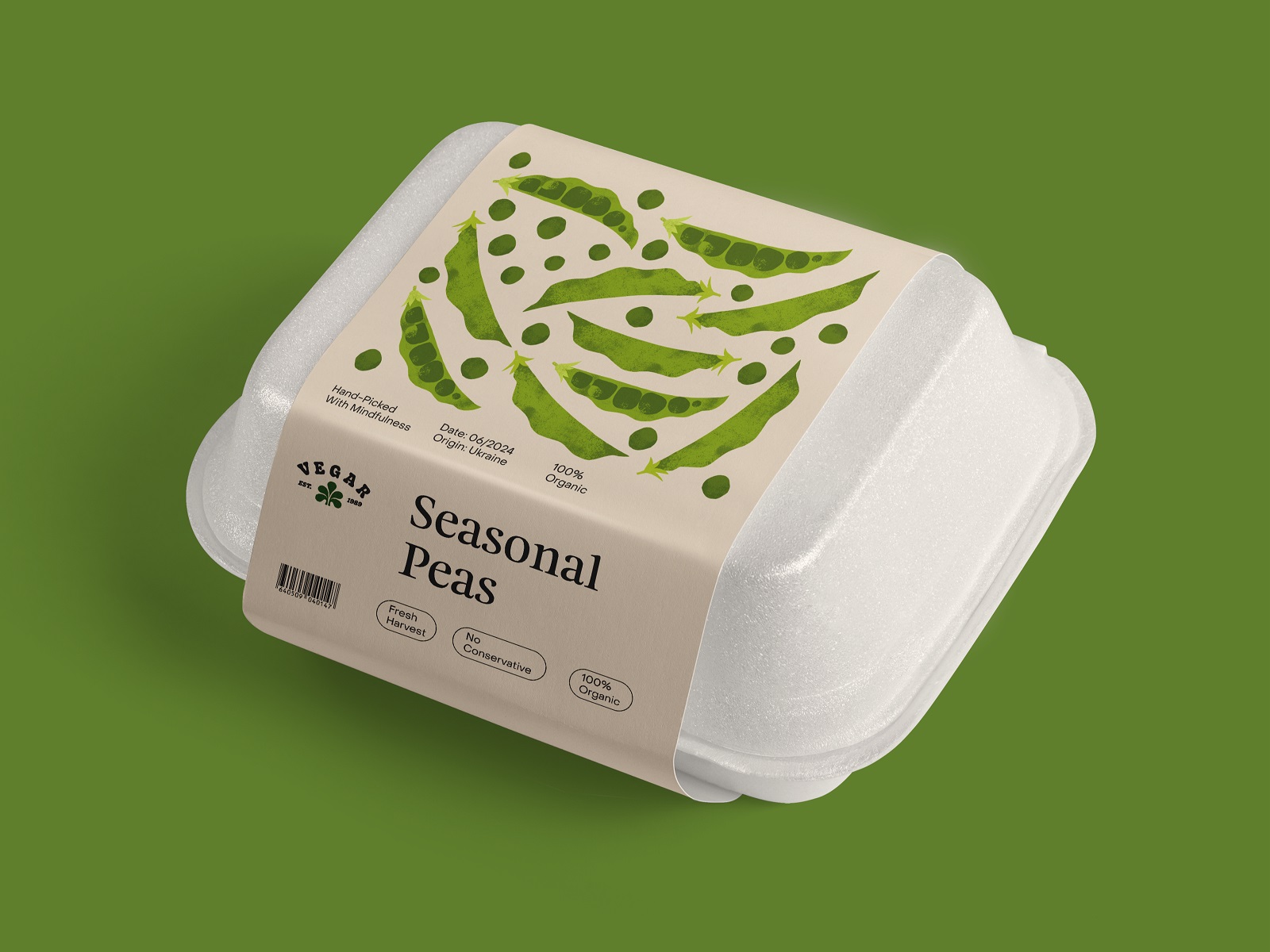
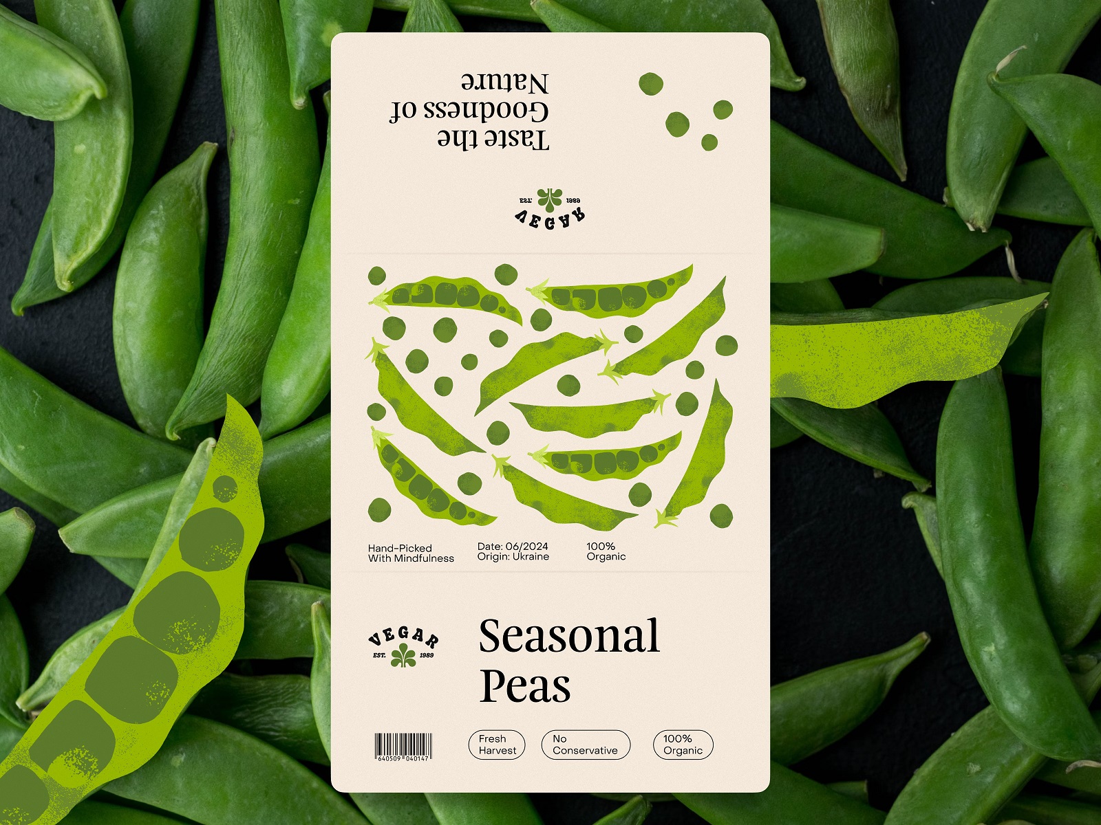
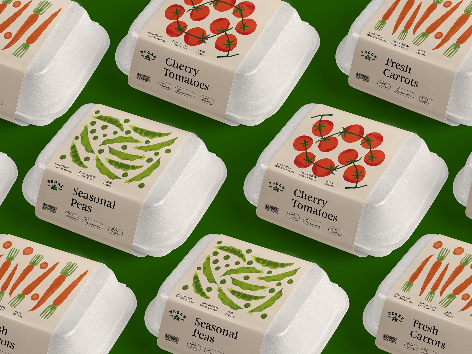
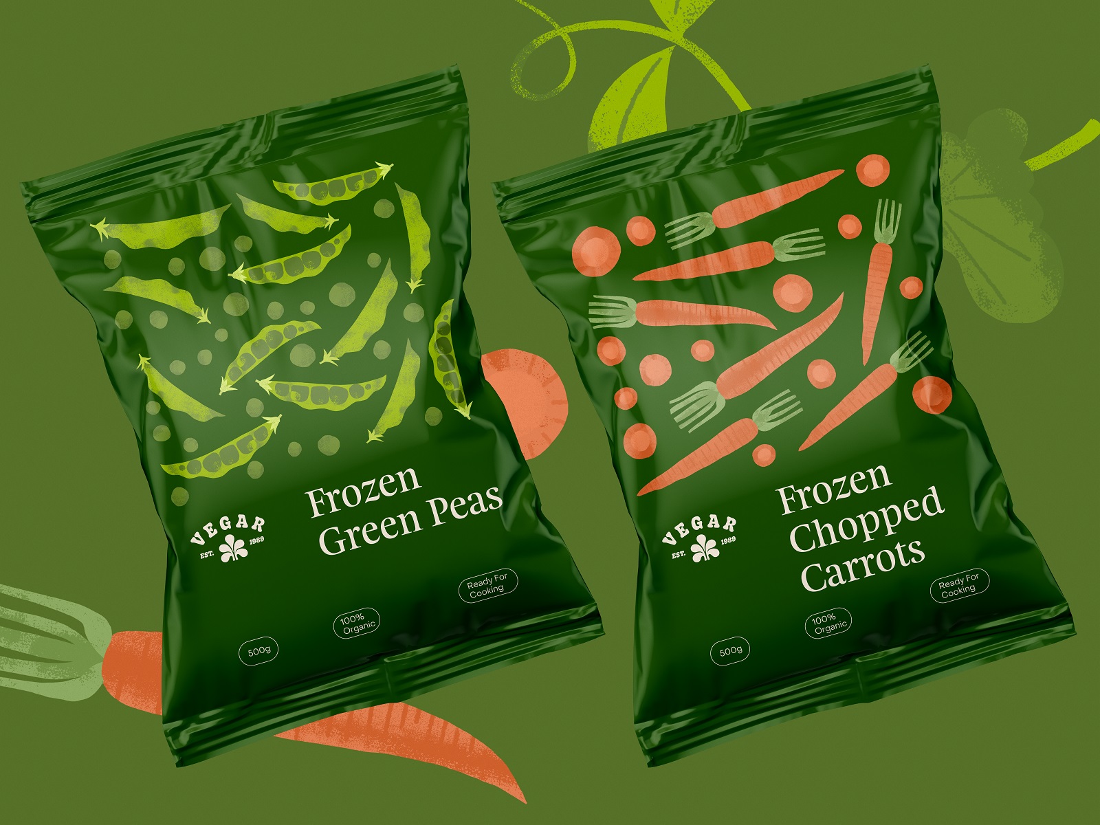
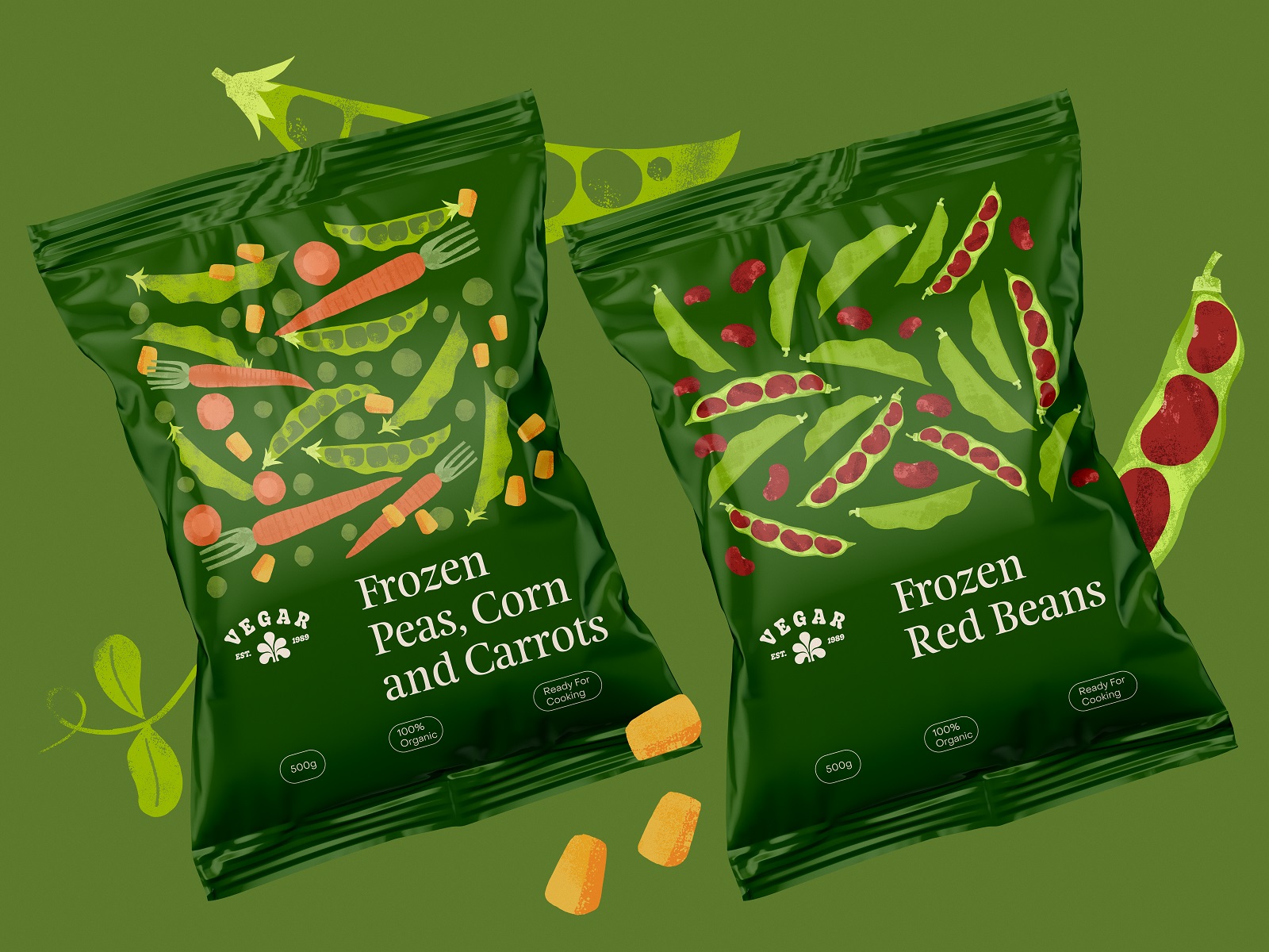
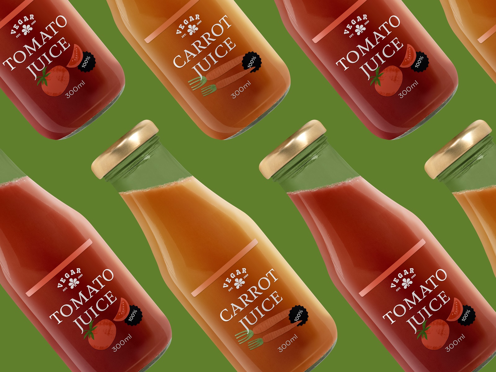
Frozen packets and juice bottles round out the system, each solving its own physics problem. A packet has to win a cold, fluorescent freezer aisle where everything looks faintly blue and unloved. A bottle gets to show its contents through glass, so the label simply frames the product.
Posters, billboards, and branded items push the same system into public space, where a brand gets remembered or gets driven past at sixty miles an hour. Same leaf, same palette, same warmth, scaled up without getting louder. Consistency earns the third glance more than volume ever could.
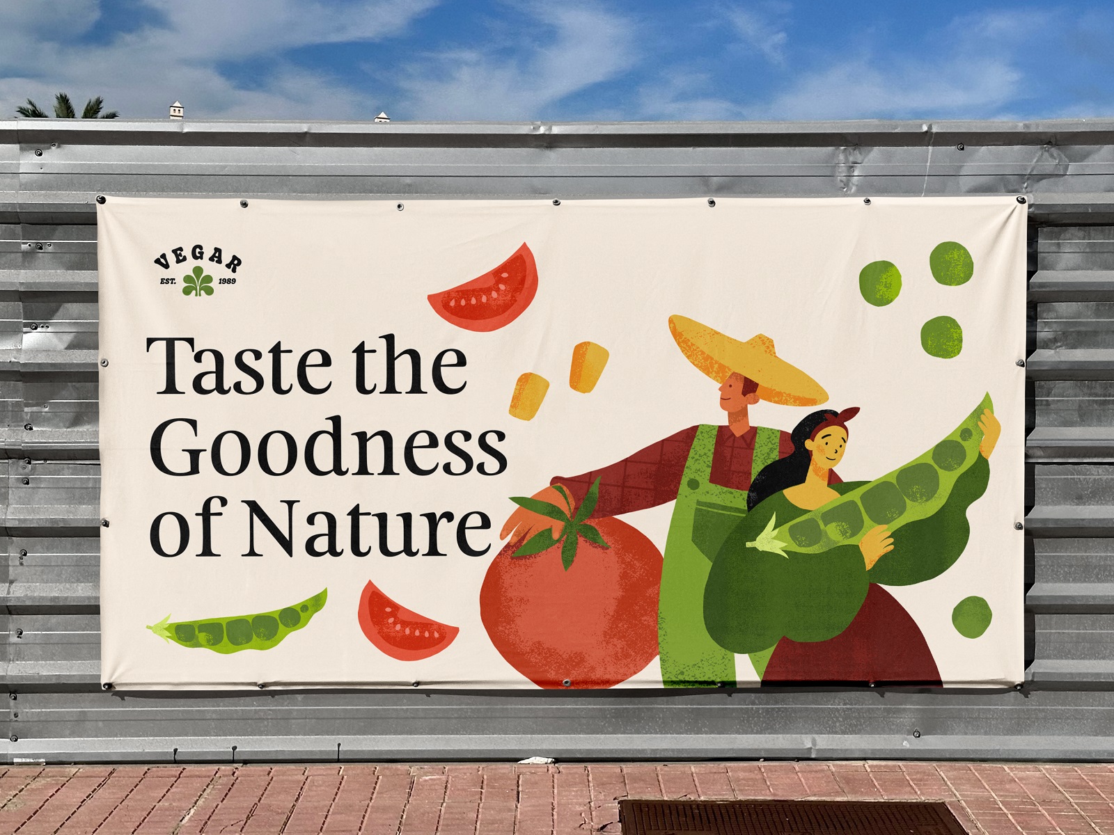
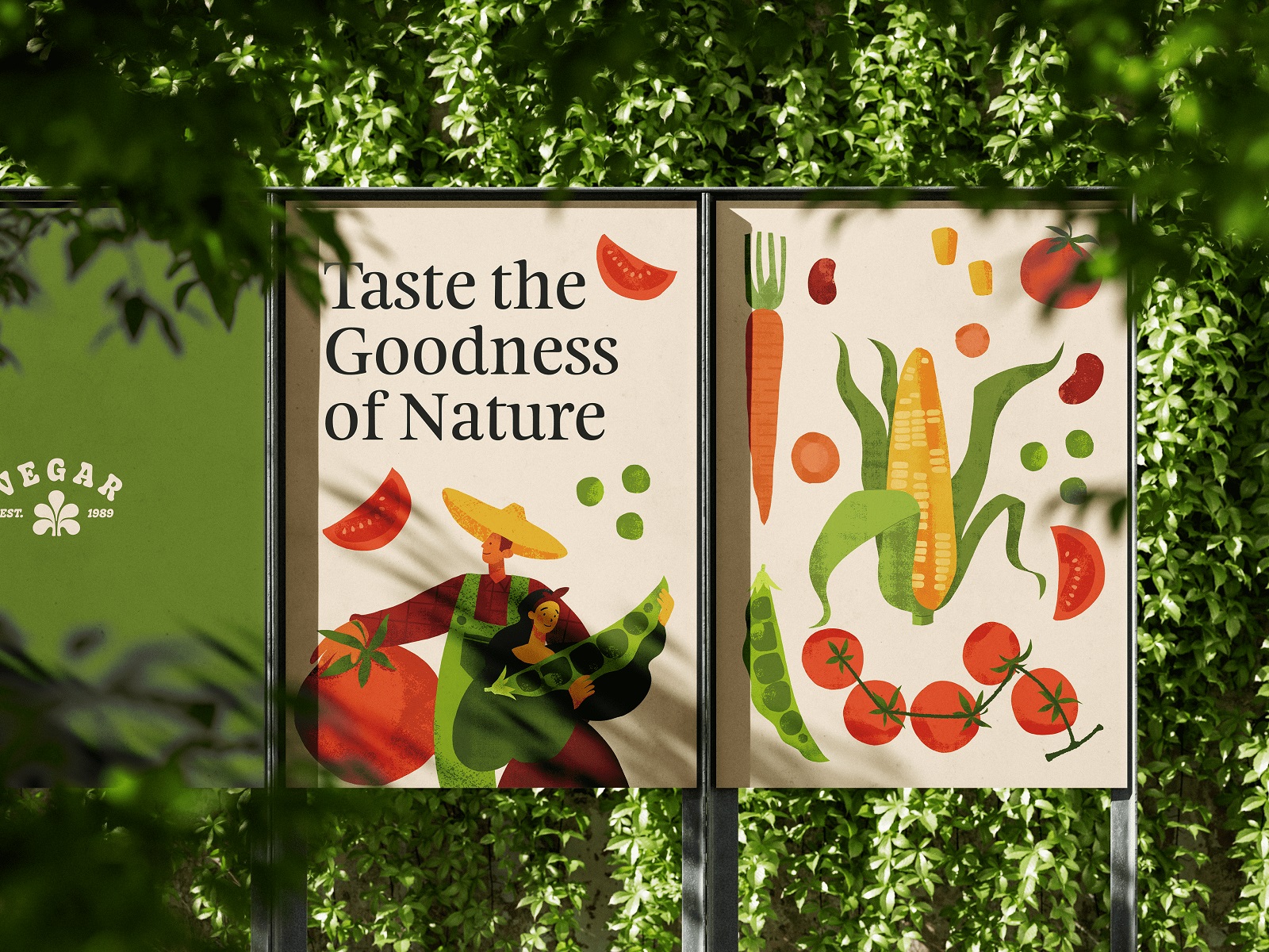
Outdoor advertising posters design
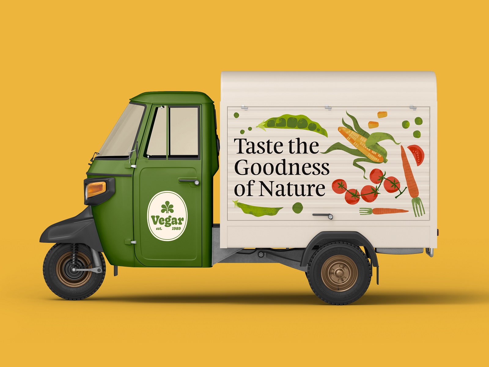
Branded truck livery design
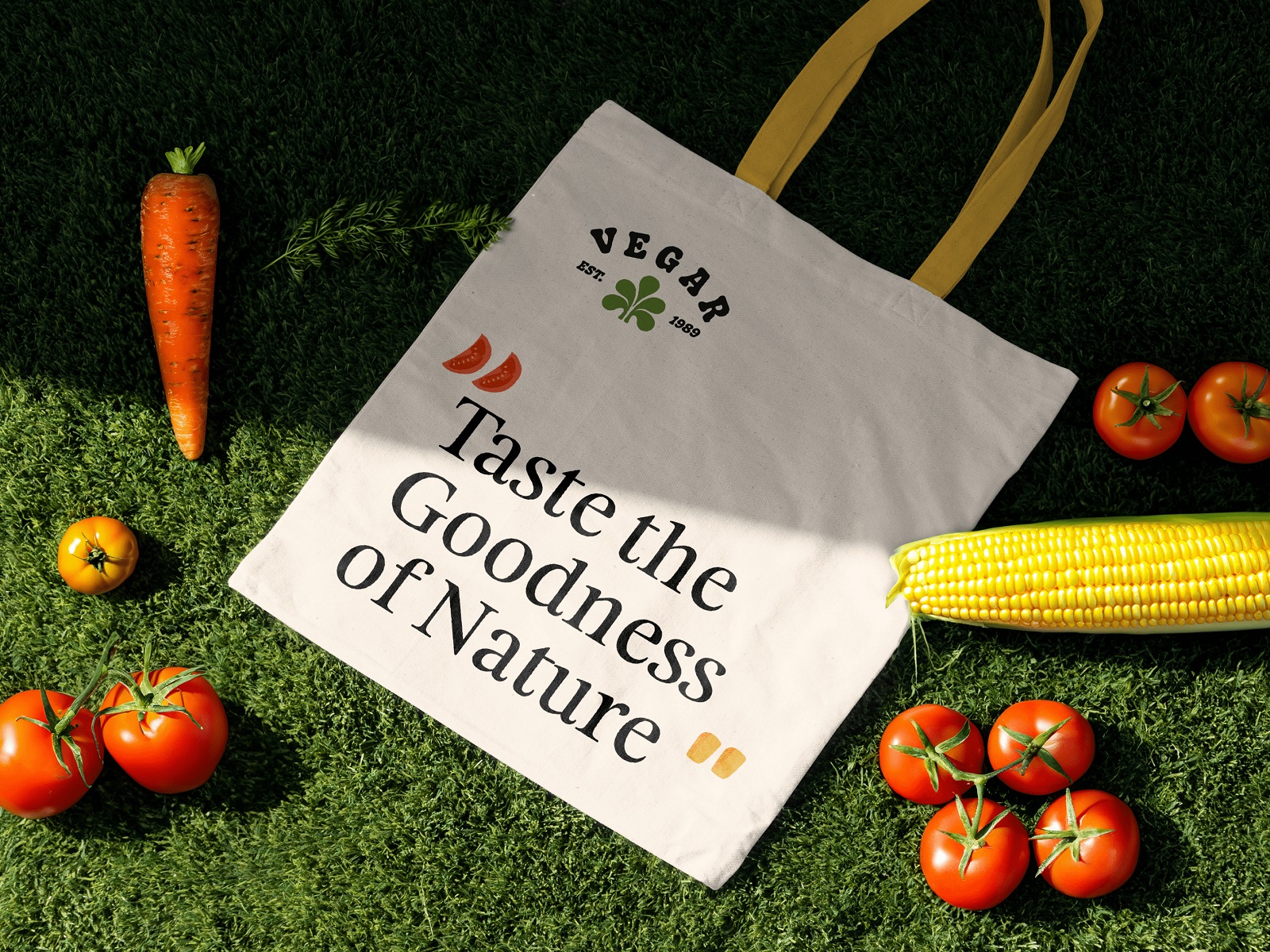
Branded tote design
Recommended Reading
Still Hungry? Great design works like a great vegetable patch: once you start digging, you find more. Take a look at our other case studies and design think pieces:
Lagerby Llama. Mascot Design for Ecommerce
Graneri. Artistic Granola Brand Packaging
Digital Art Case Study: Product Characters Illustration Concept
Pencils of Promise. Picture Book Creation Process Step by Step
Gofe. Packaging and Marketing Design for Coffee Brand
Illustration Case Studies: Visual Storytelling Art for User Experience
12 Bright Projects on Visual Identity and Packaging Design
Love Sign. Gift Box Packaging Design with Romantic Vibes
PierSide. Packaging Design for Tinned Fish Brand
KOISI Tokyo. Packaging Design for Japanese Restaurant