Every February, brands scramble to slap a heart on something and call it packaging design. Tubik studio’s Maryna Solomennykova and Yaroslav Manzheliy, working with art director Sergii Valiukh, skipped the cliché and built an actual narrative instead—the kind of Tubik Studio design work that treats a brief as more than a color swap.
Their brief for SwitLuv, a sweets brand, asked for something rarer: real storytelling, illustrated affection standing in as the delivery method for sugar. The trick behind good brand illustration is restraint—one strong idea beats five competing gimmicks fighting for shelf attention. That’s the version of “consistency matters” most chocolate packaging design advice conveniently skips.
Windows Sell Better Than Hearts
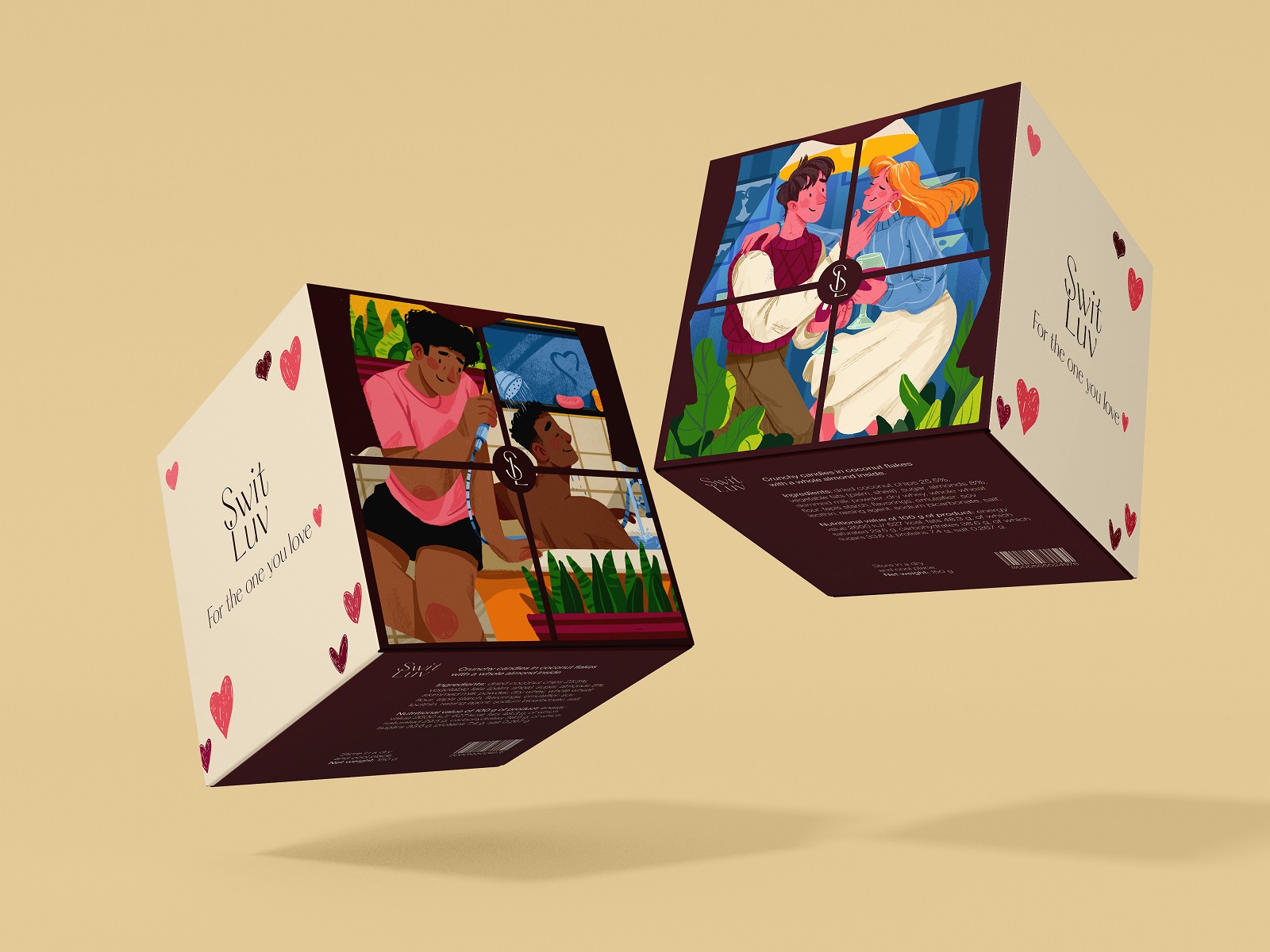
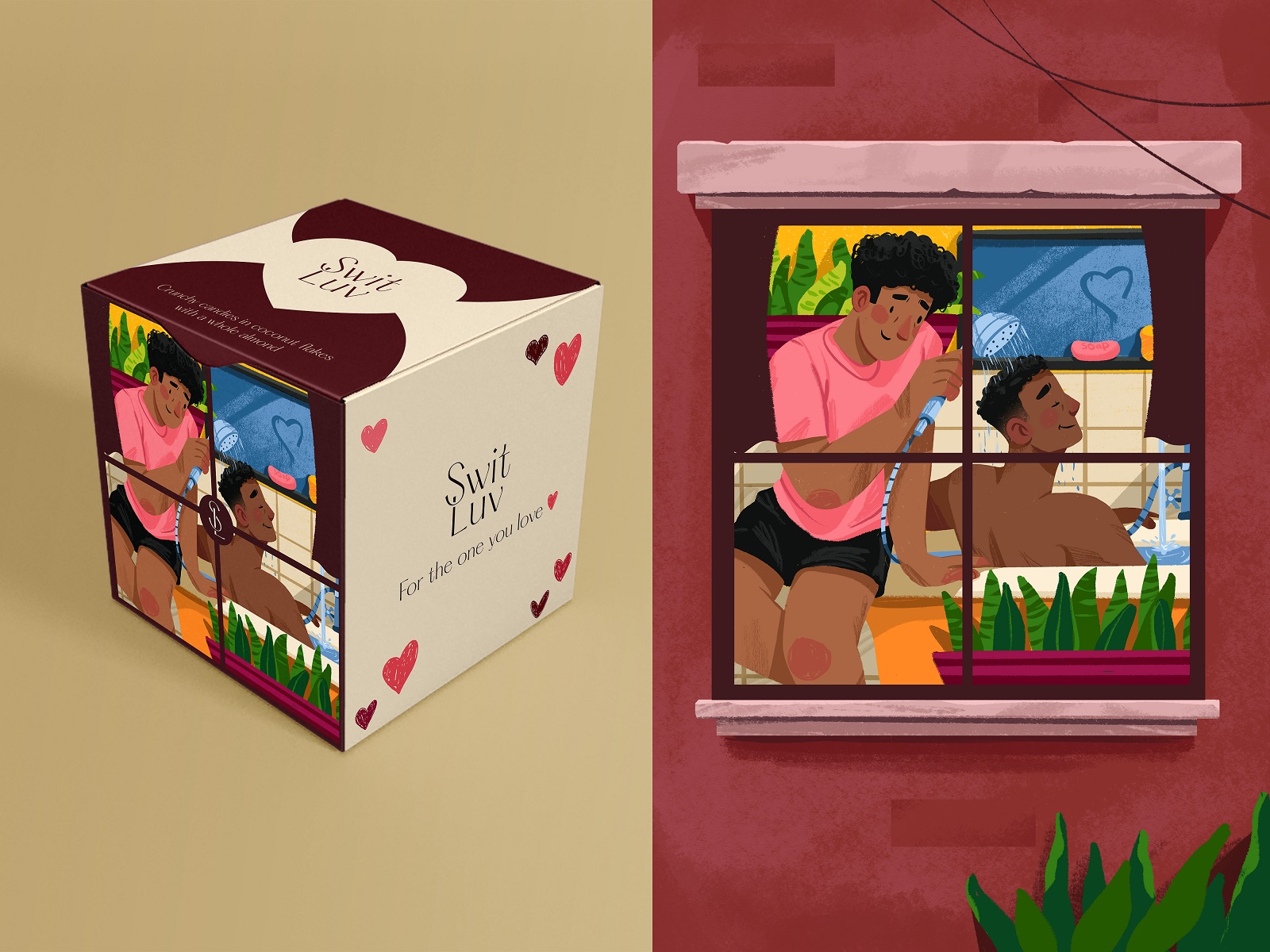
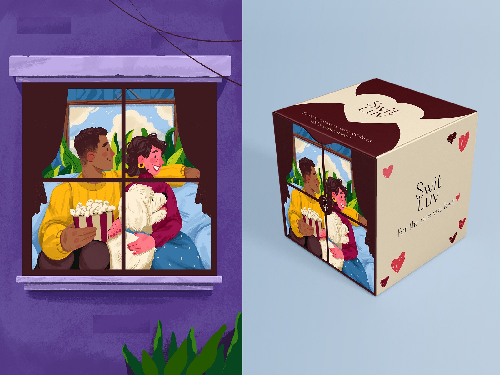
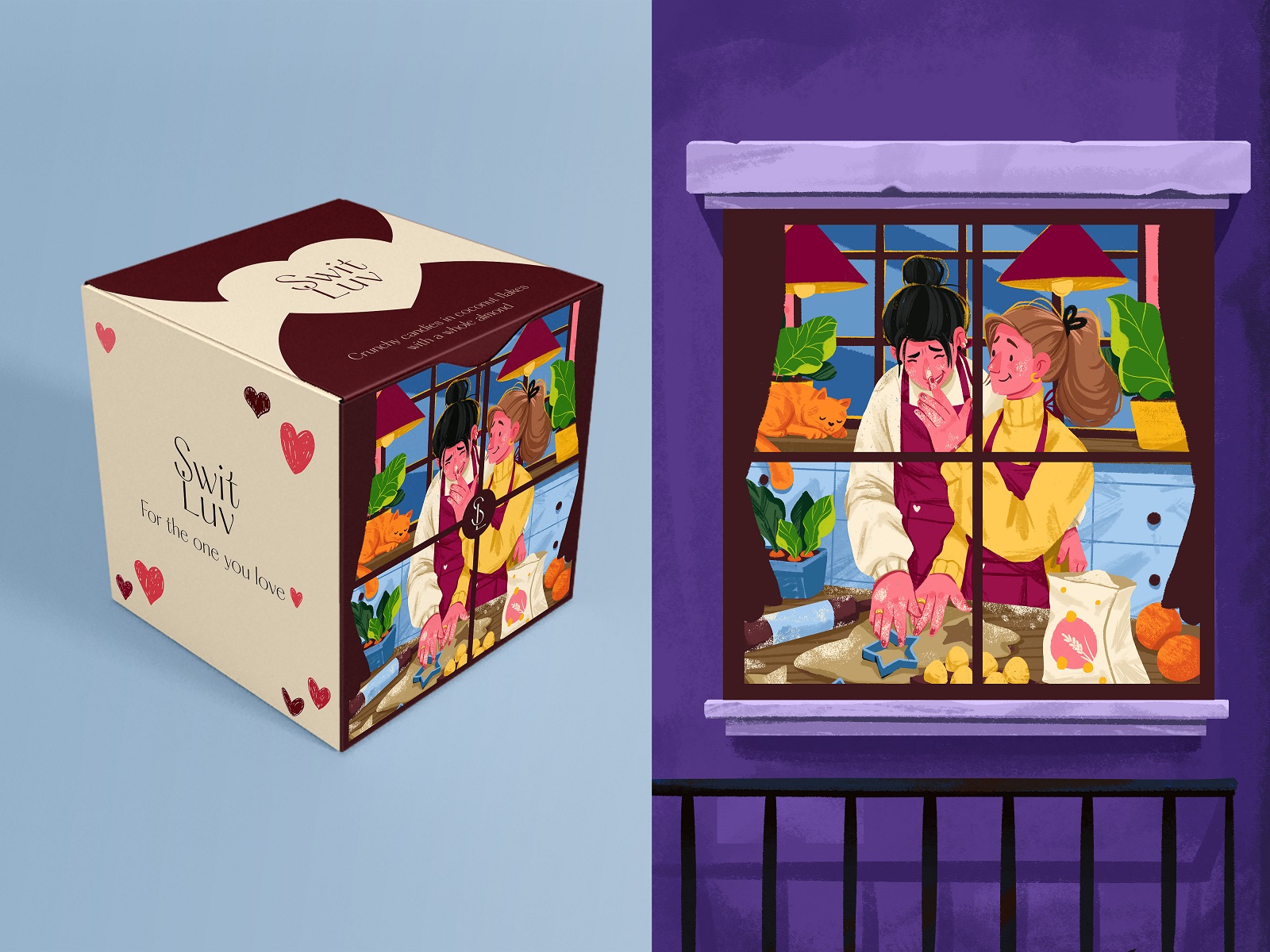
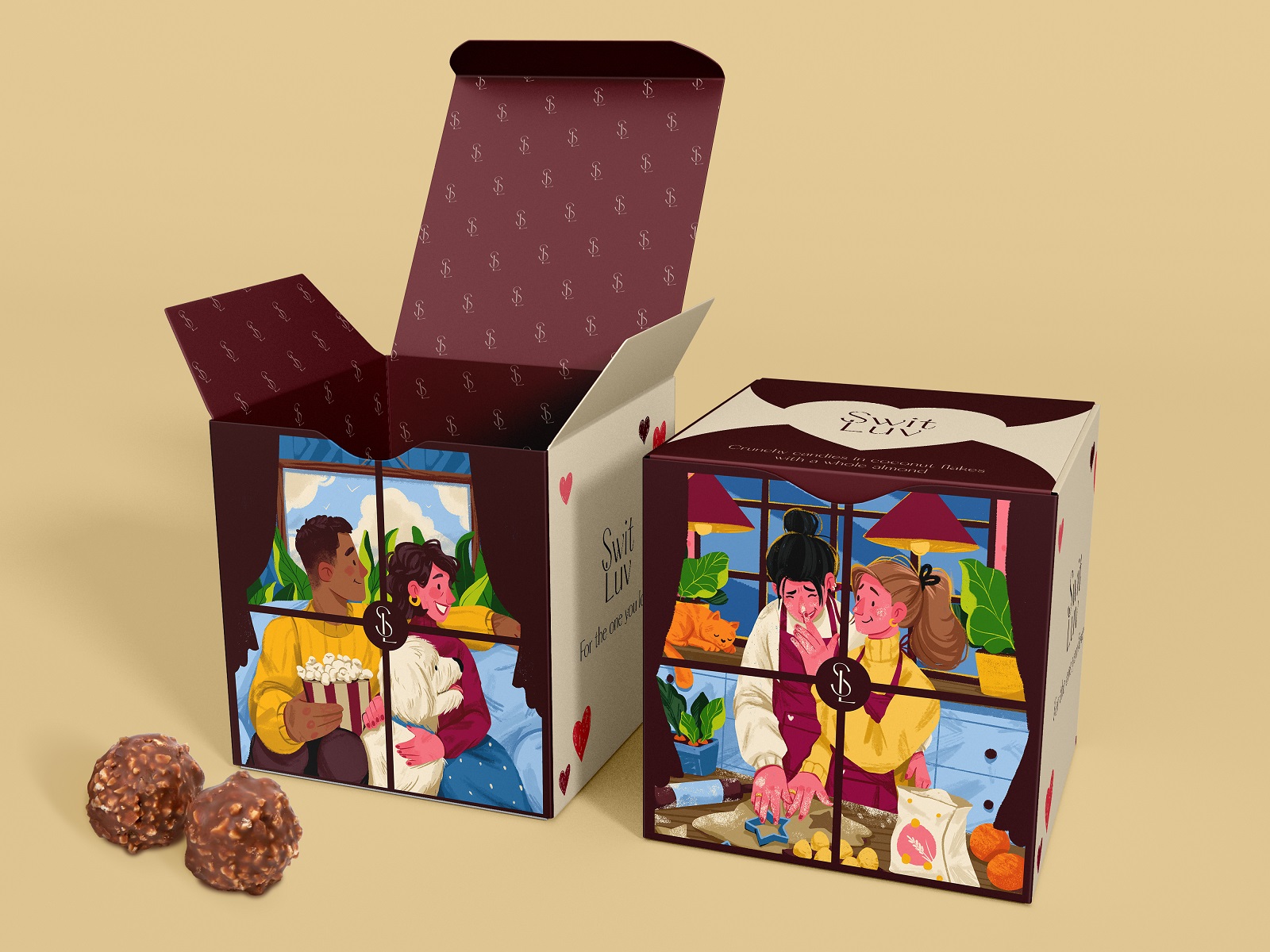
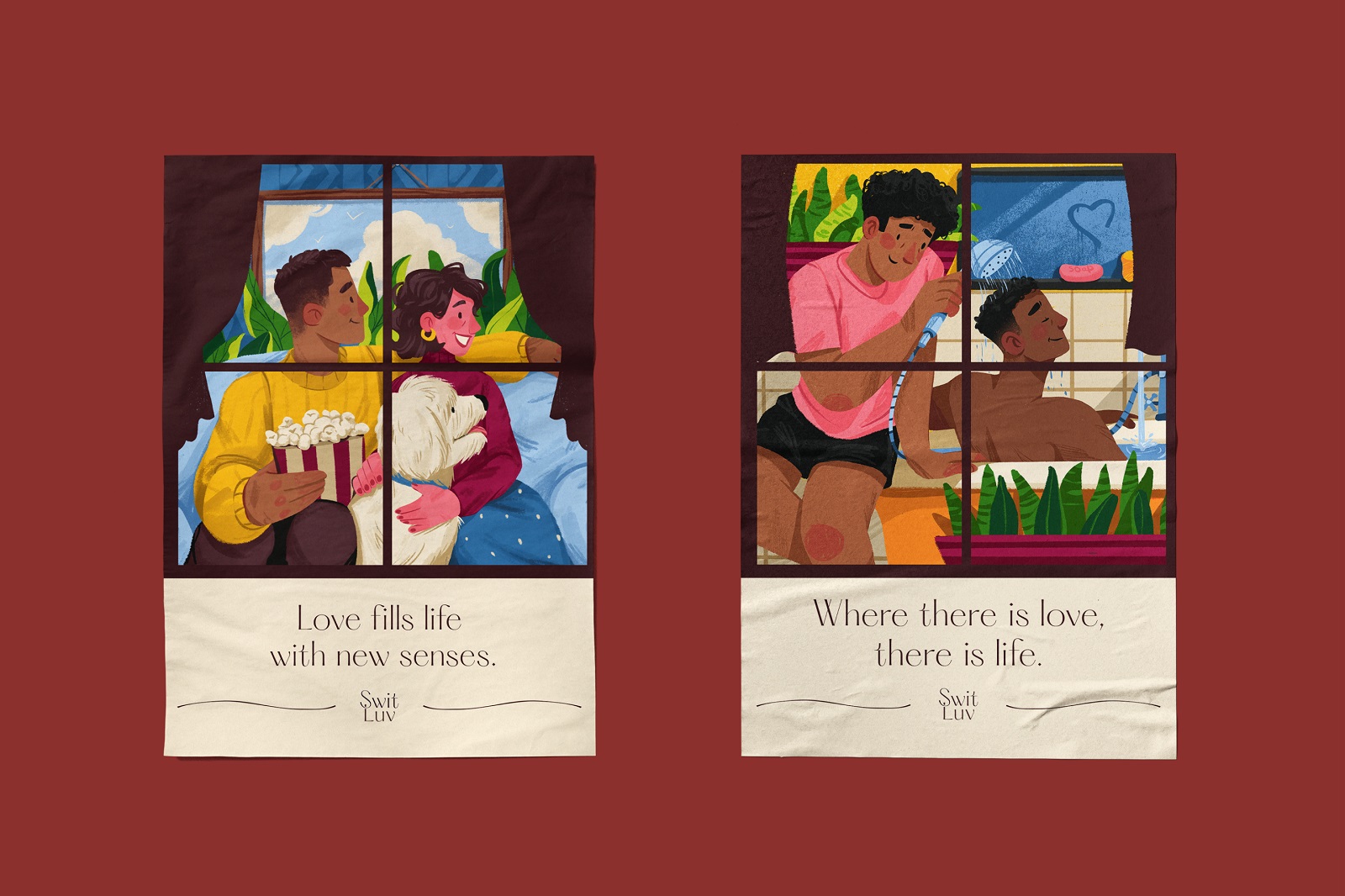
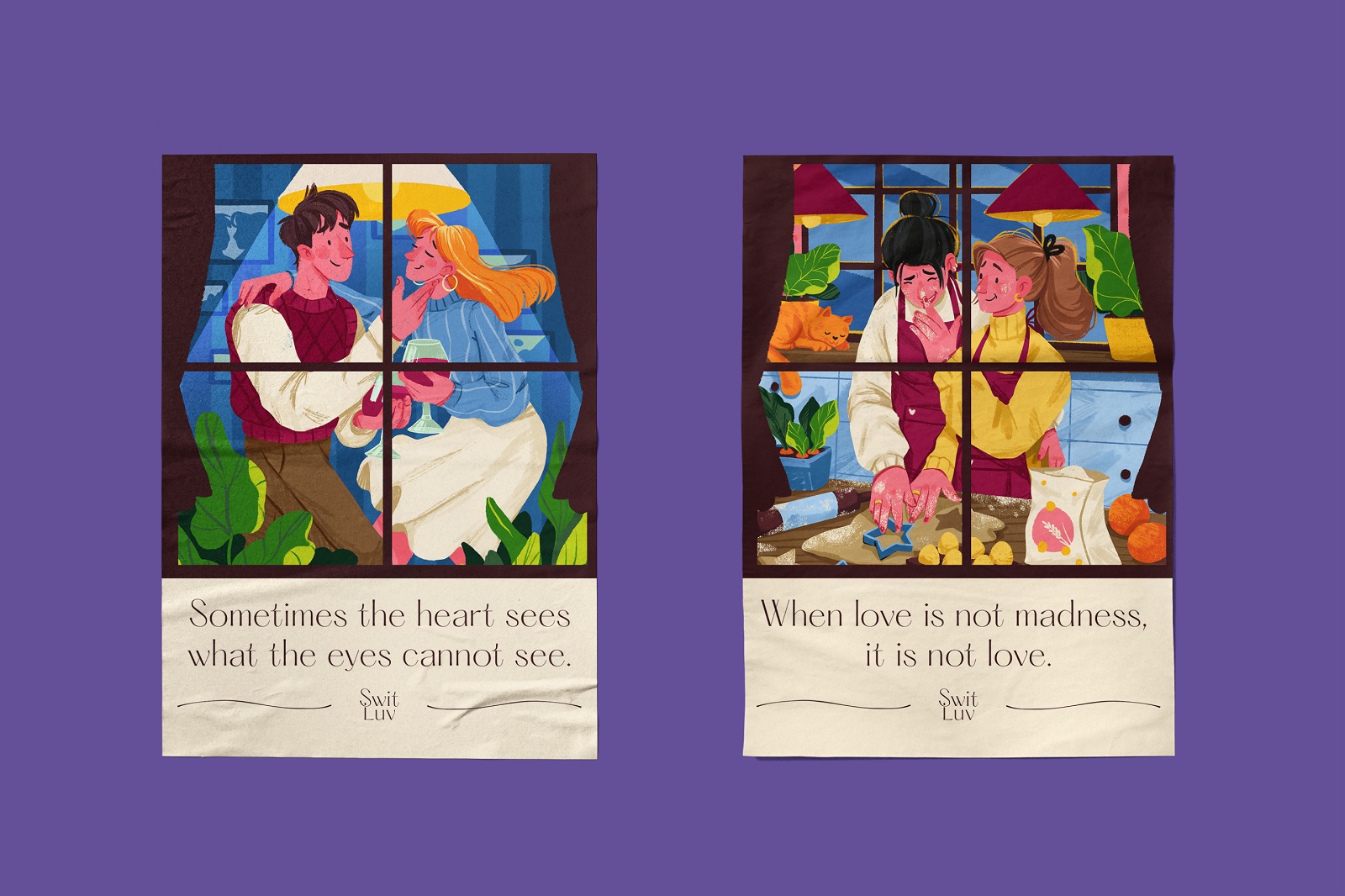
Rather than stamping couples front and center, the team framed each illustration like a window you’re peeking through—a stranger’s kitchen glowing at dusk, someone else’s Tuesday looking suspiciously romantic. That single compositional choice does more emotional labor than a dozen heart icons stacked together, and it’s a small case study in product packaging design done with restraint.
Visual storytelling works best when the viewer feels like a welcome voyeur, not a sales target. A useful habit for anyone building product packaging: crop the illustration like a scene rather than a logo, and shoppers linger at the shelf longer than the ad budget accounts for. It’s a reminder that shelf appeal packaging depends on more than a bigger logo, and a solid source of package design inspiration for anyone tired of pastel hearts.
Color and Type Play Bouncer
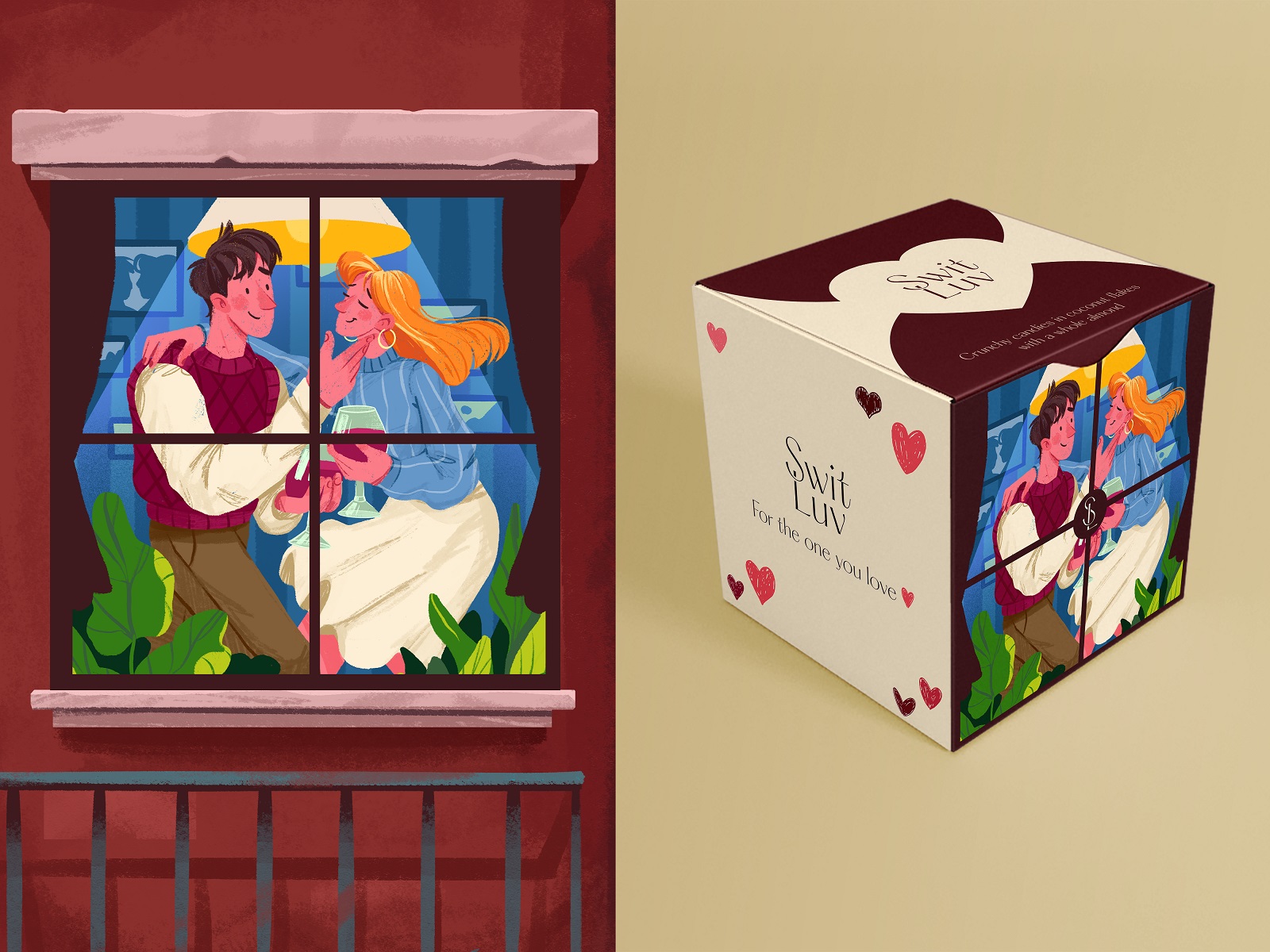
The palette leans contrasting instead of the usual pastel blush, which keeps this valentine’s day packaging from drowning in the expected pink. Typography stays neat and disciplined, handling the unglamorous job of keeping romance legible rather than sappy—a quiet lesson in typography in packaging that most brands skip in favor of a bigger heart.
Heart shapes do show up, but tucked quietly into the illustration style instead of blasted across the box front—a reminder that strong brand identity design often hides its symbols rather than shouting them at the register.
The Extras Nobody Skips
Small greeting cards shipped alongside the boxes, stretching the same illustration language into something a customer could actually hand to someone else—a nice bit of greeting card design that extends the story past the shelf. Smart move, structurally: brand consistency across packaging design and collateral multiplies shelf impact without multiplying the production budget, and it’s the kind of art direction design decision that separates a campaign from a one-off box. When candy packaging design tells one genuinely good story, the trick is letting that story leak into every touchpoint it can reach.
Recommended Reading
One case study rarely satisfies anyone with real curiosity about design. Browse the rest of our work and see what else earned a deep dive:
Garden Gates. Identity and Packaging Design for Garden Center
BlockStock. Brand Identity and Website for Minecraft Models Resource
Fulfill. Illustrations and Web Design for 3PLs Marketplace
Roebuck. Mobile Design and Illustrations for Educational App
World Humanitarian Day. Illustrations and Video for United Nations
Bikker. Identity Design and Illustrations for Biking Service
Albert’s. Christmas Cookies Packaging Design