There is an entire genre of LinkedIn posts built on one ritual: someone opens a chat window, types “act like a senior full-stack developer and build me a COOL landing page, make no mistakes,” and twenty minutes later announces that the design industry is dead.
What comes back is always the same site: a cold gradient, a little sparkle icon next to anything allegedly smart, monospace type wherever it fits, and a headline about supercharging your workflow or whatnot. The creator ships it, and so do two hundred others that same week. The industry, against all odds, survives the week anyway.
The internet calls this vibe coding, and the name is honest about the method: you describe a feeling, the model writes code, and nobody involved could tell you what separates a good result from one that merely runs. For throwaway weekend projects, that works just fine.
We use the same AI design tools at tubik, and the label fits our work about as well as “doodling” fits an architectural drawing. Factura took nearly two hundred messages of extremely specific opinions, one banned color scheme, five rejected transitions in a single evening, and a bug that only a human hand on a trackpad could feel. A vibe is something you describe once and hope for. What our art director did for ten days was direct, and directing machines turned out to demand the same skills that directing people always did.
So, what happens when you give a designer with a decade of taste about sixty tireless assistants who forget everything every few hours? Read on for the full story of how a year-old sketch of a stone arch became a live product site in ten days.
Factura hero section
An arch in search of a product
Ernest Asanov, tubik’s Art Director, carried one image around for almost a year: a first screen with stone columns, an arch between them, and a headline set in a gothic typeface. Building that scene needed a 3D designer, and good 3D designers have one thing in common with good restaurants: if you can book one for tomorrow, you should start asking questions. None was ever free, so the concept sat and waited.
The product grew out of the typeface. Gothic script is called blackletter, and its best-known variety is Fraktur, from the Latin fractura, a break. Drop one sound and fractura becomes factura, Latin for “a making,” which over centuries came to mean the document listing what was made and delivered: an invoice. Factoring comes from the same root. That chain, blackletter → fractura → factura → invoice, finally gave the dormant concept something to stand on: Factura, an invoicing service for B2B teams.
Before anyone touched a pixel, a research AI agent looked at how AI genuinely helps in accounts receivable, and the product’s thesis came out of that: the agent prepares, the human approves. That one sentence later settled several design arguments, which is about the best thing a product thesis can do.
Factura product overview
Casting the crew
The brief was a finished dark single-page site with the arch from the concept, built this time by agents. The human wrote messages, looked at results, and said what was wrong; the rest was up to the machines. The latter came in several kinds:
- A main session that broke the work into tasks and handed them out.
- Single-assignment agents for short, well-specified jobs like laying out five sections or checking contrast. They reported back and vanished.
- Long sessions for anything that depended on taste: the 3D scene, the first screen, the product interface. These got direct, hands-on art direction.
- An auditor that checked everyone else’s work across six screen widths, console, motion, and accessibility, and never touched the code.
Over ten days that added up to about sixty agents. All project memory lived in files, because the main conversation was compressed more than fifty times and each fresh version learned the project purely from those documents.
Advertising agencies worked out this structure long ago. The classic art director rarely set the type or painted the illustration; the skill was knowing precisely what was wrong with someone else’s work and saying it in words they could act on.
Building the hero scene
The original plan was to render the arch in Blender and scrub through frames on scroll. By the end of day one we’d decided the scene had to be alive. Blender stayed as the source of geometry, and Three.js took over in the browser. The stone got photoscanned textures with shadows baked in, the model was squeezed down to 1.7 MB, and the arch turns a few degrees to follow your cursor. On top sits a blackletter headline drawn in Figma and a single “Request beta” button, because a product that hasn’t launched has no trial to offer.
The longest fight was the handoff from the arch to the first section. In one evening we tried five variants and recorded fifteen videos. The product window zoomed with the arch, swung like a pendulum, surfaced from the darkness of the nave, materialized as a skeleton loader. All rejected. Every one of them asked the visitor to watch a trick.
The winner was the plainest: the window rises from the bottom of the browser with a slight scale-up, the way content naturally enters a scrolling page. A day later, even that got reworked, because a pause over the arch felt staged. Now the section simply scrolls over the pinned arch. The arch does its job as a backdrop and gets out of the way. Our rule of thumb from this: if a transition needs explaining, cut it.
Factura mobile layout
What the machines couldn’t feel
Around the same time, we recorded a trackpad scroll where the product window twitched at the edge of the first screen. Two audits had already passed that exact spot.
The reason was how the auditor scrolled. It moved the page programmatically, step by step, and every frame it captured looked correct. A real trackpad gesture moves the page before the animation script can put the window back, which produced a jump of up to 21 pixels. Once the pinning moved to CSS and a new probe started replaying genuine gestures, the deviation dropped to a single pixel. That probe now runs before every merge, and every bug the checks miss becomes one more step in it.
This is the most important thing we learned on the project. Machines verify exactly what you ask them to verify, and a sequence of correct frames can still add up to wrong motion. Motion lives between frames, in timing, in how a gesture feels under a finger. No checklist caught it until a designer felt it and turned the feeling into a test. If you’re building motion with agents, budget for a human to scroll the thing with their own hands, on real hardware, every day.
Against the Average
Day two brought the B2B SaaS design work: an invoice editor, a payments table, reconciliation. The verdict was fast and unflattering. The interface reeked of AI, and almost every choice in it was one the model had made by default. A sparkle diamond sat beside “Agent draft,” purple ran through the logo and the UI color palette, and monospace showed up anywhere it could be justified. That’s what a model produces when asked for “a product” and given nothing else.
So this time the rules came before the code. The hero already had two light sources on the columns, one warm and one cold, and that gave us the system: cold blue means the agent is acting, warm orange means a person is acting, neutral is reserved for facts. The product’s thesis—agent prepares, human approves—became a color rule you can read at a glance in the payments table. The same two lights burn on the arch, so the hero and the interface speak one visual language. Purple and pink were banned outright, and we tuned the orange so white text on it passes contrast.
Factura agent and user actions interface
Every era of the web has had its default look. There were the Bootstrap years, when every startup opened with the same jumbotron, and then the years of flat Corporate Memphis illustrations full of people with tiny heads and enormous limbs. The AI aesthetic is the newest member of that family, and it comes from the same place. A model’s instincts are the statistical average of everything it has seen, so left alone it builds the median website. A senior designer earns their keep by knowing exactly where the median sits and having a reason to leave it. Give every color a job inside the product’s logic, and the median stops being an option.
Factura agent interface
A tale of an ordinary laptop
The first outside feedback came the day the site moved to its own domain. Tubik’s project manager Nick opened it on his MacBook Air M1 with 8 GB of RAM, and while Safari flew, Chrome and Firefox dragged on the first screen.
The scene already had a quality ladder that steps down to a still poster when frames fall behind. It had never fired, because the scene was timing how long the processor spent sending commands to the graphics card instead of how long the card spent executing them. Four fixes followed back to back, about six hours in all:
- The ladder started measuring real frame time.
- The canvas shrank from the full screen to the size of the arch, roughly halving GPU time per frame on our Mac.
- The GPU now gets measured under the preloader, so the right quality is chosen before the scene appears.
- The ladder learned to check the scene’s own frame separately, after Firefox’s slow page compositing made it blame the arch for something the arch never did.
One problem took four tasks mostly because no weak laptop sat on the desk; it’s way better when a slow device belongs within arm’s reach from day one.
The case for human judgment
The concept sat in a folder for a year because the economics never worked. A bespoke 3D hero needs a 3D designer, a front-end developer, and a schedule they both share. With agents, it shipped in ten days with the photoscanned stone, the live scene, and a performance budget for a modest laptop all intact. About ten hours of that was hands-on design time. Nothing was cut to get there.
What the tools amplified was judgment. Every decision that makes Factura look like Factura came from a decade of practice: the etymology that named the product, the lens, the color logic, five rejected transitions, a 21-pixel twitch nobody else noticed. The machine made each attempt cheap enough to afford being picky, and fifteen videos in one evening is what pickiness looks like when trying costs almost nothing.
For clients, this means concepts and MVPs that used to arrive as static mockups can now arrive as working products, ambitious parts included. For designers, the news is less comfortable. These tools reward people who already know what good looks like and punish anyone hoping the model will know for them.
The people in our industry panicking loudest about AI tend to be the ones whose value was mostly execution. The ones whose value was judgment just got a much bigger workshop, and we intend to use every inch of it.
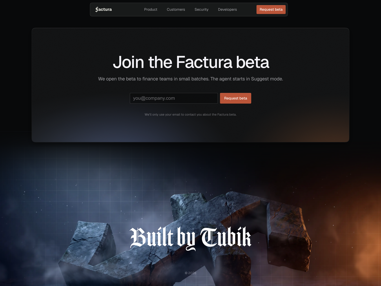
Factura footer
Recommended Reading
Enjoyed this one? Make sure you also check our other case studies, they’re just as cool:
One Brand, Every Surface: Biotech Company Redesign Case Study
Zealous × TAS Case Study: Design Meets Purpose
Case Study: Manatee Energy. Designing Warmth