
There’s a moment every designer quietly dreads. Not a crash, not a blank screen, something subtler: the look on a user’s face when something goes wrong and the interface offers nothing useful in return. No explanation, just the digital equivalent of a shrug.
Whether we, as designers, want it or not, errors are part of the product. The question is not whether your users will encounter them; it’s whether your error state design is ready when they do.
Now, let’s dig deeper.
What an Error Actually Is
Before fixing something, name it precisely. An interface error is any state where the interface cannot do what the user wants. That breaks down into three honest scenarios:
The platform literally cannot do what’s being asked—the function doesn’t exist, the server is down, the file format isn’t supported. The system cannot understand the input—a field expects a number and got a sentence, an email address is missing the @, a password doesn’t meet requirements the user never knew about. Or the user is combining things that can’t coexist—operations that conflict in ways that are invisible from the outside.
Three different problems. Three different types of communication required. Grouping them into a single “error” category and responding to all three identically is where most design systems start to crack.
What makes this genuinely serious: errors aren’t neutral. Research connecting smartphone error messages to cortisol levels—the body’s stress biomarker—found a measurable physiological response to a bad error state. For some users, in some moments, a confusing UI error message triggers real anxiety and raises cognitive load significantly. It makes them stop trying. It costs you not just a conversion but a relationship.
Design for that reality, not the ideal one.
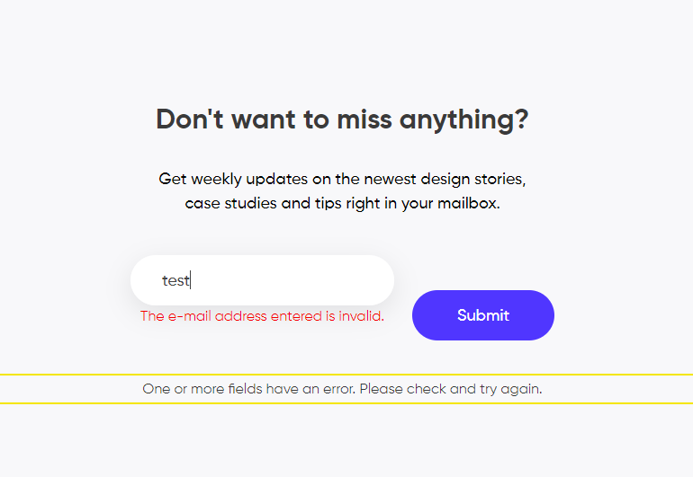
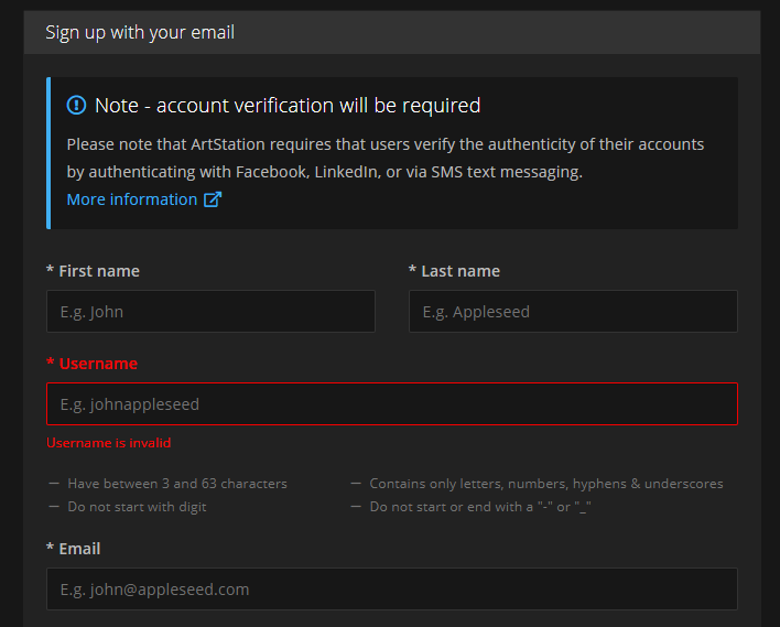
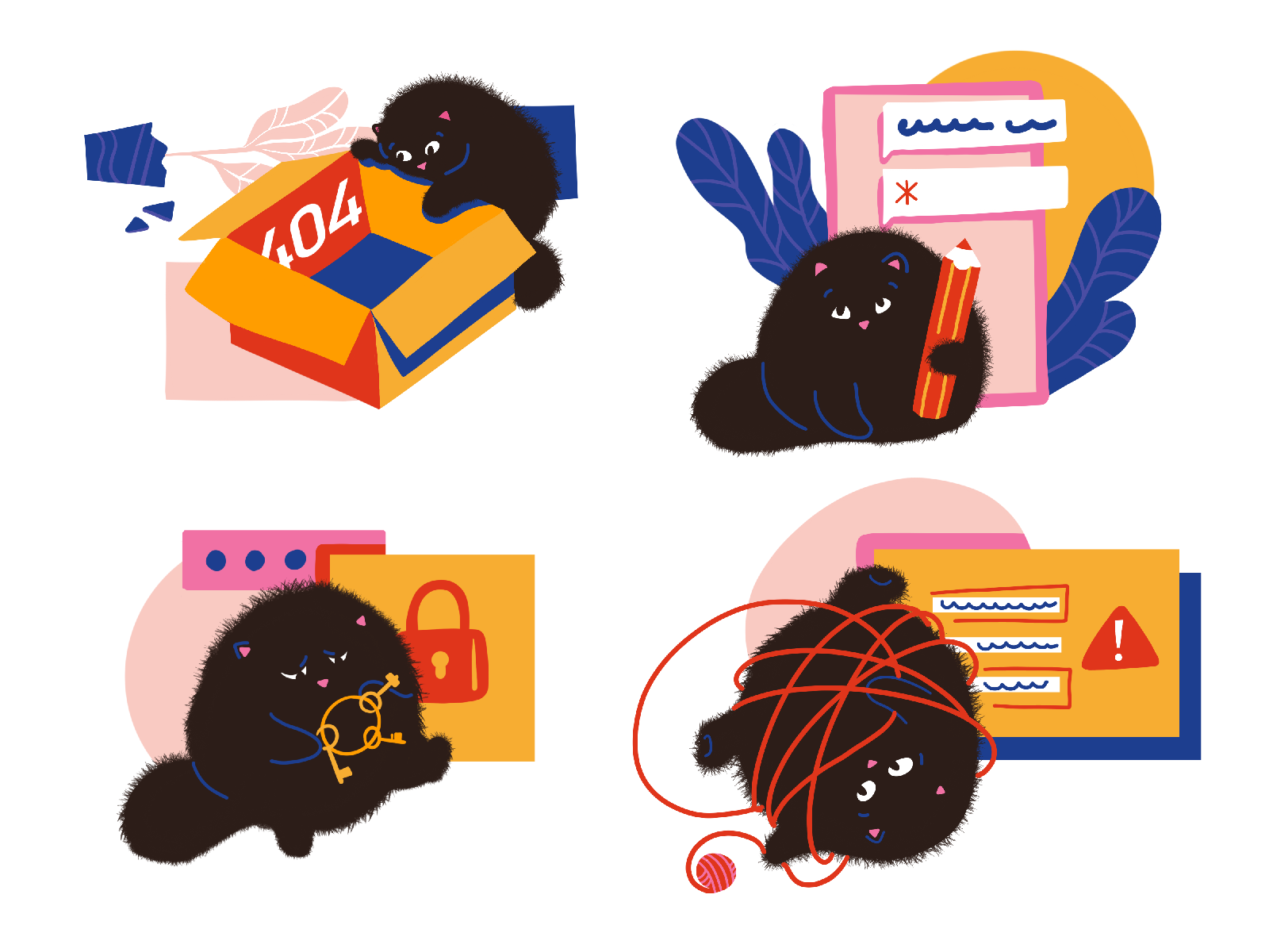
This is how the error of filling the subscription form on our website looks
Design Principles for Errors That Don’t Insult People
There’s no single moment where users decide they’re done with a product—it’s a series of small failures that stack up. Here’s how to make sure UX error states aren’t one of them.
Make It Impossible to Miss
The worst error is a silent one. The second worst is one that’s easy to overlook.
If a form has ten fields and one is invalid, do not tell the user “something went wrong” and make them play detective. Highlight the broken field. Put the message next to the problem, not at the top of the page in a banner they’ve already scrolled past. Error visibility is about respect for someone’s time—and it’s one of the most fundamental UX design principles there is.
Yes, the red border might disturb your minimalist composition. But the composition doesn’t matter if the product doesn’t work.
Use Signals People Already Know
Designers love novelty. Error states are the wrong place for it.
Red and exclamation marks exist for a reason: decades of learned behavior mean users process them instantly, without thinking. That instant processing is exactly what you want when someone is already in a moment of friction. Use the conventions. Save your creative energy for places where originality adds value.
One important caveat: color alone is never sufficient. A red border that’s the only indicator of an error is invisible to colorblind users. Pair color with iconography. Pair both with text. Redundancy here means accessible error message design—it’s an inclusive UX design requirement. Ignoring it means failing WCAG error indicator standards and locking out a significant portion of your users.
Explain What Happened, Not Just That Something Did
“Invalid input” is not an explanation. “The username or password don’t match” is.
The difference between those two messages is the difference between a user who tries again and a user who gives up. When someone doesn’t understand what went wrong, they can’t fix it—and they’re likely to hit the same wall again. Worse, they start to feel confused and incompetent, which they will attribute to the product (and rightfully so).
This is where UX writing for errors does its real work. Explain the problem in plain language, not a developer or legal one. The language of the actual human who is standing there, holding their phone, trying to log in before their meeting starts, the train arrives, or the coffee goes cold. Plain language UX isn’t dumbing things down—it’s showing respect.
Keep the Interaction Minimal
The instinct when something breaks is to escalate: pop a modal, add a full error screen, demand acknowledgment before proceeding. Resist this almost every time.
Inline validation—a message that appears immediately next to the field or action where the error occurred—is almost always preferable to a modal. A modal requires an extra click to dismiss, interrupts the user’s mental flow, and adds friction at the exact moment when you should be reducing it. Good form validation UX keeps the user in flow; bad form validation pulls them out of it.
A modal earns its place only when the error genuinely requires redirecting the user to a different context entirely. In every other case, fix it where it broke.
Write Like a Human Being
Read your error messages out loud. If they sound like they were written by a legal department or generated by a server log, rewrite them.
Short sentences. Active voice. No jargon. No error codes (unless there’s a support workflow that requires them—and even then, pair the code with a plain-language explanation). Get to the point immediately; the user doesn’t need a preamble, just a solution.
The bar for error message copywriting is not eloquence, it’s clarity. Those are different things, and clarity is harder.
Don’t Blame the User
This one seems obvious, but still needs to be said out loud.
“You entered an invalid email address” and “Enter a valid email address” contain almost identical information. The difference is that the first assigns fault and the second gives direction. Users already feel friction in an error state—adding blame compounds that feeling into something that erodes user trust in UX. Write every error message as if you’re speaking to someone you respect who made an understandable mistake. Because that’s exactly what’s happening.
Be Constructive: Tell Them What to Do Next
Explanation without direction is half the job. Once you’ve told someone what went wrong, tell them how to move forward.
On a web interface, this means giving clear paths—back to the homepage, back to the previous step, or directly to the broken element. On mobile UX design, it means making navigation out of the error state effortless, not buried. In multi-step forms, it means surfacing errors at each step rather than presenting a list of failures at the very end, after someone has spent eight minutes filling everything out.
The constructive error message is functional—it turns a dead end into a detour. And in terms of conversion rate UX, this single principle can make the difference between a completed form and an abandoned one.
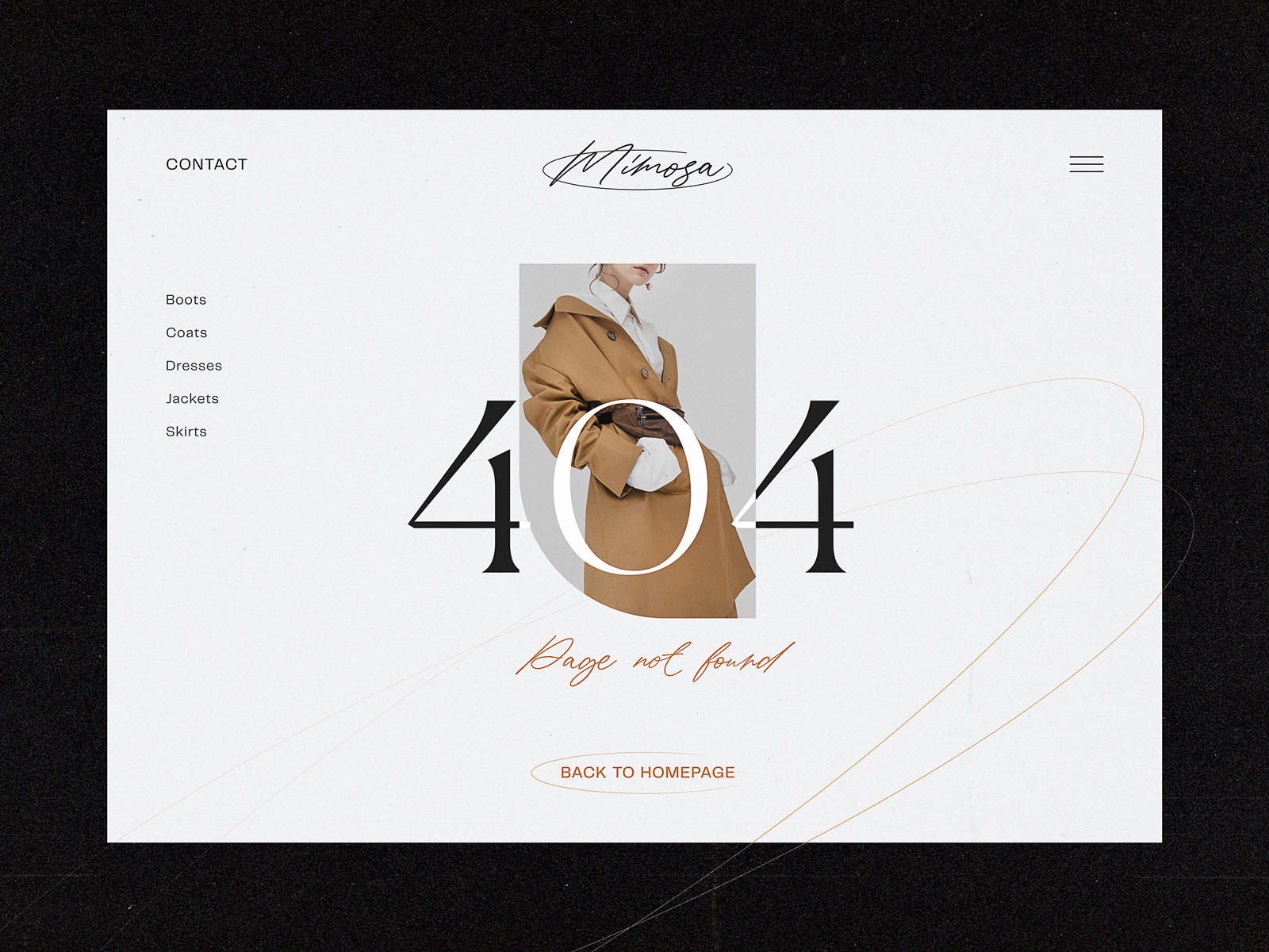
This 404 page of the fashion brand’s e-commerce website gives the visitor various options to jump to, marking the ability to get back to the home page as the main call-to-action
Use Imagery Thoughtfully
Not every error screen needs an illustration. But when an image is appropriate—a 404 page design, an empty state design, a major system failure—a well-chosen visual does something text cannot: it shifts the emotional register of the moment.
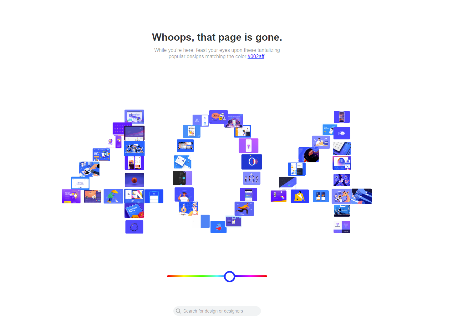
Dribbble’s 404 page is a useful example not because it’s clever (although it is) but because it’s calibrated. They know their audience—designers with visual curiosity—and they give that audience something to engage with instead of just a dead end. The error becomes, briefly, interesting. That’s emotional design at its best: understanding your users well enough to meet them in the moment.
The rule: use imagery when it genuinely reduces tension or adds useful context. Avoid it when it becomes decoration on top of a bad experience.
404 error page for the ShipDaddy website uses funny mascot animation integrating brand graphics into the web interactions and making the error page smoothened with fun.
Test, Watch, and Iterate
Error handling UX is not finished at launch. It’s never finished. Analytics will show you where users drop off. Session recordings will show you the face of confusion in slow motion. A/B testing error messages will show you which version gets someone back on track and which one loses them. Error states are among the highest-leverage places to iterate in any product—the improvements are fast to implement and the gains in completion rates and user trust are often significant.
The Checklist
A well-designed error state is:
- Visible—impossible to miss, impossible to ignore
- Clear—written for the user, not the developer
- Explanatory—says what happened, not just that it did
- Constructive—tells the user what to do next
- Friction-light—no unnecessary extra steps or clicks
- Human—polite, direct, and never condescending
The Summary
The way a product behaves when things go wrong is one of the most revealing things about how much its makers respect their users. An error state handled well—visible, honest, helpful, human—can actually build trust. A user who hits a problem and gets clear, kind guidance through it comes out the other side with more confidence in the product than before.
That’s what UX design for errors—and really, all of product design best practices—is about.
Recommended Reading
Still here? Good taste. Browse our other articles on design, UX, and the decisions that make products feel crafted with love rather than just assembled:
Best Practices on Preventing Errors in User Interfaces
Visual Dividers in User Interfaces: Types and Design Tips
Directional Cues in User Interfaces
How to Make User Interface Readable
Basic Types of Buttons in User Interfaces
3C of Interface Design: Color, Contrast, Content