Color theory sounds like something you’d sleep through in art school, right next to a slideshow about negative space. Which is a shame, because color is doing more work on your brain than almost any other design decision, and most of that work happens before you’ve consciously registered what you’re looking at.
A button shifts from gray to orange and people click it more. A logo moves three shades of blue and a brand feels more trustworthy, or less, depending on which blue got picked and how much research got skipped. Understanding color theory has less to do with memorizing a wheel and more to do with learning the vocabulary fast enough to improvise with it—the way a jazz musician studies scales so she can eventually ignore them on purpose.
So, what even is color? Let’s dive in.

The Word Everyone Uses Wrong
Start with the word “color” itself, because everyone in a design meeting throws it around while meaning six different things. Technically, color is the umbrella term—the general phenomenon of light bouncing off a surface and registering in your eye as red, teal, mustard, or whatever else. What people usually mean when they point at a swatch and say “I want that color” is a hue: one of twelve pure, unmixed positions on the color wheel.
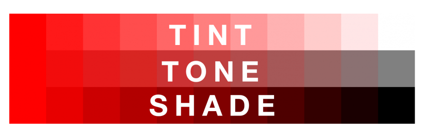
A hue is the raw ingredient. Add white to it and you get a tint, that dusty pastel your client’s teenager keeps requesting for the app icon. Add black instead and the hue becomes a shade, moodier and heavier, better suited to a whiskey label than a wellness app. Add both white and black together, in careful proportion, and you land on a tone, which tends to read as more sophisticated than either extreme, mostly because nature rarely produces pure hue on its own. Forests are toned green. Skies are toned blue. Pure hue mostly shows up in traffic cones and children’s toys.
Three Numbers Hiding Inside Every Hue
Underneath every hue sit three measurements that decide how it actually behaves on a screen or a wall: value, chroma, and saturation, and mixing them up is the fastest way to sound like you skipped the reading.
Value tracks how light or dark a color is, essentially how much white has been folded in—push it high enough and even the moodiest maroon turns into something you could paint a nursery with. Chroma measures purity: how diluted a color has become with gray, white, or black, with the twelve wheel hues sitting at maximum chroma because nothing has been added to water them down. Saturation gets confused with chroma constantly, but it describes something different: how a color performs under changing light, how bold it reads in full sun versus how flat it goes under office fluorescents.
A designer who can tell chroma and saturation apart can explain, with actual precision, why a hex code that looked incredible on a monitor looks embarrassing once it’s printed on a poster and left out in daylight.
Newton’s Circle, Still Undefeated
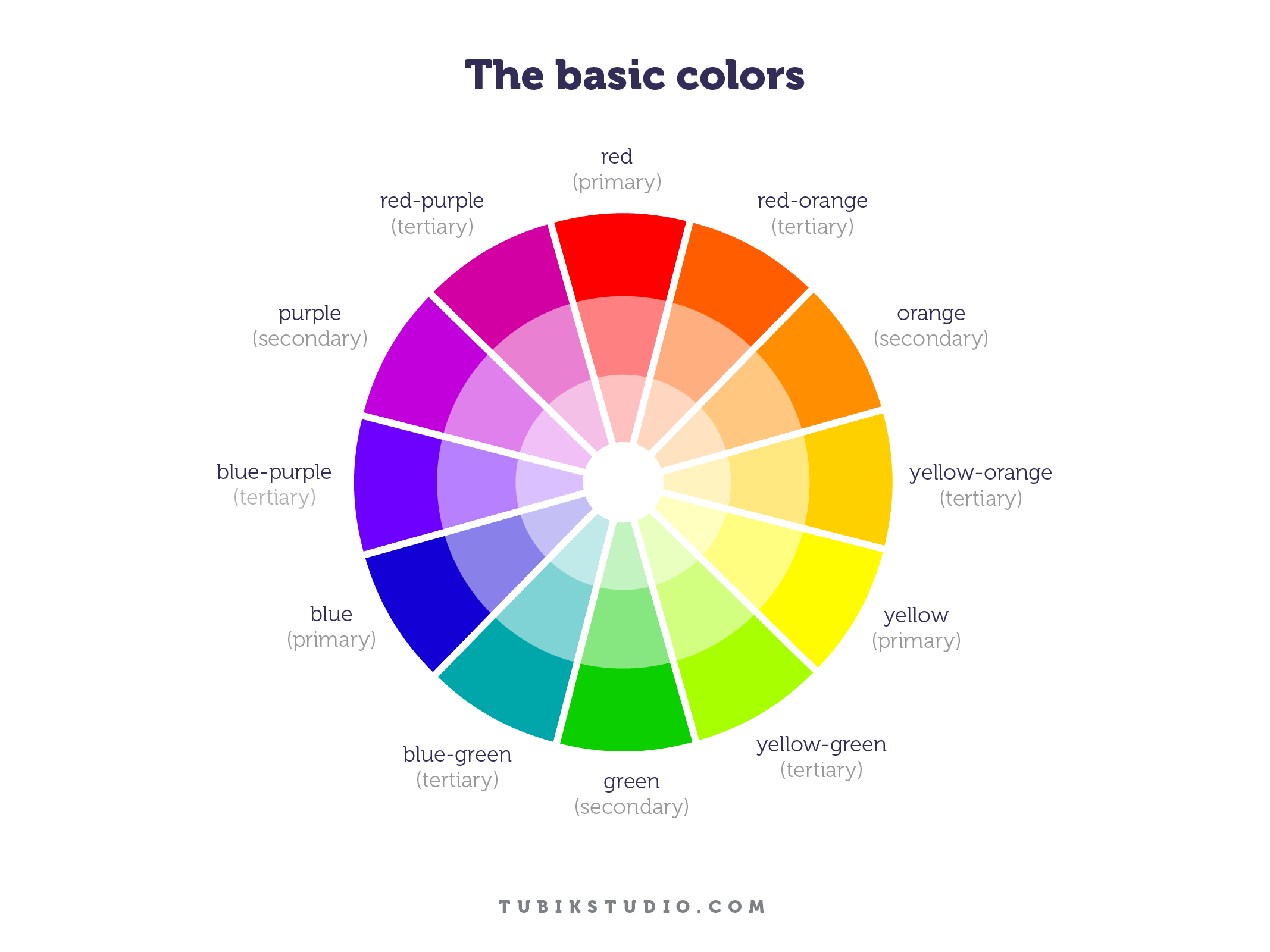
The color wheel itself is older than most institutions you’d trust with your money. Isaac Newton sketched the first version in 1666, arranging primary, secondary, and tertiary hues into a circle to show how they relate, and design has been arguing with his diagram ever since without fully replacing it.
That kind of durability says something: a three-hundred-and-fifty-year-old chart still shapes how app icons get colored and how paint stores organize their walls, mostly because human eyes haven’t been upgraded much since the seventeenth century. The wheel functions less like a rulebook and more like a periodic table for light—a map of relationships that turns genuinely useful the moment you understand why certain colors sit where they do, rather than simply memorizing which ones look nice next to each other.
Primary Colors Are a Trick Question
Ask ten designers what the primary colors are and you’ll get three different answers, all correct, which is either delightful or deeply annoying depending on your tolerance for ambiguity.
On a screen, the RGB color system treats red, green, and blue as primary, combining light rather than pigment, which is why layering all three at full strength gives you white instead of muddy brown—a genuinely counterintuitive result if you grew up mixing poster paint in elementary school.
In print, the CMYK color system starts from cyan, magenta, and yellow, then adds a dedicated black channel, because those three pigments alone combine into a sad, inky brown rather than a true black.
Painters, meanwhile, still lean on the older RYB model of red, yellow, and blue, the one most of us learned before we knew any of this had official names. Combine two primaries and you get a secondary color—red and yellow becoming orange in paint, red and green becoming yellow in light—and combine a primary with its neighboring secondary to land on a tertiary, those two-word colors like blue-green or red-violet that sound like paint chip names (because they usually are).
Warm, Cool, and the Beige In Between
Every hue also carries a temperature, which is less poetic than it sounds and more like a shortcut your brain runs on autopilot. Warm colors—reds, oranges, yellows—read as closer and more urgent, which explains why sale banners and error states lean on them so heavily. Cool colors, the blues and greens, recede and calm, which is presumably why nearly every meditation app on your phone defaults to some variation of teal.
Neutral colors like gray, brown, and beige sit outside the wheel entirely, doing the unglamorous but essential job of giving the loud colors somewhere to rest. A palette built entirely from warm, saturated hues exhausts a viewer within seconds, it’s the visual equivalent of a person who never lowers their voice. Good UI design colors usually pair one temperature as the lead and the other as relief, the way a well-edited room needs a statement chair and a plain wall to set it against.

Picking a Scheme Without a PhD
This is where color theory actually earns its keep, because a handful of proven color schemes will get you further than any amount of staring hopefully at a wheel.
A monochromatic palette, built from a single hue pushed through different tints, shades, and tones, is nearly impossible to ruin, which makes it the reliable pick when a client is nervous and the deadline is tomorrow morning.
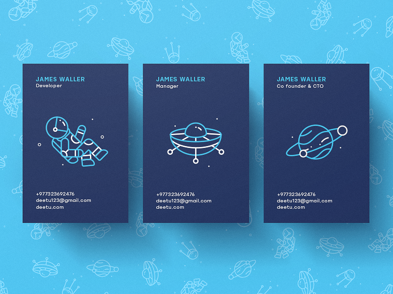
Deetu Business Cards
Analogous colors sit next to each other on the wheel and produce a calm, low-contrast feel suited to backgrounds and anything meant to support content rather than compete with it.

Complementary colors sit directly opposite each other and generate the kind of contrast that makes a call-to-action button impossible to miss—orange on blue, a red accent against forest green, et cetera.

Split-complementary softens that same contrast by pairing a hue with the two colors flanking its opposite rather than the opposite itself, giving you drama without the full visual shouting match.

Financial Service Website
A triadic color scheme spaces three hues evenly around the wheel and works best when one color takes the lead and the other two show up as accents rather than fighting for equal attention.
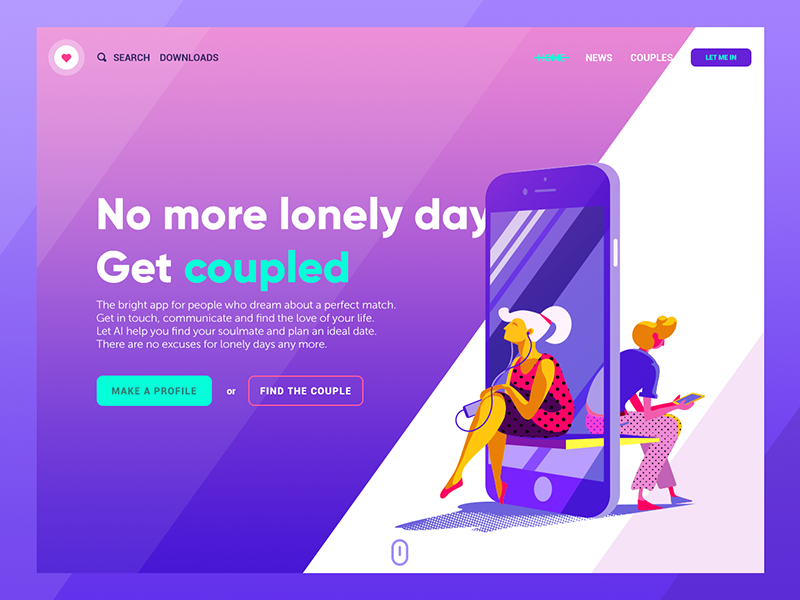
Dating App Landing Page
Tetradic, or double-complementary, palettes use two full complementary pairs and demand real restraint—four strong colors rarely behave themselves without one dominant voice keeping the peace, which is why this scheme tends to reward designers who have already made a few ugly palettes and learned something from the wreckage.

Business Card App
A Few Rules Worth Keeping in Your Back Pocket
- When in doubt, start monochromatic. You can always introduce contrast in round two.
- Test any palette in grayscale first. If the layout collapses without color propping it up, the hierarchy is broken, not the palette.
- Save true complementary contrast for one moment per screen—a single button, a single alert—since two competing complementary pairs tend to cancel each other’s urgency.
- Check chroma before checking saturation. A muted, low-chroma palette prints and photographs far more predictably than a highly saturated one, which can shift wildly from screen to screen.
None of this replaces taste, and no wheel has ever rescued a bad idea on its own. Fluency in this vocabulary changes what you actually notice: why a palette works instead of just happening to work, why a rebrand still feels expensive in grayscale, why one button gets clicked while an identical one three shades duller gets ignored. Learn the language the way a chef learns knife cuts, precisely so you can eventually work fast enough to stop thinking about the technique altogether.
Recommended Reading
Liked this one? It was just the appetizer. Browse the rest of our case studies and think pieces for more design opinions you didn’t know you needed:
Color Theory: Brief Guide For Designers
Color in Design: Influence on Users’ Actions
Color Matters. 6 Tips on Choosing UI Colors