There’s a moment every designer knows. You’re staring at a blank canvas, and the path of least resistance stretches out in front of you: white background, dark text, safe hierarchy, done. It works. It always works. But “it works” and “it’s right” are two different things—and the gap between them is exactly where the most compelling interfaces live.
Dark background UI design has been argued to death in studio meetings, Reddit threads, and design reviews since the internet learned to have opinions. And somehow, after all that noise, most products still default to light.
This article is about going the other way—intentionally and beautifully—by choosing darkness and knowing exactly what you’re doing with it.
Visual Perception: What the Research Actually Says (And What It Doesn’t)
Dark mode design has a complicated relationship with science. Research from Hall and Hanna confirms what most designers already sense intuitively: positive polarity—dark text on light backgrounds—produces slightly better reading performance in controlled conditions. Jacob Nielsen, the patron saint of usability, put it plainly: white text on black is almost as effective, but it slows readers by a small margin.
Note the word almost. And note the word slightly. These studies measure sterile conditions—plain text, uniform lighting, no context. Real interfaces exist in the wild. Someone browsing a photography portfolio on an OLED screen at night. A user navigating a luxury e-commerce app in a dim apartment. A musician checking a mixing tool backstage. Context shifts everything, and the research that ignores context is the research designers need to treat with careful skepticism.
The more honest takeaway from the science: dark UI backgrounds work when contrast, hierarchy, and legibility are handled with rigor. They struggle when they’re slapped on without thinking. That’s generally true of every design decision ever made.

Readability on Dark: The Discipline of Air and Type
Here’s what separates good dark interface design from the ones that make your eyes water: space, weight, and restraint. Applied correctly, dark background websites feel more deliberate. The darkness demands it.
A few principles that actually matter in practice:
- Breathing room is load-bearing. Dark backgrounds absorb light from surrounding elements. Pack them too tightly and the layout suffocates. Every meaningful element needs margin to assert itself—more than you’d typically use on a light canvas. Think of space as the material, not the absence of it.
- Line length controls comprehension. Long text blocks are already a reader’s challenge. On dark backgrounds, where eye fatigue accumulates across a session, shorter line lengths reduce the cognitive toll. The classic 45–75 characters per line guideline applies everywhere; on dark it deserves stricter enforcement.
- Leading and kerning are not optional fine-tuning. Too-tight line spacing on dark backgrounds creates visual mud. Too-loose looks unconfident. This is where dark UI typography earns its reputation for being harder—and where it rewards designers who care about the millimeter-level decisions.
- Dark doesn’t always mean black. This point gets said a lot and ignored even more. The most sophisticated dark interfaces are almost never built on pure #000000. Deep navies, rich charcoals, cool dark grays—these have character and nuance that flat black destroys. Test and compare—the difference between a great dark palette and an aggressive one often lives in a 15% lightness adjustment.
- Sans-serif for readability, serif for elegance—both with intention. On dark backgrounds, sans-serif fonts hold their weight more reliably at smaller sizes. Serifs, when used boldly at display scale, bring a gravity and class that few other typographic choices can match. The key word is intention: neither choice is default here, both require commitment.
Contrast: Your Secret Superpower
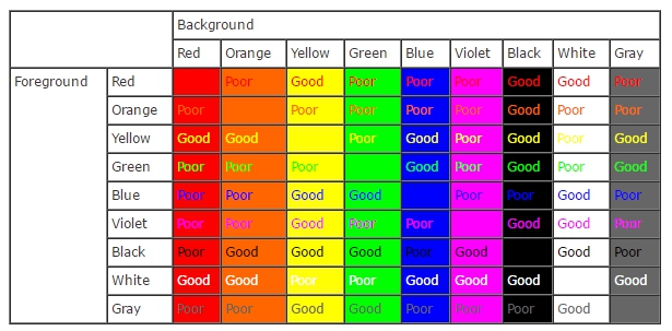
The contrast table contains a fact that rarely gets the attention it deserves: black is the only background that provides strong contrast with virtually every color in the spectrum. Every other background color has a list of colors it fights with. Black has almost none.
This matters enormously for UI color contrast and accessibility. It means that a dark foundation gives designers a broader palette of accent, highlight, and call-to-action colors to work with—without compromising legibility. A vibrant teal, a warm gold, an electric coral—all of them sing against a dark ground in ways they’d never manage against a competing mid-tone background.
One technique worth internalizing: avoid pure white text on pure black. Tone it down to a warm off-white or light gray. The extreme contrast creates optical glare that actually reduces legibility even while technically maximizing contrast ratio. A slight softening reads as white to the human visual system while eliminating the strain.
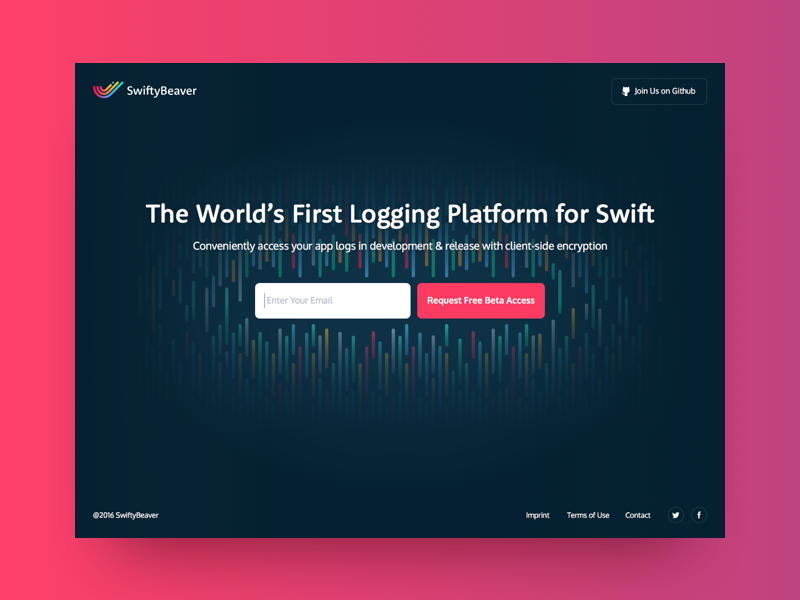
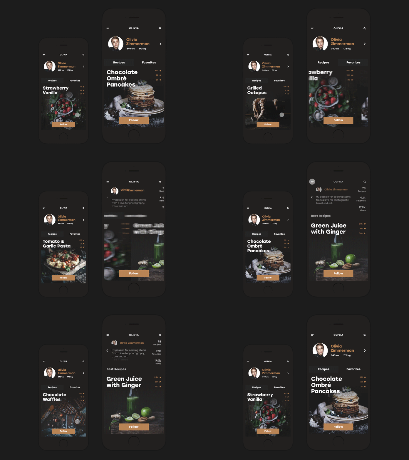
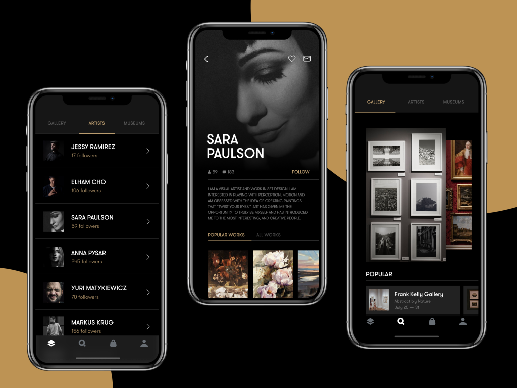
Dark backgrounds also give graphic content—photography, illustration, poster design, video—a showcase no light background can match. The surrounding darkness recedes, and the image becomes the only thing in the room. For interfaces built around visual assets rather than copy, this effect alone can justify the entire design direction.
The Emotional Layer: What Darkness Actually Communicates
Color carries cultural weight accumulated over centuries, and designers who ignore that weight are leaving a powerful communicative tool in the drawer. Dark colors carry associations of elegance, authority, mystery, and precision. Because luxury fashion, high-end automotive design, premium consumer electronics, and fine dining have converged on these associations for decades. The world’s most aspirational brands—from Chanel to Porsche to Apple—understand this fluently. Their darkest design choices communicate that the product inside demands respect.
For premium app design and websites representing craft, exclusivity, or creative excellence, a dark palette signals that the creators are confident enough to subvert the default. It hints that something interesting is happening here, before a single word is read. This is a calibrated signal to the right audience that this product exists in a different category than everything else competing for their attention.

The Benefits — Without the Asterisks
Collecting the genuine advantages of dark background UI into one honest list:
- Style and elegance that light backgrounds must work harder to achieve, if they can at all.
- Depth and atmosphere—dark interfaces feel dimensional in ways flat white surfaces struggle to match.
- Contrast flexibility—that almost-universal compatibility with accent colors.
- Visual hierarchy support—the natural weight of dark grounds makes luminous elements assert themselves without screaming.
- Graphic content showcase—photography and illustration reach their full potential against darkness.
- Ambient environment adaptation—dark interfaces cause less eye strain in low-light conditions, which matters for products used at night or in controlled-light environments.
Each benefit translates into a measurable dimension of user experience—perception, navigation, comfort, or recall.
What to Get Right Before You Ship
The case for darkness made, here’s the uncomfortable part: dark backgrounds expose design weaknesses that light backgrounds forgive. A slightly off font weight that looked fine on a light ground becomes glaring against dark. An icon that passed review at 2x falls apart at 1x. A spacing inconsistency becomes visible from across the room.
User research sets the foundation. Understanding your audience—their environment, devices, visual expectations, and aesthetic vocabulary—is the brief that makes every subsequent decision defensible.
Competitive analysis deserves honest attention. If every competitor in your market uses dark UI, yours needs a genuinely differentiated take to avoid becoming visual noise. If none of them do, you have an opportunity—and a responsibility to execute it impeccably.
Device and resolution testing is non-negotiable. Dark interfaces behave differently across display technologies. OLED screens render pure blacks as true voids—spectacular and unforgiving. LCD panels introduce backlight bleed that shifts how dark backgrounds read. Test on hardware, not just simulated browser previews.
Content volume shapes the decision significantly. Dark backgrounds with dense text and tightly-packed UI elements are exhausting to parse. If the interface carries a heavy information load, the dark direction either needs generous spacing or a different approach to information architecture. More air, fewer elements per view, cleaner hierarchy—darkness rewards restraint.
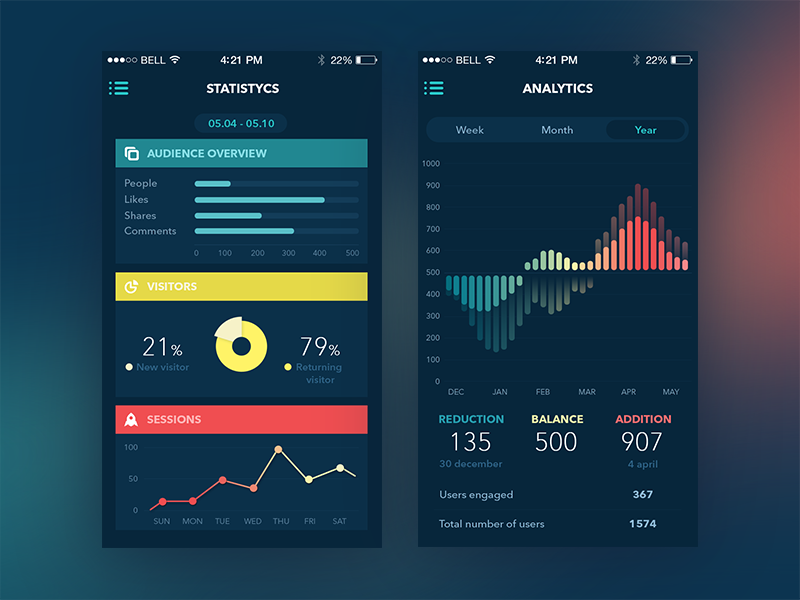
Content type may be the most clarifying filter of all. Interfaces built around photography, video, data visualization, music, or immersive experience are natural candidates for dark. Interfaces that are fundamentally text-delivery systems—documentation, news, long-form reading—need stronger justification and more careful execution.
The Decision
Good interface design has never been about defaults. Every choice—background color, typography system, spacing rhythm, interaction pattern—should exist because someone decided it was the right answer for this product, this audience, this moment. Not because it was the obvious choice. Not because it tested well in 2019.
Dark UI backgrounds, done right, are one of the most powerful tools in a digital designer’s vocabulary. They demand more skill to execute, reward more attention to detail, and communicate things light backgrounds simply cannot. They’re a design decision with consequences—and the studios and products that understand those consequences are the ones building interfaces worth remembering.
Choose dark when it’s right. Execute it when it scares you a little. That’s usually the signal you’re onto something.
Recommended Reading
The best design conversations don’t end on a single article. Check out our other case studies and long-reads:
Light and Darkness in UI Design. The Matter of Choice
Light or Dark UI? Tips to Choose a Proper Color Scheme
Copywriting for Mobile and Web Interfaces: Types of UI Copy