Try reading a paragraph set in mid-gray text on a background one shade darker. Technically, you can do it, the way you can eat soup with a fork—slowly, badly, and with growing resentment.
Truth is, contrast is one of the main reasons design works at all. The eye is built to notice difference, not sameness, and every legible screen you have opened today is running on that fact, whether its designer ever thought about it directly.
Most of what makes that possible has an actual name, a measurable ratio, and in one case, a very specific warning issued by a Canadian typographer back in 1952. Let’s dive in.
What Is Contrast in UI Design?
Contrast, in the strict sense, is the difference in color, light, or form that lets your eye separate one object from another. Designers call the extreme end of that difference the contrast ratio, sometimes the dynamic range, and it gets measured rather than eyeballed—which is more rigor than most brand guideline decks manage. For people with color blindness, which affects roughly 1 in 12 men and 1 in 200 women according to Colour Blind Awareness, contrast stops being a stylistic flourish and becomes the entire mechanism by which they read your interface. Skip it, and you have made an accessibility failure.
Good contrast in UI design does two jobs at once. It sets the visual hierarchy, telling users which button matters and which label is just along for the ride, and it supports basic scannability so people can navigate without reading every word on the page. Skimping on either usually shows up in the data before anyone names the actual cause—support tickets about a button nobody could find, drop-off on a form field that blended into the background.
Academic art has leaned on this same principle for centuries, pairing light against dark, rough against smooth, large against small to build drama and steer the eye across a canvas. Interface design borrowed the technique and handed it an actual job to do beyond mood-setting. A painting can sit with ambiguity for as long as it wants. A checkout flow cannot, which is how a visual principle that once just set an emotional tone ended up doubling as a conversion metric.
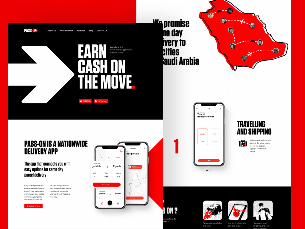
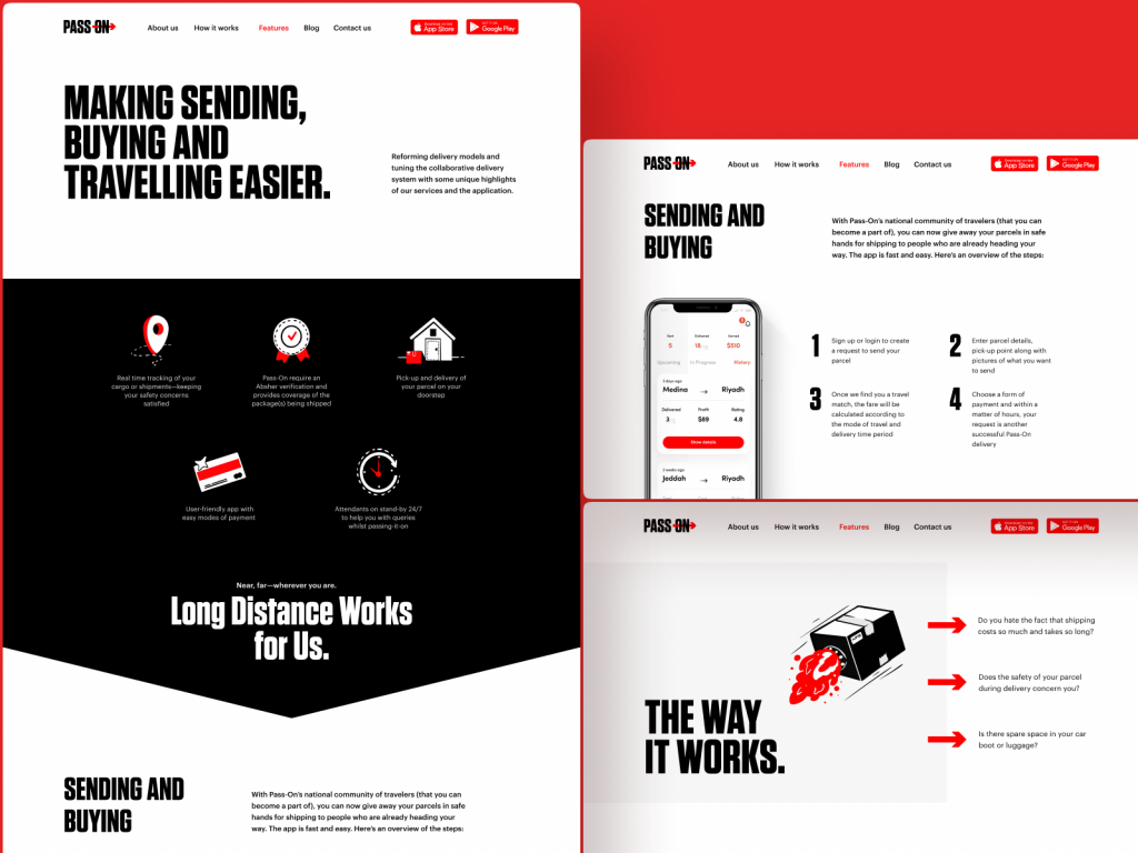
The design of the landing page for the Pass-On application shows the example of effective color and size contrast building up the solid visual hierarchy for the pages.
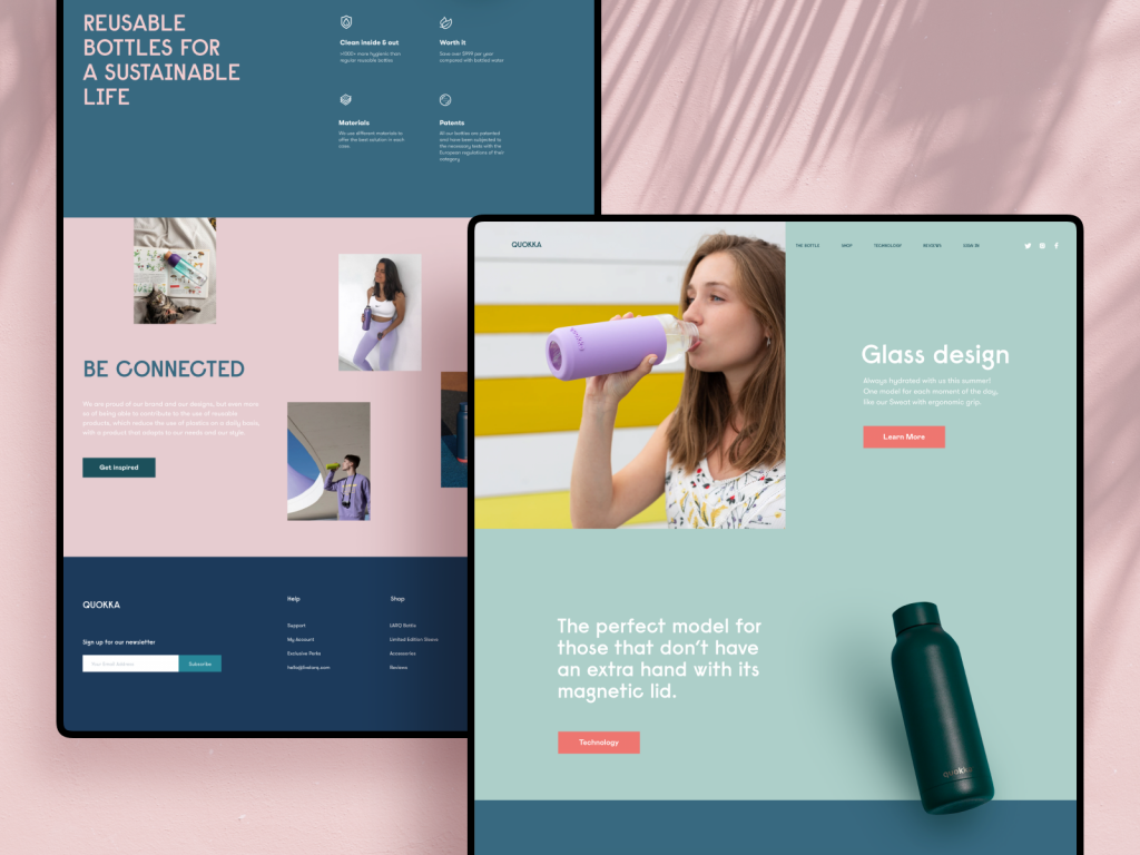
Eco-bottles brand website uses background colors contrast to separate different logical sections of the web page.
Six Types of Visual Contrast in UI Design
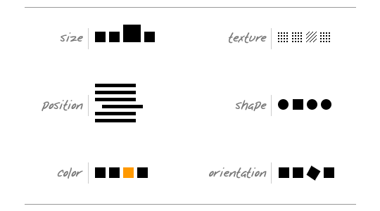
Designer Andy Rutledge mapped this out cleanly in his essay Contrast and Meaning, sketching out the handful of ways one element can be made to stand apart from its neighbors. Nothing on the list is exotic. That is the point—most designers have used half of these since their first Photoshop file, usually without naming them.
- Color contrast: the loudest and laziest of the group, working best when hues sit opposite each other on the color wheel—complementary, split-complementary, triadic. It explains why so many “Buy Now” buttons land on orange or teal, a color the rest of the brand palette otherwise avoids on purpose.
- Size contrast: make the thing that matters physically bigger than everything around it. A 48px heading next to 14px body copy does more for hierarchy than three font weights combined.
- Shape contrast: a circular icon sitting in a field of squares gets noticed first, almost every time, because the eye treats an odd shape as an interruption worth investigating.
- Position contrast: an indented paragraph, an outlier in a grid, one card nudged off the baseline. Small positional shifts read as intentional signals rather than mistakes, as long as the layout commits to them consistently.
- Texture contrast: rare in flat interfaces but far from dead—a subtle grain or gradient against an otherwise flat field still pulls the eye, part of why skeuomorphic touches keep sneaking back into modern UI.
- Direction contrast: tilt one element five degrees off the grid, and it becomes the first thing anyone sees on the screen, for better or worse.
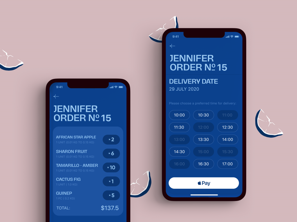
On the checkout screens of the Exotic Fruit app, color contrast helps to instantly define the call-to-action button as well as helps to distinguish active time slots from inactive ones.
The shipping company website with a limited color palette and trendy 3D graphics uses bright color accents making the design more dynamic and catching users’ attention
Typographic Contrast: Carl Dair’s Seven Rules
Long before anyone argued about system fonts online, Canadian typographer Carl Dair wrote the rulebook. His 1952 book Design With Type broke typographic contrast into seven distinct categories, and design students have been quizzed on some version of them ever since, whether or not anyone credits Dair by name.
- Contrast of Size: enlarging a headline against the body text, the oldest trick in publishing and still the fastest way to establish order on a page.
- Contrast of Weight: bold type sitting inside a paragraph of regular type, doing the attention-grabbing work that italics usually get more credit for.
- Contrast of Form: capitals against lowercase, roman against italic, condensed against expanded. Dair specifically warned against pairing italics with script typefaces, since both mimic handwriting and end up fighting each other instead of contrasting cleanly.
- Contrast of Structure: a geometric sans sitting next to a high-contrast serif, two structurally different letterforms doing two different jobs on the same page.
- Contrast of Texture: how a block of text reads as a gray mass from across the room, before anyone has parsed a single word of it.
- Contrast of Color: a second ink color, which Dair noted almost always reads as less forceful than plain black on white—reserve it for the one thing you actually need someone to notice.
- Contrast of Direction: horizontal blocks of text against tall, narrow columns, an old newspaper layout trick that still shows up in modern editorial grids.
Pull up the last screen your team shipped and count how many of these seven show up. Most interfaces lean entirely on size and weight and ignore the other five, which is a quiet reason so many apps end up looking interchangeable.
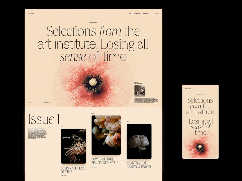
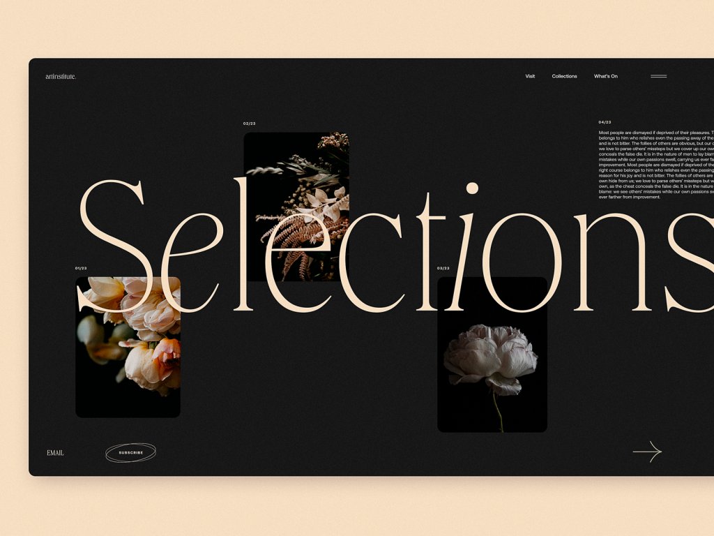
Art Institute blog concept demonstrates diverse types of typographic contrast as an impressive feature of the design approach.
Contrast Ratio and WCAG Accessibility Standards
The Web Content Accessibility Guidelines put a hard number on all of this, and it is worth knowing precisely rather than recalling vaguely from a design system meeting two years ago. WCAG 2.0 calls for a contrast ratio of at least 7:1 for standard body text at the AAA level, dropping to 4.5:1 for large-scale text—defined specifically as 18-point type or 14-point bold. Text inside a disabled component, purely decorative marks, or a logotype gets an exemption; brand marks have never had to justify their hex codes to an accessibility audit.
Run your palette through a tool like WebAIM’s Contrast Checker before shipping, not after a support ticket calls the app unreadable in direct sunlight. It takes about ninety seconds per color pairing, which is cheap insurance against a much longer conversation later—especially given that UsableNet’s yearly legal review has tracked more than 4,000 digital accessibility lawsuits filed in U.S. federal court in a single year, with insufficient contrast a recurring citation alongside missing alt text and broken keyboard navigation.
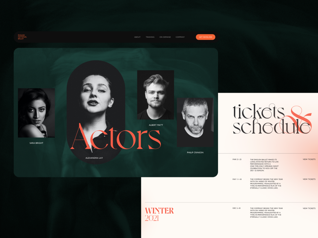
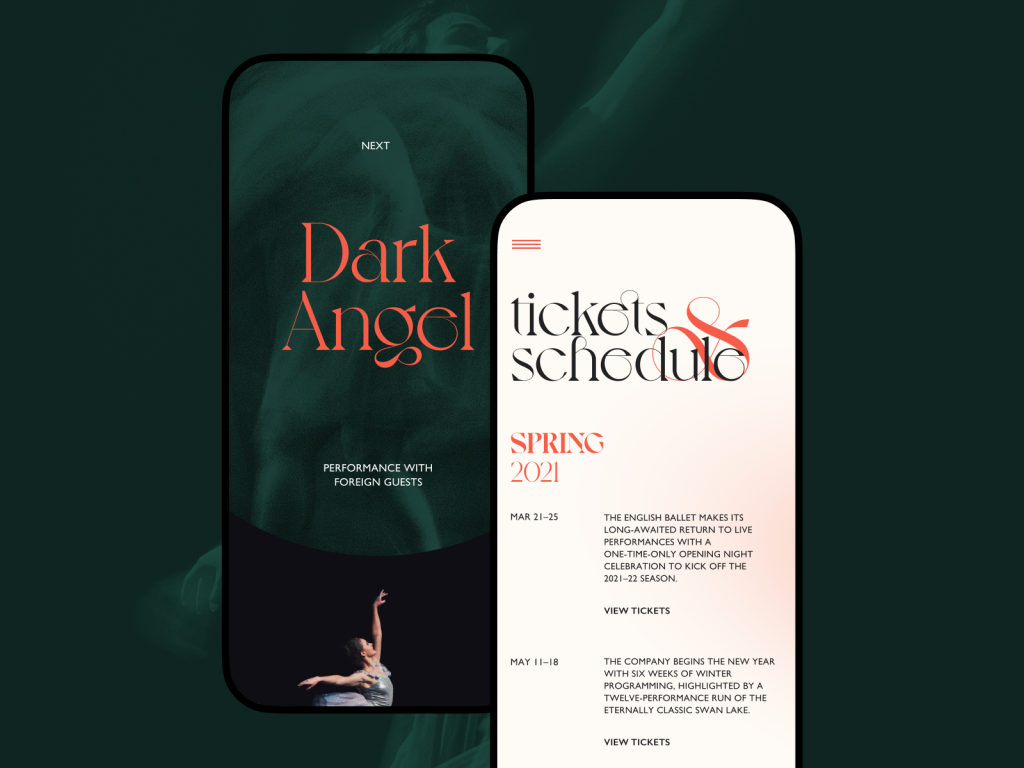
The ballet company website concept uses color contrast to distinguish text-based parts of the pages from image-based ones as well as make bright accents works, for example, to make the CTA button in the website header noticed at once. Also, the typographic contrast based on the difference in size and fonts makes the various text elements clearly distinguished and easily skimmed.
ShipDaddy website uses a contrasting color palette for good and accessible navigation and scannability. What’s more, it uses another level of visual contrast, combining real-life background with an animated cartoonish brand mascot, this way contributing much to making the website look original and atmospheric.
Dark Mode vs Light Mode: Which Wins?
Every dark mode debate online skips the actual engineering underneath it. A 2021 Purdue University study measured OLED screens playing video content in dark mode and found real, measurable battery savings at higher brightness levels, because OLED pixels switch off entirely to render black rather than dimming toward it. That is the kind of concrete data point worth citing the next time someone insists dark mode is obviously the better default.
The feature itself is younger than most people assume. Twitter shipped its “Night Mode” in 2016, and Instagram waited until 2019 to follow, largely because the engineering cost of maintaining two full color systems across a codebase is higher than the toggle suggests. Every icon, chart, illustration, and elevation shadow needs a second pass, not just an inverted background, or the contrast ratios that worked in light mode fail in dark mode without anyone noticing until a user complains.
The real decision involves more than a toggle in settings:
- Clarity—can users tell which elements are interactive without hovering or tapping to find out? The old “squint test” still works: blur the screen and see what survives.
- Readability—long-form reading favors dark text on a light background for most people, which is why serious e-reader apps still default to it despite years of dark mode enthusiasm.
- Accessibility—the choice should track actual user needs rather than internal design fatigue with light interfaces. Some users with astigmatism report light text on a dark background as harder to focus on, the opposite of the intended benefit.
- Responsiveness—a color scheme approved on a calibrated studio monitor can fall apart on a five-year-old Android screen. Test contrast on the cheapest device in the office, not the newest one.
- Environment—a glossy tablet screen in daylight turns a dark UI into a mirror. The same interface in a dim room saves the eyes considerably. Identical design, opposite result, depending entirely on where someone happens to be standing.
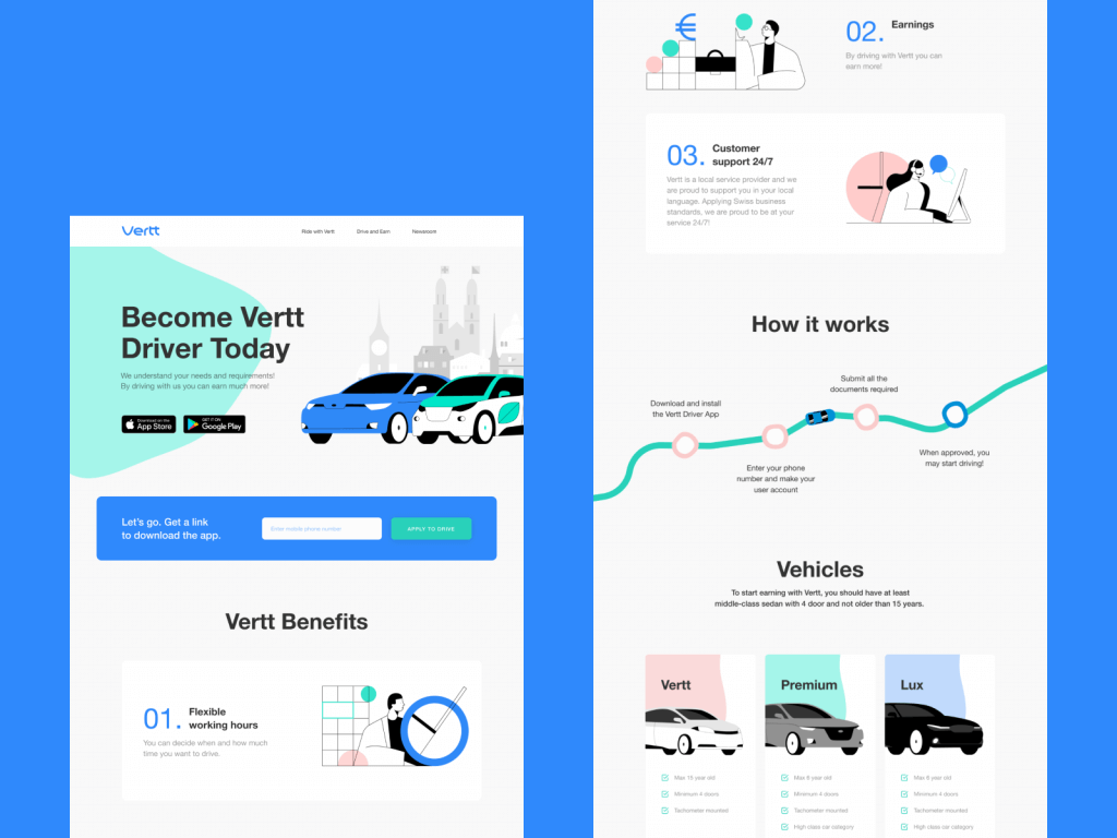
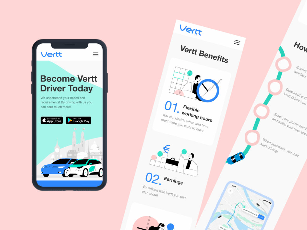
The landing page for Vertt car-sharing service uses light background allowing to activate the power of colors to make different navigation elements and information sections clear and separated from each other.
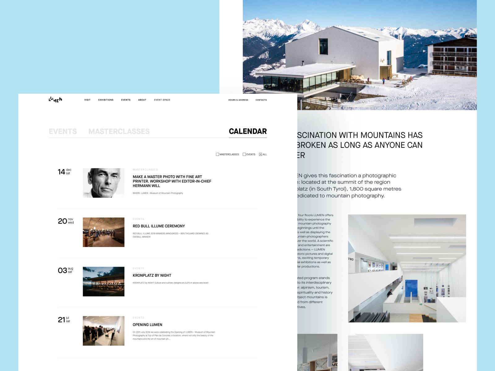
Light and airy Lumen Museum website focused on making each page accessible and easily scanned, information well-arranged, and photo content impressive
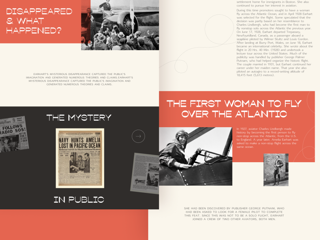
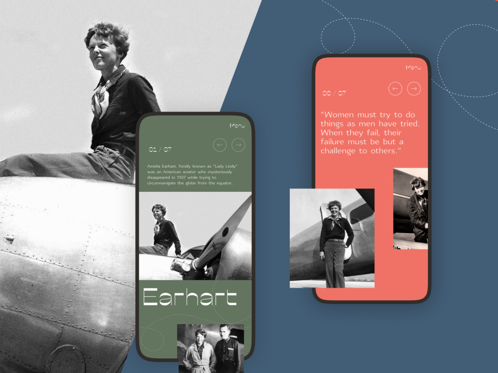
The design for a website devoted to powerful women in history shows careful attitude to different types of contrast to make it attractive and easy to perceive on different devices
Different types of contrast making the Habit Builder app interface not only beautiful but also easy to use.
Common Contrast Mistakes in UI Design
Background photography still gets used constantly because it makes a screen feel alive without much design effort. It also wrecks legibility the moment a caption lands on a busy patch of sky or a face. Keep overlaid text at a 4.5:1 contrast ratio minimum, or 3:1 for large characters, and reach for a gradient scrim behind the type rather than fighting the photo head-on.
In Designing for Emotion, Aarron Walter compared a screen stacked with high-contrast elements to a party where everyone is shouting to be heard over everyone else shouting. The volume goes up, and somehow nobody communicates any better. Every additional high-contrast element on a page adds to the time it takes someone to complete a task, learn the system, and remember how to find their way back through it. A screen where everything yells ends up as a screen where nothing actually gets through.
Negative space is what keeps contrast legible instead of exhausting—the buffer that stops two loud elements from blurring into visual static. Trim the padding around your highest-priority element in the name of information density, and the usual result is less usable data, not more, since nothing has room to stand apart from anything else. Give your most important click target 20 to 30 percent more surrounding space than the rest of the screen this week and watch what happens to the click-through numbers.
A quick way to audit an existing screen: drop it into grayscale using any image editor’s desaturate filter and look at it for ten seconds. If the primary action does not jump out immediately once color is removed, the hierarchy was relying on hue alone to do work that size, weight, or position should have been sharing. Color is the fastest contrast tool available and the least reliable one, since it disappears entirely for a portion of your users and degrades badly under bad lighting, cheap displays, or a screen brightness turned down to save battery on the train home.
Geography blog applying full-screen background photos
Why Contrast Still Matters in UI Design
None of this is decoration bolted onto a finished layout. Contrast decides whether someone finds the checkout button in three seconds or eleven, whether a form error gets caught before submission instead of after, whether a color-blind user can complete a purchase at all.
Get it right and the payoff shows up as:
- a clearer visual hierarchy, since eyes travel toward the loudest difference on the screen
- faster task completion, because users stop hunting for the interactive element
- genuine accessibility, rather than a line item on a compliance checklist
- a screen that stays legible on a cracked, five-year-old phone in direct sun
- an interface working with human vision instead of against it
Run one screen from your current project through a contrast checker this afternoon. Then step back and blur your eyes at it from across the room. Whatever survives that test is your real hierarchy—everything else is noise the team has simply gotten used to looking at.
Carl Dair figured most of this out with metal type and no screens to test it on. The tools have changed considerably since 1952; the underlying mechanics of how a human eye separates one shape from another have not, and probably will not, no matter how many new frameworks ship this year.
Recommended Reading
Still scrolling? Good. That means you’re exactly who we write for. Browse the rest of our case studies and design think pieces below:
5 Basic Types of Images for Web Content
How to Make Web Interface Scannable
The Anatomy of a Web Page: Basic Elements
How to Design Effective Search
Web Design: 16 Basic Types of Web Pages
Directional Cues in User Interfaces
Negative Space in Design: Tips and Best Practices
Error Screens and Messages: UX Design Practices