There is something kinda theatrical about a landing page. It has seconds—sometimes less—to convince a stranger that arriving here was not accidental, that whatever brought them deserves their attention, that staying is better than leaving. A poorly designed landing page does not fail loudly. It simply lets people go. A great one makes staying feel like the obvious choice.
What follows are ten landing page concepts from our studio’s design practice, each built for a different industry, a different emotional register, a different conversion goal. Together, they map the range of what landing page design can actually do—far beyond hero images and CTA buttons.
Organic Food Shop: When Appetite Does the Persuading
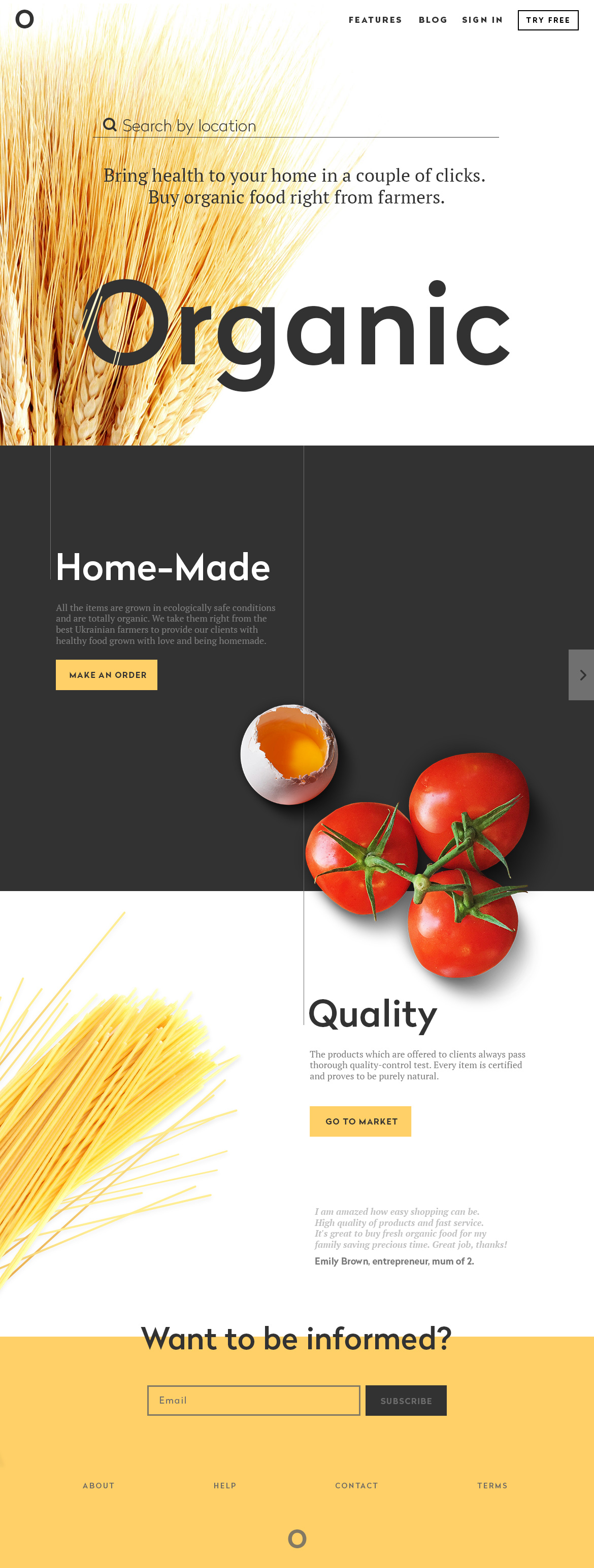
The most effective visual hierarchy on a food retail landing page starts with hunger. In this concept for an organic food shop, every image was selected for one specific reason: immediate visceral appeal. No abstract photography, no lifestyle scenes detached from the product. The food itself carries the message.
Short copy blocks support the visuals rather than compete with them. Words like organic, home-made, and quality earn their placement through visual emphasis—not bolded in a conventional sense, but positioned and sized so that a user skimming at speed still catches them. This aligns with a well-documented principle in conversion rate optimization: users scan before they read. Give them something worth scanning.
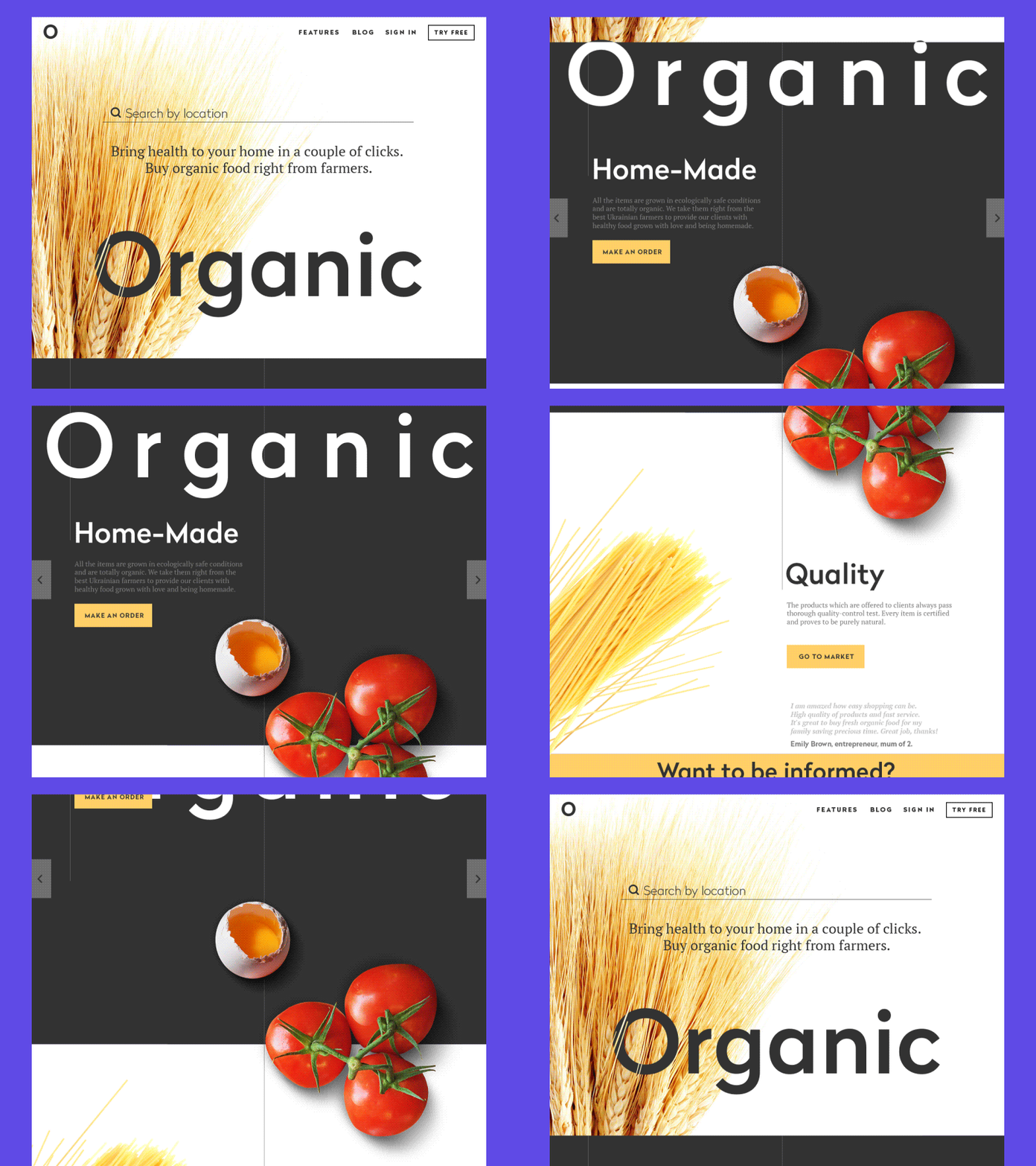
Scroll-triggered animation adds the final layer. Each section arrives with purpose, making the experience of browsing feel closer to walking through a market than loading a static URL.
Landing Page Animation
Everyday Services Agency: Color as Personality
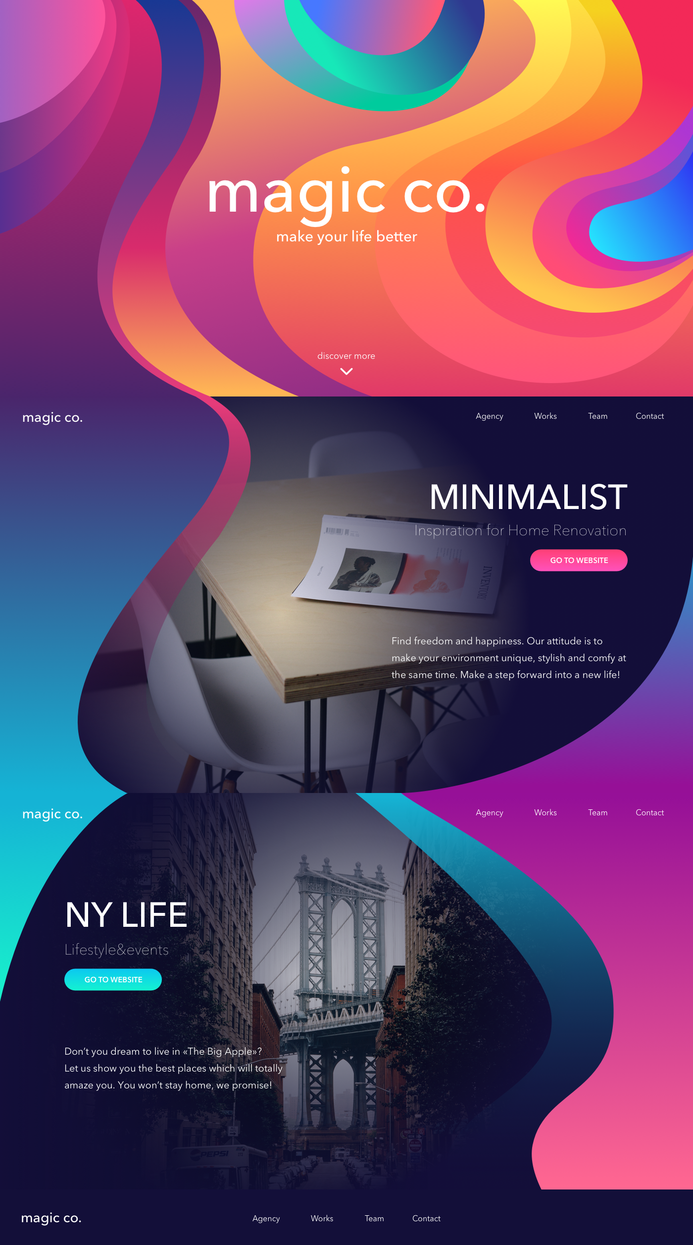
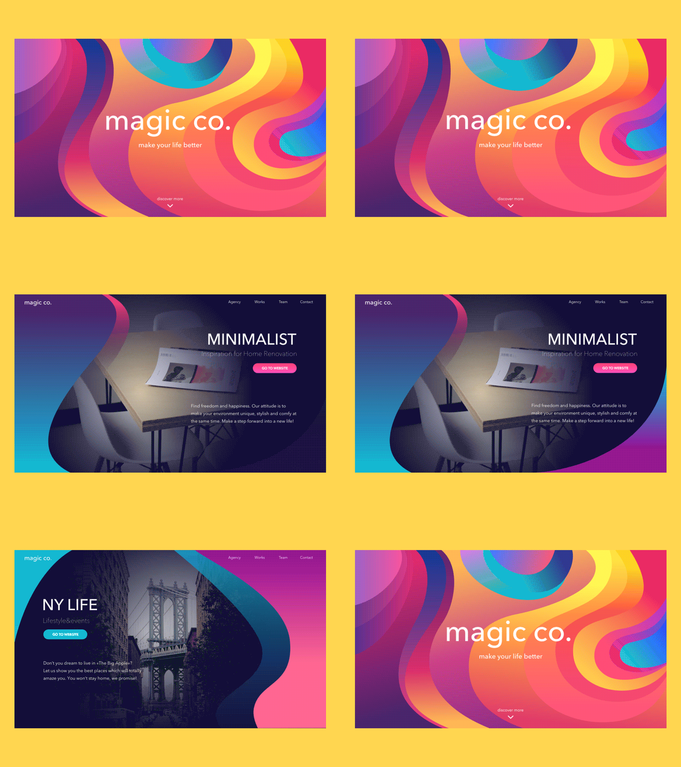
Some brands have a single strong visual identity. Others offer so many different things that visual monotony would be dishonest. This concept for a multi-service agency leans into variety—a palette that shifts and moves, reflecting the range of what the agency actually does.
The risk with colorful, dynamic UI design is visual noise overwhelming usability. The solution here was typographic discipline: a clean font pairing with strong contrast ratios keeps readability intact while the color and motion do their work around it. Dynamic motion accents punctuate transitions rather than run continuously, so the eye always has somewhere to rest. In web design terms, this is the difference between a brand that performs and one that exhausts.
Museum Exhibitions: Restraint as a Design Strategy
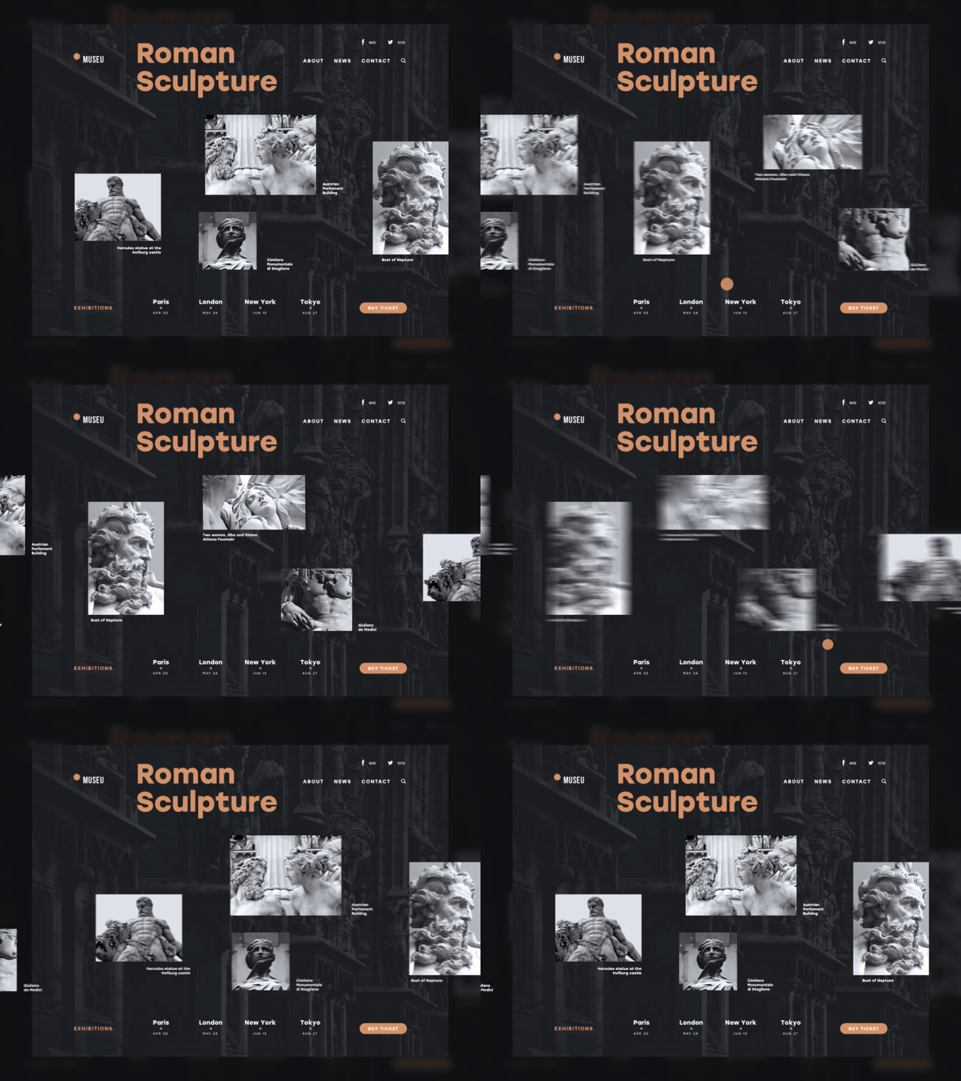
A landing page promoting art exhibitions operates under particular pressure: it must feel as considered as the work it represents. Here, minimalism and utility arrive at the same solution from opposite directions—less visual clutter, more room for the work itself.
The dark background earns its place functionally and symbolically. Black has long carried associations with formality, prestige, and depth—qualities that align naturally with institutional cultural spaces. More practically, dark UI makes exhibition images land with more intensity than they would against white. The exhibit photographs appear luminous. Readability holds, supported by careful font selection that treats typography as a design element, not an afterthought.
This concept also applied eye-tracking research to layout decisions, placing the highest-priority elements in the zones users naturally encounter first. Information architecture built on user behavior data is the kind of detail that separates landing pages that convert from ones that merely exist.
Non-Profit Charity: When Copy Carries the Weight
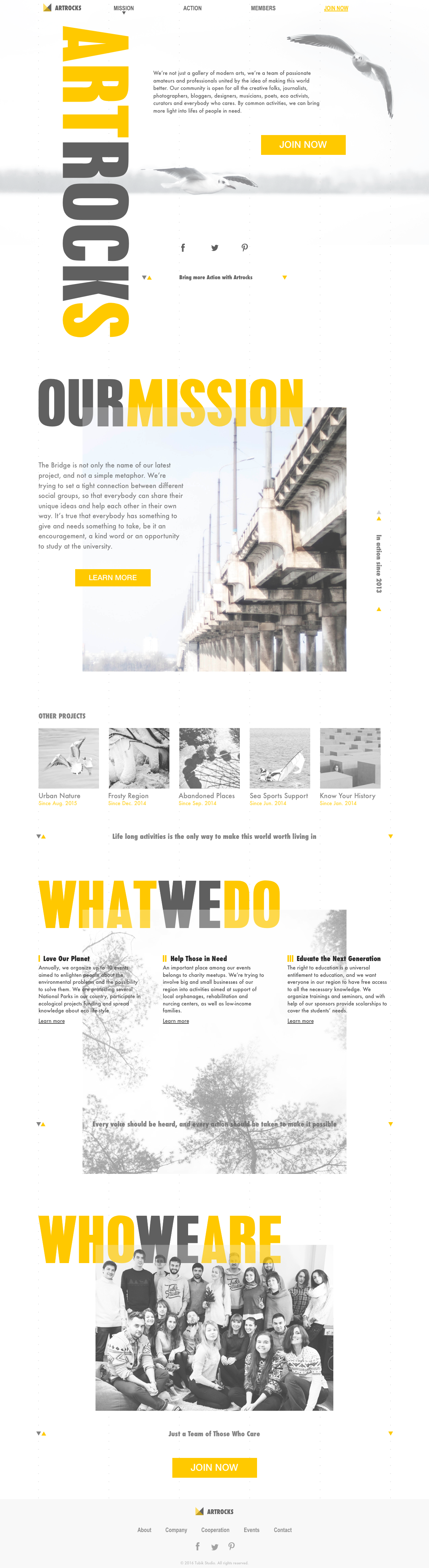
Not every landing page can anchor itself to a product photograph. When the offer is an idea, a cause, or a set of activities rather than a tangible object, words become the primary conversion tool. This concept for a charity organization understands that—and does not apologize for it.
Longer copy blocks require more from the reader, which means they require more from the writer. The text here works in stages: orientation, understanding, emotional engagement, action. This structure reflects how people actually make decisions about causes they have never encountered before. User research consistently shows that unfamiliar offerings need more explanation, not less. Brevity works for recognition; depth works for discovery.
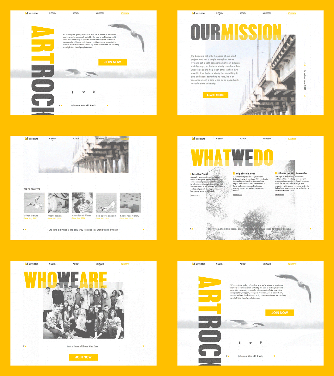
Developer Tool (SwiftyBeaver): Designing Without Visual Material
This was a genuinely interesting constraint. SwiftyBeaver—a native Mac application for developers—does not offer much in the way of photogenic product imagery. The interface is functional, technical, text-heavy. Standard landing page visual strategies largely do not apply.
The solution: pull design language from the application itself. Colored accents echoing the app’s own UI create continuity between the landing page and the product experience. The minimalist layout removes everything that does not serve either the copy about functionality or the CTA for free beta access. Supporting links appear but do not compete. In UX design terms, this is a clear hierarchy—one primary goal, everything else subordinate.
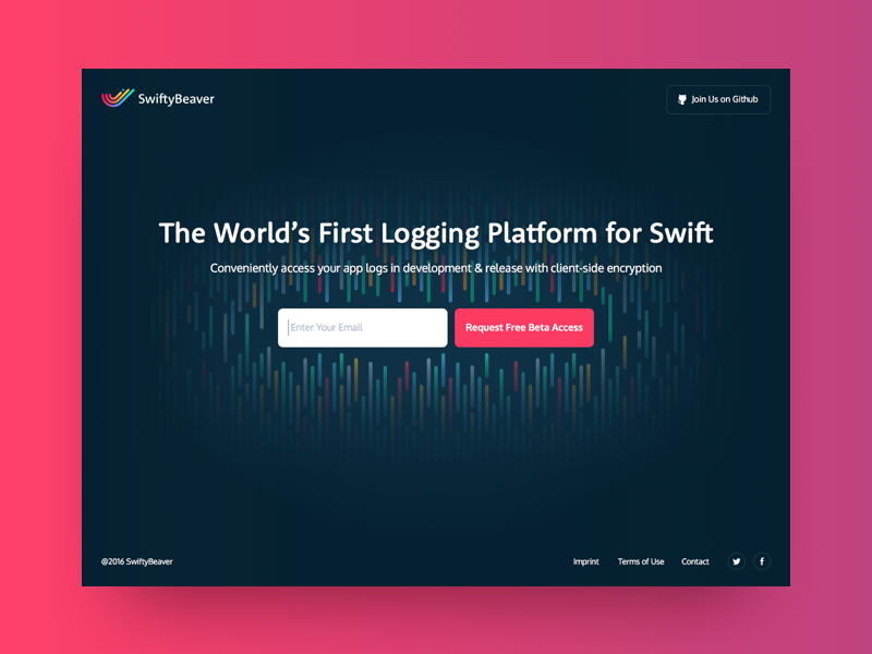
Gym Landing Page: Motivation Architecture
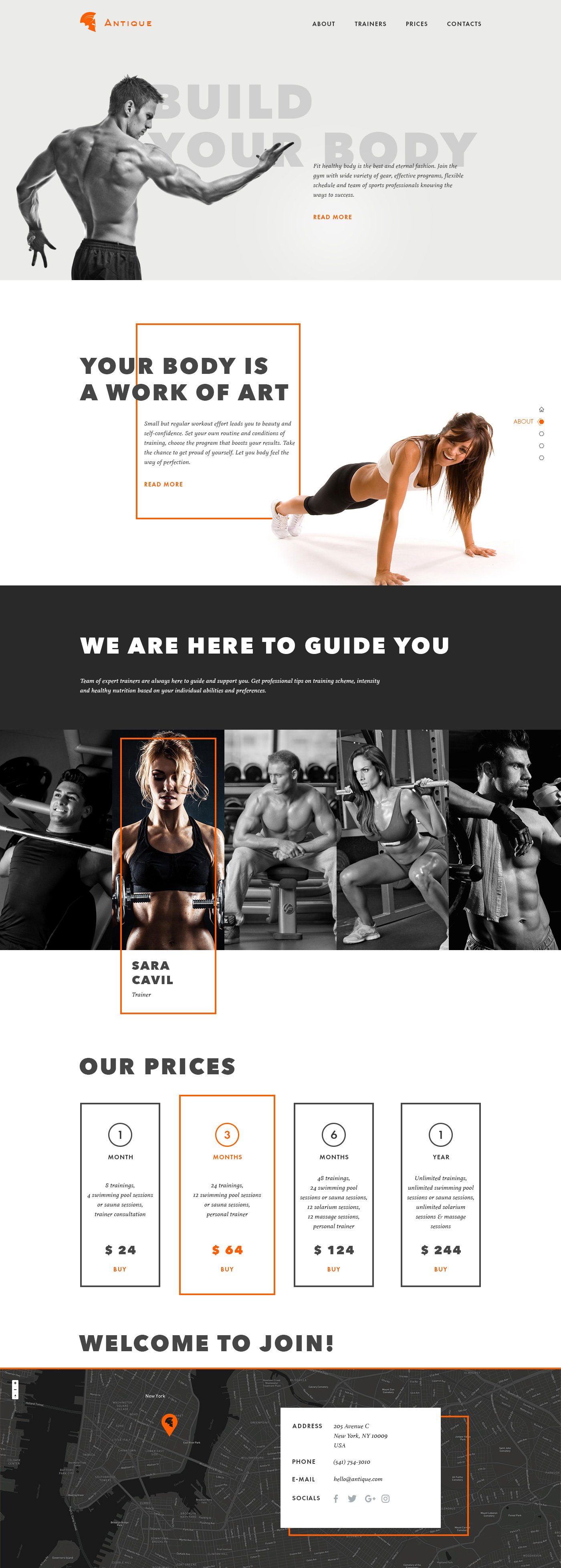
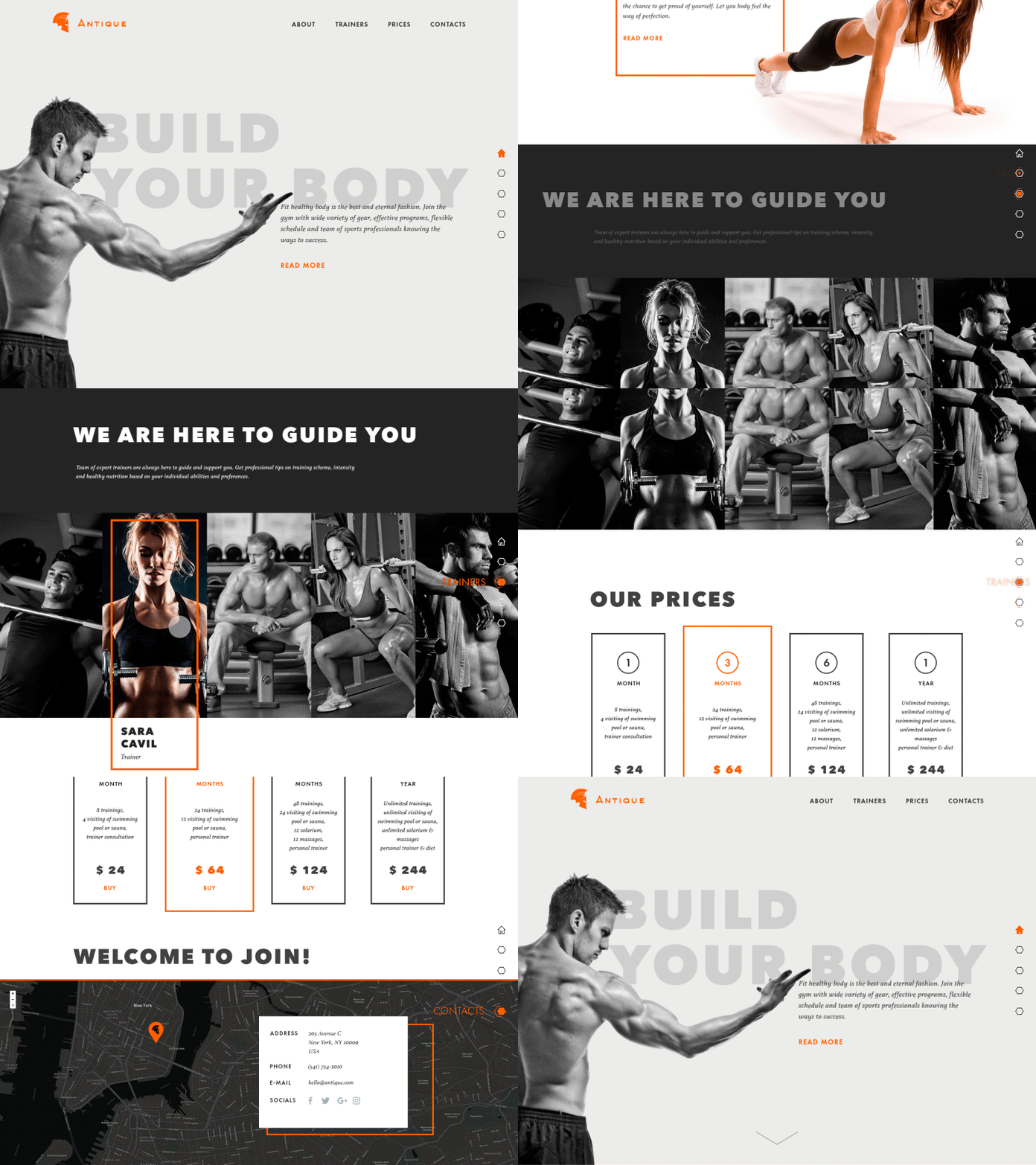
What a gym landing page must do is not complicated: it needs to make the reader want to move. Every image selection, every headline, every moment of white space serves that goal. This concept uses bold, heavy typography for headlines—a deliberate choice that echoes the weight-bearing, strength-first associations of the space itself.
Motivational imagery here is not decorative. Photos of athletes and training spaces do the emotional work that copy cannot do efficiently: they make the benefit of the service immediately, bodily felt. Motion effects smooth the scroll experience without becoming distracting. Slight color accents break monotony without undermining the serious, energetic tone the brand needs. Fitness is a competitive market; landing page design that signals clarity and ambition earns trust before a single word is read.
Travel Gear: Selling the Feeling Before the Product
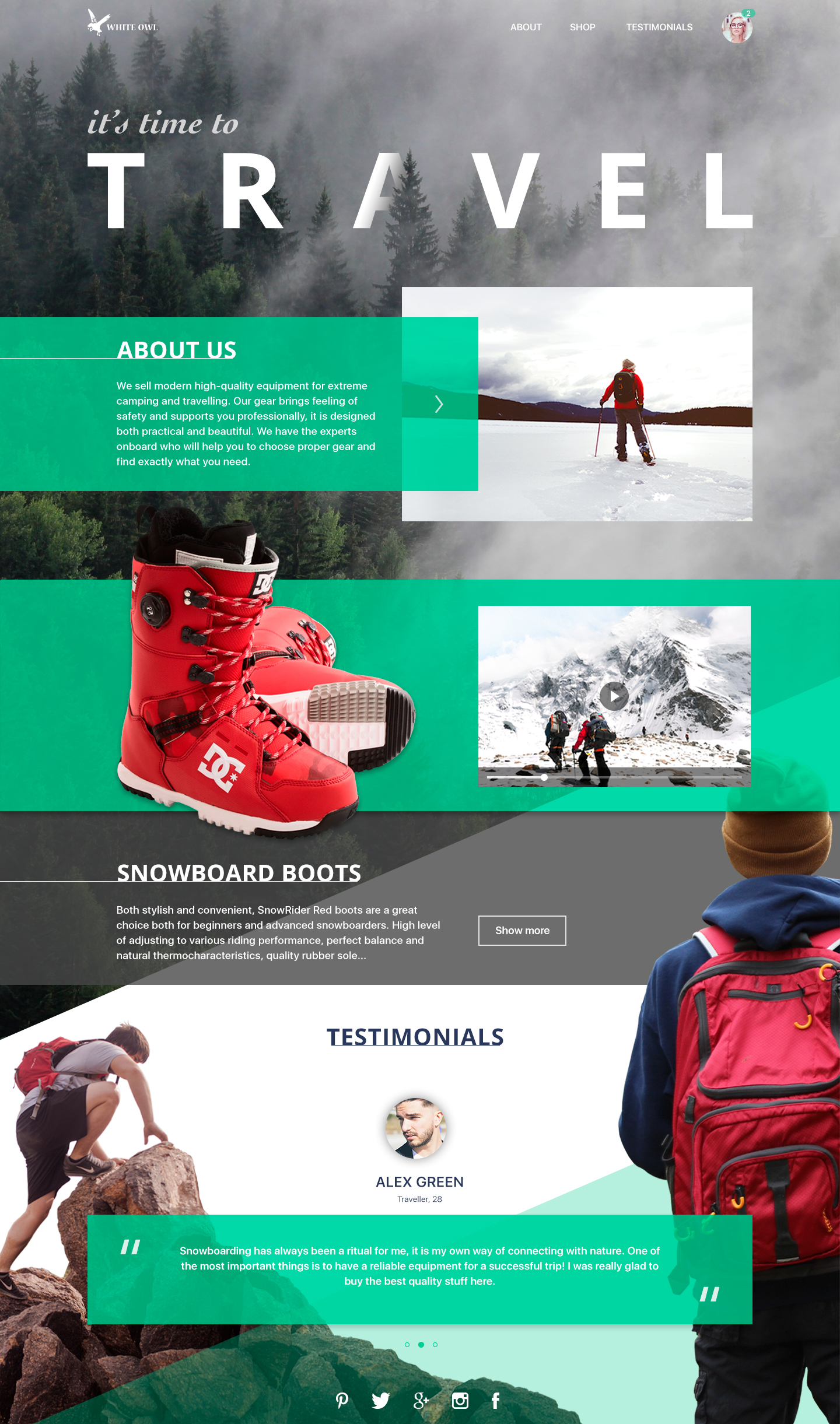
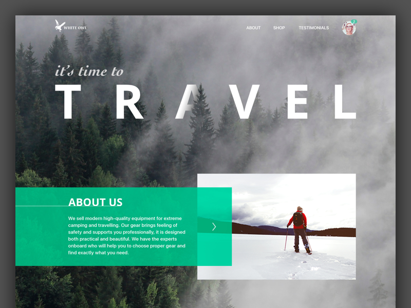
Extreme sports and active travel gear presents an interesting landing page challenge. The buyer already knows what a tent or a harness looks like. What they are purchasing is closer to an identity, a lifestyle, a particular relationship with risk and freedom. The design responds to that.
Dynamic photography—motion blur, action shots, dramatic landscapes—establishes the emotional context immediately. Product-forward sections sit within that context rather than replacing it. Testimonials appear not as social proof checkboxes but as narrative, giving potential buyers the language to understand how this gear fits into a life they aspire to. E-commerce UX design done well understands that the path to the cart runs through desire, not information.
Handcrafted Wood Products: Texture as Argument
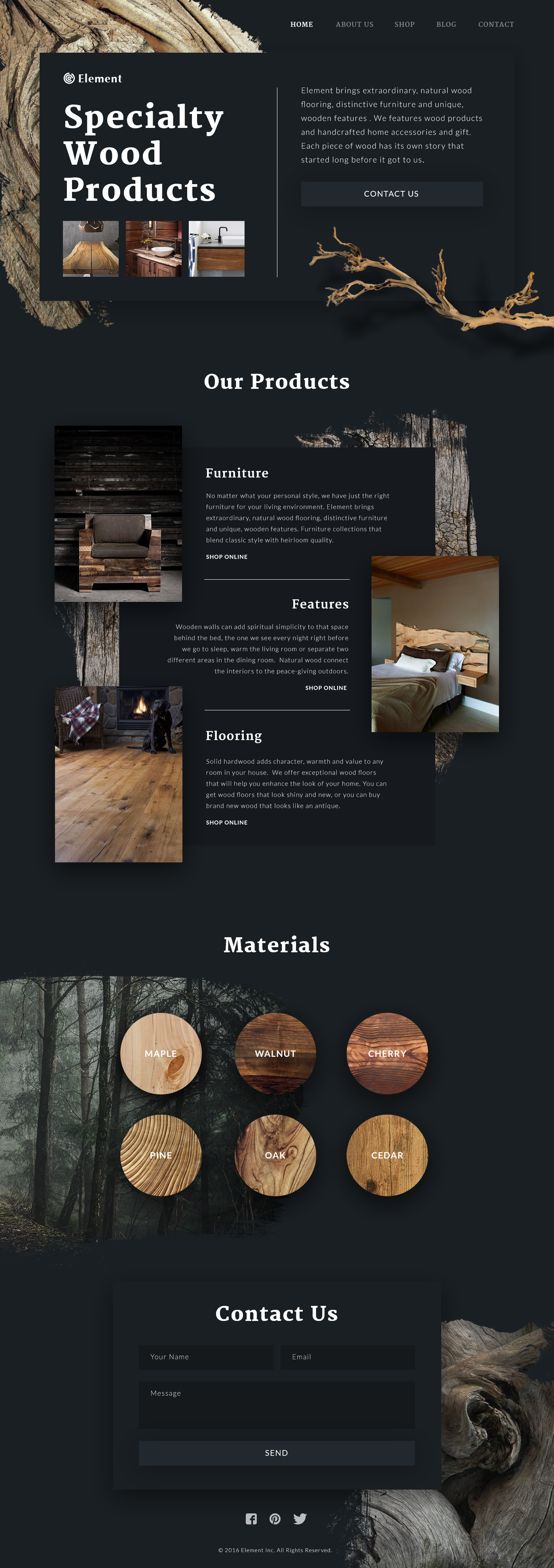
There are products where the material itself is the message. For a company selling handcrafted wooden goods, the sensory qualities of wood—its grain, warmth, weight, imperfection—need to be present in the interface before anyone reads a single line.
Wooden textures applied across sections of this landing page do not function as decoration. They function as evidence. The dark background amplifies the richness of the materials shown, making colors more saturated and compositions more striking. Typography was tested extensively—not just for aesthetic harmony, but for legibility across the varied textural backgrounds. The result is a landing page that feels like the product: deliberate, natural, made by hand.
Free Education App (Capitoledge Screensaver): Light, Air, Motion
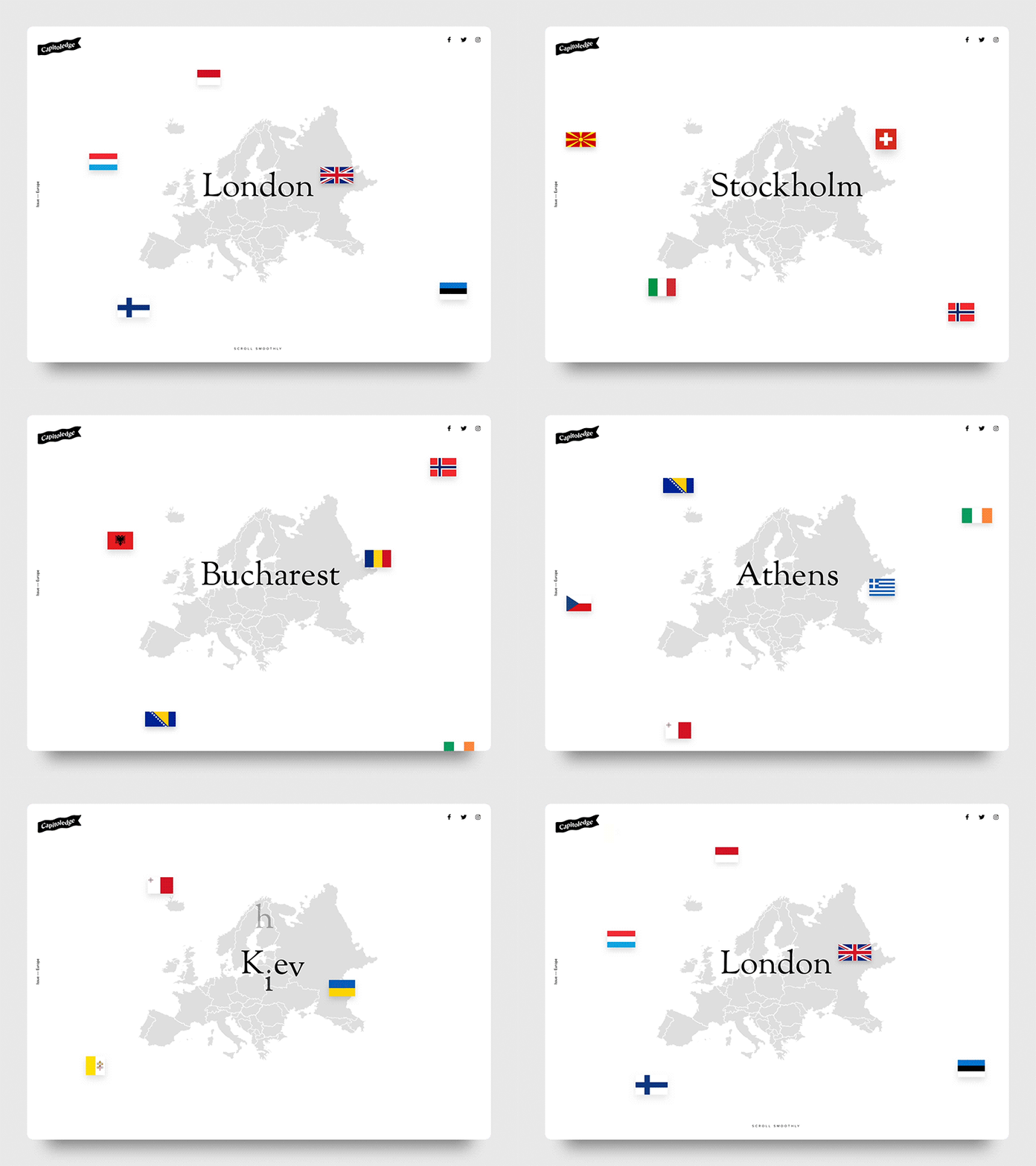
This concept promotes a free digital educational tool—a screensaver that teaches world capitals. The visual language needed to feel open and inviting rather than heavy with persuasion, given that the offer costs nothing and the barrier to conversion is essentially just inertia.
The light background creates the sensation of space. A background map image gives immediate context without exposition. Scroll-triggered animation activates as the user moves through the page, turning passive reading into a small interactive experience. For digital product landing page design, this approach mirrors the product itself: learning that feels effortless, almost ambient.
Capitoledge Screensaver
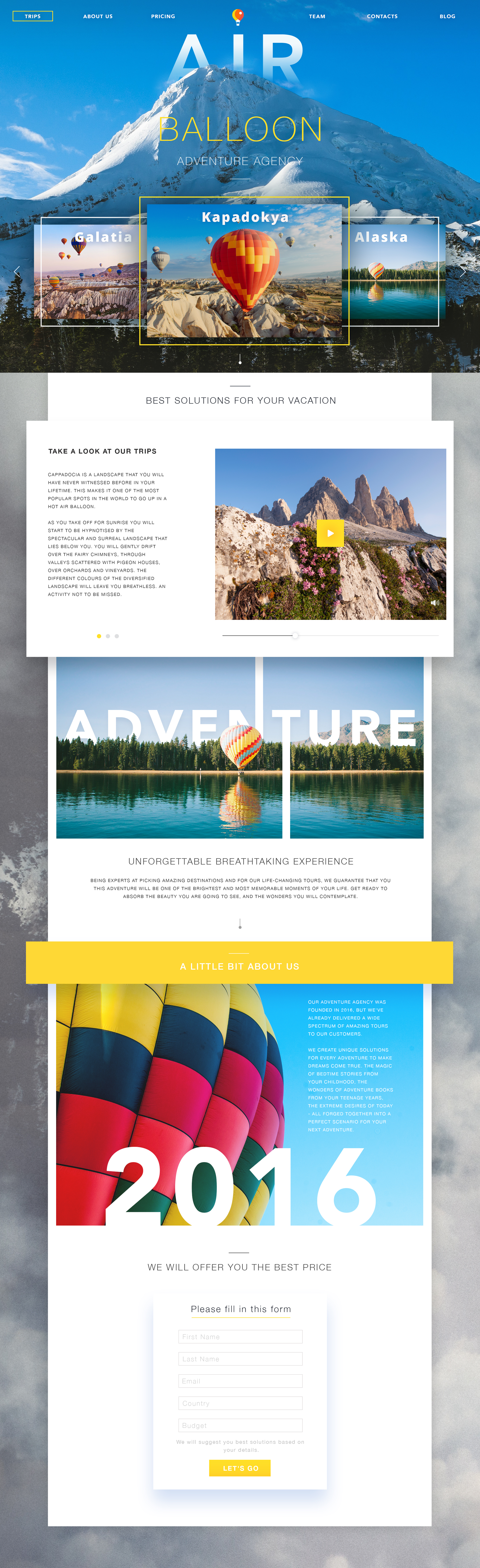
Adventure Agency (Hot Air Balloon Tours): Copy as Journey
The final concept brings together several principles in a single execution. Bright, thematic photography anchors each section—balloons over landscapes, people mid-flight—while the copy structure mirrors the stages of a sales funnel: awareness, interest, desire, action. The light background keeps the visuals breathing, adds literal air to the metaphor.
What this concept demonstrates is that landing page structure and content strategy are not separate disciplines. The sequence in which information appears, the emotional temperature of each section, the timing of the call to action—these are design decisions as much as layout choices. Information architecture and visual design arrive at the same destination together, or neither fully works.
The Landing That Actually Lands
Across ten concepts, ten industries, ten different visual languages, the same principle holds: a beautiful landing page built on unclear logic or weak information architecture converts at the same rate as an ugly one. Design earns its value by supporting function, not substituting for it.
Usability, navigational clarity, and purposeful content hierarchy come first. Visual design—motion, color, texture, typography—then amplifies what is already working, makes the experience memorable, gives people a reason to feel good about the choice they are making. That is the soft landing. The one that leaves people glad they arrived.
Recommended Reading
Curious to go deeper? We have more where this came from, make sure you check our other articles:
App Design Ideas: 7 Nifty Mobile Application Design Projects
Product Page Design Inspiration: 17 Ecommerce Web Designs
11 Diverse Functional and Awe-Inspiring Website Designs
UI in Volume: 3D Graphics in Creative UI Design Concepts
Web Design: 26 Examples of Creative Landing Pages
Web Design: 5 Basic Types of Images for Web Content
UX Design: How to Make Web Interface Scannable
Single-Page Website: Best Design Practices
Hit the Spot: Design Strategies for Profitable Landing Pages
From Zero to Hero: Look at Hero Images in Web Design
Web Design: 9 Eye-Catching Web Interfaces with Bright Graphics