Despite what many brands think, competition does not reward the loudest company. It does, however, reward the one customers recognize on sight and trust without even thinking twice. Recently, Nielsen’s global research on new products found something worth framing on a wall: close to six in ten people choose a new product simply because the brand behind it already feels familiar, and one in five buy because they like that brand, full stop. Just recognition and affection doing the selling for you.
Paul Rand put it better than any branding deck ever will: “Design is the silent ambassador of your brand.” Notice that he didn’t mention logos or color palettes specifically. He said design—the whole shape of how a company shows up in the world, speaking on its behalf even when nobody from the company is in the room.
Marketing people like to take credit for brands. But designers built that wall, brick by brick, and most of the bricks happen long before anyone sketches a logo. Here are the six stages that separate a brand people remember from a logo nobody notices.

Creative process of branding design for Andre
Stage 1: Decide Who You Are Before You Decide How You Look
A designer does not invent a company’s purpose. That work belongs to the founders, sitting in a room arguing about what actually matters before a single pixel exists. But that purpose is the soil everything else grows out of, and skipping it shows.
Designing a brand without knowing its personality works like sketching a stranger’s portrait from a blurry photo. You can get the proportions right and still miss the person entirely. The drawing is technically correct and completely soulless.
Smart designers often ask for five words a client would use to describe their company at a dinner party, slightly drunk and finally honest. Here is another version of that question: what do you want your harshest competitor to admit about you, even if they never say it out loud? People answer that one without overthinking it, and the honesty shows up in the work.
Plenty of clients show up wanting “something that pops” with zero clarity on what their company stands for. Founders think in product and revenue. Designers think in perception and memory. The job, before any visual work begins, is closing that gap with the right questions—the same instinct a good psychologist brings to a first session, listening for what someone means underneath what they are saying.
Personality, once defined, needs to survive contact with a bad quarter. Anyone sounds confident in a kickoff meeting. A brand earns its character on the days nothing goes right—the apology email, the canceled order, the moment a customer is angry and watching closely. A personality that cannot hold up under pressure was never a personality. It was a mood, borrowed for a pitch deck and abandoned the first time it got tested.
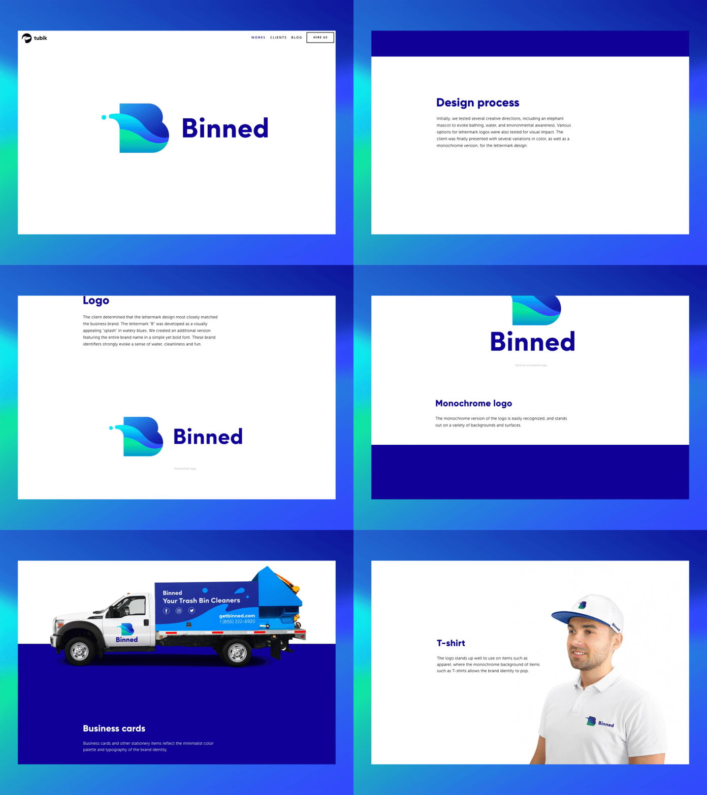
Corporate identity for Binned
Stage 2: Do The Homework Nobody Sees
Once a personality exists on paper, the temptation is to start designing immediately. Resist it. This is where research earns its keep, and it applies whether the deliverable is a logo or an entire app.
Market research first. Study competitors honestly—to spot the exact mistakes everyone in the category keeps repeating. An entire industry occasionally agrees, without meaning to, to be equally forgettable. The fastest way to stand out is finding that shared mistake and refusing to make it.
User research comes next, and it matters more than anyone admits. Personal taste—the designer’s, the client’s, the founder’s brother-in-law’s—needs to step aside for what the actual audience responds to. Good user research digs past stated preferences into the quieter stuff: what people worry about, what makes them suspicious of a new company, what makes them trust one instantly.
Design rewards instinct, but it punishes skipped homework. An hour of research costs far less than a year of rebuilding a brand nobody connected with the first time.
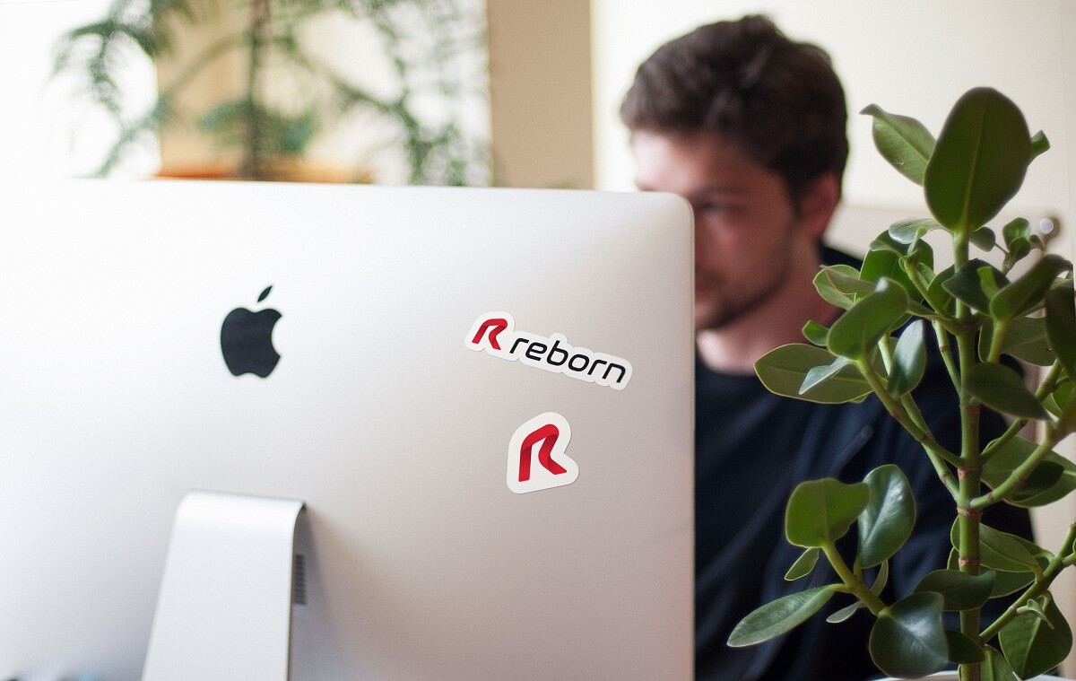
Stickers designed for Reborn
Stage 3: Build The Logo—But Know What It Actually Is
Somewhere along the way, “brand” and “logo” became the same word in casual conversation. They are not. A logo is one stage of branding, arguably the most visible, but never the whole story.
What a logo really does is compress everything decided in stages one and two into a single mark, simple enough to recognize at a glance, on a phone screen, from across a parking lot, or stitched onto a hat. That compression is the hard part. Anyone can draw something pretty. Distilling an entire company into one shape that survives being shrunk to the size of a thumbnail—that takes real craft.
The actual workflow, stripped of jargon: define the task, study the audience, study the market, explore directions without falling in love with the first one, settle on a style, choose a palette, then test relentlessly—small, large, black and white, on a delivery van, at midnight on a dim screen. A mark that only looks good in the pitch deck has already failed at its actual job.
There is a particular kind of humiliation reserved for logos that only work in the exact conditions they were designed in—full color, centered, on a clean white background. The real test arrives later: as a sixteen-pixel favicon, as a gray app icon sitting next to forty other gray app icons, as a single-color stamp at the bottom of an invoice nobody is reading closely. A mark earns its keep in the unglamorous places, not on the mood board.
One unglamorous but essential habit: look hard at competitor logos before finalizing anything. Not for inspiration—for collision avoidance. The last thing any brand needs is to be confused with one of the companies it’s trying to outshine.
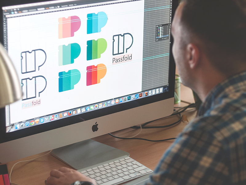
Logo design for Passfold
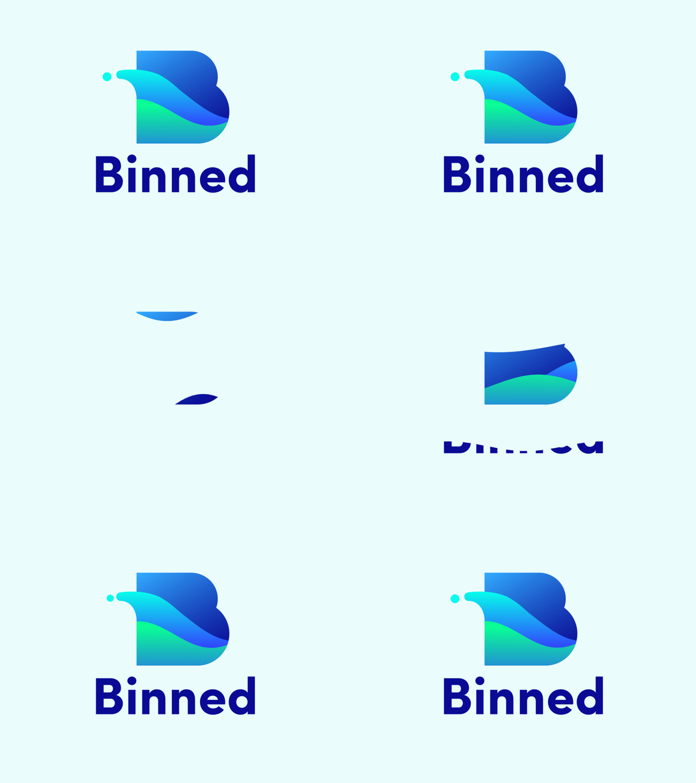
Logo animation for Binned
Stage 4: Give The Brand A Voice And A Face
A logo is the brand’s signature. Typography and mascots are its actual voice—the parts people absorb without ever consciously noticing them.
Mascots, done well, turn an abstraction into a presence. A custom character gives a company something to point at, something with a personality that does not need a paragraph of explanation to land. People remember mascots the way they remember cartoon characters from childhood, which is exactly the kind of long-term, unpaid rent that branding is supposed to buy.
Typography works just as hard. The letters on a business card, a banner, an email signature—all of it either reinforces a company’s character or argues against it. Choosing a typeface deserves the same scrutiny as casting an actor: does this voice sound like the company, or does it sound like every other company that grabbed the same trendy font off the same list this year? Some brands commission a custom typeface purely to own a sound nobody else can borrow. Most do not need to go that far—they just need fonts chosen on purpose instead of by default.
Color does the same job from a different angle. It reaches people before they consciously register shape or word, settling an emotional verdict in a fraction of a second, long before logic gets a vote. A palette chosen because it trended last season ages the way last season’s interior design ages—fast, and not gracefully.
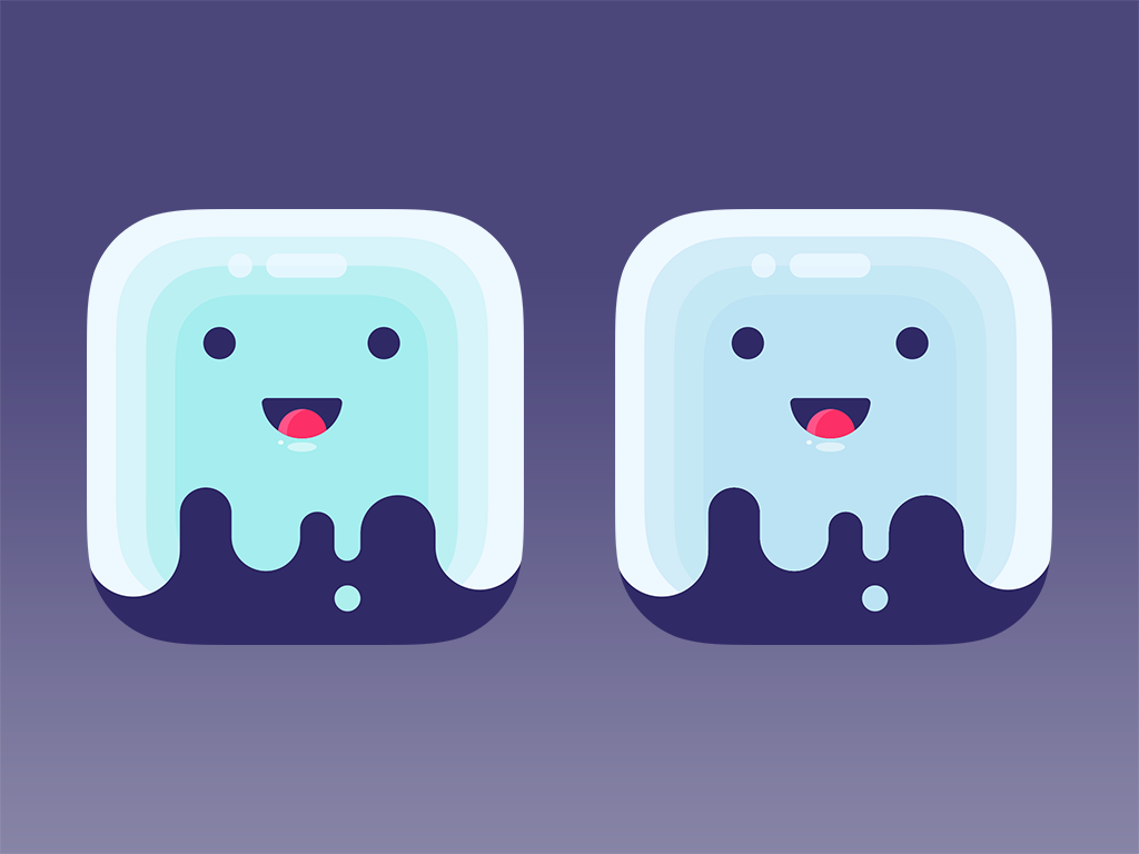
Mascot design for Saily
Logo design for Reborn
Stage 5: Let The Brand Show Up Everywhere Consistently
Once the logo, type, and color palette exist, the job becomes translation: making sure the same personality survives the trip across every object a company touches.
A business card still does real work in a world full of digital introductions—it’s often the first physical object someone holds that represents a company, and first impressions made of paper carry weight.
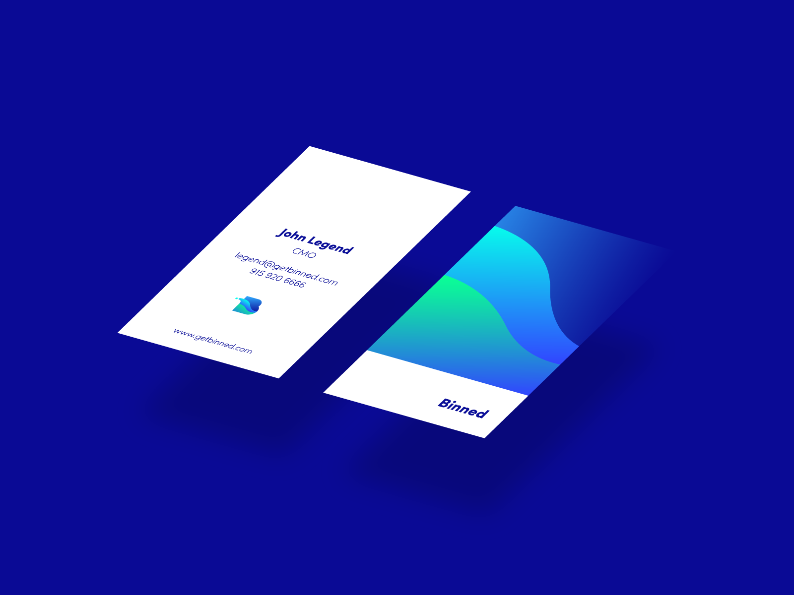
Business cards designed for Binned
Correspondence—letterheads, envelopes, the boring documents nobody thinks about—signals whether a company sweats details, which is exactly the signal clients pay attention to before signing anything.
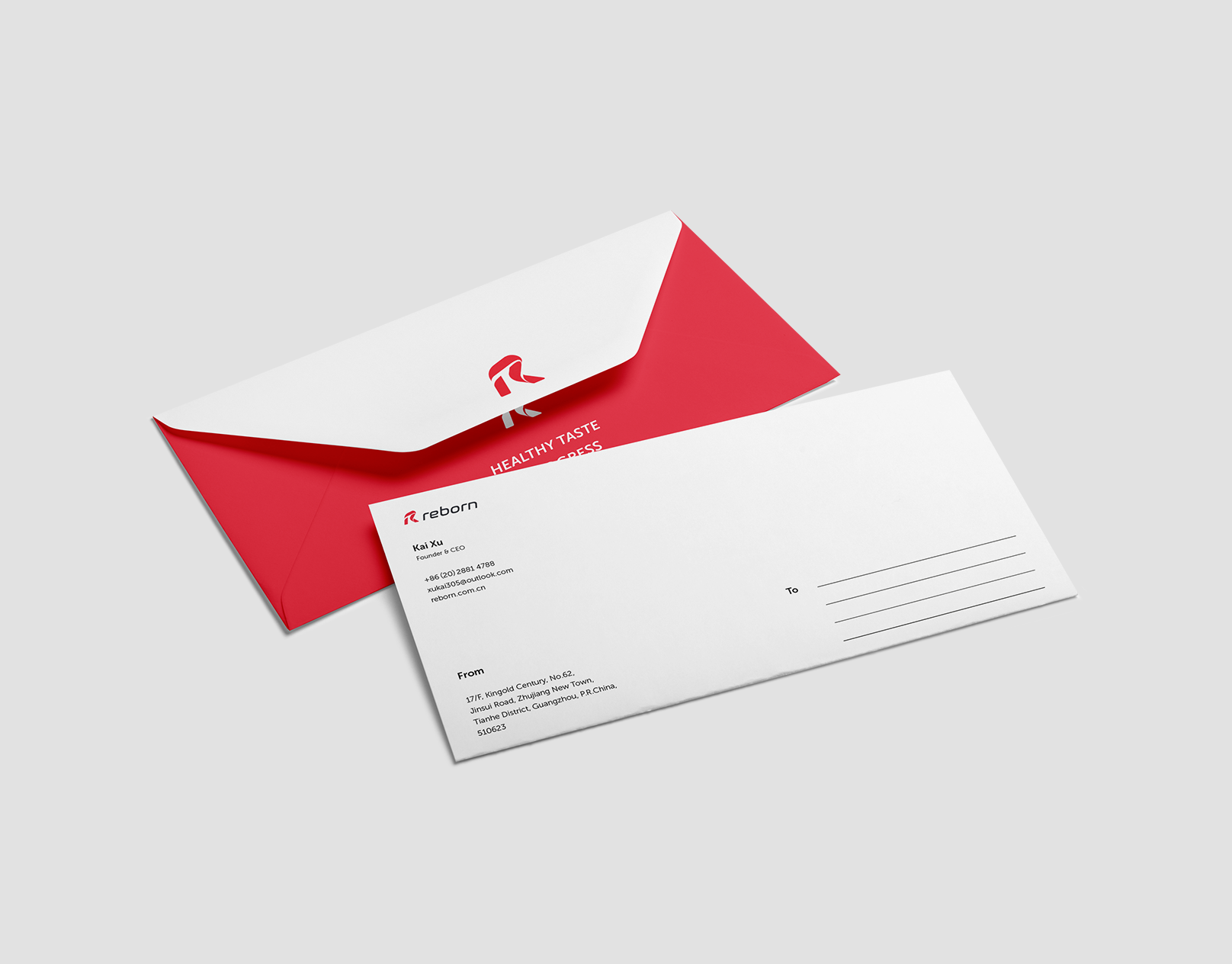
Envelope design for Reborn
Billboards and banners get the glamorous creative budget, understandably, since they are the loudest version of a brand most people will ever see.
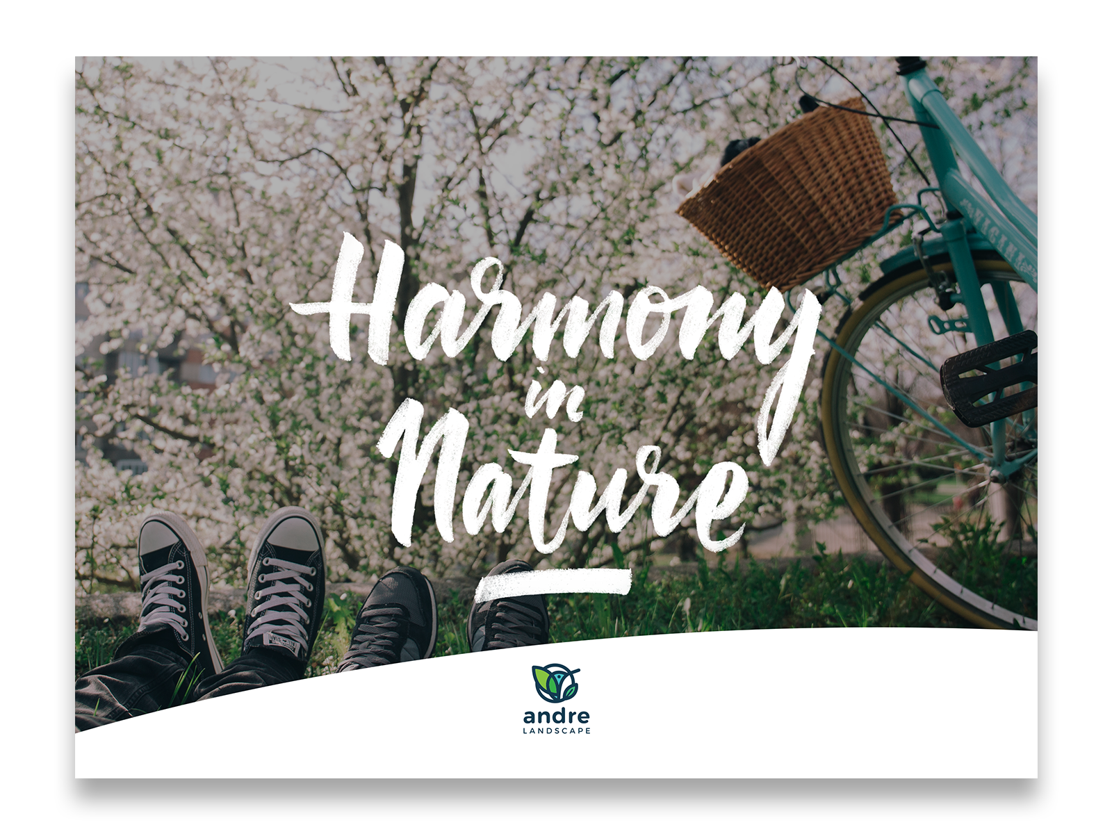
Poster designed for Andre
Vehicles matter more than companies usually credit. A delivery truck is a moving billboard nobody pays for twice, and a sloppy one undoes weeks of careful brand work in a single red light.
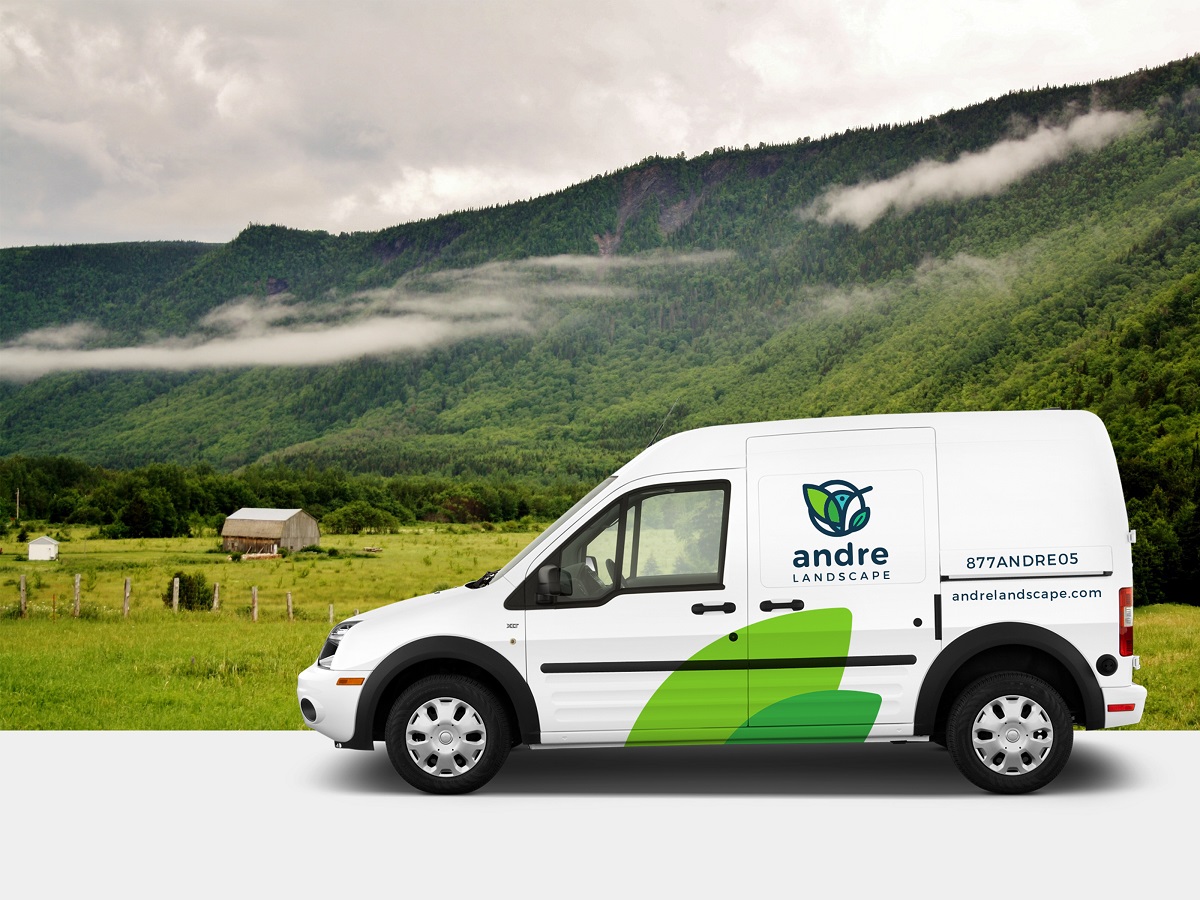
Vehicle livery designed for Andre
T-shirts and hats build something subtler—a sense of belonging. Employees wearing a brand voluntarily, off the clock, is the kind of endorsement no advertising budget can buy.
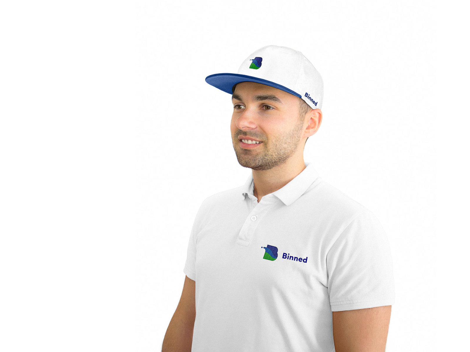
Branded clothes designed for Binned
None of these objects matter individually. What matters is that all of them, seen together over months, add up to one coherent impression instead of six unrelated ones.
Stage 6: Write The Rules Down Before Someone Breaks Them
The work looks finished. It never quite is, because the next person to touch the brand—an intern resizing a logo, a print shop guessing at a color, a new hire designing their own flyer—will need rules they were not in the room to absorb firsthand.
A style guide exists to prevent a thousand small decisions made without context. It explains the thinking behind the logo, locks down the exact color values, and shows the typography hierarchy in plain enough language that nobody needs a design degree to follow it.
The most useful style guides include wrong examples on purpose—a stretched logo, a clashing color, a font swapped for whatever happened to be installed. People learn boundaries faster from seeing them violated than from reading a rule about them. A few well-chosen mistakes, shown clearly, save a brand from a hundred real ones later.
Branding rewards patience and punishes shortcuts, in that order. Skip the personality work and the logo looks pretty but says nothing. Skip the research and the design pleases the room and nobody else. Skip the style guide and the brand erodes one careless decision at a time, until the company that took two years to build looks like it was assembled in an afternoon.
Six stages, done in order, with attention paid at each one—that is the difference between a brand people forget by lunch and one they recognize on sight years later, the way you would in a parking lot, in the dark, in the rain.
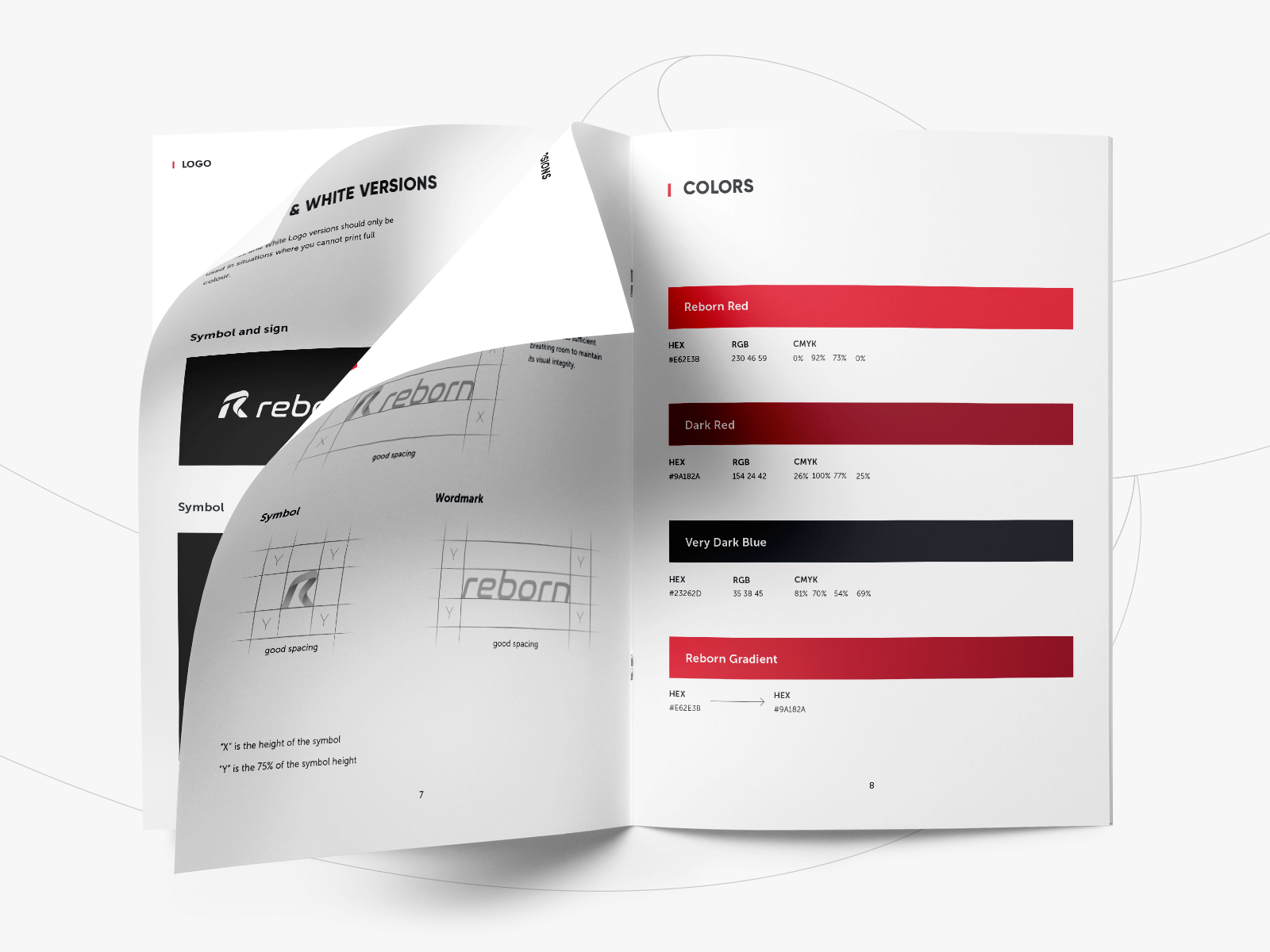
Styleguide for Reborn
Recommended Reading
You read this far—that almost never happens on the internet. Here is more, in the same spirit: case studies and think pieces from Tubik:
Logofolio: 16 Logo Designs for Different Business Goals
Collection of Creative Logos for a Variety of Brands
Remember Me. Basic Types of Efficient Logos
Shape and Color in Logo Design. Practical Cases