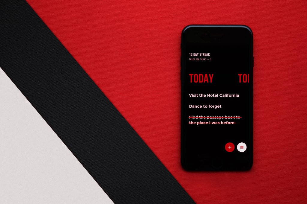

There’s a moment, familiar to anyone who has stared at a poorly designed app, where the eye just drifts. Nothing pulls it in, everything competes equally for attention, and so attention gives up entirely and leaves. That’s what happens when the interface lacks visual hierarchy. And understanding what it actually means, beyond the textbook definition, is what separates nice UI design from a working one.
The practical stakes in information architecture and UX are high—a buried CTA, a headline that shares visual weight with body copy, a layout that forces interpretive work the designer should have done—all of it quietly erodes the experience before users can articulate why something feels off.
Every spacing decision, typeface choice, or color call is either building a coherent hierarchy or quietly undermining one. The interfaces that feel intuitive almost always achieve that quality not through clever feature design, but through visual hierarchy executed consistently at every scale simultaneously.
Let’s get into how it actually works.
Why Typography Does Most of the Heavy Lifting
Typographic hierarchy is possibly the most underestimated tool in a UI designer’s kit. The way copy is structured and sized teaches users how to read a page before they have read a single word. The eye scans first, then reads—and what it scans for is contrast and pattern, not content.
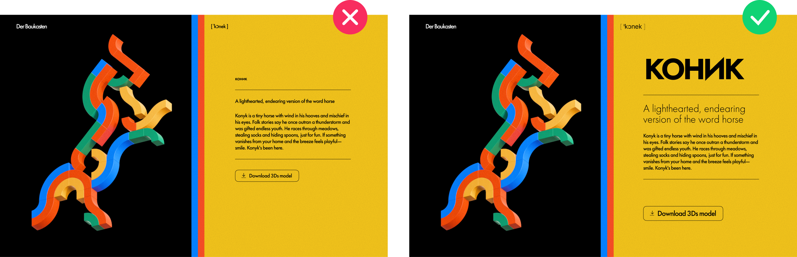
The system works in three layers. The primary level—headlines, hero text, key callouts—is where the biggest type lives. These elements anchor orientation: they answer where am I and why does it matter before users consciously ask it. The secondary level handles subheaders and captions, which function less like titles and more like navigational signposts.
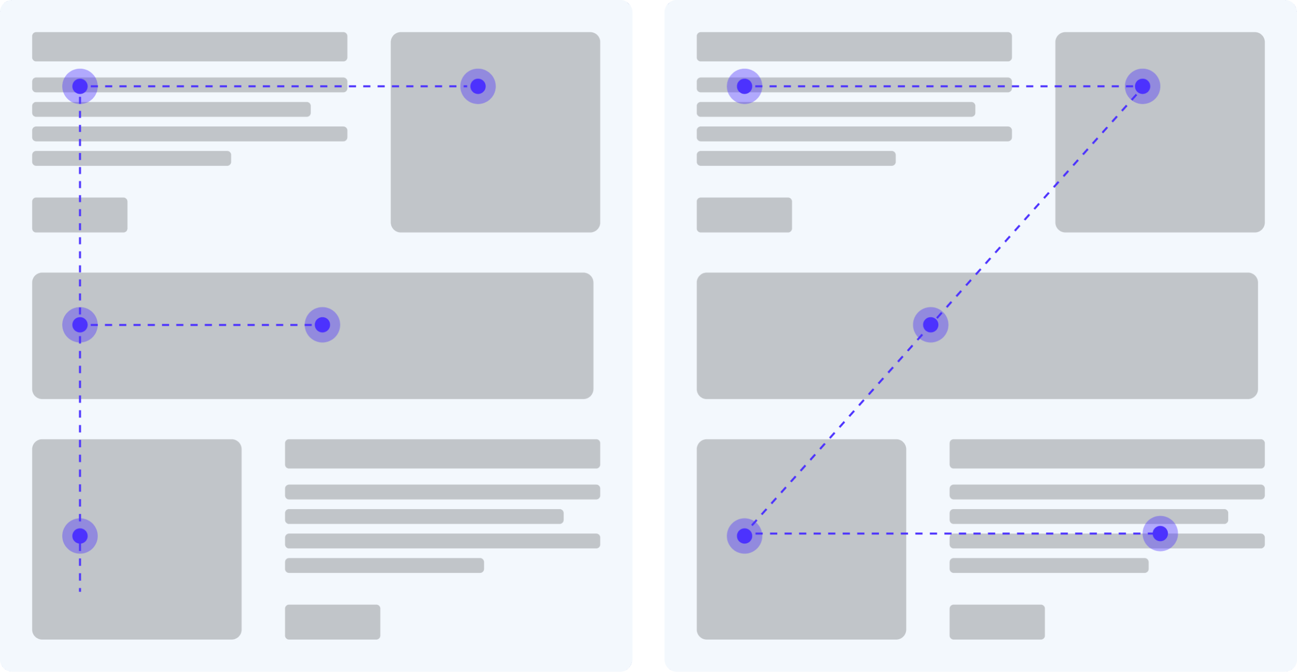
Eye-tracking research consistently shows that the overwhelming majority of web users scan in an F or Z pattern, meaning secondary-level elements positioned along those scan paths carry disproportionate influence over whether users continue reading at all. The tertiary level is body copy—smaller, quieter, but critical for trust. A page with a strong primary and secondary level but cramped, low-contrast body text signals that the product cares about first impressions but not about the user who actually commits to reading.
Where designers get into trouble is treating these three levels as purely a size problem. Type size alone is insufficient—weight, tracking, line-height, and color all contribute to perceived hierarchy, and the relationships between them need to be calibrated, not assumed. A headline at 48px in a thin weight may register as less dominant than a subheader at 24px in a bold weight. The hierarchy lives in the contrast between levels, not in any individual level’s absolute size.
Font pairing choices carry the same weight. A sharp, geometric display typeface—something with real personality at large sizes—paired with a humanist serif or a well-spaced grotesque at body size creates readable contrast while maintaining editorial coherence. The display font gives the page its voice; the body font determines whether users can actually hear it comfortably for more than a paragraph.
On most mobile layouts, this means folding the primary and secondary levels into a single confident heading tier—one size and weight doing the orientation work that hero text and subheaders split between them on desktop—paired with body copy as its own clearly differentiated second tier. Two tiers, executed with precision, often outperform three tiers executed with nuance that the screen size and user context cannot support. This is one of the clearest examples of hierarchy as a design decision shaped by context, not by universal rules.
Size: The Most Primal Signal in UI Design
Humans learned before language that larger things demand attention. Designers tap into that wiring constantly—but the sophisticated application of size in UI design goes well beyond simply making important things bigger.
Size works differently depending on density. In a spacious layout with generous padding, even modest size differences register clearly: a headline that is x1.5 the body size reads as emphatically primary. In dense interfaces—dashboards, data-heavy tools, analytics platforms, admin panels—size relationships need to be more exaggerated to achieve the same perceptual separation, because surrounding visual noise reduces the effective contrast. This is why data-dense products like Bloomberg Terminal or complex SaaS dashboards often use stark size jumps that would look crude in a consumer-facing design: the context demands it.
There is also a less-discussed dimension to size hierarchy: the relationship between element size and interactive affordance. Larger elements communicate clickability, or at least invite more confident interaction. A primary button that is too small relative to secondary actions creates a subtle but real hesitation, a split-second where the user second-guesses whether they are about to do the right thing. That hesitation compounds across a product, visit after visit, and erodes the sense that the interface is guiding them rather than testing them.
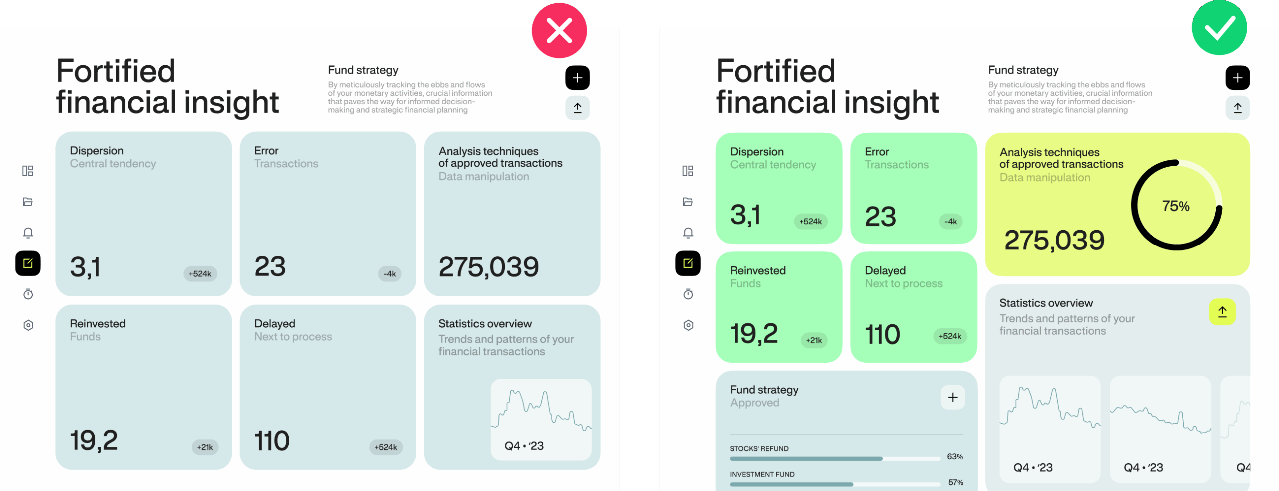
The practical discipline of size hierarchy starts with a ruthless ranking exercise before any visual decisions are made. What does the user need to perceive first? What supports that? What can wait? That ranking becomes the blueprint. Designers who skip it often end up with every element sized at medium, and medium everything is functionally identical to no hierarchy at all.
Color and Contrast: The Hierarchy You Feel Before You See
Color has its own built-in attention hierarchy, and it operates faster than any other visual signal. High-chroma colors—reds, warm oranges, electric blues, acid greens—activate attention before the conscious mind gets involved. This is not a design convention; it is a neurological fact rooted in how the visual cortex processes wavelength differences. Designers use it accordingly: a bright CTA button on a neutral background will pull the eye even when the button is physically smaller than surrounding elements. Color can override size, which makes it uniquely powerful and uniquely dangerous.
The danger is this: every additional element that shares the high-chroma treatment dilutes the effect proportionally. One red button on a grey interface is a beacon. Four red buttons are just a red interface. This is why color hierarchy requires a discipline of scarcity—the accent color only works as a hierarchy tool when it is genuinely rare on the page.
Contrast in UI design extends well beyond color. There is contrast between thick and thin typographic strokes. Contrast between motion and stillness—an animated element in a static layout pulls the eye with a force that no static design element can match, which is why animated CTA banners convert despite being aesthetically aggressive. Contrast between density and space: a single element given an island of white space in a dense layout reads as more important than its size alone would suggest. All of these create hierarchy without changing a single color value.

One underexplored application of color hierarchy: using it to reinforce system states rather than just emphasis. Error states, success states, active navigation states, disabled elements—these all benefit from a color language that is consistent and learnable. When users encounter a color for the third time in a product and correctly anticipate what it means before they read the label, that color has done real design work. That kind of color literacy is only possible when the hierarchy is consistent enough to teach.
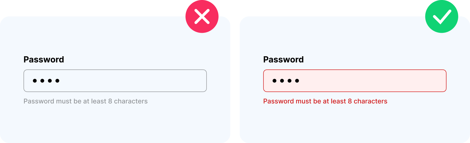
Negative Space: The Element That Holds Everything Else Together
White space—or negative space—is the element that most clearly separates designers with trained eyes from those still developing theirs. The beginner sees empty space as waste, something to fill before the design feels complete. The experienced designer understands that space is load-bearing: it is doing active work in the composition, not waiting to be replaced.
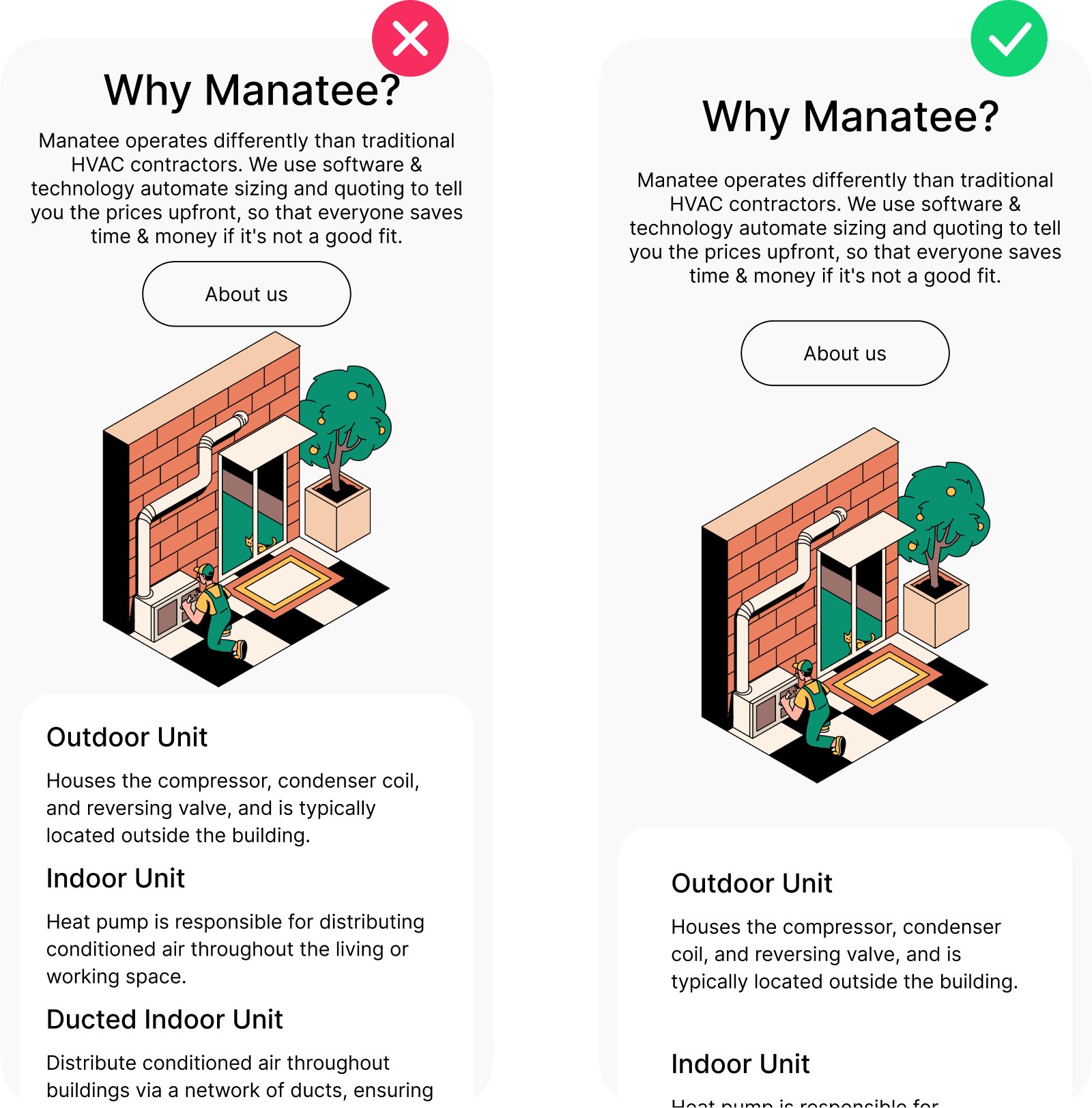
Negative space serves hierarchy in two distinct ways. First, it isolates elements, giving each one a perceptual territory that the eye can recognize as distinct. An element surrounded by space reads as complete in itself, worthy of attention on its own terms. Second, generous space around an element communicates its importance independently of its size or color—a small button with significant padding around it reads as more significant than a large button crammed into a cluttered header. Space is a proxy for confidence.
There is a specific principle here that product teams often miss: the relationship between cognitive load and white space is not linear. Reducing clutter by 20% does not reduce cognitive load by 20%—the effect is multiplicative, because the brain expends effort both parsing individual elements and resolving the relationships between them. Fewer elements in more space means both tasks become easier simultaneously. This is why even minor spacing improvements in complex interfaces can produce measurable changes in task completion rates.
The discipline of negative space is also one of the most reliable markers of brand quality in digital products. Premium interfaces—in fintech, in luxury e-commerce, in thoughtful SaaS—universally use more space than seems strictly necessary. That generosity signals something: the product is not anxious for your attention, not trying to cram everything in before you leave. It trusts you to explore. That emotional register is established almost entirely through space, not through logo quality or color choice.
Here are some examples from our Transform9 and Manatee Energy cases:
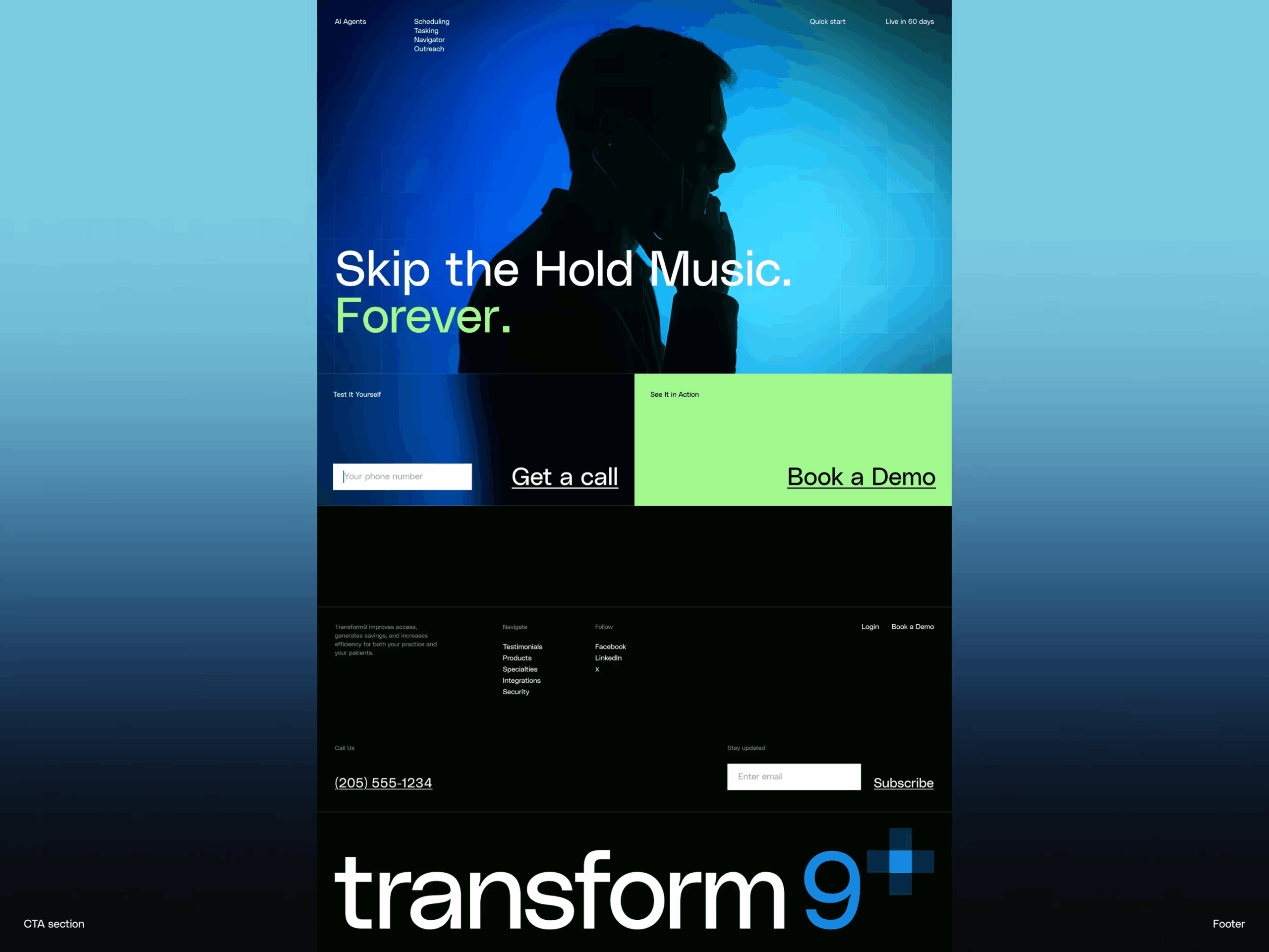

Proximity and Repetition: The Grammar of Visual Groups
Proximity is one of Gestalt psychology’s most directly applicable contributions to interface design, and it operates with a logic designers can exploit very precisely. Elements placed close together are read as related. Elements placed apart are read as separate. No label, no caption, no visual indicator is required—users apply this rule automatically, before they are aware of doing so.
The implication for navigation design is significant. A row of five menu items grouped tightly reads as a unified navigation system. Scatter those same five items with uneven gaps and users need conscious effort to categorize them—effort that they resent, usually without knowing why. Proximity creates information architecture silently, as long as designers apply it intentionally.
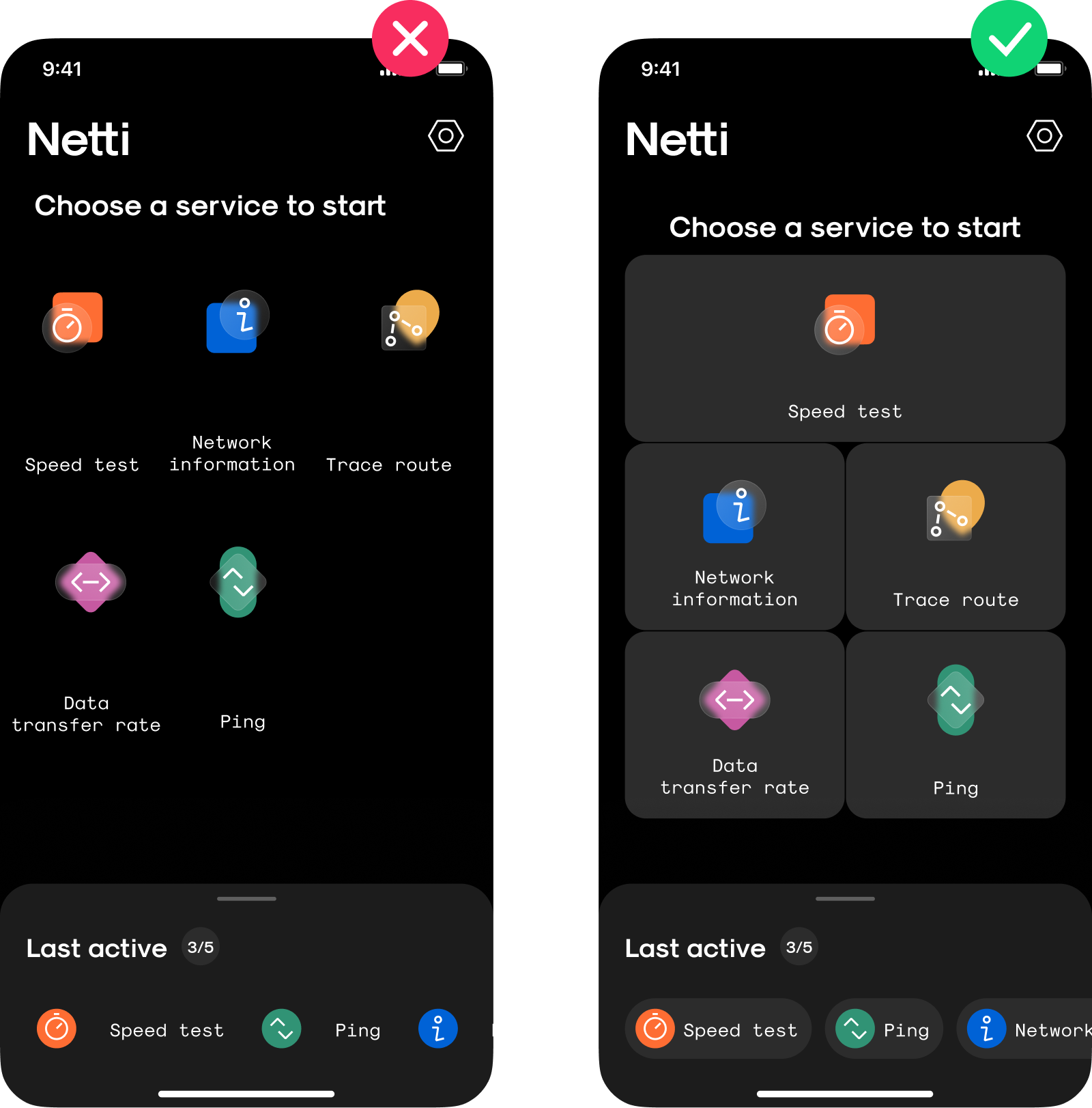
But proximity also creates hierarchy in a less obvious way: it establishes parent-child relationships. A label placed in tight proximity to an input field is understood as belonging to it. A caption placed close beneath an image is read as describing it. Move that caption further down the page and the relationship dissolves—suddenly users are inferring, not reading. The design system that handles proximity well is one where users never have to infer; the spatial relationships do the interpretive work for them.
Repetition works alongside proximity to build what is arguably the most durable aspect of visual hierarchy: learned patterns. When a visual element—a card shape, a specific icon weight, a background treatment for interactive vs. static elements—appears consistently, users begin building mental models of what it means. The third time they encounter a teal chip component, they already know it is a tag they can click. They did not read instructions. The repetition taught them. This is how mature design systems create interfaces that feel learnable rather than just usable, and it is one of the clearest arguments for investing in component consistency early in a product’s lifecycle.
The Macro, Meso, and Micro: Hierarchy as a Nested System
Here is the conceptual frame that most articles about visual hierarchy skip, and it is arguably the most useful one: hierarchy operates at three nested scales simultaneously, and all three need to be coherent with each other.
The macro hierarchy is the page-level or screen-level structure. It answers: what is the most important thing on this screen, and what supports it? This is the level most designers think about consciously.
The meso hierarchy is the component level. Within a card, within a modal, within a form—each of these has its own internal hierarchy that needs to be consistent with the macro level without competing with it. A card that tries to be its own headline-and-body experience inside a page that already has a headline creates a hierarchy conflict the user’s eye has to resolve before they can extract meaning.
The micro hierarchy is typographic and spatial: the relationship between a label and its value, the weight difference between a button label and its icon, the spacing between list items. These decisions feel minor individually, but they compound. A product where micro hierarchy is inconsistent—where some labels are heavier than their values and some are lighter, where some list items have more breathing room than others—feels unpolished in a way that users register emotionally before they can identify the source.
The interfaces that feel truly effortless are the ones where all three levels are consistent and coherent. Macro, meso, and micro all speak the same visual language, all reinforce the same reading order, all treat the user’s attention as something to guide rather than compete for.
Getting visual hierarchy right does not automatically make a product beautiful. But it makes it usable, navigable, and satisfying in a way that users register as trust—a felt sense that the product respects their time and anticipates their needs. In a landscape where users make decisions about whether to continue using a product within seconds of encountering it, that quality is one of the most durable advantages a digital product can have.
Recommended Reading
Design has more layers than it shows on the surface—and so do our articles. If this one made something click, make sure you check our other think pieces:
Tips on Applying Copy Content in User Interfaces
UX Design: How to Make User Interface Readable
Information Architecture. Basics for Designers
Information Architecture: Effective Techniques For Designers