Strip away every design trend, every Dribbble shot, every Awwwards winner, every pixel-perfect mockup. What remains? A person, trying to do something. Your job, the whole of it, is to make that something happen faster, easier, and with a little joy along the way.
That’s the entire brief. Everything else is commentary.
This article is written on behalf of the user, that largely invisible protagonist around whom all the hard work of UX research, information architecture, interaction design, and interface craft quietly orbits. It’s based on years of observing how people actually behave with digital products: not how we assume they behave, not how they say they behave in focus groups, but how they really behave at 11pm on a phone with cracked glass and 12% battery, trying to do the one thing your product promised to help with.
Pay attention.

I Want It Simple. But Not Simpler.
Einstein—not a UX designer, but occasionally right about things—said everything should be made as simple as possible, but not simpler. This is the most precise design principle ever accidentally stated by a physicist.
Simple and primitive are not synonyms. Confusing them is one of the most expensive mistakes a product team can make.
Simple means the complexity is yours to carry, not the user’s. The sophisticated logic, the conditional states, the edge cases—all of it handled invisibly, so what surfaces is clarity. Simple means a user can accomplish something without a manual, a tutorial, or a moment of existential frustration.
Primitive means you removed things that mattered. It means the product condescends. Users feel it instantly, even if they couldn’t articulate why—there’s a specific kind of annoyance reserved for interfaces that treat adults like they’ve never touched a screen before.
The balance between these two points—maximum elegance, zero condescension—is the actual craft of UI/UX design. Not the color palette. Not the motion curves. This.
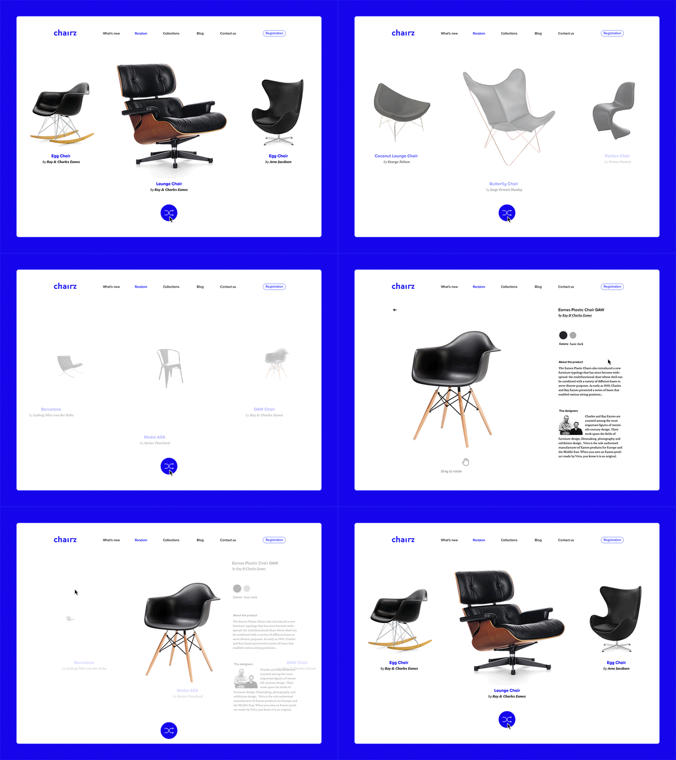
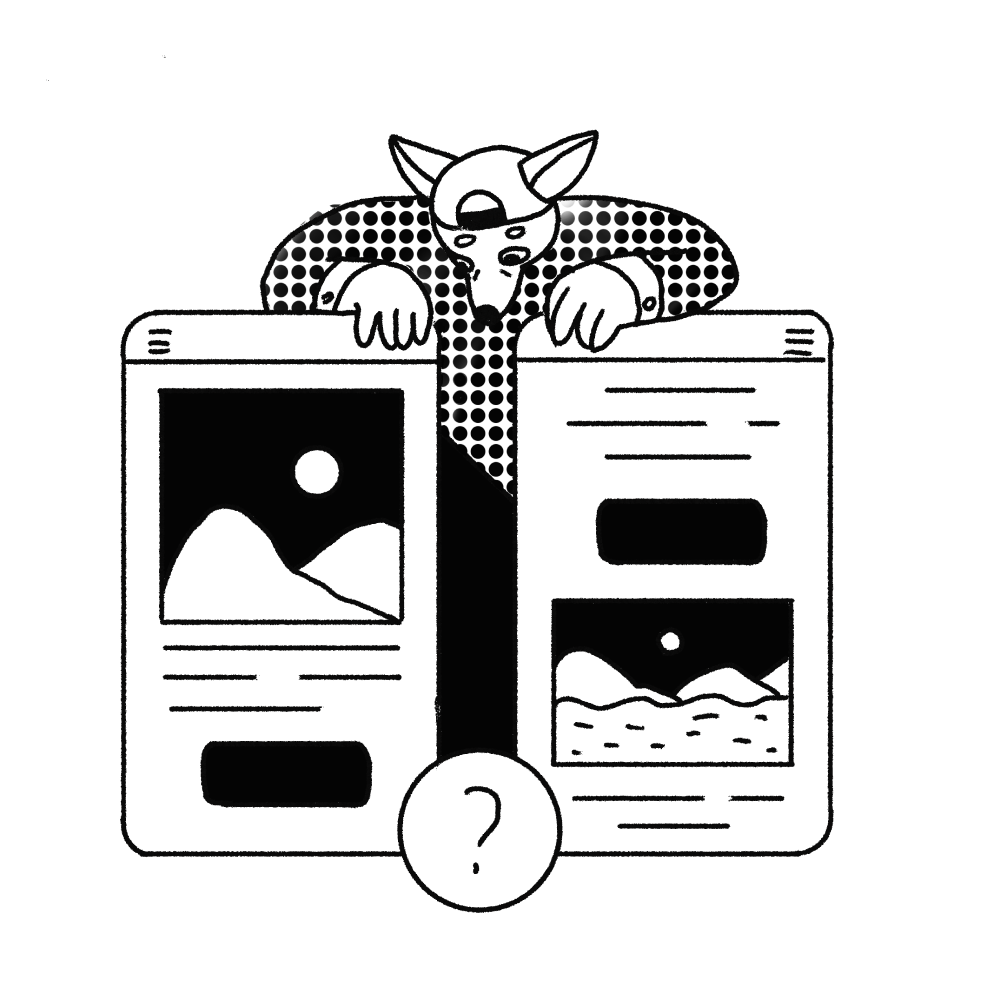
Randomizer concept
I Want It Easy To Start With.
First impressions in digital products work exactly like first impressions everywhere else: they’re disproportionately powerful and nearly impossible to undo. The first sixty seconds a user spends with your product will shape their opinion of it for months.
This makes onboarding UX one of the highest-leverage investments a product team can make, and one of the most consistently underinvested areas in the industry.
The goal of a great first experience is deceptively simple: show users the value before asking them for anything. Don’t open with a permissions request. Don’t front-load a registration form. Don’t throw them into a blank screen and hope they figure it out. Instead, show them the one thing your product does better than anything else. Make it immediate. And make it feel like a gift.
Onboarding patterns worth considering: contextual tooltips that teach by doing rather than explaining in advance; progressive disclosure that surfaces features as they become relevant; empty states that are actually invitations rather than voids. The goal of all of it is the same: make the first experience feel like something the user already knows how to do, even if they’ve never done it before.
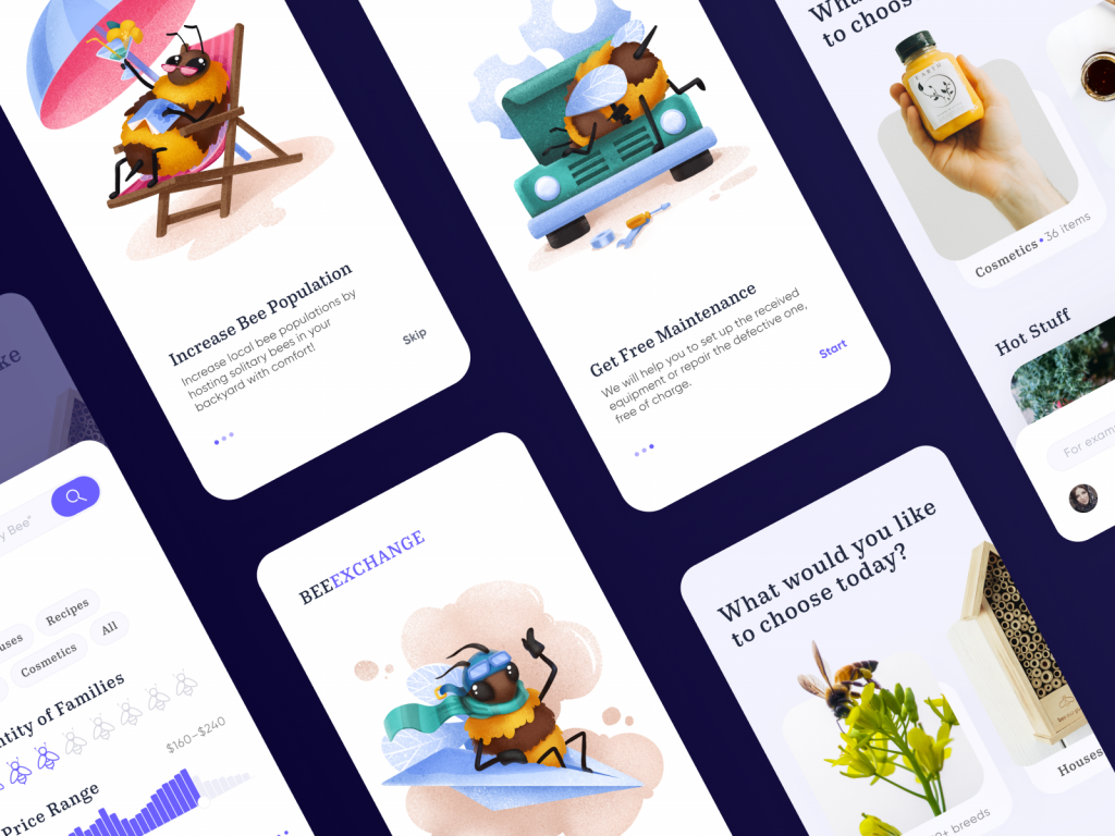
Onboarding tutorial for Bee and Honey app
I Want It Clear And Understandable.
Edward Tufte—the other person besides Einstein worth quoting in a design article—described good design as clear thinking made visual. This is the bar. Every screen, every state, every interaction should be the visual equivalent of a sentence that means exactly one thing.
Users should always know three things: where they are, what they can do, and what just happened. These are the baseline of usable design. When any one of them is unclear, the product starts to feel broken, even if technically nothing is wrong.
This is where microinteractions earn their keep. A loading state tells the user the system heard them. A success confirmation tells them it worked. An error message—a good one, not a cryptic code—tells them what to do next. These small moments of feedback are the product’s side of the conversation, and they matter more than most teams realize.
Readability, navigation hierarchy, affordances, signifiers—these aren’t jargon for its own sake. They’re names for real problems real users run into when a product fails to communicate clearly. Knowing the vocabulary is how you diagnose and fix the failure.
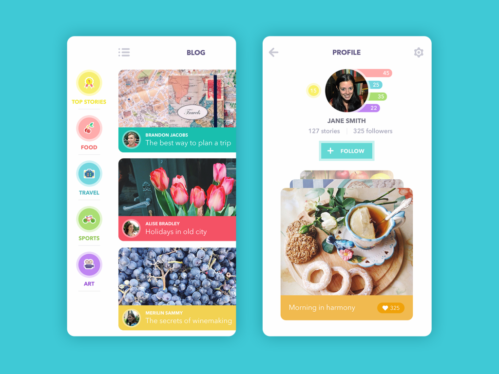
Blog App
I Want It Helpful.
Technology has always been a promise. A better, faster, less frustrating version of something that used to be harder. Every app, every website, every product exists because someone believed it could help someone else do something better than the alternative.
Users remember that promise. And they evaluate your product against it constantly.
User-centered design means taking this evaluation seriously at every stage—from the first wireframe to the tenth iteration post-launch. It means asking not just “does this feature work?” but “does this feature help?” The distinction sounds subtle. In practice, it’s the difference between a product people love and a product people tolerate.
One underrated dimension of helpfulness: anticipating problems before users encounter them. Error prevention beats error recovery every time. Smart defaults, confirmation steps for irreversible actions, auto-save, intelligent search suggestions—all of these are the product looking out for the user before they need to ask for help. That kind of care builds trust at a speed that no amount of visual polish can replicate.
I Want It Useful.
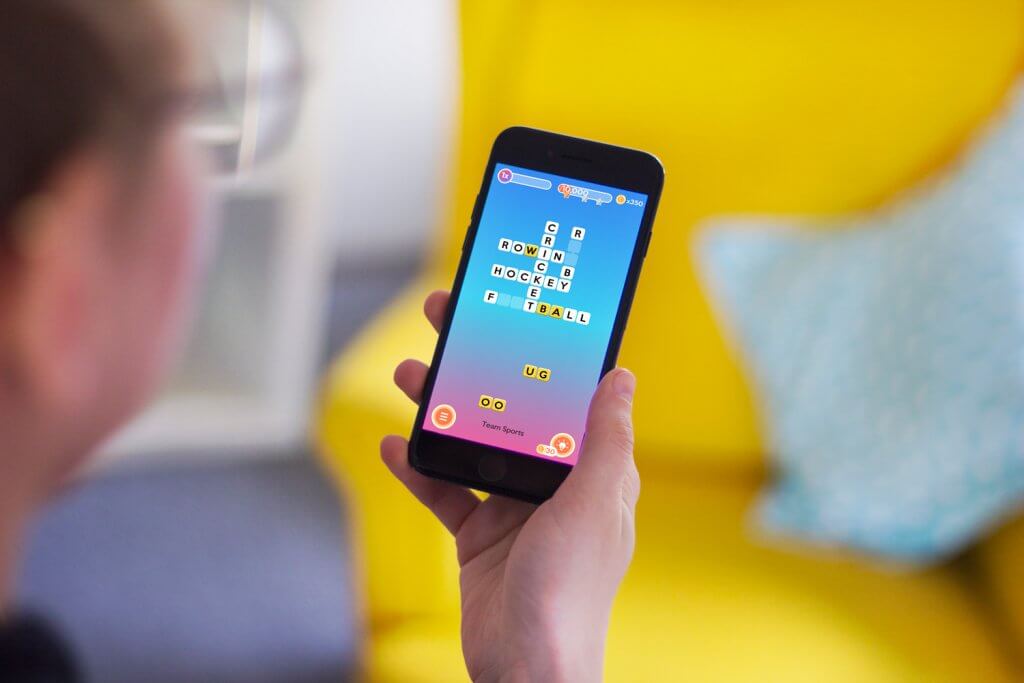
Here’s something the design industry occasionally forgets: entertainment is useful. Rest is useful. Beauty is useful. The experience of delight is useful. Deciding that some categories of product are “serious” and others are not leads to a hierarchy that serves no one, least of all users.
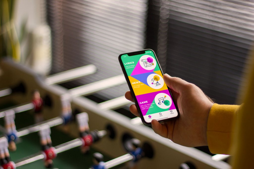
A game that genuinely relaxes someone is solving a real problem. A social app that connects people who would otherwise be isolated is doing something important. A music streaming interface that makes discovering new artists feel like an adventure is delivering real value.
User research at its best doesn’t ask “is this product useful?” in the abstract. It asks “what does this specific person, in this specific context, actually need right now?” The answers are always more interesting and more varied than any assumption you started with.
The practical takeaway: the job of defining usefulness belongs to users, not to product teams. Usability testing, behavioral analytics, and real conversations with real users will reliably tell you things that no amount of internal debate ever will. The product that retains users is the product that earns its place in their actual life, not the theoretical life you imagined for them during the design sprint.
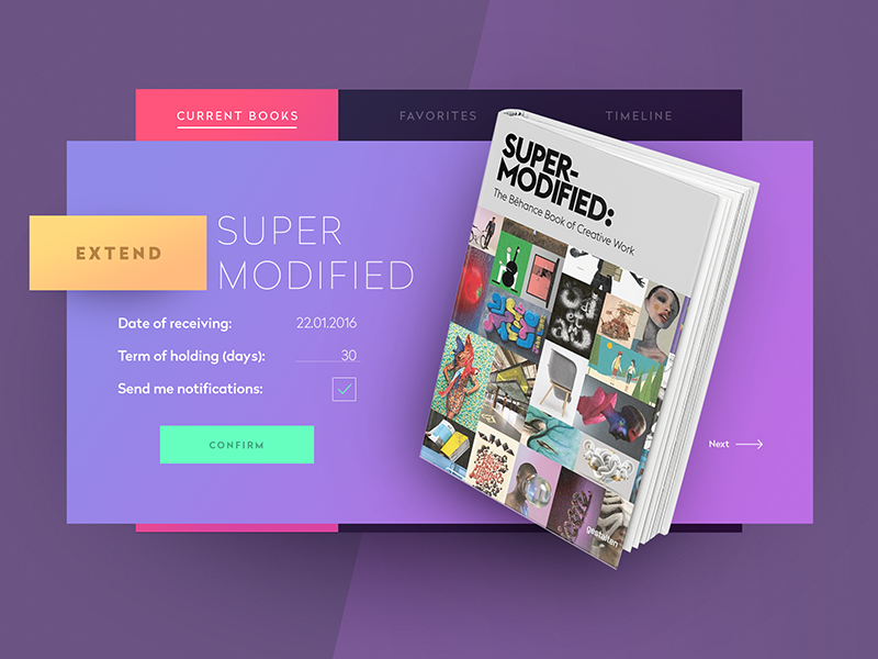
Library Widget
I Want It Fast.
Research from every era of digital product design has arrived at the same finding: users abandon slow products. The threshold of patience is lower than teams want to believe, and it keeps dropping as expectations rise. A page that loaded acceptably three years ago may feel broken today.
Performance optimization belongs in the design conversation, not just the engineering one. Decisions about image formats, animation complexity, data loading patterns, and screen transitions all affect perceived speed—and perceived speed is what users actually experience. A technically fast product that feels slow has failed. A product that manages expectations well while loading—progress indicators, skeleton screens, optimistic UI—can feel fast even when it objectively isn’t.
The discipline is this: every design decision has a performance cost, and that cost is real. Page load time, interaction latency, animation frame rates—these are real design metrics. Build that into the process.
I Want It Updated.
Products that stop evolving start feeling stale. Users notice, even if they never say so explicitly. There’s a particular quality to an interface that hasn’t changed in years—a certain rigidity, a sense that no one is home.
Regular, thoughtful updates send a signal: the team is paying attention. They’re improving things. The product is alive.
Two caveats worth taking seriously. First, updates should improve the product, not just change it. UX iteration driven by data and user feedback creates products that get better over time. Updates driven by internal restlessness or design trends for their own sake often make things worse.
Second, radical redesigns are almost always more disruptive than their authors expect. Users build mental models of how your product works. Overturning those models all at once—no matter how logically justified—triggers genuine frustration. Let users adjust. Respect the relationship they’ve built with what already exists.
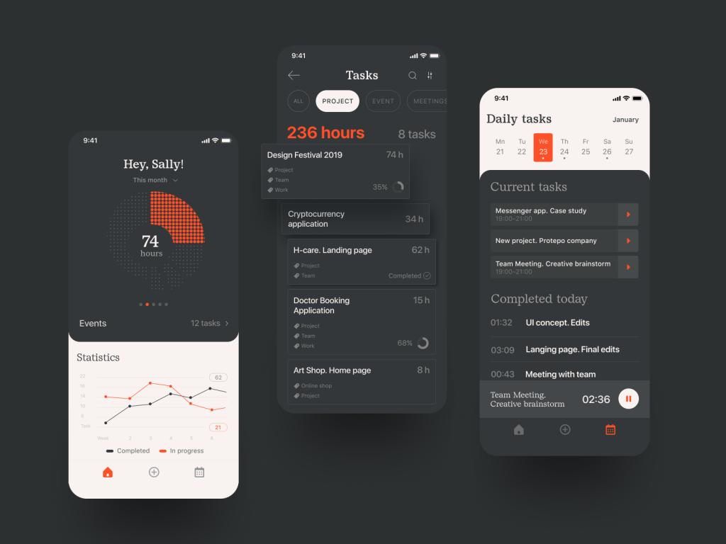
I Want It Nice And Stylish.
Don Norman—add him to the Einstein and Tufte list—made the point that products need to bring joy and beauty into people’s lives, alongside function. This gets dismissed as aesthetics-as-luxury in conversations that should know better.
Visual design does real work. An attractive interface increases perceived usability—this is an empirical finding, replicated across studies. People try harder with beautiful things. They forgive small friction points. They feel better about the experience. And yes, they come back.
More practically: in a world where most products solve similar problems with similar competence, visual identity is frequently what makes one product memorable and another forgettable. The user scrolling through an app store, or clicking through search results, or getting a recommendation from a friend—they’re making a judgment call based partly on how the product looks before they’ve experienced how it works.
UI design trends, typography, color systems, motion design—these are part of what makes an experience feel coherent, trustworthy, and worth returning to. The cover matters. Build it like it matters.
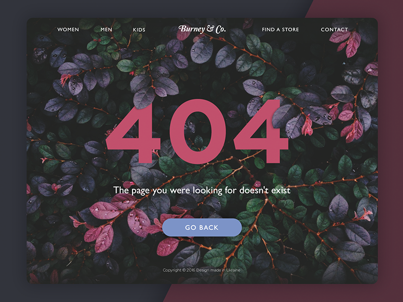
I Want To Have A Choice.
Here’s the argument for minimalism at its most reductive: users want less. Remove everything optional. Simplify to the point of uniformity. One interface to rule them all.
Here’s what’s missing from that argument: the user.
Users are not a single entity with a single preference. They are a population of millions of different people, with different cultural contexts, different aesthetic sensibilities, different technical fluency levels, different accessibility needs, different ideas of what “simple” means. Inclusive design and design diversity exist because this reality is true, and pretending it isn’t produces products that serve a narrow demographic while alienating everyone else.
The push for universal simplification, however well-intentioned, can become a kind of design imperialism—one team’s preferences imposed on everyone else’s experience. The healthiest digital ecosystem is a diverse one. Products that take aesthetic risks, that make bold choices, that serve specific audiences with specific visual languages—these are evidence that design is alive.
Users want to choose a product that feels like it was made for them. That feeling comes from specificity. From a product that has a point of view. From design choices that weren’t arrived at by committee or by trend, but by someone who genuinely thought about what this particular user, in this particular moment, actually needed.
Make that product.
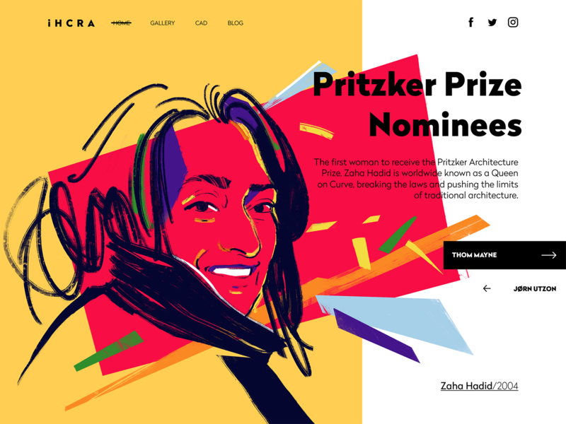
Landing page for an architectural magazine
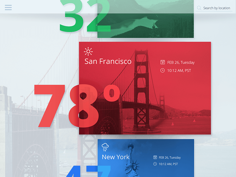
Weather app design
Recommended Reading
Still Here? Good. That means we’re speaking your language. Keep going—here’s more thinking on design, products, and the people who use them:
5 Basic Types of Images for Web Content
How to Make Web Interface Scannable
The Anatomy of a Web Page: Basic Elements
How to Design Effective Search
Web Design: 16 Basic Types of Web Pages
Directional Cues in User Interfaces
Negative Space in Design: Tips and Best Practices
Error Screens and Messages: UX Design Practices