Graphic design sits at a peculiar crossroads. It borrows the rigor of communication theory, the instincts of fine art, and the logic of visual psychology—then collapses them into something a viewer processes in under a second. Every color decision, every typographic weight, every negative space carries an argument.
When that argument lands cleanly, the result can stop someone mid-scroll. When it doesn’t, the work disappears. This collection of fifteen concepts by the Tubik team spans characters, city illustrations, posters, covers, and stickers—and each one has something worth pulling apart.
Character Design: Consistency Across a Cast
Character design for games and apps presents a specific challenge that portrait illustration doesn’t: you’re not designing one person, you’re designing a visual language that needs to hold across an entire cast. Every face, costume, and posture has to read as part of the same world. Tubik’s Wild West set demonstrates this discipline clearly. Sheriff Jimmy Foxx, the Native American elder, and the bandit villain are three completely different personalities—but they share silhouette density, color saturation levels, and a detail-forward approach to storytelling through props.
Jimmy Foxx works because the designer treats the mustache and the star badge as psychological anchors, not decorations. The viewer reads “authority with hidden warmth” before they’ve consciously identified either element. That’s character concept art doing its job: encoding personality into visual shorthand fast enough that a player, mid-game, never has to pause to understand who they’re dealing with.
The bandit takes the same approach in reverse. The golden tooth, the cigarette, the skull embellishments—each detail compounds the threat. What’s notable is the restraint: the designer could have added more, but the silhouette stays readable. Strong character illustration always knows when to stop.

Sheriff Foxx

Indian Dreamcatcher
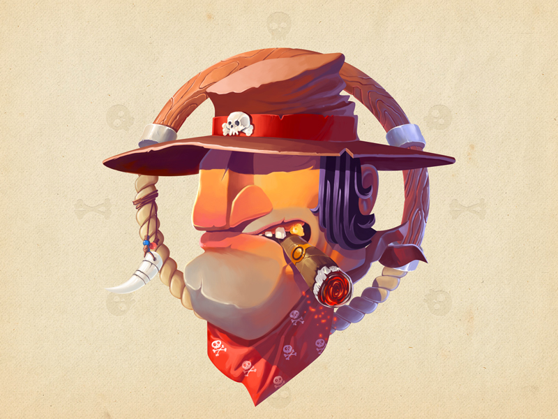
Wild West Bandit
City Illustrations: When Flat Design Carries Mood
There’s a tendency to treat flat design as emotionally neutral—clean, yes, functional, certainly, but not particularly evocative. These city illustration concepts push back on that assumption hard. The Lofoten piece captures something genuinely atmospheric: the Norwegian light, the improbable brightness of the painted buildings against cold water. The postage stamp framing is a clever conceptual move. It codes the image as precious, as worth sending somewhere, which primes the viewer to look at it with a kind of affection.
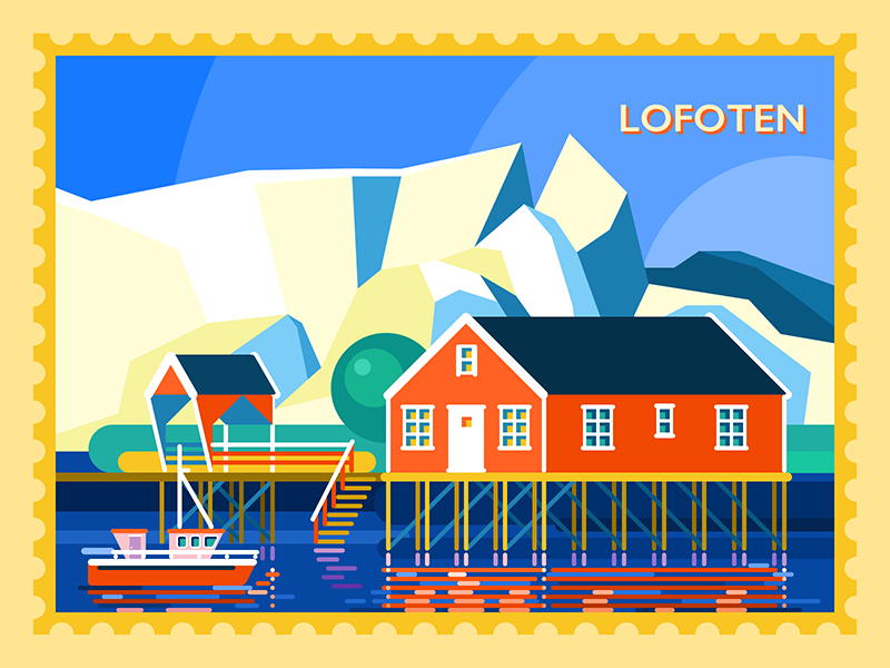
Hallo Lofoten
Rome demands a different solution. The designer leans into a complementary blue-and-yellow palette—a choice that feels almost aggressive until you realize it’s exactly right. Rome itself is a city of extreme contrasts: ancient stone and brilliant sun, shadow and spectacle. The illustration’s visual tension mirrors the place.
Using simple geometric shapes to render landmarks like the Colosseum requires genuine editorial judgment. You can’t include every detail, so you have to decide which shapes are the shapes—the ones that trigger recognition. That’s a form of visual thinking that goes well beyond decoration.
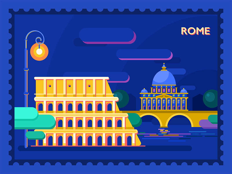
Buongiorno Roma
The Bavaria illustration takes the opposite approach: soft, almost dreamlike. Neuschwanstein Castle rendered in muted tones and spring color palette leans into the castle’s own mythology. A place that already lives in collective imagination as a fairy tale deserves a palette that doesn’t compete with that.
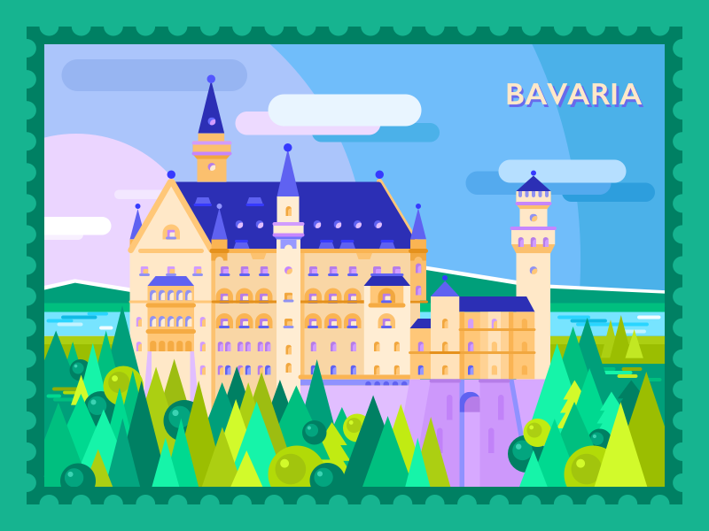
Guten Tag Bavaria
Poster Design: Character as Constraint
Poster design rewards designers who can work within tight constraints and still find original moves. The Rogue One Star Wars concept works by accepting the visual grammar of the source material—dark space, silhouetted heroes, focused gravity—and executing it cleanly rather than subverting it. The characters read as determined without the image tipping into propaganda. That tonal balance in movie poster design is harder than it looks.
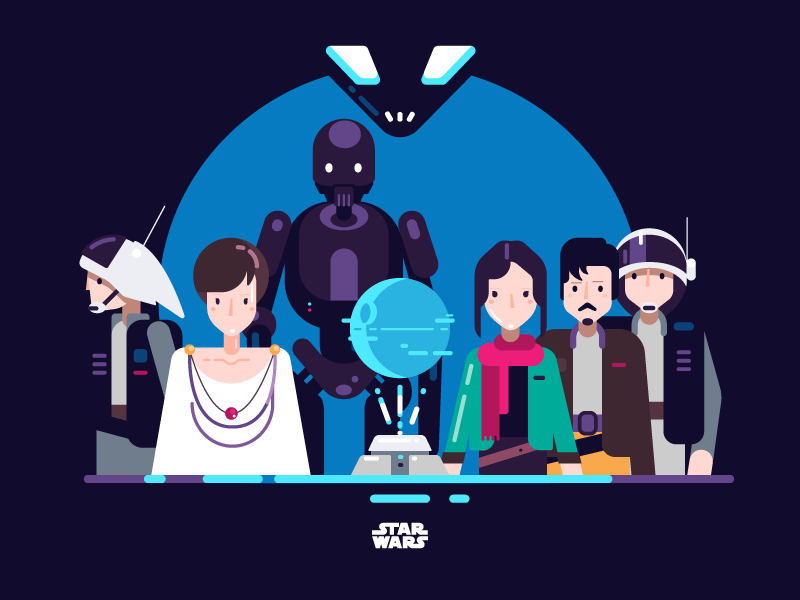
Star Wars Rogue One Illustration
The Pikachu poster is more adventurous. Hiding the character’s body and rendering the silhouette through color alone is the kind of typographic illustration decision that risks not landing—and lands completely. The shadow built from repeated “Pika” text is the sort of idea that, once you see it, you can’t unsee it. It’s playful and structurally clever at the same time. Digital illustration for fan posters often defaults to hyperdetail; this piece goes the opposite direction and wins by doing so.
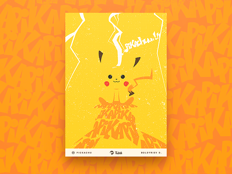
Pikachu Poster
The Joker Suicide Squad poster commits to a different kind of depth. Dark, layered, details hidden in the composition for repeat viewers to discover—this is poster design that understands the audience. DC fans will look twice. Casual viewers get the tonal read they need. Hidden visual elements in poster art function almost like easter eggs: they reward attention without requiring it.
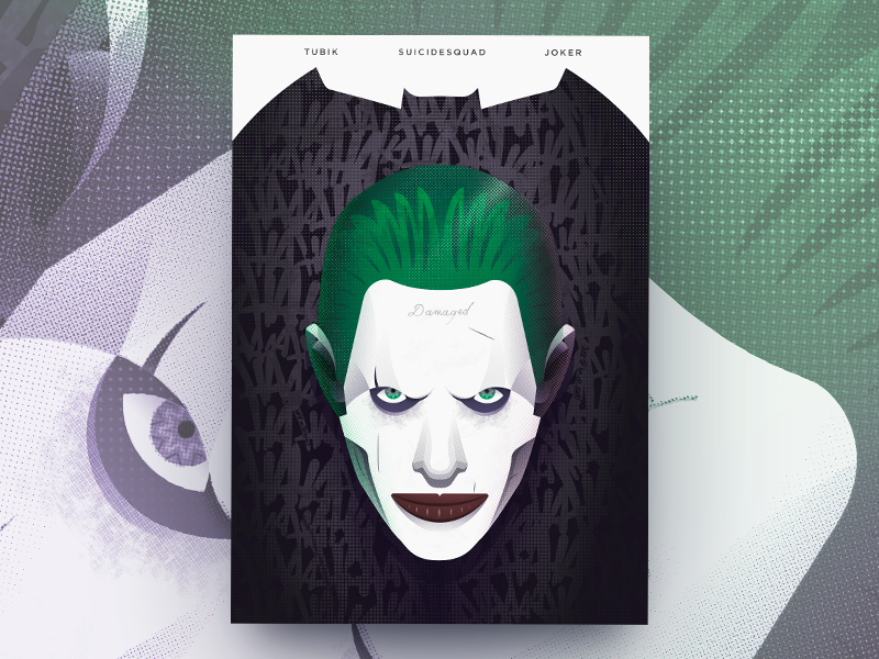
Suicide Squad Poster
Cover Design: One Image, One Argument
A cover has exactly one job: make someone pick up the object. Everything—composition, color, typography, illustration style—either serves that goal or undermines it. The sports-and-business magazine cover manages to be immediately legible and quietly witty. An athlete rendered in graphic elements rather than photography is a deliberate choice; it signals a publication that takes visual ideas seriously, not just content. That choice alone communicates editorial personality.
The F. Scott Fitzgerald cover for Tales of the Jazz Age is the more nuanced of the two. The noise texture and mild color palette create a patina effect—the illustration feels like it has history, which is exactly right for a collection of stories that are themselves artifacts of a specific cultural moment. The figure reads as period-accurate without resorting to pastiche. That’s the difference between illustrated book cover design that references an era and one that inhabits it.
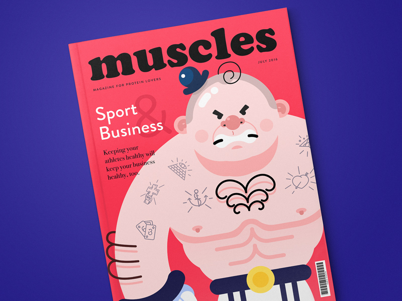
Muscles Magazine
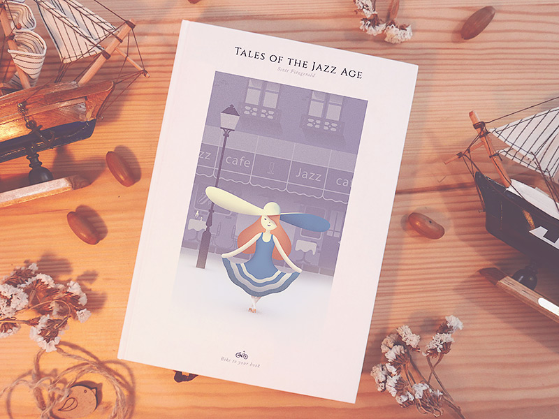
Tales of the Jazz
Stickers: Small Format, Specific Purpose
Stickers are easy to underestimate. They’re small, they’re casual, they live in messenger apps and margins. But sticker design for digital products is genuinely demanding work because every image has to communicate a complete thought at thumbnail size with zero supporting context. The vegetable and fruit set succeeds by treating saturation as the primary tool. Juicy, slightly exaggerated color values make the food feel more real than a photograph would at that scale. The flat design approach removes noise and lets color do all the emotional work.


Healthy Stickers
The Mood Messenger sticker set has a different brief: capture human emotion with enough specificity that a user can find the right face quickly. Detailed facial illustration at small sizes requires typographic thinking—you have to understand which features carry the most emotional information and make them largest. The eyes do more work than the mouth, the mouth more than the brows, and so on. Getting that hierarchy right is the entire job.
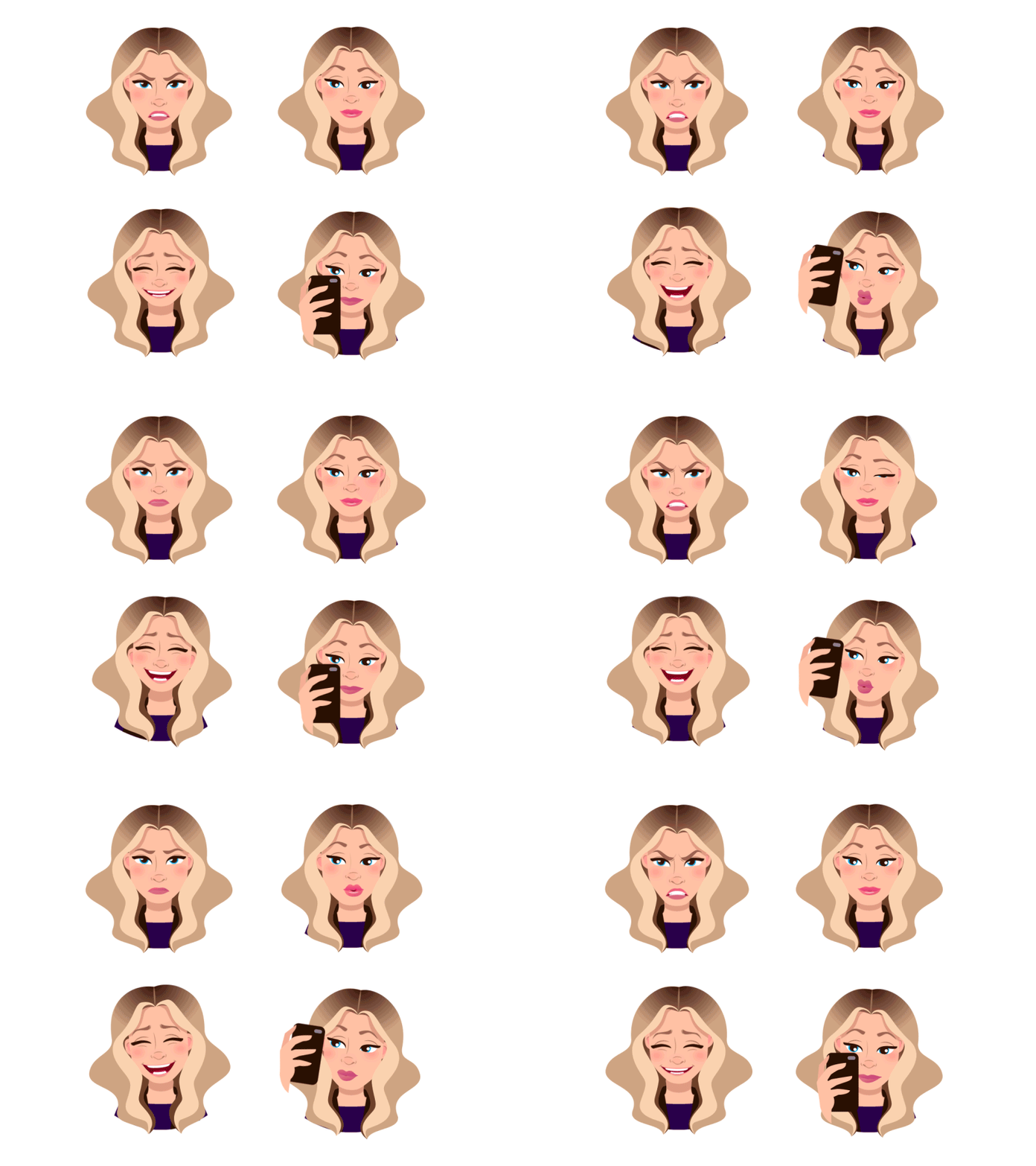
Animated Stickers for Mood Messenger
What these fifteen concepts share, across all their different formats and briefs, is a refusal to treat visual communication as neutral. Each piece takes a position. That’s what separates graphic design that functions from graphic design that resonates—and what makes studying a range of work like this genuinely useful, not just pleasant.
Recommended Reading
Looking for more to dig into? We’ve got you covered! The reading list below will keep you going:
Picturesque Digital Illustrations Inspired by Art of Architecture
Digital Art: Diverse Digital Illustrations Inspired by Wildlife
OK Boomer. Trivia Game Design and Branding
Art of Love: Romantic Illustrations on Love and Affection
Human Medley: 30+ Bright and Stylish People Illustrations
CUBE. Illustration Set for Video Production Company
Real Bitcoin. Creating Website Illustrations
Art of Seasons: 30+ Bright Illustrations Inspired by Nature
45 Inspiring Illustrations About Workspaces, Creativity, and Art
PackYak. Mascot Design for Shipping Service