Every photo on a page is doing a job, whether or not anyone designed it to. The right one carries conversion rate, brand tone, and the emotional temperature of an entire screen, often before a visitor has read a single word of copy. Get it wrong, and the rest of the layout spends the whole session compensating for it.
We spend more hours than we would like to admit hunting for the right shot. Because in interface design, photography is never sitting next to the real work. It is the real work, doing the same job as the typography, the button placement, and the negative space around it.
Below are the seven things we ask a photo to do before it earns a spot on the page. Let’s dive in.
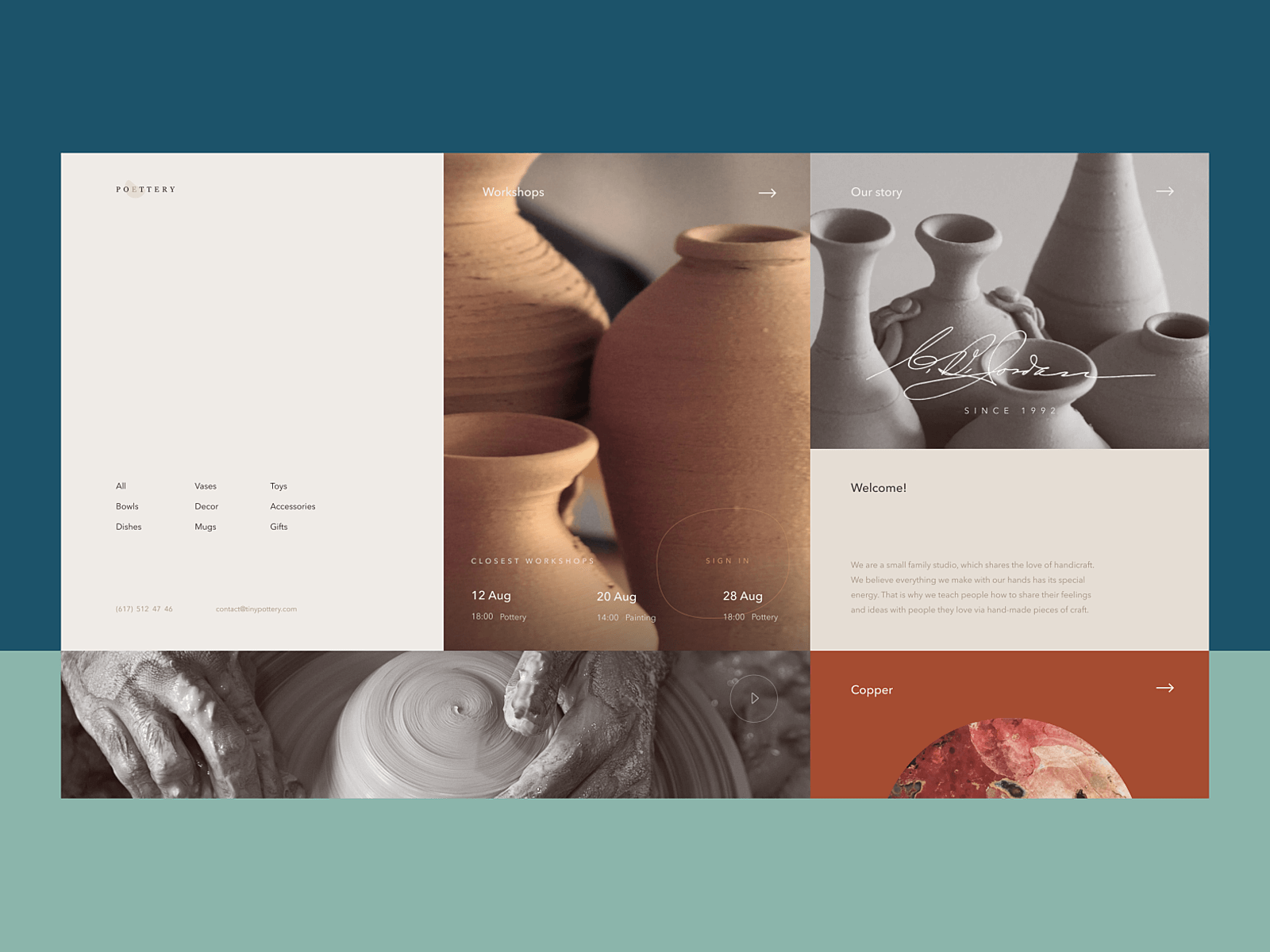
Pottery website design
The Photo Has to Sell the Thing
E-commerce runs on one unforgiving rule: you get what you see. A shopper cannot lift the fabric, check the stitching, or feel how heavy a mug actually is, so the photo becomes the entire pitch. Swap a flat product shot for one on a model and watch the add-to-cart number move. We see it often enough that it has stopped surprising us.
Originality and consistency do more for a brand than either one does alone. Regular shoots, a defined visual style, and photography guidelines that everyone actually follows turn a product catalog into something recognizable, rather than a feed that could belong to anyone. Some brands go candid and lifestyle-driven, others go clean and studio-lit, and a few build out a whole visual world around the product. The style matters less than the discipline of keeping it the same across the product page, the email campaign, and the ad that runs three months from now. Visitors recognize brands the way they recognize handwriting: by pattern, not by logo.
Multiple angles help. Context helps more. Clothing on a model sells better than clothing on a hanger, because the eye fills in fit and drape automatically once there is a body in the frame. A toy in a kid’s hands, a backpack mid-hike, dishes on a set table—these let a shopper imagine ownership instead of just reading a spec sheet. The work that performs best usually pairs a clean, distraction-free object shot with a lifestyle shot beside it: one for clarity, one for aspiration. The same logic applies to services, where the photo has to translate something intangible into something a visitor can picture themselves doing.
Portfolio sites carry the same pressure, compressed into a few seconds. Attention online is short and unsentimental, so the work has to land on first scroll. A weak hero image at the top of a strong portfolio can undercut everything beneath it before a visitor scrolls far enough to find out it was worth their time.
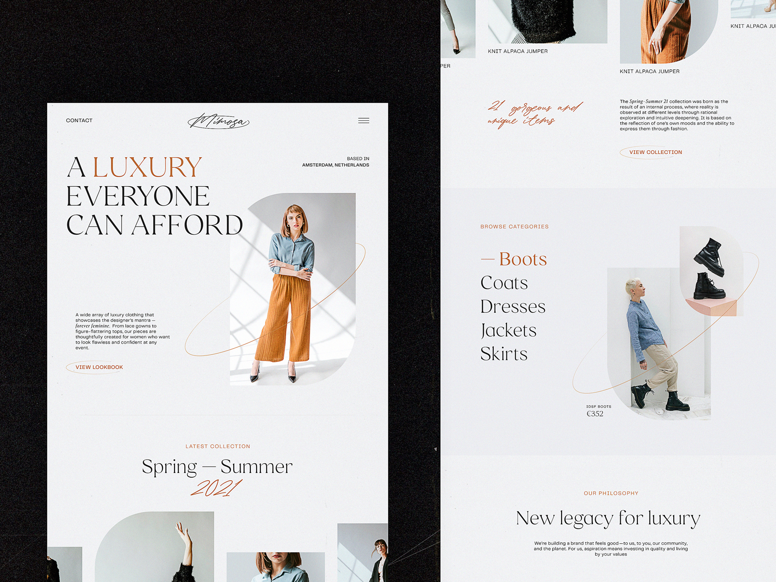
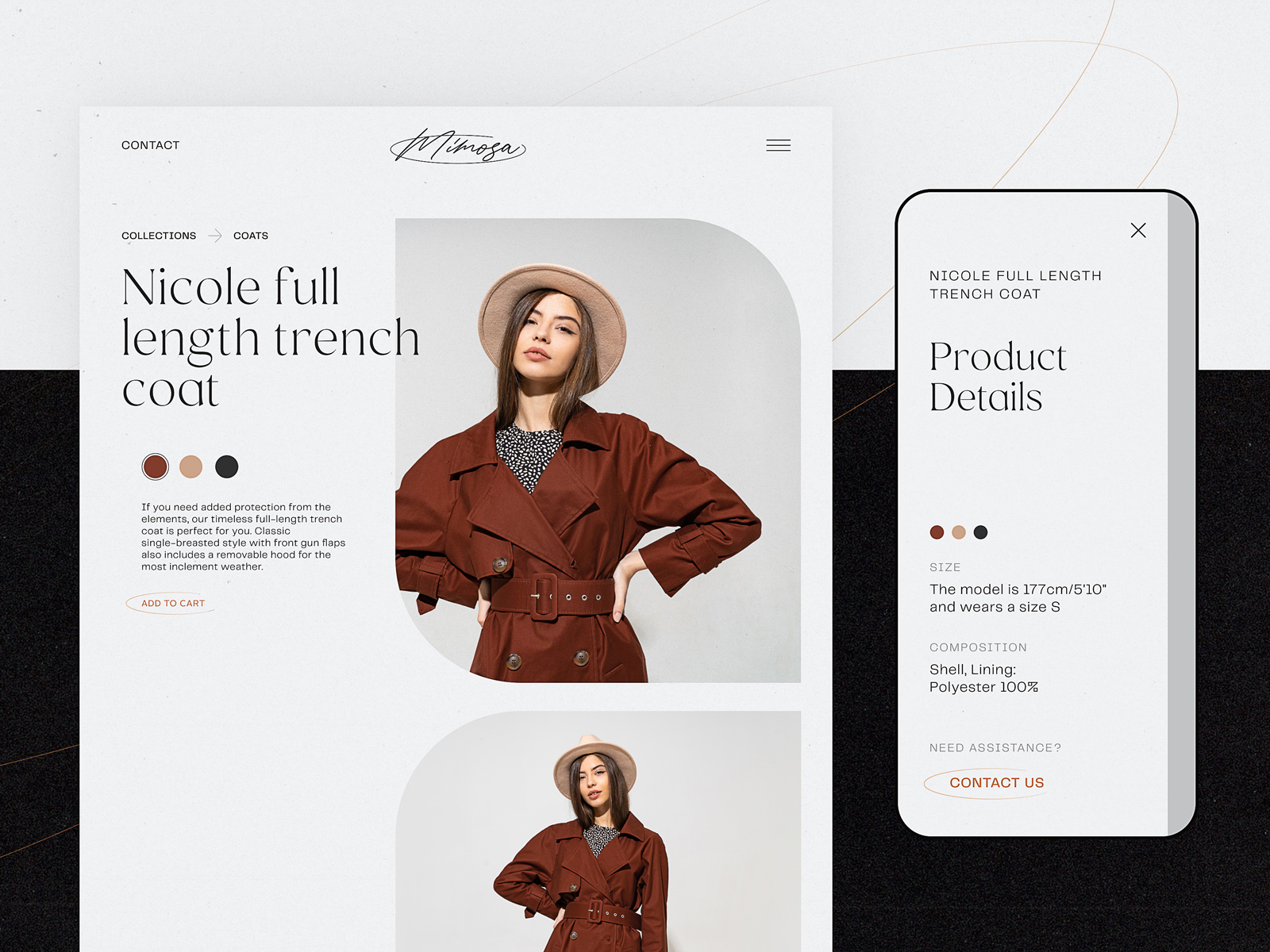
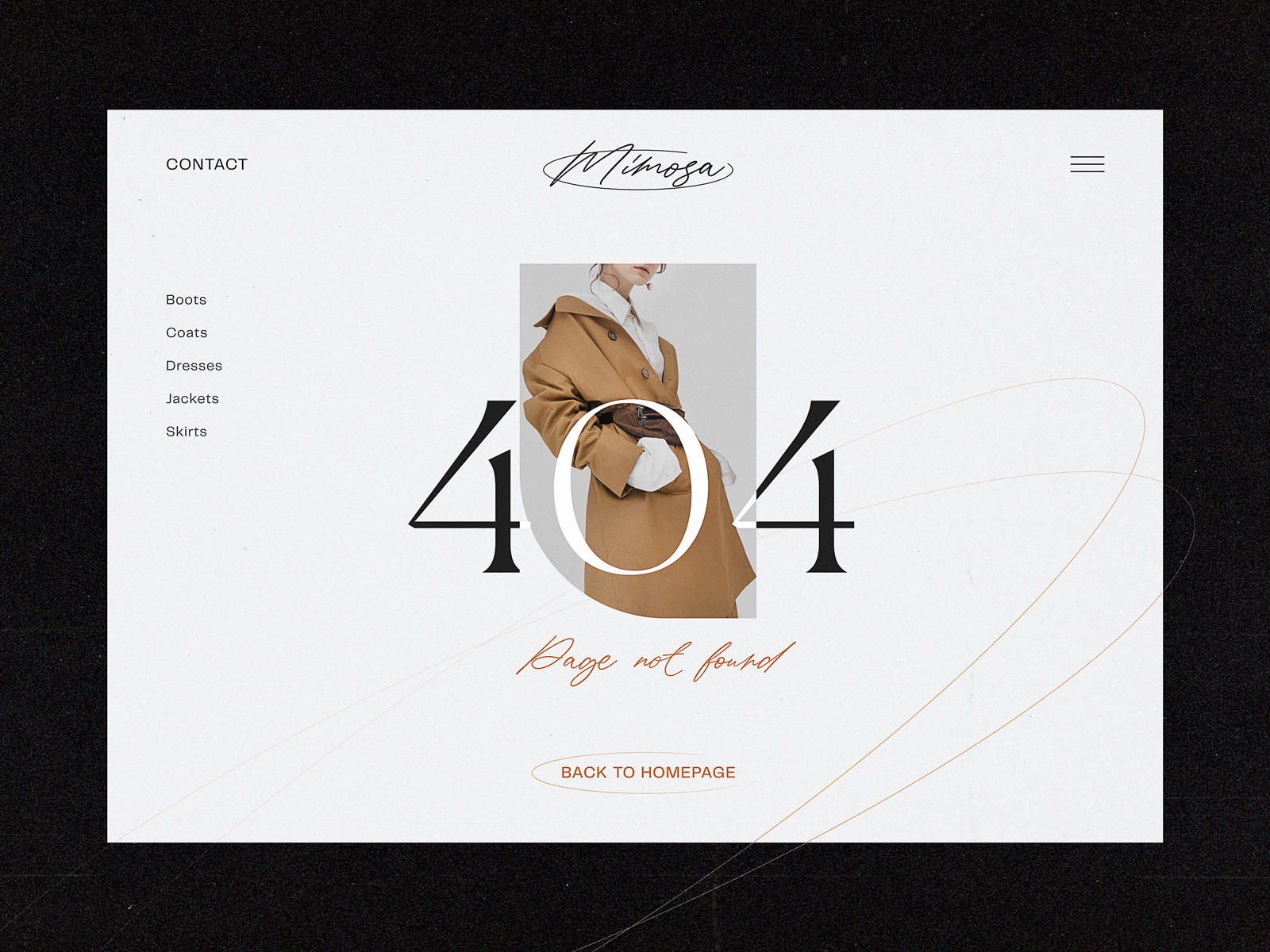
A consistent approach to a visual photo presentation of the items on the e-commerce website for a fashion brand
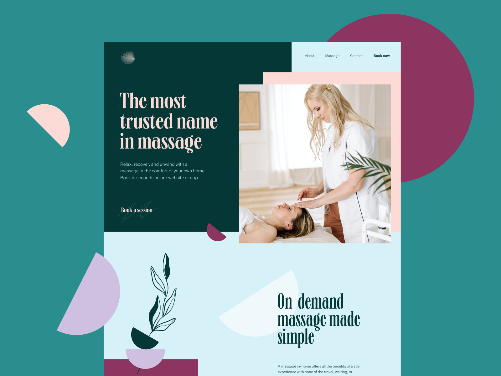
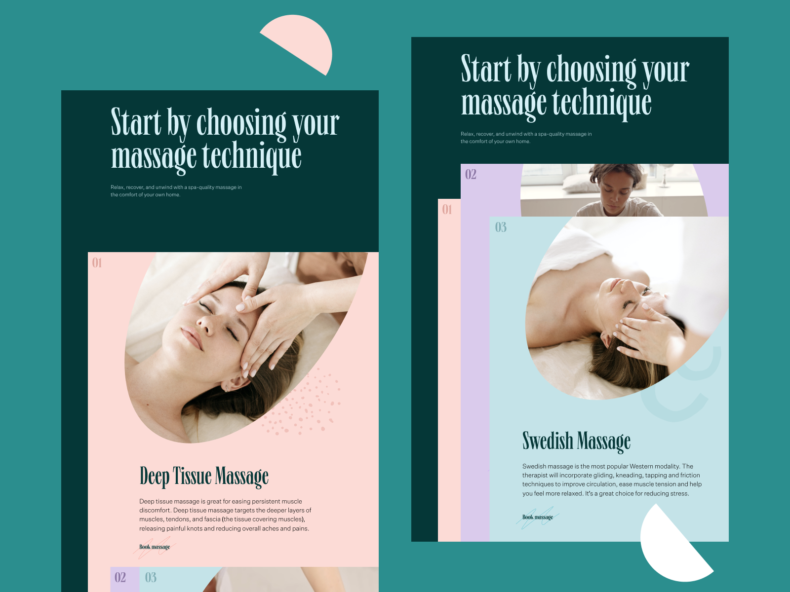
Website for a massage services company
Creative approach to using photo content for not only setting a visual connection to the provided services of a cleaning company but also as a part of scroll animation
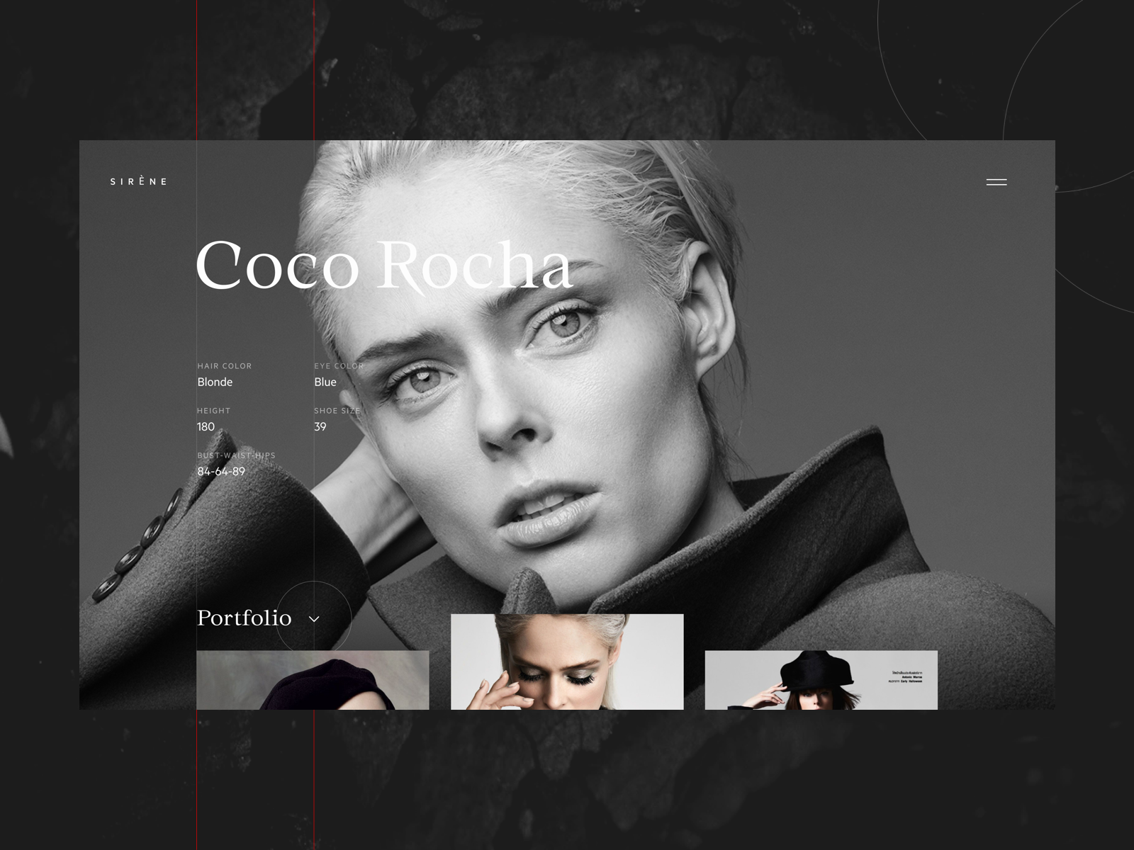
Fashion models portfolio website
MYWONY wedding dresses brand website
Mood Arrives Before the Headline Does
A good photo can put a visitor in a particular emotional state before they have consciously processed anything else on the page. That is the entire reason hero photography gets so much attention from designers: it sets the register for the page that follows, and it does it before logic has a chance to weigh in.
Full-bleed background photography has become a genuine UI trend for the same reason, and the appeal is obvious. A photo stretched edge to edge gives a screen a sense of atmosphere a flat color block cannot fake. The tradeoff is also obvious: legibility becomes a constant negotiation. A gorgeous background image with text nobody can read is an obstacle wearing a nice outfit. Gradient overlays, scrims, and a willingness to leave enough negative space around the type are the usual fix, and they only work if someone is checking contrast ratios instead of just admiring the mood board.
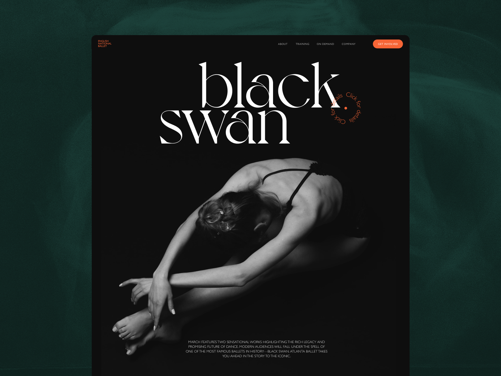
Home page for the ballet company website concept
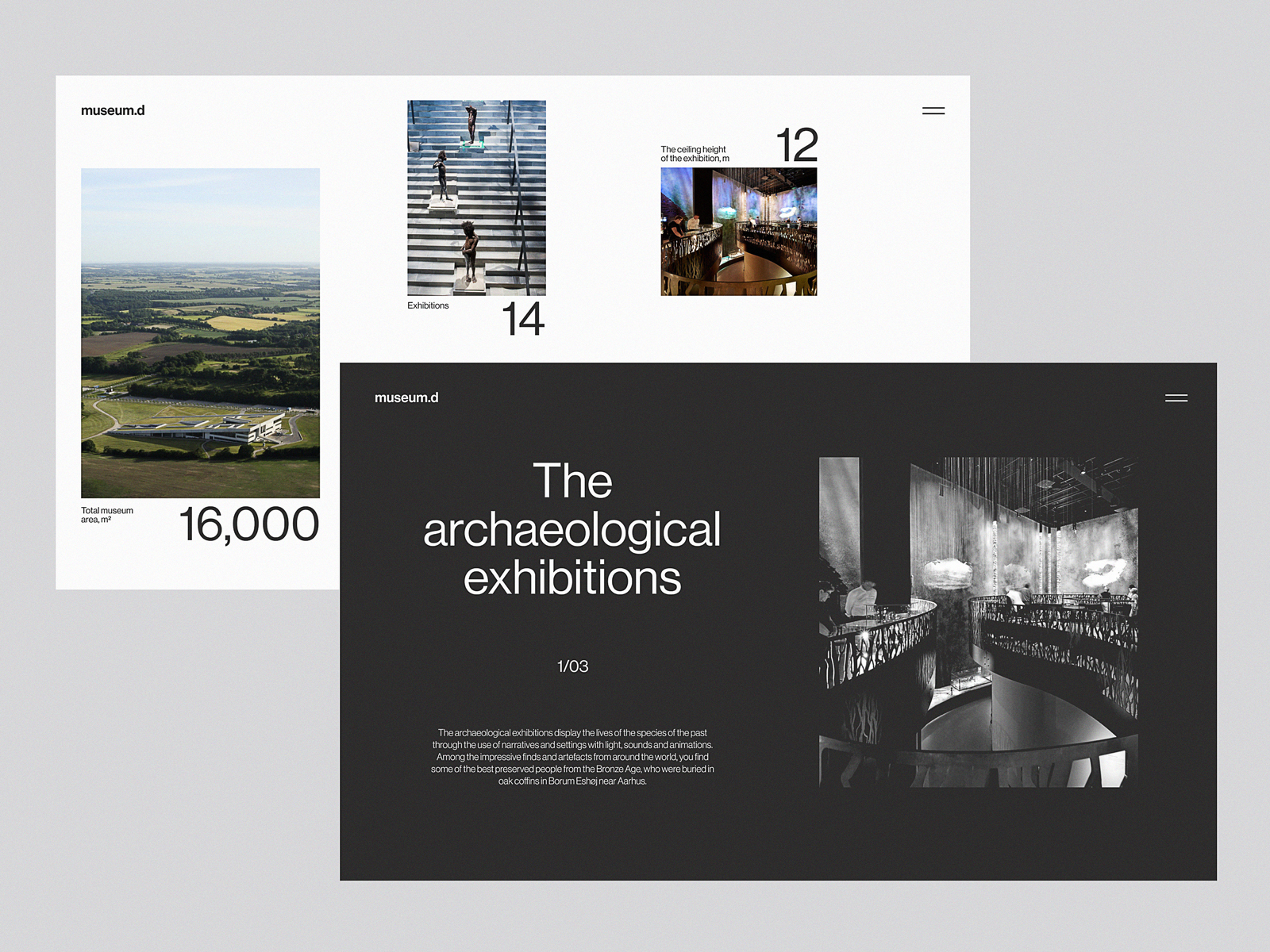
Website design concept inspired by Moesgaard Museum
Website design concept inspired by Moesgaard Museum: the home page features an atmospheric full-screen background photo.
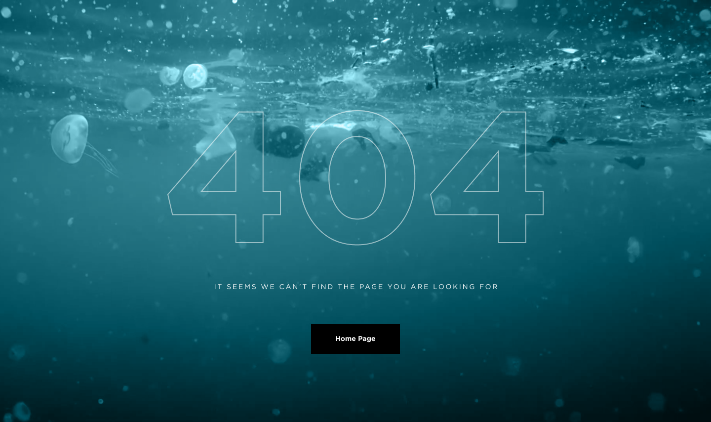
The impressive 404 error page for the website devoted to saving the oceans features the impressive full-screen background photo, instantly communicating the problem to the visitor.
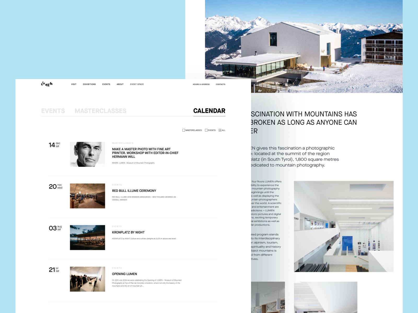
Lumen Museum website pages
Faces Build Trust Faster Than Copy Does
People notice other people before they notice almost anything else on a page. A face draws the eye faster than a graphic, and a real human photo builds trust in a way an icon set never quite manages. Team photos, founder portraits, support staff, customer testimonials with an actual person attached—these are all doing the same quiet work: turning a brand from a wordmark into a group of people someone might trust with their card details.
This matters even more for anything intangible, like software or a service. A real photo of the support team on a contact page does more for credibility than another paragraph about how much the company cares. Authenticity beats polish here too. The laughing-at-a-laptop genre of corporate stock photography has become a punchline in design circles for a reason, and visitors are getting faster at spotting it.
Nonconventional Show interview podcast website
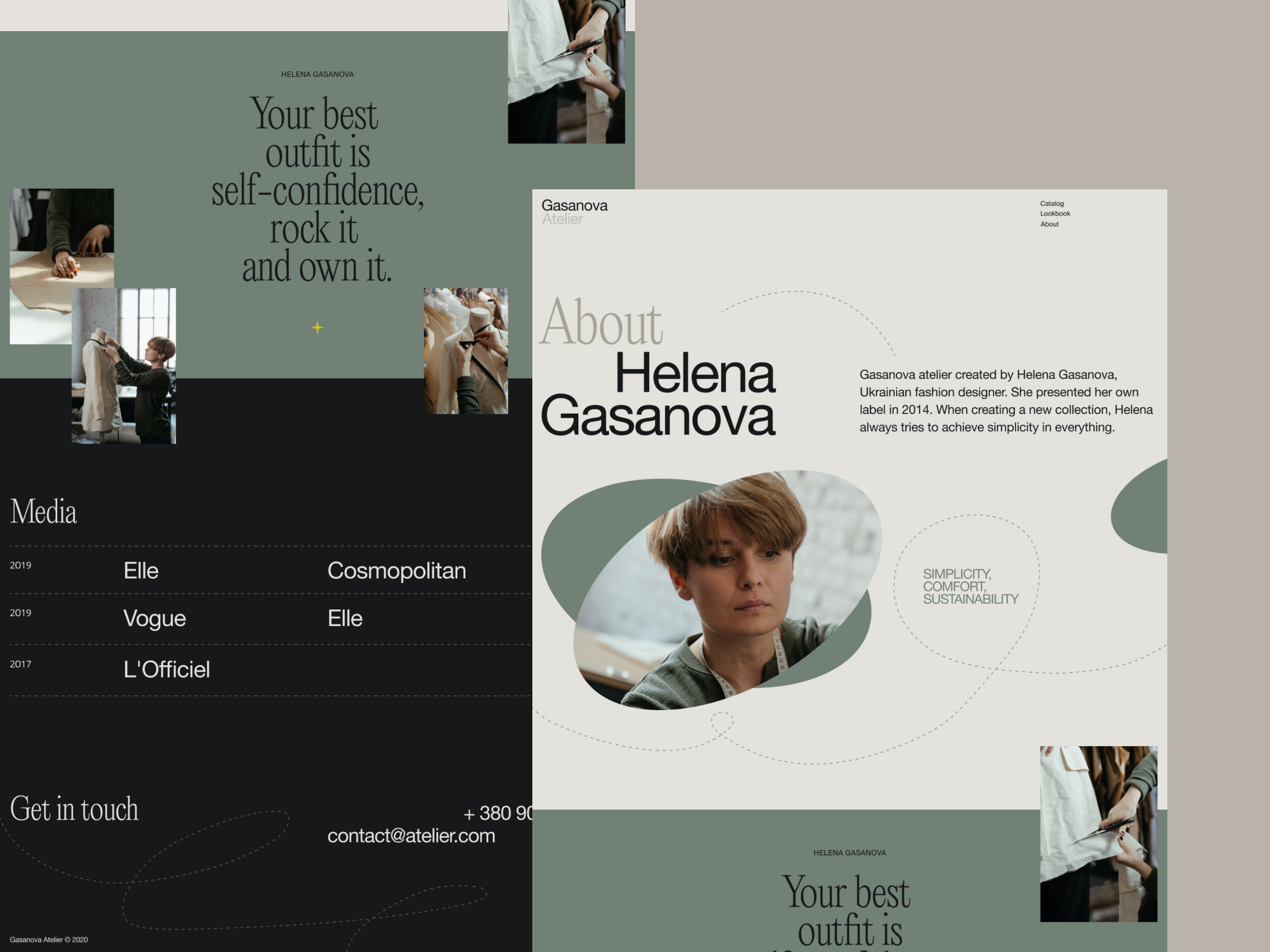
Website of a fashion designer brand
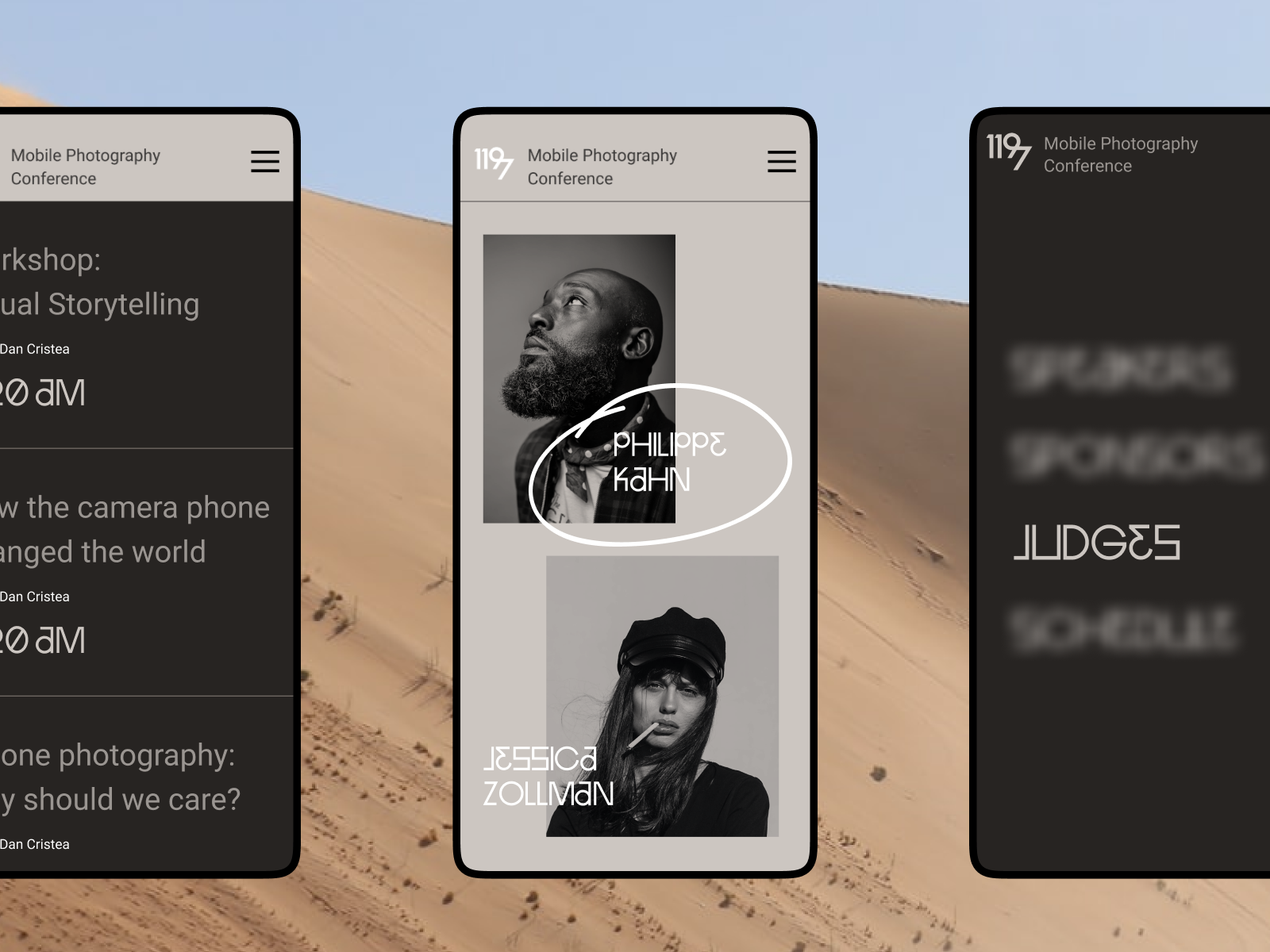
Design concept for a website of a photography contest
Website design for Mayple, a fully-managed marketing services marketplace designed to help businesses work with the experts.
A Photo Can Point Without Saying a Word
A directional cue is a visual signpost, doing in pixels what a road sign does on a highway. Done well, it:
- improves scannability
- reinforces visual hierarchy
- guides navigation toward the action you actually want taken
- lifts conversion on the call to action sitting nearby
Photography can carry this weight as well as an arrow icon, sometimes better, because it reads as a suggestion rather than an instruction. A person in a photo glancing toward a signup button pulls the visitor’s eye there without a single line of layout code dedicated to the job. A pointing gesture does the same thing dressed differently. It is eye-tracking psychology hiding inside what looks like an ordinary lifestyle shot, and it remains one of the cheapest tools in the whole conversion toolkit.
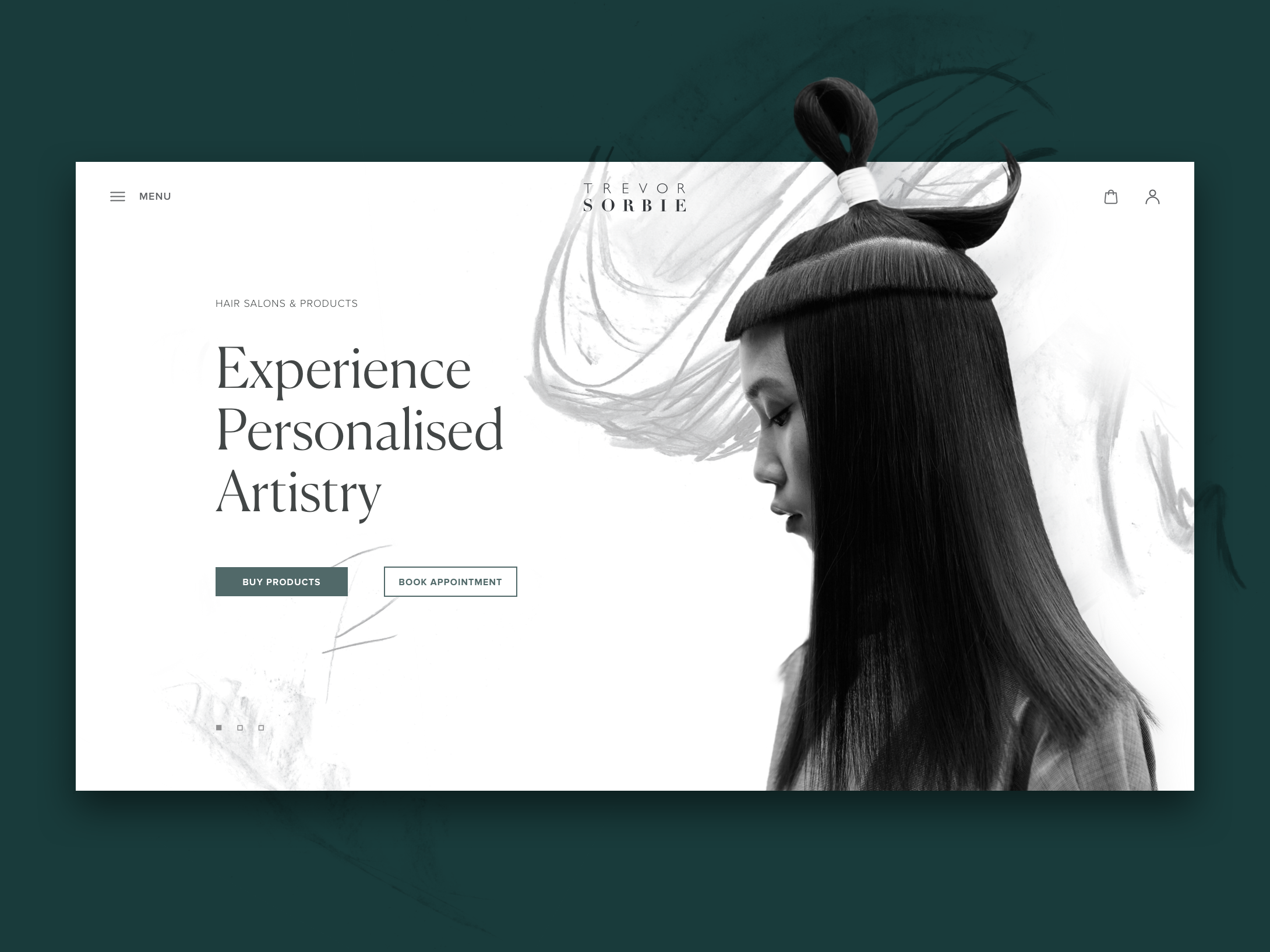
The hair beauty company website uses a hero image on the home page that works as a directional cue: the model’s eyes attract your attention to the zone of CTA elements.
Some Instructions Only Work as Pictures
Instructional content lives or dies on photography. Recipes, assembly guides, tutorials, anything asking a reader to replicate a physical action benefits from photos that ground the text in the real, physical world. Try explaining how to fold a fitted sheet using only words, then watch how fast the comments fill with confusion. Three clear photos solve the same problem in seconds.
This is content design as much as it is photography, and treating it as one without the other tends to show. Each image in a sequence should show a distinct, useful state of the process, not a vague mood shot that loosely relates to the topic. A good tutorial treats its photos as functional UI elements, on the same level as the numbered steps or the timer sitting next to them.
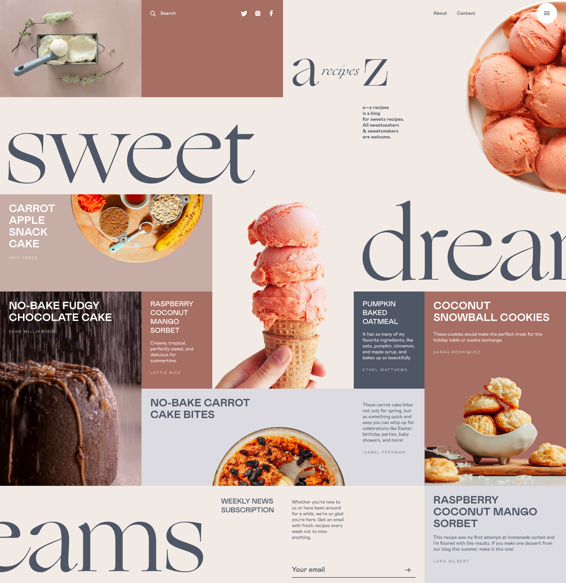
Dessert recipes blog
An Image Earns Its Spot or It Doesn’t Belong
Editorial photography only works when it adds context. The rule we hold to most: never use a photo as filler. Both the title image and anything inside the article body need to clarify or deepen the piece, not compete with the text for attention while contributing nothing.
Relevance decides whether that happens. A historical feature deserves archival photography, not a generic stock photo of vaguely old-looking people. A piece about a specific neighborhood deserves a photo actually taken there, not a similar-looking street somewhere else entirely. Readers notice the gap, even when they cannot name what felt off, and a mismatched stock photo can drain credibility from an otherwise well-reported piece.
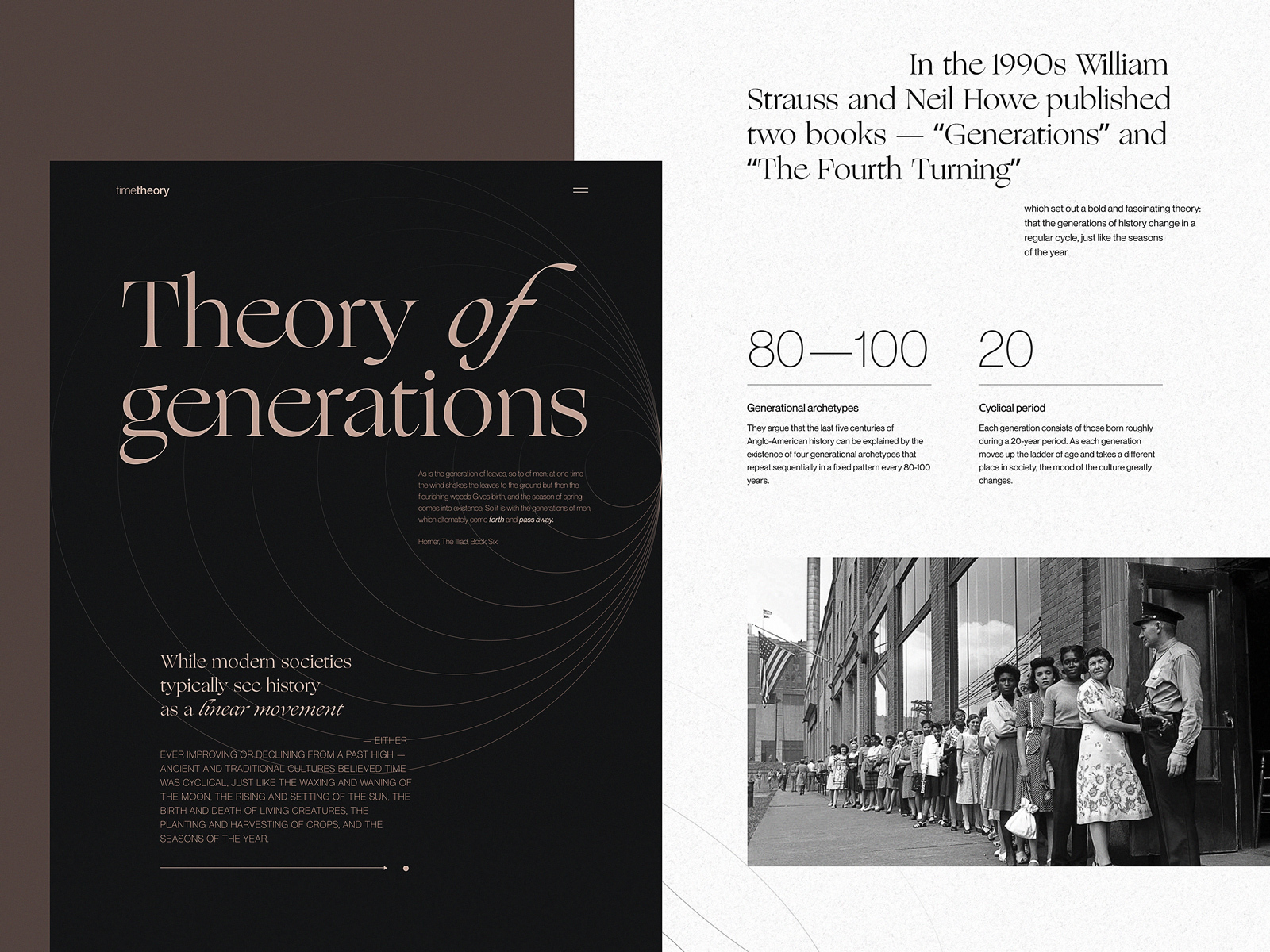
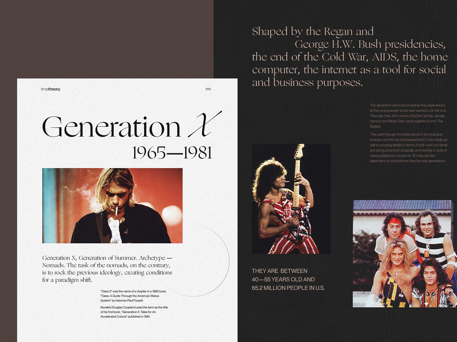
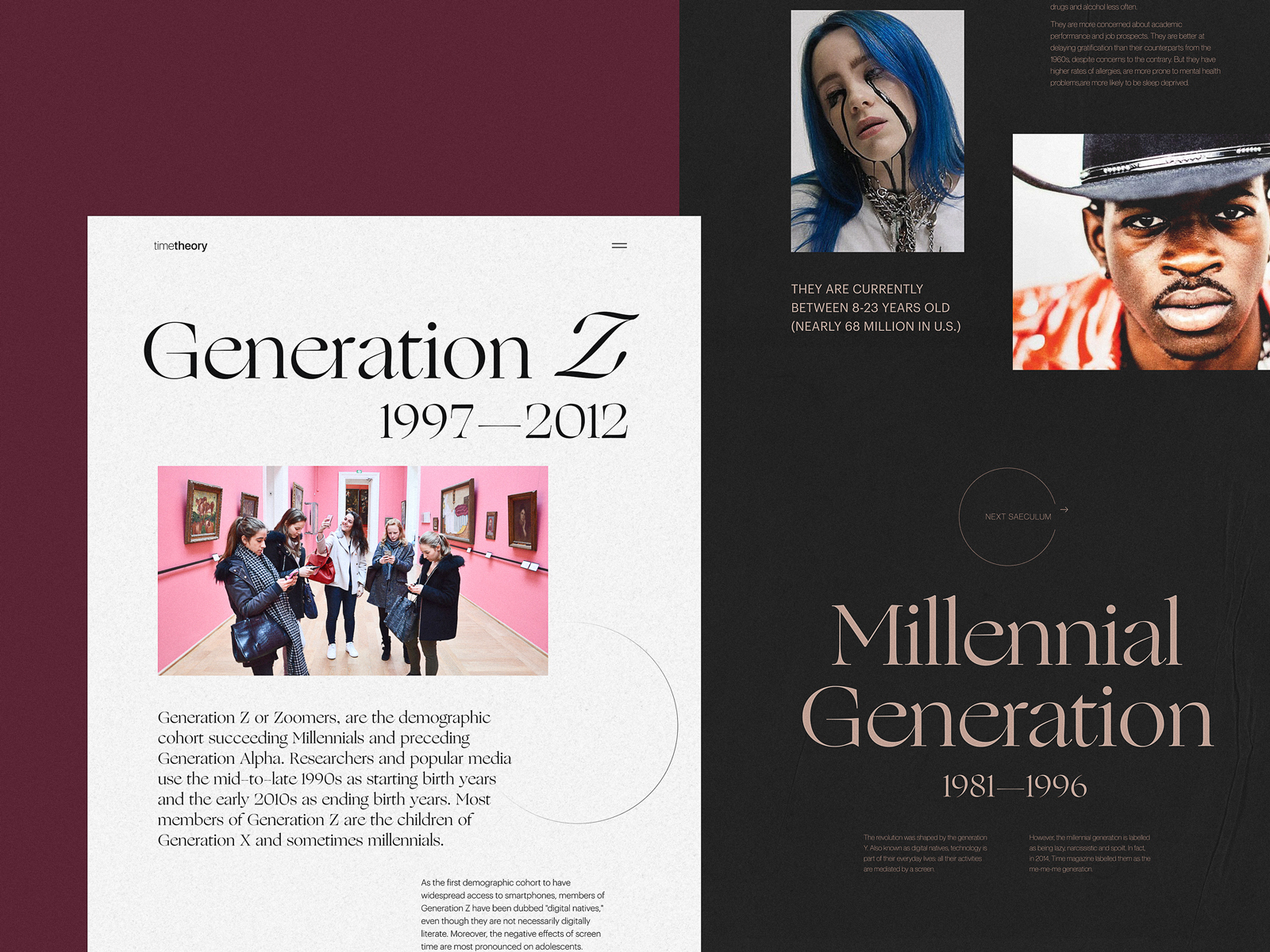
Online editorial about different generations
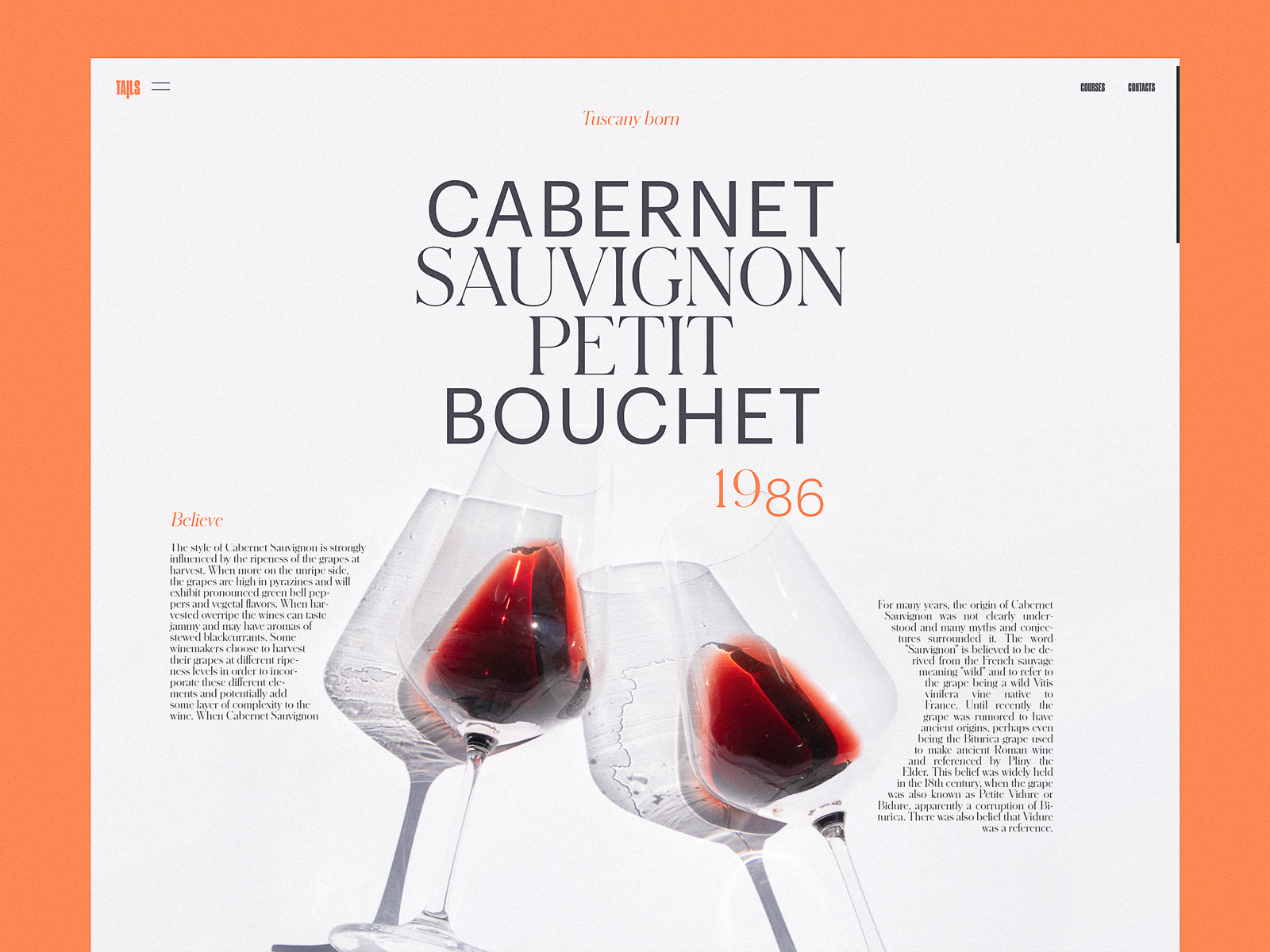
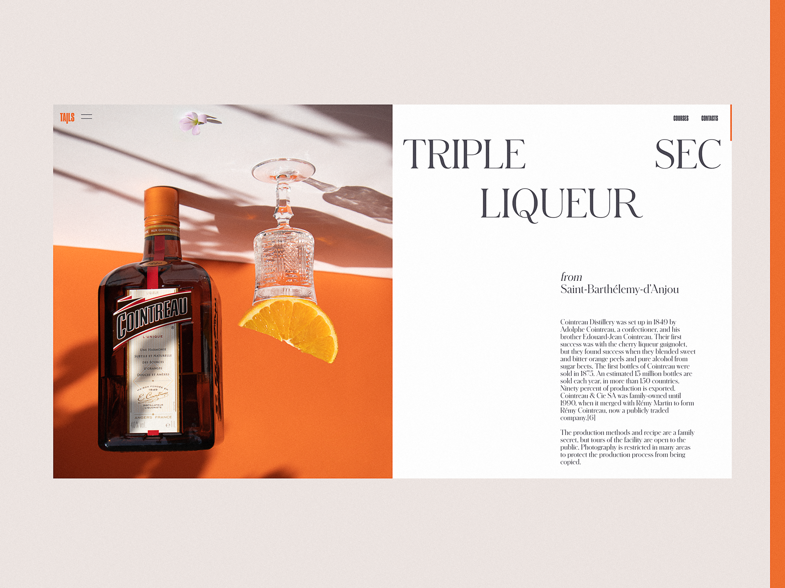
Bartending encyclopedia website
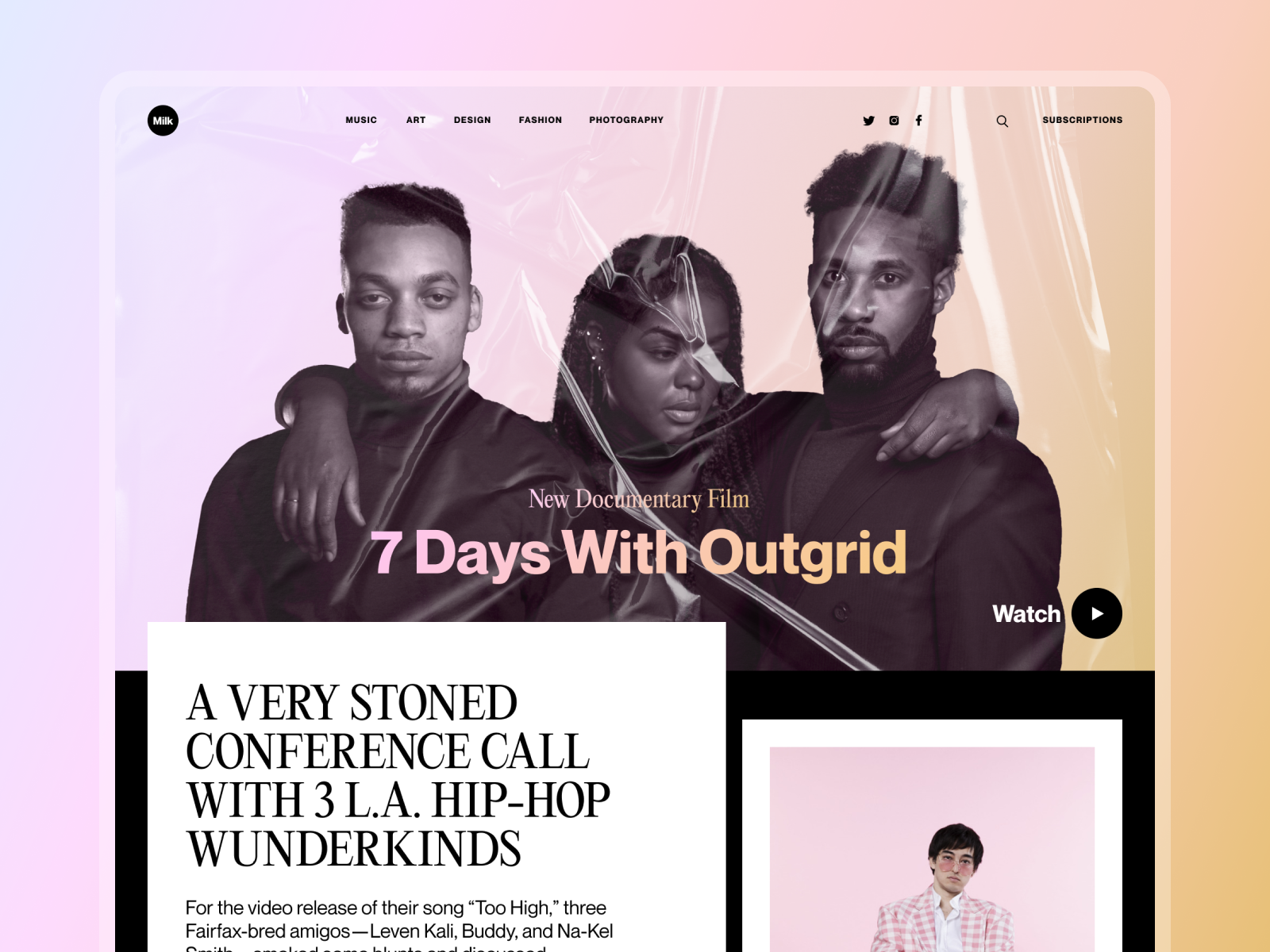
Web design concept for an online magazine
Logic Gets People to the Page. Feeling Gets Them to Click.
Images get processed faster than text, which means a photo can set mood and association before a visitor consciously reads anything. That emotional layer sits underneath every rational argument a page makes, shaping how persuasive it feels even when nobody could explain why.
The right photo, placed at the right point in a user journey, shifts how someone feels about a decision in a way copy alone struggles to match. It is the invisible infrastructure behind a lot of high-converting pages: warm, human, well-placed photography doing the persuading while the headline collects the credit.
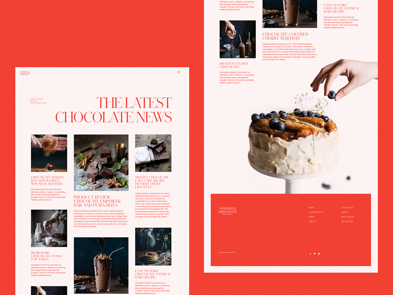
Confectionery website design setting strong emotional appeal
Online editorial about the history and development of skateboarding
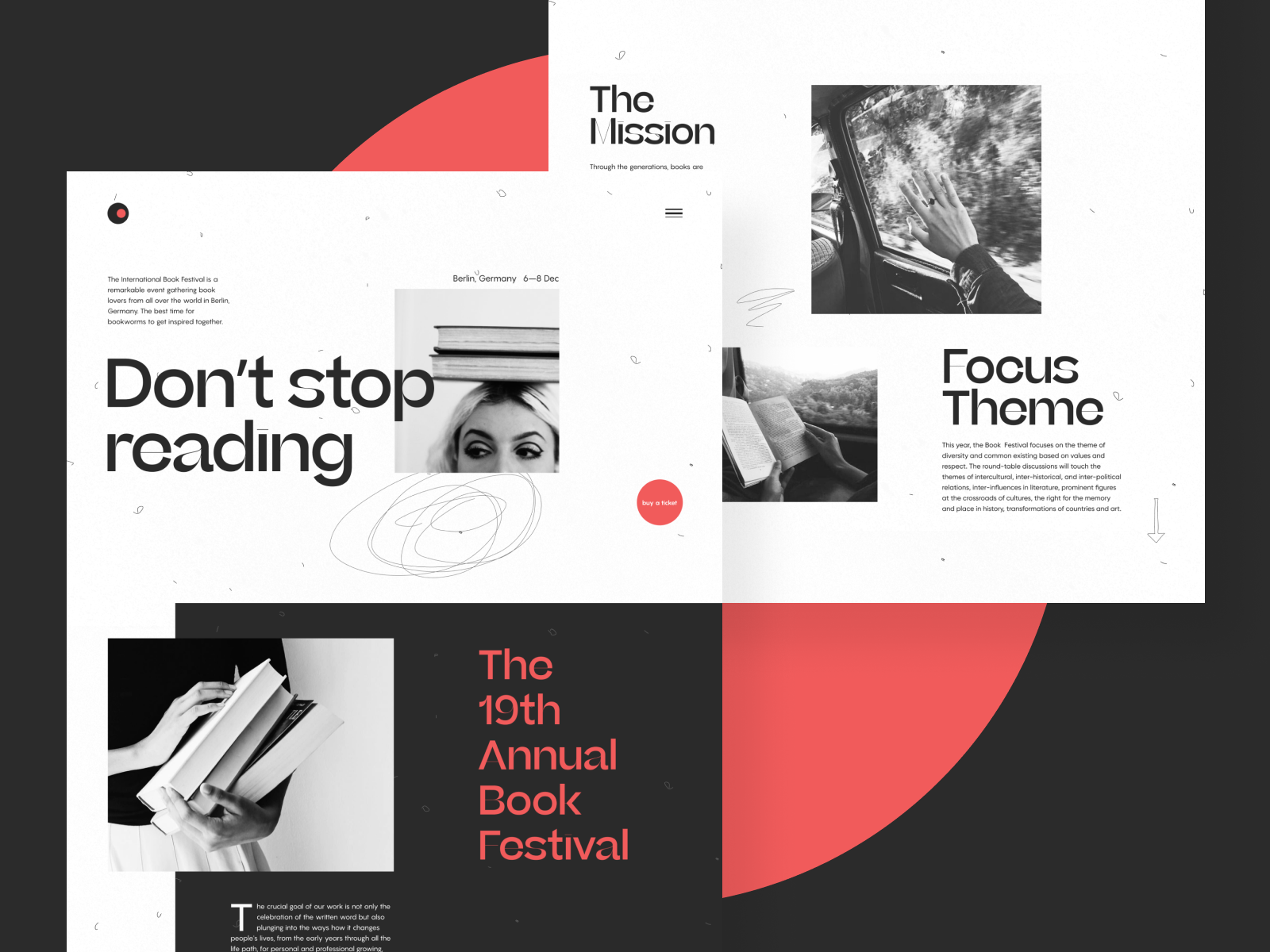
Book festival website
Why Photography Still Wins
Photos connect a screen to the physical world in a way illustration and 3D renders, however fashionable, do not quite replicate. Photography predates the internet by well over a century, which gives it a kind of legibility most people process without effort, and everyone now carries a camera in their pocket, which only deepens the fluency. It is one of the few visual languages a designer can use and trust that the entire audience already speaks it.
Photography also functions as art, which means a studio gets to dial the balance between realism and style depending on the brand sitting in front of them. Editorial sites and blogs lean on this constantly, using photos that feel grounded in reality while still carrying a clear point of view.
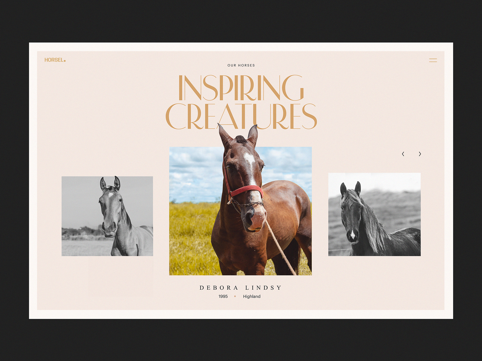
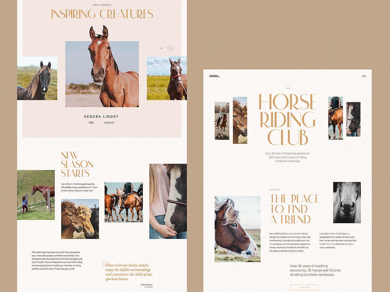
Website design for a horse-riding club
A Few Rules We Don’t Bend On
- Source high-resolution files. Pixelation reads as unprofessional immediately, no exceptions.
- Compress and optimize for web and mobile. Load speed affects user experience and search ranking both.
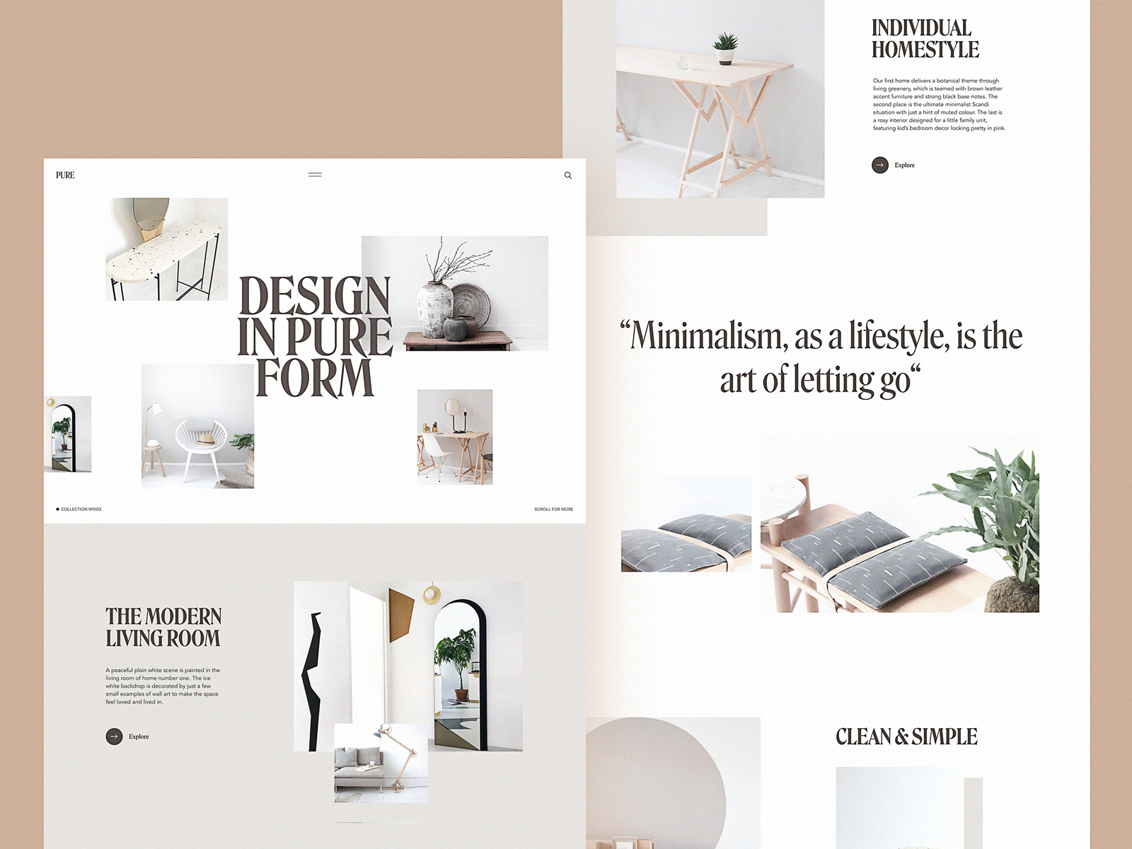
- Give images room to breathe. Negative space around a photo is doing work, not going to waste.
- Check every image across screen sizes. A hero shot that looks perfect on desktop can crop into nonsense on mobile.
- Make every photo communicate something. If it cannot, it does not belong on the page.
Where We Actually Source Photos
Three real paths exist, and each comes with a tradeoff attached.
Original production gives the highest exclusivity and the tightest brand alignment, at the highest cost in time and budget. Worth it for the assets that carry the brand long-term.
Paid stock photography moves faster and costs less than a custom shoot, though finding the exact right frame can still eat an afternoon.
Free stock photography costs nothing, which is the appeal and the risk in equal measure. Other brands have access to the same library, so standing out takes extra work in cropping, color grading, or pairing the image with something original enough to disguise where it came from.
A few libraries we go back to:
- Unsplash. A curated community of photographers sharing free work, with editorial standards that keep the noise out
- Pexels. A large free library spanning nearly every topic worth shooting
- Pixabay. Free photos alongside illustrations and vector graphics in one search
- Shutterstock. A large paid library covering almost any niche a brief could ask for
- Depositphotos. Another sizable paid library, particularly strong for business and marketing use
The choice between these depends on budget, timeline, and how much the project actually rides on the image. A nonprofit blog post and a flagship product launch are not solving the same problem, and matching the sourcing strategy to the real stakes of the work saves both money and time better spent elsewhere.
We treat photo selection with the same weight we give typography or color, because on a scroll-driven, attention-starved web, the image is usually the first thing seen and the last thing forgiven if it does nothing. Make it work as hard as everything else on the page.
Recommended Reading
Liked this one? Good. We write more of these than is probably reasonable. Other Tubik Studio case studies and design think pieces are right this way:
Web Design: 5 Basic Types of Images for Web Content
The Anatomy of a Web Page: 14 Basic Elements
Functional Art: 10 Big Reasons to Apply Illustrations in UI Design
UX Design: How to Make Web Interface Scannable
Negative Space in Design: Tips and Best Practices
Single-Page Website: Best Design Practices