Most coffee packaging design leans on beans, steam, and a serif font that thinks it’s whispering “artisanal.” Gofe skipped that whole playbook. The Tubik Studio team—designers Maryna Solomennykova and Arthur Avakyan, with art direction from Vlad Radionov—built a brand around a stranger idea: what if the mascot did more work than the logo?
The Logo Nobody Notices First
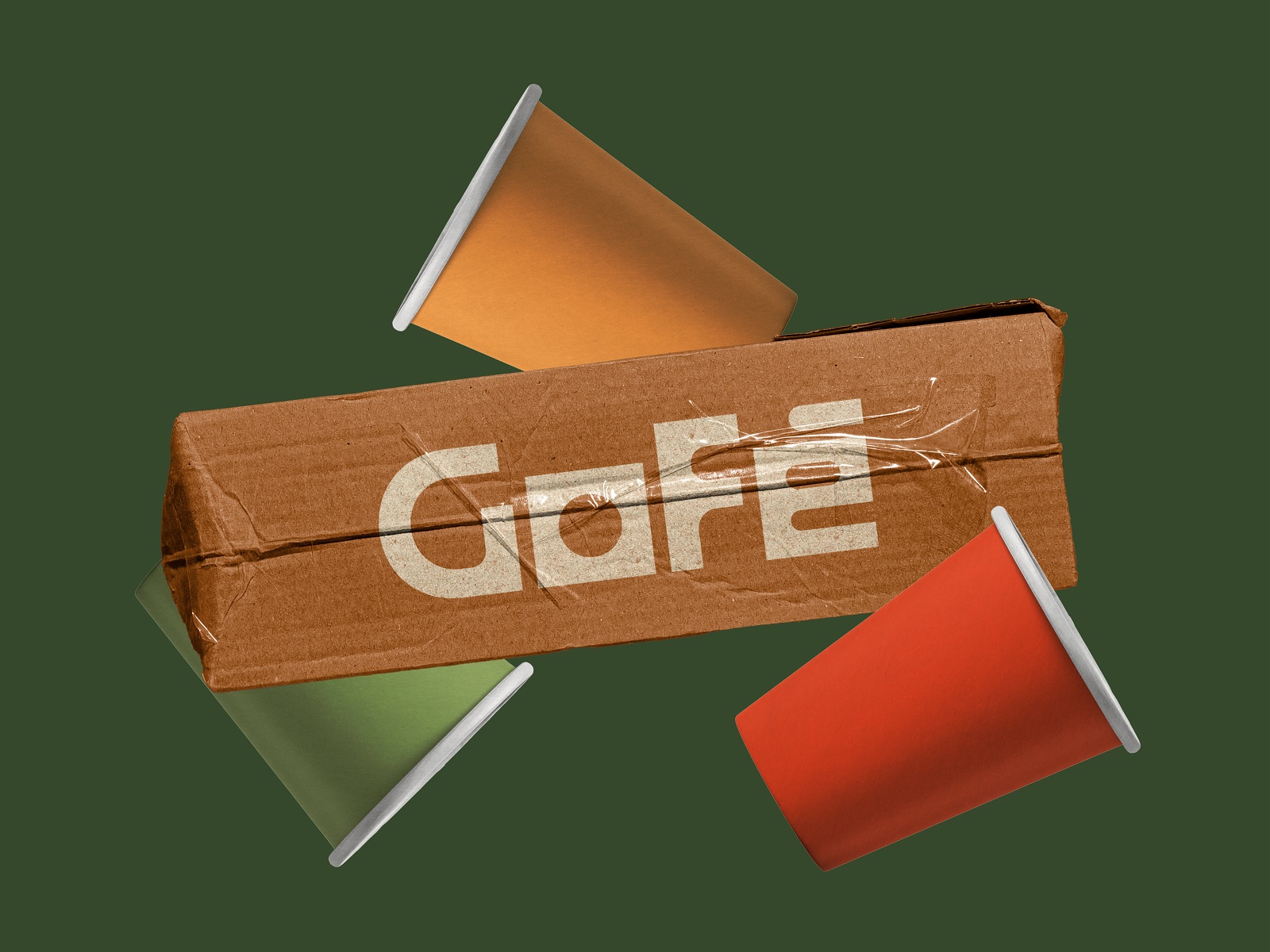
Gofe’s wordmark mixes sharp angles with rounded curves, a deliberate tension that mirrors the brand’s “coffee on the go” premise. Good logo design usually gets top billing in a case study. Here it barely gets a second glance, because a squad of illustrated cat characters steals every scene on the packaging. That’s the surprising bit: the visual identity system leans on character-driven branding rather than wordmark recognition, and it still reads as cohesive.
Cats, Not Beans
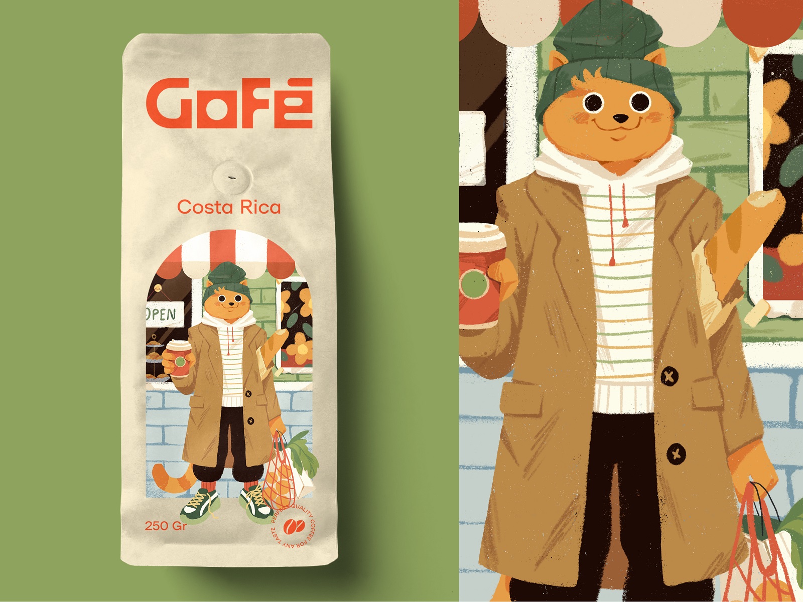
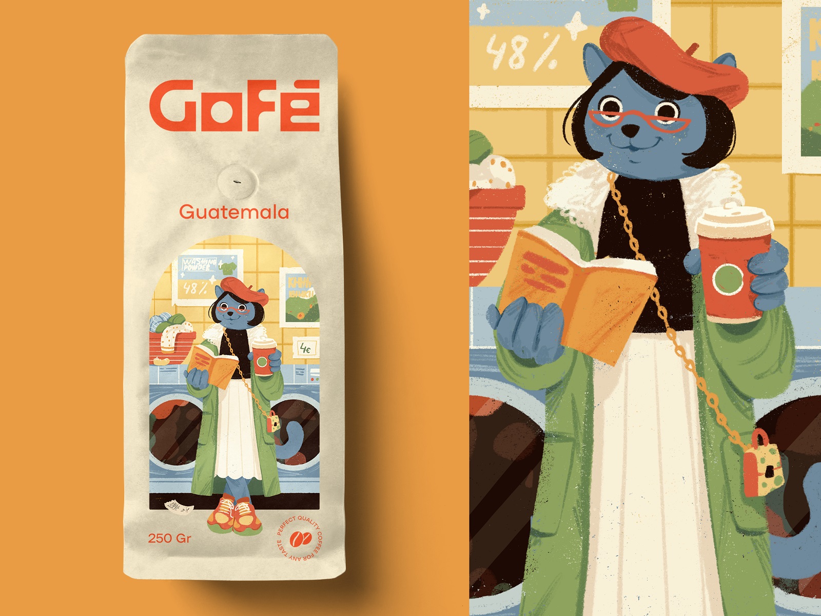
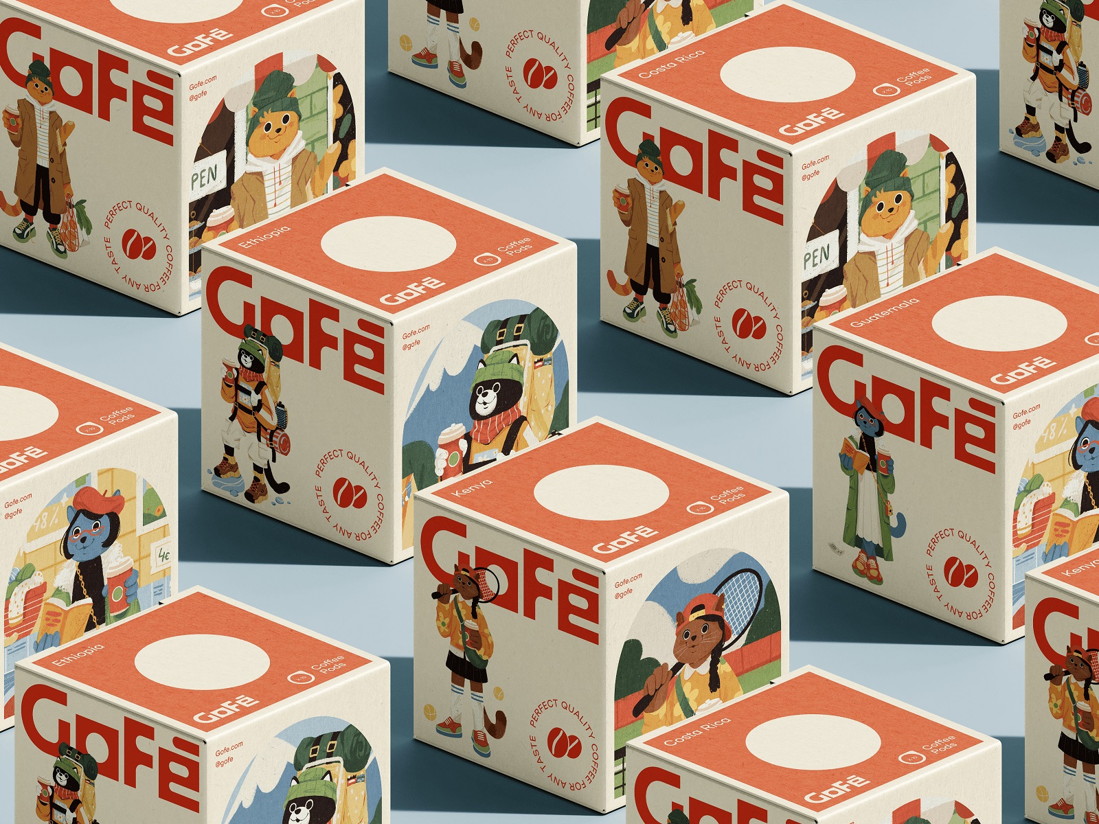
The mascots show up mid-errand—commuting, playing sports, clutching a cup—which sells the “coffee anywhere” concept better than any tagline could. Illustrated characters carry emotional recall in ways abstract logos rarely do; Aflac’s duck and the Michelin Man built billion-dollar recognition on the same principle decades before “brand personality” became a LinkedIn buzzword.
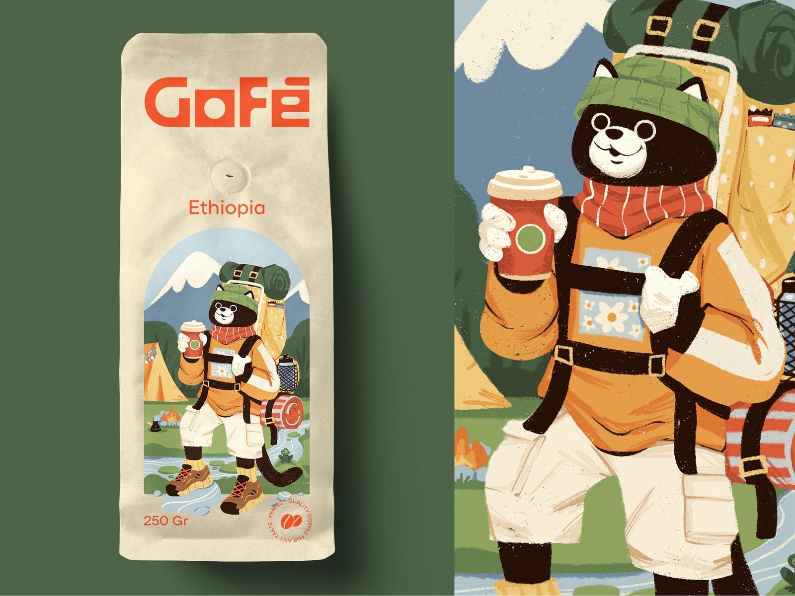
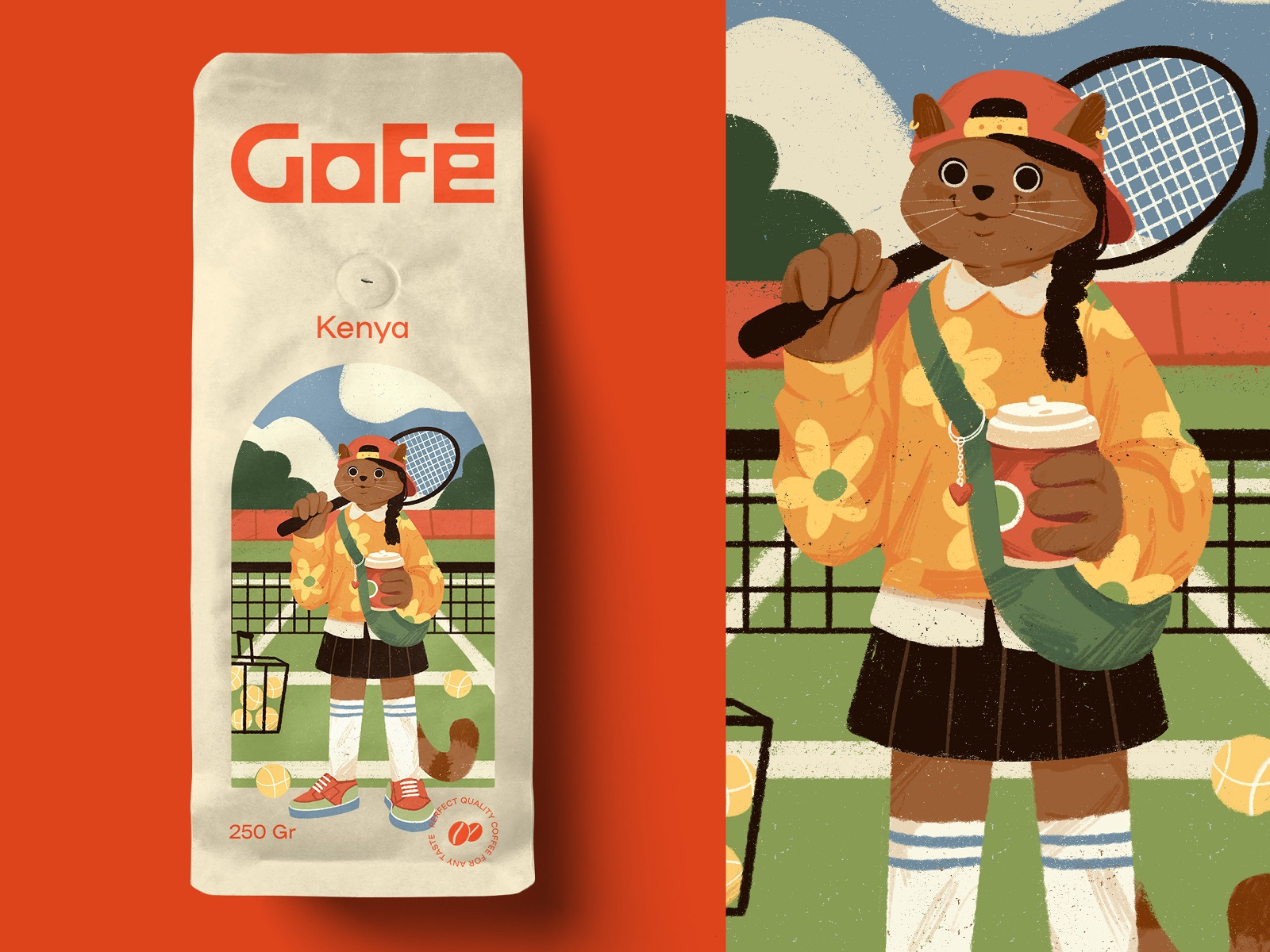
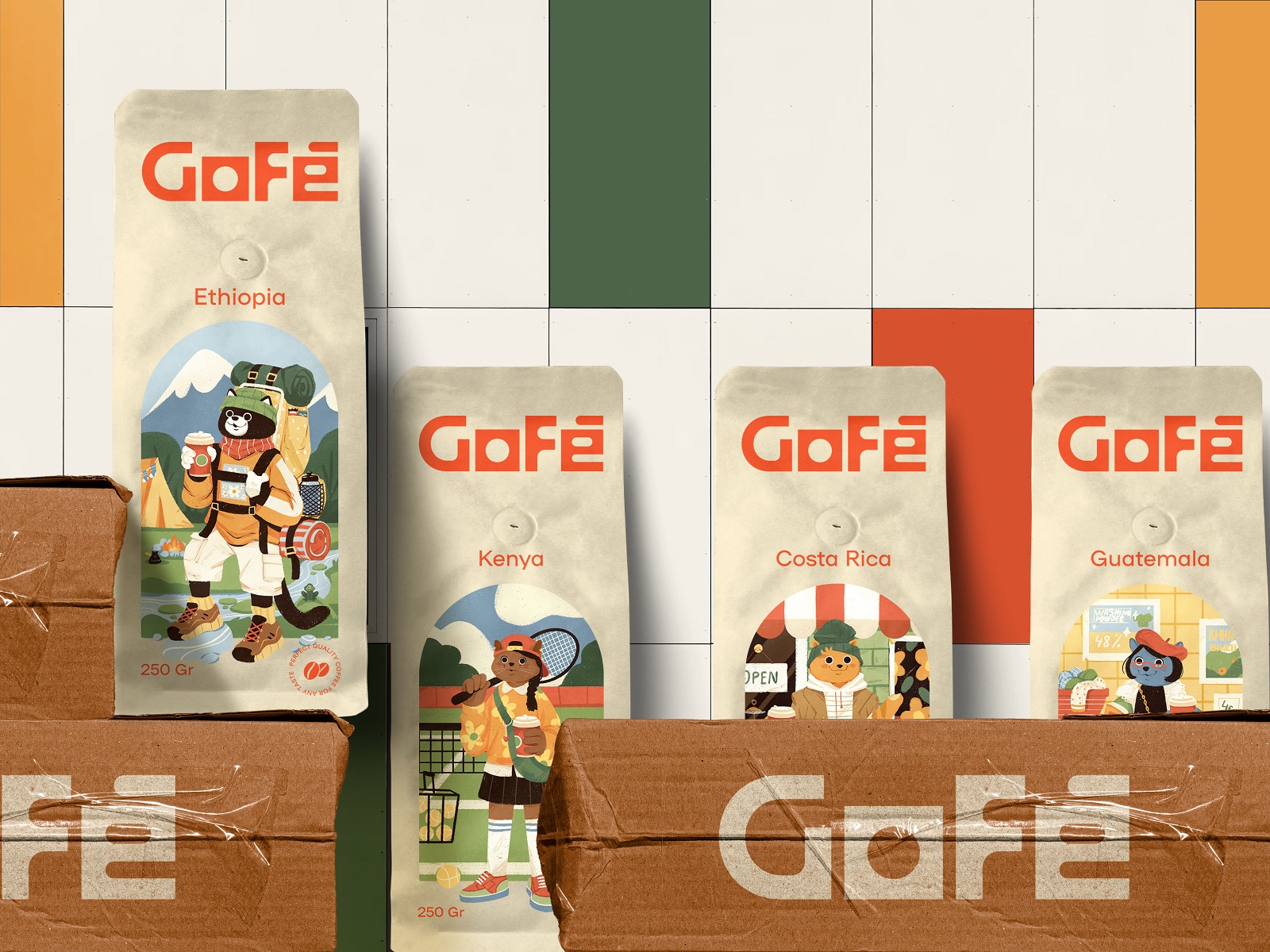
Packaging Design That Actually Differentiates
Gofe needed two formats—coffee pouches and coffee pod boxes—and the studio solved both with the same illustration system, scaled and cropped differently per surface. That’s the real skill in packaging design system work: knowing which parts of a character survive a shrink to pod-box size and which get cropped without losing the joke.
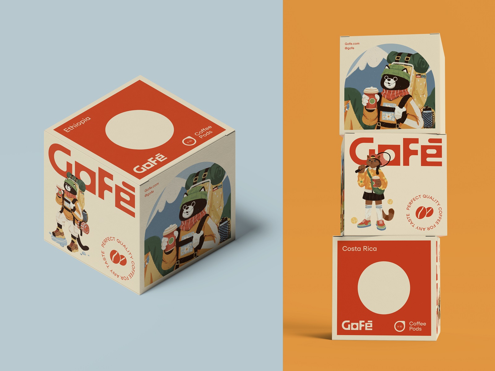
Marketing Collateral: The Boring Part That Isn’t Boring
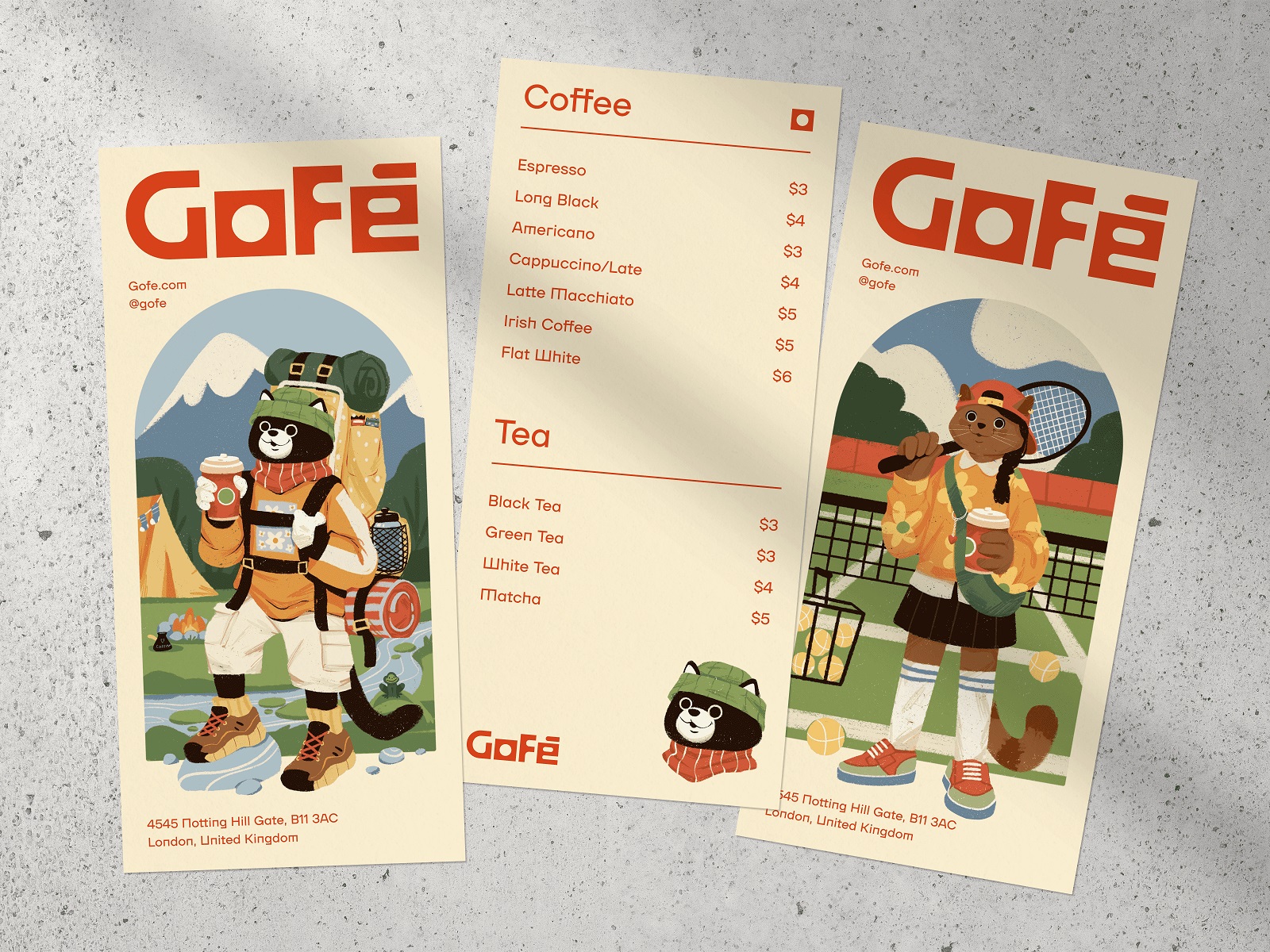
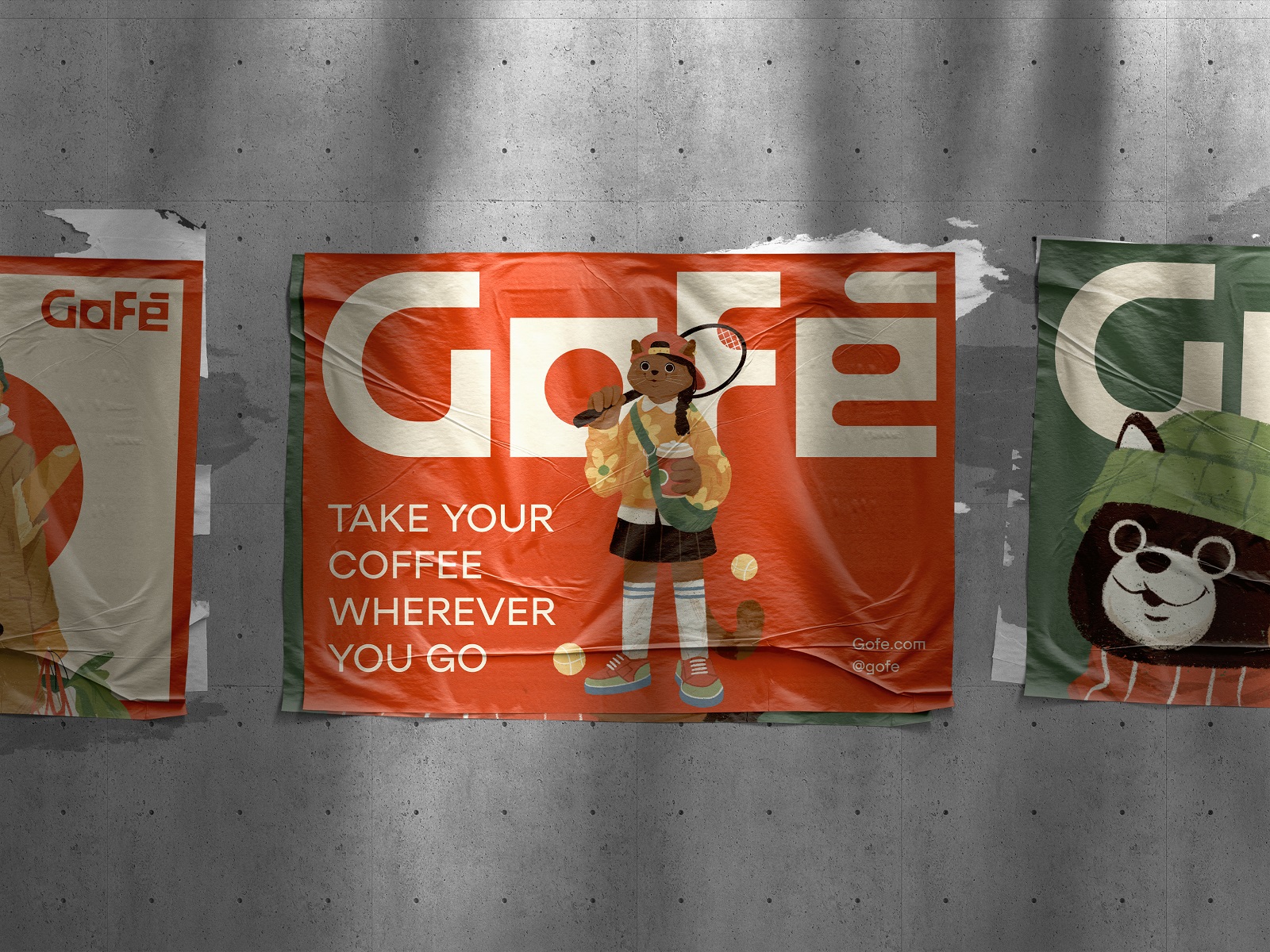
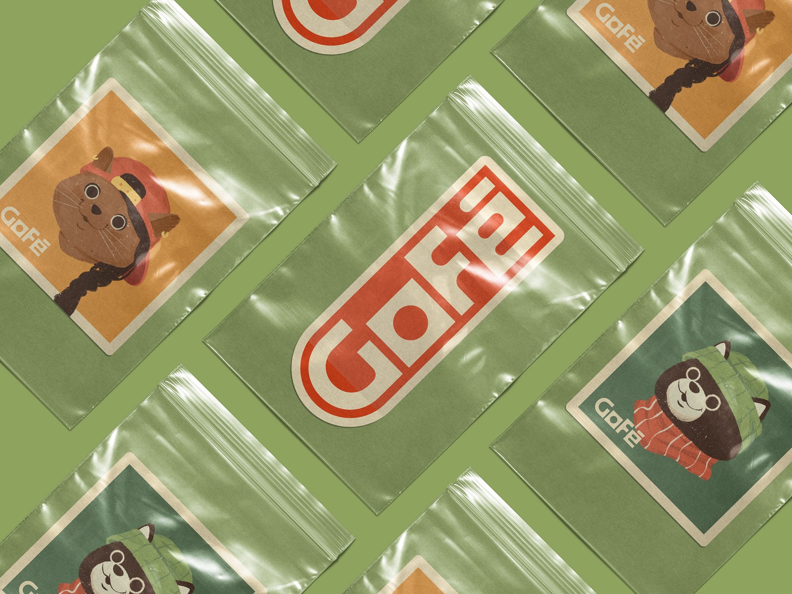
Menu leaflets, price lists, posters, stickers—unglamorous stuff, until you realize it’s where most customers actually meet the brand. Gofe extended its color palette (warm, earthy, sunny) and cat illustrations across every touchpoint, turning marketing design into reinforcement rather than repetition.
Recommended Reading
Still Curious? Good. Here’s more design thinking to fall down a rabbit hole with—case studies, opinions, the occasional strong take:
12 Bright Projects on Visual Identity and Packaging Design
Love Sign. Gift Box Packaging Design with Romantic Vibes
PierSide. Packaging Design for Tinned Fish Brand
KOISI Tokyo. Packaging Design for Japanese Restaurant
Sidra Vivo. Vibrant Packaging Design for Cider Brand
Christmas Fair. Graphic Design for Winter Marketing Campaign
Black Friday. Graphic Design for Marketing Campaign
Fairytale. Picture Book Illustrations and Design
Aqua Dudes. Cartoonish Packaging Design for Fish Food Brand
Herteas. Packaging Design for Herbal Tea Brand
Nutribite. Tasty Packaging Design for Granola Bars
Milkimu. Packaging and Marketing Design for Dairy Brand