
Every industry drags around a set of zombie beliefs—ideas that made sense once, got repeated at enough meetings, and calcified into gospel. UI/UX design collects these the way a hoodie collects lint. Somewhere along the way, a decent observation about 1990s newspaper sites became an unbreakable law of the universe, and designers now spend half their careers explaining why the “rule” a client read on LinkedIn does not apply here.
Below are ten of the most stubborn myths in interface design, the ones living less inside design teams and more in the client briefs, stakeholder comments, and confident hallway opinions surrounding them. Consider this a myth-busting field guide for anyone tired of relitigating the same arguments in every kickoff call.
1. Design Equals Decoration
The assumption: a designer picks a trendy palette, a nice font pairing, slaps on a gradient, done. Ship it.
The reality: visual choices are functional decisions wearing an aesthetic costume. Color builds trust before a single word gets read. Spacing creates hierarchy, telling the eye exactly where to land next. Typography determines whether text gets read at all under real-world conditions—tired eyes, small screens, bad lighting.
Take a banking app’s sign-up flow. A client might ask for something “beautiful and modern,” and get exactly that: a gorgeous screen with fifteen fields, no real-time password validation, and a “Next” button that vanishes behind the keyboard on mobile. And their conversion tanks anyway. UX design succeeds when a user reaches their goal without friction, and the visual layer exists to guide attention rather than disguise a broken flow underneath.
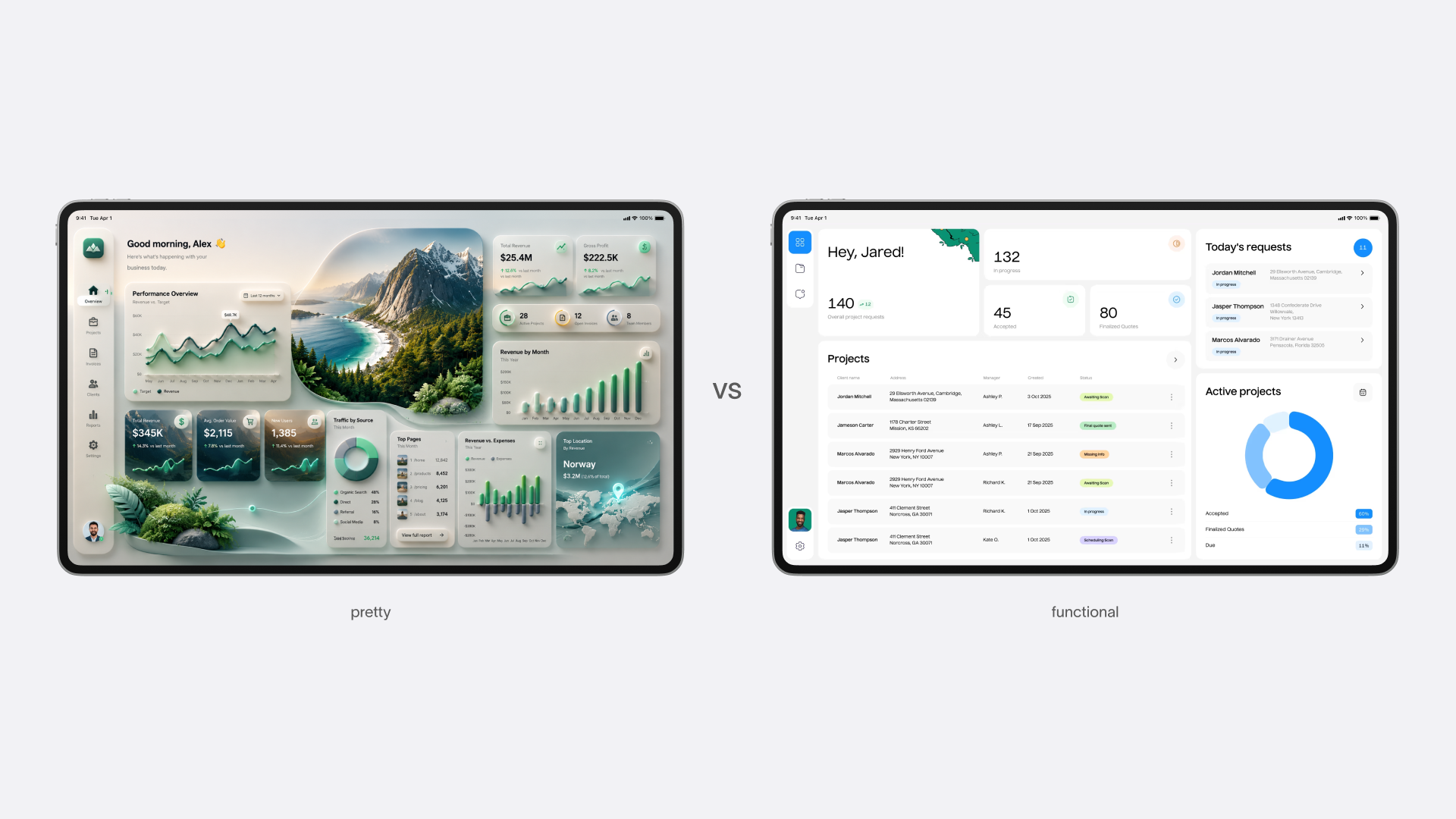
Contrast between decorative and functional interface
2. Design Runs On Sudden Inspiration
The myth suggests designers wait around for lightning to strike, then sketch a flawless concept in one sitting. Cue the movie montage.
Actual studio work looks more like a research lab running controlled experiments—which is exactly why we built our own version of one, Tubik Lab, a space for testing ideas that have no client, no deadline, and no guarantee of working.
When a major e-commerce brand, for example, rebuilds its checkout, the winning solution never arrives fully formed. It shows up after weeks spent digging through drop-off analytics, sketching twenty low-fidelity wireframes, and running usability testing rounds that kill most of those wireframes off. Breakthroughs come from iteration, not inspiration—product design lives closer to engineering than to fine art, however much the portfolio site pretends otherwise.
3. Mobile Is Just A Shrunken Desktop Site
Historically, desktop came first, so mobile got treated as the compressed sequel—same content, smaller container. Convenient logic. Wrong one, too.
In reality, phone represents an entirely different context, not a scaled-down screen. Desktop users sit at a desk, mouse in hand, attention mostly available. Mobile users stand on a train platform, thumb-typing with one hand, half-distracted by everything around them.
Luke Wroblewski’s mobile-first design principle flipped the entire workflow: start from the smallest, strictest screen and build outward. Constraints act as a filter, not an obstacle—if a feature cannot survive a phone screen, it probably needed cutting anyway. Instagram launched mobile-only in 2010 and stayed that way for eleven years, skipping a full desktop experience until 2021. Starting small sharpened the product’s ambition instead of shrinking it.
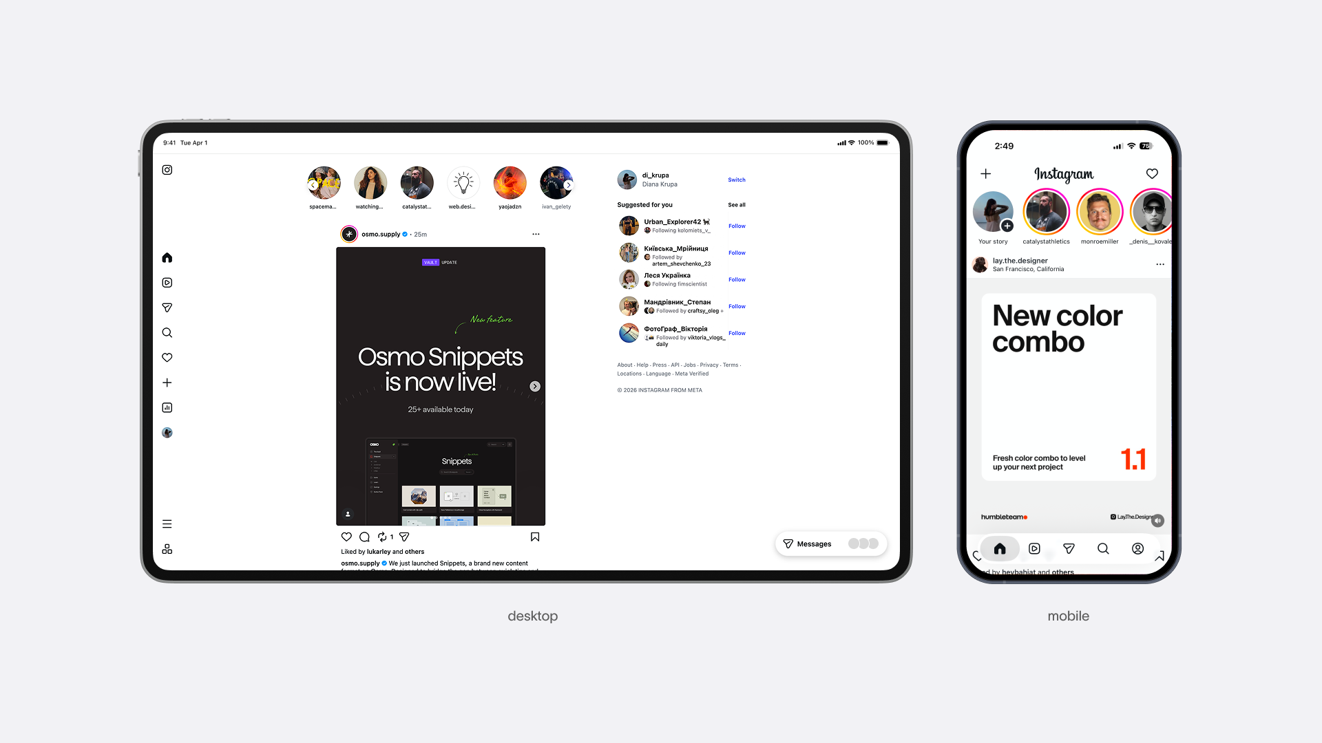
The differences between mobile and desktop layouts
4. The Three-Click Rule
Repeated in client meetings with religious certainty: if users cannot reach what they want within three clicks, they abandon the site. Treated as neuroscience. Actually a 1990s misquote.
The original guidance addressed navigation depth, not click count—a subtle distinction that got flattened into an arbitrary number somewhere along the way. What genuinely drains user patience is uncertainty, not clicks. A five-step checkout with clear progress indicators feels faster than a two-step form that leaves people guessing whether anything happened.
Teams chasing the three-click myth tend to compress everything: cramming decisions onto one screen, hiding fields behind collapsible toggles, squeezing a multi-stage flow into a single dense page. The click count drops while the confusion stays put. A longer flow with obvious, well-paced steps consistently beats a short one full of guesswork. Clarity wins the usability game every time.
5. More Features Make A Better Product
This myth survives because every stakeholder benefits from believing it. Clients want visible value for their budget, managers want demo-able progress, developers enjoy building complex logic, marketers want a longer feature list. Everyone adds. The designer who suggests cutting something gets labeled difficult.
Enter feature creep: a product launches with one crisp value proposition, then absorbs “just one more important thing” from every department until the interface resembles an airplane cockpit built by committee. Microsoft Word by the mid-2000s had buried so many features inside nested menus that Microsoft’s own research found users discovering everyday tools by accident—hence the Ribbon redesign, an entire navigation system built to manage the clutter. Google Docs launched around the same era with a fraction of the functionality: text, formatting, real-time sharing. It won a massive audience anyway, because nothing extra stood between the user and the task. Product design rewards restraint far more than it rewards ambition.
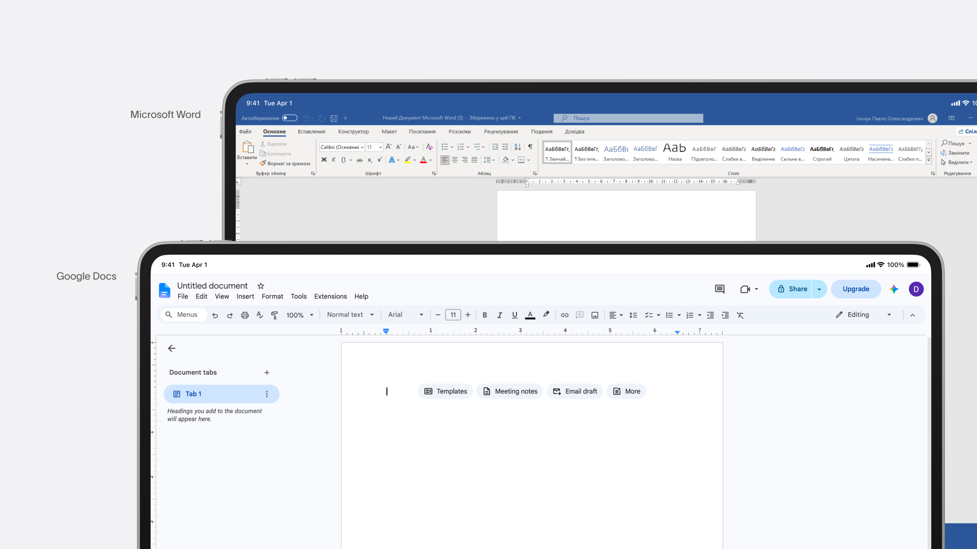
MS Word vs Google Docs: the differences in layouts
6. Users Read The Text
Copywriters polish headlines, legal teams review terms of service, designers arrange paragraphs—all operating on the comforting fiction that users read left to right, top to bottom, word for word. They do not.
Users scan. The Nielsen Norman Group identified this pattern back in 1997: eyes trace the first line fully, skim the second line loosely, then glide straight down the left edge of the page—the now-famous F-pattern. Modern eye-tracking research keeps confirming it. Designing for linear reading buries the important stuff mid-paragraph and stacks calls-to-action after three sentences nobody finished.
Financial and insurance companies spent years hiding fees inside dense, jargon-packed PDFs, technically giving users “the opportunity to read.” Nobody did. Once EU regulators mandated a scannable, single-page Key Information Document, comprehension jumped dramatically. Interface copy should confirm what a user already suspects or answer one specific question—everything beyond that turns into background noise.
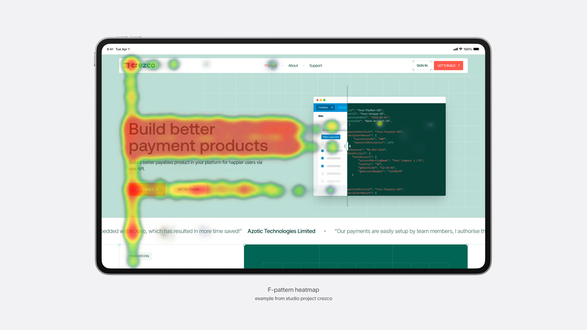
F-pattern heatmap example
7. Animation Is A Nice-To-Have
Ask a client about motion design and the answer often lands somewhere near: “if there’s time.” Animation gets treated as garnish, added after the real work wraps up.
That framing misses the actual job motion performs: communication. A well-built transition answers instant subconscious questions—what just happened, where did that element go, is this loading or frozen? Skip the animation and transitions feel abrupt, giving the brain no chance to build a spatial mental model of the interface. Tapping the heart on a social media post shows this well: the icon pulses, scales up briefly, and settles back into place. Strip that motion away and the tap still registers technically, but something feels off—for a split second, the user has no confirmation the action landed at all.
Motion still needs restraint, though. Purely decorative animation creates friction, especially for people with vestibular sensitivities or thin patience. A “reduce motion” toggle counts as a core accessibility feature for exactly this reason. Great animation earns its place, communicates precisely what matters, and steps aside for anyone who would rather not watch things move.
8. Scrolling Is Bad—Cram It All Above The Fold
This one is a literal newspaper relic. “Above the fold” described the top half of a physical paper visible on a newsstand rack, the portion a passerby saw before deciding to buy it. Early web designers in the 1990s copied the concept wholesale, worried that users would not know how to scroll down a page.
Digital behavior tells a different story, but a more nuanced one than “scrolling solves everything.” Scrolling is a native, near-automatic gesture, unlike flipping open a folded newspaper—people do it constantly, often without thinking. But attention still concentrates near the top. Nielsen Norman Group’s own eye-tracking research found users spend about 57% of their page-viewing time above the fold, and 74% within the first two screenfuls of content. Compare that to 2010, when 80% of attention stayed above the fold — the gap has narrowed, but the pattern holds. The top of the page still does most of the heavy lifting; it just no longer has to do all of it.
Which means the real design problem was never “will people scroll.” It is “will people want to.” Apple’s marketing pages make a case study out of this. A single product page can run for dozens of screenfuls, yet each section earns the next one—one idea per scroll, a beat of visual pacing, a small reveal timed to the swipe, never a wall of specs dumped all at once. The page rewards curiosity instead of demanding patience. Length works as a storytelling device when every section pulls its own weight. Because scrolling was never really the problem; giving people zero reason to keep going was. The first screen just needs to earn the next scroll, not carry the entire pitch alone.
Apple’s scroll-based animation
9. A Redesign Can Save A Broken Product
Executive teams love this fantasy: retention drops, revenue misses target, so a fresh coat of UI paint gets commissioned to fix it. Product designers get treated like emergency mechanics expected to reverse a downward trend with brighter buttons and a smoother onboarding screen.
In reality check, design amplifies value, but it never manufactures it from nothing. Imagine an international delivery app that miscalculates customs fees and loses invoice data regularly. Hire the best UX designer available, build a gorgeous minimalist interface with flawless touch targets and buttery animations—the underlying logistics still fail, and users still delete the app. A polished redesign over a broken core product just makes the sinking ship look nicer on the way down.
10. White Space Is A Luxury
The unspoken assumption: generous white space belongs to premium brands like Apple, companies wealthy enough to let their interfaces “breathe” while everyone else crams content edge to edge for efficiency.
The mistake here is treating white space as empty leftover real estate rather than an active structural tool. Cramped layouts force the brain to work overtime figuring out hierarchy—which label belongs to which field, which button matters most, where to look next. Usability research consistently shows that increasing line height, indentation, and spacing between content blocks speeds up form completion and cuts user errors significantly. That improvement comes from reduced cognitive load during information processing, not from looking fancier. White space functions as a placed component, deliberately chosen, never a byproduct of running out of things to add.
The Pattern Underneath The Pattern
Line these ten myths up and a shared origin story appears. None of them started as outright mistakes—each one made reasonable sense once, under specific constraints, for a specific device or era. Above the fold made sense for newsstands. The three-click rule made sense as guidance about navigation depth. Desktop-first made sense before smartphones existed.
The trouble starts when a reasonable-for-its-time idea outlives the conditions that justified it and gets treated as permanent law instead. Once a belief stops getting tested, it becomes default behavior, unquestioned and expensive, shaping millions of user interactions without anyone actively deciding it should.
Good interface design means checking these assumptions against real user behavior, real data, and the actual device someone happens to be holding right now—not against a rule someone repeated in a meeting back in 2011.
Recommended Reading
Liked this one? Keep scrolling! More case studies, more opinions, more design myths waiting to get busted. Browse the rest of our blog:
Zealous × TAS Case Study: Design Meets Purpose
Case Study: ABUK—Designing Ukraine’s Leading Audiobook Platform
SPYLT Case Study: Delicious by Design
The Glass Is Half Empty: How Apple’s Boldest Redesign Missed the Point
Designing for Justice: Telling the Story of Jailhouse Lawyers
Drawing Attention: The Real Power of Illustrations in UI Design