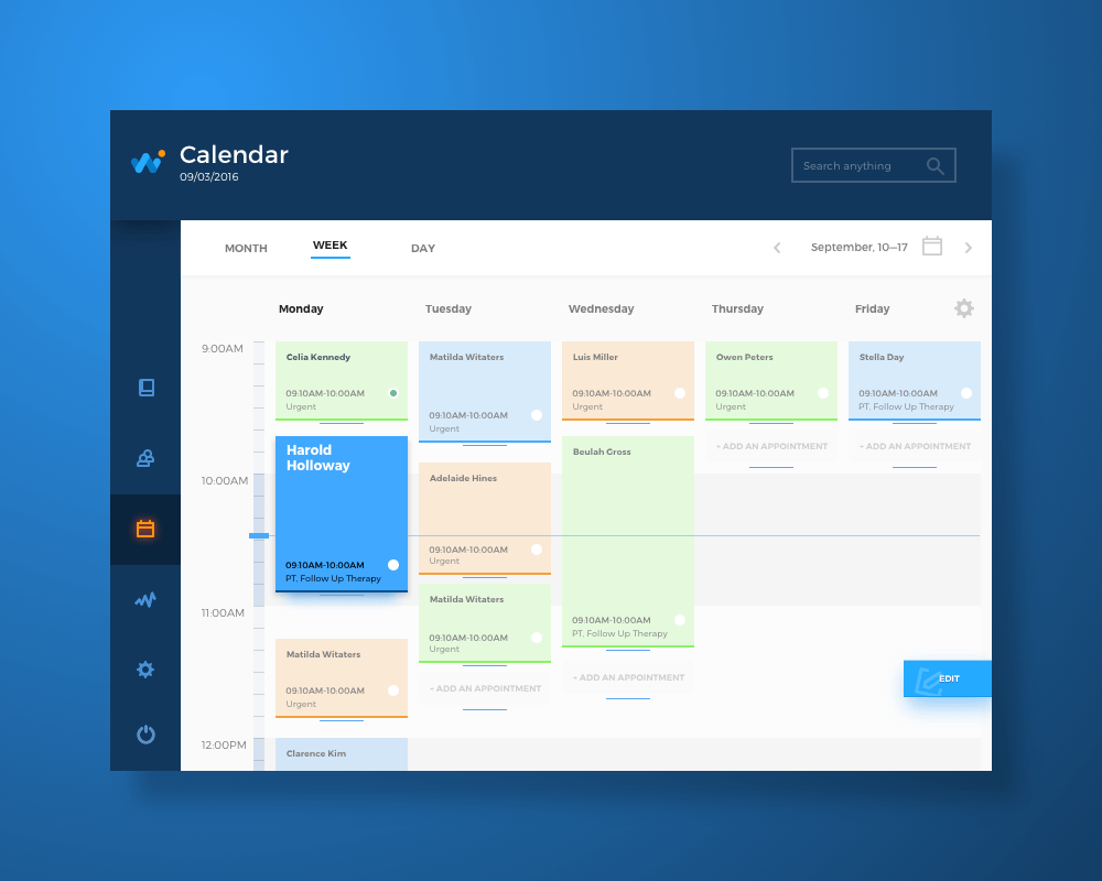
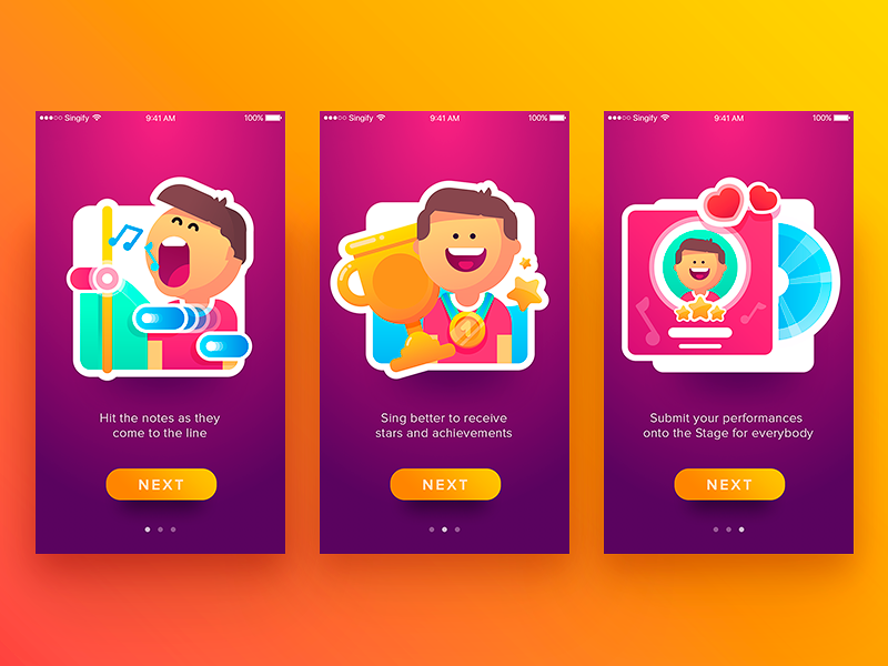
Somewhere between the wireframe and the App Store, most typography decisions die a slow design-by-committee death. A font gets swapped for “brand consistency,” line spacing gets crushed to fit one more CTA, and suddenly your beautifully architected app reads like a ransom note. Mobile UX design lives and dies on details this small, and typography—of all things—is usually the one nobody fights for in the meeting.
Here are ten real, testable, mildly opinionated principles for mobile UI typography—the kind that survive contact with an actual shipped product, not just a client’s first look at the prototype.
1. Legibility Comes Before Everything Else
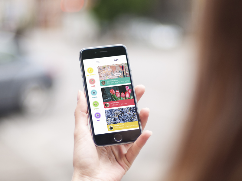
Legibility measures how fast a brain can turn pixels into meaning. On mobile, that brain is usually distracted, walking, or squinting into direct sunlight on a subway platform. Ambient light and tiny viewports are typography’s natural enemies, so every decision—font pairing, spacing, contrast—gets filtered through one question: can a tired thumb-scrolling human read this in two seconds flat? If the answer hesitates even slightly, send it back to Figma.
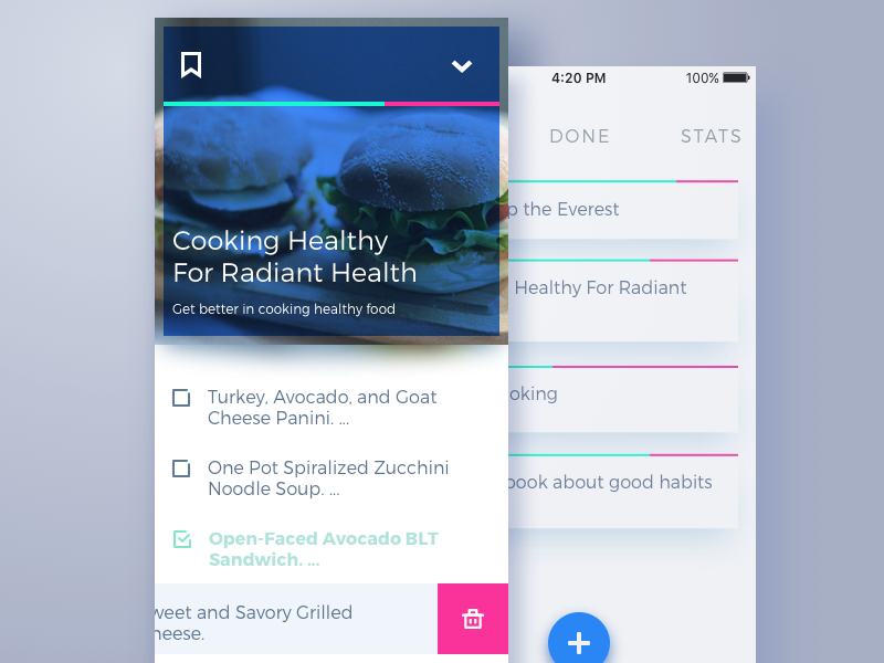
To-Do List App
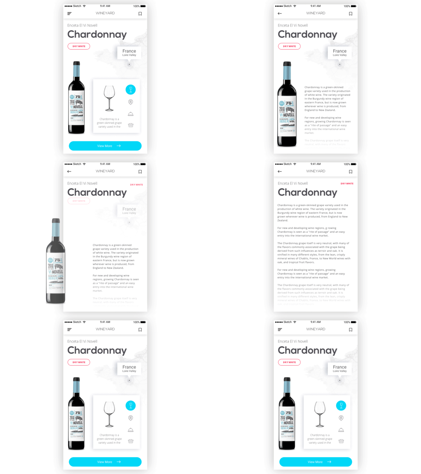
Wine Year App
2. Font Size: Bigger Is Not a Compromise
A stubborn myth floats around UX circles that small screens call for small text, some tidy proportional logic where tiny devices deserve tiny type. Reality disagrees. Shrink your body copy too far and you get eye strain, headaches, and users who zoom in out of sheer self-defense—a workaround, not a feature.
Mobile font size needs to sit in a sweet spot: large enough for effortless reading, restrained enough to preserve hierarchy. Apple’s Human Interface Guidelines and Google’s Material Design both set a 16px floor for body text, and that number comes from actual usability research, not a designer’s gut feeling on a Tuesday.
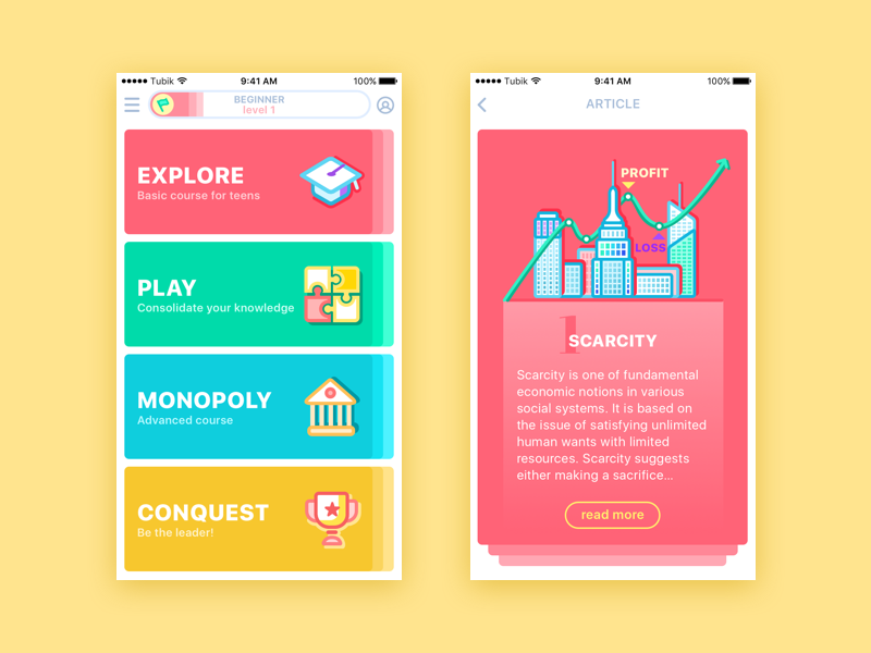
Moneywise App
3. Leading: The Space Between Lines Does Heavy Lifting
Leading—the vertical gap between baselines—behaves differently on mobile than on desktop. Desktop screens can afford generous breathing room; mobile screens punish it. Crank leading too wide and text blocks fragment into visual confetti, disconnected and hard to track. Squeeze it too tight and lines collapse into each other, turning a paragraph into a soup of ascenders and descenders. Dialed-in leading lets the eye glide from line to line without conscious effort, which is exactly the point of line spacing in the first place.
4. Line Length: Keep It Tight
Line length is where a lot of ported desktop layouts fall apart. What reads comfortably across a wide desktop column turns into an eye-tennis match on a phone, forcing readers to whip their gaze back and forth across the screen.
The fix is basic math, not magic: aim for 30 to 40 characters per line. Shorter measures mean faster scanning, sharper retention, and copy that feels engineered on purpose rather than dumped into a container and hoped for.
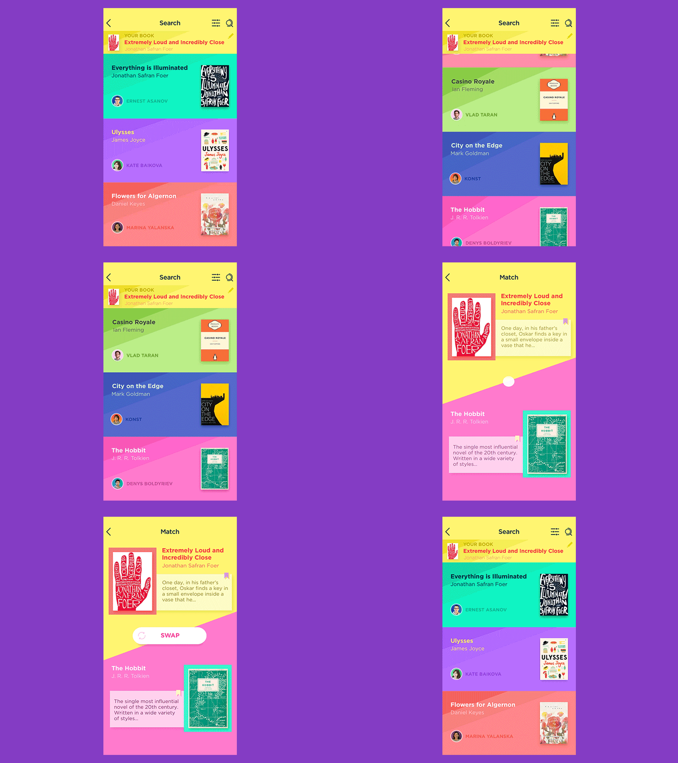
Book Swap Interactions
5. White Space: The Underrated Power Move
Cramped interfaces stress people out, even if they cannot articulate why. Elements crowding each other read as chaos, and chaos kills conversion. White space gives every text block room to breathe and signals visual hierarchy without a single extra design element.
Mobile real estate is scarcer than desktop, obviously, so the goal here is calibration rather than abundance. Just enough negative space to separate ideas, not so much the screen feels abandoned mid-render. Confident spacing turns out to be one of the most expensive-looking design choices you can make for free.
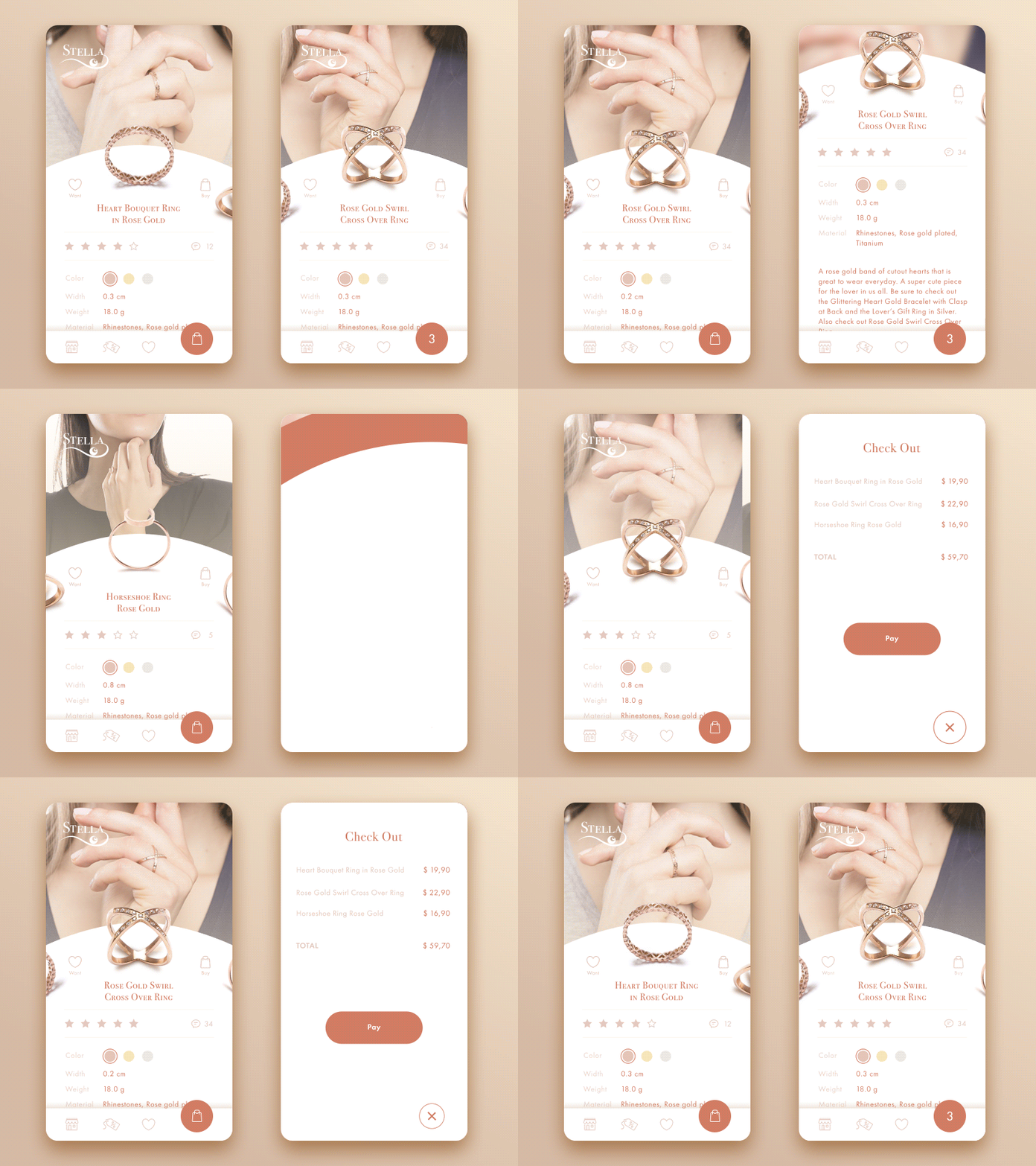
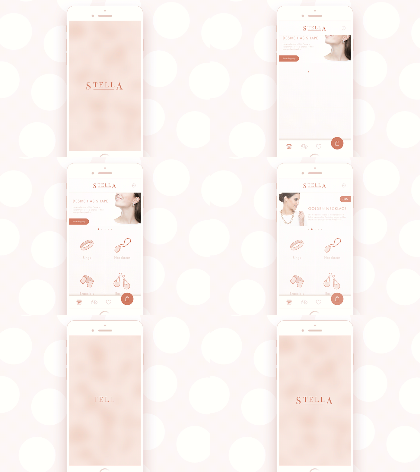
Jewellery E-Commerce App
6. Fewer Levels of Hierarchy
Desktop design can afford three tiers of copy hierarchy: headings, subheadings, body text, plus supporting captions and CTAs layered on top. Mobile screens cannot support that much scaffolding without collapsing under their own weight. Trim it down to two levels: one for attention, one for information. Let subheads shrink or vanish entirely. A leaner hierarchy forces real editorial discipline—every surviving element has to earn its pixel real estate, and users get a clean, obvious path through content instead of a maze of competing type sizes.
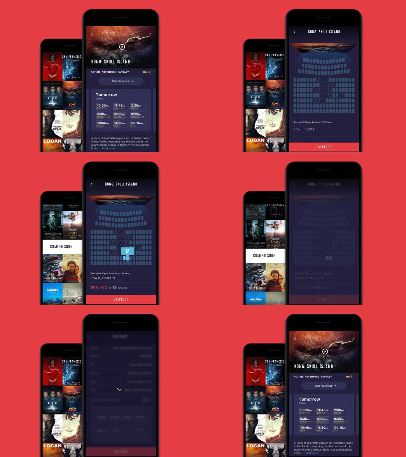
Cinema App
7. Simplicity of Fonts: Two Is Plenty
Font pairing on mobile rewards restraint. Two typefaces, maybe three if there is a compelling reason, keep an interface feeling cohesive. A classic serif-and-sans-serif combination still delivers solid contrast without sacrificing legibility. Decorative, script, or novelty fonts might charm a poster, but shrink them onto a five-inch screen and they turn into visual static. Drop the drop shadows too—they add polish on a 27-inch monitor and clutter on a phone.
8. Delicate Contrast: Loud Is Not the Same as Clear
Harsh contrast between text and background, paired with small type and unpredictable ambient light, can make a screen genuinely uncomfortable to look at for more than a few seconds. Softening that contrast slightly, while staying clear of low-visibility territory, keeps reading pleasant instead of punishing. Build hierarchy through font size and weight rather than color intensity alone, and dial down size contrast too, since mobile layouts rarely have room for a truly oversized headline anyway.
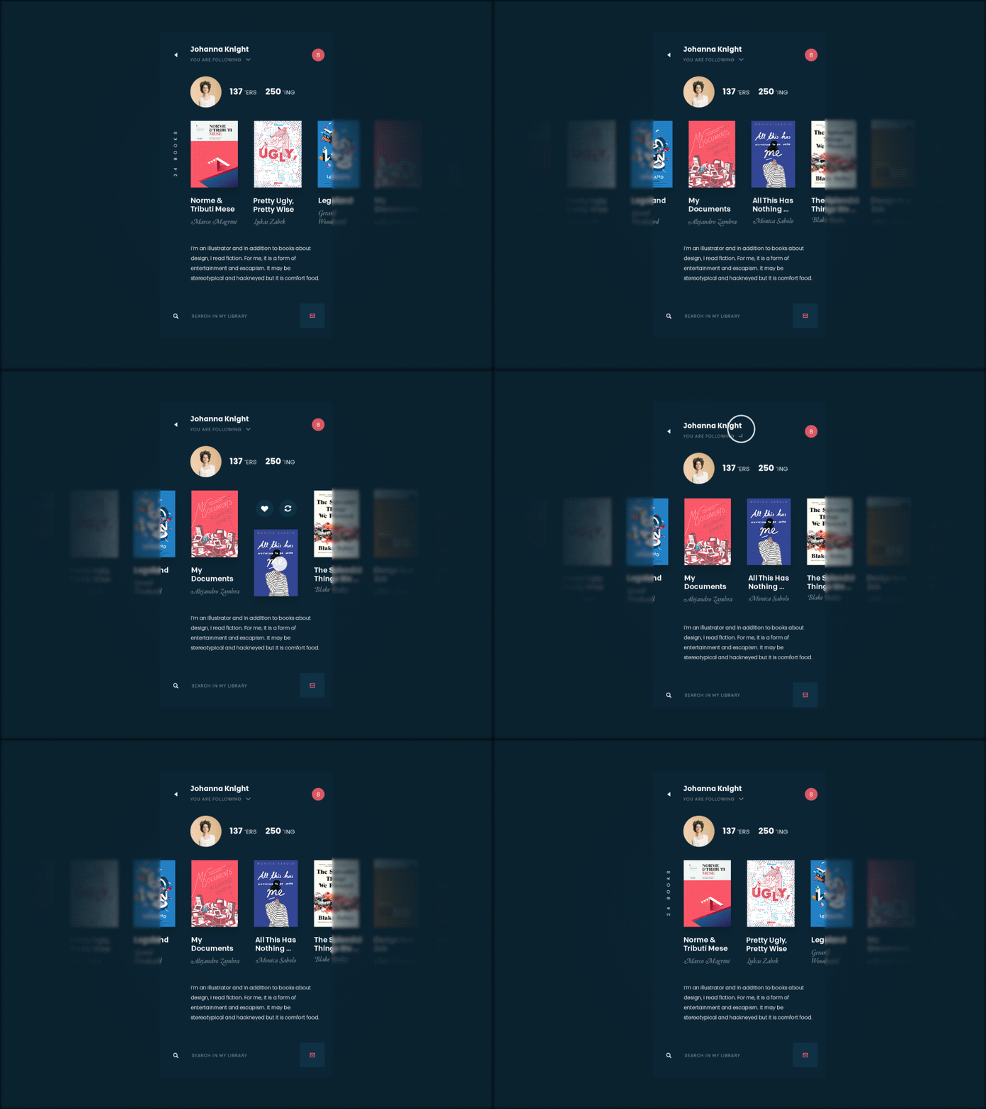
Book App
9. Prioritized Content: Cut Before You Add
Mobile interfaces have zero patience for filler copy. Users want the answer, the price, the button, fast. That means ruthless content prioritization: strip anything that is not earning its place on the screen. Size, weight, and width become the tools for signaling what matters most, guiding a user’s eye through a decision tree instead of a wall of text. If a line of copy cannot justify itself, it does not belong on a small screen.
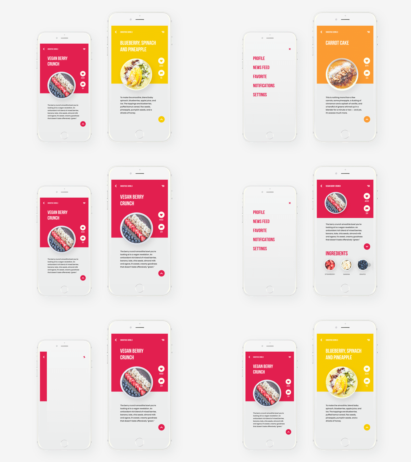
Healthy Food App
10. Functional Typography: Type That Does Something
A lot of mobile copy is infrastructure. Buttons, links, form labels, and calls-to-action all rely on type to signal that tapping does something. Functional text needs a distinct visual identity from body copy, and tap targets need real size and padding to survive contact with an actual human thumb, not just a mouse cursor gliding across a Figma prototype.
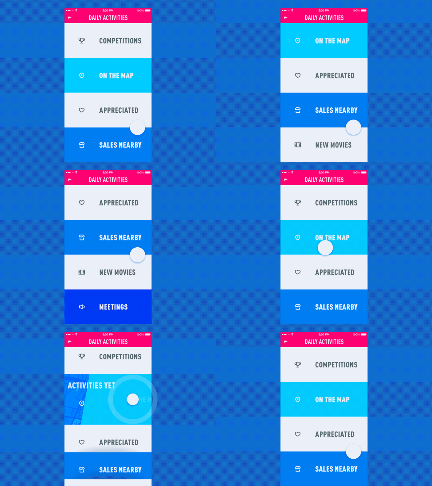
Menu Interactions
Bottom Line
Somewhere between the leading and the line length, someone might ask why any of this matters beyond aesthetics. The real answer is, type is the interface. Buttons, icons, and gradients get the credit, but words do the actual work of telling a user what happens next. Every unlock, every scroll, every rushed decision made at a bus stop runs through text first.
The average person checks their phone over a hundred times a day, in bursts of seconds, not minutes. That’s the entire brief. Type built for glances, not stares, wins. Accessibility guidelines and WCAG contrast ratios exist for the same reason grandmothers and squinting commuters both need to read a checkout button without a magnifying glass.
Great mobile typography earns its keep by disappearing. Nobody screenshots a font size. They screenshot the moment the app just worked.
Jewellery App
Recommended Reading
Not done yet? Neither are we. Design rabbit holes, case studies, hot takes—all parked right here for your next coffee break:
How to Make User Interface Readable
Tips on Visual Hierarchy in User Interfaces
Mobile UI Design: 15 Basic Types of Screens