
Every design movement starts as an act of rebellion and ends as the thing the next rebellion is against.
Minimalism’s rebellion was urgent and necessary: most interfaces of its era were performing design rather than practicing it. Somewhere under all the texture and chrome and visual noise was an actual human trying to accomplish an actual thing, and we’d buried them under radial gradients, glossy icons, and navigation bars that looked like the inside of a Las Vegas casino.
So we stripped it back. All of it. And in doing so, we learned a lot about hierarchy, space, and the invisible architecture that actually determines whether someone finds what they’re looking for. That decade of restraint was foundational. But foundations are not homes. You are not supposed to live on the concrete slab.
At some point, clean became cold. We created the most sterile, frictionless, and perfectly considered digital world in history. And somewhere in all that perfection, we accidentally removed the reason anyone would want to be there at all.
The rebellion has a new target now. It’s white. It’s clean. It loads in a second. And it has never made a single person feel alive—not even the people who built it.
How We Got Here
To understand why minimalism mattered, you have to remember what came before it—and “before” goes back further than you might think. Back in the late ’90s and early 2000s, Winamp skins had already shown just how far customization could go: players reskinned as Zelda cartridges, Doritos bags, anime characters, slabs of raw chrome, whatever the creator felt like that week. It was glorious, chaotic, and almost entirely disconnected from any coherent design logic
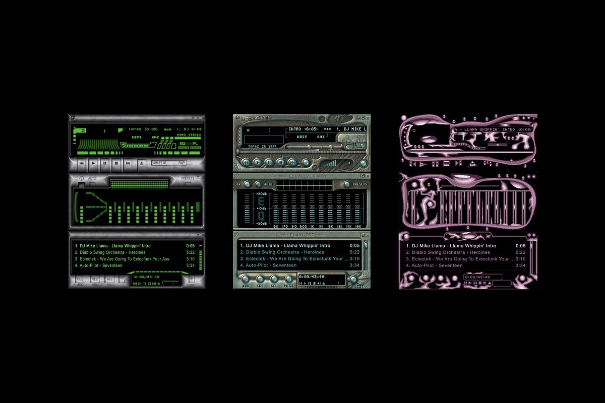
The wild, skeuomorphic interfaces of 2000s Winamp skins
Now, cast your mind back to the early 2010s. Your iPhone calendar was stitched in leather. Your podcast app had a reel-to-reel tape player built into it. The entire web looked like it had been designed by someone who’d just discovered Photoshop Layer Styles and really wanted you to know about it.
Besides being aesthetically exhausting, it was structurally dishonest. All that texture was doing real ideological work: it was hiding the seams. If your music app looked like a vintage jukebox, nobody had to think too hard about what a music app actually was—what its real architecture looked like, what its true hierarchy of information demanded. The decoration was a distraction from the design, and in many cases, it was covering for the fact that no real design decision had been made at all. It just looked fun.
Minimalism, when it arrived in force, was a reckoning. Apple’s iOS 7 in 2013 hit the industry like a controlled demolition. Love it or hate it (and people had feelings, the kind you usually reserve for significant personal betrayals), it forced a question that the whole industry needed to sit with: What is this interface actually for?
Strip away the texture. Kill the shadow. Remove the bevel. What’s left? What should be left?
That question was enormously productive. Google’s Material Design gave it a framework. The startup world gave it a business model. A generation of designers gave it a decade of serious, earnest work. Flat design, at its best, was the discipline of learning what load-bearing walls look like before you start decorating. It was design as surgery—precise, intentional, uncomfortably revealing.
This was necessary. This was good. This was, as it turned out, not the final destination.
When Clean Became Lazy
Here is the thing about surgical discipline: it’s a skill you develop, not a permanent aesthetic state. You learn it so you can move past it. Nobody becomes a great chef by deciding that, because plain rice is nutritionally sufficient, plain rice is the pinnacle of culinary achievement.
And yet.
Somewhere around 2016, “clean” stopped meaning considered and started meaning effortless. White background. One typeface. Ghost button. A hero image shot on a $12,000 camera of someone staring pensively at their laptop in a sunlit loft. Ship it. The minimum viable aesthetic had arrived, and it was wearing minimalism’s clothes while doing absolutely none of minimalism’s intellectual work.
Then came Corporate Memphis, the illustration equivalent of giving your brand a lobotomy.
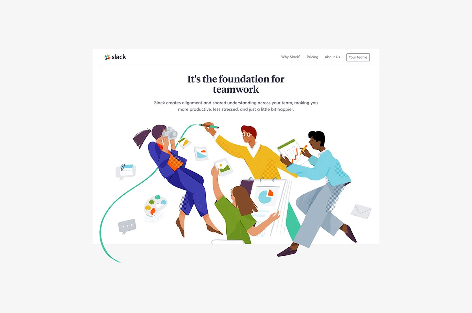
Slack’s 2017 website and the explosion of Corporate Memphis
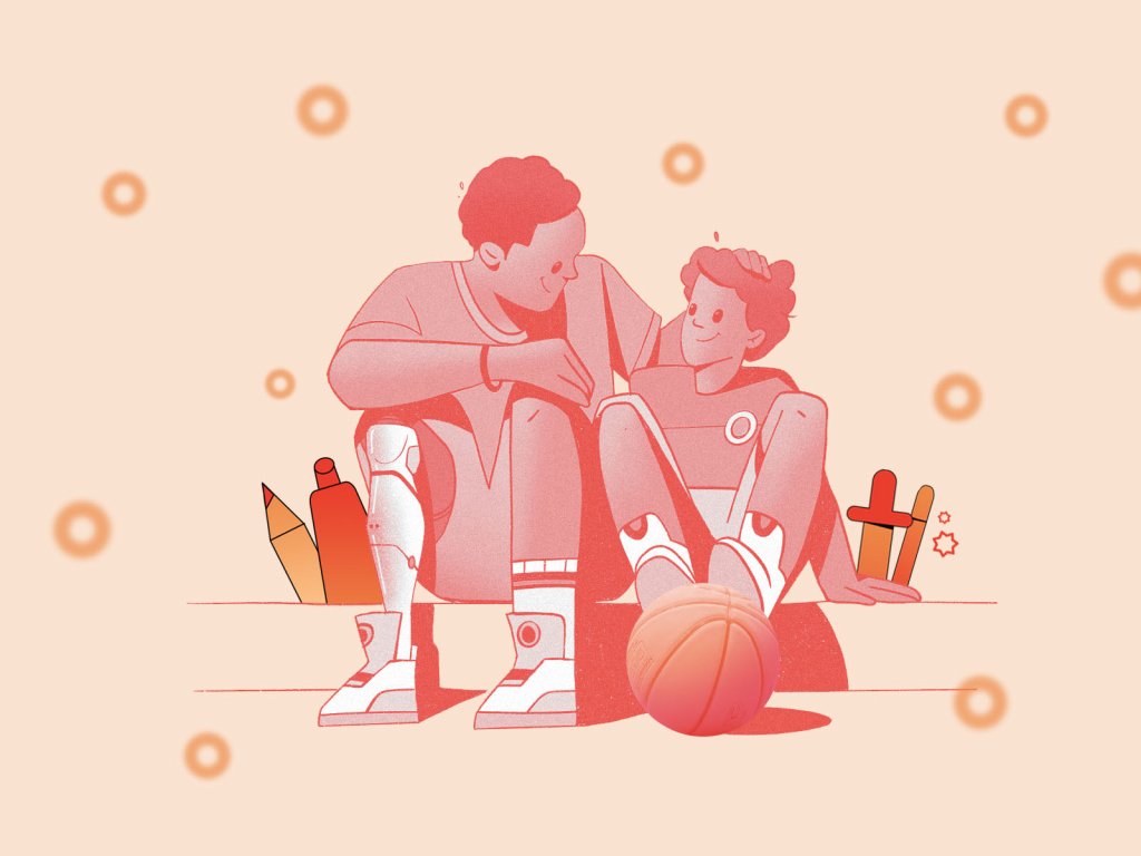
You know Corporate Memphis. You have seen Corporate Memphis on every SaaS landing page, every fintech app, every HR platform, and approximately 40% of all PowerPoint presentations made between 2018 and 2022. Those cheerful, limbless illustrated people in coral and sage green. Those floating geometric shapes. Those faces—if you can call them that—carefully, deliberately, almost philosophically free of any specific human feature, ethnicity, or emotion, assembled from circles and rectangles into something that suggests humanity the way a scarecrow suggests a farmer.
Corporate Memphis was born from genuinely good intentions: accessible illustration, diverse representation, friendly approachability. And then it was copy-pasted across the entire internet until it meant nothing at all, until it became the visual language of companies that wanted to seem human without doing the work of having a personality.
Nothing says “we are a people-first organization” quite like depicting your people as amorphous blobs with mitten hands.
Meanwhile, design systems—blessings though they are—were becoming golden cages. The 8-point grid is a miracle of structural thinking; It is also, when applied with the fervor of a religious convert, a way to never make a decision again. A system built to give designers freedom was being used to outsource every creative judgment to a Figma component library. Consistent? Absolutely. Memorable? Not even remotely.
This is where flat design’s dirty secret came fully into the light: a lot of it wasn’t minimalism at all. It was absence. Minimalism asks “what is essential?” and keeps only that. Absence asks nothing and removes everything. The results look identical from a distance and feel completely different to exist inside.
By the end of the 2010s, every interface had merged into one screen—and that screen was fine. Perfectly, inoffensively, and soul-destroyingly fine.
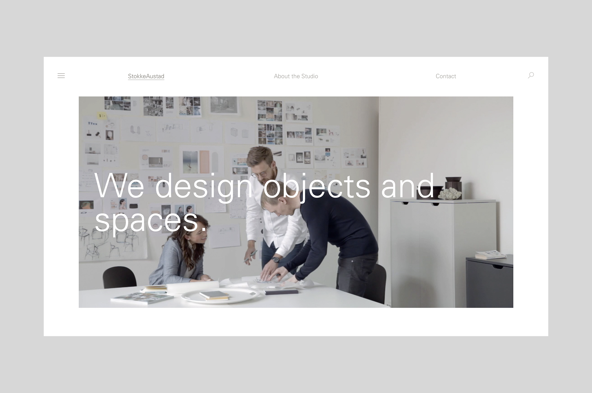
StokkeAustad — a minimalist furniture studio website from 2016
The New Wave Cometh (God Help Us All)
Somewhere right now, a freshly graduated designer who has never lived through a skeuomorphic winter is opening Figma, dragging in a drop shadow, cranking the blur radius up to 24, and somewhere a grizzled senior designer just felt a disturbance in the Force.
Every couple of years, a new generation of creatives collectively decides that everything before them was a mistake. Helmets on.
Here’s the uncomfortable thing, though. They might not be wrong.
Neumorphism showed up first, awkward and fascinating in equal measure. Its soft, extruded, almost-physical UI style—surfaces that looked pressed from clay, buttons that appeared to float millimeters off their backgrounds—was ugly to many, inaccessible to some, and deeply interesting to everyone who’d spent years staring at flat rectangles. Yes, the contrast ratios were horrifying. Yes, it failed WCAG guidelines in spectacular fashion. But it was feeling something. It had a point of view. In a landscape of frictionless off-white voids, the audacity of having texture again felt almost transgressive.
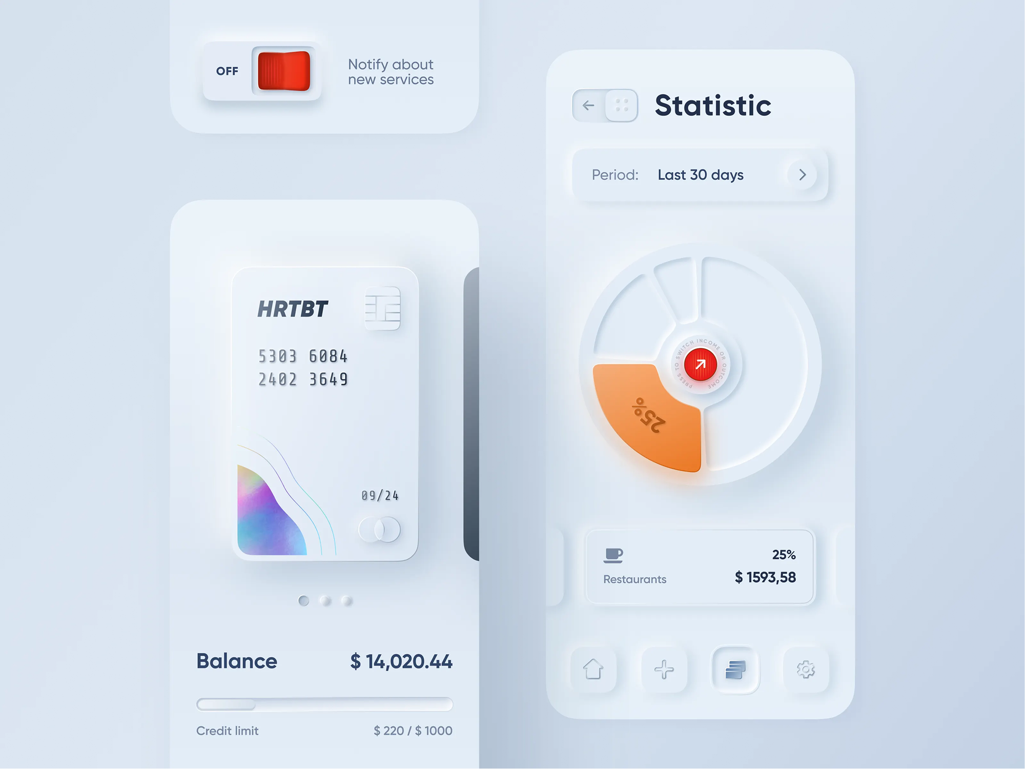
Experiments in Neumorphism by Oleksandr Plyuto (2019)
Then the skeuomorphic throwbacks started appearing—but different this time. The old skeuomorphism was deceptive: it dressed digital things in physical clothes because it didn’t trust users to understand digital things. The new version is referential. It’s a wink. It’s a designer saying, “I know what this is, you know what this is, and I’m choosing to make it feel like a vinyl record or a Polaroid or a cassette tape because feeling something is a legitimate design objective.”
Meanwhile, something strange was happening at the edges of the design world. Brutalist web design—raw grids, exposed structure, deliberately unsexy typography, interfaces that looked like they were designed by someone who had once read a Bauhaus manifesto and taken it personally—found a devoted cult following. Editorial design and digital design started bleeding into each other in genuinely surprising ways: asymmetric layouts, collaged photography, type that violated its own containers, motion that had personality rather than just utility.
The whimsy was coming back. This time, as an argument.
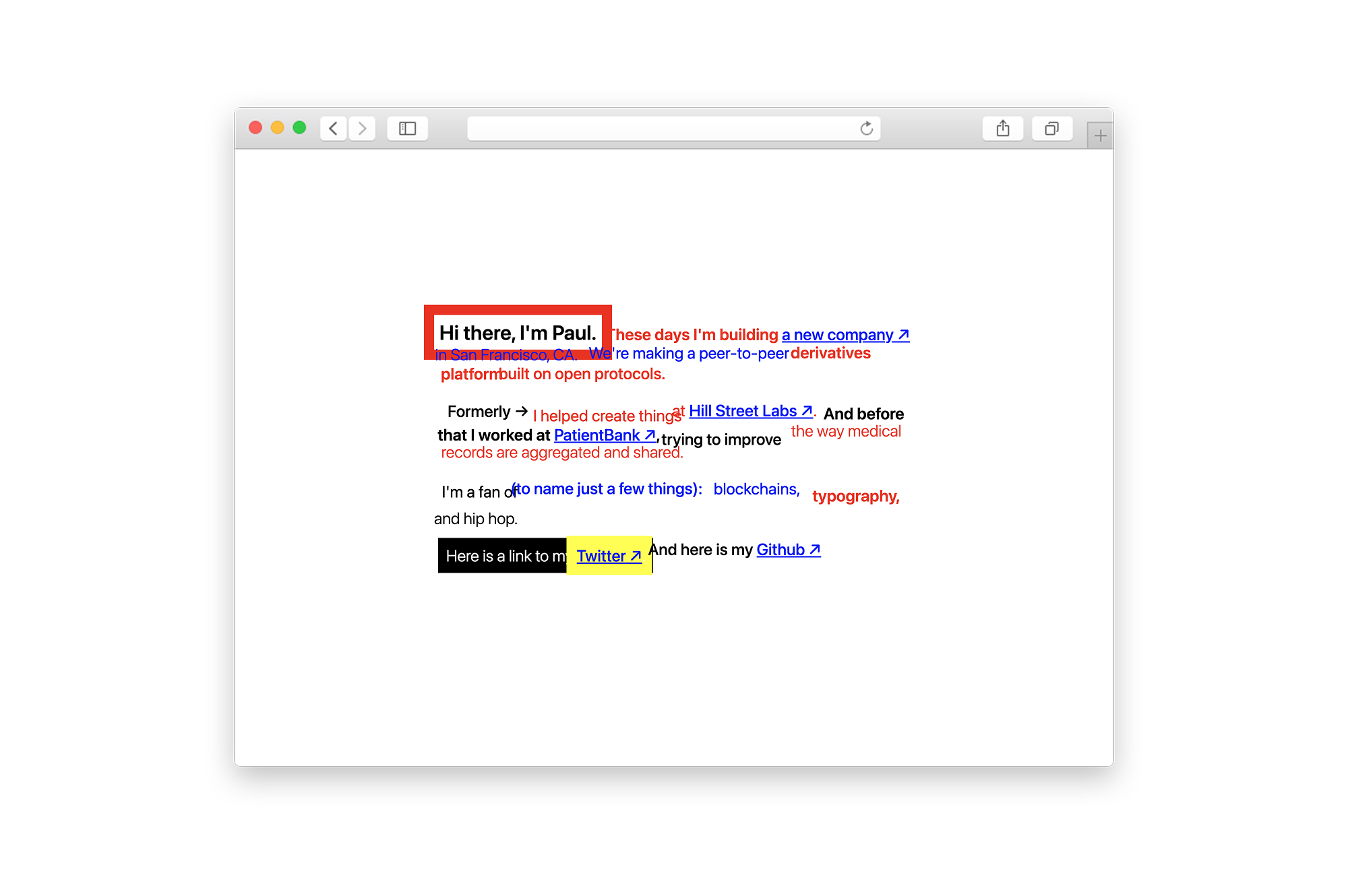
Paul Fletcher-Hill’s 2020 website: An exercise in Brutalist design
The Skeleton Learns to Dance
Minimalism didn’t fail us. We over-extended it. It was always meant to be a constraint that teaches, not a permanent aesthetic destination. This is how all foundational disciplines work. You learn classical drawing to understand form, not to draw classically forever. You learn music theory to understand harmony, not to compose only by the rules. Because you cannot build complexity on a foundation you don’t understand.
The 2010s gave the design world something genuinely precious: a shared, internalized grammar of UX architecture. Hierarchy. Affordance. Negative space. Information density. The real shape of how people navigate. A generation of designers learned what the bones look like.
Which means we can now dress the skeleton, and finally teach it how to dance.
This is the crucial distinction between what’s happening now and the pre-minimalism era we escaped. When skeuomorphism decorated interfaces, it was often hiding bad structure. When ornamentation preceded understanding, it was camouflage.
What’s happening now is different. The designers embracing depth, texture, whimsy, and richness in 2026 and beyond are doing it from the other side of a decade of structural education. They know what the skeleton looks like. They’re choosing to give it a personality.
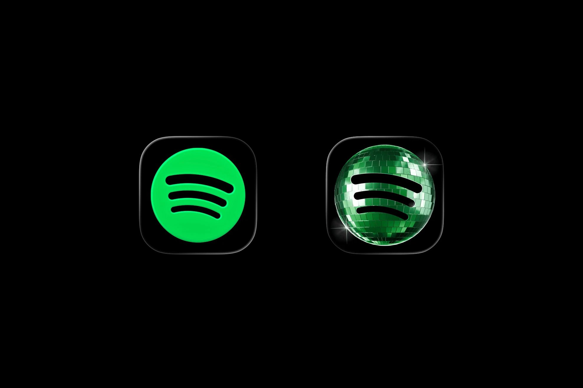
Spotify’s temporary disco ball icon
Whimsy, it turns out, sits comfortably alongside usability—and Don Norman spent years making the case for exactly that. Emotional design, the dimension of experience concerned with how an object makes you feel, is just as legitimate a design consideration as how efficiently it routes you from A to B.
Delight creates engagement. Personality creates memory. An interface that feels like something is an interface that people return to. The case for whimsy lives in behavioral research, not aesthetic preference.
So What Now? A Manifesto for the Post-Flat Era
The question minimalism asked was: What can I remove?
It was a great question. It deserved a decade. The decade is over.
The question now is: What should this feel like to be inside of?
That shift requires permission that the design culture of the 2010s actively suppressed—permission to add depth, literally and figuratively. Shadows used with intent. Gradients that earn their presence. Layers that create space rather than confusion. Color that makes an emotional argument, not just a brand compliance check. Motion that carries personality, not just transition logic.
It requires treating whimsy as a design value rather than a design accident. The difference between a delightful micro-interaction and a gratuitous one lives entirely in meaning. Does this animation tell you something about how this product thinks? Does this texture make you feel something true about what this service is? Does this Easter egg reward the curious in a way that’s consistent with who this company is? If yes: ship it.
And it requires honesty about what we’re actually doing—this movement has nothing to do with nostalgia. The designers reaching for depth and richness now aren’t trying to go back to 2010. They are going forward from 2020, taking everything the minimalist era taught about structure and breathing life back into it. The brutalism, neumorphism, and editorial maximalism emerging today are, at their best, structurally literate and aesthetically alive. Fully aware of the rules, and deliberately choosing which ones to break.
Not in spite of the minimalist decade.
Because of it.
Recommended Reading
Enjoyed this article? Buckle up, because we’ve got plenty more where it came from:
Zealous × TAS Case Study: Design Meets Purpose
The Glass Is Half Empty: How Apple’s Boldest Redesign Missed the Point
Drawing Attention: The Real Power of Illustrations in UI Design