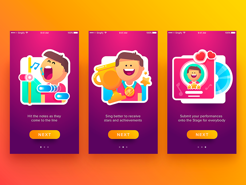
Somewhere around 2010, every product manager on earth discovered the word “gamification” and decided their expense-reporting app needed badges. Most of it was terrible—points for logging in, confetti for filling out a form, a leaderboard nobody asked for, ranking employees by how fast they submit timesheets. The instinct was right and the execution was almost always lazy, because slapping game mechanics onto bad UX design doesn’t make the UX design better. It just makes it louder.
Here’s the weirder, truer version of the idea: gamification was never really about points and badges at all. It was about pacing. Nintendo’s Shigeru Miyamoto figured this out decades before “gamification” was a word—the famous story is that early Super Mario Bros. levels were designed so a player could not physically progress without first learning to jump, because the level layout itself forced the skill before the game ever explained it in a text box. No tutorial popup. No “here’s how jumping works.” Just a gap in the floor that taught you. That’s the entire discipline in miniature: sequence the difficulty, and the explanation becomes almost unnecessary.
Most digital products get this backwards. They front-load an explanation and hope the pacing sorts itself out later. It rarely does.
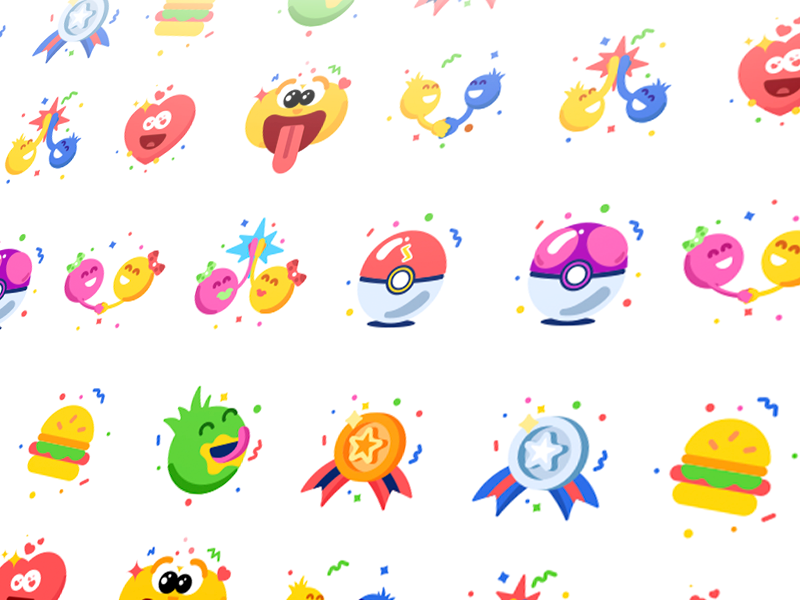
PukaPal Badges
Onboarding: Stop Explaining, Start Sequencing
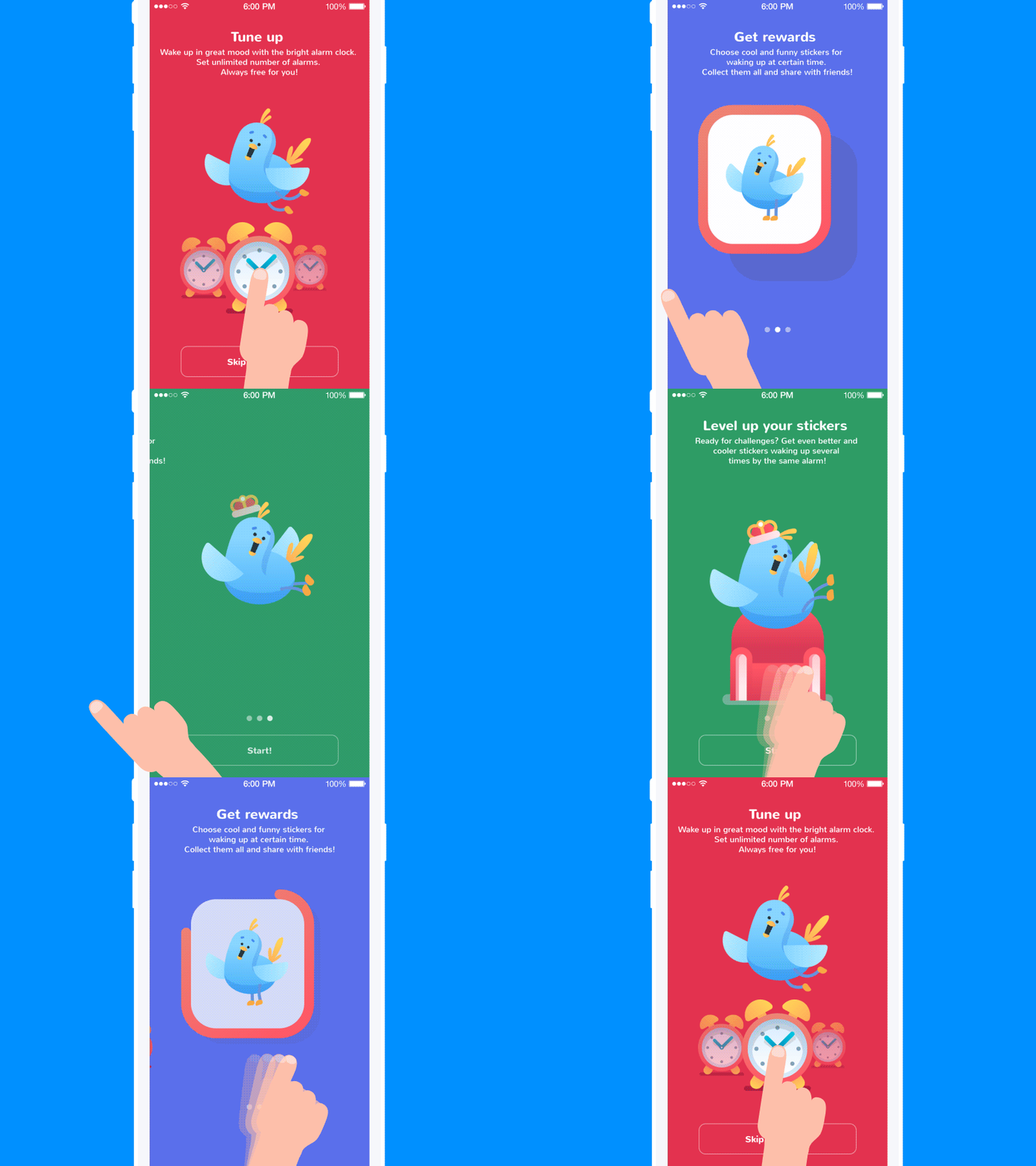
The obvious advice here is “make onboarding simple.” Fine, sure, but simple compared to what? The more useful frame is that onboarding’s actual job is triage—deciding, in the first sixty seconds, whether this person is worth the product’s attention and vice versa. Duolingo’s onboarding doesn’t explain how Duolingo works—it asks you to translate one sentence, immediately, before you’ve read a single instruction. You either get a small win or a small stumble, and either way you’ve learned the mechanic by doing it once.
Practical thing to try this week: audit your first screen and count how many words a new user has to read before they can take their first meaningful action. If it’s more than what fits in a tweet, you’re explaining instead of sequencing. Cut the copy and replace it with one small, guaranteed-winnable task.
The motivation piece matters too, but not in the “inspire your users” sense that gets thrown around in user experience design decks. It’s closer to a bet the product makes with the user: try this one thing, and I’ll show you immediately why it was worth your ten seconds. Slack’s early onboarding leaned hard on this—the “Slackbot” DM that walks you through your first message is a whole conversation, which is a small but deliberate trick, since a conversation implies the product is already alive and waiting for you, rather than a manual you’re expected to read cover to cover.
Scaffolding: The Feature You’re Hiding Is a Feature
Scaffolding is the stage most product teams skip entirely, mostly because “reveal fewer features up front” sounds like it contradicts the instinct to showcase everything you built. It doesn’t. It’s the opposite instinct, and it’s harder to execute because it requires admitting that most of what you built isn’t needed by most people on day one.
Figma is a good case study here because it’s a genuinely complex tool that somehow doesn’t feel like one to a first-time user. The interface reveals advanced panels—component libraries, auto-layout, variables—progressively, largely gated behind actually needing them, rather than dumping the full toolbar on you like a cockpit. Compare that to the opposite failure mode: enterprise software that opens with forty icons across three toolbars, assuming competence it hasn’t earned yet. But real users don’t read documentation to catch up. They just narrow their usage down to the four buttons they understand and never touch the rest, which means you built sixty percent of your product for nobody.
A genuinely useful, checkable habit: pull your product analytics and look at feature adoption curves for users in their first week versus their twentieth. If a feature has near-zero engagement until week four regardless of when it was introduced, that’s a signal it belongs in scaffolding, not in the initial interface. Hide it. Earn the reveal.
Progress: People Will Endure Almost Anything If You Show Them a Number
This is the part of gamification that actually has hard data behind it, not just vibes. Peloton’s leaderboard and streak tracking are frequently cited as major drivers of retention—the company has talked publicly about how visible progress metrics correlate with workout frequency, and anyone who’s used the app knows the specific, slightly deranged feeling of not wanting to break a 200-day streak even on a day you don’t feel like exercising. That’s loss aversion, a well-documented behavioral bias, doing manual labor for your retention metrics.
Duolingo has been even more explicit about this mechanically: the company has said streaks are one of its single strongest predictors of long-term retention, strong enough that losing a long streak is one of the top reasons given for churn. Which also tells you something slightly uncomfortable—the feature keeping people engaged with your product might have nothing to do with how good the product actually is at teaching Spanish, and everything to do with a number that goes up.
Practical tip: if your product doesn’t currently show users a visible measure of accumulated effort—streak, count, percentage, anything—you’re leaving retention on the table for free. It costs almost nothing to build a counter. It costs a lot more to build actual habit formation any other way. Just don’t gate anything essential behind it, because the moment “keep your streak” starts overriding “do the thing well,” you’ve built a slot machine instead of a product, and users notice that faster than you’d think.

Blog App
Endgame: Most Products Have No Idea What a Veteran User Looks Like
Ask most product teams what happens to a user’s experience after two years of daily use, and you’ll get a shrug. The interface for a brand-new user and a three-year power user is, in most digital products, exactly the same. That can be a design failure, too
Stack Overflow handles this better than almost anyone. Its reputation system genuinely changes what the platform looks like and permits as your contribution history grows—enough reputation and you can edit other people’s posts, vote to close questions, access moderator tools. Compare that to a generic app that just hands out a “5-year member” icon on your profile that does absolutely nothing. One of these treats loyalty as functional. The other treats it as decorative.
LinkedIn’s endorsement and “All-Star” profile status system is a messier example, but instructive precisely because of its mess. It correctly identified that professional users want recognized expertise, then built the recognition system almost entirely around volume rather than verified skill, which is why anyone with enough colleagues willing to click a button ends up “endorsed” for skills they don’t have. The instinct—reward proficiency visibly—was right. The execution measured the wrong thing.
If you’re building customer loyalty mechanics into your product this year, the actionable version of this lesson is blunt: don’t reward your most experienced users with a badge. Reward them with capability. Early access to a feature, the ability to skip a step other users still have to do, a genuinely useful shortcut earned through use—these compound. A badge just sits there.
The Actual Point
None of this works as a bolt-on. You cannot gamify a bad user experience design by adding a progress bar to it, the same way you can’t fix a boring movie by adding a trailer. The user journey concept borrowed from game design isn’t really about games at all—it’s a forcing function that makes you sequence difficulty honestly, hide complexity until it’s earned, and figure out what your product owes someone who’s stuck around. Most teams skip straight to the shiny mechanics—points, streaks, badges—because they’re fast to build and demo well in a meeting. The actual hard part, the pacing and the sequencing underneath all of it, doesn’t demo well at all. It just works, quietly, for the users who stick around long enough to notice.
Recommended Reading
Liked this? We’ve got more where that came from—case studies, hot takes, and the occasional gentle roast of an industry. Dig in:
UX Design: Types of Interactive Content Amplifying Engagement
Aesthetic Usability: Beauty on Duty for User Experience
Gamification in UX. Increasing User Engagement
Motion in UX Design: 6 Effective Types of Web Animation
Web Design: 16 Basic Types of Web Pages
UI Animation. Microinteraction for Macroresult
Case Study: Toonie. UI Animation Development