A company website is the only team member on the clock at 3am, fielding first impressions from strangers who found you through a Google search and have zero patience for confusion. It doesn’t get tired, doesn’t go off-script, and doesn’t ask for a raise, but it will absolutely tank your conversion rate if nobody made deliberate decisions about how it works.
This article covers the six structural elements that determine whether a business website is doing its job: value proposition, visual identity, calls to action, trust signals, contact access, and the favicon. Each has a standard way of being done badly, and we’ll get to all of them.
Let’s dive in!
Website design for the company producing and selling wines
What a Corporate Website Is Actually For
A corporate website sits at the top of the customer journey and is usually the first place a prospective client forms an opinion about whether you’re worth their time. That opinion calculates fast—studies put meaningful first impressions at under 50 milliseconds—so the site is making an argument before anyone has read a word. The core audiences are clients evaluating your offer and candidates evaluating your culture, and while they often share a homepage, they’re running entirely different decision processes. Getting website structure right means acknowledging that both groups are present and building an information hierarchy that serves both without confusing either.
The B2B vs B2C distinction runs deeper than tone. It shapes content density, the placement of pricing, assumed familiarity with industry language, and the length of the sales cycle the site needs to support. A B2B website design built for procurement managers with a three-month decision timeline reads structurally differently from a consumer-facing website built for impulse-adjacent purchases. The mental model of the user, their level of risk tolerance, and what they need to see before trusting you are all different—and those differences should be legible in every layout decision, from the navigation design down to the label on the primary button.
The Value Proposition Lives at the Top
The value proposition is the answer to “what do you do and why does that matter to me”—and it belongs above the fold, in plain language, before any ambient brand philosophy gets in the way. Clear messaging at the hero level is the first filter users apply when deciding whether to keep reading or close the tab. The inverted pyramid principle, borrowed from journalism, is the operating logic here: lead with the conclusion, support it with specifics, let the details live lower on the page. Most homepage designs fail this test by warming up with vision statements before arriving at anything concrete.
Text content, hero images, and video content each carry the value proposition differently, and a well-constructed page uses all three in sequence. Body copy carries precision and brand voice simultaneously, which means typography choices—font, size, weight, line length—are part of the argument itself, not the packaging around it. A paragraph set in compressed type at low contrast is already communicating carelessness before anyone reads the words.
Original photography and custom illustration work faster than text for initial impression-setting, which is exactly why stock images undermine credibility: the layout says “professional brand,” the image says “royalty-free subscription.” Explainer video earns its place when a product genuinely benefits from demonstration—when the visual sequence is more efficient than the written description—and not a frame sooner.
The home page for the website of the company specializing in business growth and consulting uses a prominent tagline supported by a brief description text block in the hero section, giving a concise introduction to what they offer to clients. And the more details are uncovered when the visitor scrolls down the page.
The typography chosen for the furniture company website uses a decorative and elegant font for titles to echo the style of the things they manufacture and a readable, simple typeface for descriptive text blocks.
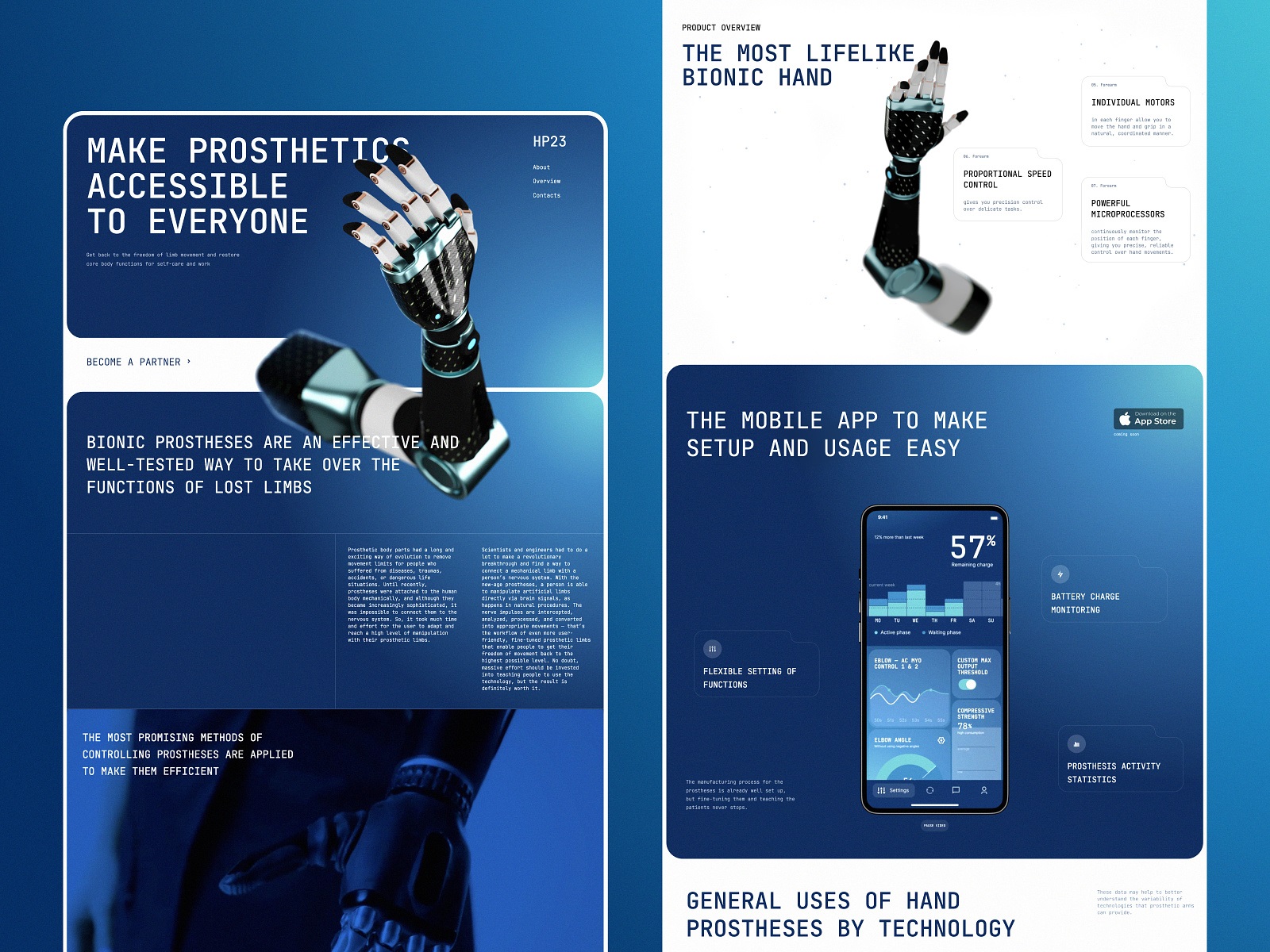
The company website for the prosthetics producer employs the impressive animated 3D model of a prosthetic arm to demonstrate and amplify the value proposition from the first seconds of interaction.
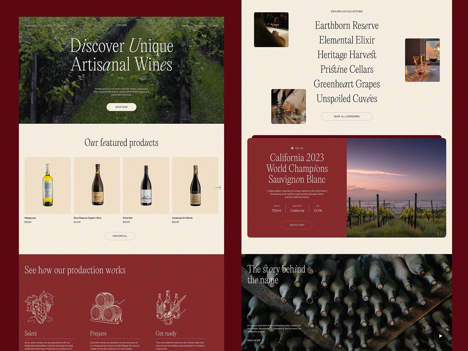
Wine producer company website design skilfully combines photos and neat line illustrations to make the website atmospheric and set the theme at once.
The website of event agency PointZero25 uses an impressive video featuring its projects in the hero section to instantly set the mood and theme.
The website for FluxWear, the health tech producer, uses video sharing the founders’ story so they can personally explain their company’s value proposition.
Visual Identity as a Consistency System
Brand identity on a website is an infrastructure decision. The logo, color palette, brand typography, and iconography together form a recognition system that operates faster than language—users register coherence and incoherence before they consciously process content. When a brand already has market presence, those visual elements carry accumulated trust: the user’s prior exposure does credibility work the site itself doesn’t have to do. When the brand is newer, consistent visual design across every page is the signal that someone is in charge and knows what they’re doing.
The practical implication is that brand guidelines define the design system, and the design system defines every decision that follows—spacing, component behavior, image treatment, interaction states. A UI design system applied consistently across homepage, product pages, blog, and error states is one of the cleaner signals of organizational competence, and users detect its absence even when they can’t name it. Deviating from established brand consistency in the name of visual variety introduces friction that rarely repays the investment. The job of web design for business is to make the brand argument as legible and as fast as possible—not to demonstrate that the design team had options.
MOVA Brewery’s website is a consistent part of the company brand communication system as it features the same visual identity style used on real point-of-sales, restaurant space, and packaging design for the goods.
ShipDaddy visual identity and mascot design are consistently integrated into the company website.
CTA Designed For Conversion
A call to action is where attention becomes behavior, and it’s also where otherwise solid website design most reliably falls apart. The failure mode is almost never aesthetic—it’s structural. The button exists, but it’s competing with four other elements at the same visual weight, or it’s placed before the user has enough information to act, or the label is a verb that describes a system event rather than a human outcome. CTA button design is applied persuasion, and the variables are testable: color contrast, copy, size, proximity to supporting content, and position relative to the decision moment all affect click-through rate in ways that are measurable and rarely surprising once you look.
Button label copy is where the most value gets left on the table at the lowest cost. “Submit” describes what the form does to data; “Get your proposal” describes what the user gets. That’s a conversion optimization decision that takes thirty seconds to make and compounds across every session. The same logic applies to placement: a visitor on a services page has more intent than someone on the homepage, and the user flow should reflect that by presenting a more direct action sooner. Interactive elements that carry conversion deserve at least as much design attention as the visual identity components that usually dominate the brief.
The THT company website uses a noticeable CTA button in the hero section of the home page to enable visitors who are interested in communicating to jump into the discussion.
Trust Signals Work Because Numbers Stop the Eye
Social proof is the structural answer to the question every new visitor is running in the background: why should I believe any of this? Customer testimonials, client logos, case studies, industry awards, and trust badges address that question at different levels of specificity and different stages of the decision process.
Logos imply endorsement by proximity; testimonials deliver named, specific outcomes; certifications and awards shift the credibility source to a third party. A well-structured company website deploys all of these, placed where the user’s skepticism peaks—typically after the value proposition section, when they’re weighing whether the claim holds up.
Website statistics and numerical data deserve particular attention. Research from Nielsen Norman Group on eye-tracking behavior established that numerals pull visual fixation even in text-heavy layouts—the brain treats them as data rather than language, making them more scannable and more memorable than their written equivalents. “Helped 400+ teams ship faster” is shorter, more specific, and more credible than “helped hundreds of teams.” This is how user attention works on a web page layout that users are scanning, not reading.
The about page, often treated as a formality, belongs in the trust architecture too: team transparency, company timeline, and named leadership are meaningful credibility signals in B2B contexts where the relationship outlasts the transaction.
Hales Freight’s website home page features a clear value proposition, supported by real-life videos and increasing trustworthiness with informative stats about the company and a section of partner testimonials.
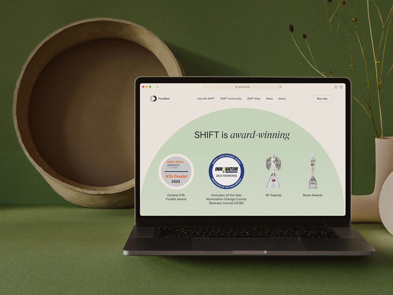
The awards section on the home page of the FluxWear website
The About Us page of the business consultancy website
The Contact Path Should Be Obvious
How easy it is to reach the company is a direct signal about how the company handles client relationships—and users read it as such. The contact page is one of the higher-stakes destinations on any business website and typically receives the least design attention. Header navigation and footer links are where users look first; placing the contact link anywhere else introduces friction with no payoff. These are UI patterns users have internalized across thousands of sites, and the correct response to established mental models is to satisfy them, not subvert them.
The contact form itself is a UX design problem that most teams solve by copying whatever they used last time. The principles are simple and consistently ignored: fewer fields, clear labels, helpful error handling, and a confirmation state that tells the user what happens next. Asking for information the company doesn’t need at this stage of the relationship is a conversion barrier—every additional field is an opportunity for the visitor to reconsider. Mobile responsiveness on the contact page is non-negotiable; a form that breaks at 375px width is a qualified lead walking away. Page load speed matters here more than anywhere, because a visitor who has already decided to reach out should not be made to wait.
Contact page for the website of the company organizing exhibitions and events with art galleries
The Favicon Earns Its Place
The favicon is sixteen pixels of brand recognition in a browser tab, and it compounds quietly across every session. When a user has ten tabs open—which is most users, most of the time—the favicon is the only visual identifier the site retains. A generic globe, a blurry initial, or a low-contrast mark at that scale is a missed touchpoint; a considered icon that holds its identity at small size reinforces the same visual design system operating everywhere else. Website branding at this level of detail signals that someone thought about the complete experience, not just the parts that appear in design presentations.
Web usability research has consistently shown that small, coherent interface elements contribute to the overall sense of quality users associate with credible sites. The favicon sits at the end of that argument—the detail that confirms whether the web design was treated as a system or assembled as a checklist. It also appears in browser bookmarks, search engine results on some platforms, and pinned tabs, which means it functions as a brand asset in contexts outside the site itself. Sixteen pixels, considered seriously, is a reasonable investment.
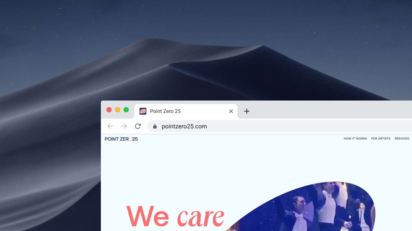
Favicon for the PointZero25 website
Conclusion
A company website is a system, and systems fail at their weakest point. The six elements above compound in both directions: a sharp value proposition lands harder inside a coherent visual identity; trust signals convert better when the contact page is one click away; a well-placed CTA loses half its work when the page around it is fighting for attention.
The websites that perform aren’t the ones that did one thing brilliantly—they’re the ones that made no bad decisions at scale. That’s the actual brief for corporate web design: not a hero moment, but a system with no obvious exits.
Recommended Reading
Still Here? Good. The rest of our case studies and think pieces reward the same kind of attention. Go find something worth disagreeing with:
Big Little Details: 7 Helpful Elements of Web Usability
UX Design: Types of Interactive Content Amplifying Engagement
Negative Space in Design: Tips and Best Practices
5 Basic Types of Images for Web Content
Types of Contrast in User Interface Design
5 Pillars of Effective Landing Page Design
How to Make Web Interface Scannable
The Anatomy of a Web Page: Basic Elements