Every designer loves to talk about attention, as if the whole job were a shouting contest for eyeballs. Wrong contest. Instead of competing for attention, a good call-to-action button simply settles an argument the page already started. By the time someone’s cursor drifts toward it, the real work already happened upstream, in the layout and in a long list of competing options that got cut before the user ever arrived. The button just names what’s left.
That’s the strange truth about CTA button design most think pieces skip on their way to a paragraph about drop shadows. A button’s real power comes not from brightness of color, but from scarcity of alternatives. Give a user six equally loud options and the flashiest one wins by accident, not by design. Give them one honest, well-placed call-to-action button, and they click it because there was nothing else worth doing on that screen. Conversion rate optimization, stripped of its jargon, is mostly the art of narrowing a room until there’s only one door.
None of this means size, color, and placement don’t matter. They do, enormously so. They just matter in service of clarity, not decoration—a distinction most button tutorials skip entirely.
Big Enough to Matter, Not an Inch More
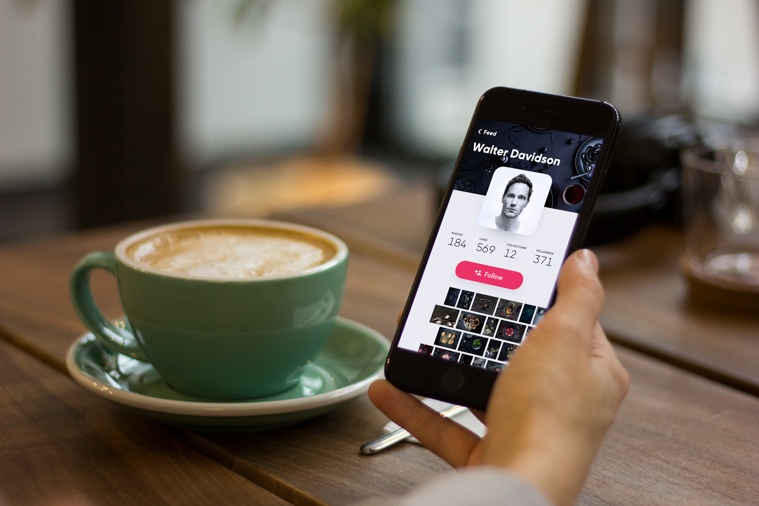
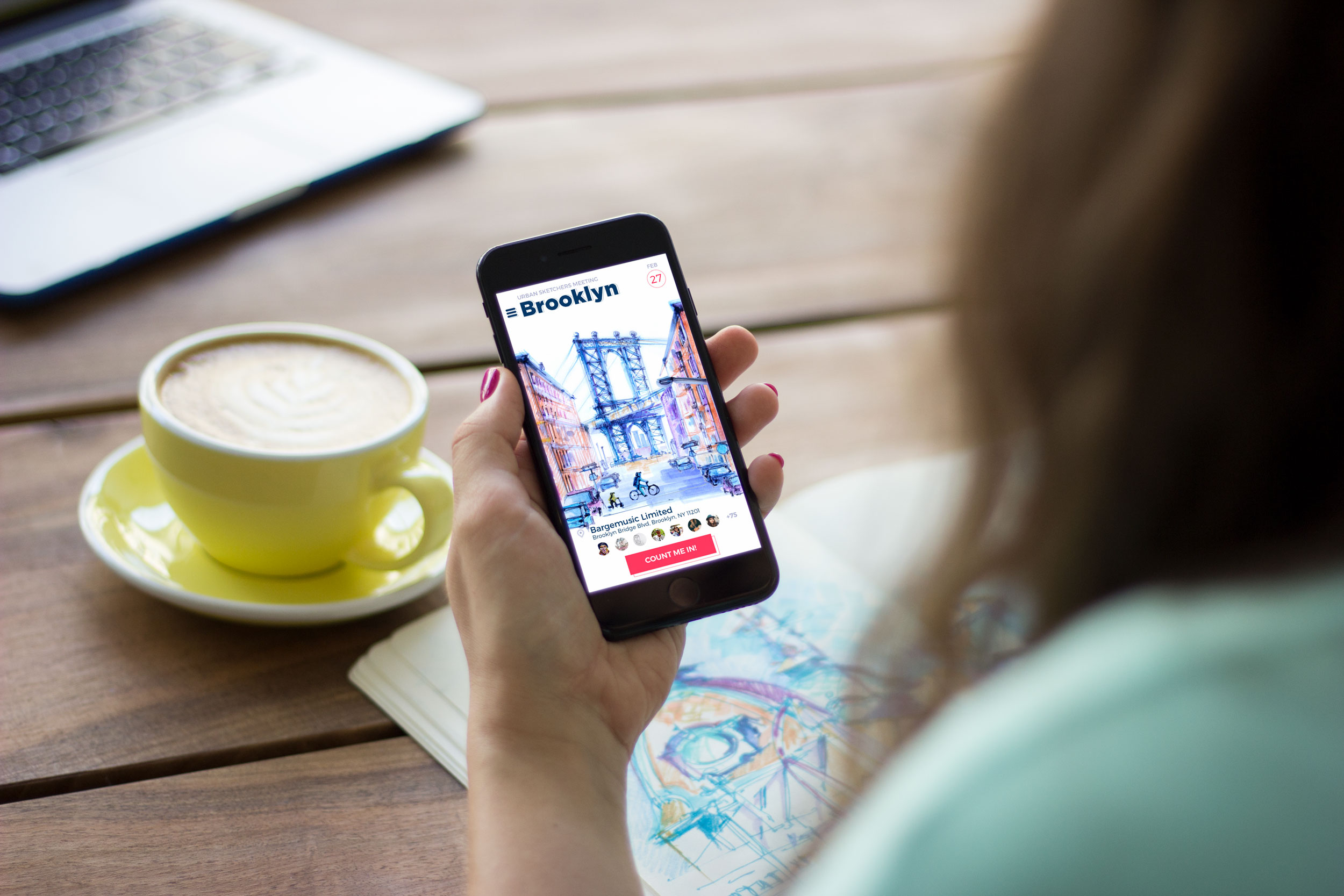
Size is the blunt instrument of UI button design, and blunt instruments work, until they don’t. A button too small gets missed by thumbs, especially in mobile UI design, where fingertips are considerably less precise than cursors. Apple’s own interface guidelines put the minimum touch target at 44 by 44 pixels; Microsoft, working from different research, lands closer to 34 by 26. Neither number is gospel. What matters is the logic underneath: a tap target has to survive contact with an actual human hand, not just a mouse pointer gliding around a Figma file.
The opposite failure gets less attention but does just as much damage. A call-to-action button blown up to dominate the screen reads less like confidence and more like a salesman leaning too close into your personal space. Visual hierarchy collapses the moment one element eats the whole layout. The practical fix: size your CTA relative to its neighbors, not in isolation. It should win the comparison, without swallowing the whole page.
When in doubt, look at the screen at arm’s length and squint. If the button still reads as the obvious next click from three feet away, the sizing is doing its job.
Color Psychology, Minus the Mysticism
Every design blog eventually produces a chart claiming blue means trust and red means urgency, as though color psychology were a vending machine you feed a hex code into and out drops a feeling. While actual human color perception is way messier than that, the mechanism underneath is real—color triggers a fast, mostly unconscious emotional read before conscious thought catches up to it.
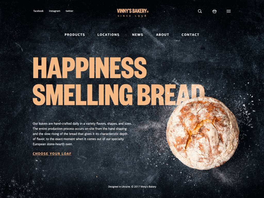
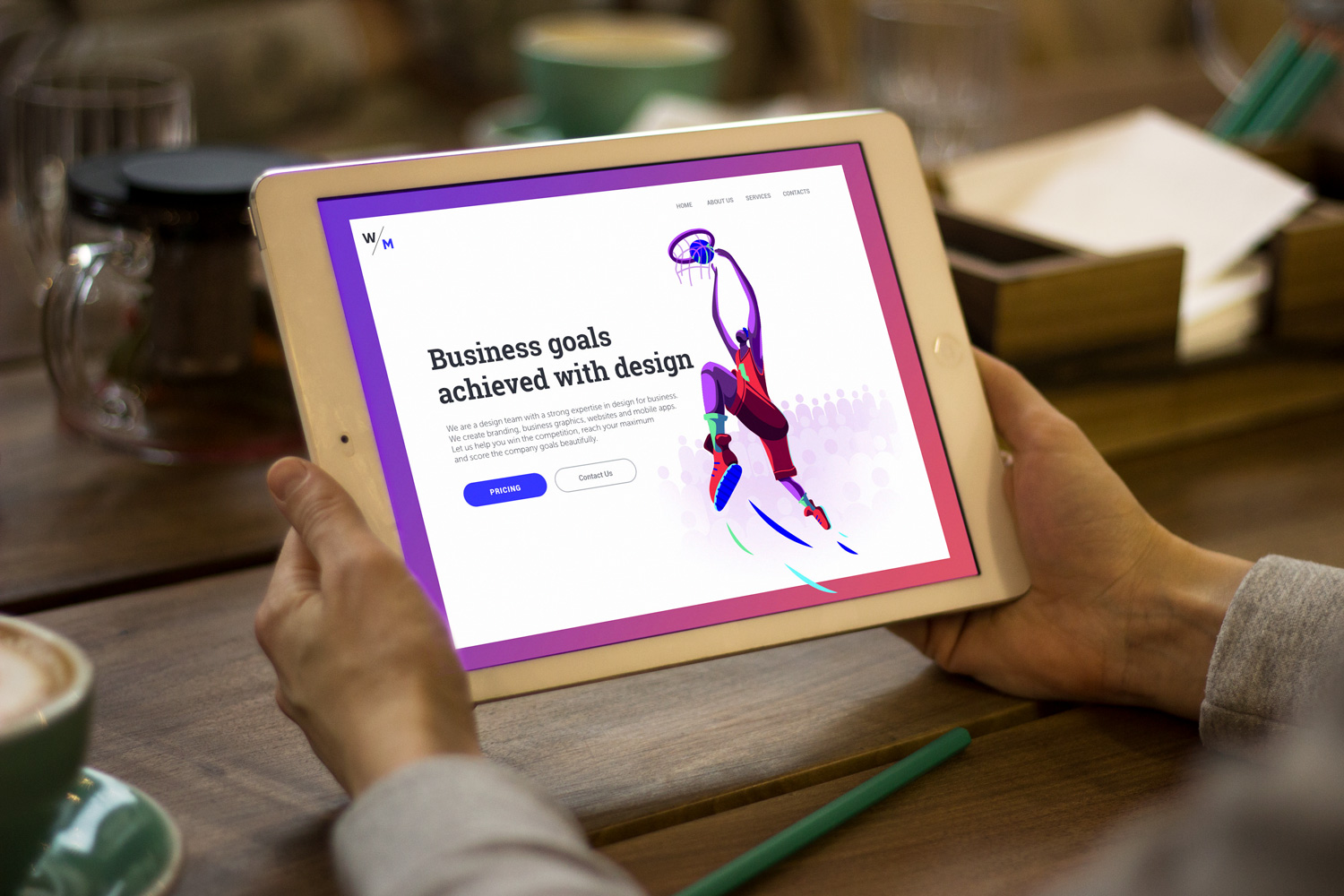
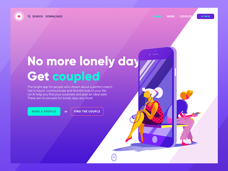
The more reliable rule, and the one actual research into button color psychology keeps confirming, has nothing to do with which hue you pick. It comes down to contrast. A CTA button that matches its background in saturation and value disappears into the wallpaper, whether it’s a trendy shade of coral or a safe corporate navy. Choose a color that fights its surroundings a little. Orange against a mostly blue-and-white layout will outperform a “more appropriate” blue button nearly every time, simply because the eye has nothing else nearby in that value range to compare it against.
Shape carries its own low-grade signal too. Rounded rectangles read as approachable and easy to click, which is a large part of why they dominate modern UI design; sharp corners register, at a barely conscious level, as something to be a little cautious around. None of this demands a psychology degree to apply. It does demand restraint, though: pick one accent color for action, keep it consistent across the interface, and let contrast do the persuading instead of decoration.
Where Eyes Already Go
Placement decisions get treated as an afterthought, bolted onto a finished layout once the “real” design work wraps up. That ordering runs backwards. Eye-tracking research from groups like the Nielsen Norman Group has mapped scanning behavior for years, and the findings hold steady enough to build a layout around, rather than glance at after the fact.
Content-heavy pages—blogs, news sites, anything built from real paragraphs—tend to get scanned in an F-pattern: a horizontal sweep across the top, a shorter sweep partway down, then a vertical drift down the left margin hunting for keywords. Landing pages usually pull a Z-pattern instead: top-left to top-right, a diagonal cut down toward the bottom-left, then a final horizontal pass along the bottom. Drop a call-to-action button into the dead center of a paragraph-heavy F-pattern page, and it becomes a button nobody reaches, no matter how loud its color.
The practical move is almost insultingly simple: map which pattern your page naturally produces before placing anything, then put the CTA where that pattern already runs out. On a landing page, that’s usually the bottom-right, sometimes echoed near the top-left for anyone scrolling fast who needs a second chance to notice it. On a long-form page, repeating the CTA at natural stopping points—the close of a section, a pause in the argument—beats stapling one giant button to the top and hoping it survives the scroll.
Two Words Doing All the Work
Microcopy gets treated as filler, something knocked out after the “real” design is finished. That ordering is backwards as well. The words on a button carry more persuasive weight per pixel than almost anything else on the page, because they’re the last thing a user reads before deciding (or leaving).
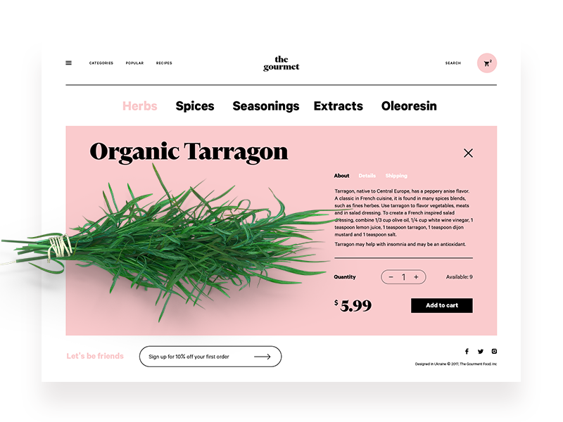
“Submit” belongs on a tax form, not a product page—it describes an obligation, not a benefit. “Get Started” describes a beginning. “See Pricing” describes information gained. The strongest button microcopy answers, in two or three words, the question every visitor is quietly asking right before the click: what happens next, and is it worth my time? Specificity tends to beat cleverness. “Start My Free Trial” will usually outperform a cute pun, because it removes one more small unit of hesitation standing between a visitor and the click.
A habit worth building: write five versions of the button copy before settling on one, then read each aloud in the voice of someone mildly skeptical. Whichever version survives that little audition earns the digital real estate.
The Actual Lesson
Strip away the size charts and the color wheels and what remains is a fairly unglamorous idea: a call-to-action button works when everything around it has already done the persuading, and the button just gets to collect the result. Treat it as the final word in an argument the whole page has been building, not as a decoration competing for attention against everything else on screen. Get the layout, the color contrast, and the scanning pattern right first. The button, at that point, barely has to try.
Recommended Reading
More case studies, more opinions, more design done properly. Browse the archive if you’re not quite done thinking about this yet:
UI/UX Design Glossary. Navigation Elements
UX Design Glossary: Interface Navigation Elements. Set 2
7 Tips to Enhance Mobile Interactions
3C of Interface Design: Color, Contrast, Content
9 Effective Tips on Visual Hierarchy