The search bar on your website or app is a direct line to the inside of your user’s head. The moment someone types into that field, they’re handing you a gift—a raw, unfiltered declaration of intent. No second-guessing.
Internal search is the function that takes that declaration and converts it into a useful result. When it works well, it’s a shortcut that feels almost telepathic. When it fails, it’s a wall. Users bounce, conversion drops, and you’ve lost someone who was already on your website, which is arguably the hardest and most expensive person to lose.
The search field—also called a search box or search bar—is the UI element that makes this possible. It accepts the query, hands it to the engine underneath, and surfaces what matters. The interface component itself is deceptively simple, which is exactly why it gets underestimated.
How you design internal search will determine whether your users find what they came for—or leave to find it somewhere else. Here’s what actually matters.
Physica Magazine website features the search control in the header
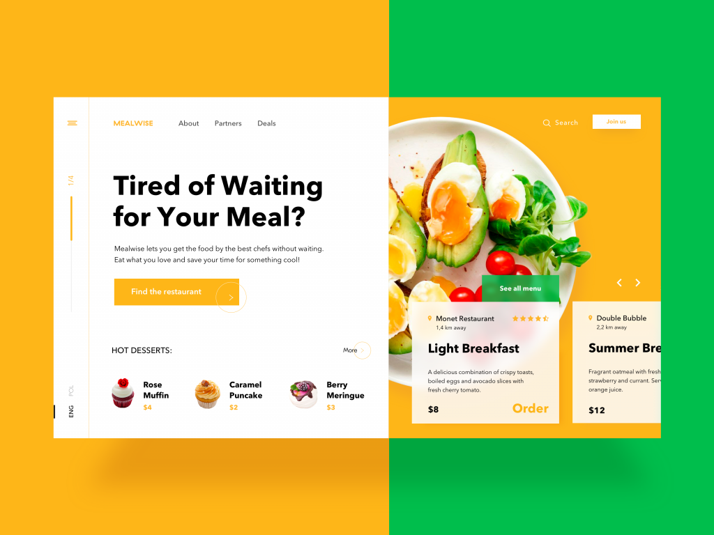
The website of a food delivery service features the search control with a text label in the header
When Your Product Needs a Search Function
The old rule of thumb said: add internal search once your site hits 100–200 pages. That rule was written in a different era of the internet. Today’s users are navigating dozens of digital products a day, and their tolerance for friction has plummeted accordingly.
A better trigger: 50+ pages. At that threshold, well-designed navigation alone starts to crack under the weight of user expectations. If a visitor arrives from Google or social media with a specific item, article, or answer in mind—and has to hunt for it through menus and scroll depth—you’ve already started losing them. A fast, well-placed search interface removes that risk entirely.
Single-page sites, portfolio sites, lean corporate pages—these can live without search. Solid navigation handles the load. But for e-commerce platforms, content-heavy blogs, news sites, SaaS documentation, marketplaces, and media libraries, search UX is a core business function.
One more thing worth saying clearly: search does not replace navigation. These two elements serve different types of users. Some people know exactly what they want and will use the search bar. Others browse and explore, following links and menus without a fixed destination. Design for both. Tipping too far toward search-as-default means you’ll frustrate every user who would rather follow a path than invent one. This balance between search and navigation is where thoughtful UX lives.
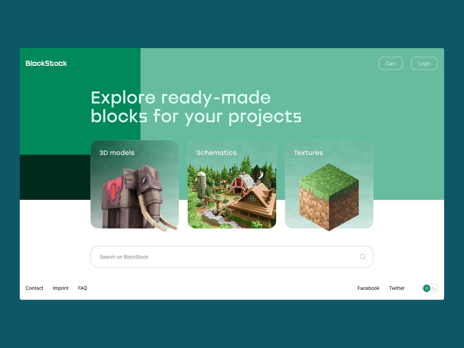
The home page of the BlockStock website features a big search field in the above-the-fold area to let users quickly find the Minecraft assets they want
Three Non-Negotiables for Search That Actually Works
Before getting into design specifics, there are three properties that make or break a search experience. Consider these baseline requirements, not nice-to-haves.
- Instant visibility. Users should spot the search bar without scanning. If someone has to look for the search function, the search function has already failed. Visibility here is measured in milliseconds.
- Immediate legibility as search. The field needs to communicate its purpose through shape, icon, or label without any reading required. Anyone glancing at your interface should instantly recognize it as a search input.
- Relevance of results. This is partly an engineering problem, but the design of filters, categories, and query input directly affects how well users can communicate what they want to the system. Poor search result relevance is often a UX problem wearing an engineering mask.
The Crypto Blog makes a search control one of the core CTA elements on the page
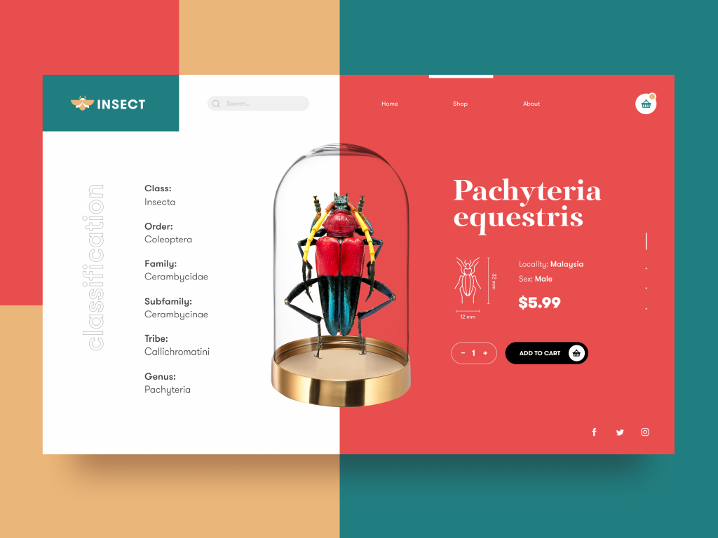
The e-commerce platform selling insects features the open search field in the header
UX Design Practices for Effective Search
The following practices apply across web interfaces, mobile apps, and hybrid products. Each one has a real-world reason behind it.
Place the Search Field Where Eyes Land First
Placement drives discoverability more than any other variable. In web design, the header is the highest-attention zone on the page—studies on visual scanning confirm it consistently. The search bar belongs there, visible on load, positioned without requiring any scrolling or hunting.
For large e-commerce sites, this placement makes commercial sense. A user who arrives looking for a specific product and fails to find the search bar quickly is a lost customer. When mental models are factored in—and they should be, because users bring habits from every other site they visit—the header search bar is expected. It has been there long enough on enough sites that deviating from it requires a very good reason.
Hidden search, buried below the fold or tucked into a footer, might as well not exist for most users. The exception: offering search in both the header and footer makes sense for long-scroll pages without sticky navigation. A user who has scrolled to the bottom should be able to search from there, without the friction of scrolling back up.
Mobile search UX operates under different constraints. Screen space is limited, and everything is a tradeoff. If search is central to the user journey—travel apps, e-commerce apps, job search platforms—it earns a spot in the tab bar, always reachable with a thumb. If search is secondary to the core experience, it can live in a contextual menu or appear only on screens where it adds meaningful value.
The tea e-commerce website includes the search control in the header which is sticky and easily reached from any point of interaction
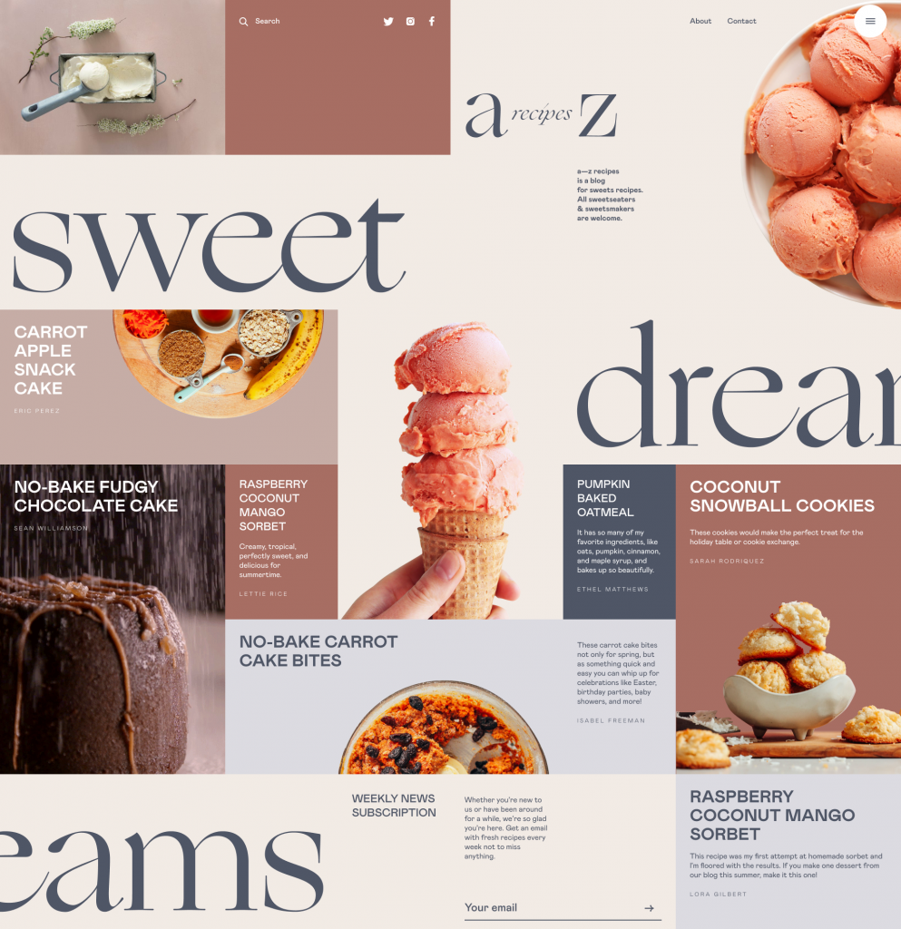
The blog devoted to dessert recipes features the search icon in the header
Use the Magnifying Glass. Defend the Magnifying Glass.
The magnifying glass icon is one of the most universally recognized symbols in digital interface design. It means search to almost every user, on every device, in every country. That kind of symbol consensus is worth protecting.
Experiments with alternative icons are a gamble with your users’ cognitive load. Before replacing the magnifying glass with anything else, ask what you gain and who you’re designing for. In most cases, the answer is: nothing, and everyone. So, stick with the standard.
There are legitimate exceptions, though. A design system built entirely around typographic hierarchy and minimal visual elements might use a text link rather than an icon—and that can work if the surrounding context makes the function clear. But it should be a deliberate, tested choice, not a creative impulse. When in doubt, test with real users before shipping a custom search icon into production.
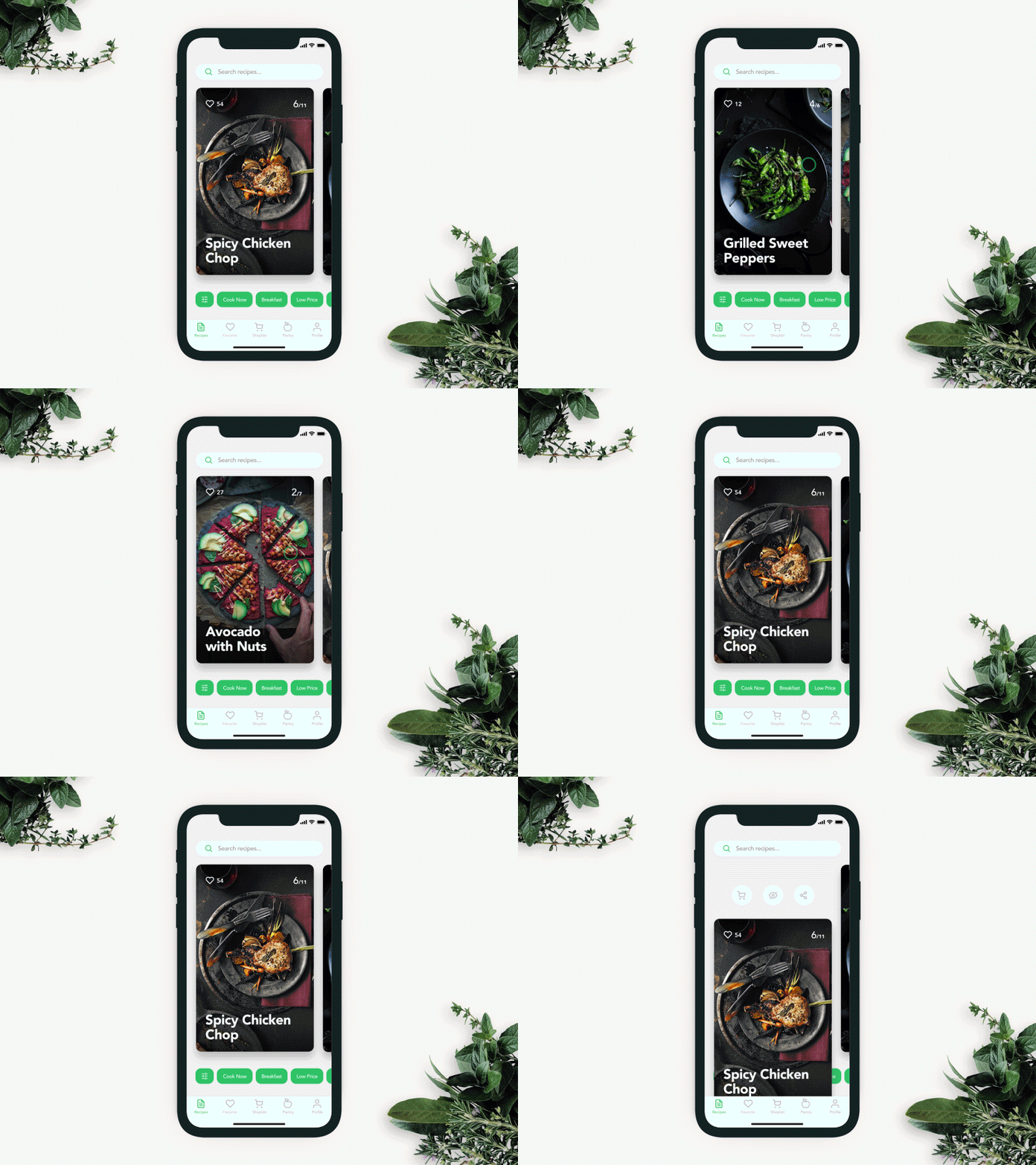
The recipe app full of content features the search field in the top part of the screen, with both a search icon and a textual prompt to make its functionality super clear. Also, the tags below help to tune the search better.

The concept of search interactions for a mobile app
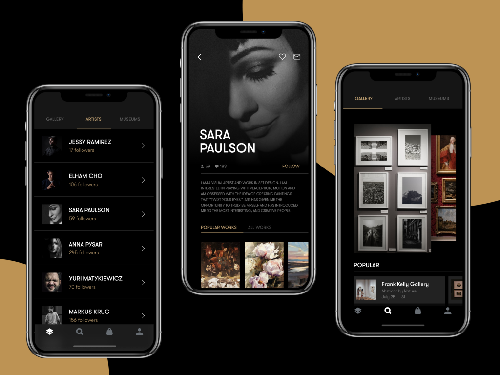
The Gallery App features the search icon in the tab bar allowing a user to reach it quickly
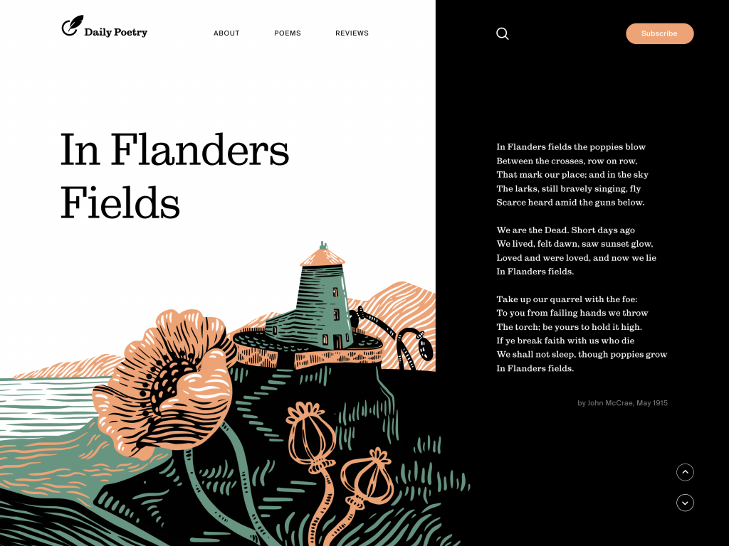
Daily Poetry website features the search icon in the header and makes it super visible due to the color contrast
Textual Prompts and Predictive Search
Placeholder text inside the search bar serves a dual purpose: it confirms the field’s function, and it can seed query ideas for users who are mid-intent. “Search for products, brands, or categories” tells a user both what to do and what’s possible. Two jobs done in six words.
Beyond static placeholder text, autocomplete and predictive search are among the highest-value search UX features available. The moment a user begins typing, surfacing relevant suggestions accelerates the entire interaction. Fewer keystrokes. Faster path to results. More time engaging with actual content.
Autocomplete works best when tuned to the most common and commercially significant queries your users actually enter. This data lives in your search analytics, and if you’re not mining it for UX insights, you’re sitting on intelligence.
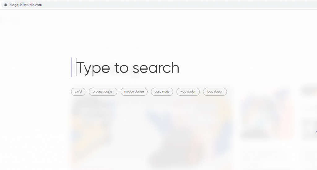
The search here in Tubik Blog opens a minimalistic new page blurring the blog home page as a background. The user gets the big search field with a text prompt “Type to search” and pulsing cursor showing that the form is interactive. Also, there are clickable tags with popular queries.
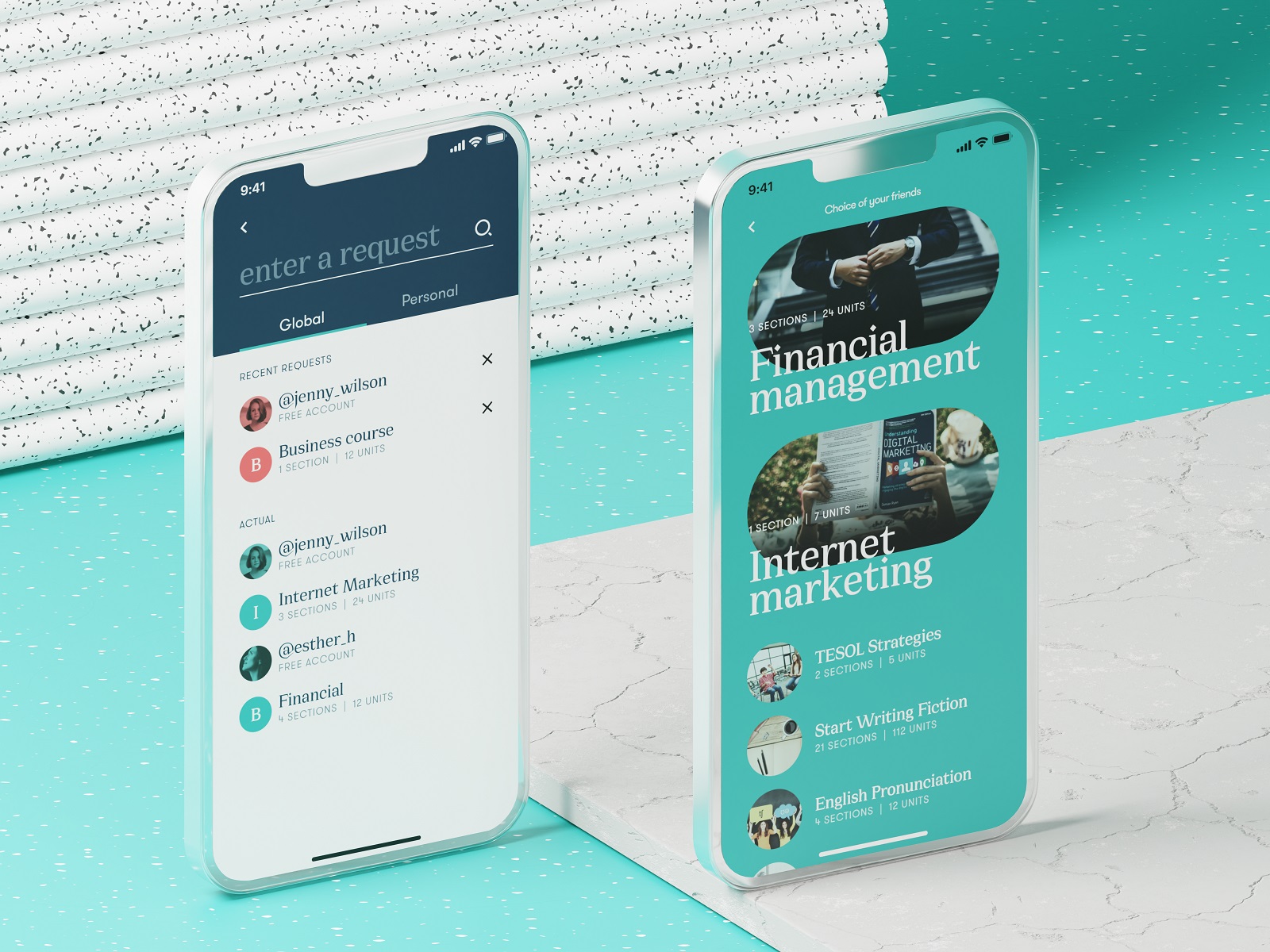
Search screen of the education courses app
Show Results Before They Ask
Dropdown result previews take predictive search further. Rather than just completing a query, the interface offers actual results—snippets, thumbnails, titles—while the user is still typing. This transforms the search bar from a submission form into a real-time discovery surface.
For an e-commerce product search, this means showing product images and prices. For a blog or media site, this means article headlines and publication dates. For a documentation portal, this means section titles and brief descriptions. The interaction pattern is the same, the content is what makes it powerful.
Done well, preview search results reduce the cognitive load of forming a perfect query. Users can course-correct in real time, following what they see rather than trying to guess the right keywords.
Search interactions for Calorie Calculator App
Filters: Giving Users Control Over Their Own Search
High-content environments—think large marketplaces, media archives, recipe platforms, or research databases—produce too many results for even a precise query to surface what a user actually wants. Filters are the solution: structured controls that let users narrow results by price, date, category, brand, rating, format, or whatever dimensions matter most for the specific content type.
Good filter UX means filters are visible without cluttering the results view, easy to apply and remove, and designed around how users actually think about the content—not how the database happens to categorize it.
Amazon’s category dropdown embedded in the search field is a useful reference point: search can begin inside a context the user selects before even typing. That reduces noise from the first keystroke.
On mobile, filters are especially powerful. The small screen limits how much can be shown at once, so giving users precise filtering tools means they spend less time scrolling through results that miss the mark.
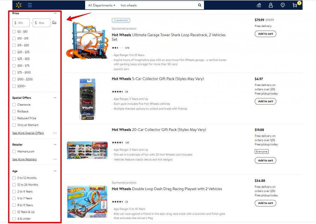
Here’s what search filters look like on Walmart website: the page of search results has a sidebar on the left to allow users to narrow down the list of options with the fine-tuning
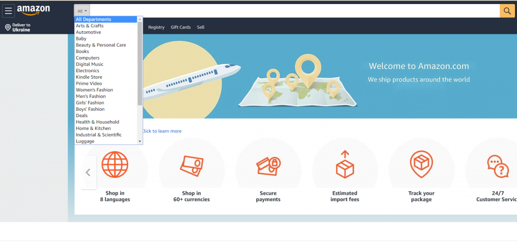
Amazon’s search interface
Filters also work really well in mobile search interactions as they are easily tuned and save time and effort in finding the perfect item.
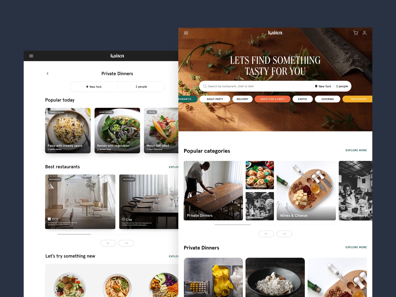
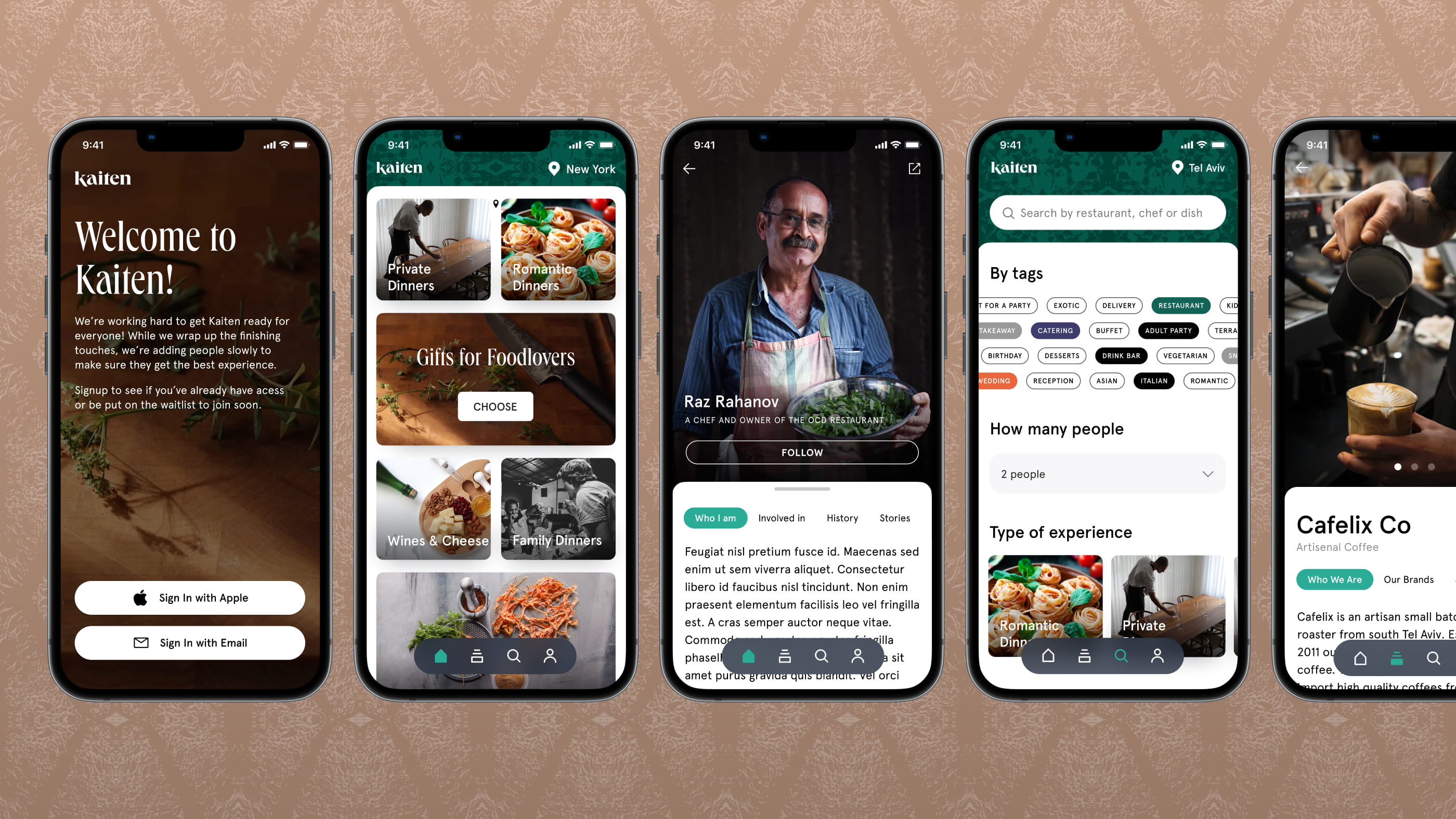
Here’s how Kaiten food marketplace website and application use filters to help users tune their search process
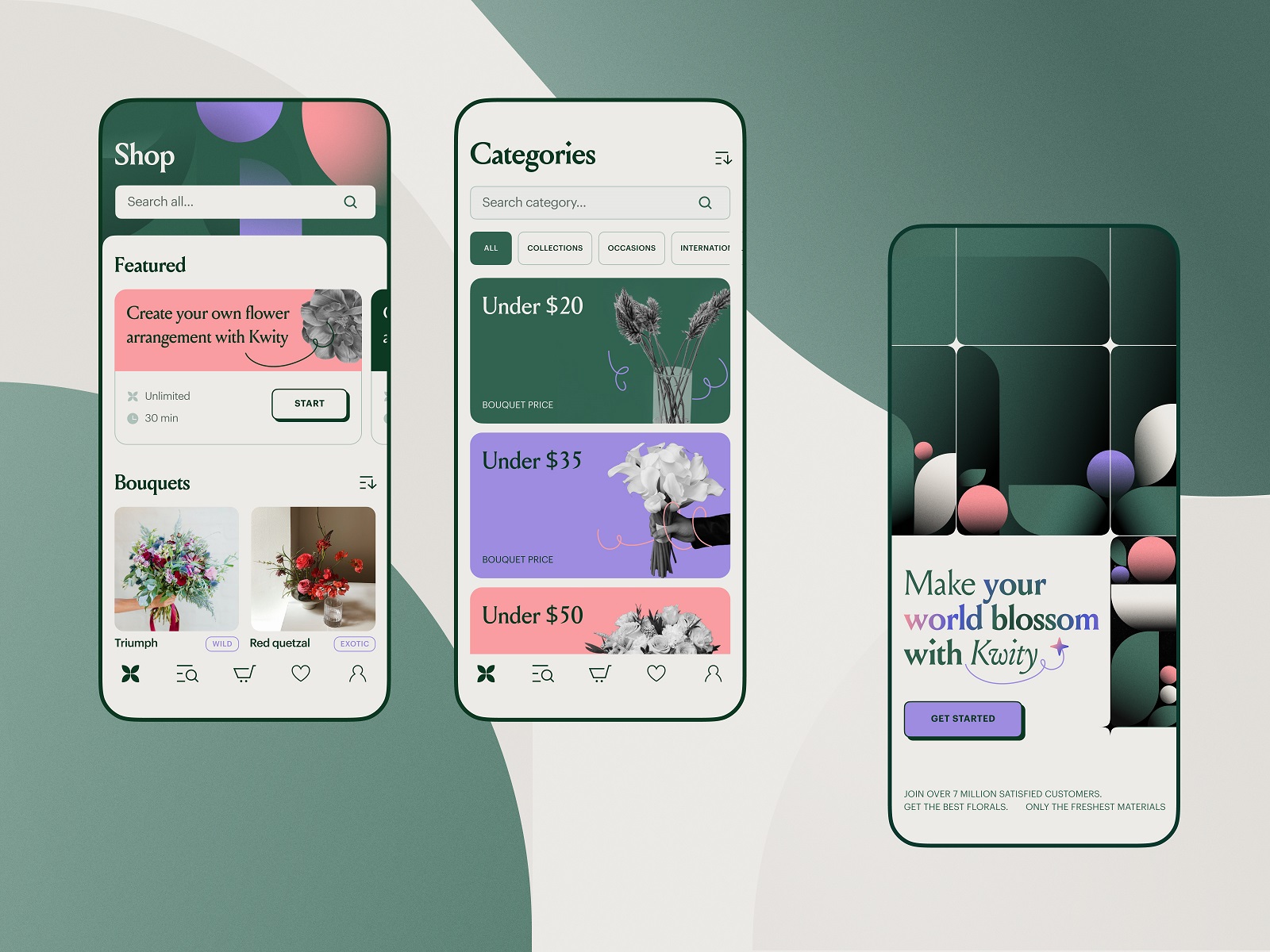
The flower store mobile application uses a noticeable search field on the top of the screen and makes the search process tuned with filters
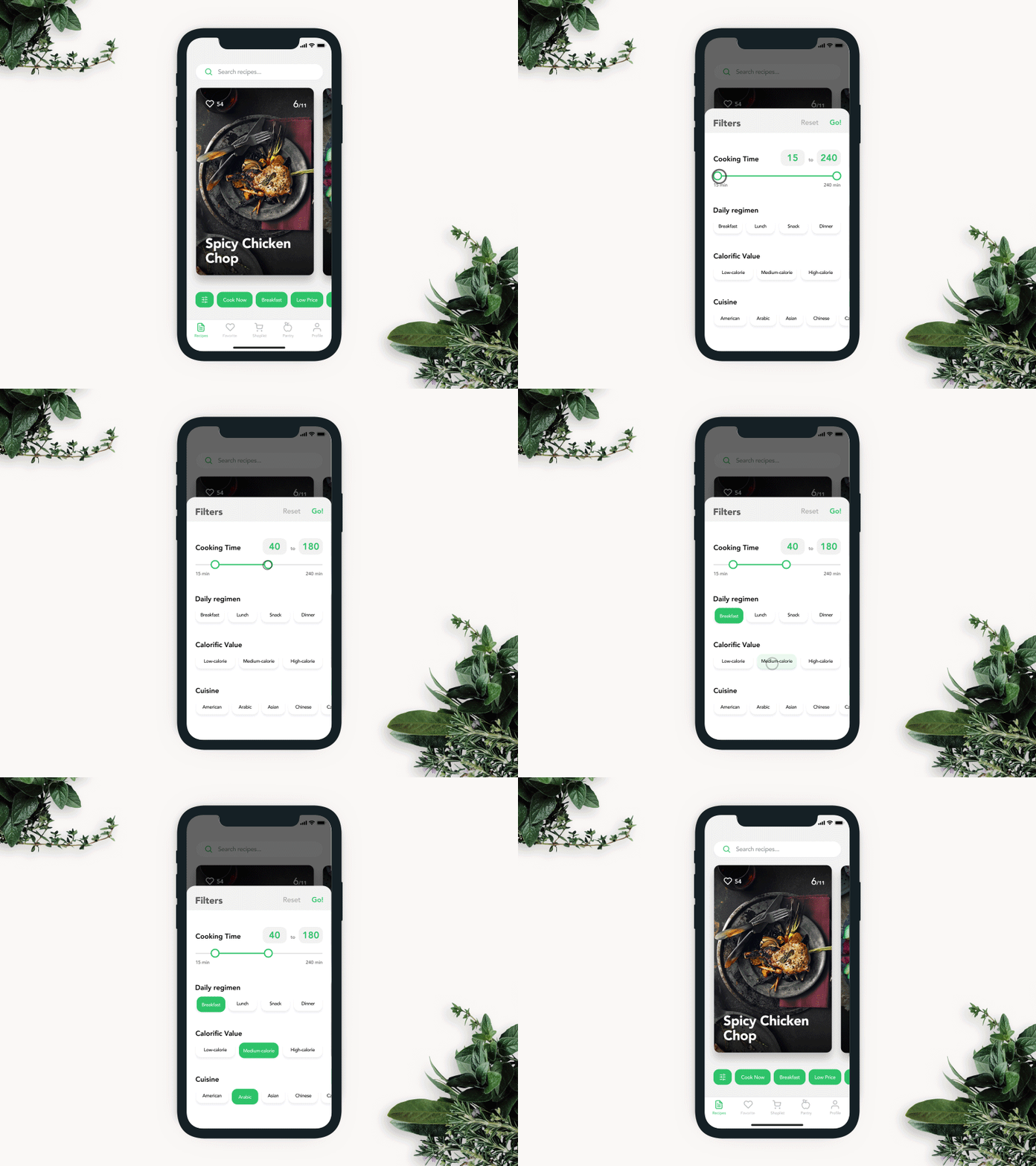
Recipe app filters interaction designed to tune the search among the hundreds of recipe options in the mobile app.
The Last Word on Search Design
Internal search rewards the attention you give it. Build it thoughtfully—visible, familiar, fast, and relevant—and it becomes the most direct path between your users and what they came for. Neglect it, and you’ve built a very elegant door that leads somewhere no one can find.
There’s one more practice that separates good search UX from great search UX: analyze your search data. Every query users type is a signal. It tells you what they want, what they expect to find, and often what your navigation fails to surface. Those insights feed back into better content architecture, smarter autocomplete, more useful filters, and ultimately a product that improves because it listens.
The search bar might be a small box. What it contains is the voice of your user. Design accordingly.
Recommended Reading
If this got your brain moving, you’ll want to dig into the rest of our writing—case studies, design breakdowns, and opinions we’re prepared to defend:
Error Screens and Messages: UX Design Practices
Visual Dividers in User Interfaces: Types and Design Tips
Directional Cues in User Interfaces
How to Make User Interface Readable
Basic Types of Buttons in User Interfaces
Negative Space in Design: Practices and Tips