Open ten browser tabs. Count how many headlines lean on the same four fonts. That’s no accident—a font library is simply doing its job too well.
Every tool promises infinite choice. Every brand somehow ends up sounding the same anyway. Call it the paradox of abundance: more options on the menu, and everyone still orders the same five dishes.
Hand lettering breaks that pattern. Software can spin up a thousand typefaces in a second. It can never plagiarize a single pencil stroke. The wobble in a hand-drawn line, the small hesitation before a curve commits to its direction—for software and algorithms, that’s noise. For designers, a signature.
Hand lettering has outlasted every design fashion since the printing press tried to make it obsolete. Digital tools showed up promising a replacement and ended up working as an assistant—a tablet and a stylus extend a hand, they never replace it. What follows is where that old craft still earns its seat at the table, where it makes a brand breathe, and where, handled carelessly, it can sink a perfectly good website.
What Lettering Actually Is
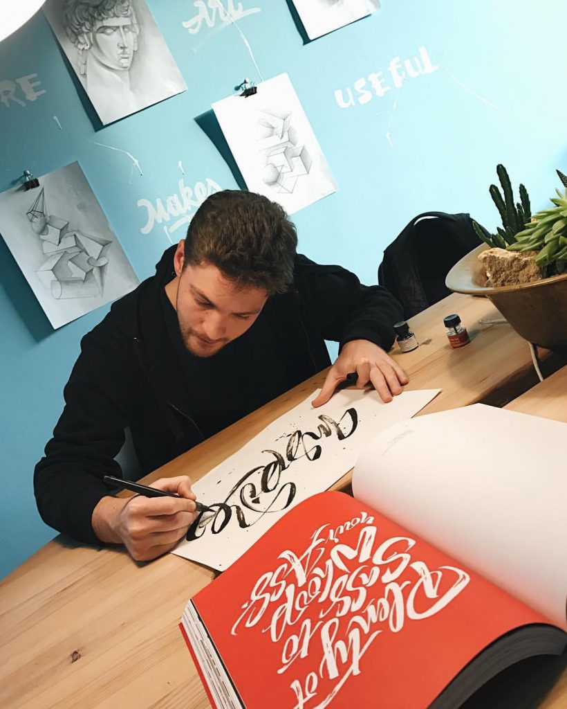
While a font gets typed, lettering gets built.
Type a word, and a designer is choosing from a catalog—every letterform locked in advance by someone they will never meet. Letter a word by hand, and a hundred tiny decisions happen in real time: how a stroke thickens, where a curve hesitates, how two letters lean toward each other like old friends sharing a secret.
Pencil, brush, chalk, ink—the classic toolkit. A stylus and tablet can do the job too, though it asks for real fluency in software like Illustrator, the same way a digital piano asks for real musicianship. The tool changes. The decision-making stays exactly as demanding.
The most useful thing to remember about lettering: it can take hours of careful planning, or thirty spontaneous seconds. Both count. Both qualify as art. Neither one is a font.
Lettering vs. Calligraphy: Cousins, Not Twins
People mix these up constantly, so here’s the line that separates them.
Calligraphy is a discipline with centuries of rules behind it—a dip pen, controlled pressure, one continuous stroke per letter. Calligraphers chase perfection inside a fixed style: beautiful, consistent, repeatable on command.
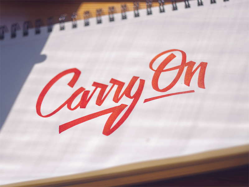
Lettering answers to none of that. Lettering is illustration that happens to spell something. Each letter gets treated as its own small object, then arranged to work as a team—closer to building a tiny sculpture garden than writing a sentence.
Here’s a fact worth keeping in a back pocket: the device this article is being read on owes its multiple typefaces to a college calligraphy class a young Steve Jobs wandered into with zero plan to use it. A decade later, that class shaped how the first Macintosh handled type. The lesson travels well beyond computers—craft studied without an obvious payoff has a habit of resurfacing exactly when it matters most.
Where Hand Lettering Earns Its Keep
A designer today has access to more fonts than any one human could responsibly use in a lifetime. But certain products still need something no shelf of fonts can offer.
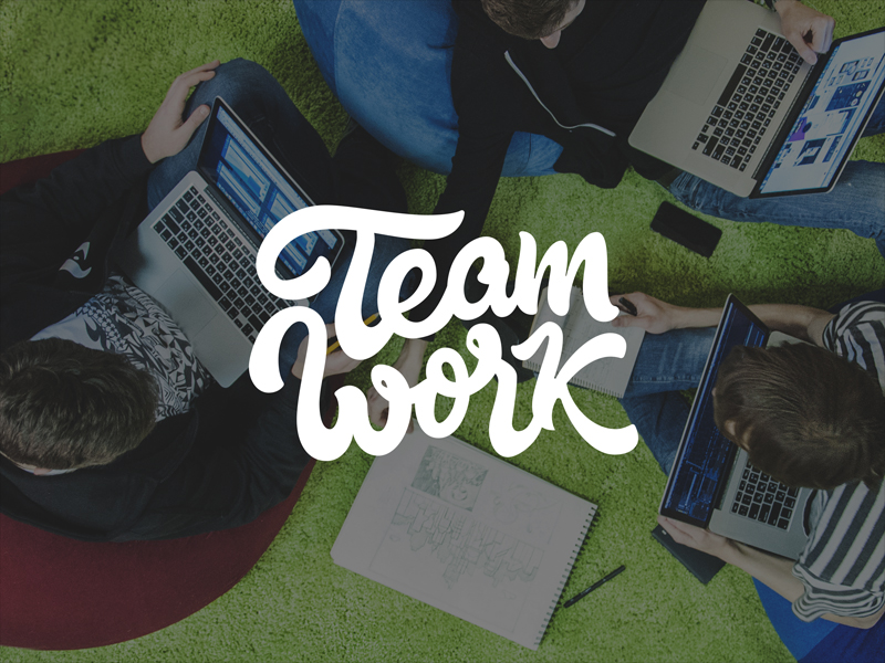
A slogan rendered by hand stops a scroll in a way Helvetica never will. It signals that an actual person spent actual hours caring about three words—a strange and increasingly rare claim for a brand to make. People remember effort, and they notice it now more than ever, in a moment when producing polished design assets has become almost trivially fast. Scarcity flipped sides: anyone can output a thousand competent layouts before lunch. Almost nobody can produce one letterform with a genuine pulse.
That pulse buys trust before a single word gets read. Visitors size up a brand within seconds, mostly on gut feeling, and craftsmanship reads as honesty to the human eye—even when nobody could explain why.
The Logo Argument
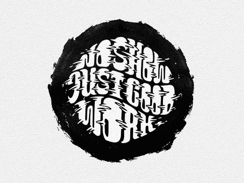
A brand identity built entirely from licensed fonts gets recreated by a competent designer in an afternoon, screenshot in hand. A brand identity built from custom hand lettering takes a forger weeks to fake, and the fake still looks like a forgery—the way a photocopy of a photocopy slowly loses the soul of the original.
That gap matters more than it sounds. Trademark protection rewards distinctiveness, and a wordmark drawn from scratch carries a kind of fingerprint a stock typeface never offers, since no two hands draw a curve the same way twice, let alone like a competitor’s. Every stroke gets decided around what one specific company stands for, not around what a type foundry calculated would sell to ten thousand other clients.
The payoff: a mark that defends itself simply by existing. Hard to copy. Easy to recognize. Worth every extra week it takes to get right.
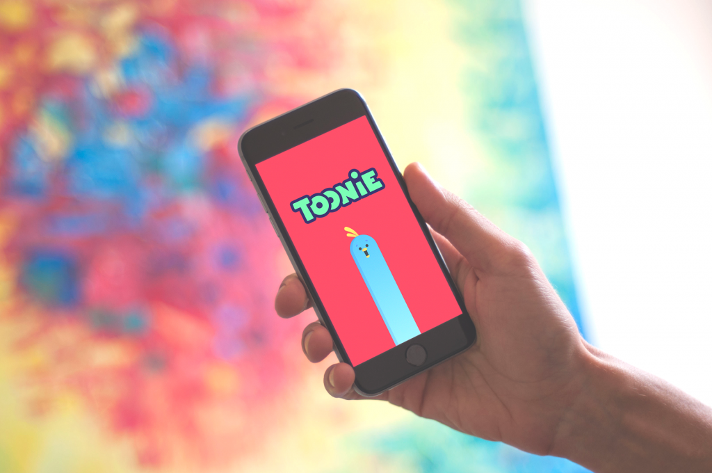
Logo lettering handcrafted for Toonie Alarm
Where It Goes Wrong
Craft and judgment are different muscles, and lettering tests both.
A law firm promising serious legal protection, rendered in a bouncy, playful script, sends a message nobody intended: please do not trust us with anything important. Tone has to match audience, every single time. A surgeon’s clinic and a children’s bakery should never share a hand-lettered treatment.
Legibility causes the second disaster. Decorative flourishes look stunning in a portfolio piece and turn into a genuine liability the moment a real customer squints at a homepage trying to find a phone number. A gorgeous letterform nobody can decode has failed its only job. Readability outranks beauty, always—a rule worth pinning above every design studio’s coffee machine.
Advantages Of Lettering
- It resists copy-paste. Almost every other design choice can be cloned in seconds; this one can’t, and that scarcity is the entire value proposition.
- It catches the eye before a single word gets read, because it looks exactly like effort feels.
- It triggers real aesthetic pleasure—a measurable response, not a marketing buzzword.
- It builds brand recognition fast, since people remember shapes well before they remember names.
- It carries emotional texture a font file often misses; some feelings need a hand, not a typeface.
- It helps a brand stand apart in a market where every competitor reaches for the same five fonts.
- It leaves a first impression strong enough to decide whether someone keeps scrolling or starts shopping.
None of it makes hand lettering mandatory for every project. All of it makes hand lettering worth a serious conversation before the next brand identity gets built.
Software can hand a brand a font. A hand can give it a voice.
Recommended Reading
Still with us? Keep Going. More case studies. More design thinking. Same obsession with getting the details right:
Ecommerce UI/UX: 6 Web and Mobile Design Projects for Online Shopping
Feel Homey. Handy Tips for Home Page Design
Hit the Spot: Design Strategies for Profitable Landing Pages
Ten Landing Pages Worth Studying (And Why They Work)
Digital Art: Diverse Digital Illustrations Inspired by Wildlife