There’s a version of the healthcare AI brand you’ve already seen in your head. Sterile white. Some shade of blue that means “we’re trustworthy, we promise.” A stock photo of someone smiling at a tablet. A sans-serif typeface that says absolutely nothing. Somewhere in the hero section, the word “seamless.”
You feel safe. You feel nothing. You leave. That’s the design equivalent of a firm handshake from someone who won’t make eye contact. Technically correct. Completely unconvincing.
Transform9 came to us with a different kind of vision—and a better brief.
The Problem Hiding Inside the Product
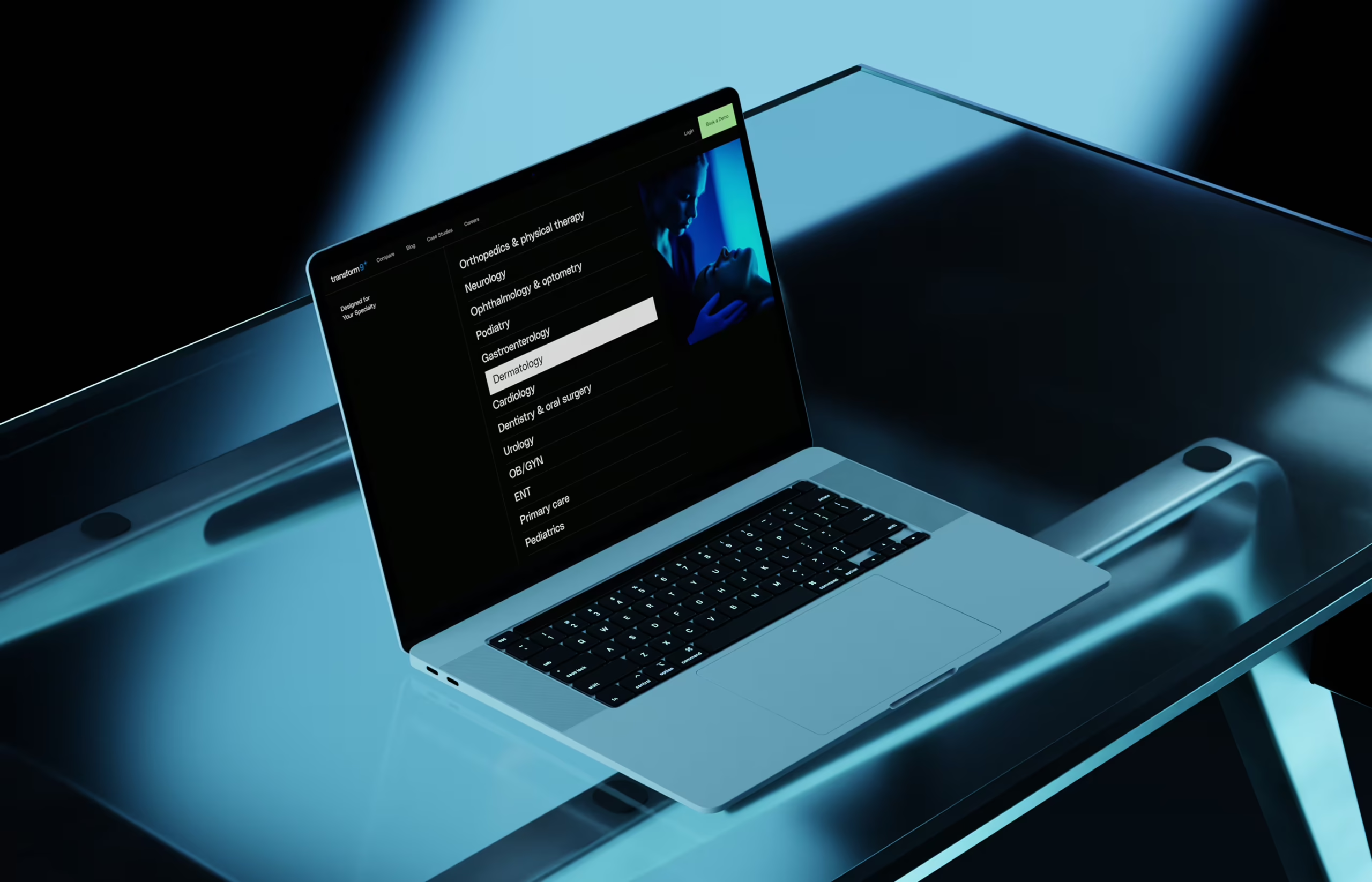
Transform9 does something genuinely useful. The platform is a SaaS product built for clinics and healthcare providers—it automates patient communication from the ground up. Appointment booking, routine requests, administrative back-and-forth—all handled by AI, invisibly, before a single staff member needs to pick up a phone. The people running clinics spend less time on logistics. Patients get faster responses. Everyone wins.
Except there’s a catch, and it has nothing to do with the technology.
Healthcare is one of the highest-trust industries on earth. People hand over their bodies, their histories, their fear. And AI—even good AI, even AI that objectively makes things better—still arrives with baggage. Skepticism from patients who don’t know what’s reading their requests. Hesitation from clinic administrators who’ve been burned by overpromised software before. The technology works. The perception is the problem.
Transform9 needed a brand that could carry the weight of both sides: confident enough to signal real innovation, warm enough to not make a clinic manager feel like they’re onboarding a machine that doesn’t care if anyone gets better.
The Brief Is a Contradiction. Good.
The thing about a brief like this—make it innovative but human, credible but approachable, tech-forward but warm—is that it sounds like a contradiction until you realize contradictions are where the most interesting design lives.
We weren’t trying to split the difference. We weren’t averaging two aesthetics into beige. We were looking for the overlap: the place where confidence and care feel like the same thing.
That place exists. We’ve been there before. The answer is almost never in the concept, it’s in the execution. The gradient that moves in the right direction. The typeface that’s precise without being cold. The spacing that gives content room to breathe instead of commanding it to perform. The motion that says “we’re alive” without saying “look at us.”
Building the Identity
We started at zero. Logo, visual system, design language—all of it from scratch. That’s both a privilege and a responsibility, because when there’s nothing, every decision is foundational.
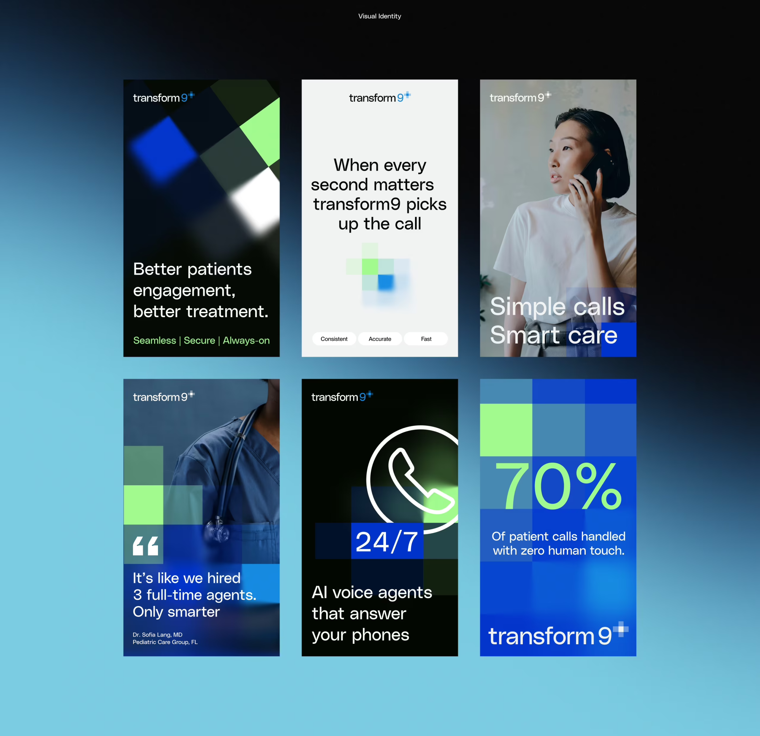
The visual identity we developed for Transform9 centers on subtle gradients and refined UI details. Not the dramatic, sci-fi gradients that scream “AI startup circa 2021.” The kind that shift slowly, that create depth without demanding attention. The kind that feel like light through a window rather than a loading screen. The typography was chosen for the same reason—legible and authoritative, but with a warmth that keeps it from tipping into the cold precision of a medical form.
Color palette, type system, visual tone—we defined each one not as a standalone choice but as part of a language. A brand identity lives or dies by how it behaves across touchpoints, not how it looks in a single mockup. Everything needed to hold together at scale.
We also built custom imagery for the project, which is a detail that matters more than it sounds. Generic stock photography in healthcare is a specific kind of visual lie: the perfectly lit doctor, the patient with the exact right expression, the exam room that has never smelled like anything. We avoided all of it. The imagery we created is specific to Transform9’s world—supporting the brand tone rather than undermining it with borrowed credibility.
Mapping How Decisions Actually Get Made
Before a single pixel of the website existed, we did the structural work. Sitemap. Wireframes. User flow.
This is the part of design that clients sometimes want to skip—the part that looks like diagrams and feels like bureaucracy—and it’s the part that saves everyone months of frustration later. Because we were designing for clinic decision-makers: people with limited time, real budget authority, and zero patience for a website that makes them work to understand what they’re buying.
We mapped the journey from landing to understanding to converting with that person explicitly in mind. What do they need to see first? What question are they asking on each page? When have they seen enough to take the next step? The information architecture is the answer to those questions made visible.
From Wireframes to Something That Feels Alive
High-fidelity design is where the identity stops being a system and starts being an experience. We carried every element through—full page designs, inner pages, blog layout, case study templates—because consistency at scale is only possible when the foundation is solid.
The web development happened in Webflow. We implemented GSAP animations throughout the site: motion that adds depth without performing it, subtle enough to feel polished, purposeful enough to make the site feel alive. There’s a specific calibration required for motion in a brand like this. Too much and you’ve built a demo reel. Too little and the design sits flat on the screen. We were looking for the version that feels like a confident exhale.
What We Learned That We’ll Use Forever
Trust is a design problem. In high-stakes industries, visual tone does as much persuasion as copy. Maybe more. People make trust decisions before they’ve read a single word.
“Innovative” and “human” coexist. The tension between them is a great brief. Restraint in motion, intention in typography, subtlety in color—those are the tools.
Systems beat pages. A brand identity is only as strong as its weakest touchpoint. Every template, every inner page, every edge case—each one needs to hold up on its own. That only happens when the identity is solid from day one.
AI products don’t need to look like AI products. The best thing we can say about the Transform9 site is that it feels like it was made by people who care. Which, for a platform asking patients and providers to trust an automated system with something as personal as healthcare, is exactly the point.ч
The glowing orb stays in the recycling bin where it belongs.
Recommended Reading
Design is a long conversation. Here’s more of ours—case studies, process breakdowns, and the ideas that keep us up at night:
NestEgg: Designing a Wellness Platform Where Everyone Wins
Zealous × TAS Case Study: Design Meets Purpose
The Glass Is Half Empty: How Apple’s Boldest Redesign Missed the Point
Drawing Attention: The Real Power of Illustrations in UI Design
Case Study: Manatee Energy. Designing Warmth
SPYLT Case Study: Delicious by Design
Motion with Intent: How Animation Earns Its Place in Mobile UI