There’s a version of gamification that feels like a chore wearing a costume. Points that don’t mean anything. Badges nobody asked for. Progress bars leading nowhere worth going. We’ve all seen it. We’ve all ignored it.
Preezy, the gamified mobile app built by GamerG, was determined to be something else entirely. The premise is elegant: users pick challenges tied to real prizes, collect points through engagement and gameplay, and build out their in-app avatars over time. Loyalty, but alive. Progression, but personal.
When GamerG brought us in, the core product logic was already sharp. Our job was to make the interface worthy of it—to design the moments that would turn a good idea into something people actually feel.
The Client: A Brand With Bones
GamerG arrived with their house already partially built. An established color system, a pixel art visual language, mock-ups of key screens, and a clear sense of what Preezy should feel like. That’s a gift and a constraint in equal measure.
A gift, because you’re designing with direction—there’s no vacuum to fill with guesswork. A constraint, because you can’t just design freely; every decision has to earn its place within an existing system. The walls are up. You’re responsible for everything that happens inside them.
What struck us about the GamerG brand was its commitment to pixel art—a deliberate aesthetic choice that signals nostalgia, craft, and playfulness all at once. This was a whole design philosophy, and it meant our work had to meet that standard at every level: screens, icons, illustrations, avatar accessories. Everything visible, everything consistent.
The Brief: Clarity And Momentum
The challenge GamerG handed us sounds simple until you try to solve it.
Design a UI that communicates a challenge-and-reward system—one with real rules, real competition, real prizes—without tipping into the aesthetics of a gambling app or the confusion of an over-engineered loyalty platform. Keep it light, keep it clear, but keep it fun.
That three-way tension—clarity, motivation, and restraint—is where most gamified products fall apart. Either the interface is so cautious it feels flat, or so visually aggressive it feels manipulative. The sweet spot is narrow.
Our scope was focused: key screens and user flows, plus a custom pixel-style illustration and icon set. Not the whole product—the critical moments. The entry point. The decision point. The moment of achievement. Those are the screens that shape how a user understands the entire app. Get them right, and the rest of the experience follows.
What We Did: Building Inside Someone Else’s World
Before touching a single frame, we ran a collaborative design session with the client to align on visual direction and interaction principles. Every hour spent aligning at the start saves three hours of revision later—and produces something far more confident than a design team working from assumptions.
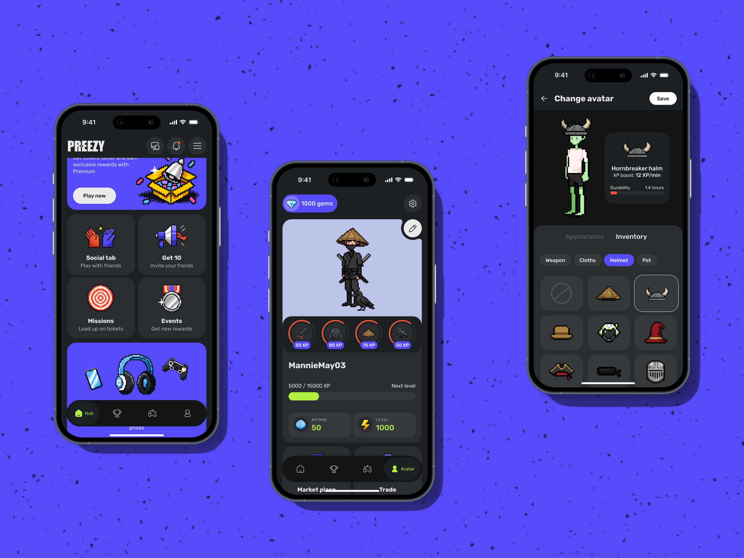
From there, we studied. The brand colors, the graphic elements, the pixel language—how it moved, where it breathed, what it could and couldn’t do. We mapped the core user journey from first open to final result: app entry → challenge selection → active participation → progress tracking → winners screen. Each screen a chapter, each transition a decision.
Designing For The Moments That Matter
We focused our UI work on four critical points in the flow:
The main screen, where available challenges live. First impressions set expectations. We needed users to immediately understand the system—what’s available, what’s at stake, what to do next—without a tutorial.
The challenge selection view. Each challenge links to a specific prize, and that link had to feel meaningful. The design needed to communicate motivation, not just information. Users should choose based on what they want, not what they can decode.
The active participation view. Real-time point tracking, eligible games, and leaderboard position—this is where the app becomes alive. The design here had to hold attention and maintain orientation simultaneously. You’re in it. You can see where you stand. You know what to do.
The winners screen. This one deserved—and received—special care. It’s the emotional peak of the entire experience—ranking, results, the feeling of having finished something. A poorly designed winners screen deflates what the whole journey built up. We treated it as a product decision as much as a visual one: structured enough to scan, playful enough to celebrate, rewarding enough to make the next challenge feel worth starting.
Building The Pixel System From Scratch
The illustration and icon work was where craft became most visible and most demanding. We developed a full set of pixel-style assets for the avatar customization system: accessories, clothing, wearable items that extend what users can express about themselves. Personalization in a gamified app is the mechanism of investment. When your avatar looks like you—or like who you want to be—the app has your attention.
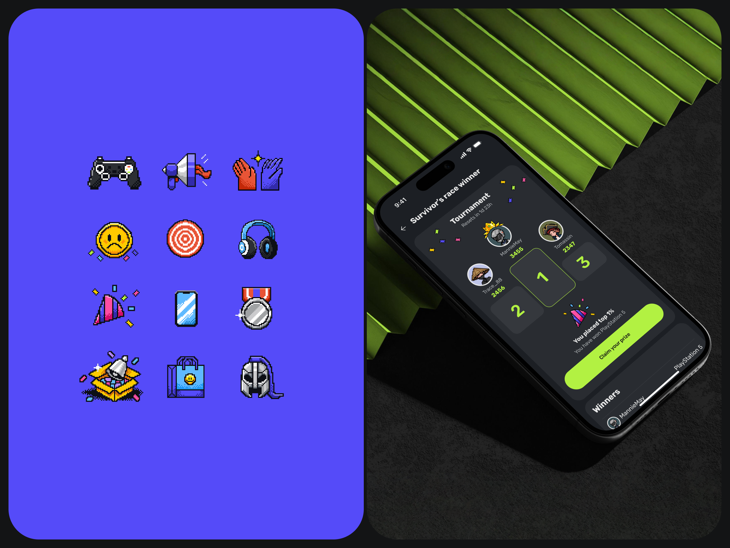
The hard part: every new asset had to look like it always belonged. We solved this by developing a custom brush that replicated the exact pixel texture and style of the existing avatar system. A technical solution to an aesthetic problem. The result was seamless integration—new icons and accessories that slot into the visual language as if they were there from day one. That kind of consistency doesn’t happen by accident. It happens when a team decides that “good enough” isn’t a finish line.
What This Taught Us
Projects like Preezy leave you with more than a portfolio piece. They sharpen your thinking.
Consistency is its own creative discipline. Working inside an established visual system means every decision is in dialogue with what already exists. That’s a different creative muscle than building from scratch—more precise, in some ways more demanding. The pixel constraint didn’t limit us. It focused us.
Structure and momentum are in tension, and that tension is the product. Users need to understand what to do. They also need to want to keep going. Those two needs pull in different directions, and the design has to hold both at once. Too much structure and the app feels like work. Too much momentum and it feels reckless. The balance point is where good gamified design lives.
Small moments carry heavy emotional weight. The winners screen is maybe fifty percent of the total screen real estate in this project. It carries a hundred percent of the emotional payoff. The feeling of achievement—that specific, earned satisfaction—is a design decision. You build it in, or you leave it out.
Alignment before execution changes everything. The collaborative kickoff session gave us a shared visual language before a single pixel was placed. When everyone on the team—and on the client side—sees the same thing, the design process becomes less about convincing and more about building.
Preezy reminded us of something we believe about good design: it doesn’t announce itself. It just makes everything feel obvious in retrospect. The right challenge at the right moment. The right icon in the right place. A winners screen that makes you want to win again.
That’s the work. And we’re proud we got to do it.
Recommended Reading
Enjoyed this one? Make sure to check out our other case studies and think pieces on all things design:
Show and Tell: Video Content As a Part of User Experience
Drawing Attention: The Real Power of Illustrations in UI Design
Form-Over-Function Mistakes, or How Not to Harm Your Business With a Pretty Interface.
Alphane Labs: Our First Real Shot at Getting Weird
Der Baukasten: From Sketch to Scroll
Zealous × TAS Case Study: Design Meets Purpose
The Glass Is Half Empty: How Apple’s Boldest Redesign Missed the Point