Building a visual identity for a science communication platform is a balancing act—one that has less to do with aesthetics than with trust. The images need to earn attention without demanding it, to hold the weight of subjects like climate change and civic inaction without collapsing into severity or retreating into irony. For Important, Not Important, we built a large-scale illustration and icon system with that friction at its center: visuals that stop a scroll while taking serious topics seriously.
The Evolution: From Symbols to Mini-Worlds
Every design system needs a point of departure. Here, it was a set of compact icons—binoculars, calendars, megaphones, stars, file folders, trash cans, rockets, hourglasses—drawn to feel fresh but grounded in the existing brand. Flat, monoline, unhurried.
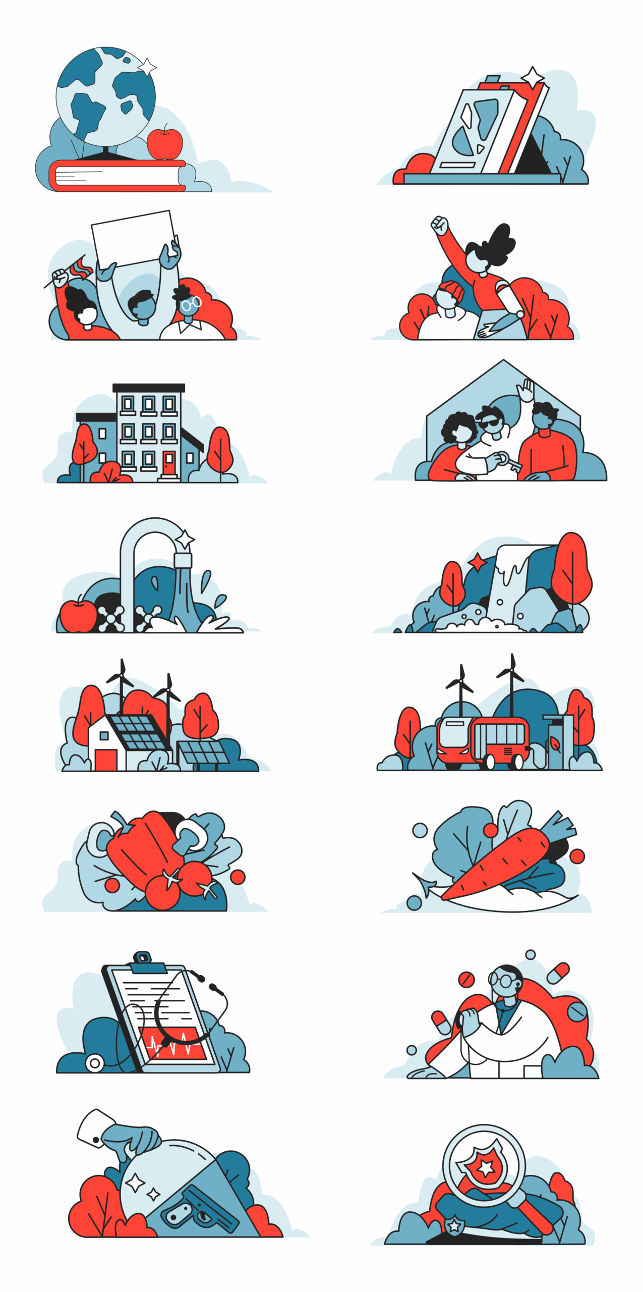
What changed over time was scale and ambition. Those isolated symbols grew into detailed, panoramic “mini-worlds”: horizontal cityscapes populated with wind turbines, civic buildings, and green landscapes, all drawn with the same hand, the same line weight, the same underlying attitude as the original icons. The system expanded. And because the DNA stayed consistent, the transition from single symbol to full scene felt organic rather than forced. The result is a library flexible enough to serve dozens of content categories without ever losing its sense of place.
Process: From Scratches to Outline
The discipline of this system lives in its restraint. Illustrations move quickly from rough gestural sketches to clean monoline outlines—there’s no extended middle stage of rendering or refinement for its own sake. Stroke widths stay within a narrow range, typically 1.5 to 3px, which gives the work a print-like rigor: shapes read cleanly, edges separate without ambiguity, and the whole library holds together across wildly different subjects.
Color is used sparingly and intentionally. Rather than graduated fills or atmospheric shading, we reach for “splashes”—areas of solid color that direct the eye toward what matters. A warm red-coral appears where there’s fire, urgency, or motion. Everything else steps back. This keeps the interfaces calm and prevents the illustrations from competing with the interactive elements around them. The image supports the page; it doesn’t perform on it.
Visual Anatomy: Editorial Flat Illustration
The aesthetic borrows from the visual grammar that modern tech brands helped popularize, but applies it with a harder editorial edge. Everything is built from simplified geometry—circles become trees, rectangles become buildings, soft silhouettes become skylines—but the scenes themselves carry meaning. They show people holding signs, researchers bent over lab benches, crowds gathered around a warming planet. They illustrate a thesis before a word is read.
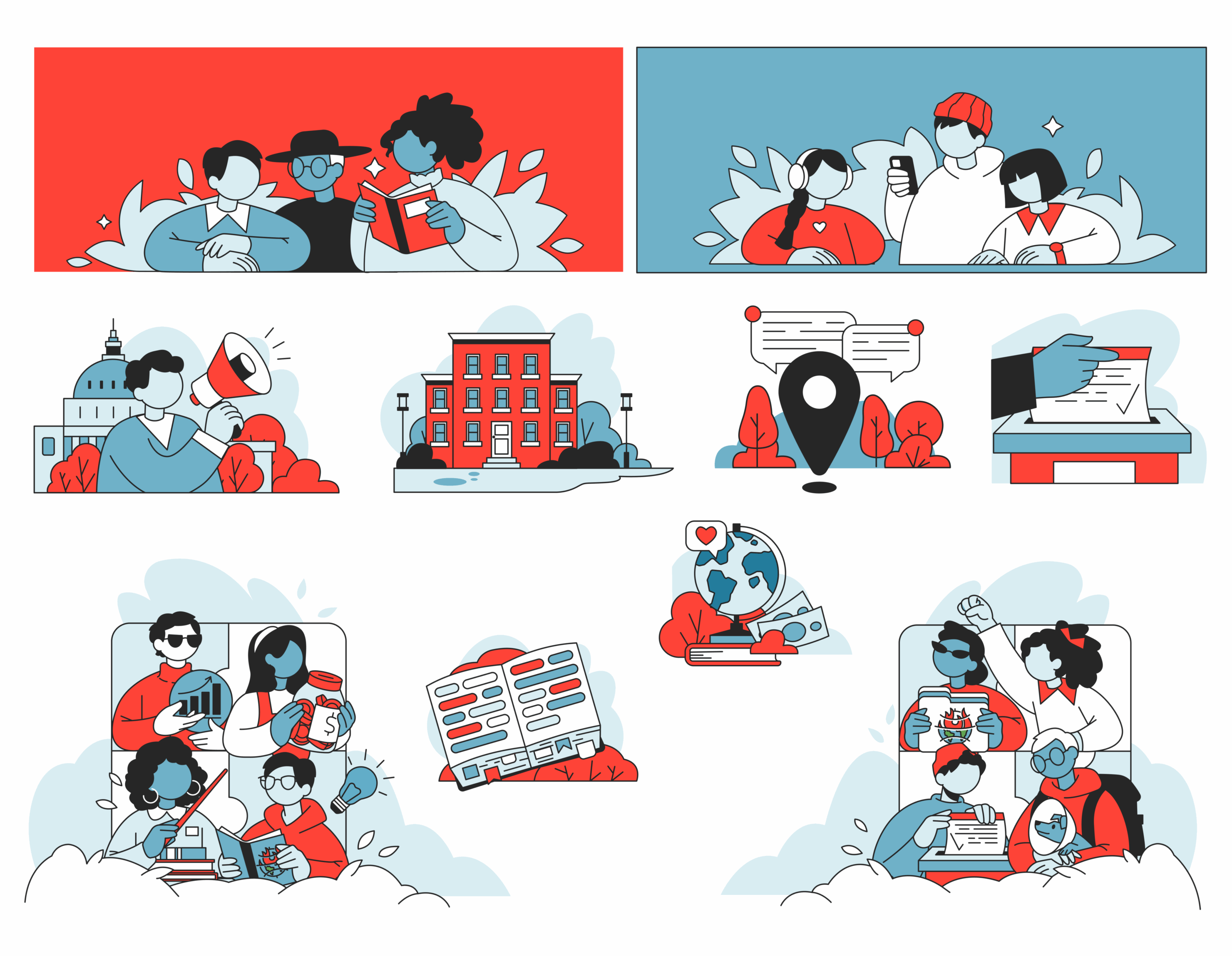
That specificity is the point. A globe on fire or a city half-submerged in water connects the image directly to the platform’s subject matter—climate, science, civic life—and signals to readers that they’ve arrived somewhere with a point of view.
Lessons for Scaling Design Systems
What made this project worthwhile to think through carefully was the question of scale. The platform publishes constantly, which means the illustration library isn’t a one-time deliverable—it’s infrastructure. That changes how you make decisions from the start.
A few principles that shaped the work:
- Build for reuse, not just beauty. Scenes, characters, and objects need to hold up across hundreds of contexts. A striking one-off illustration is easier to make than a system that stays coherent at volume.
- Define the rules clearly, then trust them. Line weight, color logic, character design—when these are locked in early, each new piece feels like it belongs without needing to reference everything that came before it.
- Let the visuals carry an opinion. The best illustration work communicates something about the place you’ve landed before you’ve oriented yourself in it. Important, Not Important is direct, urgent, and human—and the visuals needed to say that before the headlines did.
A cohesive visual language works hardest when it carries shared logic. Aesthetics alone don’t scale.
Recommended Reading
Want to dig deeper? Start here. If this project got you thinking, these articles are also worth your time:
NestEgg: Designing a Wellness Platform Where Everyone Wins
The Glass Is Half Empty: How Apple’s Boldest Redesign Missed the Point
User Experience: Insights Into Consistency in Design
Drawing Attention: The Real Power of Illustrations in UI Design