Good companies outgrow their brands. The work gets better, the clients get bigger, and somewhere along the way the website becomes a stranger you used to know. This biotech client came to us with exactly that situation—serious science, real market presence, and collateral that no longer told the right story.
The brief was clear: make the outside match the inside. Everything else followed from that.
The Real Scope of “Everything”
Overhaul projects are easy to underestimate. Someone says, “we need a new website,” and what they mean, when you actually sit with it, is: we need a new way of existing in the world. This client needed both the website and everything around it—social media assets, printed brochures, presentation templates, business cards, roll-up banners, digital display banners. The full surface area of a modern B2B brand.
This kind of scope forces a discipline that more contained projects can avoid. When you’re designing for a screen and a printed page simultaneously, you cannot rely on tricks specific to either. You have to find the truth of the visual system—the part that holds up everywhere, under any constraints. That’s actually a gift, even when it feels like pressure.
We began, as we always do, with research. Competitor landscape. Positioning benchmarks. Visual conventions of the biotech industry—and the places those conventions could be pushed. A B2B brand in the client’s category needed to communicate credibility and scientific rigor without turning cold. That tension would shape every design decision that followed.
Structure Before Surface
Before a single visual choice was made, we mapped the website’s bones. User flows, page architecture, and content hierarchy. The logic of how a B2B visitor—arriving with skepticism, limited time, and specific questions—would move through the site and ideally arrive somewhere useful.
This phase tends to be invisible in the final product, which is exactly how it should be. Good UX simply makes things obvious. A visitor shouldn’t have to think about where to go next; they should just go there. Every page in the biotech company’s site was structured to guide without coercing—to give B2B buyers what they need to trust, fast.
Trust is the actual product a B2B website sells. The company sells something else entirely, but the website’s job is to make a stranger confident enough to take a next step. Structure is what makes that possible.
A Visual Identity Built from the Inside Out
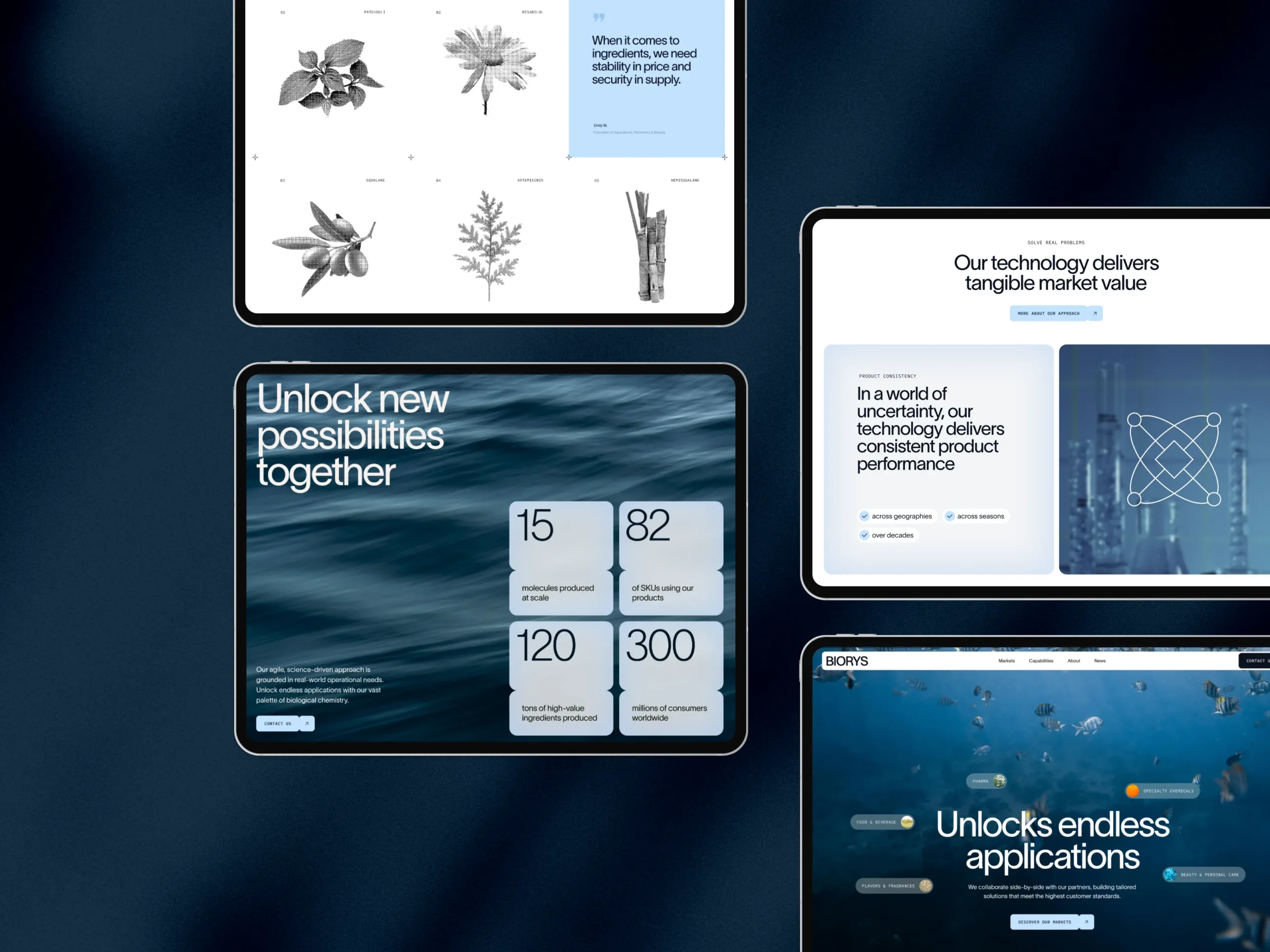
The client had a specific and meaningful request for the visual direction: nature. Not in a vague, lifestyle-brand way, but as a genuine reflection of what the company does. The company works with synthesized compounds derived from natural sources—their work exists at the precise intersection of the organic and the engineered. The brand needed to reflect that.
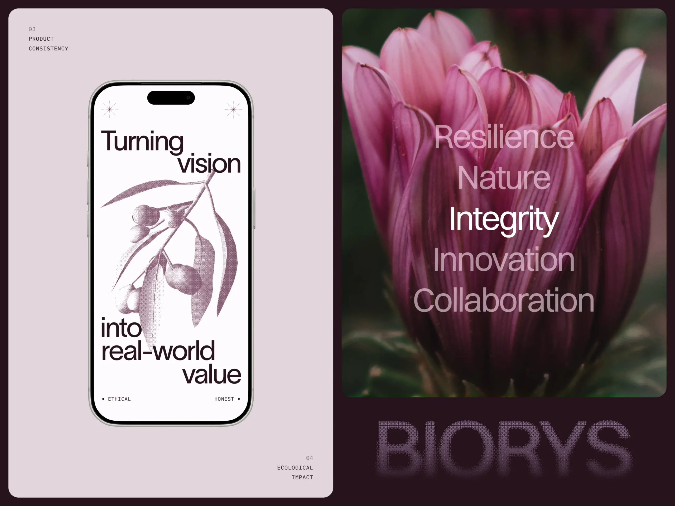
We took the amyris flower and built a 3D model of it, then applied a dithering filter to its rendering. The effect is subtle but intentional: something recognizably natural, rendered through a clearly digital process. A small visual statement that, if you’re paying attention, says something true about the company. Nature and synthesis, coexisting in the same image.
The color palette followed the same logic. Drawn from natural tones—greens, earthy neutrals, the quiet depth of botanical references—but applied with the precision and restraint that modern B2B design demands. Warm enough to feel alive, controlled enough to feel credible.
The result was a visual identity that felt grown rather than assembled, even as every component of it was deliberate.
Designing for People Who Aren’t Designers
A brand system delivered to a client is only as good as the client’s ability to actually use it. Beautiful templates that require design knowledge to operate are not deliverables; they’re dependencies. And most companies, however sophisticated, are staffed by people whose expertise is not visual design.
We knew this going in, and it shaped how we built every collateral piece for the client. The presentation templates were constructed so that anyone on their team—regardless of design background—could open one, drop in their content, and have something that looks right. The social media templates were built with the same logic: choose from the options provided, place your image, and the system does the heavy lifting.
This required us to anticipate failure modes. What happens when someone picks an image that’s too dark? What if a headline runs long? What if a team member in a hurry reaches for a color that’s close but not quite? The templates were designed to resist those errors—not by limiting flexibility, but by making the correct choices easier than the incorrect ones.
This is, in a way, the hardest design problem: designing for people who won’t read the guidelines, who won’t ask questions, and who simply need the thing to work. When it does, the brand holds. When it doesn’t, the brand erodes—one well-meaning but slightly-off execution at a time.
Building Something Maintainable
The website was developed in Webflow, and the development phase benefited enormously from the rigor of everything that came before it. A clean design system translates into a clean build. Components are predictable. Spacing follows rules. The design intent survives the handoff because the design intent was precise enough to survive it.
We delivered a Webflow build that the client can maintain independently—updating content, adding pages, making routine changes—without needing to call us every time. That’s the goal. A client who is dependent on their agency for basic upkeep is a client whose website will stagnate between engagements. We build to be trusted with a project and then trusted to leave it in good hands.
Motion design played a supporting role here: four animated icons built in Lottie, and a rotation sequence for the 3D amyris flower. Enough to add energy and signal craft. Not so much that it competes with the content.
What This Project Taught Us
Every comprehensive engagement teaches something. This one confirmed a few things we suspected and showed us at least one we hadn’t fully articulated.
The suspected: a brand system done right makes everything downstream easier. When the visual foundations are clear and honest, extending them to a new format—a banner, a slide deck, a business card—stops being a creative problem and becomes an execution problem. Execution problems are much more enjoyable to solve.
The less fully articulated: scope is actually clarifying. When you’re responsible for how a brand shows up everywhere at once, you develop a depth of understanding of that brand that narrower projects don’t produce. You find the visual language that holds up not because it looks good on a screen, but because it holds up as an idea. That’s a different and more durable kind of quality.
The client trusted us with the whole thing. We took that seriously. The result is a brand presence—digital and physical, moving and still—that the company can build on for years. Which is, ultimately, the point.
Recommended Reading
More where this came from. Case studies, think pieces, and the occasional design opinion we couldn’t keep to ourselves—all waiting for you in the blog:
Zealous × TAS Case Study: Design Meets Purpose
Immediate Case Study: Rethinking Payday
FarmSense Case Study: Fields, Sensors, and System Thinking
User Experience: Insights Into Consistency in Design
Drawing Attention: The Real Power of Illustrations in UI Design