Healthy breakfast products occupy a strange corner of the market: the category is crowded, the promises are identical, and the packaging is usually doing a lot of heavy lifting to compensate for both. Graneri arrived as an opportunity to do something more considered—a granola brand that needed not just packaging, but a visual system capable of carrying warmth, energy, and specificity across formats.
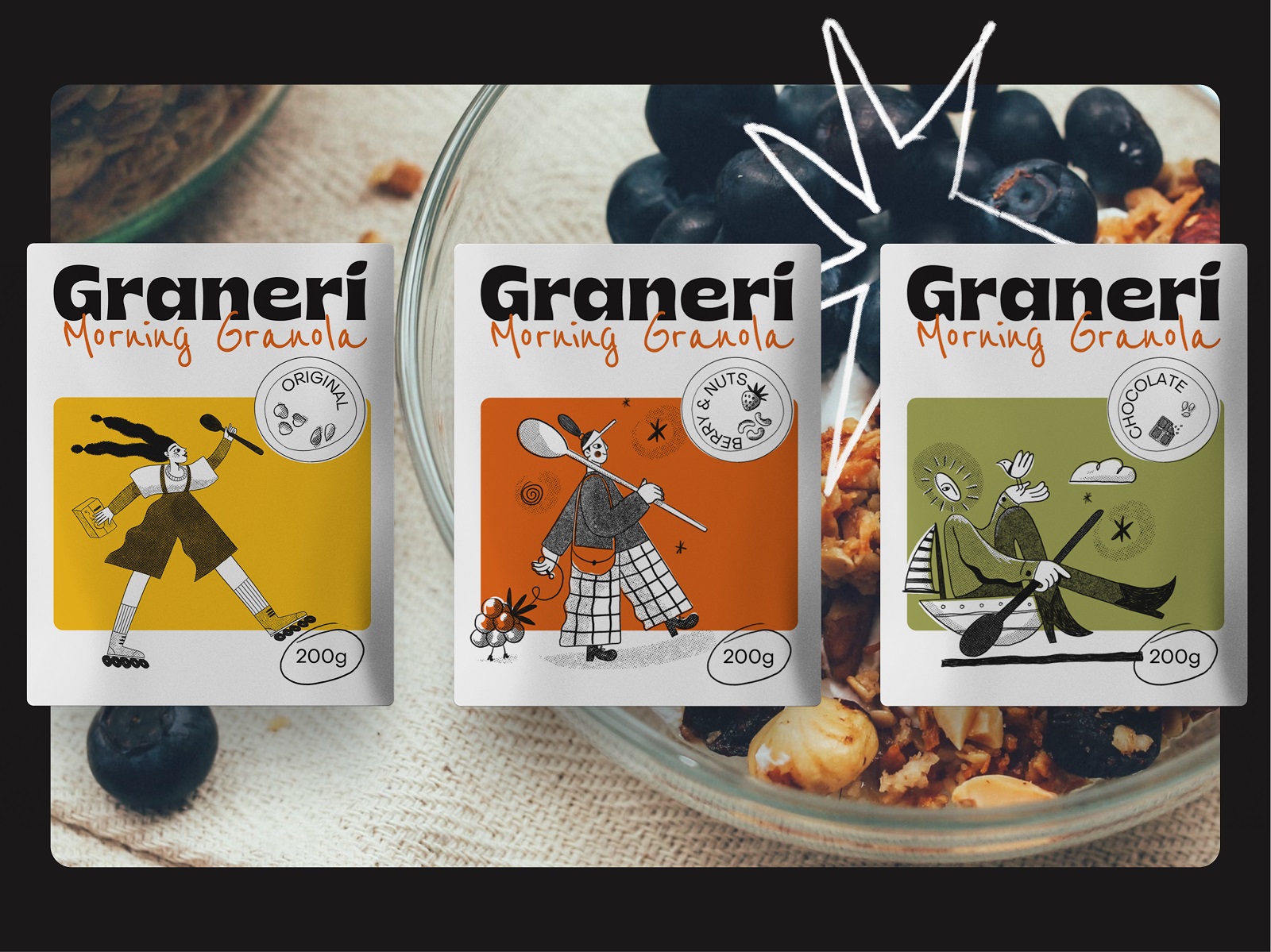
The work involved logo design, a custom illustration set, three distinct packaging types, and a marketing layer built to extend the identity into advertising. Designers Arthur Avakyan and Yaroslava Yatsuba led the project.
Starting with the Graphic Language
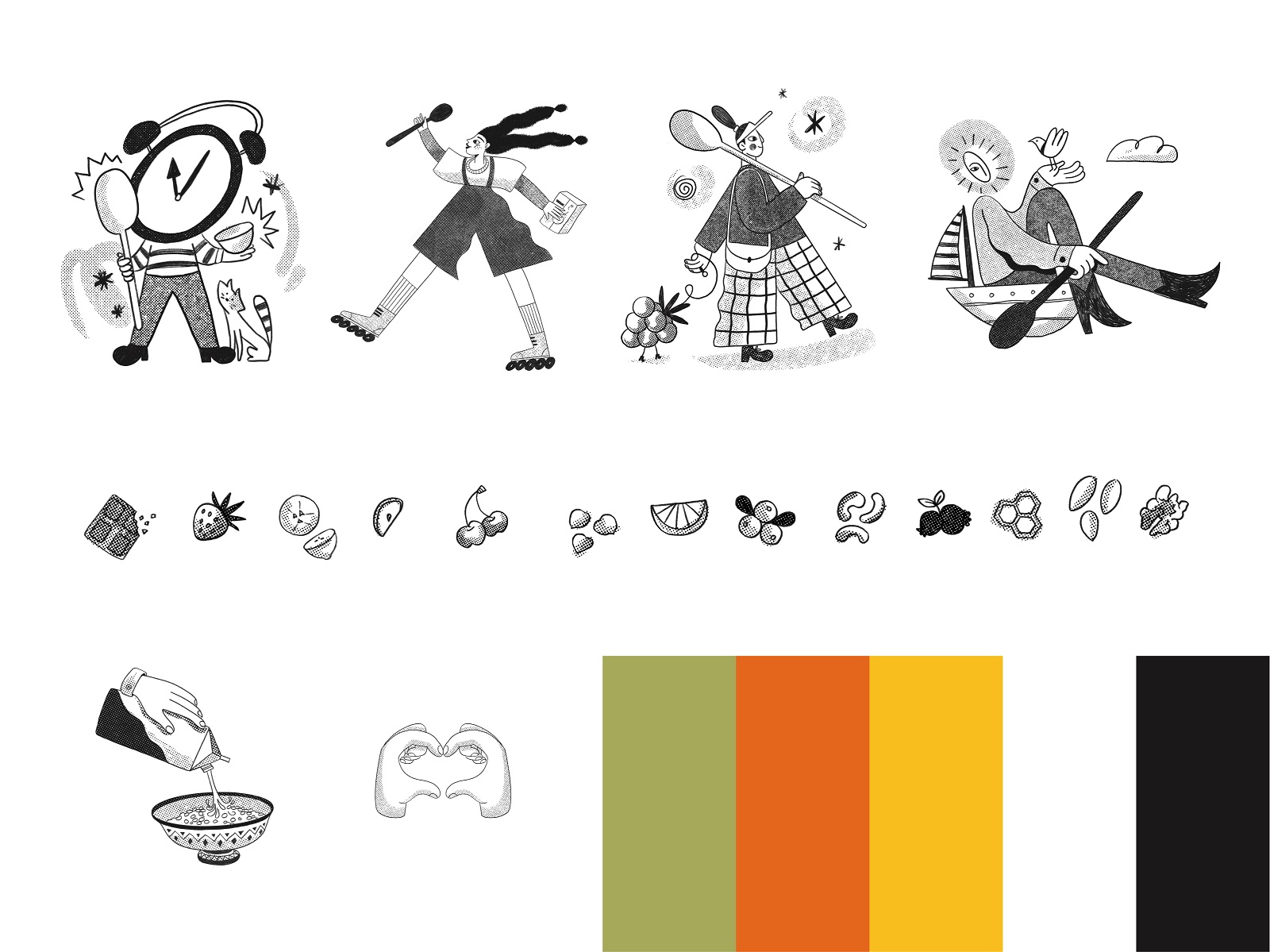
Before any packaging gets designed, someone has to decide what the brand actually looks like—which means making real commitments about color, line quality, and the emotional register of the graphics. For Graneri, the foundation is contour line illustration with clear character differentiation: human figures on one side, food ingredient motifs on the other. The contrast between those two registers gives the system flexibility. One carries personality and narrative; the other carries product reference.
The color palette—warm greens, yellows, and oranges anchored by black and white—is sunny without being naive, and it gives the designers a wide but coherent toolkit. Brand identity at this stage is less about polish than about establishing the constraints that will make every subsequent decision faster and more defensible.
Typography as Structure
Three typefaces share the space here: a bold display font for the brand name, a calligraphic face for taglines and key text, and a clean sans-serif for the informational layer. That’s a lot of voices in one room, and it works because each one has a defined role.
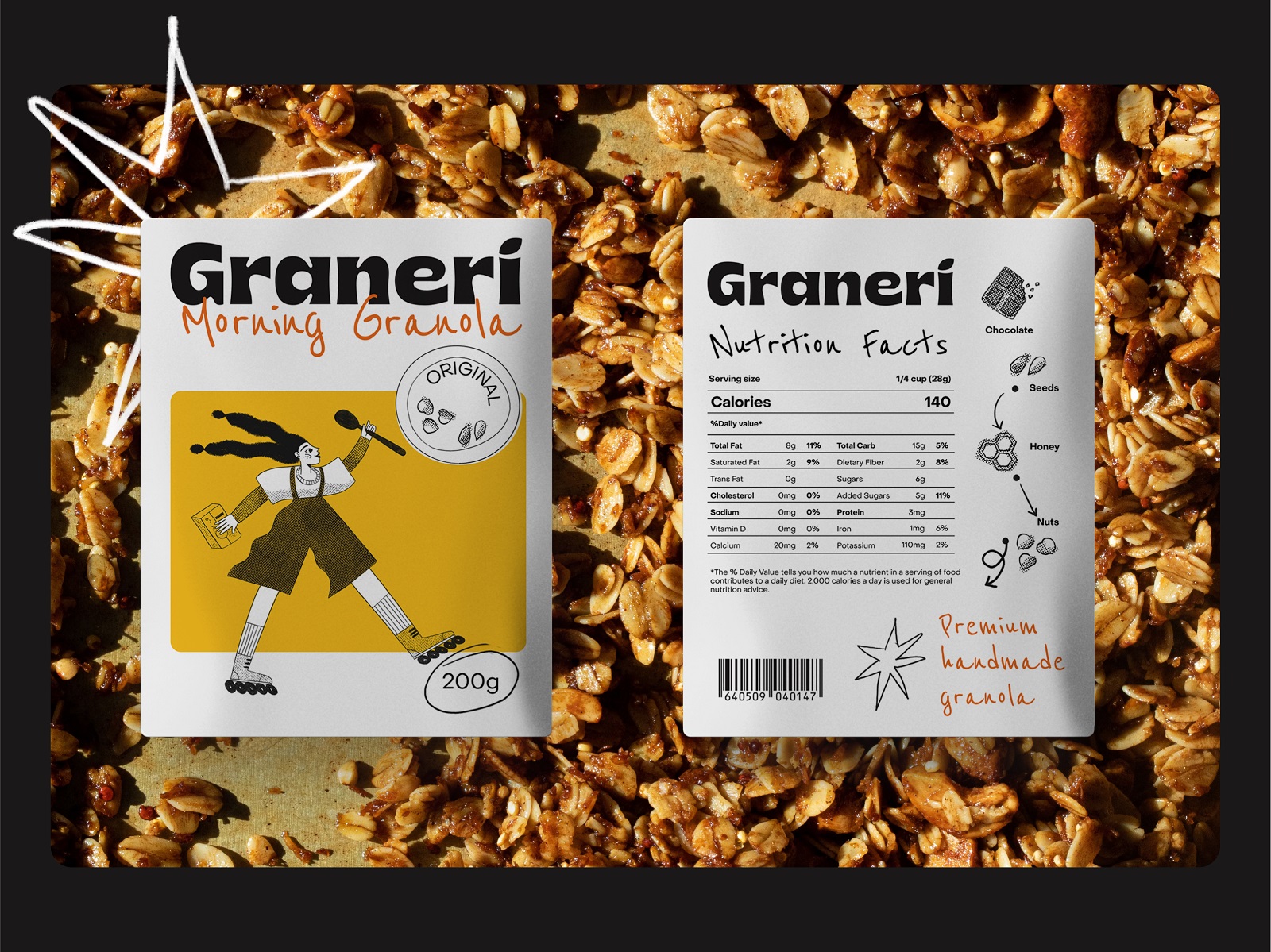
The display weight carries authority; the calligraphic face introduces warmth and a handmade quality that suits the product’s positioning; the sans-serif keeps ingredient lists and nutritional content legible without competing. Packaging typography often collapses into either sterile uniformity or decorative chaos—this system avoids both through clear hierarchy.
Three Packaging Formats, Three Different Problems
Packaging design reveals its real complexity when the same brand identity has to survive across structurally incompatible formats. Graneri’s scope covered tubes, pouches, and transparent packet labels—each with different surface geometry, different print constraints, and different amounts of usable real estate.
The tube format, with its cylindrical construction and limited flat surface, deprioritizes illustration in favor of color and typography. That’s a reasonable constraint-driven decision: forcing complex line art onto a curved, narrow substrate rarely works, and the bold palette holds the identity together without it.
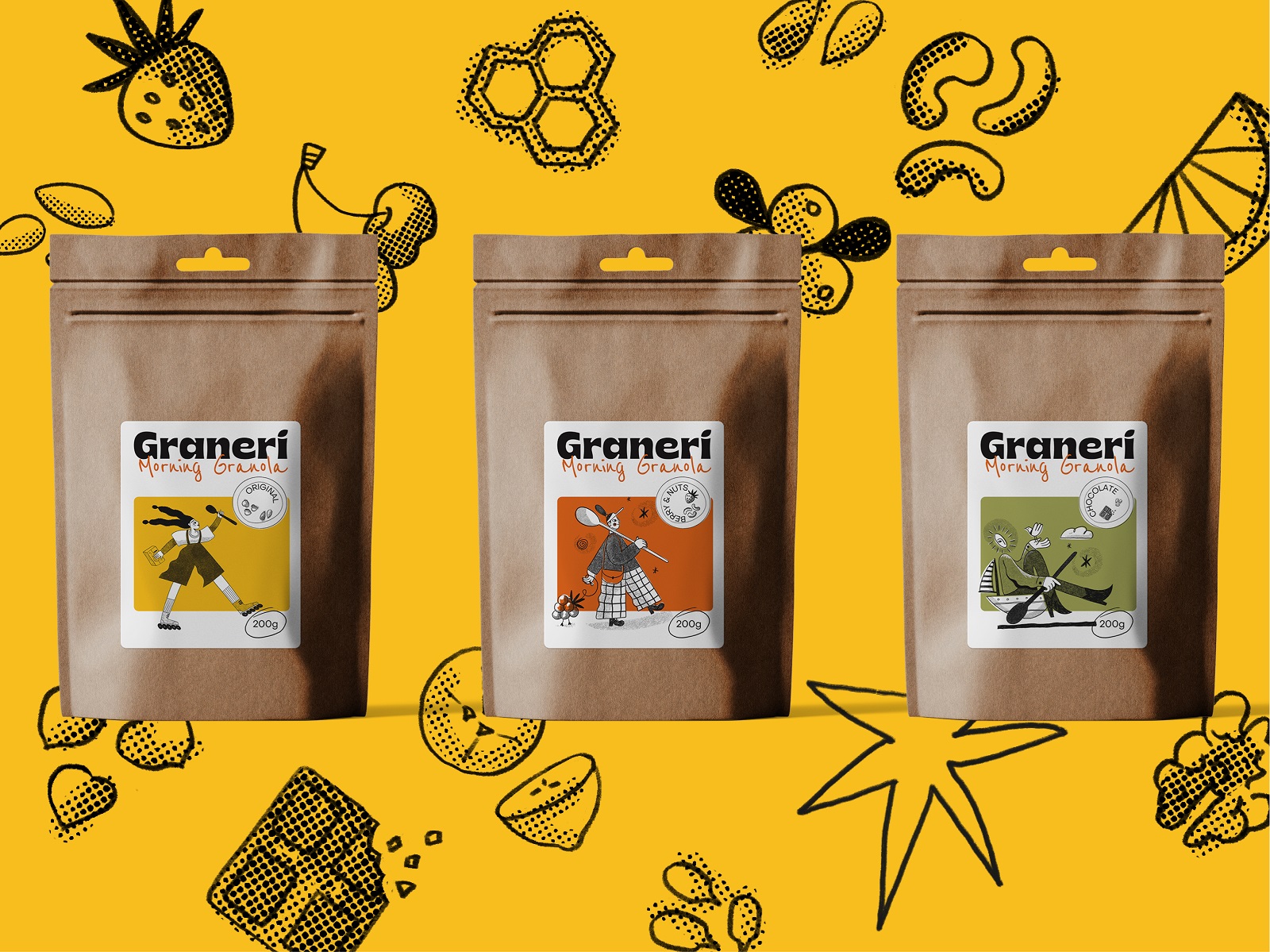
Pouches and transparent labels operate differently. Both offer enough flat space to integrate the illustrations meaningfully, and that’s where the character work pays off—the human figures and ingredient motifs become the primary visual pull, recognizable at shelf distance and coherent up close.
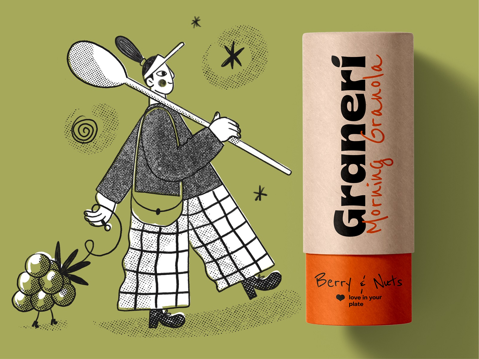
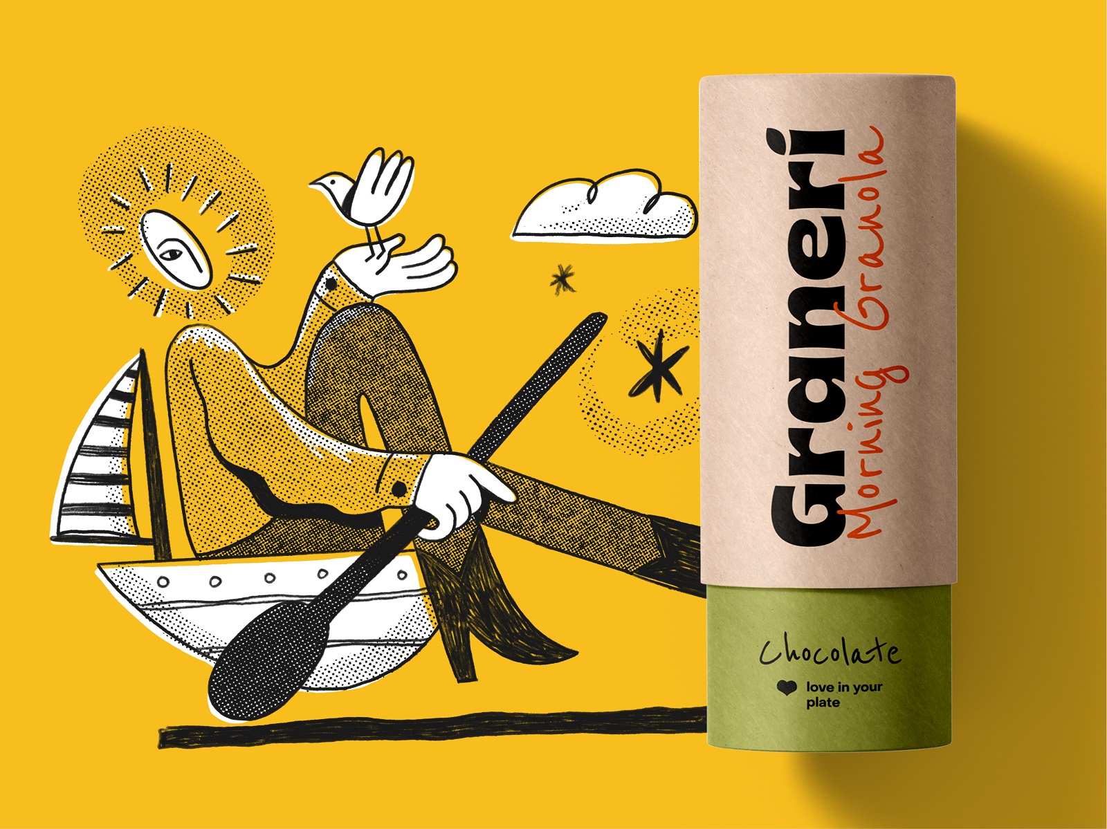
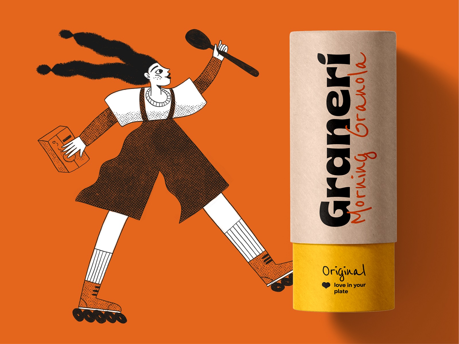
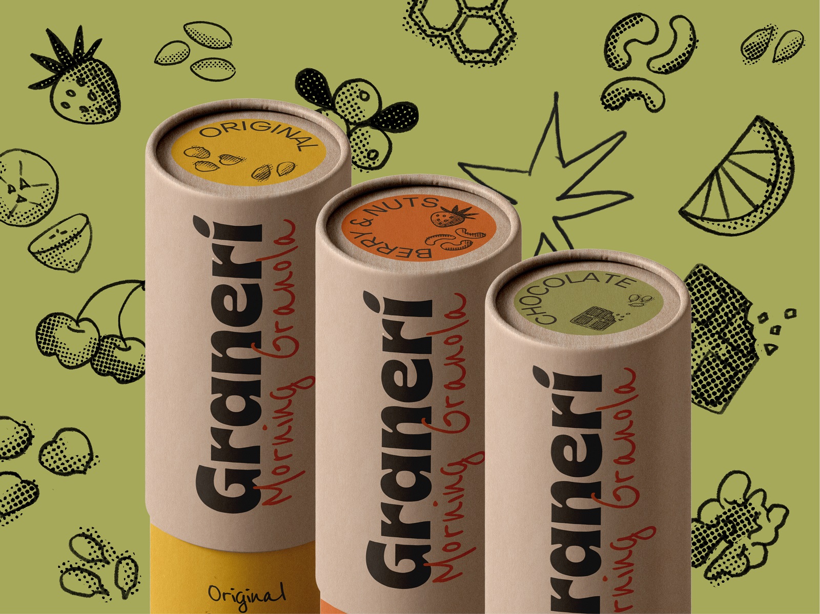
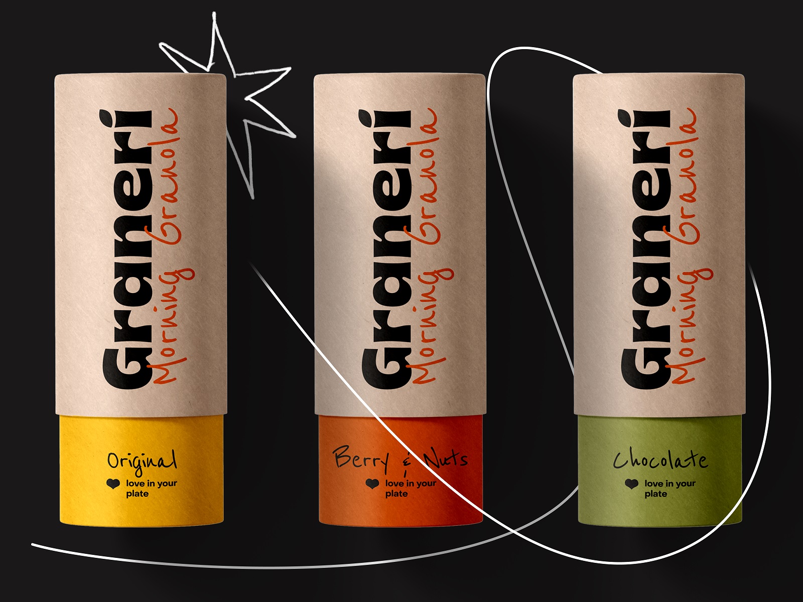
Meanwhile, pouches and transparent packet labels allowed the designers to integrate illustrations as the instant visual element sharing the vibes of cheerfulness and making the packaging catchy and recognizable on the store shelves.
Shelf Presence and Product Recognizability
Retail shelf performance is the actual test. A brand can be beautifully designed in a studio environment and entirely invisible in a supermarket aisle where forty other products are competing for the same three seconds of attention.
The Graneri illustrations give the packaging a specific visual signature—the line weight, the warm palette, the figure compositions—that reads as a family across formats. Transparent packet labels present a particular challenge here: the product itself becomes part of the composition, which means the graphic layer has to work in dialogue with whatever color the granola happens to be. The design accounts for that without over-engineering it.
Extending the System into Advertising
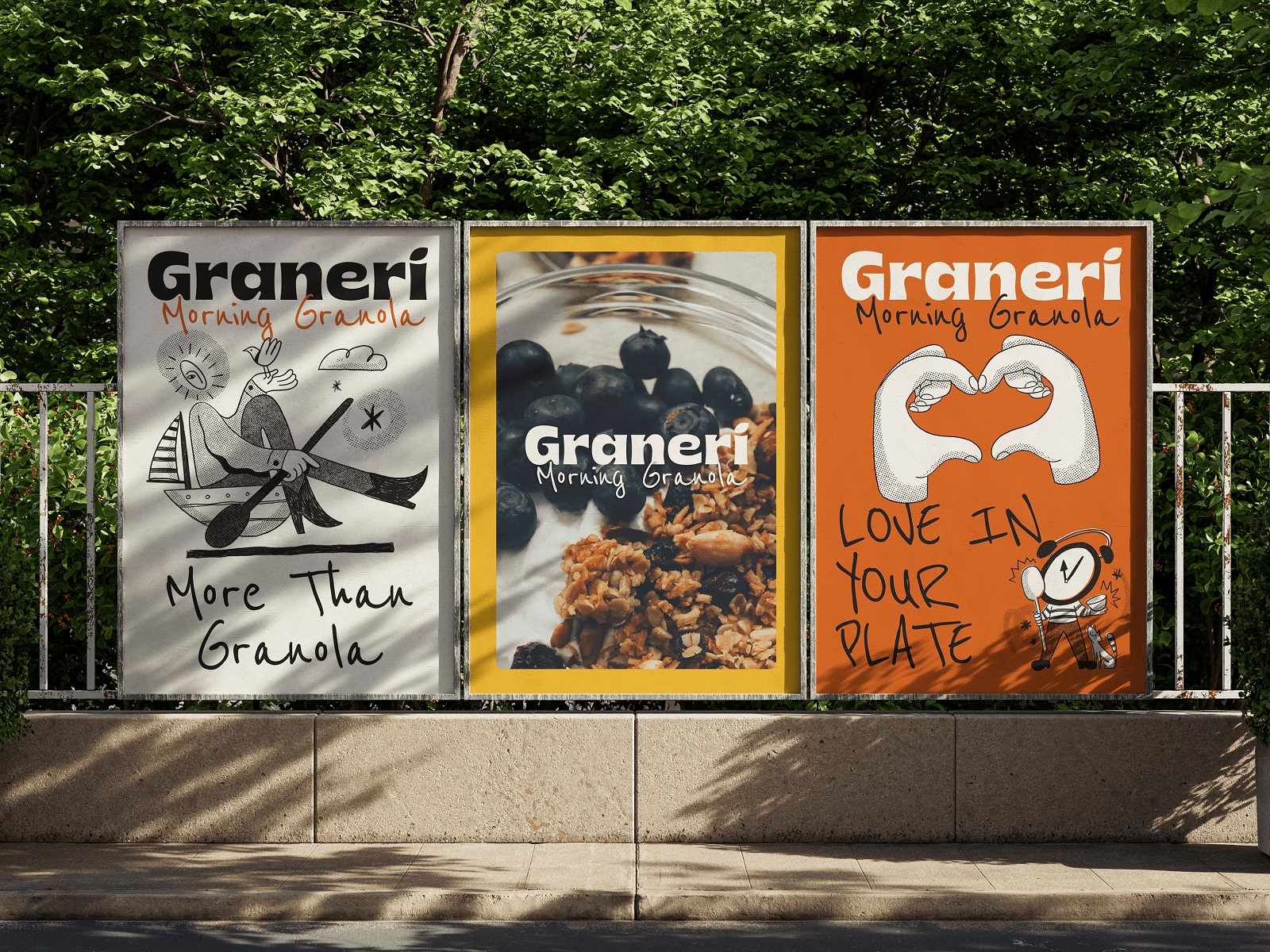
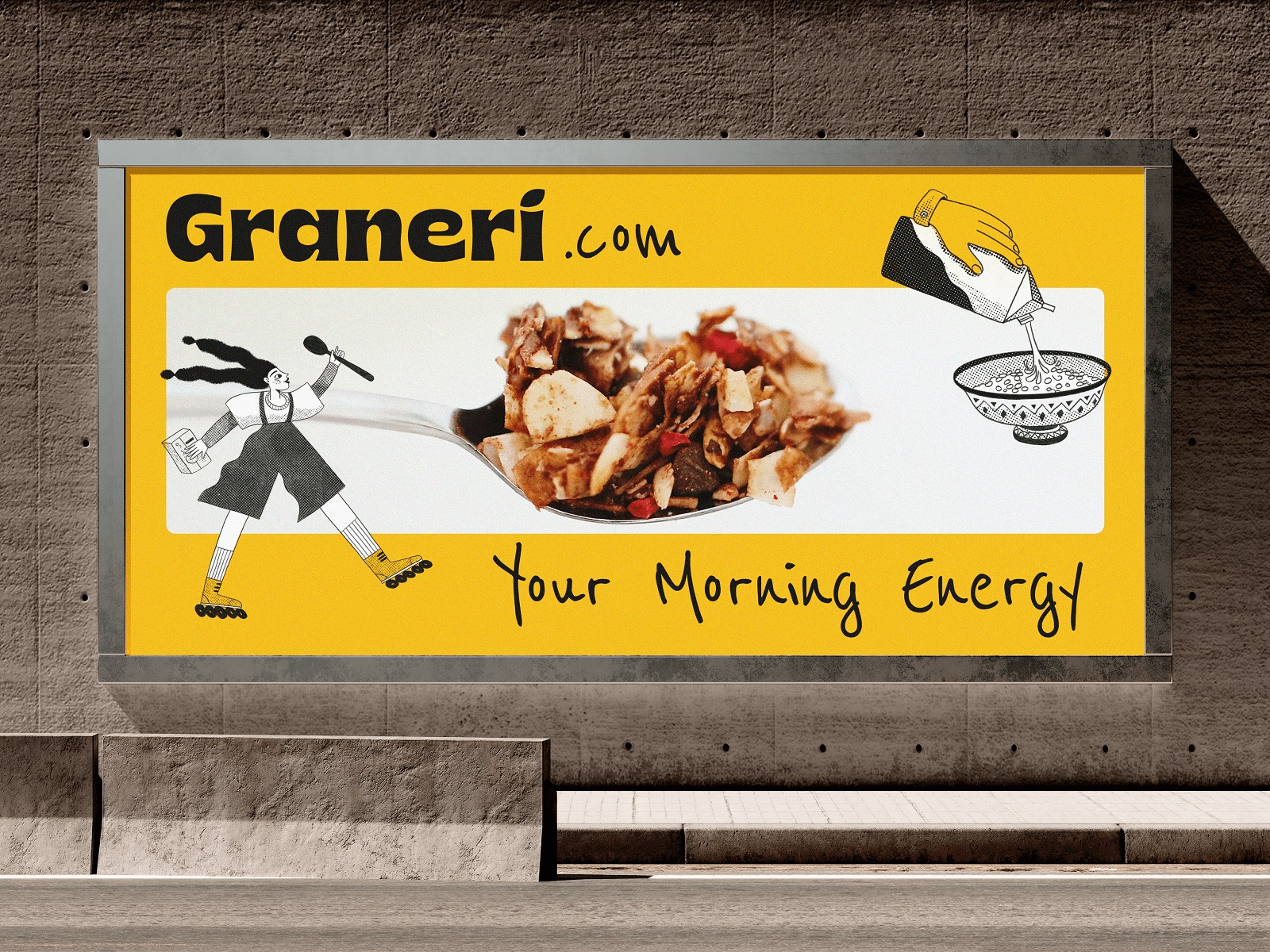
A brand identity that can’t travel beyond its primary application isn’t fully resolved. The Graneri visual language was extended into poster and billboard formats—a meaningful test, because advertising scales force you to identify which graphic elements are genuinely load-bearing. At large format, the illustration style and palette hold.
The system is coherent enough to support the jump from packaging to outdoor without requiring significant adaptation, which is the point: a well-constructed visual identity shouldn’t need to be redesigned for every new context, just applied with appropriate judgment.
Recommended Reading
Enjoyed this one? More case studies and design thinking pieces are waiting:
Pencils of Promise. Picture Book Creation Process Step by Step
Gofe. Packaging and Marketing Design for Coffee Brand
12 Bright Projects on Visual Identity and Packaging Design
Love Sign. Gift Box Packaging Design with Romantic Vibes
PierSide. Packaging Design for Tinned Fish Brand
KOISI Tokyo. Packaging Design for Japanese Restaurant
Sidra Vivo. Vibrant Packaging Design for Cider Brand
Fairytale. Picture Book Illustrations and Design
Aqua Dudes. Cartoonish Packaging Design for Fish Food Brand
Herteas. Packaging Design for Herbal Tea Brand
Nutribite. Tasty Packaging Design for Granola Bars
Milkimu. Packaging and Marketing Design for Dairy Brand