Brand identity design is a commitment before it’s a craft. Every decision—the weight of a logotype, the temperature of a color palette, the personality assigned to a mascot—signals something before a single word is read. Packaging design, especially, works in fractions of a second: shelf presence, visual hierarchy, material cues all fire before conscious evaluation kicks in.
The twelve projects below demonstrate that range, from delicate bijouterie to fizzy drinks aimed at kids who have never met a fruit they didn’t cartoon. Each approaches brand identity system design differently, and that variety is the point.
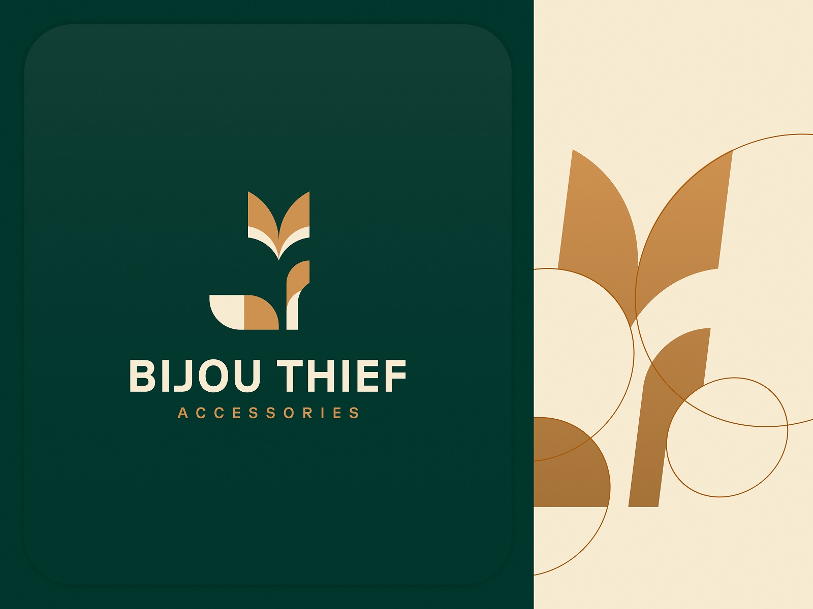
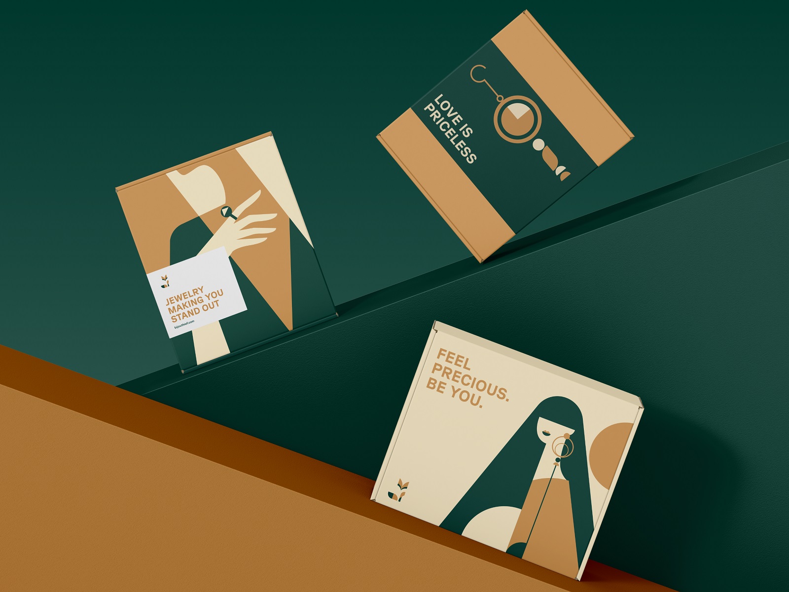
Bijouterie Brand Identity
Logo animation is often treated as an afterthought, a way to make a static mark feel contemporary. Here, it functions as a core brand storytelling device. The fox—an animalistic logo choice that carries connotations of elegance, instinct, and a certain knowing quality—was designed to move, not just sit.
That distinction matters for digital brand presence: a logo that behaves differently across contexts is responsive. The accompanying packaging design maintains the same precision, keeping the visual identity system coherent across touchpoints.
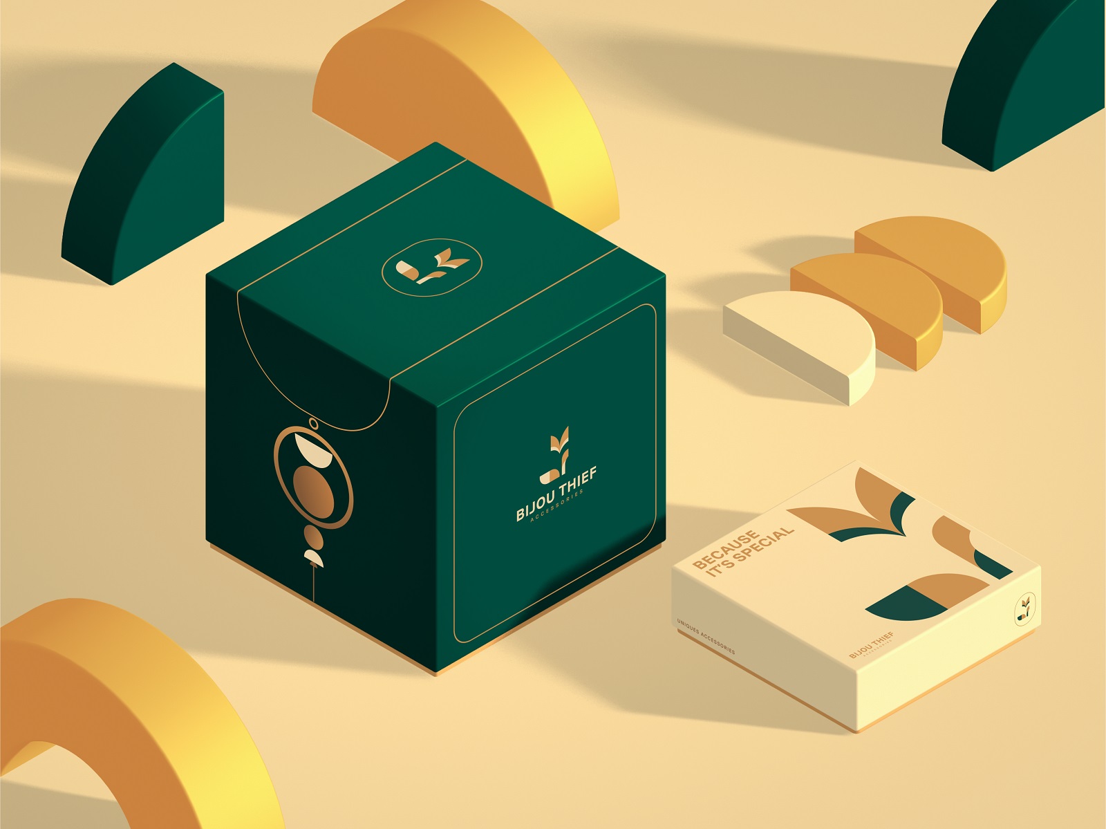
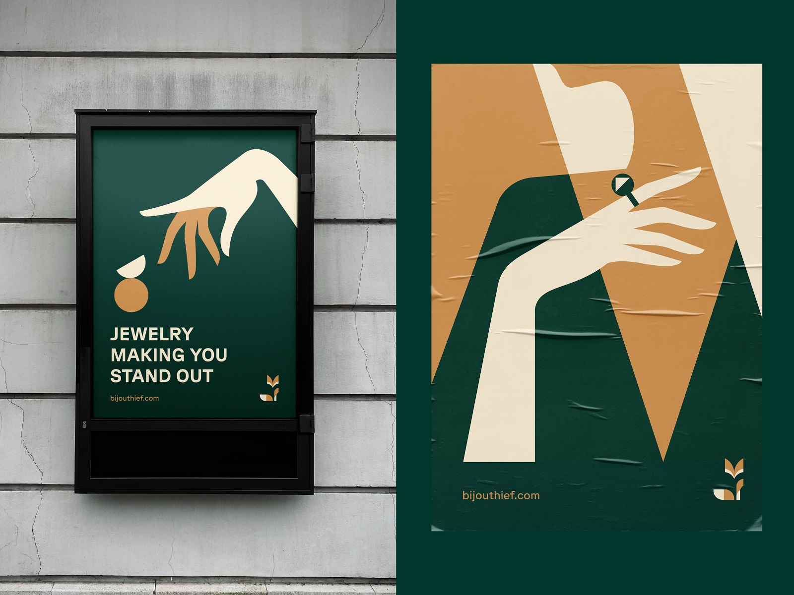

Sparkling Wines Brand Packaging
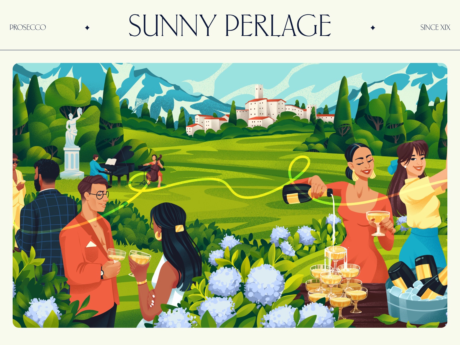
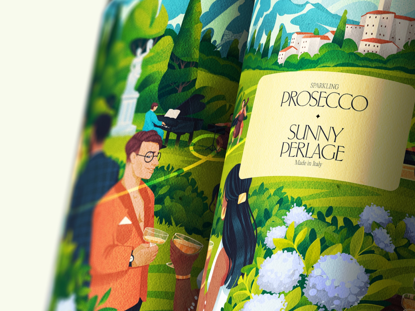
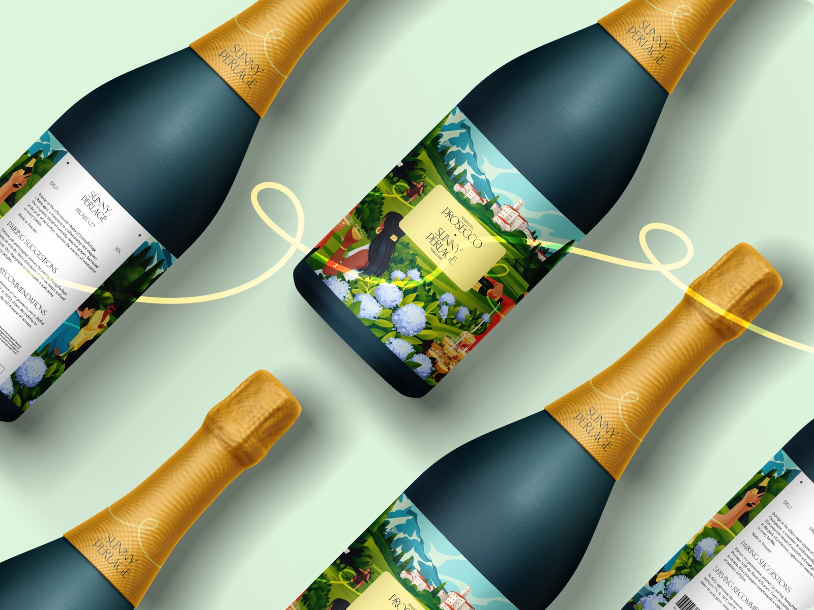
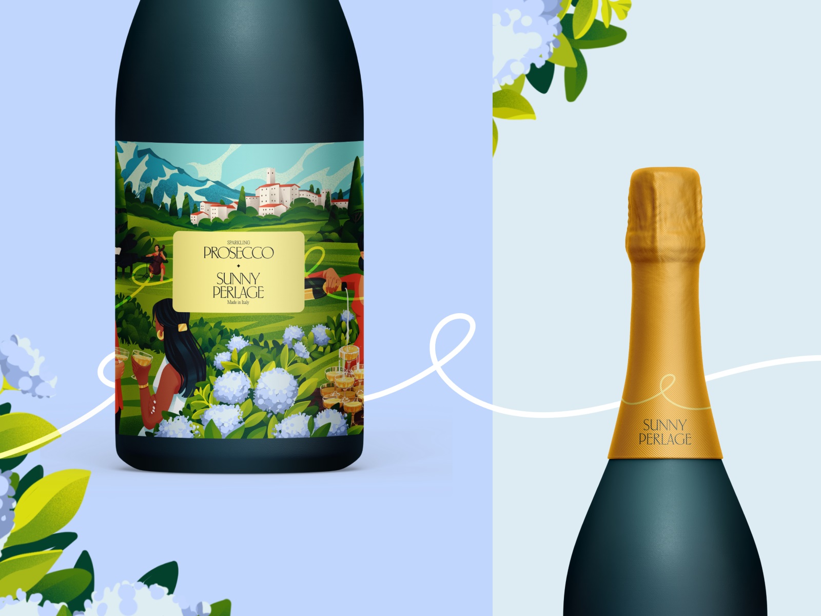
Beverage packaging design lives and dies by mood translation. The brief for this sparkling wines project called for something bright and celebratory without veering into the generic territory that plagues most drinks branding—the predictable gold foil, the aspirational cursive.
The illustration art here does the tonal work instead: sunny, cheerful, specific enough to feel authored. In alcohol packaging, where regulatory text competes for real estate, strong illustration-led design is one of the few reliable ways to carve out visual identity that holds.



Cat Food and Accessories Brand Packaging
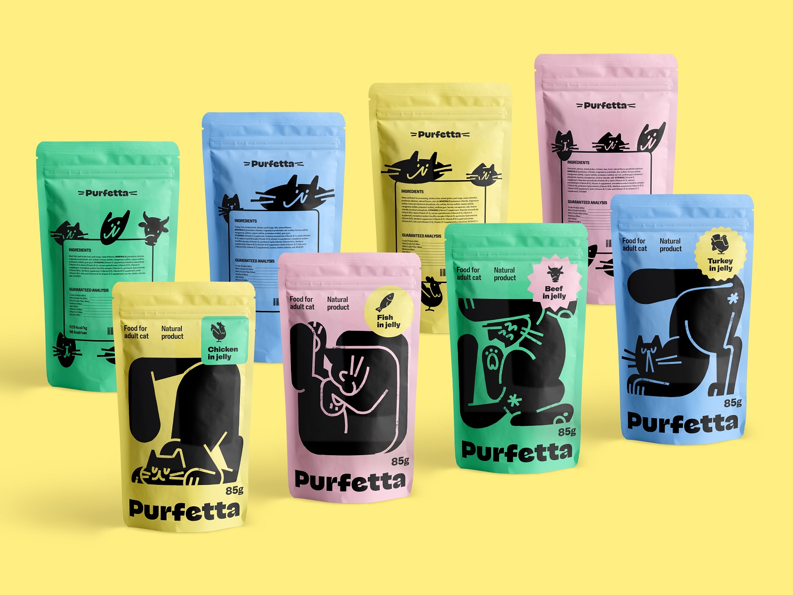
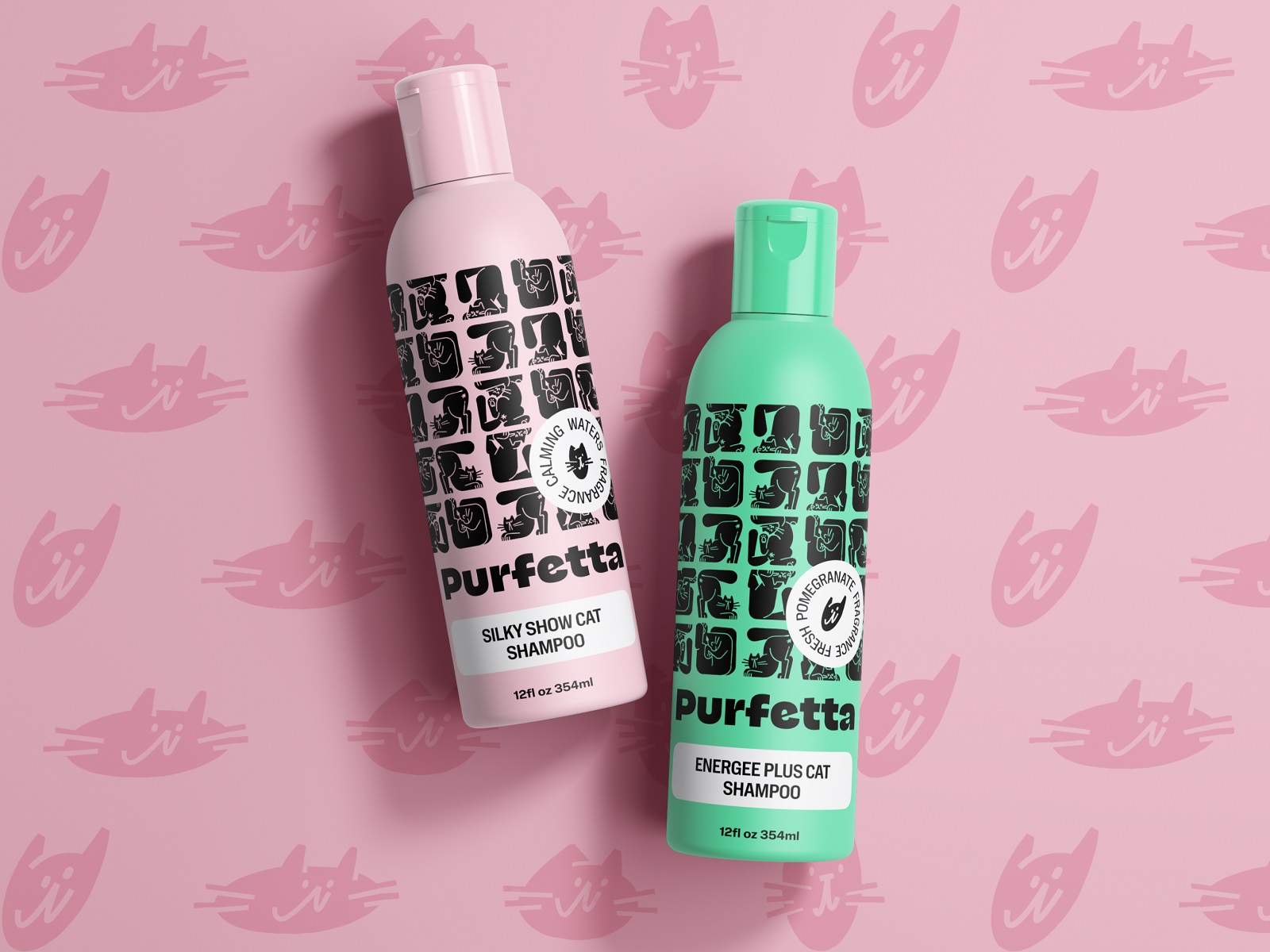
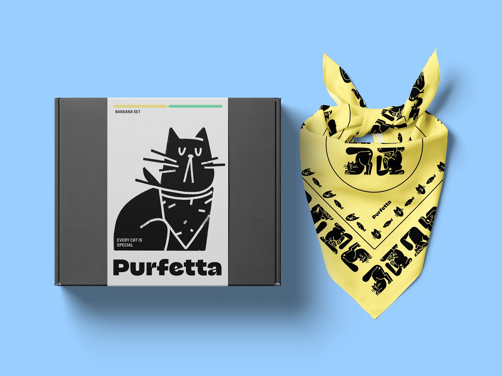
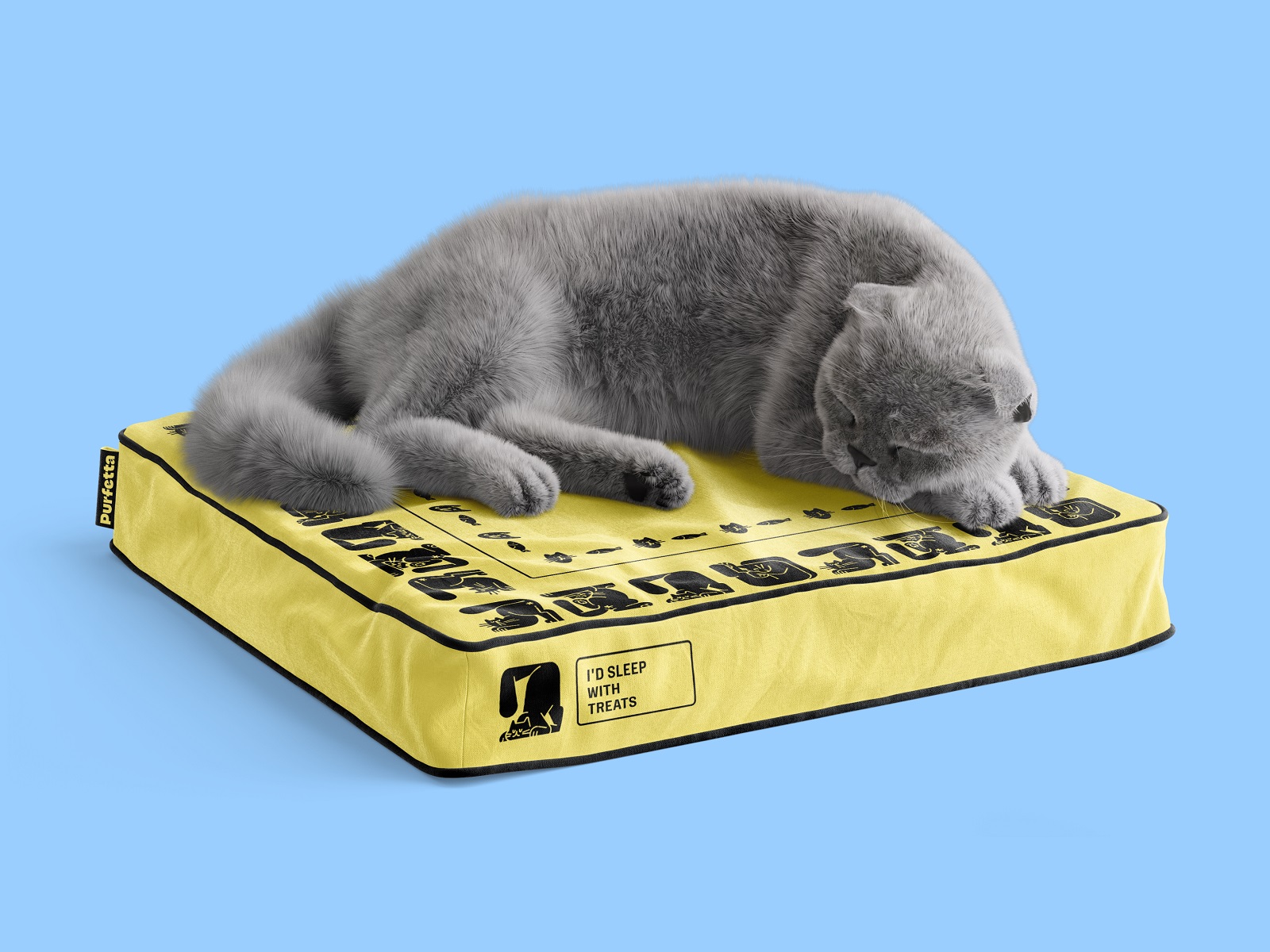
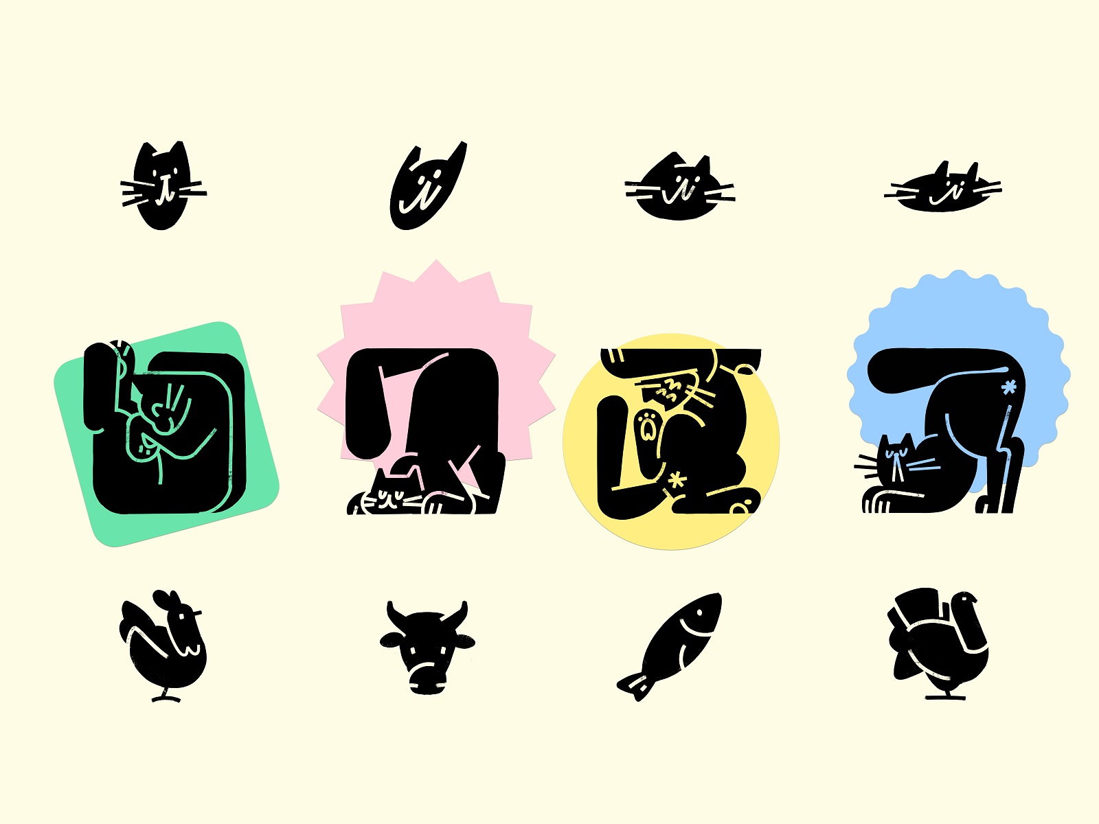
Custom illustration icons built for a brand system have an inherent advantage: they can’t be stock-libraryed by a competitor. This pet brand packaging leans into that fully, using a set of funny, character-driven visuals that work across cat food, cosmetics, and accessories—categories that don’t naturally share a visual language. The challenge in multi-category brand identity is maintaining coherence without collapsing into monotony.
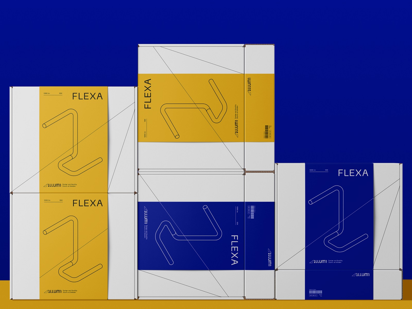
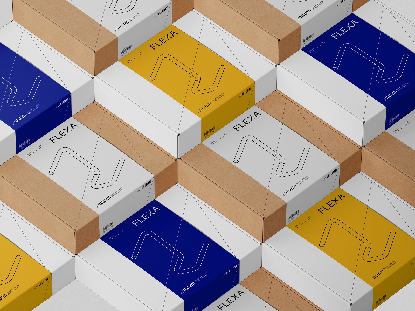
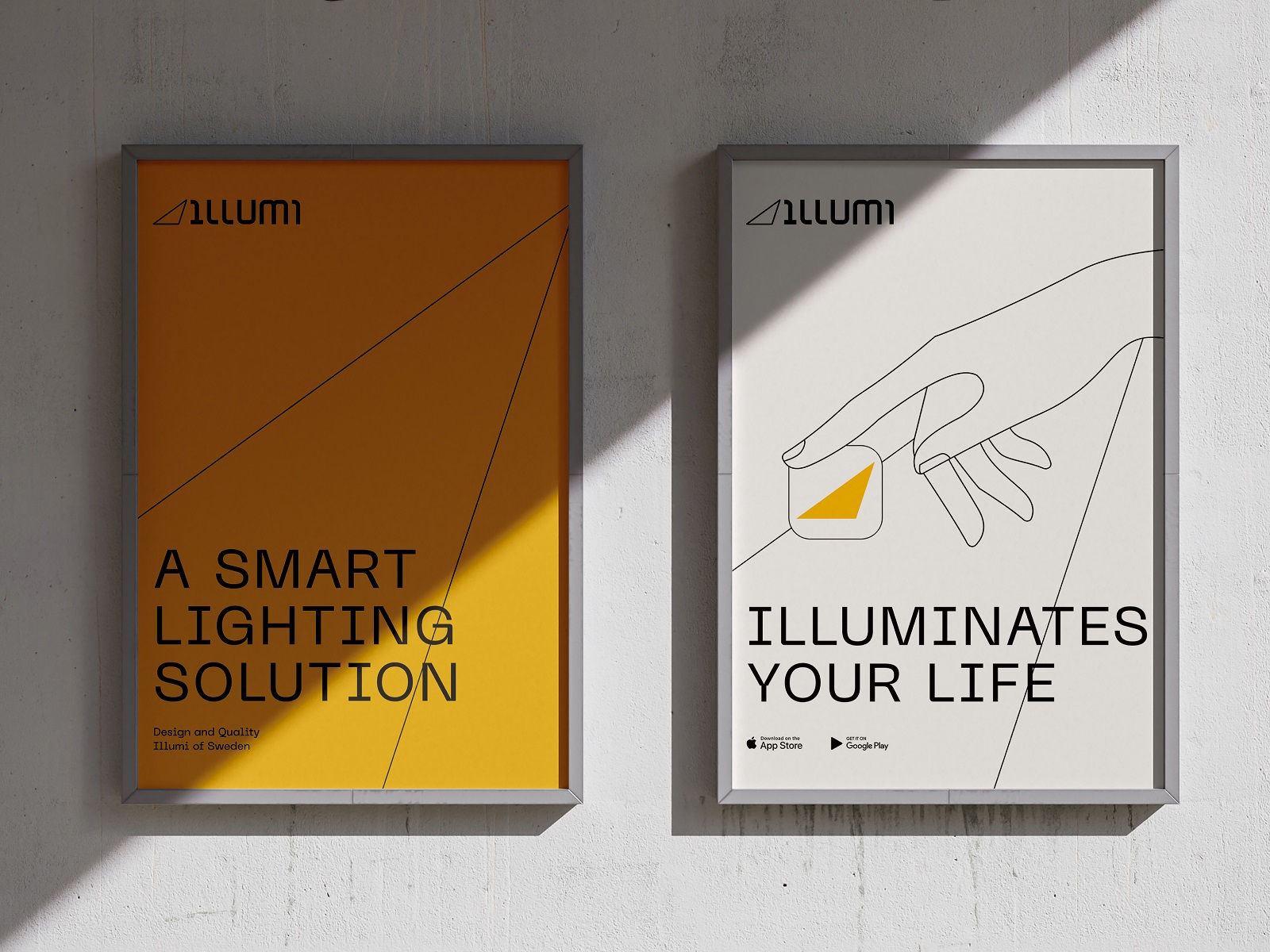
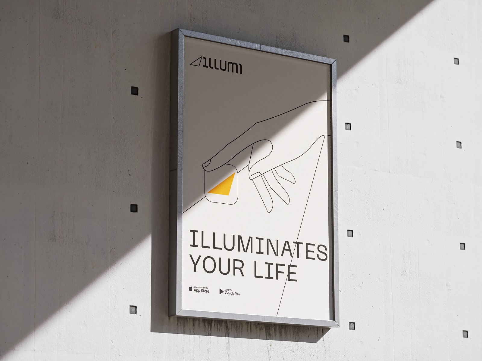
Luminaires Brand Identity and Packaging
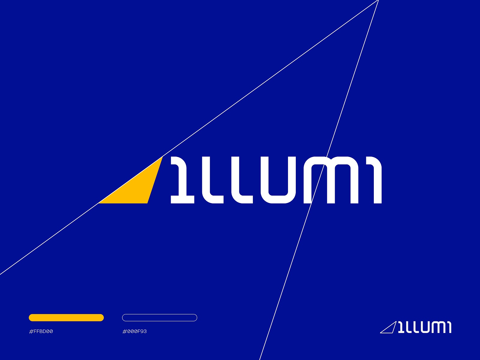
High-contrast visual identity systems signal confidence. For a company producing exclusive custom luminaires, the logic holds: sharp lines, bold contrast, poster design that doesn’t explain itself. Lighting as a product category tends to attract either the purely technical or the atmospherically vague—neither tends to produce strong brand design. Working in controlled contrast gives this identity a specificity that generic lamp branding rarely achieves, and the logo design carries that same economy of form.
Jewelry Brand Identity and Packaging
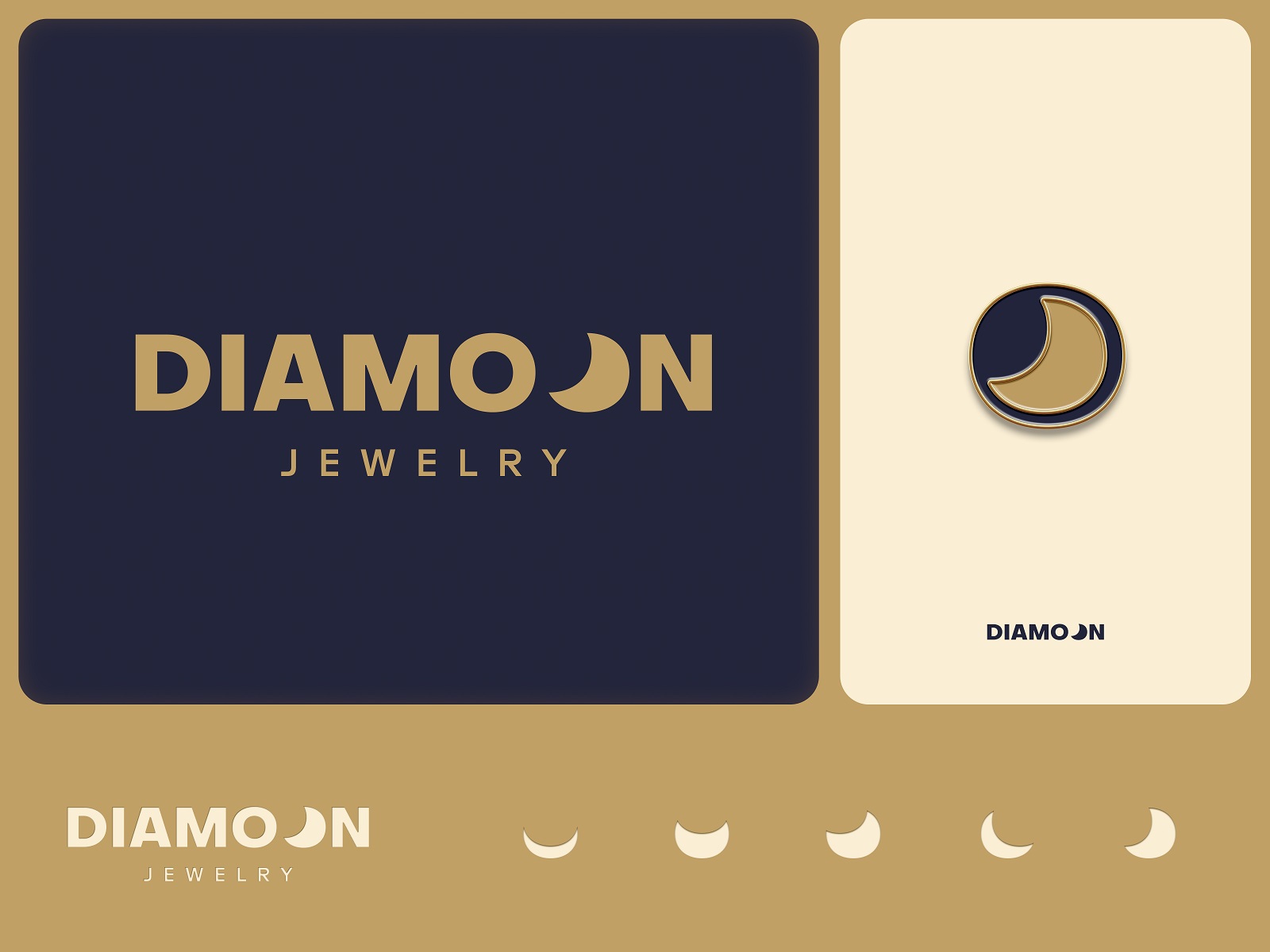
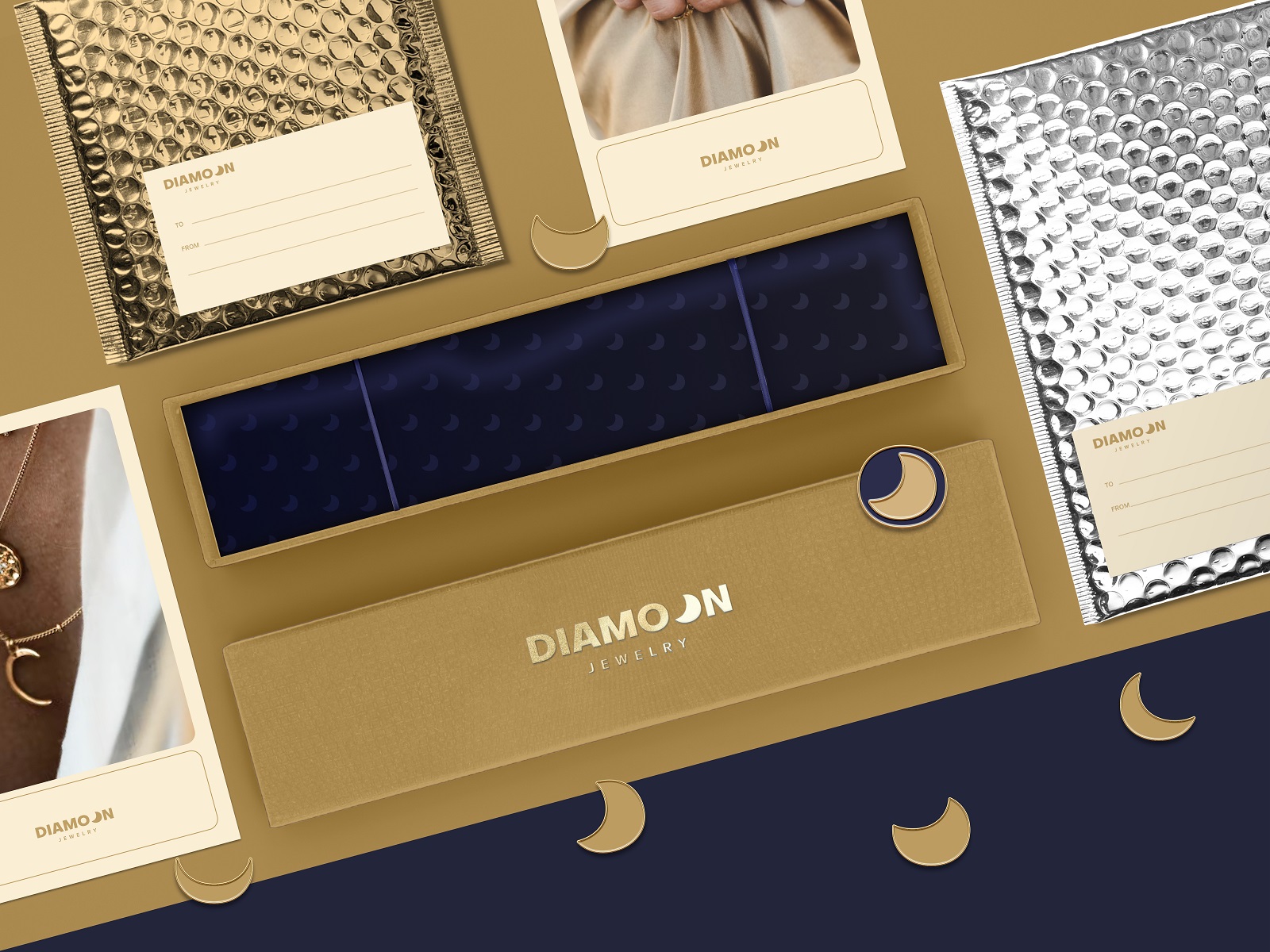
Mystic sophistication is a legitimate design register when it’s built, not borrowed. Jewelry brand identity has a tendency toward either maximalist ornamentation or stark minimalism; the interesting territory sits between those poles, where atmosphere is constructed through typographic choice and packaging structure rather than decorative excess. Logo design for jewelry needs to hold at very small sizes on hallmarks and at large sizes on carrier bags—a constraint that disciplines the whole system.
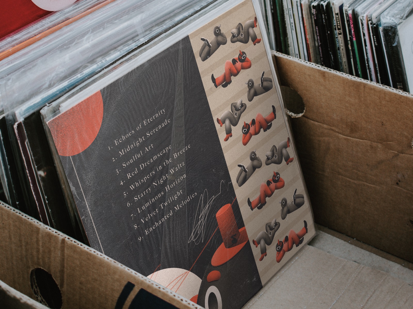
Vinyl Record Cover Design
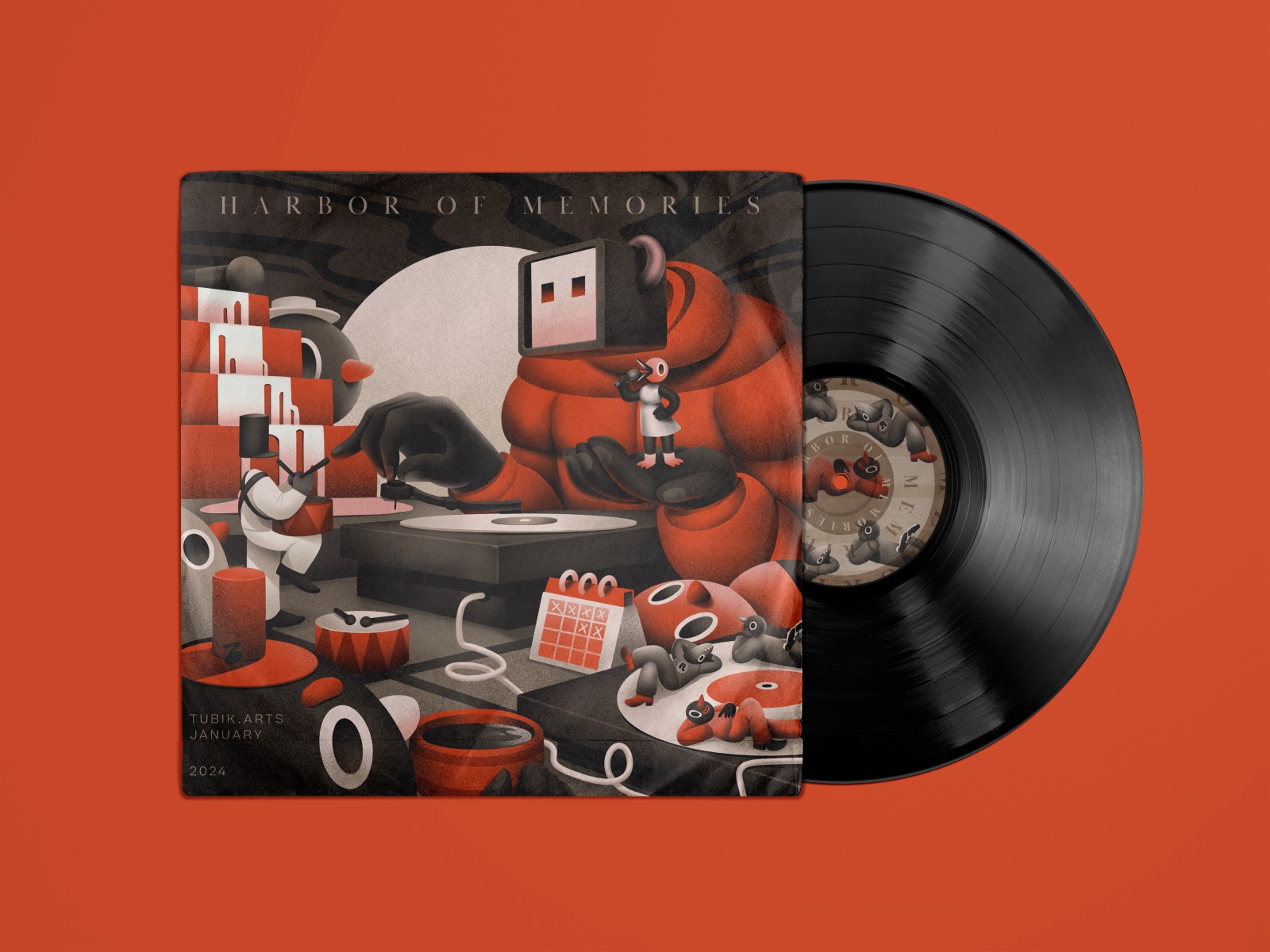
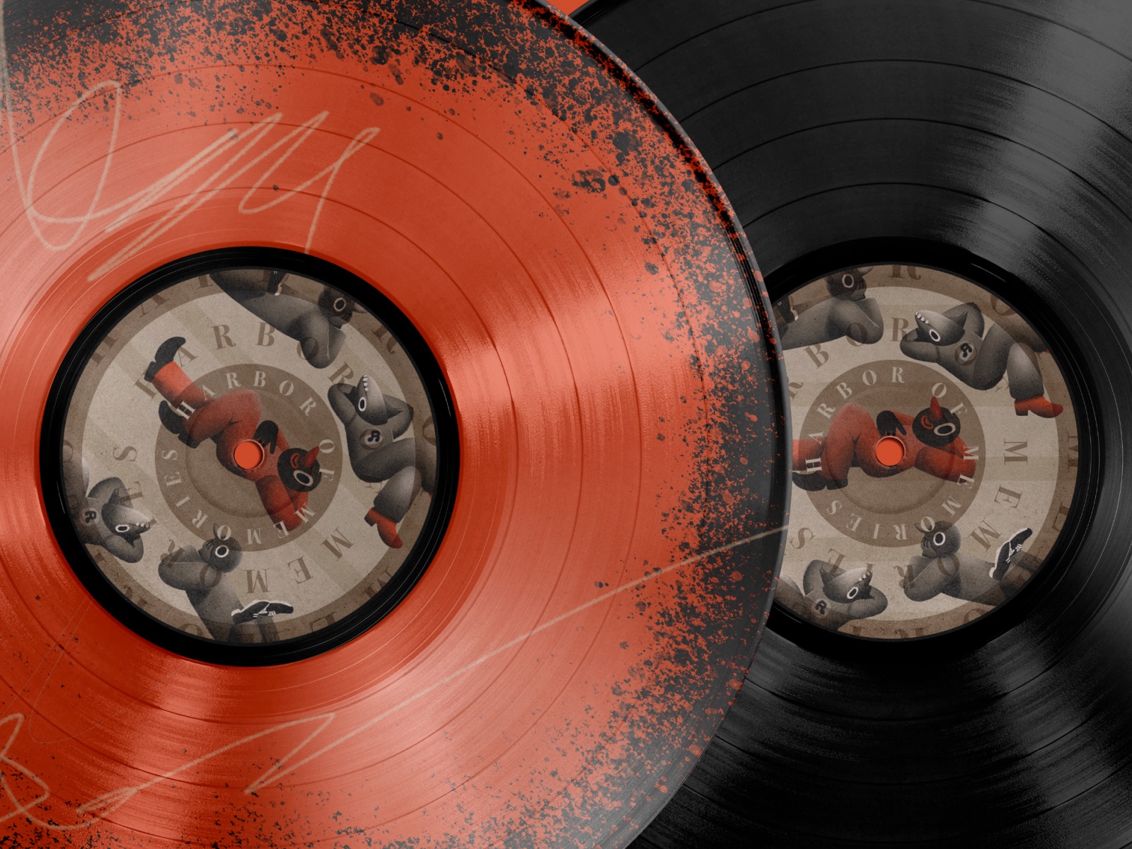
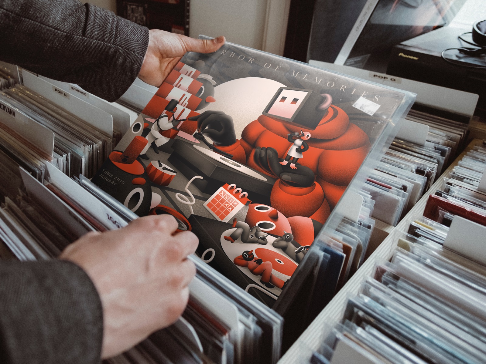
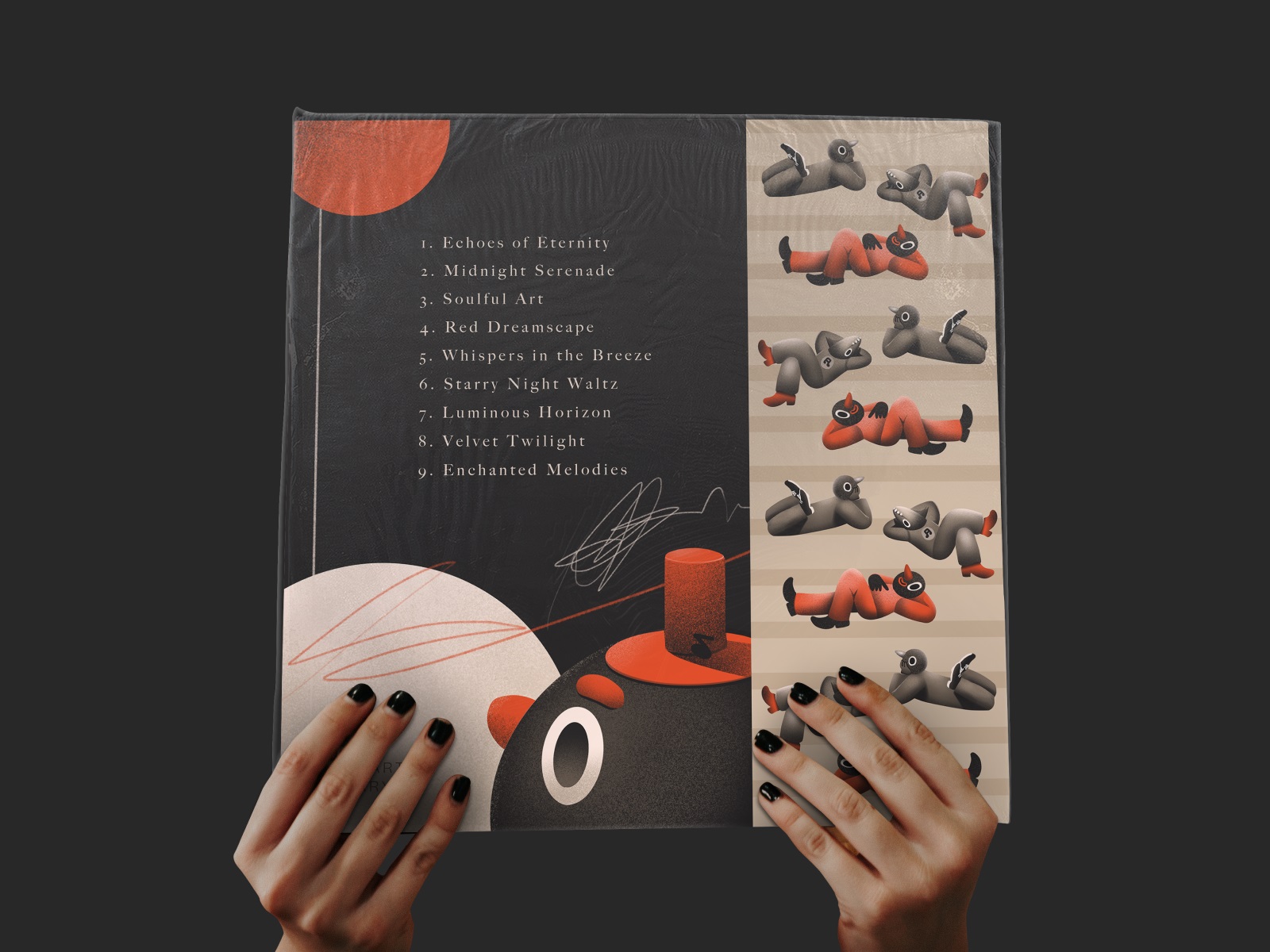
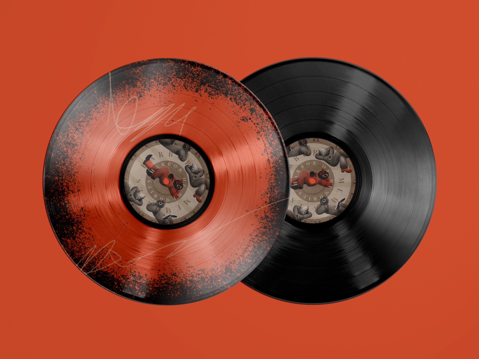
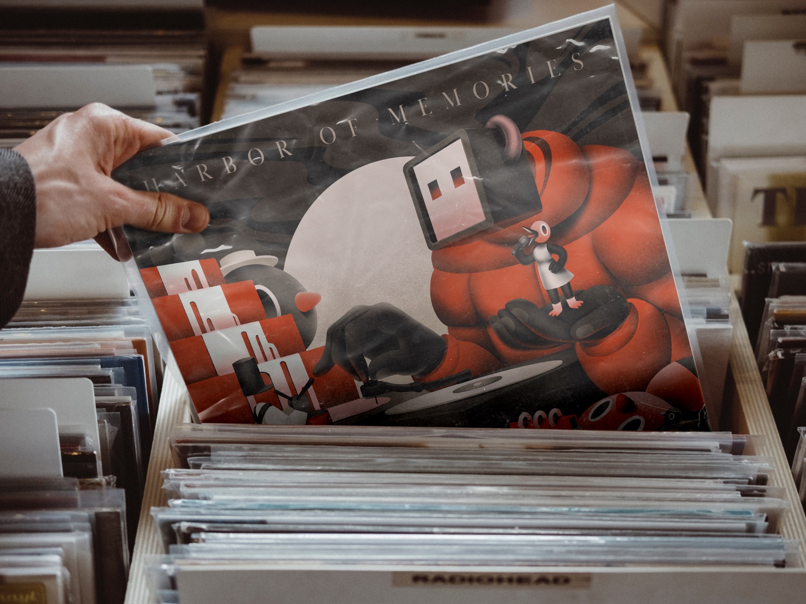
Album artwork operates by different rules than most packaging design: the audience already has emotional stakes in the content before they see the cover. Character art on vinyl record cover design is a choice that either reinforces the music’s world or creates an interesting friction with it. The futuristic character work here, wrapped in high-contrast color, treats the physical format as a collectible object—which, given the resurgence of vinyl as a deliberate purchase, is exactly the right framing. Paper inserts and inner sleeves are the supporting typography of the format; neglecting them is leaving the experience incomplete.
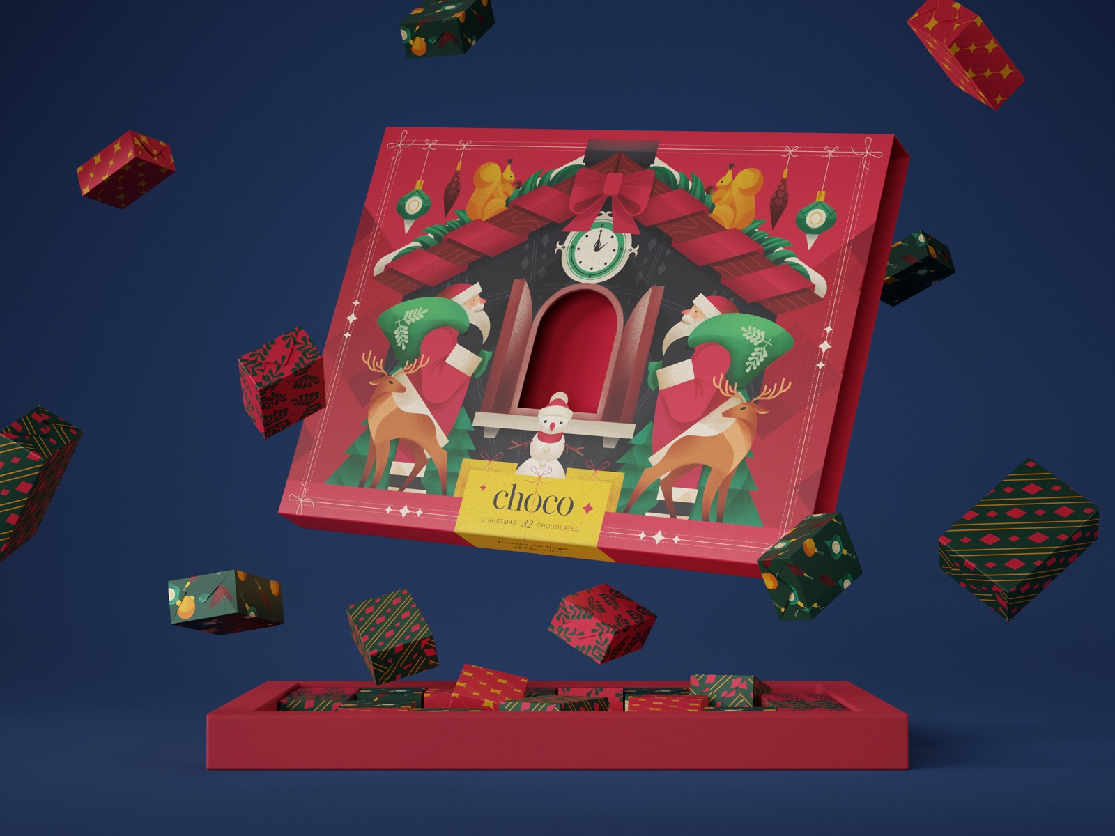
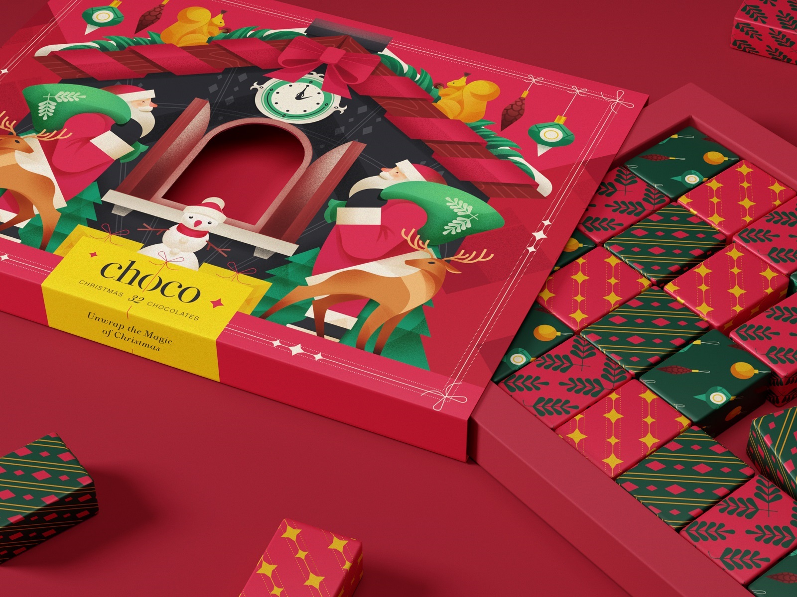
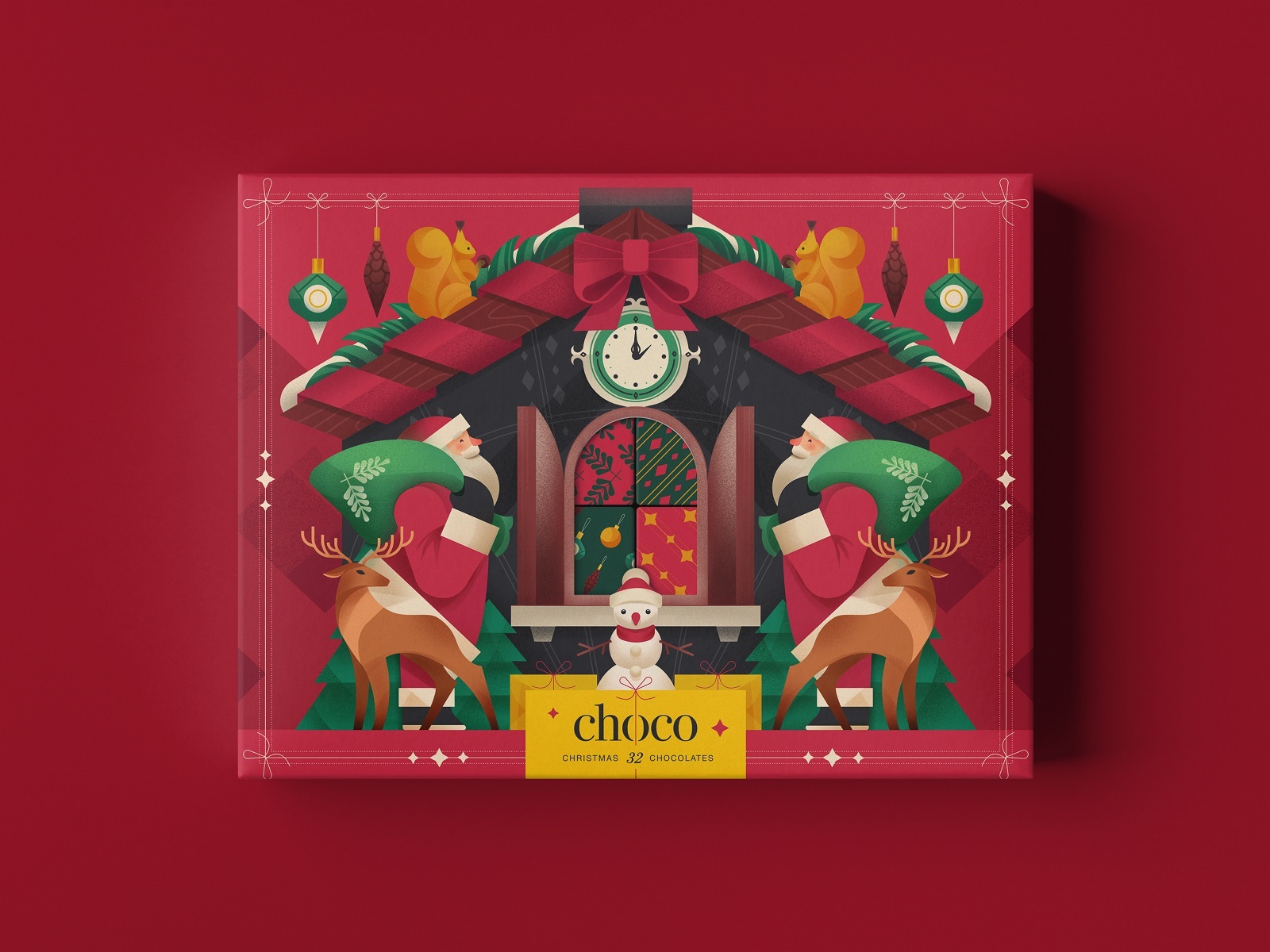
Christmas Chocolate Box Design
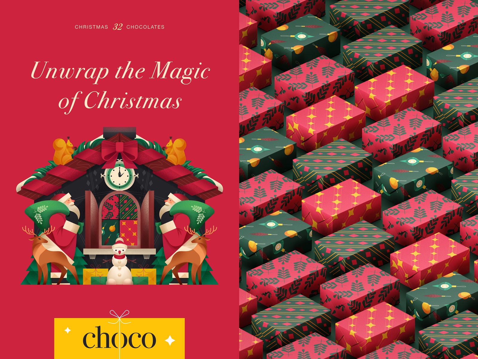
Seasonal packaging design is a stress test for illustration-based brand communication. The visual vocabulary is fixed—Santa, reindeer, snowmen, baubles—and the margin for originality appears narrow. The actual opportunity is in density and detail: a big original illustration that rewards sustained looking gives gift packaging a reason to be kept rather than discarded. Festive confectionery packaging specifically benefits from this logic, because the box often outlives the product by weeks.
Fizzy Drinks Can Design
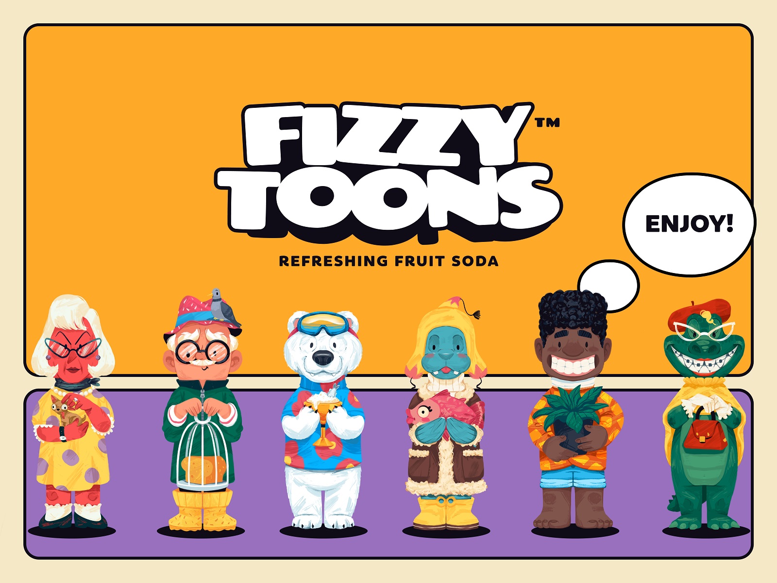
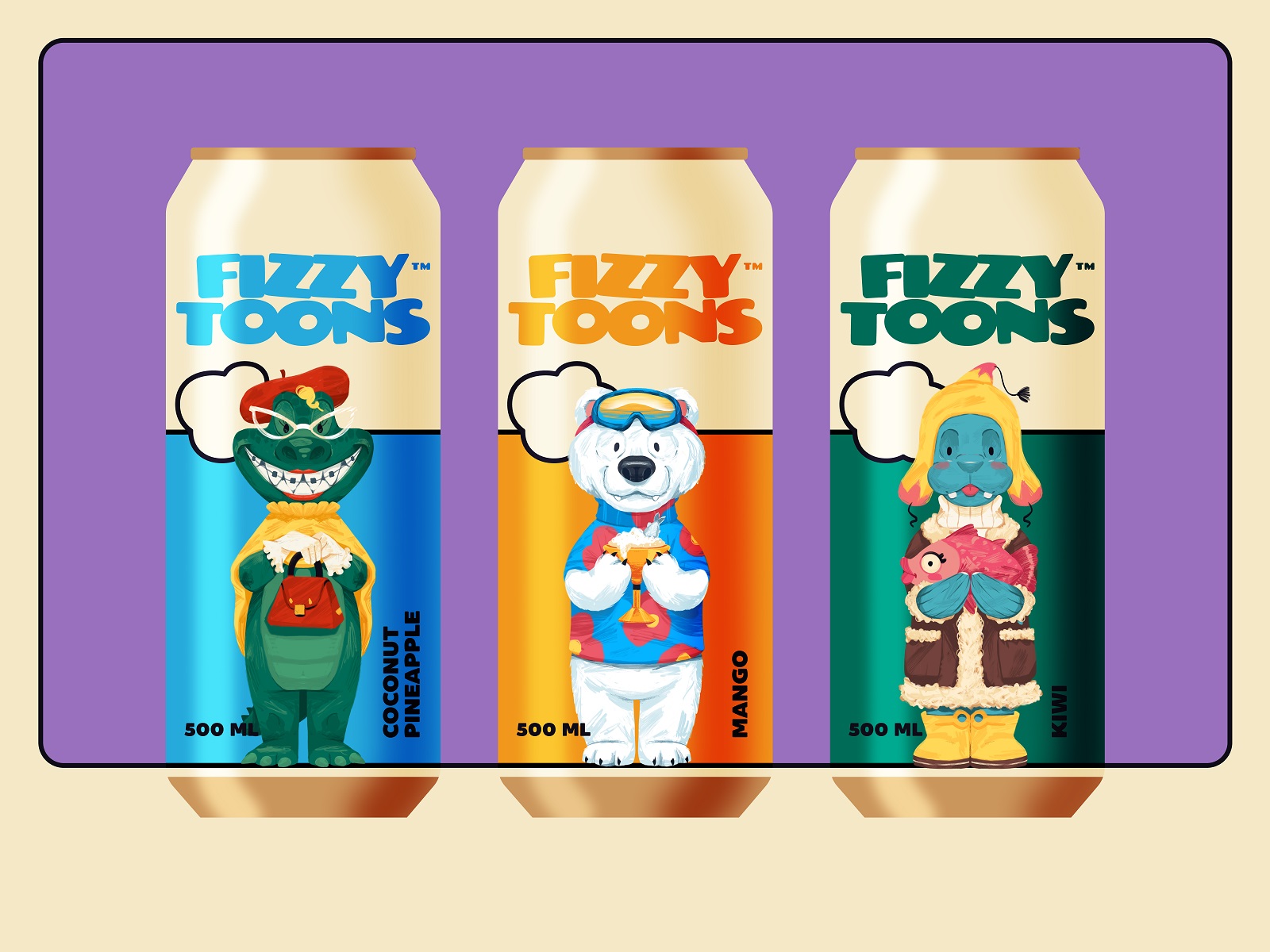
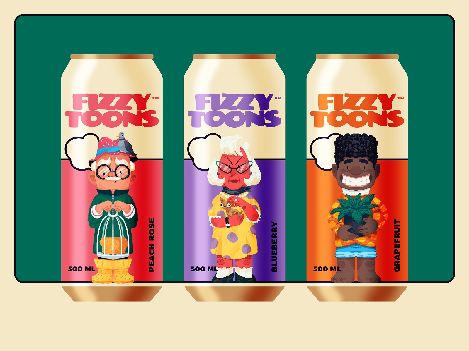
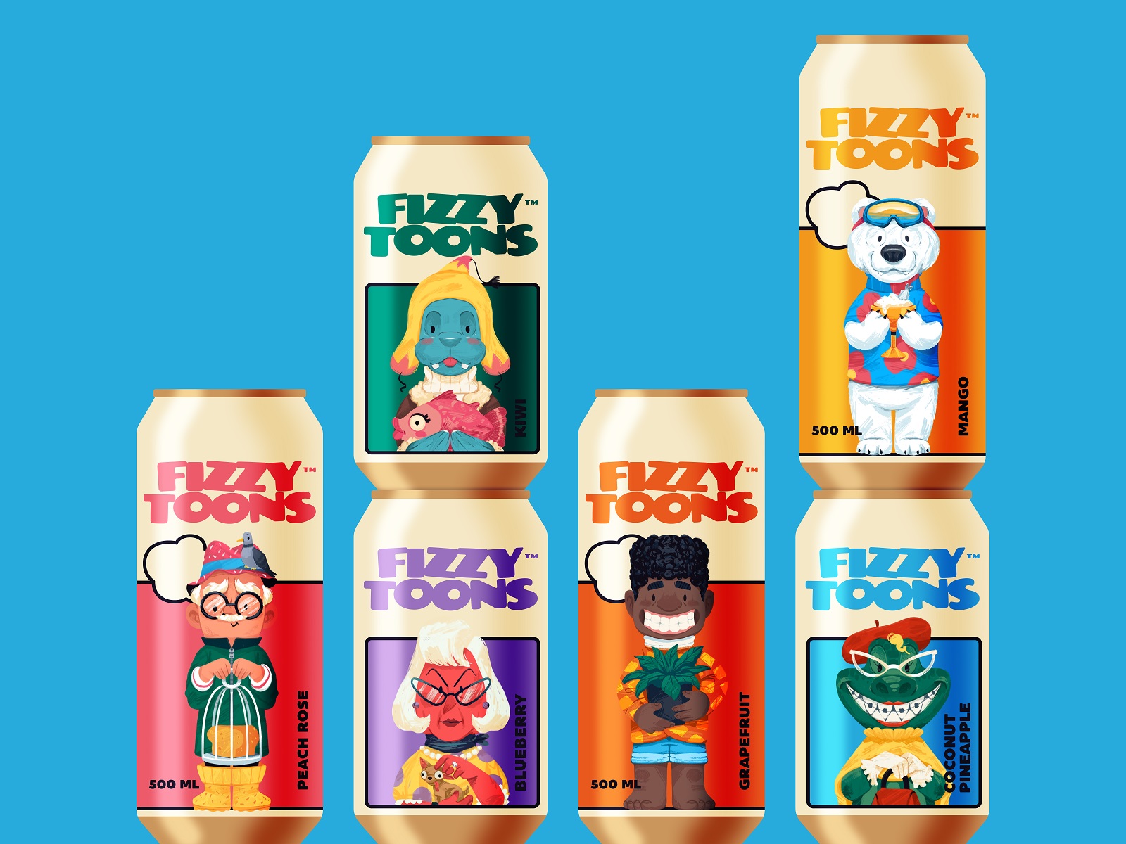
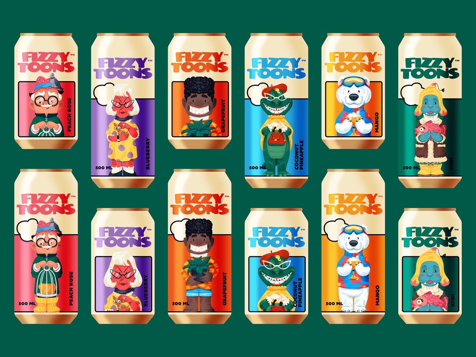
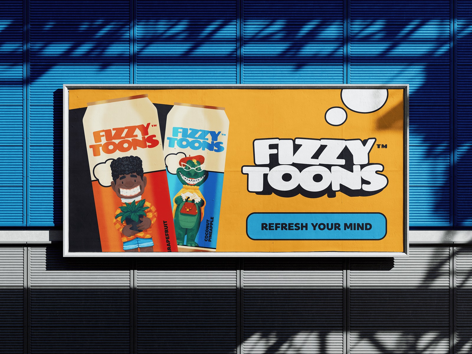
Drinks can design targeting younger consumers has its own economy: characters need to read at 73mm diameter, function in motion on social media, and survive reduction to sticker size. The character set developed for this fizzy drinks brand treats each flavor as a distinct personality rather than a color variant with a fruit sticker—a meaningful structural decision that gives the product range both coherence and internal differentiation. Vibrant color is table stakes in this category; it’s the character design work that does the actual brand-building.
Pasta Brand Packaging
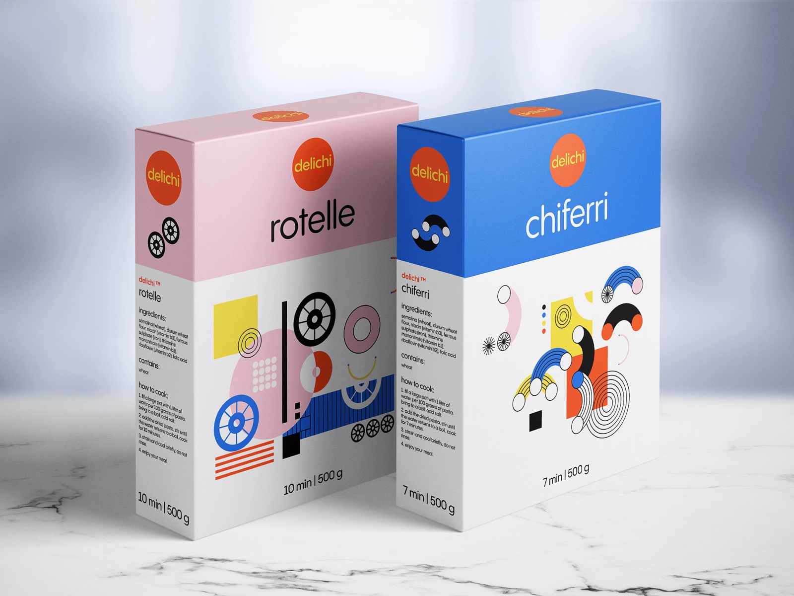
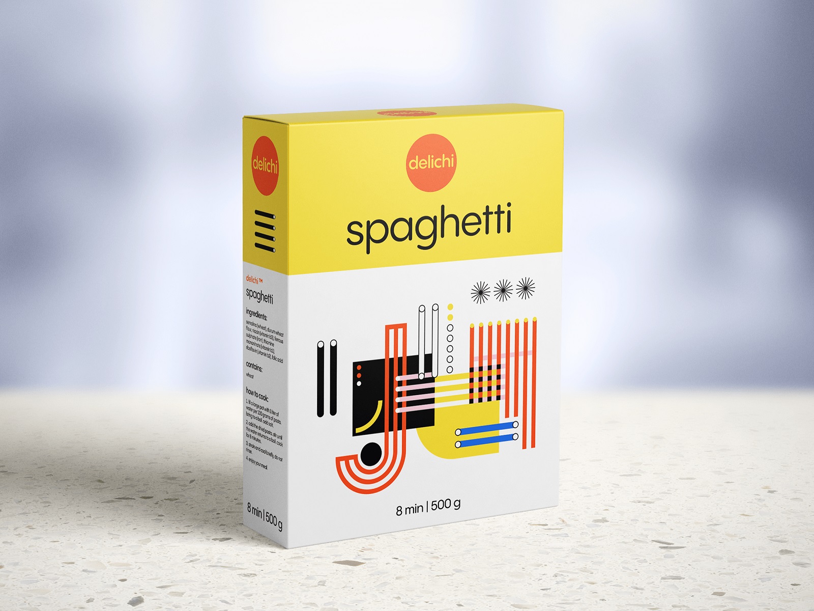
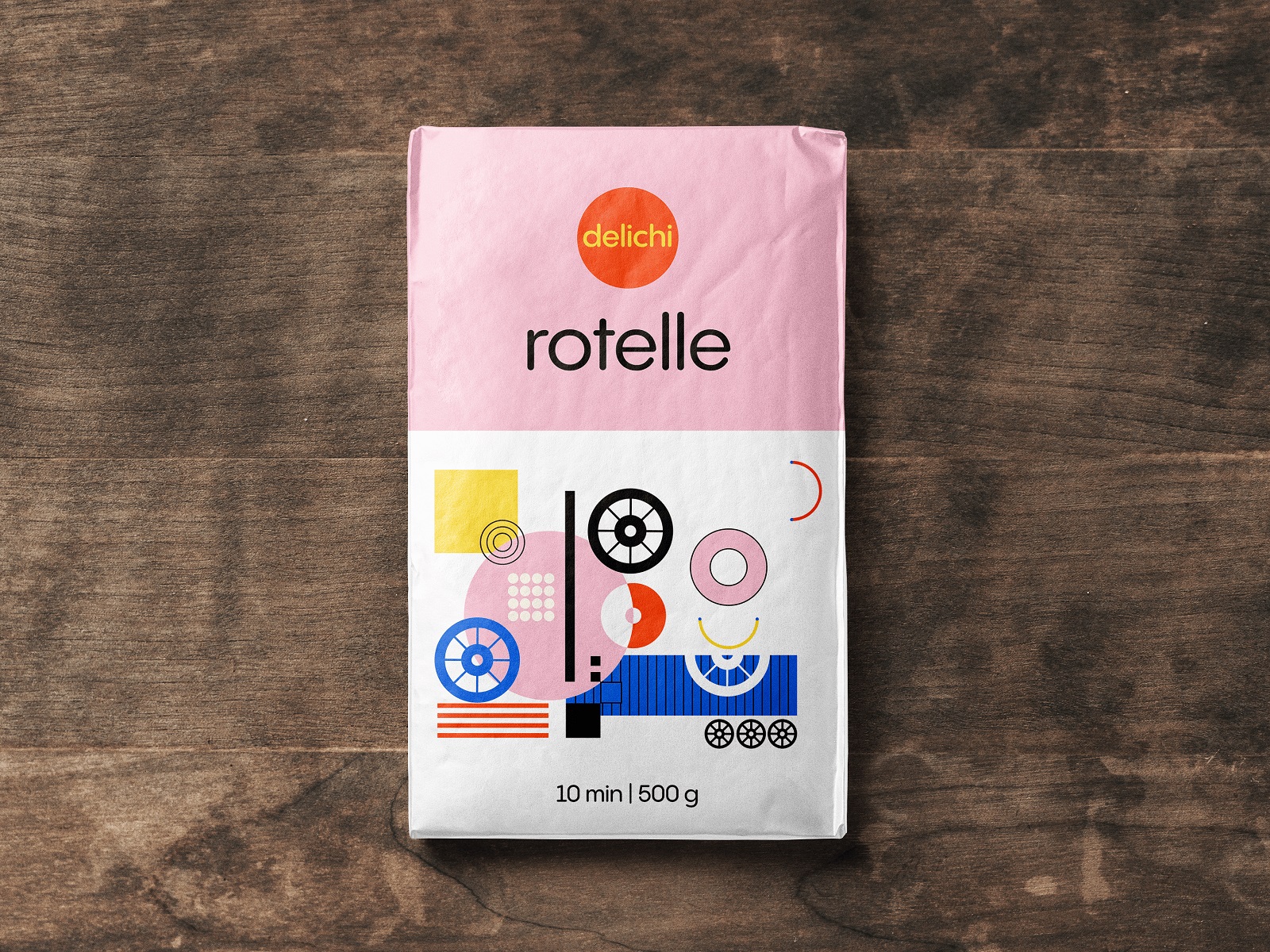
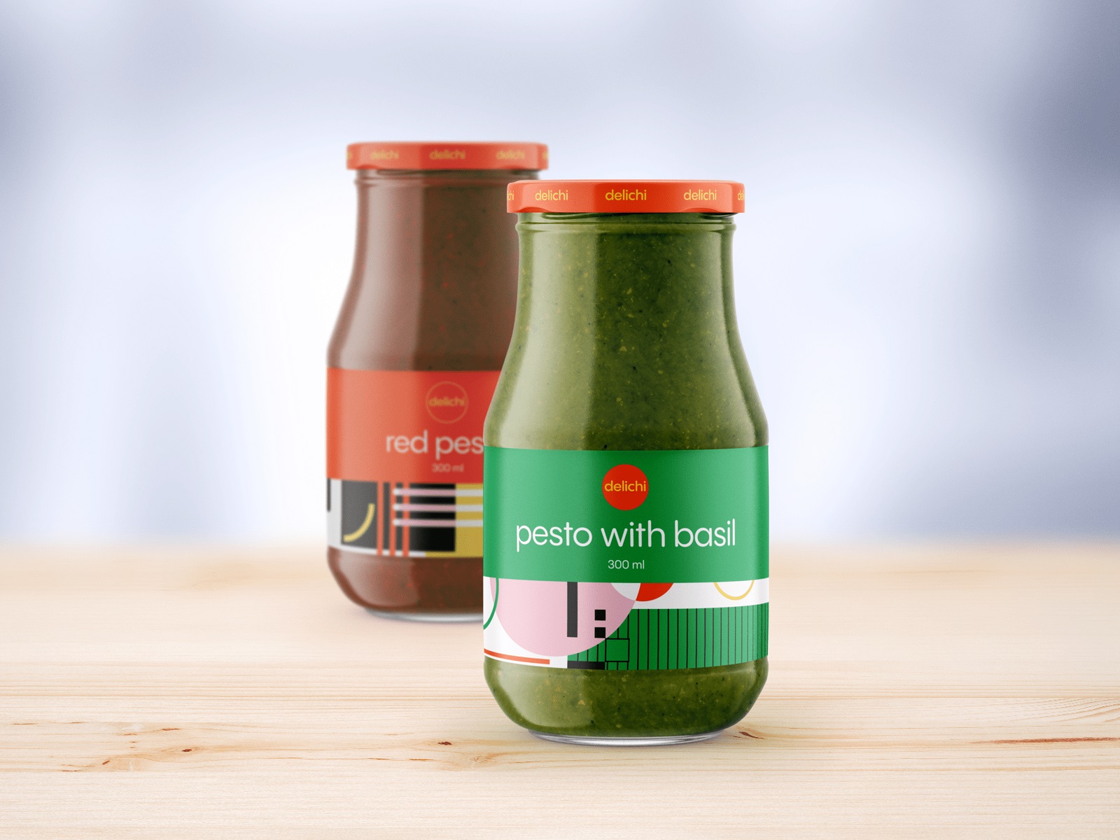
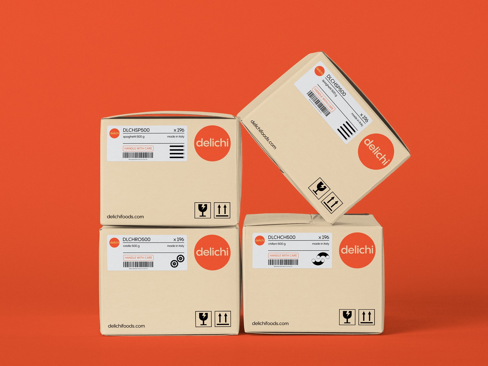
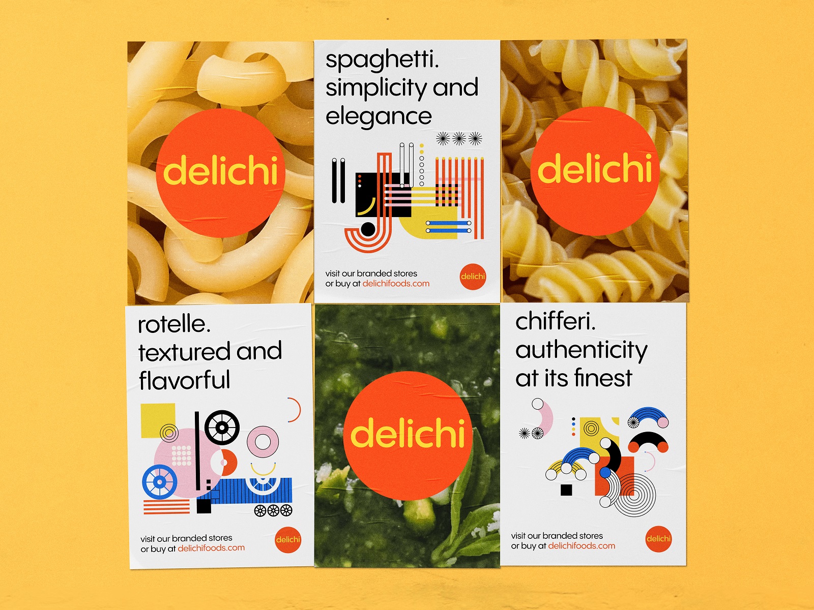
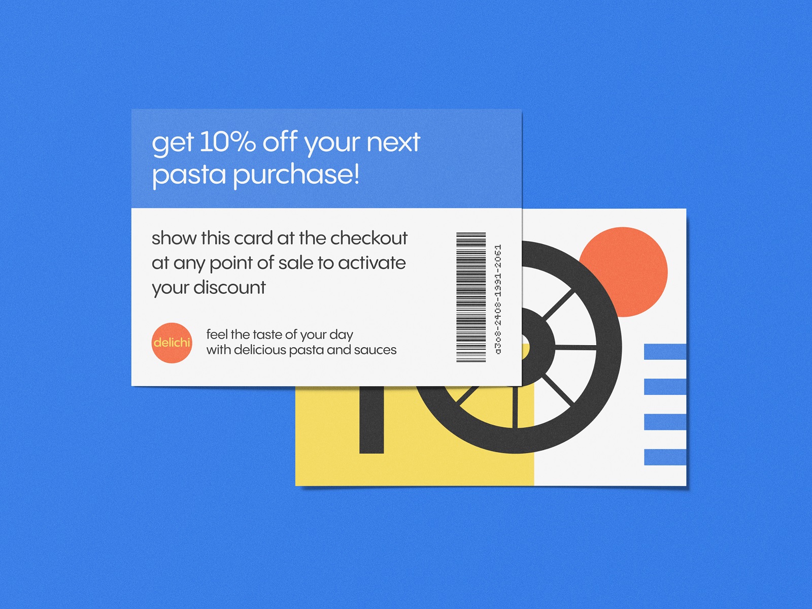
Geometric illustration in food packaging is riskier than it appears. Done without commitment, it reads as budget design trying to look considered. Done well—with genuine contrast, structural logic, and a palette that holds across box formats, jar labels, and discount cards—it produces a brand system with real flexibility.
This pasta brand packaging project covers enough marketing collateral variants to demonstrate that the design language actually scales, which is the real test of any visual identity concept.
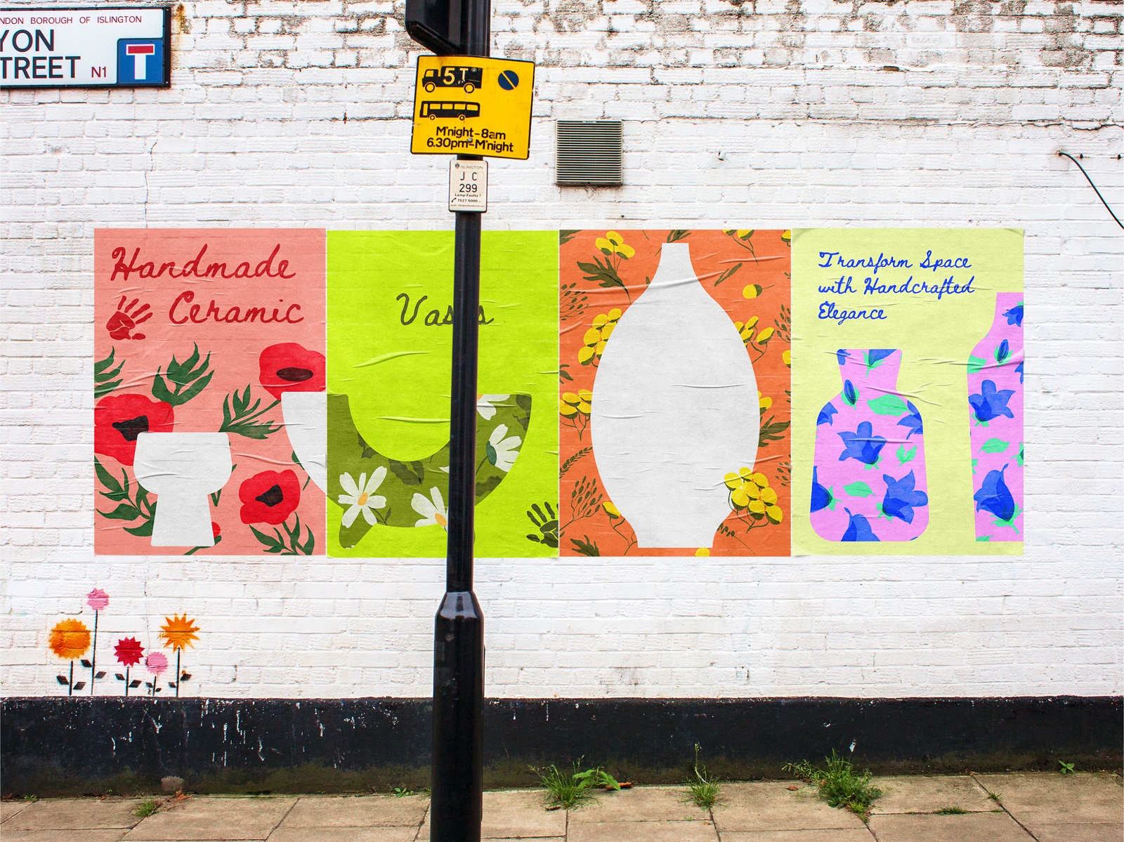
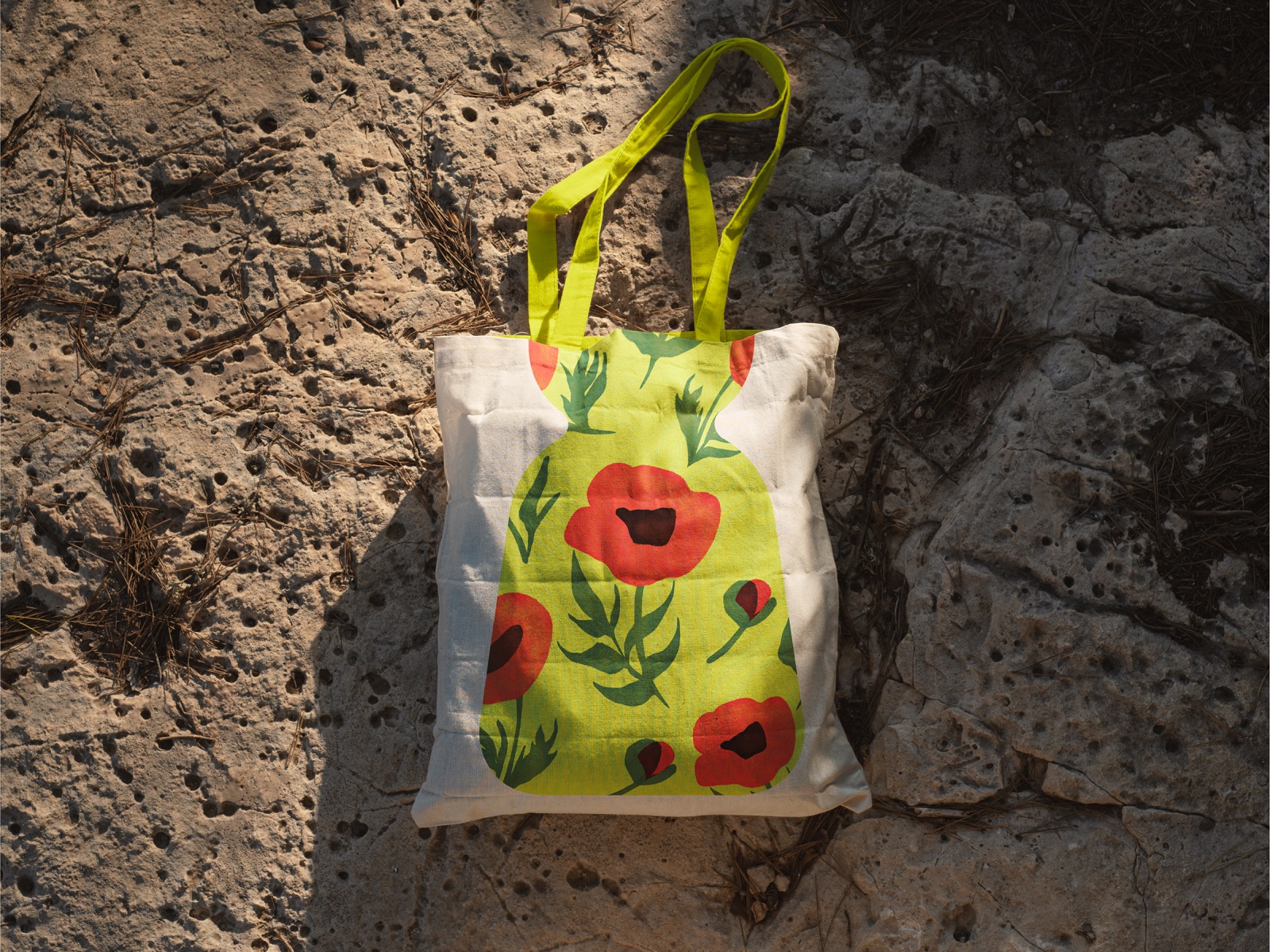
Ceramic Vases Brand Visual Identity
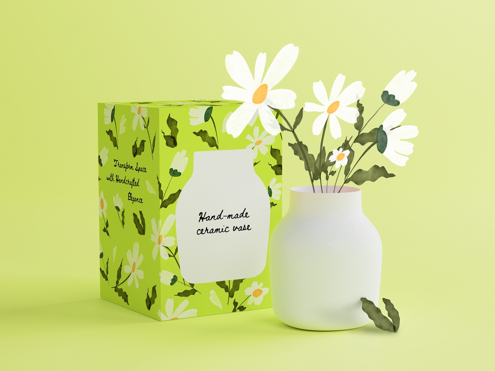
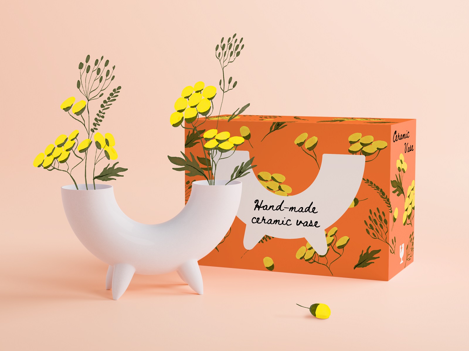
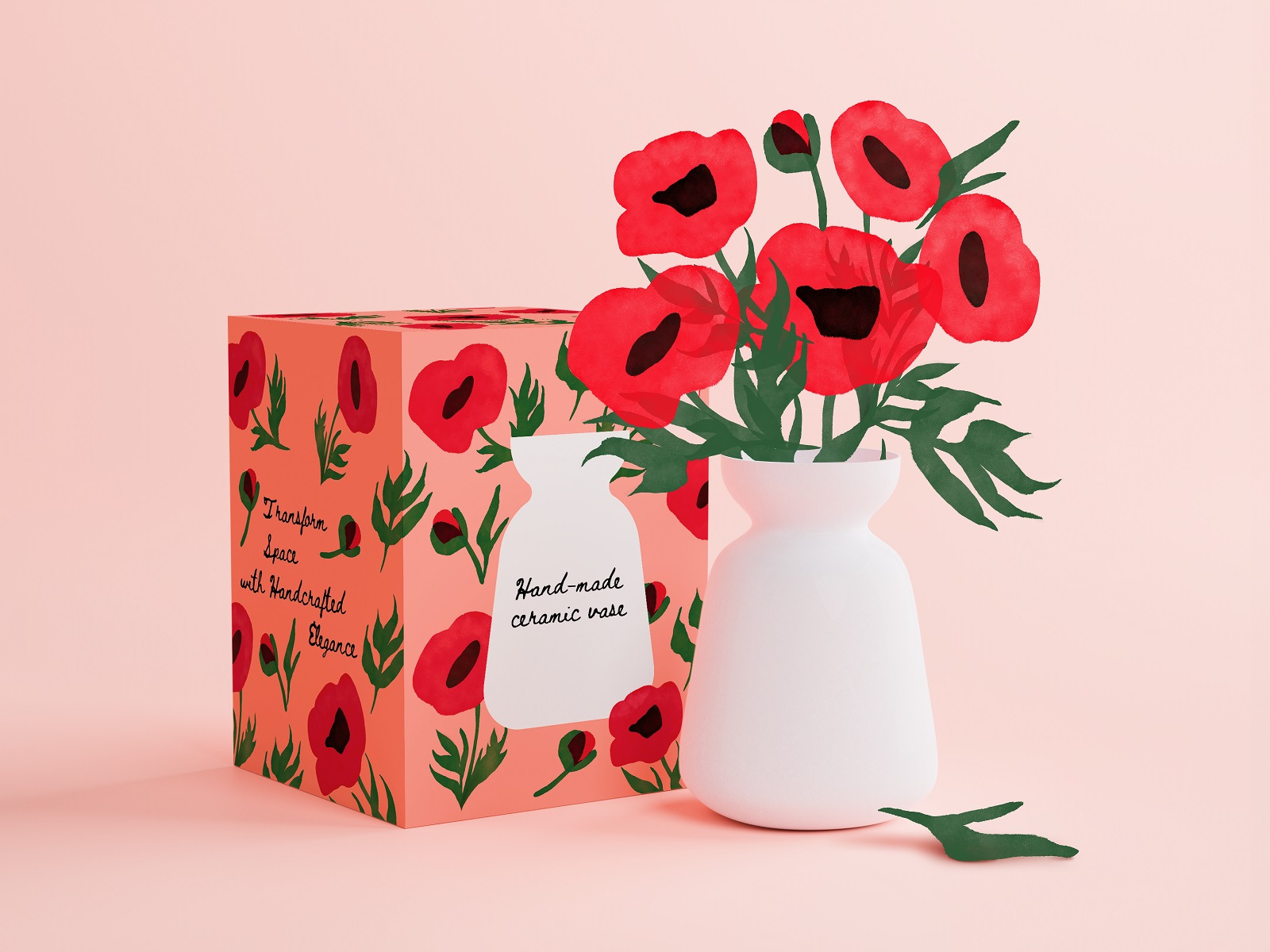
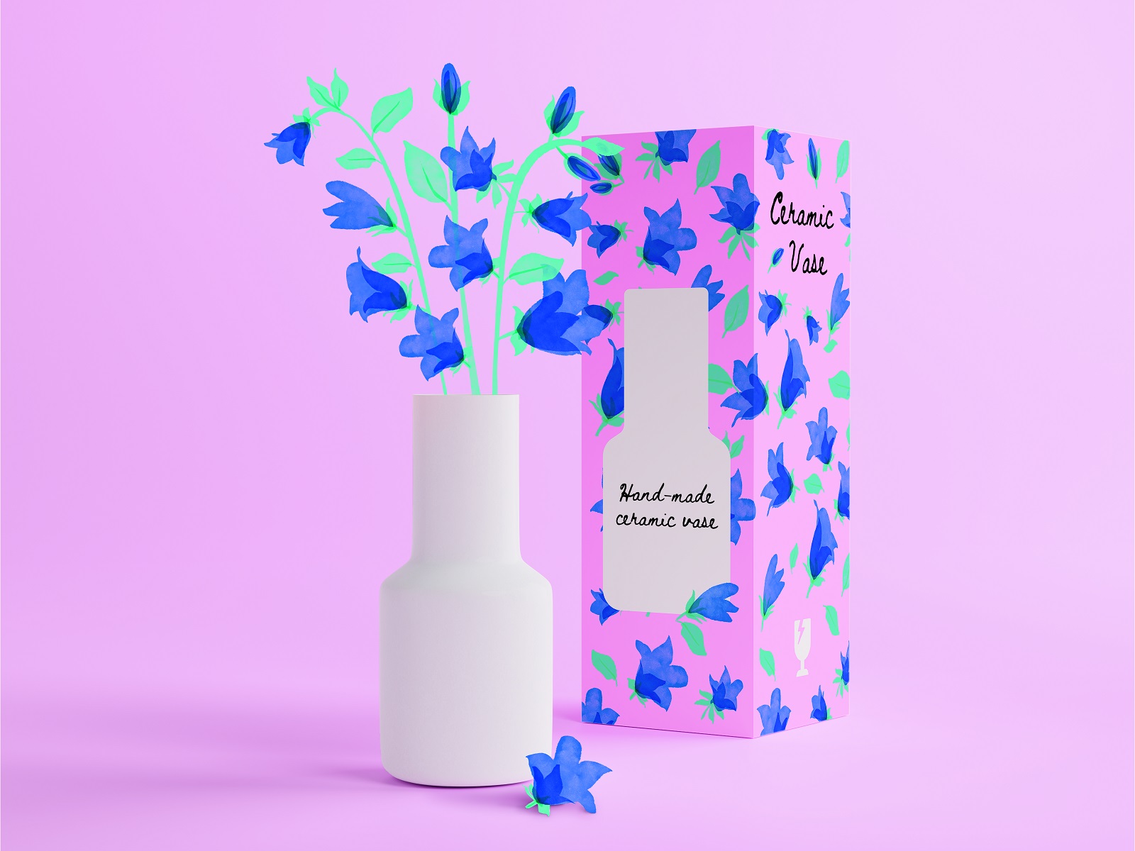
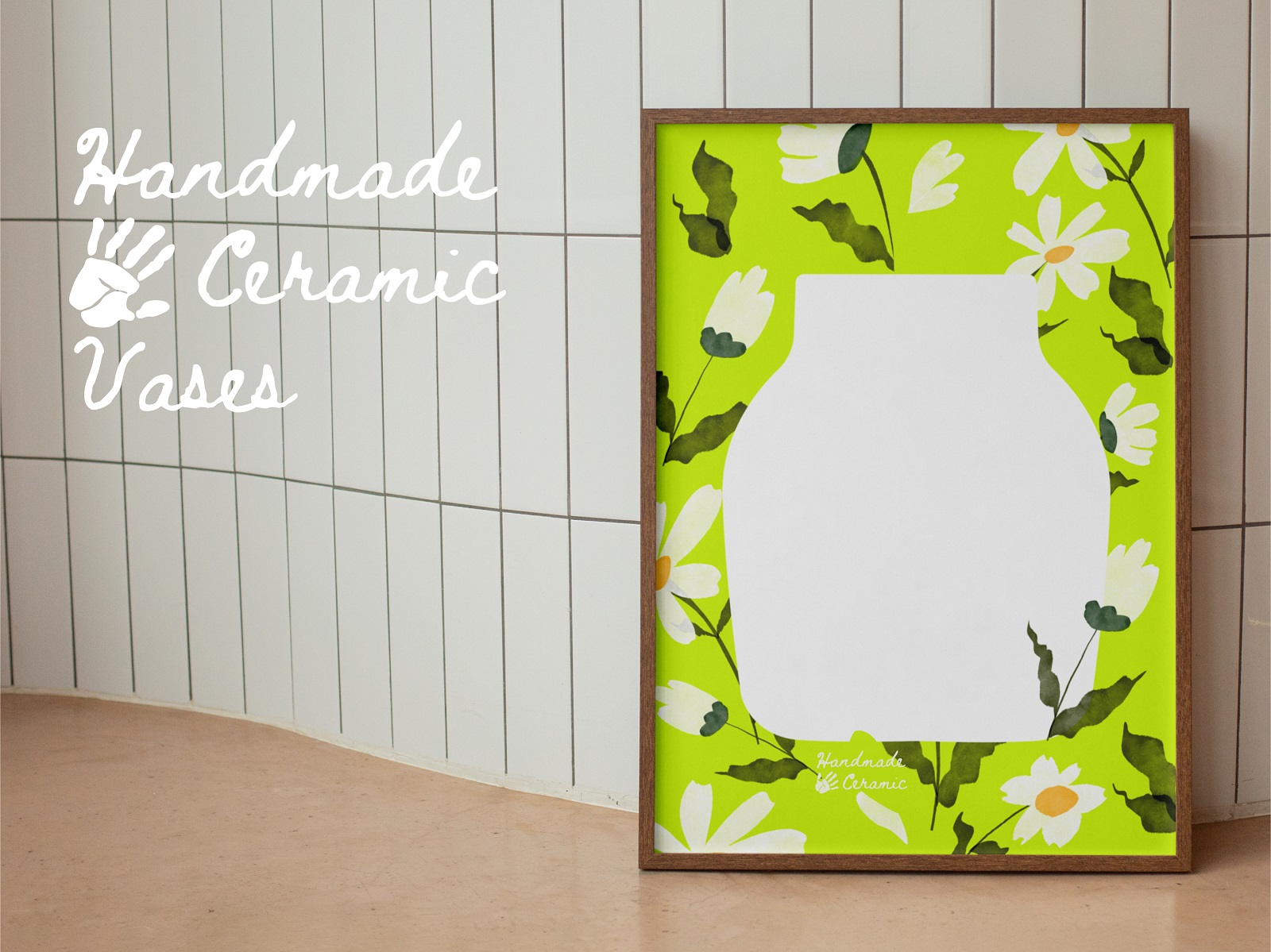
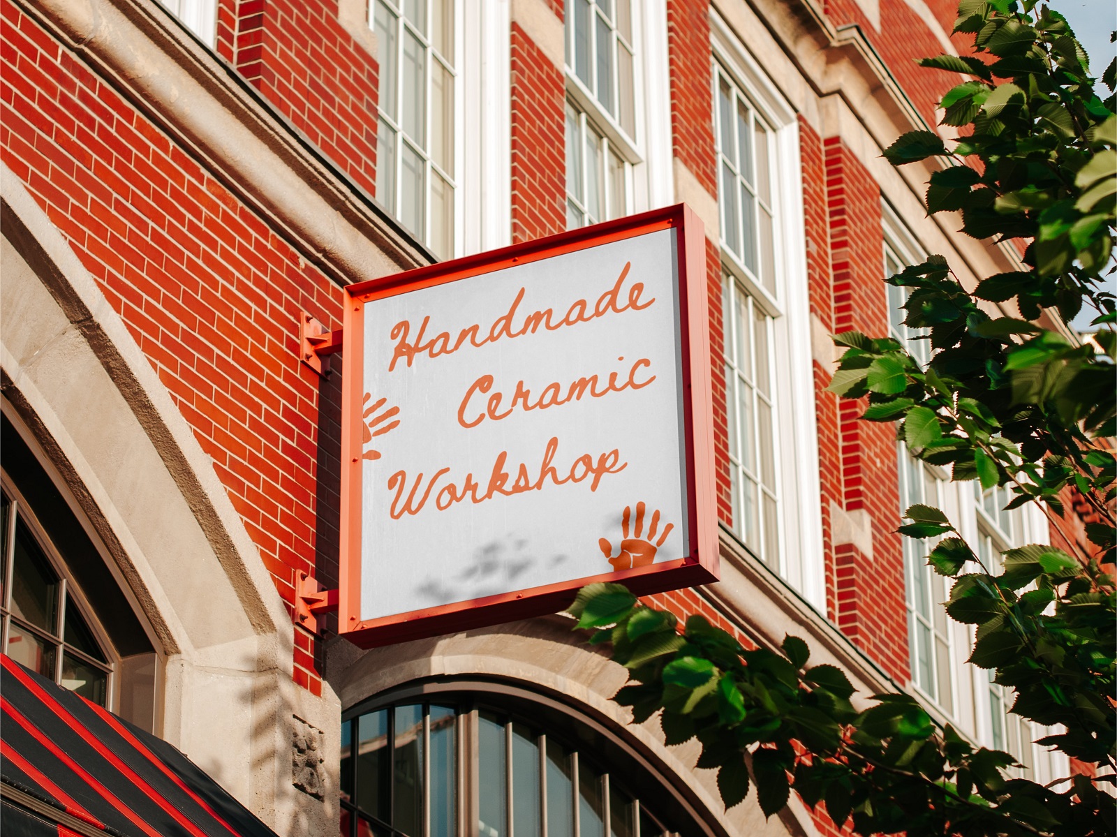
Handmade product branding carries an implicit obligation: the packaging design should feel as intentional as the object inside it. For a brand producing ceramic vases and floral interior décor, that means sophisticated artwork that matches the craft register without romanticizing it into uselessness. Typography does significant load-bearing work here, too—pairing decorative motifs with type that communicates precision reassures a buyer that attention to detail is structural.
Sports Events Posters Set
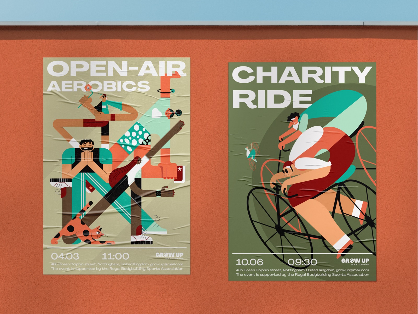
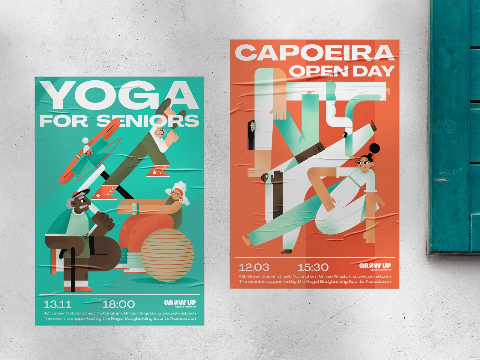
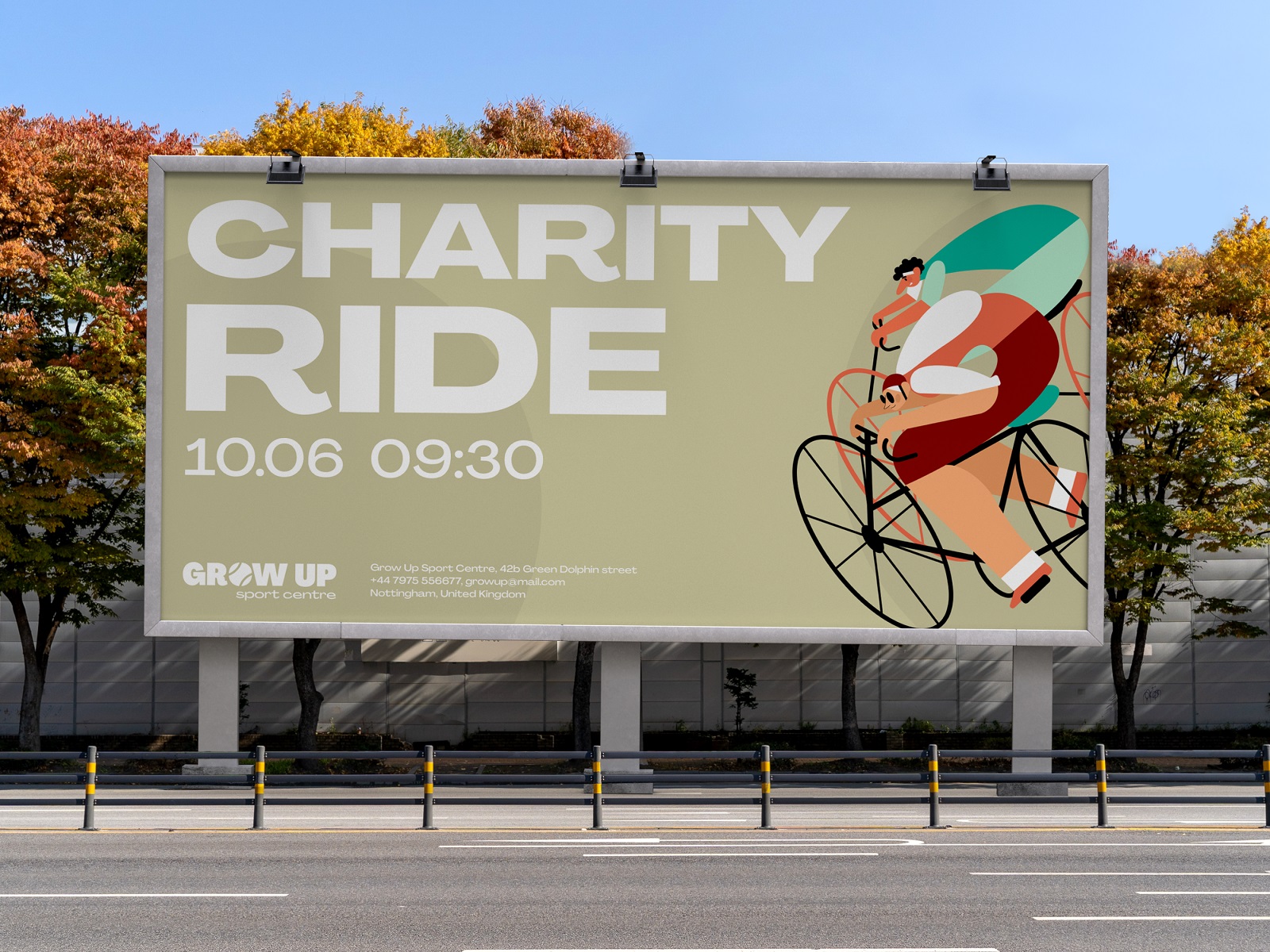
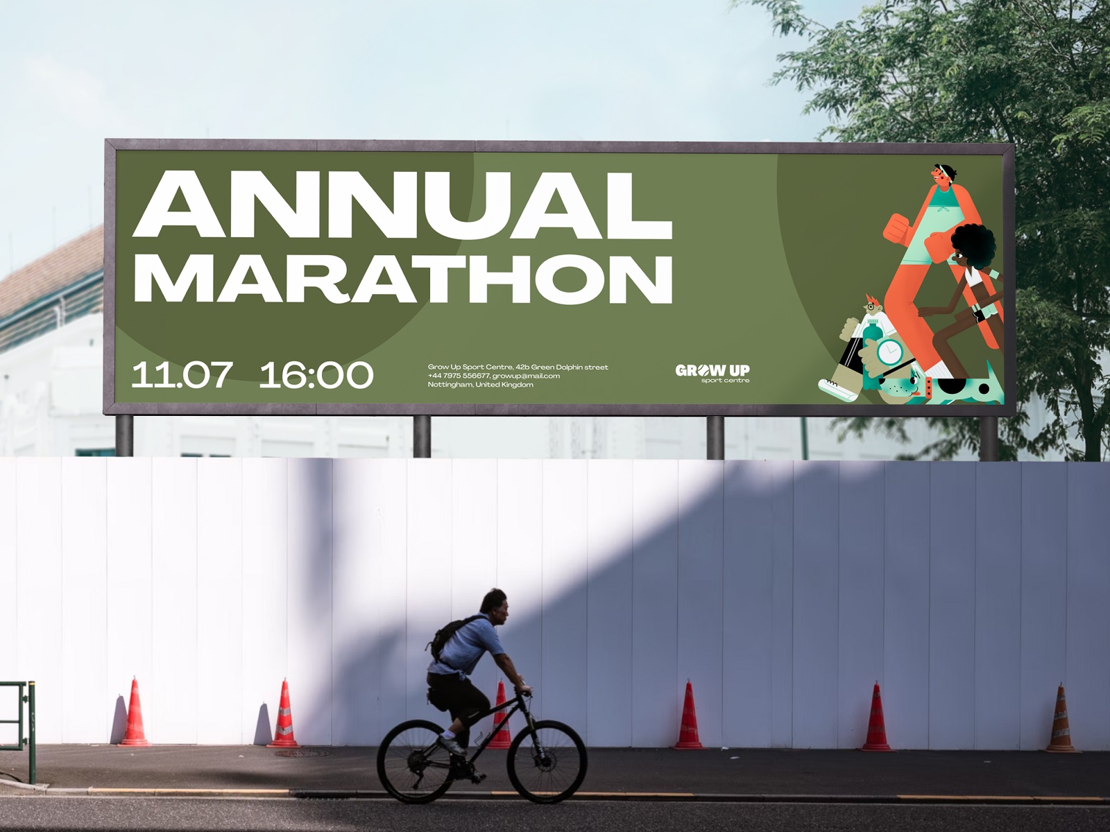
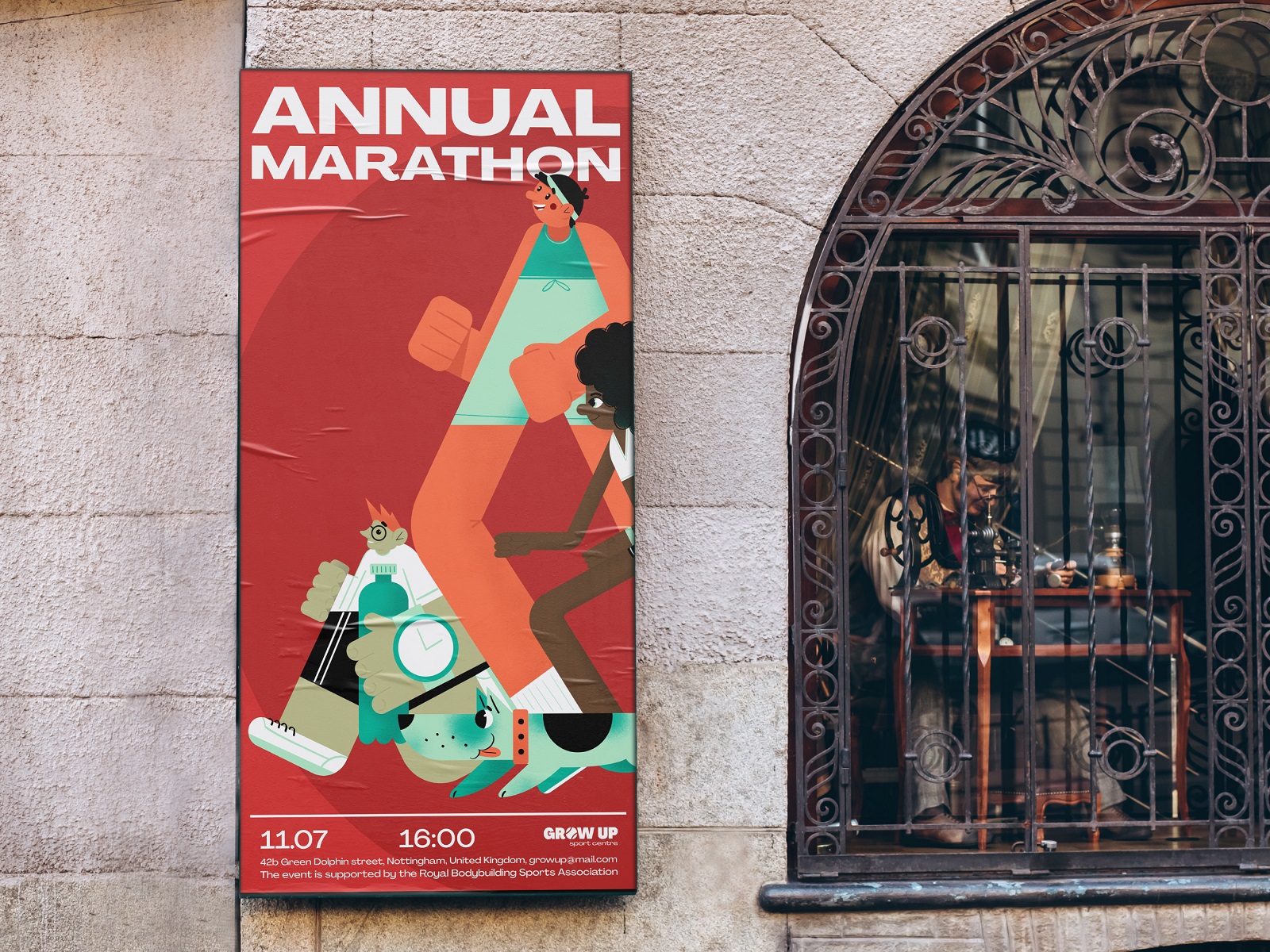
Illustration poster design for sports and fitness events needs to solve two problems simultaneously: energy and legibility. At the scale posters typically function—transit, venue, digital display—visual hierarchy has to survive reduction and environmental noise.
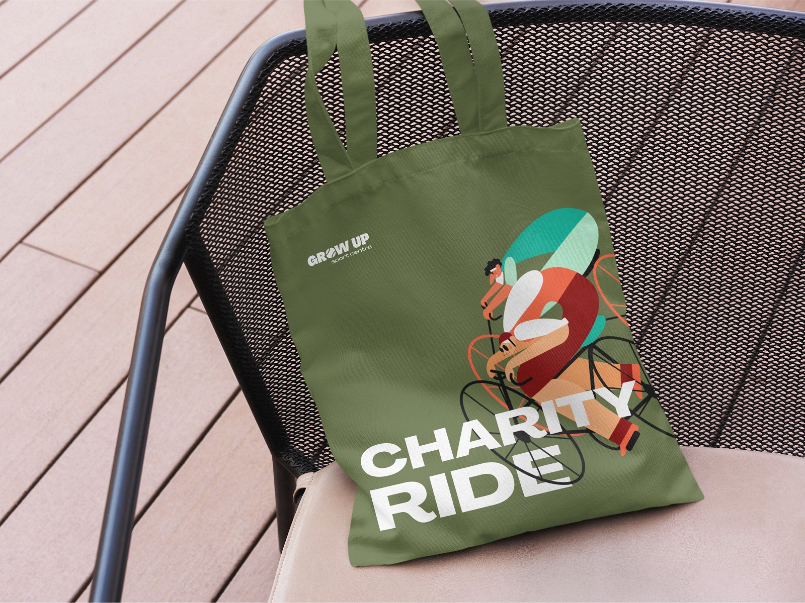
This set uses cheerful, illustration-led graphics to carry the motion and energy, while the underlying poster layout keeps information accessible. A consistent set across multiple events is also a brand identity decision: it says the events belong to the same world, which over time builds recognition.
Surfing Service Identity
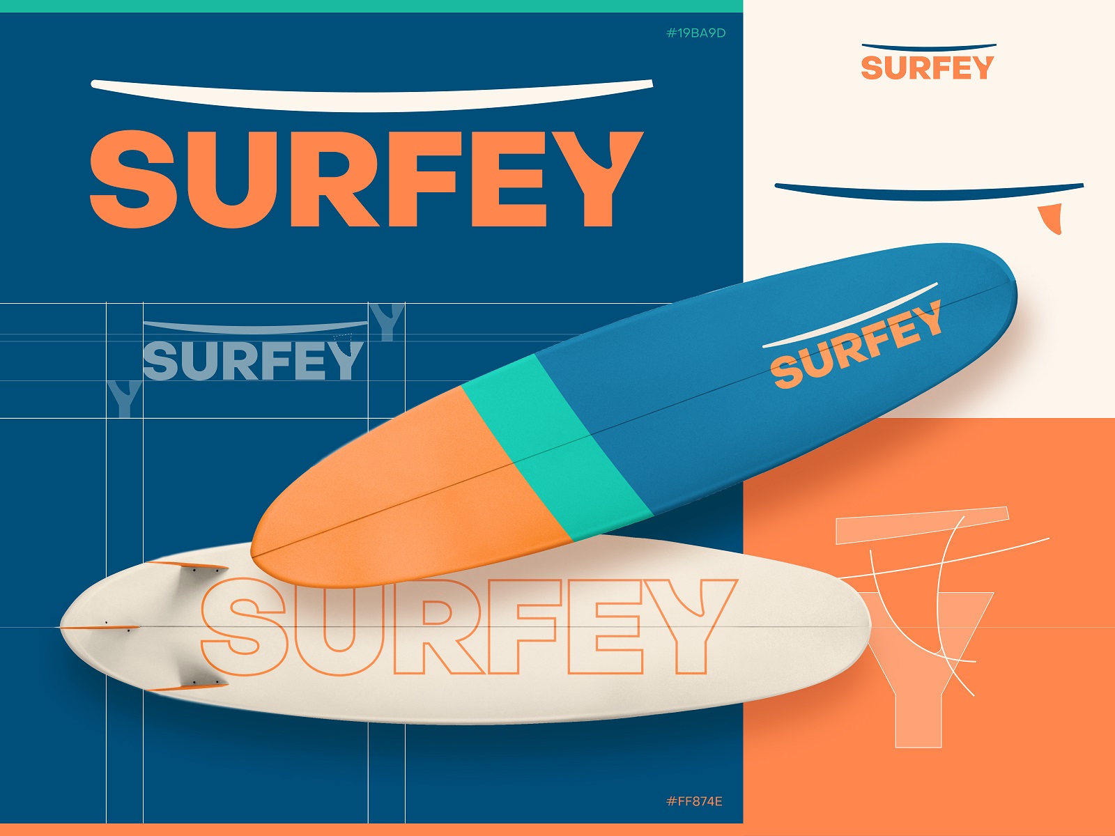
Animated logo design for a surfing hire service is a category where it’s genuinely easy to do the obvious thing—a wave, a board, or a sun. The interesting design problem is building a brand identity concept that communicates movement and joy without relying solely on those shortcuts.
Custom surfboard design is the more unusual element here: it extends the visual identity into the actual product, which is as close as a hire service gets to owning its physical environment. That’s a smart use of brand touchpoints.
What Holds It Together
Twelve projects, twelve different briefs, one consistent finding: identity design that commits to a specific visual language—whether that’s a fox that moves, a cat that expects worship, or a drinks can with a personality—earns attention that cautious, interchangeable branding simply doesn’t. The brands people remember were never trying to appeal to everyone—just to the right someone, repeatedly and precisely.
Recommended Reading
Good design writing is as rare as good design. We try to maintain a decent ratio of both—check out our other case studies, process breakdowns, and thinking pieces:
Love Sign. Gift Box Packaging Design with Romantic Vibes
PierSide. Packaging Design for Tinned Fish Brand
KOISI Tokyo. Packaging Design for Japanese Restaurant
Sidra Vivo. Vibrant Packaging Design for Cider Brand
Christmas Fair. Graphic Design for Winter Marketing Campaign
Black Friday. Graphic Design for Marketing Campaign
Fairytale. Picture Book Illustrations and Design
Aqua Dudes. Cartoonish Packaging Design for Fish Food Brand
Herteas. Packaging Design for Herbal Tea Brand
Nutribite. Tasty Packaging Design for Granola Bars
Milkimu. Packaging and Marketing Design for Dairy Brand
Dance Festival. Creating a Set of Event Poster Designs
Soaplanet. Soap Brand Packaging Design with Travel Spirit
Joossi. Packaging Design and Marketing Graphics for Juice Brand