There’s a war happening on every product page. On one side, there’s a human being with money, hesitation, and about four seconds of patience. On the other, a design that either earns their trust or loses them forever to a competitor’s better button.
E-commerce UI design has become one of the most consequential disciplines in the field, where conversion rate optimization meets visual storytelling, and where a single typographic choice can shift revenue. What follows is a look at ten design concepts from our studio’s portfolio, each solving a distinct problem for a distinct kind of buyer.
Confectionery E-commerce: When Mood Sells the Product
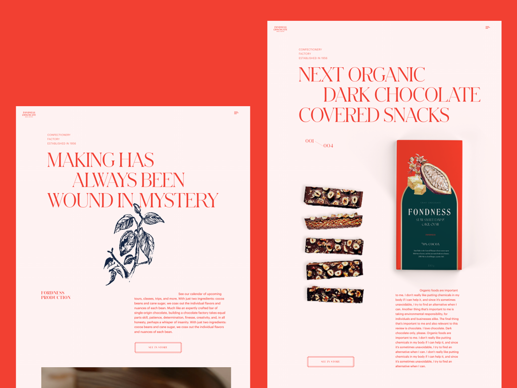
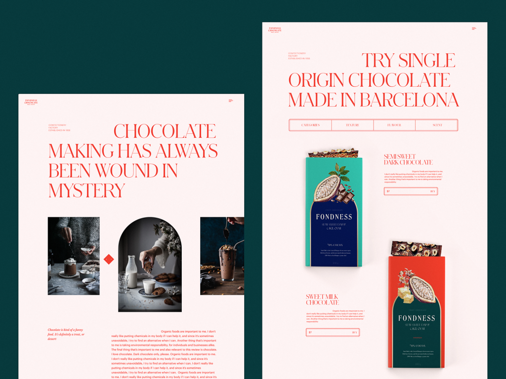
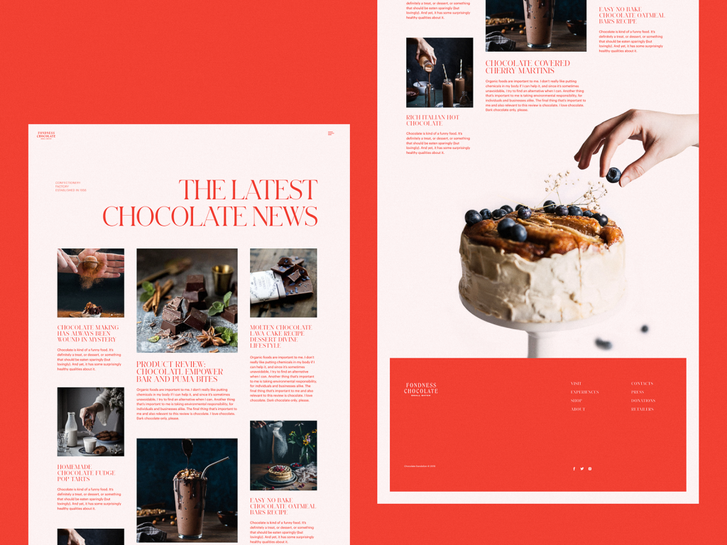
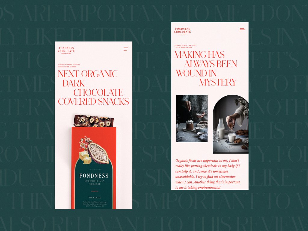
The first challenge in designing for a confectionery brand is resisting the obvious—pastel colors, cartoonish sweetness, and generic food photography. This project took a more considered path. The typographic system pairs a refined serif for headings with a humanist sans-serif for body copy, a combination that reads simultaneously indulgent and trustworthy. Sophisticated web typography like this does real work: it signals quality before the user has read a single word.
The hero section leads with atmospheric video rather than a static banner. This matters because the product—confectionery—lives and dies by emotional resonance. A looping film of chocolate being poured, or pastry being dusted with sugar, activates something pre-rational in the viewer. The rest of the layout stays airy and generous, letting photography and custom packaging illustrations do their persuasive work without visual clutter crowding the experience.
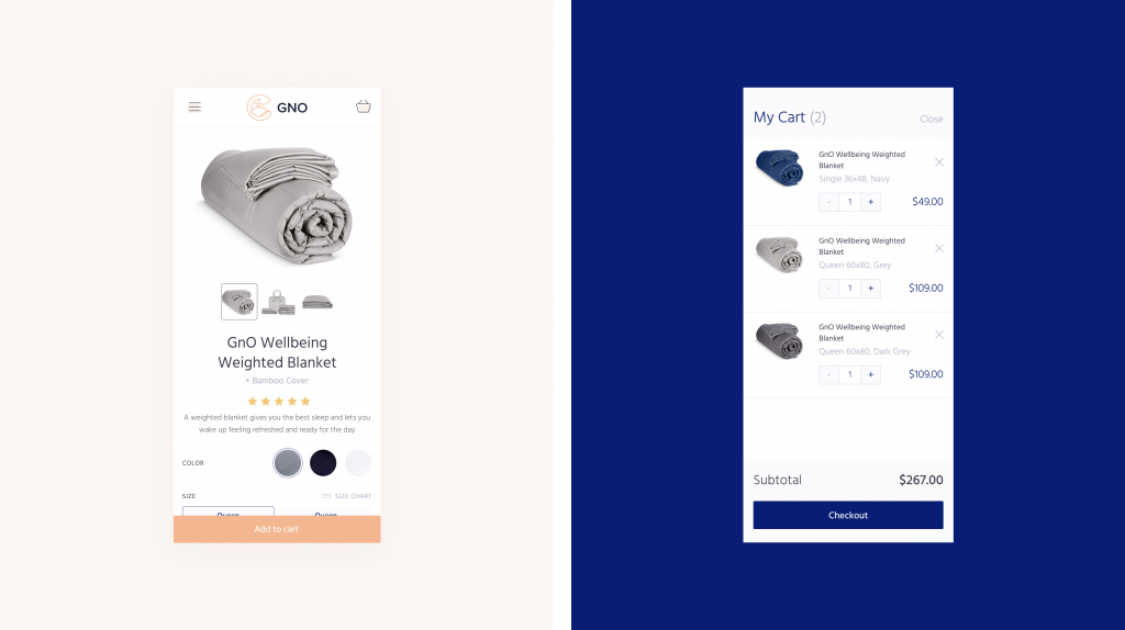
Weighted Blankets: Selling Sleep With Visual Calm
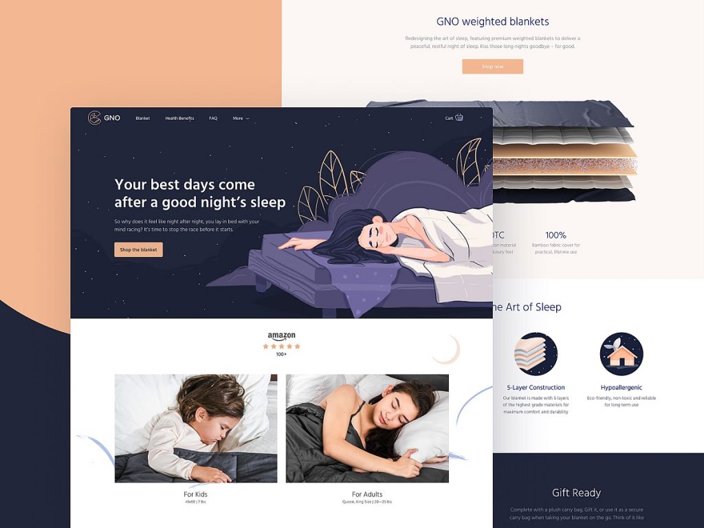
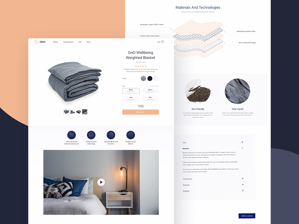
GNO makes weighted blankets, and the design brief here was essentially: make someone want to go to bed just by looking at a webpage. That’s a deceptively hard problem to solve in e-commerce product page design. The solution rests on contrast—not just visual contrast between light and dark backgrounds (both used across the site), but tonal contrast between product utility and emotional benefit.
The hero illustration of a sleeping woman sets the atmosphere before any product copy appears. The visual hierarchy throughout is deliberate and scannable: benefits before specs, emotion before function. The product page includes a video presentation alongside static photography, offering different cognitive entry points for different kinds of shoppers. A sticky header keeps the cart and navigation accessible throughout the user journey—a small structural decision with outsized impact on the checkout flow.
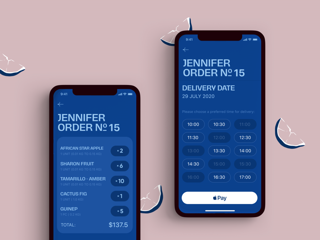
Exotic Fruit App: Color as Commerce
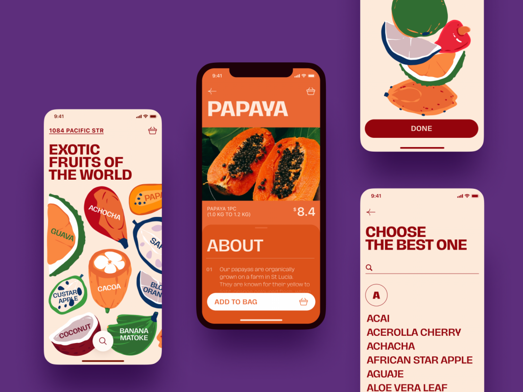
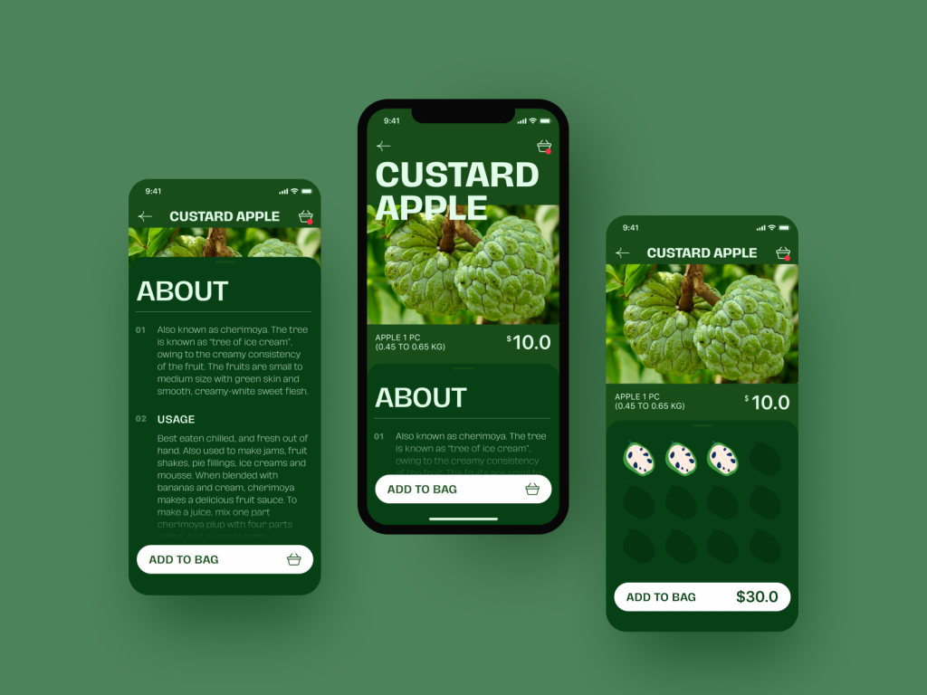
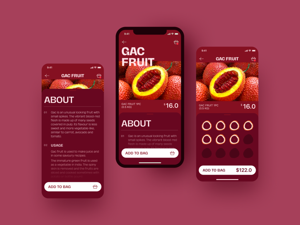
This mobile e-commerce app design concept proves something worth remembering: the right color palette can make a product genuinely desirable. The interface uses bold, saturated colors not as decoration but as appetite trigger—every screen feels like standing at a sunlit market stall. The combination of custom illustrations and food photography within a single interface could easily become chaotic; instead, it holds together because the color language is consistent and the layout breathing room is carefully managed.
The interaction design is equally considered. The main screen features interactive fruit images that navigate directly to product pages—a gesture-forward approach that rewards curiosity. The product screen surfaces critical information (price, description, add-to-cart) without burying it, while an expandable “About” tab handles deeper content for users who want it. The cart quantity selector updates the CTA button total in real time, eliminating friction from the final conversion moment. Mobile UX details like these separate apps people actually use from ones they abandon after two sessions.
Fashion Brand: Where Heritage Meets the Add-to-Cart Button
Fashion e-commerce UI design operates under different aesthetic pressure than most categories. The customer arrives with taste already formed—and the design has to meet or exceed it. This project for a brand selling accessories with traditional art influences threads a difficult needle: original enough to feel distinctive, legible enough to serve commerce.
Typography leans unconventional but stays readable, particularly for pricing and product copy—the two places where confusion costs money. Dark backgrounds on imagery-heavy pages amplify photo quality without requiring larger files or slower load times. The product page animation for the neckerchief collection, showing smooth transitions between models and patterns, is a good example of motion design earning its place: it replaces five static images and makes the selection process genuinely pleasurable rather than merely functional.
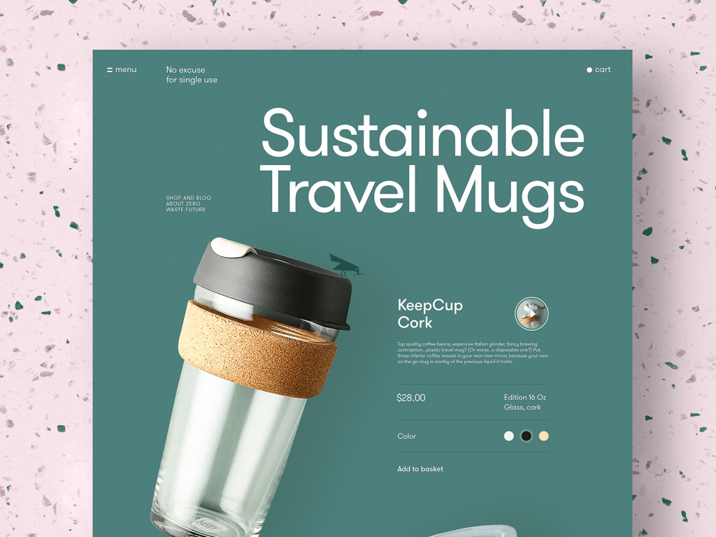
Zero-Waste Shop: Minimalism With a Heartbeat
There’s a version of sustainable brand e-commerce design that performs eco-consciousness without actually embodying it—lots of green gradients and leaf icons, all surface and no substance. This project does something harder: it builds genuine coherence between brand values and visual language. The product pages are built on principled minimalism, with white space used actively rather than passively, and typography kept simple enough that the product photography carries the weight it deserves.
The mascot—a small bird illustration that appears across the user journey—is the detail that lifts this from competent to memorable. In UX design, continuity across screens is often achieved through navigation systems and consistent components. Here, it’s also achieved through character, which creates an entirely different kind of brand recall. The animated color selection interaction on product pages, where choosing a cup color animates the change rather than merely swapping an image, is a micro-interaction that makes the product feel real before it arrives.
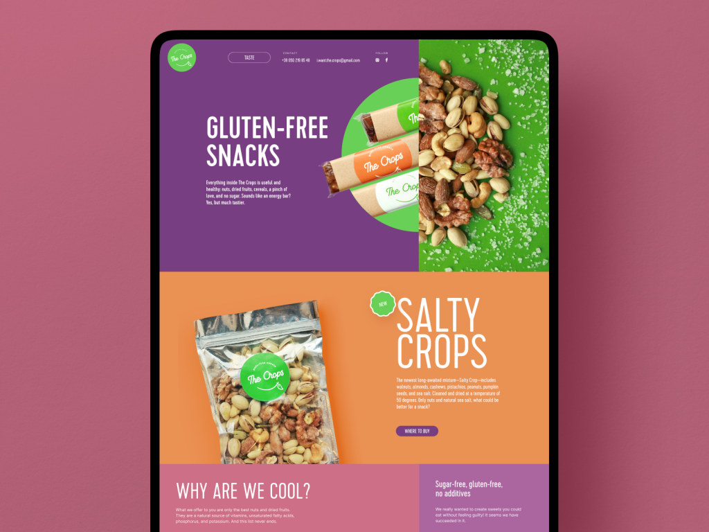
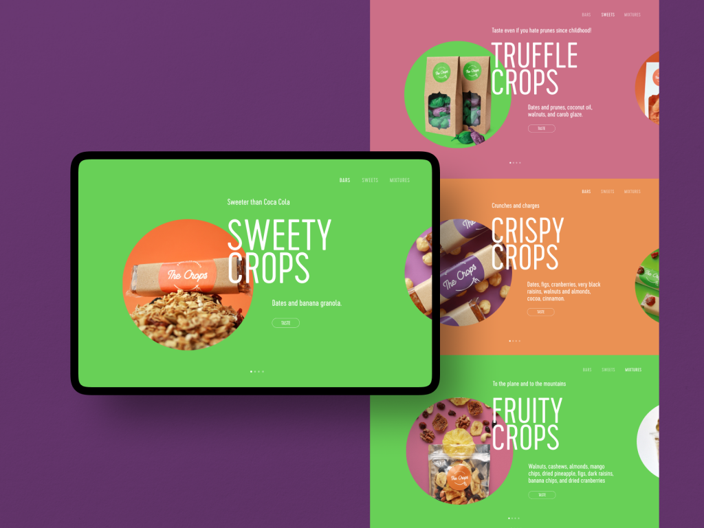
Healthy Snacks Brand: When Trend Meets Credibility
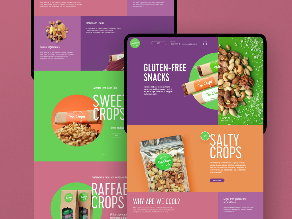
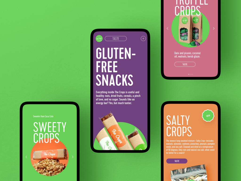
TheCrops required something specific: a website that could speak to a health-conscious audience without sliding into the clinical sterility that health brands often mistake for trustworthiness. The color palette is trendy without being irresponsible about it—meaning it will photograph well for social media but won’t look dated in eighteen months. Responsive web design adaptation across device types was a priority here because health-focused buyers research on desktop and purchase on mobile more reliably than almost any other consumer category.
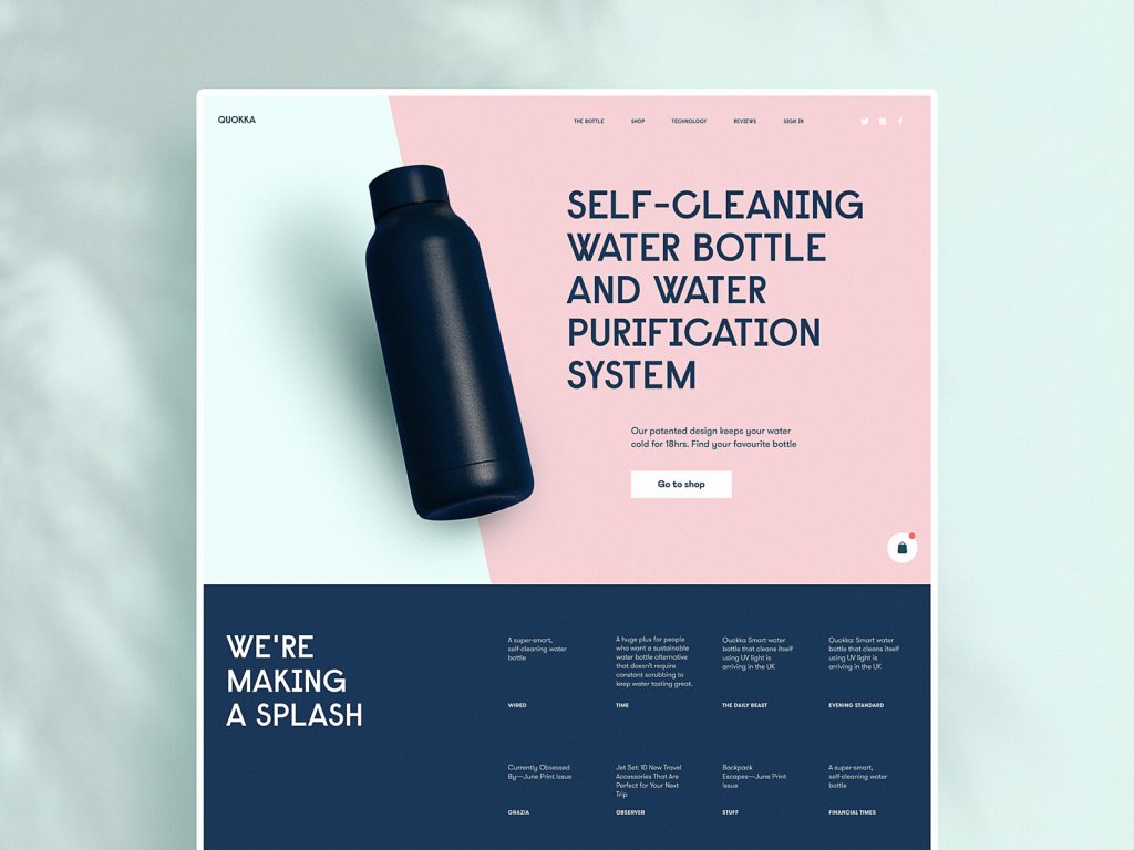
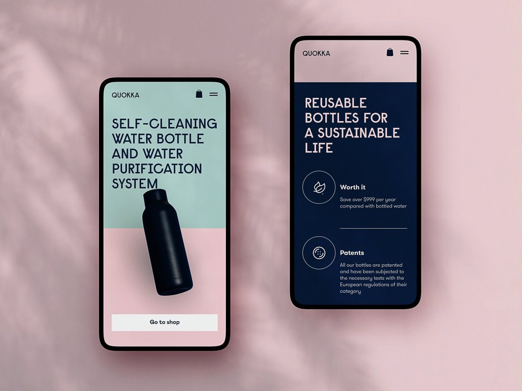
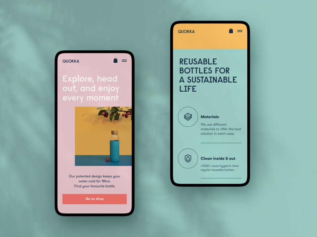
Reusable Bottles: Geometric Discipline and Color Confidence
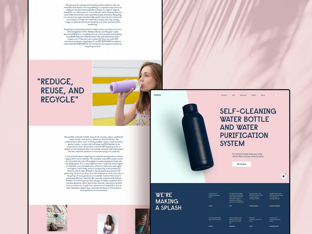
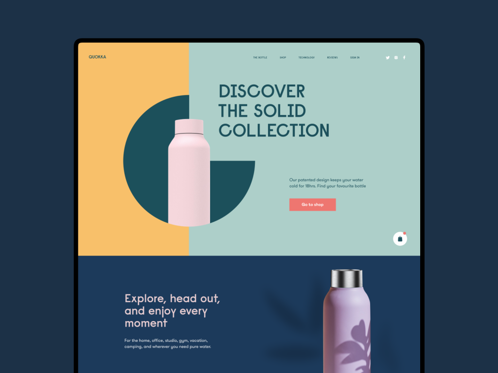
This is a project that demonstrates how much craft goes into what looks, at first glance, like a simple product site. The geometric balance of the layout is not accidental—it reflects the product itself, which has clean lines and tactile appeal. Color contrast is used to direct attention rather than decorate, a meaningful distinction in e-commerce website design where the eye can be guided toward or away from conversion points with surprising precision. The call-to-action placement and sizing here is a study in restraint: prominent without being aggressive.
Eyewear E-commerce: Identity Meets Interface
Glasses are a deeply personal product—they live on your face. The design challenge for an eyewear e-commerce site is bridging the gap between browsing and that personal ownership feeling. This concept uses photo and video content not as filler but as the primary communicative layer, establishing visual vocabulary from the first second of the landing page experience. The e-commerce UX design ensures that this content richness never sacrifices clarity—product details remain scannable, and the purchase path stays unobstructed.
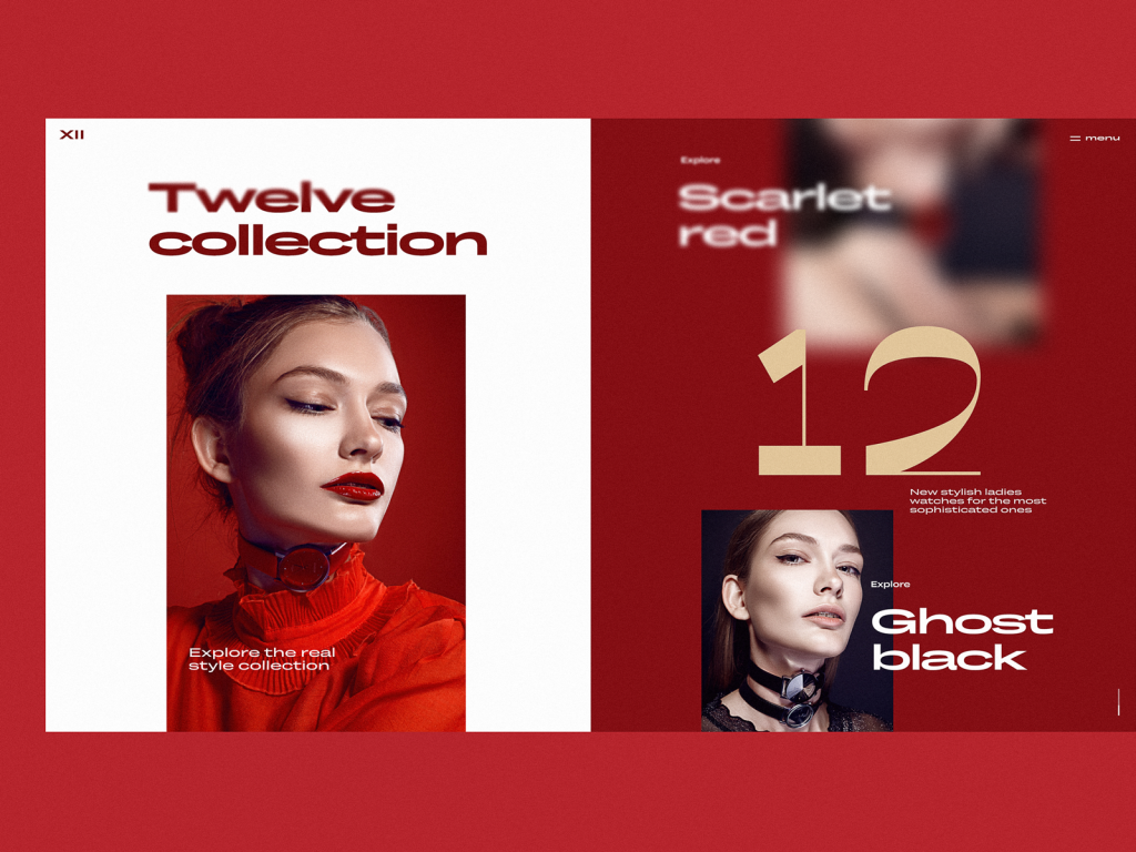
Watches and Accessories: Luxury Signals in Interface Design
A limited color palette built on high contrast. Split-screen layout. Photography treated as architecture rather than decoration. This concept for an exclusive watch collection works because every design decision signals the same thing: rarity. In luxury e-commerce design, the interface itself must perform the same function as a well-lit boutique—it should make the visitor feel that what they are looking at has been curated specifically for someone with their particular sensibility. The page interactivity adds dynamism without cheapening the experience, which is harder to achieve than it sounds.
Contact Lenses: Typography Direction as Visual Hook
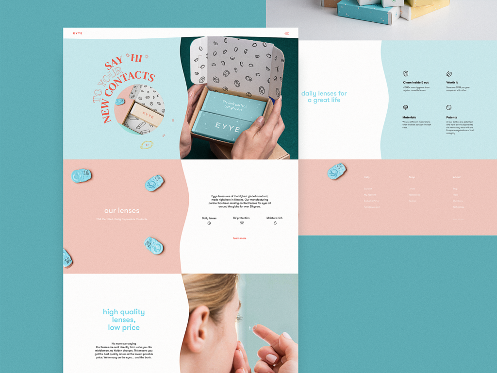
The most formally adventurous of the ten, this contact lens website uses unconventional text direction—copy running at angles, navigating around imagery—to create a layout that lodges itself in visual memory. Split-screen hero sections in e-commerce landing page design are common; using typographic geometry to make the layout feel singular is less so. The color palette is refined, the motion smooth, and the overall effect is a site that feels like it belongs to a category of one.
What All Ten Have in Common
Across very different product categories and audiences, these designs share a structural belief: that e-commerce UI should do genuine persuasive work, not merely display goods. Visual hierarchy, motion, typography, and interaction design are the sales infrastructure here. The best e-commerce design makes buying feel like the natural conclusion of an experience the visitor actually wanted to have.
Recommended Reading
If this sparked something, you are in the right place—below are a few more pieces that go deeper into all things design:
Steal the Show: Creative Web Design for Diverse Events
Web Design: 26 Examples of Creative Landing Pages
UI in Volume: 3D Graphics in Creative UI Design Concepts
Web Design: 5 Basic Types of Images for Web Content
9 Eye-Catching Web Interfaces with Bright Graphics
Web Design: 16 Basic Types of Web Pages
Motion for Mobile. 20 Creative Concepts of UI Animation
Web Design: 11 Diverse Functional and Awe-Inspiring Website Designs
App Design Ideas: 7 Nifty Mobile Application Design Projects
Product Page Design Inspiration: 17 Ecommerce Web Designs
Information Beautified: Media and Editorial Website Designs
23 Impressive Web Design Concepts for Various Business Objectives