User interfaces usually consist of many different elements. Each of them plays a significant role in the efficiency of user experience as well as conversion rates of websites and applications. Even the small components such as buttons require a lot of attention so that they could meet the goals and objectives they are expected to achieve. Today we continue the topic of call-to-action button design and share some practical tips which will help designers create sufficient CTAs.
What is CTA button?
A call-to-action (CTA) button is an interactive UI element both web and mobile. Its major aim is to induce people to take certain actions that present a conversion for a particular page or screen, for example, purchase, contact, subscribe, etc.
Lead generation and purchase rise are the basic business goals which calls-to-action can be created for. When a button design is compelling enough to immediately attract the attention of potential clients, it can entice them to click and go to the next stage such as filling a short contact form or making a preorder of a product.
In our article Call for Attention. Powerful CTA Button Design, we described the vital aspects of an effective CTA button design which are size, color, shape, placement, and microcopy. When all the characteristics are worked out appropriately the CTA button has much higher chances to fulfill its tasks.
But how to make these aspects powerful? Here are some practical tips on creating a sufficient CTA button design.
Tip 1. Make buttons look clickable
A prior task of any CTA is to make users click it, so their design should coincide with the objective. Using a product people don’t want to figure out which of the design elements are interactive. That’s why it’s important to ensure all the interactive elements appear clickable.
What can make a button look clickable? First of all, it is a visual presentation. A button may seem more clickable when designers add some 3D effect to it. For example, a CTA with a slight gradient or a small shadow usually brings the desire to push a button since it looks more salient. If a button with a 3D effect doesn’t suit the chosen style, for example, flat design, clickability can be emphasized via rounded edges of a button.
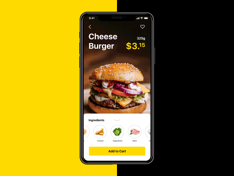
Tip 2. Choose the bigger size
Size is one of the most common tools helping to arrange UI components according to their importance. The bigger an element is, the more noticeable it becomes. Since CTAs’ prior goal is to draw users’ attention, designers usually try to make them stand out among the other buttons on the screen, especially via noticeable size.
Large buttons have high chances to be noticed and clicked still you have to keep some limits. A compelling call-to-action button is usually big enough to be quickly found but not too big so that the visual composition and hierarchy of the layout wouldn’t be spoiled. Market leaders often provide recommendations on the effective sizes of buttons in their guidelines. For example, Apple says that CTAs in mobile UI should be at least 44Х44 pixels, while Microsoft recommends 34Х26 pixels.
Tip 3. Apply contrasting colors
Color choice depends on various aspects which make the process more complicated. Designers need to consider such factors as the basic color of the composition as well as potential preferences and psychological peculiarities of the target audience.
There is one condition that is vital to keep in mind while choosing colors for CTA: buttons and background colors should be contrasting enough so that CTAs would stand out from the other UI components. For example, if a designer uses the blue color palette for the layout, it would be a good idea to use red or yellow color for CTA buttons.

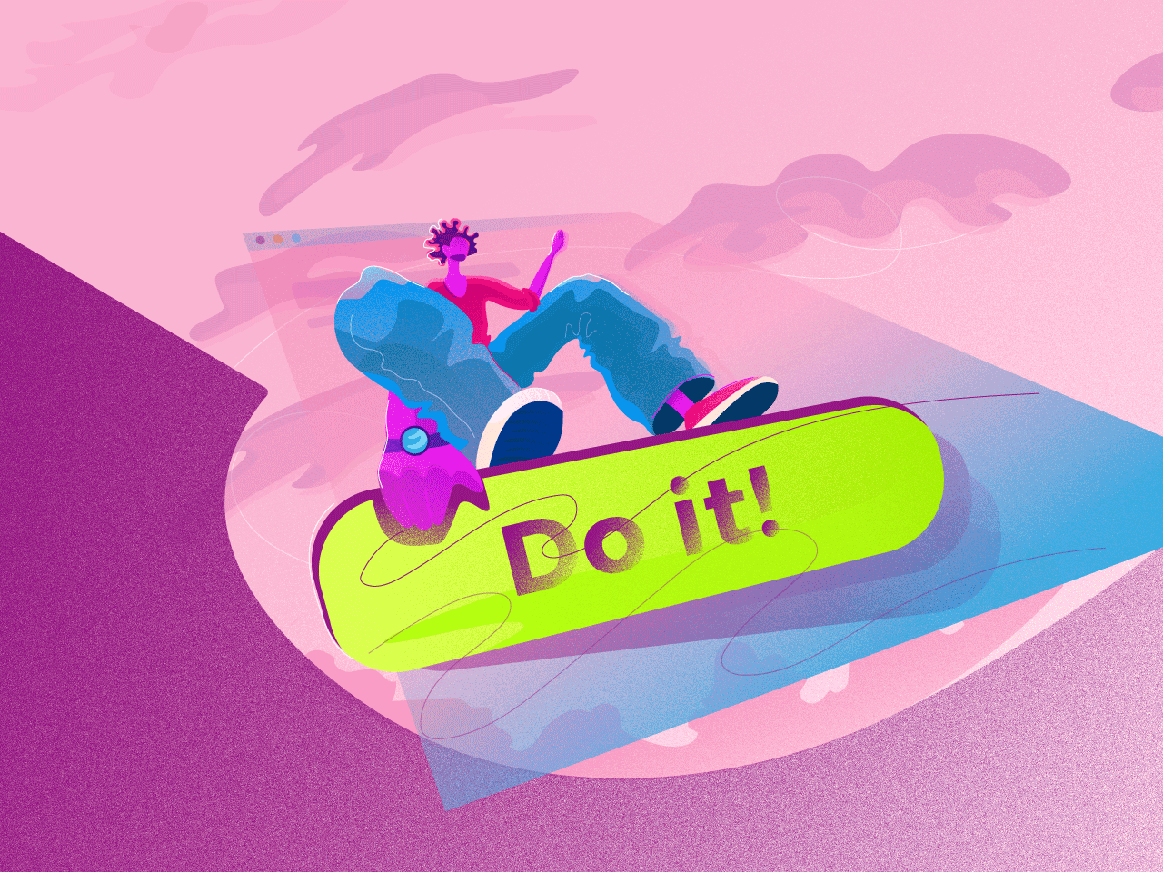
Tip 4. More imperative, fewer words
CTA microcopy is actually a call that tells users what action they will take if they click the button. The powerful CTA microcopy has to catch users’ attention quickly and lead them right to the action.
To make an effective call-to-action, you need to keep the number of words at a minimum. A few appropriately chosen words work much faster than a long descriptive phrase. In addition, applying the imperative case in CTA microcopy, you give strong and direct instructions on what users can do next.
Tip 5. Keep user flow in mind
Big size and bright colors are effective tools for catching users’ attention but the smart placement can increase the chances of CTAs to be noticed even more. User flow, also known as user journey, is a path that users follow in a digital product to complete a certain task, for example, an online purchase. Users flow helps to create UX that way so that people could go step-by-step to their goal receiving the data gradually.
Keeping the user journey in mind, you can choose efficient placement for CTA buttons. For example, creating a landing page design you need to make sure users will find the “Sign up” CTA button after they read the information about the offer or services. This way users will have an understanding of what they are signing up and if they need it. In case people see such a CTA button before they read the information there are high chances that they will just ignore it.
Tip 6. Use white space as a tool
White space, also known as negative space, is the area between elements in design composition. People aren’t usually aware of the great role of the space, but designers need to pay a lot of attention to it.
White space is not just a background of a visual composition. It is often applied as a powerful tool assisting to emphasize UI elements. If a user interface includes many visual components, a CTA button can get lost on a page or screen. The right amount of white space around a button helps to draw users’ attention as it becomes more noticeable.
In addition, white space sets the connection between UI elements. The less white space between the components, the more connected they are. So, if there are some elements that can support the call-to-action, for example, item description or photo, try to reduce the space between them and the button to provide a double effect on the users’ actions.
Tip 7. Add some extra information
As we said above, it’s important to keep the CTA message short so that it could quickly catch the attention. But when the audience notices the call-to-action, it may be useful to provide some additional data too. It can be a small piece of information explaining something about the next stages. For example, you can clarify that the sign-up process won’t take more than 15 seconds or remind that registration is free. A small remark can increase users’ interest and encourage them to take action.
Tip 8. Run constant testing
If you want to make sure something works well, you need to test it. This golden rule is a must in various spheres including UI design. User research and analysis help designers define the specifics of the target audience but it would be hard to know precisely if design decisions are the best. That’s why tests could become a sufficient solution assisting to dispel doubts.
One of the most efficient CTA testing methods is A/B testing. It compares two versions of a digital product in order to find out which one performs better. A creative team divides users into two groups and each of them is shown different variants. One half sees A version, the other — B. Such an approach helps to determine a more profitable solution.
The differences between A and B options vary from the smallest to the significant one. For example, in the case of CTA buttons, designers can change their placement, size, color, or microcopy. To receive more accurate results, it’s recommended to test one aspect per time, for instance, only the color of a button. This way you’ll be able to distinguish which factor makes difference.

The effectiveness can be measured by different criteria such as clicks, number of subscriptions, or sale-leads. The choice of metrics depends on the goals of a company or a creative team has established. In some cases, it may be good to combine a few metrics during single testing to achieve deeper insights into each aspect. For example, you can test a color of button measuring the number of clicks and subscriptions.
A/B testing is an approach assisting to make design changes carefully so that users wouldn’t feel inconvenient. Designers can collect the needed data and metrics while people continue to use an app or website.

To make a powerful call-to-action button, designers need to focus on the objectives standing behind it. A CTA with an appropriate size, color, and placement quickly draws users’ interest and sufficient microcopy encourages them to take the desired action.
Recommended reading
Call for Attention. Powerful CTA Buttons Design
UI/UX Design Glossary. Navigation Elements
UX Design Glossary: Interface Navigation Elements. Set 2
7 Tips to Enhance Mobile Interactions
3C of Interface Design: Color, Contrast, Content
9 Effective Tips on Visual Hierarchy