Interface navigation belongs to the core issues of UX design. That’s not surprising: it’s hard to get to your destination if you can’t see the way. Being surrounded by more and more websites and applications every day, users are highly-fed with the diversity of offers and expect intuitive navigation as a must-have. So, let’s continue our talk about the theme with a new issue of navigation glossary to learn more about this powerful booster of usability. Earlier we presented you the first set of UX glossary for navigation covering the definitions and examples for navigation, menu, button, CTA, bar, picker, switch, etc. Today let’s add the new ones to the list: check the details for icons, search field and tags.
Icons
An icon can be defined as an image that has a high symbolic value and is used for the purpose of communication. Icons present signs which are informative and support data exchange between the informer and addressee alongside with words and sentences: while the copy is served with letters or characters, icons communicate via the images showing pictorial resemblance with an object of the physical world. In computing and digital design, icons are pictograms or ideograms used in the web or mobile interface to support its usability and provide the successful flow of human-computer interaction.
One of the most valuable benefits of icons is the ability to effectively replace the text. This feature is able to boost usability and strengthen navigation as most users tend to perceive and decode images faster than words. However, even the slightest misperception or double meaning can become the reason for poor UX so the solutions on the type of icons should be carefully tested to reach the good balance of icons and copy for a particular target audience. One of the effective variants is using both copy and icon so that different categories of users could feel good with that: this approach is particularly popular in various catalogs of e-commerce websites where different positions are presented by both words and pictures giving the user double support for quick and clear navigation.
Based on their functions, icons can be classified as:
– interactive icons: icons that are directly involved in the interaction process. They are clickable or tappable and respond to the user’s request doing the action symbolized by them. They inform users about the functions or features of the buttons, controls and other elements of interaction. In many cases, they are obvious and don’t need the copy support.
– clarifying icons: icons aimed at explanation, visual markers explaining particular features or marking out categories of content. They may be not the layout elements of direct interaction; also, they are often found in combination with copy supporting their meaning.
– entertaining and decorative icons: icons aimed at aesthetic appeal rather than functionality, often used to present seasonal features and special offers. They present an effective way of attracting a user’s attention and enhance the general stylistic concept of a digital product.
– app icons: interactive brand signs that present the application on different platforms supporting the original identity of the digital product.
– favicons: represents the product or brand in the URL-line of the browser as well as in the bookmark tab. It allows users to get a quick visual connection with it while they are browsing.
Read more about the types and functions of icons
Search Field
A search field, which is also called a search box or search bar, presents the interface element enabling a user to type in the keywords and this way find the pieces of content that are needed. It is one of the core navigation elements for websites or apps with a big amount of content, in particular blogs, e-commerce and news websites, etc. Well-designed and easily found search field enables the user to jump to the necessary point without browsing through the numerous pages and menus: as this approach respects user’s time and effort, it is highly demanded in user-friendly interfaces.
In terms of design, this element can be presented in different ways, from the framed tab to the interactive input line, or even a minimalist clickable icon. In the vast majority of cases, the search field is marked with the icon featuring a magnifying glass. This symbol is recognizable by a wide variety of users so it has proved itself effective for setting intuitive navigation. Experiments with this icon can have a bad influence on interactions and usability of the layout, so if other symbolic images are applied, they should be carefully tested. The flow of interaction can also be supported with the dropdown menu offering possible options or auto-filling functionality.
Another important issue is the placement of the search graphic control in the interface. In web design, the search field can be often found in a header of a website and this is a good choice: as we mentioned in the article devoted to design practices for website headers, for any website it is the zone of the highest visibility, so putting a search field there enables users to quickly get transferred to the pages they really need without wandering through the website and scrolling down. For example, it is applicable to big e-commerce websites often visited by users who have a particular goal, a specific item they are looking for – if they can’t find it quickly and conveniently, the risk is high that they will leave decreasing the profitability of the resource. Moreover, the power of habit should also be taken into account: as numerous websites include search into their headers, users are accustomed to looking for it there when they need it.
Talking about the search field in mobile interfaces, the situation differs as the designer is much more limited in the usable space. If the app is based on a lot of content and search is one of the central elements of interaction, it can be found in the tab bar and easily reached. In case the search is not crucial for the user goals and usability of the app, it can be hidden in menus or shown only on the screen where it’s potentially needed.
Tag
Tag is an interactive element presented with a keyword or phrase that enables the user to move quickly to the items marked up with it. Tags are actually pieces of metadata that provide quick access to specific categories of content so they support navigation with the additional way of content classification. Moreover, tags are often the elements that users create by themselves comparing to the names of categories that are fixed by the website and can’t be changed by users.
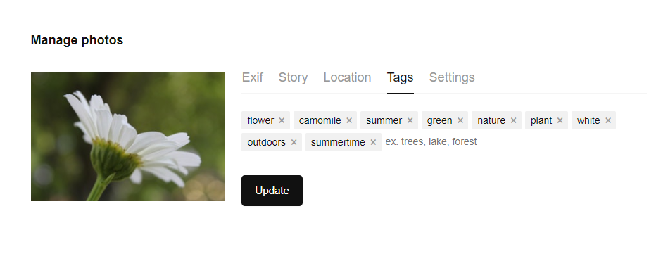
Tags used as a part of navigation on Design4Users website
Tags are widely used on the platforms based on user-generated content: when you upload the photo to the stock, post on the social networks or write on the blog, you can mark your content with the particular keywords which will then unite all the pieces of content marked with the tag. The screenshot above shows you the part of the home page of Design4Users Blog which actively uses a cloud of tags to enhance navigation around the blog content. In terms of interaction, click on a tag moves the user to the webpage collecting all the content marked with this tag. Also, tags are an SEO-friendly technique increasing the chances that the content will be found via search engines.
As another example, here’s the tagging offered by Unsplash, the well-known platform for free stock photos. When users download a photo, they are offered to type their own tags aka keywords that would describe this photo, in the best way of helping other users to find it. As we can see, the input field for adding tags also supports users with prompts for better usability. So, tags present user-generated elements of navigation that make the interface closer and clearer to their target audience.
Planning the navigation is hard work that demands a good knowledge of psychology and interaction patterns, user testing, and a serious approach to information architecture from the earliest stages of an app or website design. However, it becomes the solid ground for a positive user experience that will solve users’ problems and motivate them to get back to the product again and again.
Today’s set of our glossary is ready for those who need it, and we are going to continue this practice before long. Don’t miss the new sets — the next one will continue the issues of navigation with deeper insights into types of menus, buttons, and breadcrumbs. New definitions are coming soon!
Recommended reading
Here is the set of recommended materials for further reading for those who would like to get deeper into this topic and learn more about the theme.
UI/UX Design Glossary. Navigation Elements
How to Design Effective Search in User Interfaces
Small Elements, Big Impact: Types and Functions of UI Icons
Basic Types of Buttons in User Interfaces
Visual Dividers in User Interfaces: Types and Design Tips
Directional Cues in User Interfaces
Copywriting for Mobile and Web Interfaces: Types of UI Copy
