Smartphones have invaded almost every activity of our lives. Different applications assist us and make life easier. A designer’s job is to create the user interface meeting users’ needs and making the experience pleasant and satisfying. To build effective UI, designers need to dive deep into the peculiarities of mobile applications, learn their constituents and functionality. Nowadays it’s difficult to distinguish a standard set of necessary screens for any application because the mobile industry is evolving fast and so do the apps. Our article presents the most common and popular types of mobile screens and shows the design features they require.
Common Screens
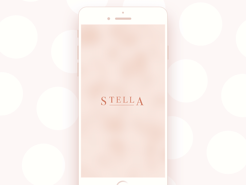
Splash screen
The first impression is one of the key points influencing the user’s opinion about a mobile application. When the user experience is pleasant from the very beginning of interactions with an app, there are more chances it’ll be more popular among users. That’s why splash screen needs to be paid as much attention as any other mobile app screen.
Splash screens are the first image users see launching a mobile application. They are usually minimalistic and present a name, logo, or slogan of a product. To make sure splash screen will look good on different devices, designers often focus the elements in the middle of the screen. Splash screens are recommended to be shown no longer than 4-8 seconds otherwise users may get annoyed. Also, it may be good to show loading progress so that impatient users could know when the app will be launched.
Jewellery E-Commerce App
Onboarding tutorial screens
Onboarding tutorial is a set of screens presenting a mobile app, its navigation system, features and benefits which the application could bring to the possible users. They appear to users who launch the app for the first time helping them get oriented within unfamiliar features and controls as well as understand if the application can be useful for them.
The structure and content of an app tutorial are highly individual for every particular project. However, there are some common tendencies in onboarding design. First of all, many tutorials use custom illustrations presenting a specific feature or benefit in an attractive and easily decodable way. Also, designers often apply a mascot, which is a character imitating the flow of real communication with the user and setting emotional bonds. A powerful copy is significant for onboarding as well. It should be short, helpful, and readable.
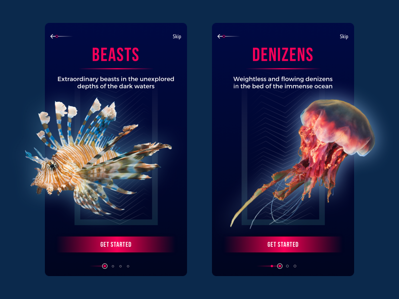
Underwater World Encyclopedia — section tutorial
Home and menu screens
Home screen is an essential part of any application. In the context of mobile apps, it’s the main screen from which users interact with most options of the application. Home screens are designed depending on the type of product and its purpose still there are some key elements common for different kinds. First of all, the main screen usually includes the search field or button so that users could easily search for the content they need. Also, since the home screen is a start point for the user journey, it often contains navigation elements providing access to the various content sections.
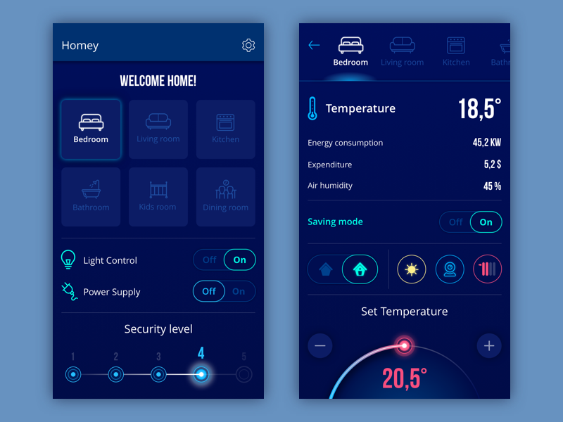
Homey App
To make user interactions easier, a mobile application outfits a menu containing the list of possible directions the user can move to within one click. There are two variants of presenting the menu in mobile applications: it can be a part of a home screen or a separate screen. It is recommended to keep the number of options on the menu under seven showing only important sections. If the app requires more, it can be a good idea to create subcategories.
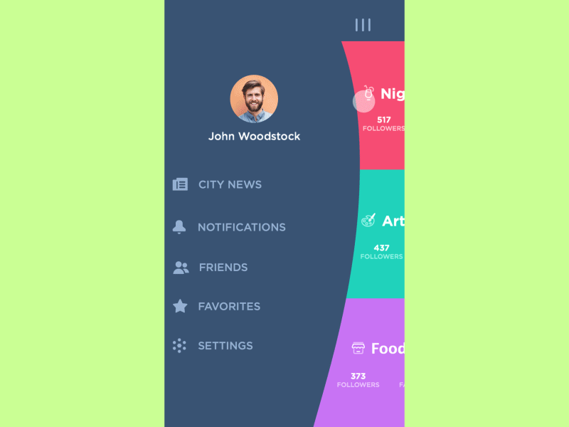
Slide Menu Concept
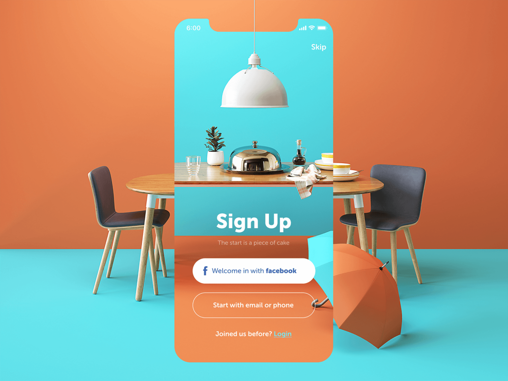
Log-in and profile screens
Today many applications offer users creating their personal accounts, so every designer needs to know how to work with log-in and profile screens. Log in screens should be minimalistic and clear so that users could easily access the application. There are usually two fields where users can enter their name and password along with the confirmation button. For people using the app for the first time, there always must be the sign-up option.
Restaurant App
Profiles make interaction within the mobile application more personalized and allow operating with the data effectively. Also, a personal account is a key part of any social network app which involves the user into the virtual community of the network and enables to share the personal info with the others. The main task for designers is to maximize convenience via smart UX. According to Interaction Design Foundation, the first point designer should consider is that the profile page should be clear in use. The amount of the information has to be limited otherwise the profile screen may look too complex. What’s more, it’s vital to make sure the navigation system is intuitive. This way users won’t have to take much effort to puzzle out the app. Finally, the profile screen design should be oriented to the target audience of the app. User research is a must if you want your app to meet users’ needs.
Dating App
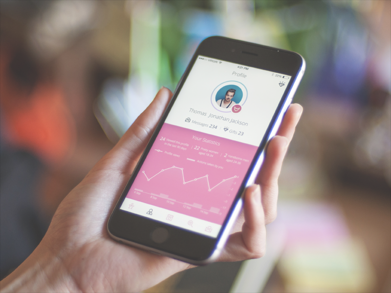
Stats screen
Various applications contain stats on user activities. The more data it provides, the harder it is to create a mobile design of a stats screen. Designers need to make sure it is possible to see all the key information still the screen has to be clear and usable. Graph curves, scales, and original icons can make the stats screen look smooth and clean on a mobile app. Moreover, stats screens require distinct typography so that users could easily read the data.

NGIN App

Stats screens for Calorie Calculator app
Calendar
Event apps, to-do list apps, and many others provide users with the personal calendar. Depending on the type of the application, the calendar accomplishes certain functions such as remindings or schedule. The visual style should fit the mood and objectives of the mobile app.
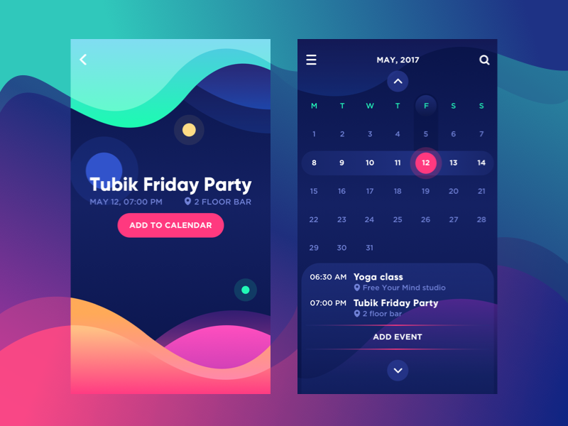
Bright Vibe Calendar
E-commerce Screens
Catalog screen
The main objective of any e-commerce project is to sell the products. Visual presentation has a great impact on users’ decisions. A catalog is a list of goods the company offers for sale. A designer’s job is to create a catalog that will attract users’ attention and encourage them to buy a product. The product list in mobile apps can be similar to many e-commerce websites where the items are placed in catenas and can be viewed via vertical scroll. The number of products in one row is settled according to the width of the screen.
Another approach to product organization in a mobile catalog is a row with a horizontal scroll. To make the navigation intuitive the last item in a horizontal row should be shown not in a full view to let the user see that this is the direction of scrolling. In addition, the photos or illustrations of products should be only high-quality so that users could clearly see what they are going to buy. The catalog screen should include a call-to-action button via which the user can add the item to the cart. This way users will be able to pick up products right from the catalog screen without the necessity to go to the page of this particular position.
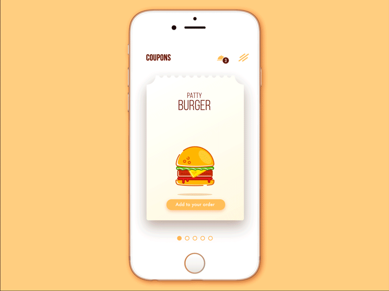
Cafe Coupon App
Product card screen
This screen is for people who like to know what exactly they buy. Product card demonstrates the key information about the goods helping users decide whether they need the product or not. Designers focus on the photo of the product putting it in the center of the screen. The description data is usually placed below. Designers can divide the data into groups such as size, material or others so that users could easily find the info they need.
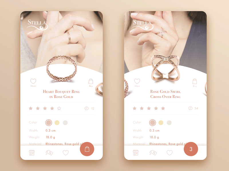
Jewellery E-Commerce App
Check out screen
Today a lot of purchases are done via smartphones so the companies try to make the mobile shopping process as convenient as it has never been before. The checkout process is the final step users take before they buy the product. Designers’ task is to make people comfortable while people take this step. First and one of the essential parts of the checkout screen is a form where a buyer fills in specific personal data such as a name and number of the credit card. The type of required information depends on the resource where a user makes a purchase. In addition, it’s important for people to know their personal data is secure, so designers have to reassure users via visual elements that their information is safe. It can be callouts in a copy as well as some icons of the famous brands who gave their approval or maybe even some certificate signs if there are such.
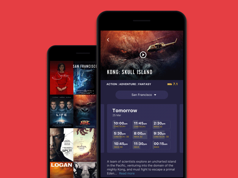
Cinema App
Social Screens
Feed
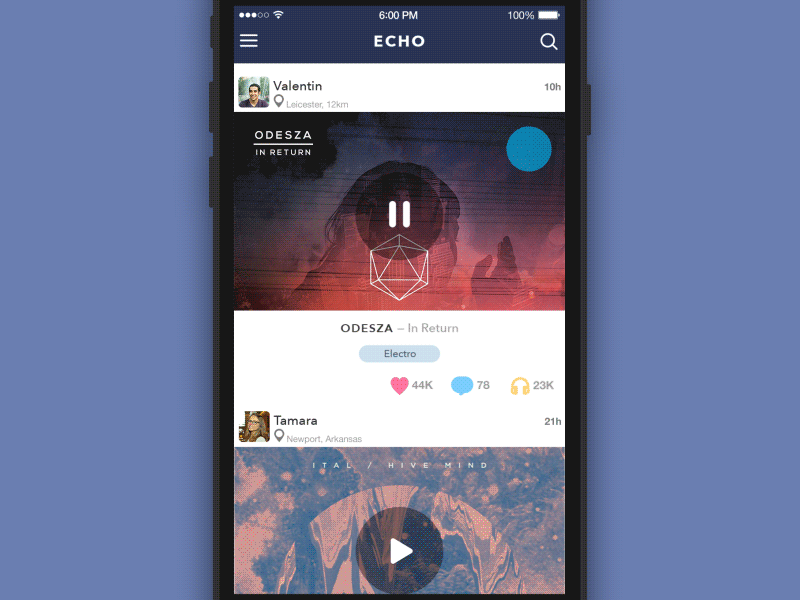
People often use various social network apps for communication and following the news and updates around them. Feed is a constantly changing list of news and other data the users choose to follow. The practice shows that mobile users prefer scanning quickly through the feed, the reason why they need a simple clear design which won’t be overloaded with visual details. The news can be presented one by one via a scroll. To make the navigation more intuitive the next piece of news should be partially shown.
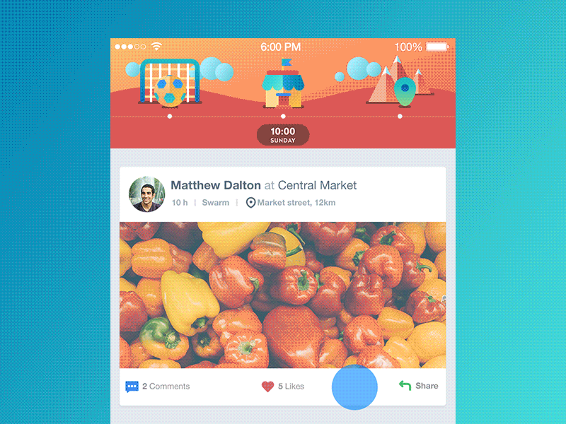
Timeline App
Contacts
The contact list has been evolving for a long time. From paper notes to the different digital variants it’s been changing visually still delivering only one purpose: saving key data about friends and other close people. Mobile contact screen presents users with a list of contact data sorted by the name in alphabetical order. Each contact should be clickable and lead to detailed data which includes the phone number, email, and sometimes contacts on Skype, Messenger, etc. Also, contact info is given with a small photo that makes the searching process easier.
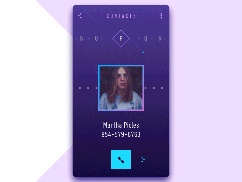
Contact List Concept
Music Screens
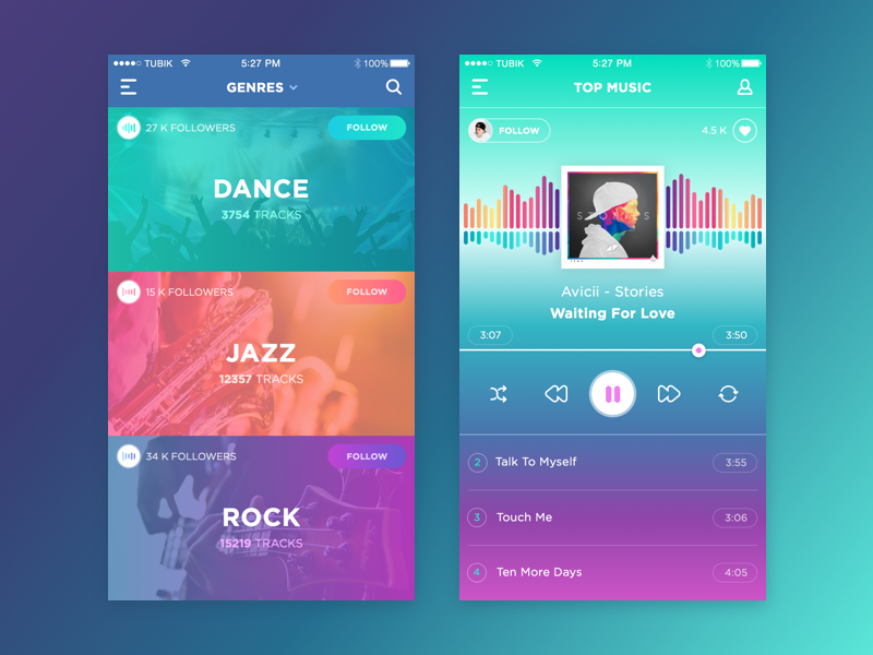
Playlist
Music lovers like creating their own playlist for every occasion. Obviously, every music app is obligated to provide its users with such a feature. Playlist screen looks similar on different apps: it’s a list of tracks showing the name of the song, singer or band, and the length of the soundtrack. Also, designers can add a small image of the album this track belongs to. In case a song has no image there still should be an icon, for example, with a music note.
Music App
Player
People can control what they listen to and how they listen to it via the player. The feature allows switching, stopping and starting a track with standard buttons that are easily recognized. This set is usually placed centrally on the bottom of the screen. The major part of the screen is typically taken by the image attached. Also, sometimes instead of a picture, many designers apply music visualizer as the central part of the screen. Visualizer is a good opportunity to reveal the imagination and creativity which is always inspiring for designers.
Nowadays, loads of mobile applications appear, so they bring new types of screens for fresh requirements users bring out. Designers should be ready to take this challenge and always follow innovations. Get inspired!
Recommended Reading
Mobile App Design: Big Guide into Types of Mobile Applications
Web Design: 16 Basic Types of Web Pages
The Big Guide into Different Types of Websites
UI/UX Design Glossary. Navigation Elements
Mobile App Branding: Tips, Strategies, and Examples
How to Use Animations in Mobile Apps
7 Tips to Enhance Mobile Interactions
The Ultimate Guide to Creating a Mobile Application
Basic Types of Buttons in User Interfaces