Simple doesn’t mean primitive. Less isn’t vague. Short doesn’t say little. Air doesn’t equal emptiness. Today we are talking about minimalism.
In the book “The More of Less”, Joshua Becker said: “You don’t need more space. You need less stuff.” Minimalism is often discussed nowadays in different spheres of life and work, and diverse directions of design are not the exception. Let’s see what are its benefits and points to consider.
What Is Minimalism?
Actually, minimalism is a word of broad meaning used in various spheres of human activity. Merriam-Webster dictionary defines it as “a style or technique (as in music, literature, or design) that is characterized by extreme spareness and simplicity”. Being applied to more and more fields, it saves its core traits: meaningful and simple.
Minimalism as a direction of visual design got especially popular in the 1960s in New York when new and older artists moved toward geometric abstraction in painting and sculpture. The movement found its impression in the artworks associated with Bauhaus, De Stijl, Constructivism, and so on. In diverse spheres of visual arts, the key principle of minimalism was leaving only an essential part of features to focus the recipient’s attention as well as support general elegance. Lines, shapes, dots, colors, spare space, composition – everything should serve its function being thoughtfully organized. Today we can meet minimalism in a variety of life spheres: architecture, arts, photography, all kinds of design, literature, music, and even food presentation.
“A shape, a volume, a color, a surface is something itself. It shouldn’t be concealed as part of a fairly different whole. The shapes and materials shouldn’t be altered by their context”, said Donald Judd, an American artist associated with minimalism. Working in this style, designers seek to make the interfaces simple but not empty, stylish but not overloaded. They tend to use negative space, bold color and font combinations, and multifunctional details making the simplicity elegant. The line dividing simple and primitive is very thin. That is why not all the designers take the risk of trying this direction: some may think it looks too decent, the others don’t find enough ways to show much with fewer elements.
Architecture Blog
Characteristics of Minimalism
Main features of minimalism often mentioned by designers include:
- Simplicity
- Clarity
- Expressive visual hierarchy
- High attention to proportions and composition
- Functionality of every element
- Big amount of spare space
- High attention ratio to core details
- Typography as a significant design element
- Eliminating non-functional decorative elements
Surely, the list can be continued but even the given positions show that minimalism in UI sounds like a user-friendly trend. Applied wisely, it helps users to see the core elements of the interface and makes user journey intuitive and purposeful. Moreover, minimalist interfaces usually look sophisticated and uncluttered bringing aesthetic satisfaction as one of the factors of desirability in UX.
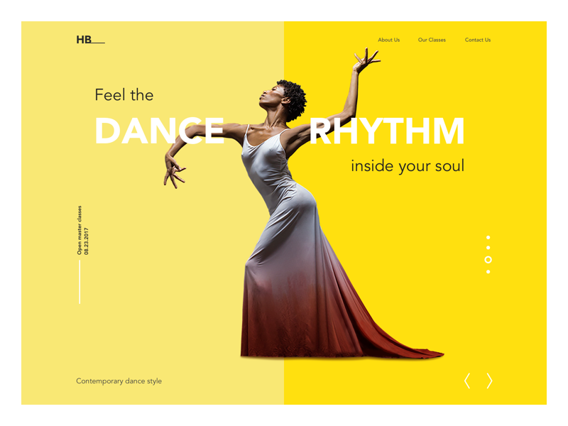
Dance Academy landing page
Practices of minimalism in digital design
Today minimalism is one of the wide-spread trends in the design of websites and mobile applications. The main points to consider can be described with the following practices.
Flat design
As we mentioned in our previous article, flat design became a great supporter of minimalism in modern digital products. The most prominent feature of this direction is applying flat 2-dimensional visual details as the opposite of highly realistic and detailed skeuomorphic images. Flat images usually use fewer elements and curves, avoid highlights, shadows, gradients, or textures. This approach allows creating images, buttons, icons, and illustrations which look neat in different resolutions and sizes. It lets designers enhance usability and visual harmony of user interfaces.
However, the terms “flat” and “minimalist” shouldn’t replace each other which often happens today. They are not the same. “Flat” deals with the style of icons, illustration, buttons, and other visual elements of the interface in the aspect of gradients, textures, shadows, etc. “Minimalist” has a much broader meaning and deals with the layout in general, its composition, color palette, contrast, and all the techniques of visual performance applied to it. So, flat can be described as one of the design techniques applied in the minimalist approach to creating interfaces.
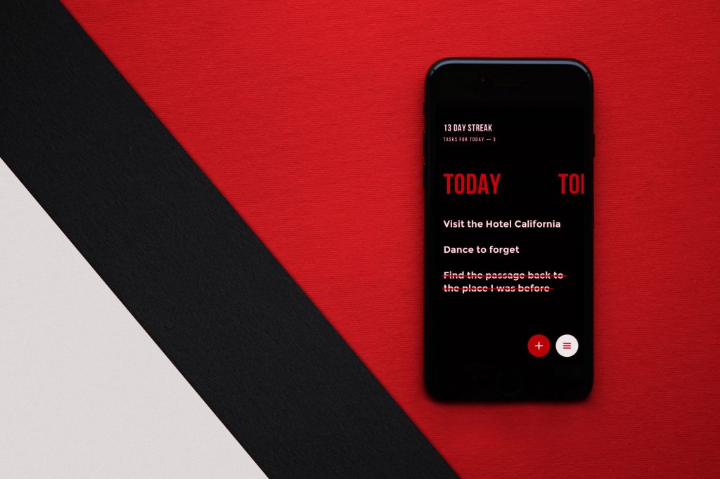
Monochrome or limited color palette
Color is a feature of great potential in the design of interfaces as it can set both informative and emotional links between the product and the user. Designers working in minimalism tend to take the maximum from color choices, and in most cases, they limit the color palette to monochrome or minimal set of colors. This strengthens the chosen colors and doesn’t distract users with too much variety. Such an approach is efficient in interfaces concentrating users’ attention on particular actions like buying, subscribing, donating, starting to use, etc. Moreover, from the psychological perspective, the colors usually transfer particular associations and emotions perceived by users, so limited palette makes chosen colors stronger in this aspect.

Slopes Website
Bold and expressive typography
Typography in minimalistic design is seen as one of the core visual elements of not only informing users about the content but also setting the style and enhancing visual performance. Choosing the way of concise use for graphics, designers usually pay much attention to the choice of typography and never hurry in testing the pairs, sizes, and combinations. As well as color, fonts, and typefaces are seen as a strong graphic element contributing to general elegance and the emotional message it sends. On the other hand, readability and legibility do not lose their leading positions in the matter of choice.
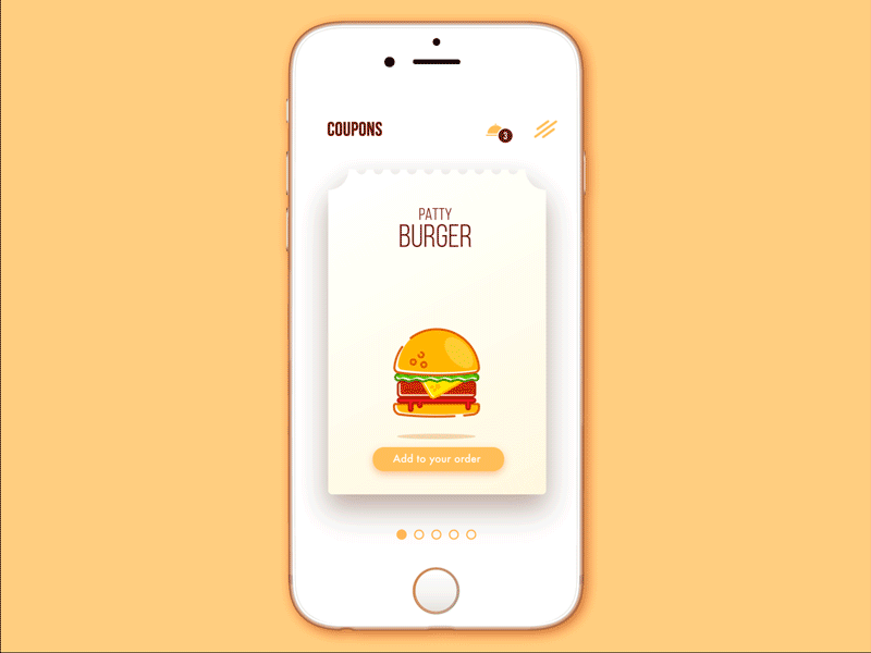
Choice limitation
One of the strong sides of minimalism in interfaces is enhanced user concentration. Being focused on functionality and simplicity, the pages and screens of this kind don’t usually overload users attention with decorative elements, shades, colors, details, motion, so in this way, they support high attention ratio and often let users quickly solve their problems and navigate through the website or app.
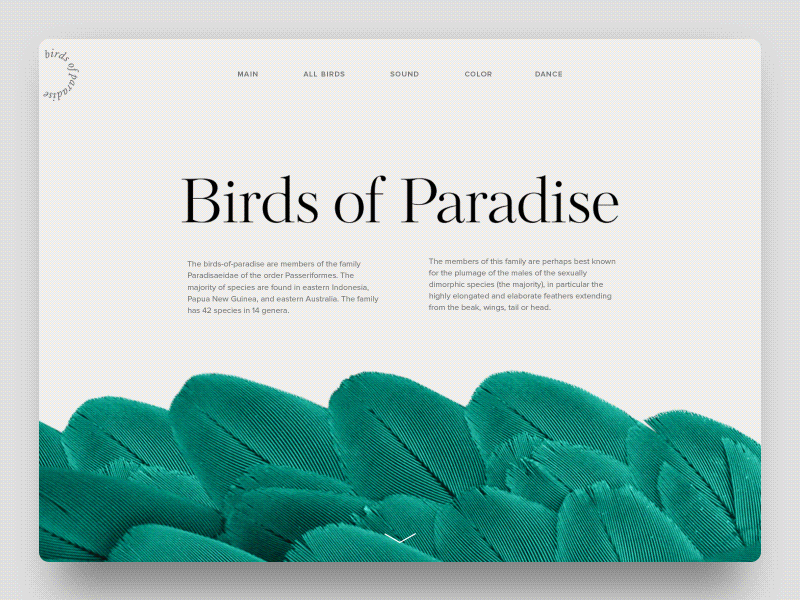
Birds of Paradise Encyclopedia
Prominent theme visual elements
Working on minimalist UI, designers do not apply many images, but those which are chosen to be used are really prominent, catchy, and informative. This approach results in the long and thorough search of the “right” image which would cover all those functions and set the required mood instantly. The photo or illustration itself has to follow the principles of minimalism, otherwise, the choice of the wrong image can ruin all the layout integrity.
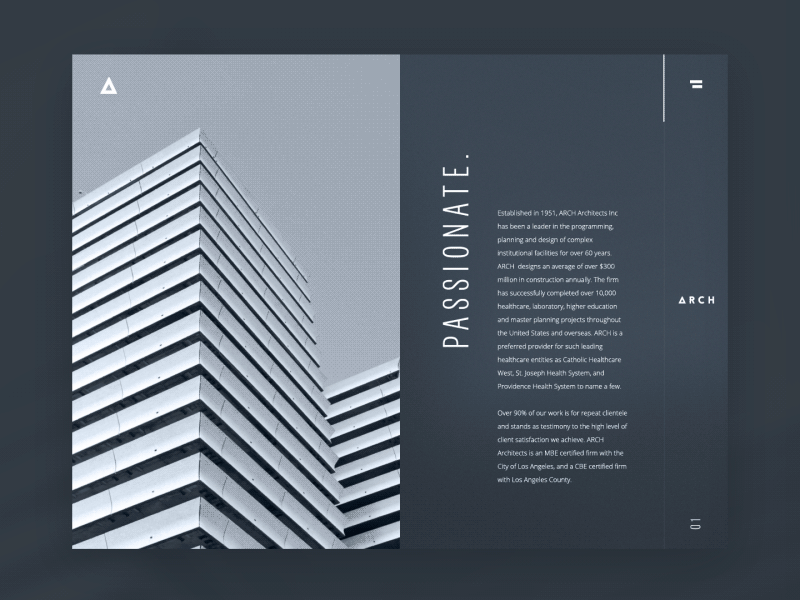
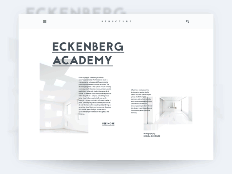
Architecture Firm
Concise and intuitive navigation
Navigation in minimalist interfaces presents another challenge: designers have to prioritize the elements rigorously in order to show only the elements of the highest importance. There are different techniques to hide the part of navigation, but doing this, it’s vital to ensure that users will find what they need easily. That is one of the reasons why minimalist approach can be criticized: not being presented properly and tested enough, solutions like hamburger menus and hidden layout elements can leave some users lost in the journey around the website. Obviously, it is not the good ground for positive user experience, therefore every solution about navigation should follow the philosophy “measure thrice and cut once”.
Adding air and using negative space
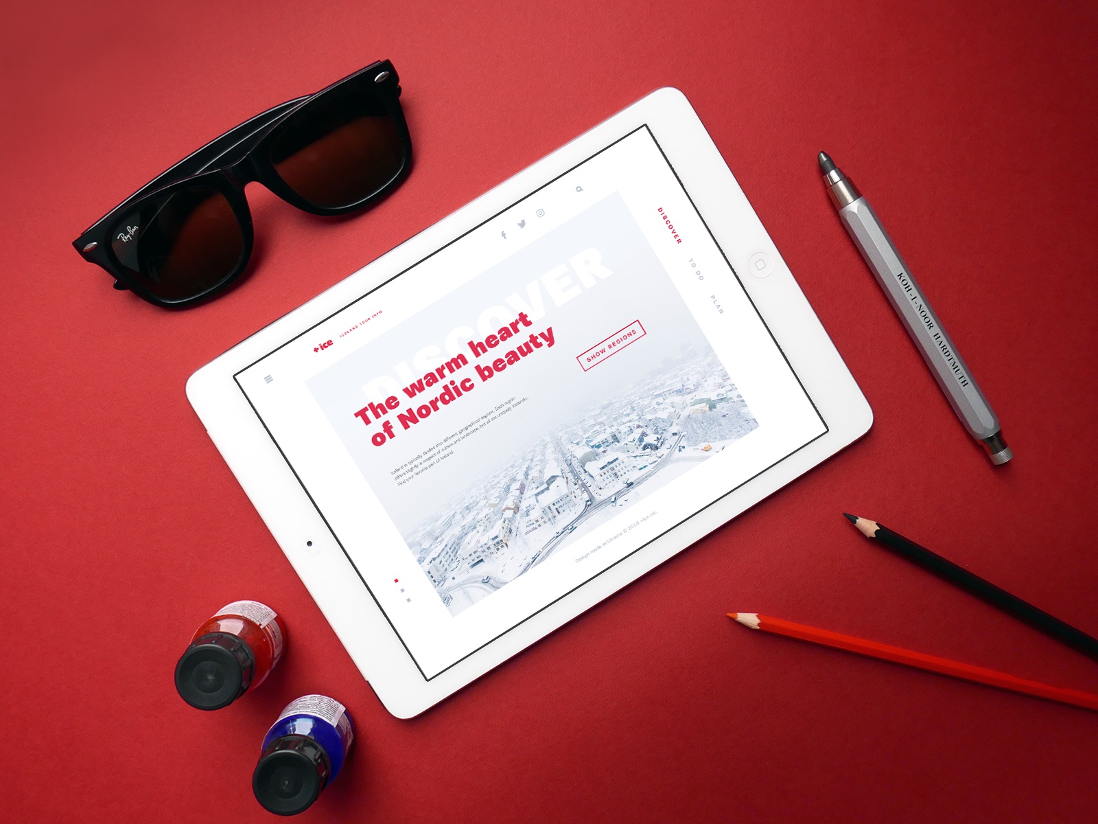
White space (also called negative) in digital design is the term which is more about space rather than color. In minimalism, it is one more effective way of adding elegance and marking out the core elements. Also, in terms of monochromatic or limited color palette, white or negative space plays a big role in creating enough contrast and supporting legibility.
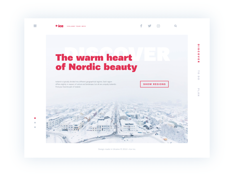
Ice Website
Grids
The grid system in minimalist interfaces can be effective for making the layout look highly-organized, especially if the website presents a lot of homogenous content. Another benefit is that grids are responsive-friendly.
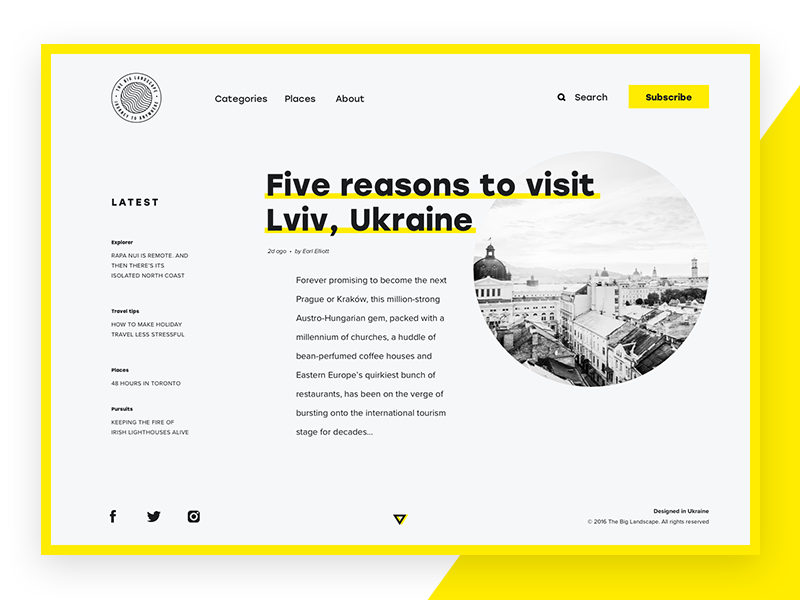
The Big Landscape
Contrast
Following the philosophy of limits and simplicity, minimalism depends much on contrast as a tool for good visual performance. The choice of colors, shapes, and placement is often based on contrast as the key feature.
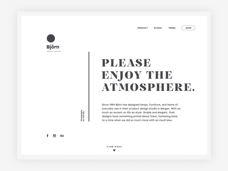
Bjorn Website
Well, it’s easy to see that minimalism has a great number of benefits and presents a good approach to creating user-friendly interfaces. However, it doesn’t mean that minimalism should be applied everywhere: every goal should be achieved by the proper means. One thing is for sure: the more minimalistic is the interface, the more time and effort the designer should invest to make it clear and functional. Elegance and beauty of minimalism should support the global aim of providing positive user experience.
Recommended reading
The Characteristics of Minimalism in Web Design
6 Steps to Perfecting Minimalism in Web Design
Functional Minimalism for Web Design
Web Design: 5 Basic Types of Images for Web Content
UX Design: How to Make Web Interface Scannable
Negative Space in Design: Tips and Best Practices