One of the major characteristics of effective design is a clear user interface. All the elements need to be well-balanced and placed in harmony so that users could easily perceive the information on the screen and interact with a product without efforts.
To create an efficient design composition, professionals apply various techniques and methods from art science as well as the basic mathematical theories. One of the common tools helping to build pleasing design compositions is a mathematical proportion called the golden ratio. In the article, we’ll define the essence of this technique and see how it can be used in the design.
What’s the Golden Ratio?
Everything in the world strives to harmony and balance. Even mother nature brings things in the forms close to the perfect. People enjoy everything which has a natural touch and they always aim at implementing these patterns and forms into their outcome. In pursuit of discovering the secrets of creation, mathematicians calculated a formula that appears in the majority of things on the Earth.
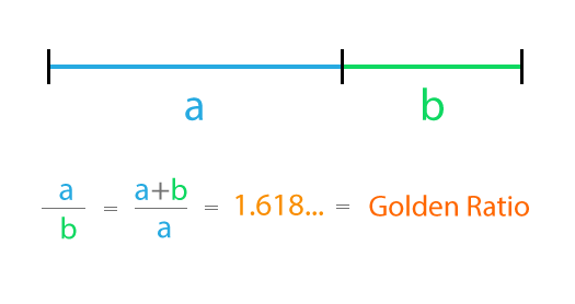
The golden ratio is a mathematical proportion between the elements of different sizes which is thought to be the most aesthetically pleasing for human eyes. The golden ratio equals 1:1.618 and it is often illustrated with seashell-shaped spirals which you could have probably seen on the Internet.
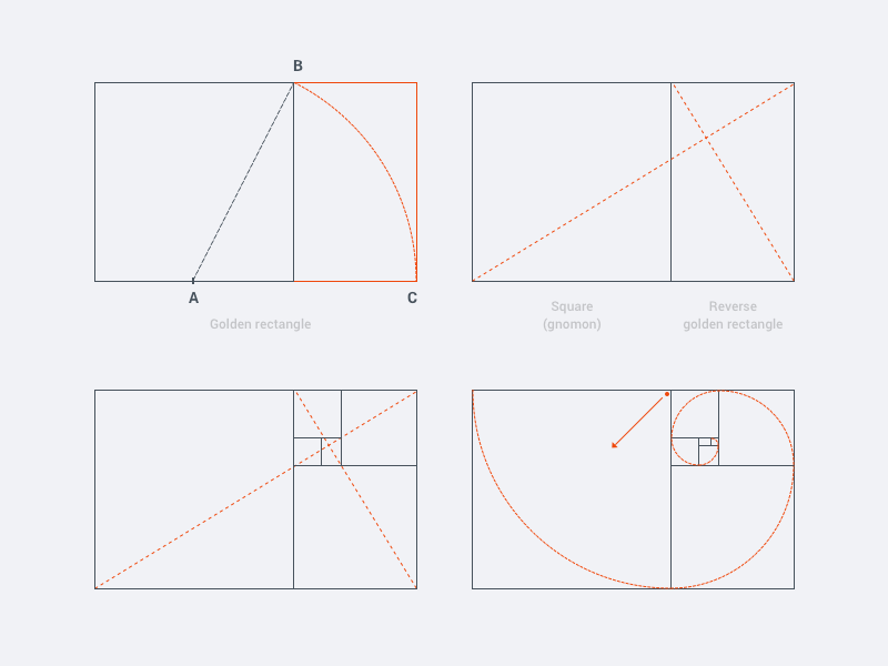
So, how exactly the perfect asymmetry is calculated? First, you need to decide the length of the small element. Then multiply it by a golden ratio which is 1.618 and the result will be the perfect length of the bigger element.
Golden ratio theory is believed to exist for more than 4000 years. Scientists discovered that the majority of the ancient buildings, as well as famous artworks, obey to the golden ratio. Leonardo Da Vinci and Salvador Dali were known as the followers of the golden ratio theory and they used it as a key tool for their amazing artworks. Today the golden ratio is applied in various fields including architecture, art, photography, and design.
Golden Ratio in Design
Effective composition is a core part of a design. All the elements need to work together to maximize a pleasant experience. Moreover, each separate element, even the small one like an icon, has to be created in a harmony within itself. The golden ratio has a positive influence on visual perception, the reason why many graphic and UI designers apply it at their workflow.
Graphic designers are more keen to apply the golden ratio. The thing is that the art teachers often explain the theory of golden ratio to help students figure out how to work with proportions. That’s why many designers continue to apply this tool while creating various graphics, especially for the small but meaningful design elements such as a logo.
Logo and icon design requires deep attention to the details. The golden ratio allows creating illustrations where each element is placed in harmony and appropriate proportion to the others. Moreover, logo design is a heart of the brand so designers strive at presenting it in the most compelling way. Golden proportion can add aesthetic appeal to a logo and increase the popularity of the brand.
User interface needs to have a clear visual presentation of the components so that people could use a product without problems. The golden ratio is often applied to place UI elements effectively. First of all, it can be used at the stage of wireframing. This way you can plan a structure for the layout placing and sizing user interface components according to the golden proportion. In addition, the golden ratio scheme can help professionals to crop images for web design so that it could make sure the composition of the photo remains balanced.
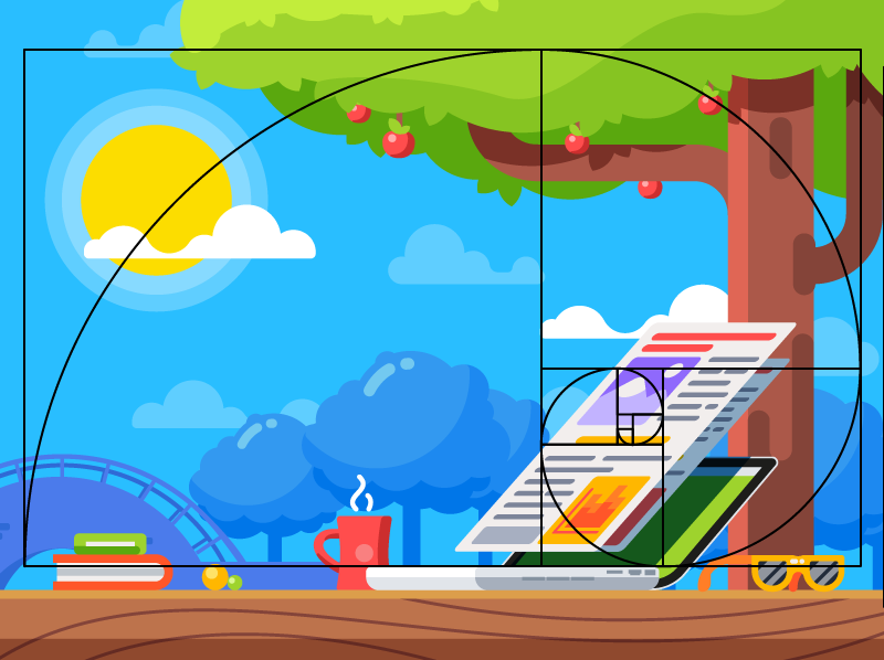
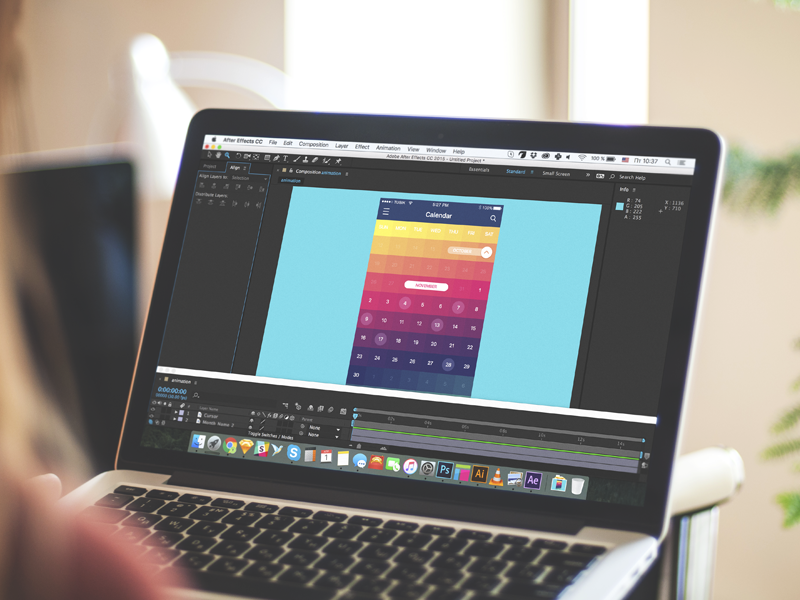
Graphic design for Opera Software promo video
How Does the Golden Ratio Improve UI Design?
Mathematical calculations may seem boring and time-consuming, so a question may arise if it’s worth the effort. Let’s see what the golden ratio can bring into a design.
Well-balanced content
Designers often face the situation when a product needs to contain a great amount of various content and each part of it is vital and cannot be replaced. To unite all the components in a pleasant composition, the golden ratio can be applied. Divide the layout into different sections using a proportion of 1:1.618 and put the content in the sectors according to their importance. Such a content composition is sufficient for users’ perception and it helps to organize all the components.
Effective visual hierarchy
Speaking of the content organization, we can’t forget about visual hierarchy. As we mentioned in our previous articles, it’s a technique of efficient structuring content components. Combining the principles of these two techniques designers maximize the chances of building a powerful design composition.
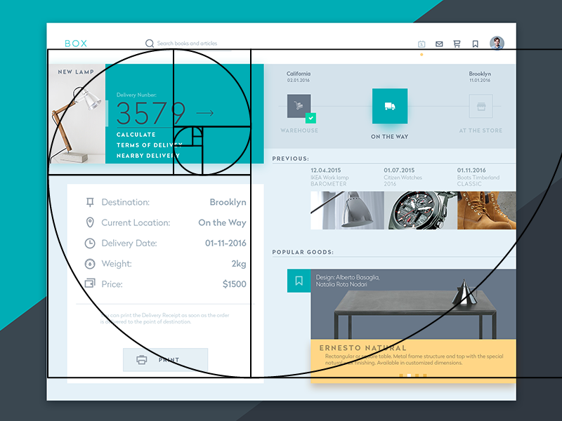
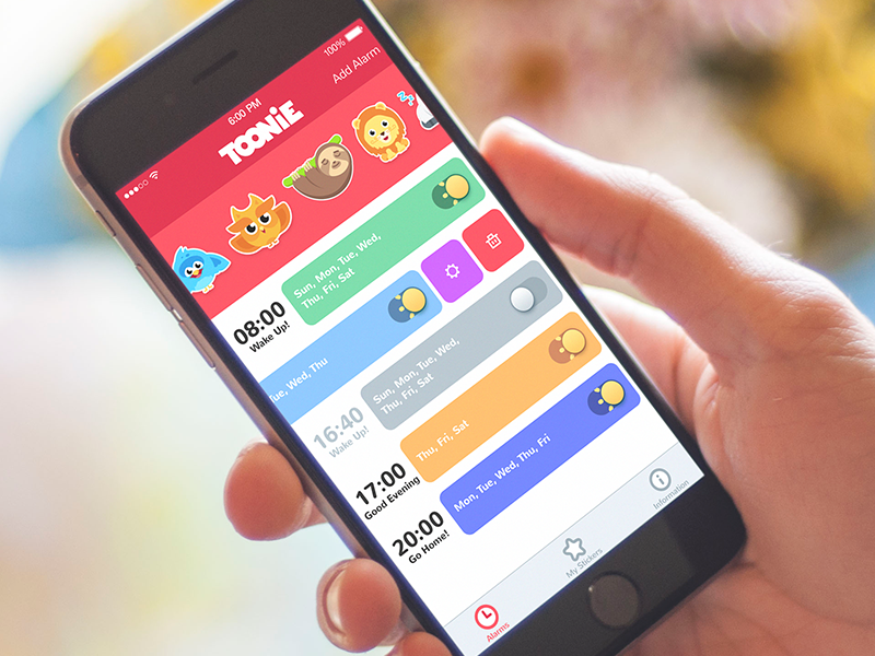
Tracking Widget
Powerful typography levels
To create efficient typography, designers need to divide copy content into different levels. They usually include various kinds of copy including headers, subheadings, body copy, caption etc. Applying golden ratio professionals can quickly define an appropriate proportion between the typographic levels, for example, you can choose a certain size for the header and then divide it by 1.618. The result will show you the most appropriate size for subheaders.
Pleasing first impression
When users try a product for the first time, they scan the user interface to understand if they like it or not. The psychology principle known as a visceral reaction states that people decide whether they like something or not within a few seconds of looking at something. This reaction goes faster than our consciousness so we don’t even realize it. That’s is why it’s vital to make sure the first impression of a product will be pleasing. Design created by using the golden ratio has a positive influence on users’ minds and their visual perception and it works from the first sight at a product.
Appropriate white space
White space is the area between elements in design composition. Designers always need to care about the amount of white space in the UI since the unity of composition highly relies on it. The golden ratio can make the process of spacing much easier and faster. Applying golden proportions you will be able to define the right white space which will work well for the design.
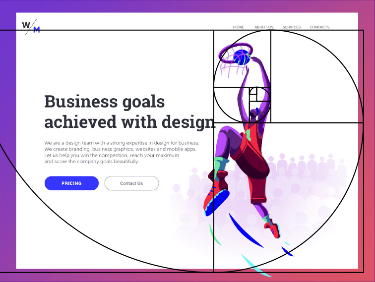
Digital Agency Landing Page
Design presenting the natural balance of the components cannot be unnoticed. The well-structured layout is one of the core parts of powerful UI. The golden ratio brings harmony to the design and makes the product pleasant for users. Don’t be afraid of the mathematical formula. It’s not as difficult as it may seem. Even more, the golden ratio can help in creating user-friendly digital products that will combine utility and aesthetics.
Recommended Reading
The Golden Ratio – Principles of form and layout
Negative Space in Design: Tips and Best Practices
How to Make Web Interface Scannable