Many designers can boast of having creative intuition and a sharp eye: they add as much passion and feeling into the layout of the future website or app as rational thinking and measurement. In lots of cases, that’s not bragging but the real skill to see all the details together, to feel the possible pitfalls of the user flow, to find the original solutions not ruining usability. Yet, there’s no magic on this way: this skill is based on not only talent but also practical experience and persistence in studying theory, standards, and guidelines which quickly change together with technology and devices. Even creative experiments are based on the knowledge of interaction mechanisms and factors influencing them: to break the rules, you have to know them well.
Visual hierarchy in web and mobile interfaces belongs to the domain knowing which designers strengthen their creative potential. Exploring the ways how people perceive information and using them for building good navigation, digestible copy, and effective color choice has a great impact on the usability of the product – and scannability as its important part. So, today we are going back to basics: let’s start revising how Gestalt grouping principles can affect user interfaces positively.
What Is the Gestalt Theory?
Basically, Gestalt is the term that comes from the German word Gestalt [ɡəˈʃtalt] meaning “shape, form”. It is used primarily in cognitive psychology for the field exploring the laws of meaningful perception of the data which people constantly get from the world that seems primarily chaotic. The basic idea behind this movement can be caught through the well-known phrase by Gestalt psychologist Kurt Koffka: “The whole is other than the sum of the parts”. When people perceive the complex objects consisting of many elements, they apply conscious or subconscious methods of arranging the parts into a whole organized system instead of just the set of simple objects. It works on different levels of perception, but the visual part seems to be the most interesting for designers creating interfaces.
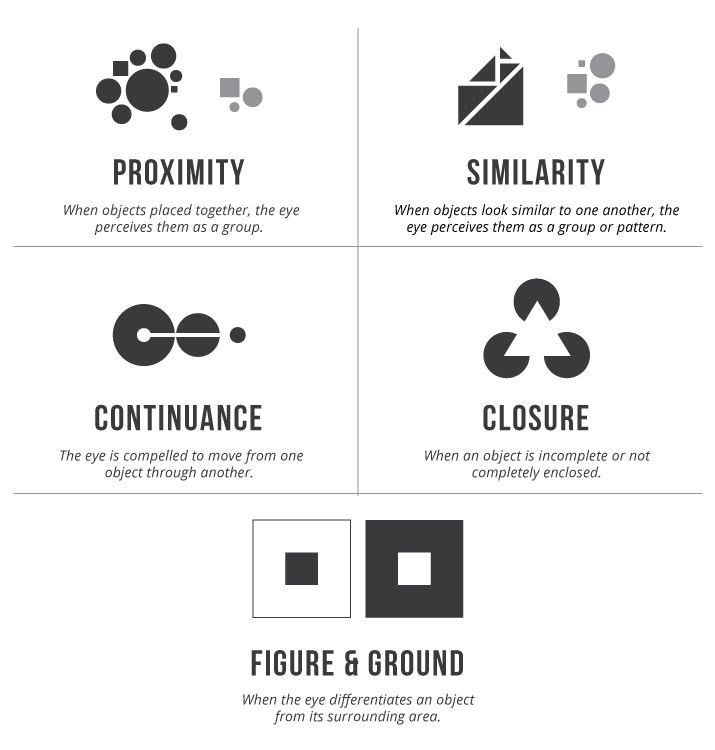
Why could designers get interested in this issue? Because it helps understand the psychology of the app or website users better. When you know the factors influencing visual perception, it makes the process of UX design much more proficient giving higher rates of successful interactions and lowering the level of misunderstandings users could get on this way. Among the various levels of this approach, principles (or laws) of grouping are probably the most essential for designers to consider. These principles are based on the idea that people arrange what they see along with some patterns organized into five global categories: Proximity, Similarity, Continuity, Closure, and Connectedness. Here’s one of the infographics offered by Vertical Measures blog and visualizing the core description for some principles.
In user interfaces, principles of grouping applied thoughtfully make the perception of layout elements quicker and easier as well as establish the priorities in different levels of interaction. Today we are going to consider the similarity principle of grouping widely used in design practice.
Similarity Principle
The principle of similarity is grounded on the idea that things that share visual characteristics such as shape, size, color, texture, value or orientation will be seen as belonging together. It means that if a person perceives the set of elements, he or she tends to group the ones which have one or several features alike as the related items. Therefore, giving different layout elements identic or similar visual features, designers stimulate users to set the appropriate connections and understand the whole scheme faster.
Similarity can be based on various visual parameters such as color, shape, size, and orientation. Let’s check some practical examples of interfaces designed by Tubik team.
Color
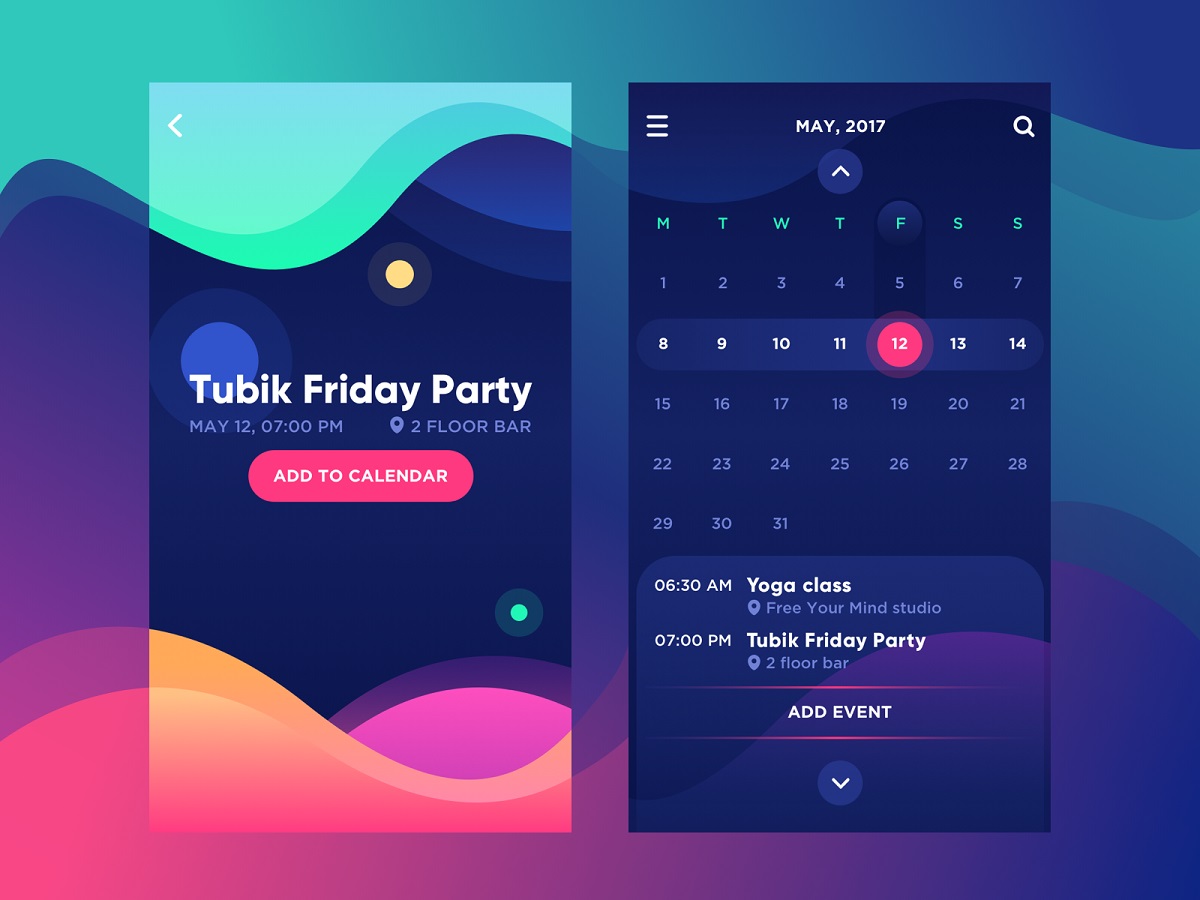
Bright Vibe Calendar
Here’s the common example of applying color similarity in the simple calendar app. The letters marking the days of the week on the calendar screen are visually grouped with one color which is different from the colors used for the numbers in the calendar grid. Therefore, the quick glance is enough to separate these types of symbols – color simplifies the process of the first scanning. The next level of color similarity takes place in the field of numbers: the dates on the week which the user has chosen look brighter while the other dates of the month look more faded. The key interactive zones are colored brightly and present the visual accent which is instantly noticeable and cannot be missed. So, color enables the designer to make the easy path of navigation for a user with an effective visual hierarchy via the principle of grouping.
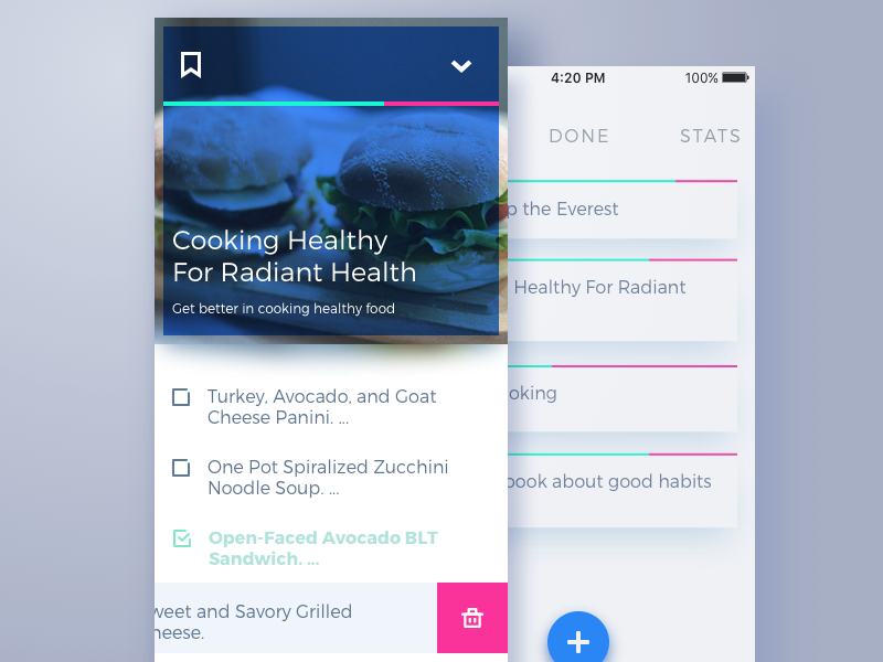
To-Do App
One more example here shows how grouping by color can be applied effectively for the copy in graphical interfaces. You can see the screen of a to-do app where the position which is already marked as done is featured in different color compared to the tasks that are in progress. It enables the user to scan the list quickly and group the kinds of tasks in split seconds.
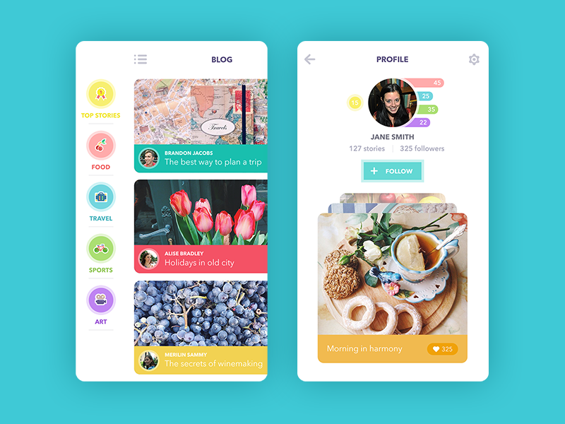
Blog App
A more complex application of grouping principle by color is marking categories and blocks of content. It works very well in the interfaces full of various content organized on several levels such as, let’s say, blogs, e-commerce or educational resources, etc. Color markers simplify navigation and keep the consistency of design enabling users to remember the color prompts and find the content they want easily. The example above shows the blog app applying this principle: various posts are organized around global categories and marked with colors which you can see on icons, colored tabs on the posts and correspondent quick stats of posts in the user profile. The same principle is applied in the Moneywise App shown below.
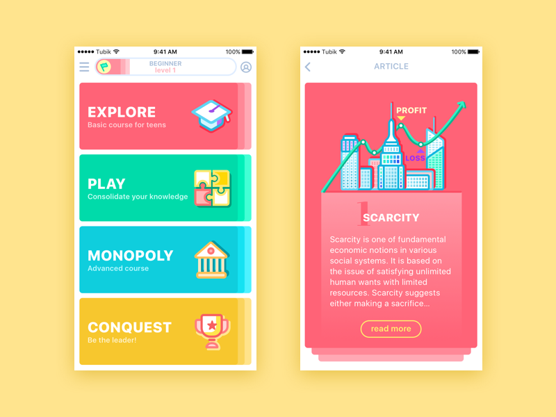
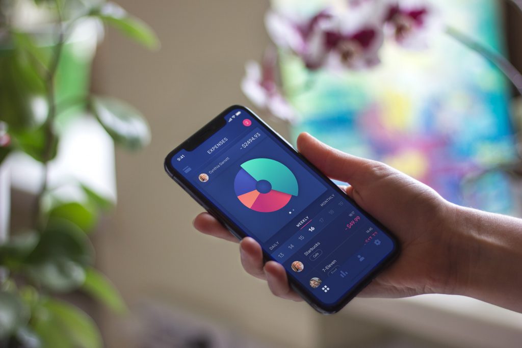
Moneywise App
This is the educational app devoted to economics: the content is organized into four global categories. The color used to mark the category is used as the background color for all the cards belonging to it. So, in the process of interaction, it helps users to quickly get oriented to where they are.
Surely, this way of color grouping goes further as it organizes not just the elements on one screen but different screens or pages within all the digital product. However, it also corresponds to the Gestalt principles: such an approach allows designers to create interfaces that look and feel consistent and support the general integrity of visual perception from screen to screen, from one interaction to the other.
Size
The principle of similarity grouping the elements by size is another cornerstone in creating intuitive and user-friendly interfaces as it establishes the basis for strong visual hierarchy supporting users. This approach helps to set priorities and make the most important content visible. Grouping the similar content elements by this principle arranges the connection between them, often faster than a user can read the copy or see all the details.
The good way to present this principle in action is checking the organization of copy content.
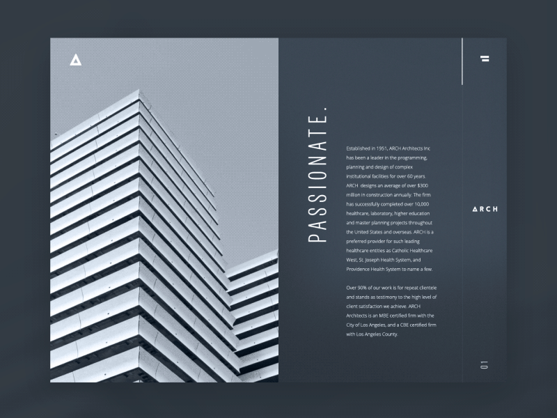
Architecture Firm Website
The example features the corporate website of an architecture company. The copy blocks presenting the benefits and approaches of the firm are supported with the keywords applying two grouping principles simultaneously: they use different size and different text orientation. In the process of interaction, they are obviously perceived as related elements. Also, the extended menu page shows the typographic hierarchy grouping copy elements by size: keywords, categories, and subcategories.
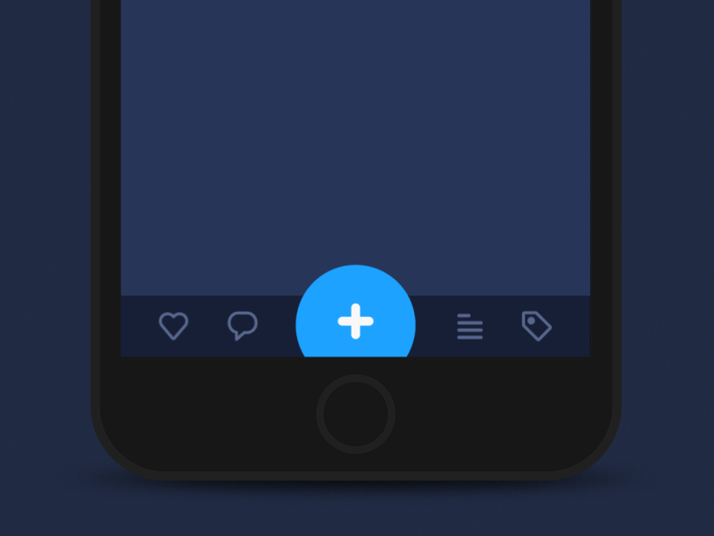
Tab bar interaction concept
Here’s another example of grouping by size and color. We can see the concept of a tab bar in which interactive elements of equal importance are given in the same size and faded shade while the core interactive element – plus button – is made prominent via bright color and bigger size. Moreover, trying to add the content via this button the user is offered three options for different types of content. And again, grouping the appearing three buttons which use the same color as the parent button but smaller size, the interface enables the user to set the connections and hierarchy of navigation elements easily based on typical operations of cognitive perception.
Shape
One more way to group the elements on the web page or screen is marking them by shape.
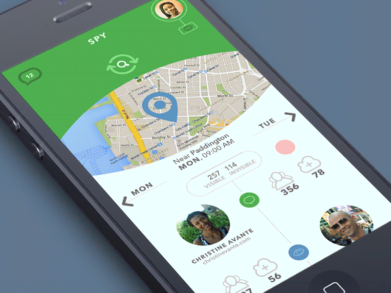
Green Spy app interactions
The example shows the app which uses cards of the same shape to simulate the interaction with the physical objects – the base of data cards. This approach allows the user to perceive the set of content blocks as related.
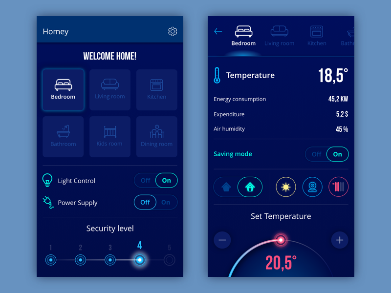
Homey App
The interface for the Homey app shown above also presents the example of grouping by shape consistently from one screen to another: the buttons marking the rooms use the rounded-square shape while the buttons of various indicators within a particular room screen use the round shape. It sets the clear connections between the related layout elements as well as global navigation in the app.
Although we have just started revising Gestalt theory usage in design, it’s already obvious that knowing these simple yet effective principles can save much effort for users and support user-friendly interfaces with mechanisms that work according to human cognitive abilities and psychological patterns. Follow the updates to check the explanations and examples for other grouping principles: proximity, symmetry, continuation, and others.
Recommended Reading
Gestalt Theory for UX: Principle of Proximity
Psychology in Design: Principles Helping to Understand Users
How Human Memory Works: Insights for UX Designers
How to Design Effective Search
Error Screens and Messages: UX Design Practices
Visual Dividers in User Interfaces: Types and Design Tips
Directional Cues in User Interfaces