Famous artist Edgar Degas once said: “Art is not what you see, but what you make others see.” In terms of graphic design, which could be also defined as art solving the particular task, this flow goes even further: what you make others see often says them what to do, what to pay attention to and helps to solve some problems. Graphic design is able to change the mood and message via the slightest changes of shapes and shades, letters and spacing. Trends in this sphere, which has become an integral part of everyday life, present an important object of consideration as they influence decision-making and problem-solving potential of modern products as well as form users’ tastes. Today we are going to focus our attention on one of the most popular directions of modern graphic design called flat design.
Definition of flat design
Today, the term “flat design” is applied to graphics for numerous purposes and tasks which have common stylistic features. Flat design is the direction that found its broad and diverse expression on digital art and is famous for minimalistic and concise use of visual expressive means. Nowadays the term is widely used as the opposite to “rich design” due to harmonic simplicity taken as the basis of this design approach. The most prominent feature which actually has inspired the name of this direction is applying flat 2-dimensional visual details as the opposite to highly realistic and detailed skeuomorphic images. Flat design has been developing actively for the last couple of years covering more and more fields of graphic design still finding the broadest and most diverse application in the sphere of digital design for web and mobile interfaces. This design approach is found as the style favorable for enhancing usability and visual harmony of user interfaces.
Origins of flat design
Obviously, flat design hasn’t appeared out of thin air. Its roots are usually set in the Swiss style which historians of the design sphere find its direct ancestor. The Swiss style, also known as International Typographic Style or shorter International Style, is the direction which appeared and got its dose of criticism in the 1920s and later won its bright expression in graphic design in Switzerland of 1940-50s fairly becoming the solid foundation of graphic design of mid 20th century around the world. The leaders of this creative movement were Josef Müller-Brockmann, the representative of the Zurich School of Arts and Krafts, and Armin Hofmann from the Basel School of Design. According to Design Is History portal, the brief description of key features of this style is the following: “…the style favored simplicity, legibility and objectivity. Of the many contributions to develop from the two schools were the use of, sans-serif typography, grids, and asymmetrical layouts. Also stressed was the combination of typography and photography as a means of visual communication. The primary influential works were developed as posters, which were seen to be the most effective means of communication.”
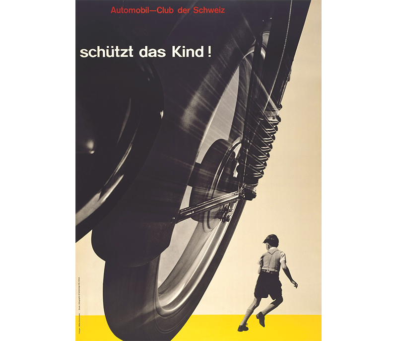
Josep Müller-Brockmann, Auto Club of Switzerland Poster, 1955
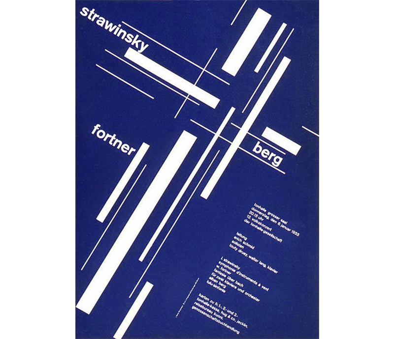
Joseph Müller-Brockmann, Zürich Town Hall Poster, 1955
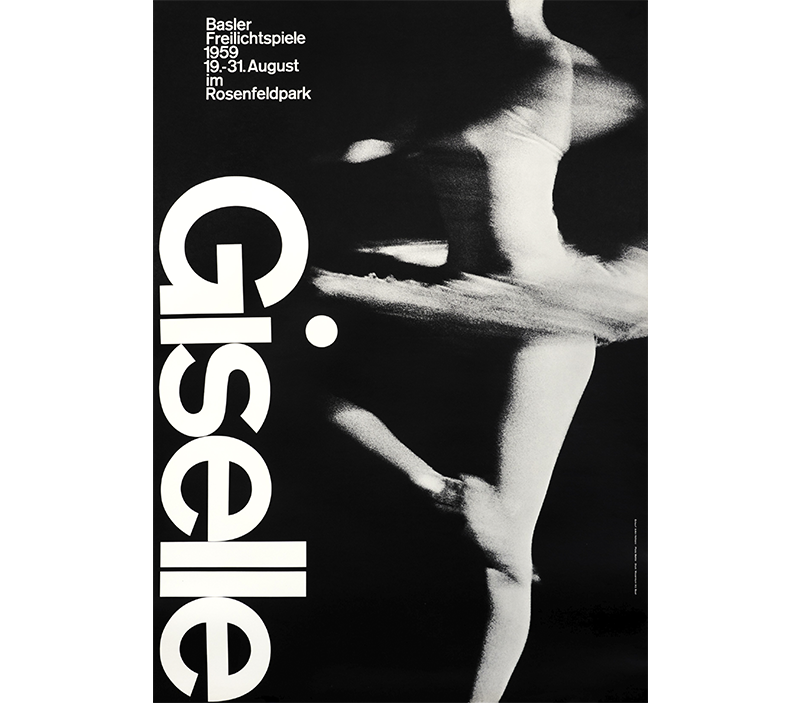
Armin Hoffman, 1959 poster for the ballet Giselle
The posters featured here as examples make it obvious that fans of this style liked simple forms, bold and strict fonts of high readability level, harmonic and geometrically based combinations of details, flat illustrations and clear visual hierarchy. It quickly grew more and more popular in different countries of the world and got its new life in the art of the early 21st century.
Although this style got a variety of expressions in the sphere of visual design for print, like posters, stamps, postcards, book covers, magazines, etc., it significantly broadened its horizons with the era of digital design, especially in the domain of design for user interfaces. Websites and mobile applications going through the dynamic development of creative search opened the amazing and fruitful perspective for this minimalist and functional approach to design solutions. The style got the name “flat design” which became instantly popular and started a new direction in graphic design daring skeuomorphism and “rich design” and supported with new challenges opened by the field of interaction design.
The first step to boosting flat UI popularity in digital products was taken by Microsoft presenting a new flat and minimalist style of their products: this movement started in the early 2000s and was widely adopted in the products of 2010, in particular in mobile interface design for Windows Phone 7. The basic features of flat design such as intuitive simple shapes, bold clear typography, bright contrast colors, long shadows, absence of complex details and textures found their further development leap in 2013 when Apple released iOS 7 based on the principles of flat graphic as the basis for user-friendly intuitive interfaces. It could be also said some key principles of flat design found their expression in Material Design for Google, still with some deviants like drop shadows, etc.
Basic and prominent features of the flat design include:
- the simplicity of shapes and elements
- minimalism
- functionality
- bold and highly readable typography
- clear and strict visual hierarchy
- close attention to details
- the thoughtful appliance of bright colors and contrast supporting quick visual perception
- avoiding textures, gradients and complex forms
- applying the principles of grids, geometric approach, and visual balance.
Benefits of flat design
Flat design has a number of benefits determining its popularity and diversity in digital design which influenced the trends of modern print design as well. Among the most significant of them, we would mention:
- readability and legibility
- clear visual hierarchy via shapes, colors, and fonts
- effective support of quick and intuitive navigation in web and mobile interfaces
- easy adjustability in terms of adaptive and responsive design
- effective legibility on various screens
- being easier for developers and usually presents less load for the digital system.
With all the above mentioned, the flat design provides a wide field for creative search and stylistic concepts.
Actual practices: fields for applying graphic flat design
The variety of design directions available and progressing these days engages flat design as a flexible and artistic approach to successfully win its place in all of them to more or less extent. Let’s review the spheres to apply its principles with a bunch of examples by Tubik Studio designers.
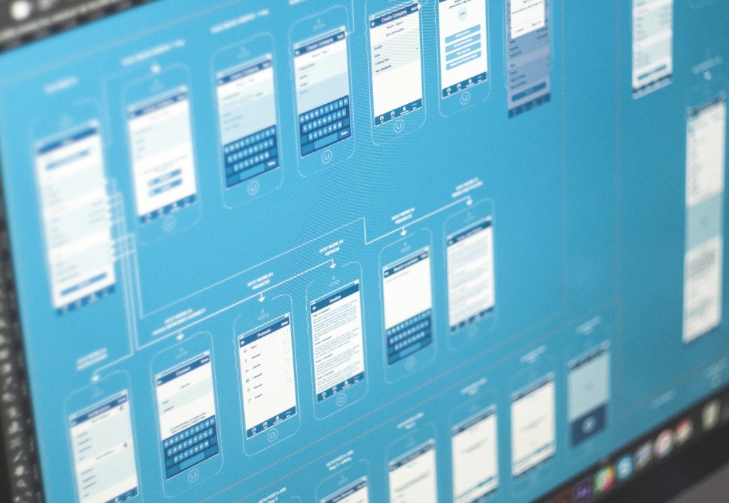
User Experience Wireframing
Even at the initial stage of planning the general layout, logic, and transitions the principles of flat design get the chances of their basic service. Digital design tools and software used on this crucial stage enable designers to present clients and the team the unified simply performed scheme of all the app screens or web pages, and even this basic performance already features key traits of visualization typical for flat design. At this step, it is ideal for the quick and effective perception of design solutions based around navigation and key elements given in the simple monochrome scheme.
User Interface Design
User interfaces have definitely become the broad and favorable field for flat design glitz and gloss. It found its development in both abstract user interaction concepts and a variety of original interfaces, mascots, icons, interface elements, and illustrations.
UI Interaction Concepts

Pull To Refresh
Portrait vs Landscape interaction
Pull Down animation
Tab bar interactions
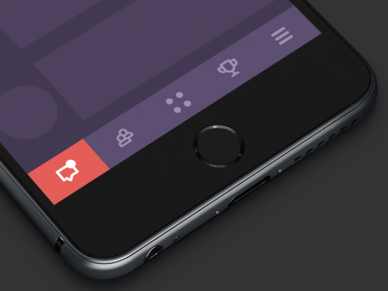
UI navigation elements and icons
![]()
The set of flat icons
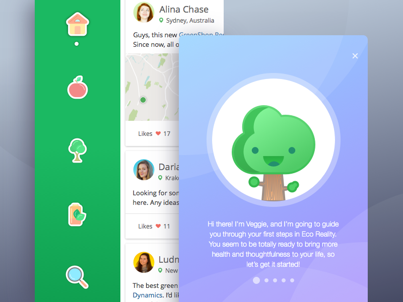
Flat icons applied in Veggie App
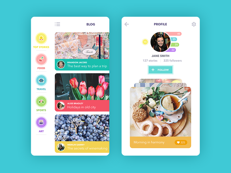
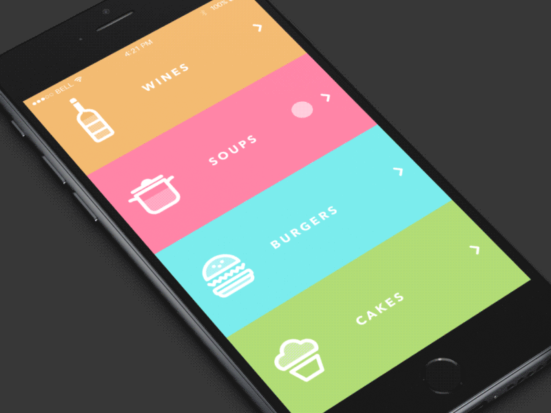
Flat icons and tabs design for Blog App
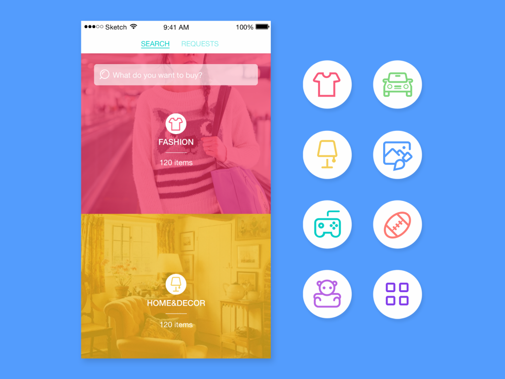
Flat icons applied in Saily App
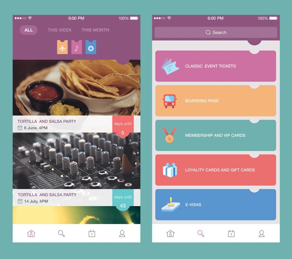
Flat UI design elements for PassFold
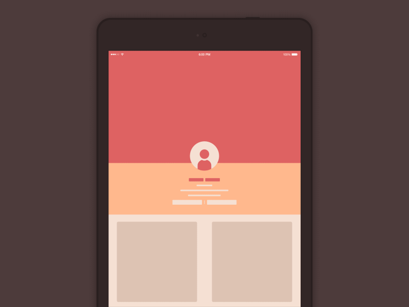
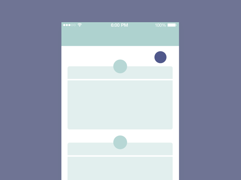
UI Interface Illustrations
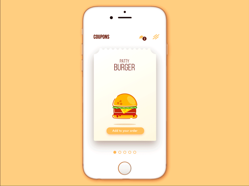
Cafe Coupon App
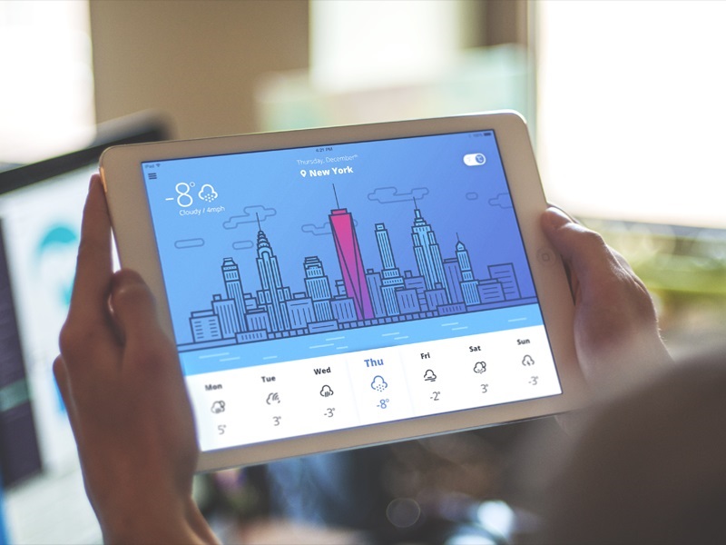
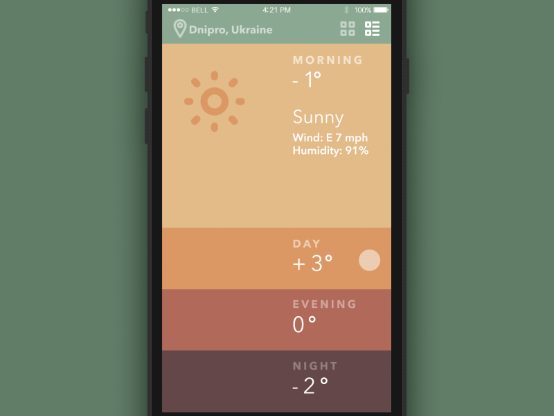
Weather App
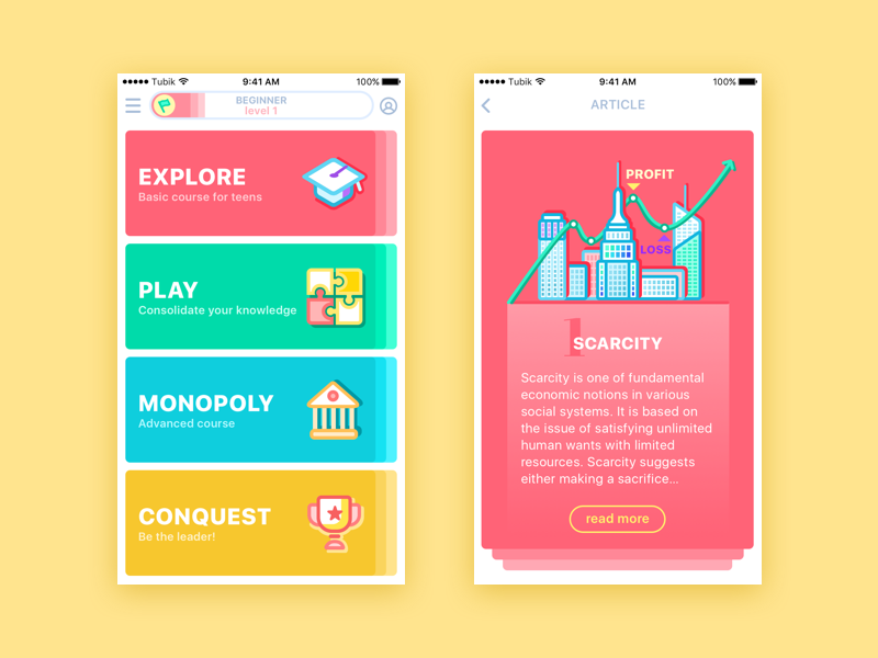
Moneywise App
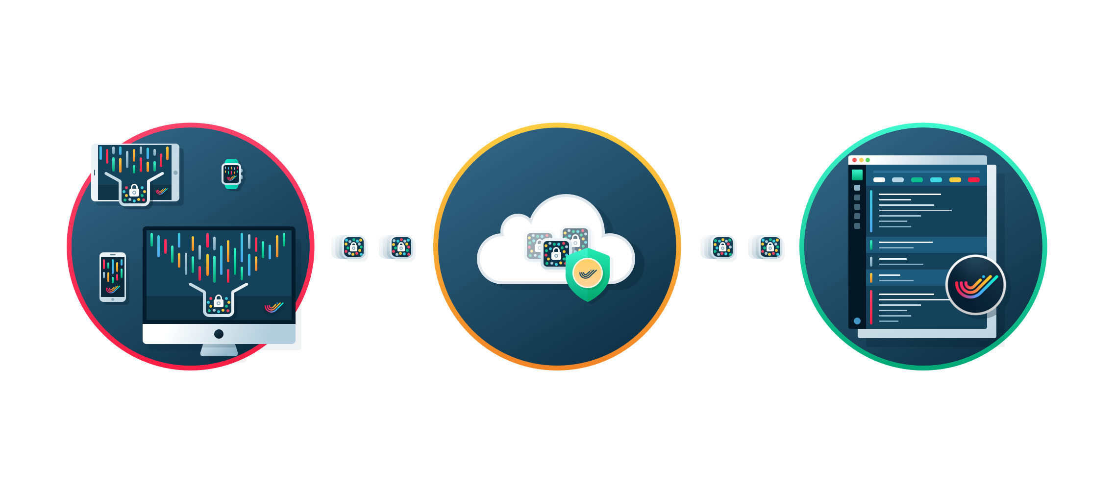
Illustration for SwiftyBeaver
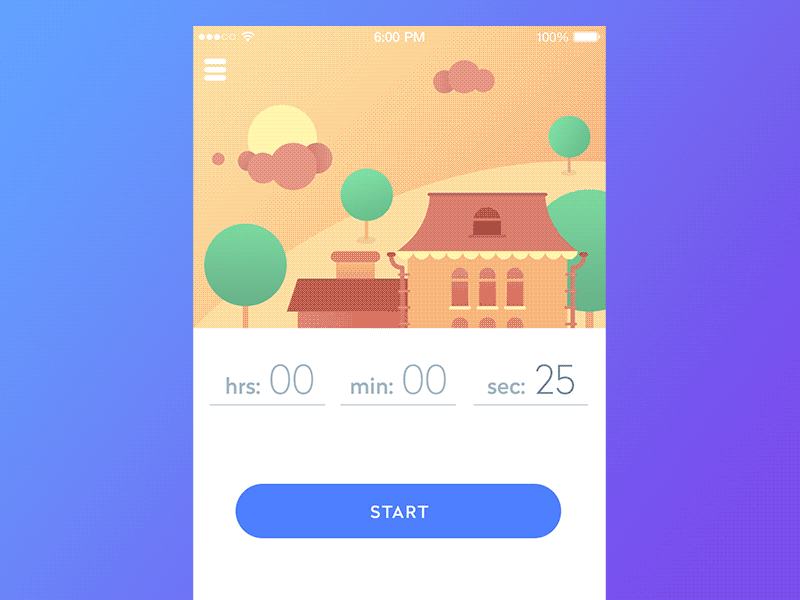
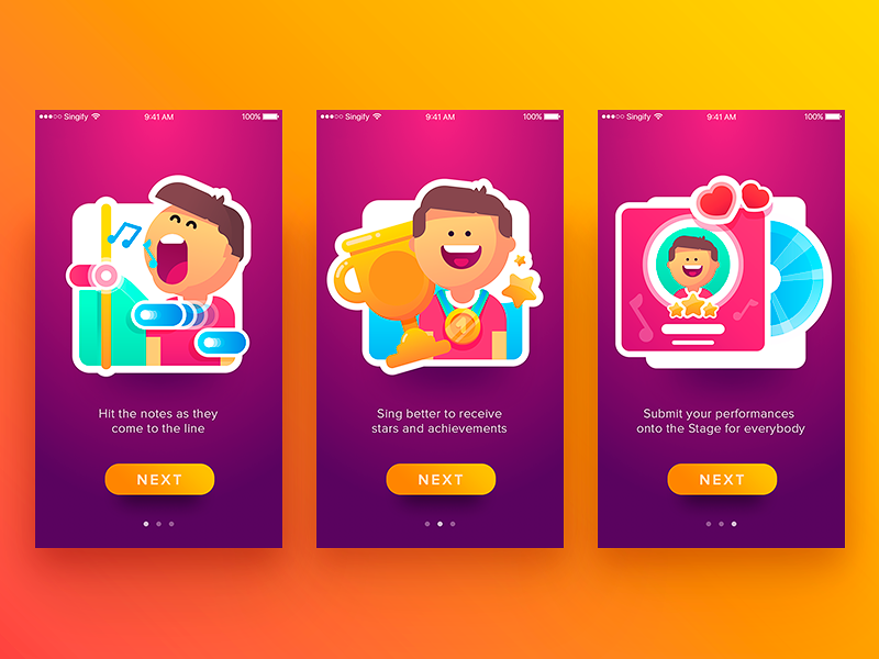
Timeline App
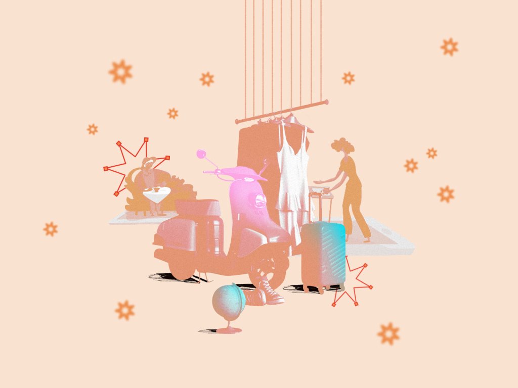
Theme illustrations
This kind of illustrations provide additional support for digital products and are usually more sophisticated in terms of detalization and satisfying users’ aesthetic needs, at the same time instantly setting the connection with a particular theme.
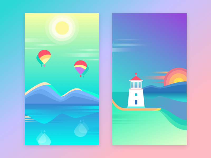
Free Colorful Wallpapers
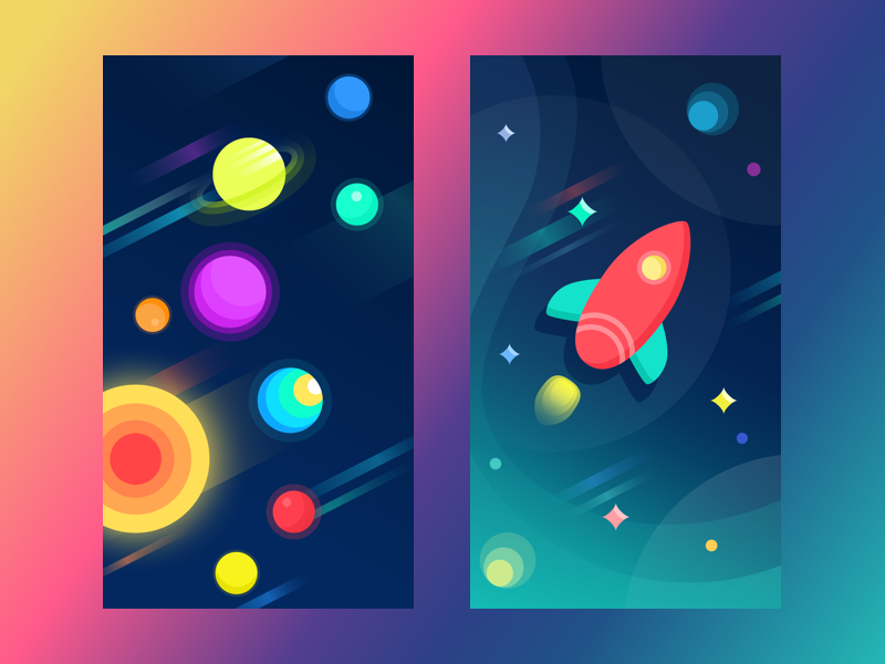
Free Space Wallpapers

Underwater Explorer

Halloween Haunted Castle
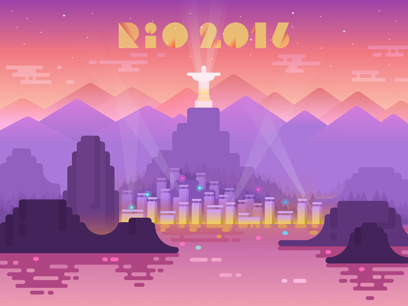
Rio Olympics
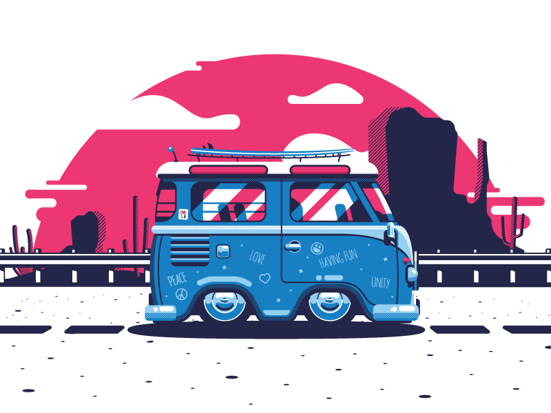
Californication Bus
Print illustration
The variety of purposes for the modern flat design and its growing popularity in digital products of everyday use also influenced other fields of design, in particular, design for printed products like posters and book covers, from which, actually, the approach takes its roots.
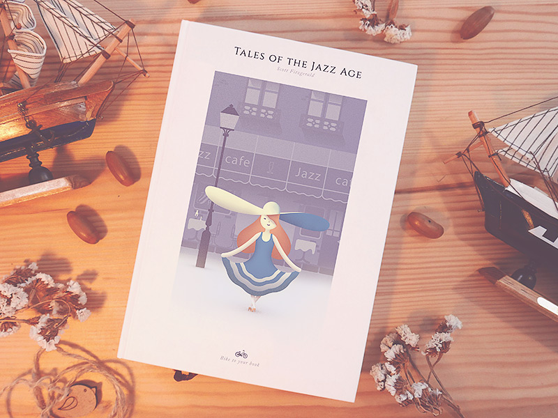
Tales of the Jazz Age Book Cover
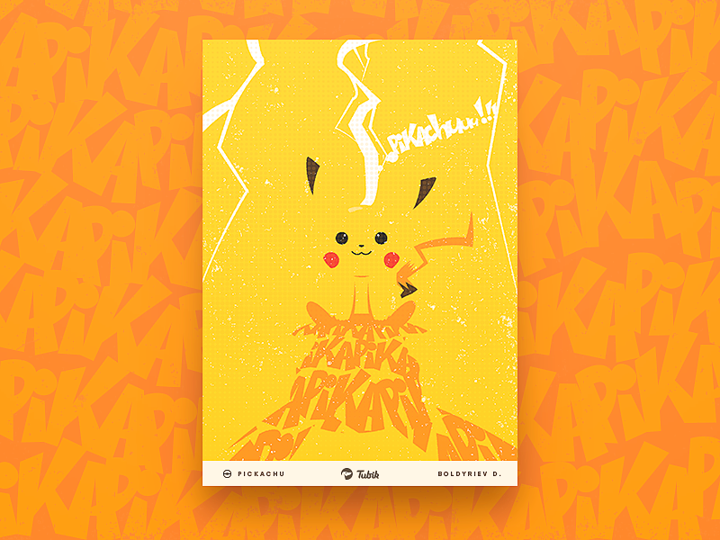
Pikachu Poster
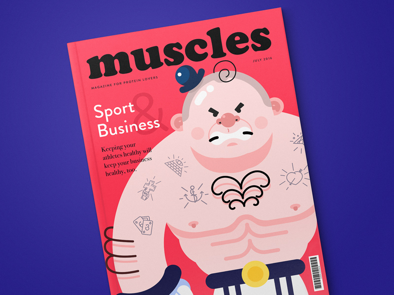
Muscles Magazine
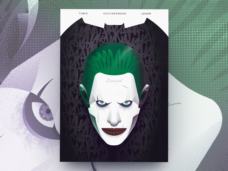
Suicide Squad Poster

Spring Girl greeting card
Branding design
These days, the branding design sphere also successfully applies principles of flat design, not only because it gives trendy look but also due to its flexibility as many products are presented on devices or get digital support on web or via applications and advertising. Flat design in branding is often represented in logos and mascots.
![]()
Logo mascot for Saily App
![]()
Logo lettermark for PassFold
![]()
Logo design for Andre
![]()
Logo for Design4Users
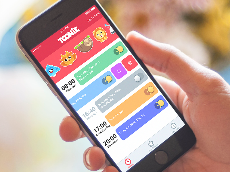
![]()
Logo lettering and mascot for Toonie Alarm
All the facts and benefits mentioned above on the issue of flat design, definitely, do not mean that this style has overcome other design approaches. Any style and direction of design has its own benefits and pitfalls. Still, flat design opened new perspectives, especially in the sphere of user-centered design solutions which present a harmonic balance of beauty and functionality.
Recommended reading
Here are some handy articles and case studies to continue plunging into the theme of design and graphics for user experience.
Functional Art: 10 Big Reasons to Apply Illustrations in UI Design
How to Create Original Flat Illustrations: Designer’s Tips
Web Design: 5 Basic Types of Images for Web Content
Design Process: How to Create Illustrations for IT Blog or Landing Page
Real Racing. Graphic Design for Mobile Game
Winter Olympics Illustration. Step-by-Step Process
Many Faces of Graphic Design: What Do Graphic Designers Do?
Case Study: Tubik in Paris. Design Process for Narrative Illustration