There’s no place like home, they say. And in the growing world of websites for all the needs and aims, it actually works the same. Home page has multiple functions: it’s a card of invitation, a starting point of the journey around the website, storage of the vital links and data, and a strategic asset for marketing goals. In the majority of cases, it is often the first visual and emotional touch to the website. No doubt, design is one of the core ways to make this touch gentle, smart, and helpful. Today we are discussing some effective tips for creating user-friendly home pages.
One of our previous articles has already given insights into the definition, types of content such a page usually includes, and basic design strategies increasing home page usability. Continuing the topic, today we are adding more recommendations organized around three essential aspects: information, interaction, and appearance.
Information
To use or not to use? That is the question. In the vast majority of cases, the home page is the point of the user’s decision. In the early 2000s guru of usability, Jacob Nielsen mentioned in his article: “Your homepage is often your first — and possibly your last — chance to attract and retain each customer, rather like the front page of a newspaper.” With all the progress the World Wide Web has witnessed, this position doesn’t change: the home page often defines if a user goes further around the website. And it is done not only by beauty and style but first of all by information which is looked for by visitors to the resource. Making it accessible, noticeable, and clear, designers grow the chances of a positive user experience.
In general, a home page can include the following data:
- the nature of the website: the page has to instantly inform users if it’s a company website, blog, e-commerce website, social network, educational platform, or anything else;
- brand or company identity elements: home page requires a recognizable visual presentation distinguishing the website from its competitors. If there is a product, company, or brand behind it, webpage design should consistently reflect its identity. In other cases, the website itself should be seen as a brand and apply strategies of identity design for better brand awareness.
- benefits of the website: it should quickly inform users why the website can be helpful or interesting for them.
- internal search: many users come to the websites with clear goals, so functionality to search right from the homepage will make interaction highly productive
- links to the core interaction zones
- contact data and links to social networks
- signs of trust: testimonials, reviews, big numbers of presence in social networks, etc.
The solution which of the mentioned points are going to be included and how they are going to be spread on the layout should depend on the goals of the website and the research of the target audience. Let’s check some tips effective in this aspect.
Fill the header with core navigation
As we mentioned in the article about web header design, it is the top part of the webpage, which people see before scrolling the page in the first seconds of introduction to the website. Headers can include a variety of meaningful layout elements, for example:
- basic elements of brand identity: logo, slogan, etc.
- tagline setting the theme of the website
- links to the core categories of website content
- links to the most important social networks
- basic contact information (telephone number, e-mail, etc.)
- a language switch in case of a multilingual interface
- a search field
- subscription field
- links to interaction with the product such as trial version, downloading from the AppStore, etc.
Obviously, it’s impossible to put all the list into one header. Moreover, it’s not a good idea to put everything because the header overloaded with diverse information will distract users’ attention. As Aarron Walter said in his book, “If everything yells for your viewer’s attention, nothing is heard”. That is why the choice of which information goes to the header and what it looks like arises on the solid ground of communication between a designer, a stakeholder, and a marketing specialist. The header is the top zone of early interaction: eye-tracking studies show that the web page is mostly scanned starting from it. So decide, which elements are primary to achieve website goals and use the limited space of header for them. For example, on a news website or a big e-commerce platform search field is crucial for positive UX while on a small company website it may be not needed at all.
Apply informative tagline
Don’t think the users are going to wander around the website trying to set why it’s useful for them. Being surrounded by thousands of websites, they may go away at the first seconds if they don’t see a clear reason to stay. So, give it to them – it’s the time for a tagline. In marketing terms, it is the name of a short and catchy phrase that summarizes the benefits or gives the description of the website. Including the keywords setting the proper theme and taking the place on the first level of visual hierarchy for the page, the tagline will quickly inform users why the website is worth their attention.
Enable users to contact duty holders
The home page is usually the place where people expect to find the contact info any time they need it. The most popular placement for it is a footer, the bottom part of the page. However, if any kind of contact data is core for conversion, it’s logical to put it in the pre-scroll area or even a header. For example, if the website presents the delivery service or online shop, users may want to call more frequently and this ability will have a direct impact on the conversion rate. Meanwhile, for entertainment or news resource, it may be not that crucial so it’s placed in zones of less active interaction. However, in any case, the contact data should be available from home. Among other reasons, it is one of the factors influencing the level of trust in the website.
Contacts can be presented in various formats. They can reveal the data such as phone number and location, emails, links to messengers, contact forms, and an instant chat window. Making the phone numbers clickable is supportive as many users now browse from their smartphones and may want to call right from there. The address can be also clickable opening the screenshot or map showing how to find the location. The solutions have to be based on thoughtful user research setting the target audience’s expectations, level of tech literacy, and the most convenient ways of contact for them. For instance, if your target audience is teenagers, just giving the phone number may be not effective as they really stick to messengers and social networks. At the same time, if your users are elderly people, social networks may not work in comparison to a phone number.
Make the call-to-action element instantly visible
Unlike the landing pages, focused on narrow and concise goals, home page contents are quite diverse. That’s why it’s important for a UX designer to care how users will see what they really need to see in all that mass of data. No doubt, it cannot happen that all, let’s say, fifty available links on the home page are equally important. So, to make the page usable, all the interactive elements in the layout should be prioritized. Visually, it can be done via the rules of the visual hierarchy so that users could see the key things first. And among them, call-to-action elements should be noticed instantly. Otherwise, there will be loss in conversion not because users didn’t want to do the action but because they didn’t find how to do it.
Interaction
The next aspect to consider is interaction – the way how users perceive, process, and interact with the information they find on the home page as well as the website in general. The next set of tips is all about that.
Check scannability and mind eye-tracking models
It’s not a secret that users first scan pages and only then make a decision if they want to get dip into details. Interface designers are highly recommended to study eye-tracking models which are now described in numerous publications, with the most prominent contribution by Nielsen Norman Blog sharing the results of actual experiments in that sphere for a couple of decades. Among the following common models, you’ll find Z-Pattern, Zig-Zag pattern, and F-Pattern. Let’s check what are the schemes for them.
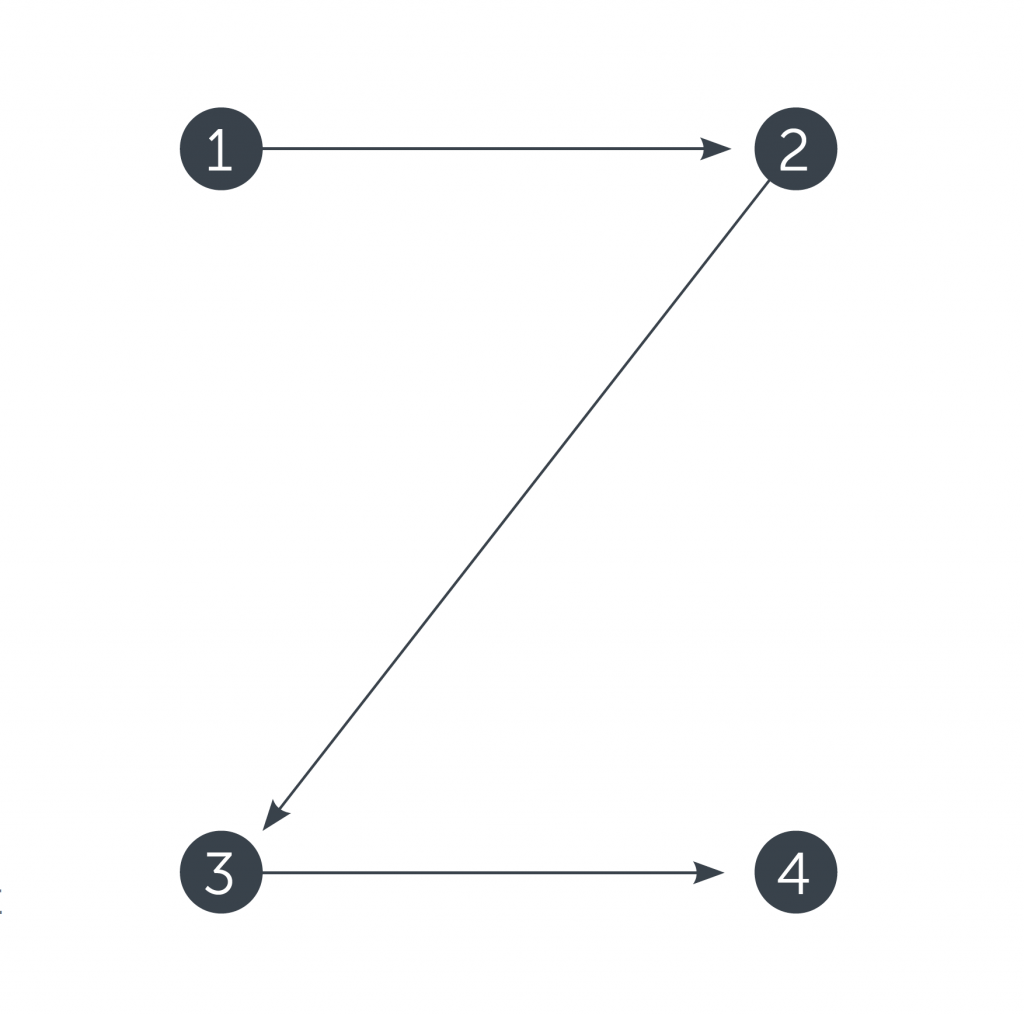
Z-Pattern is quite typical for the web pages with the uniform presentation of information and weak visual hierarchy.
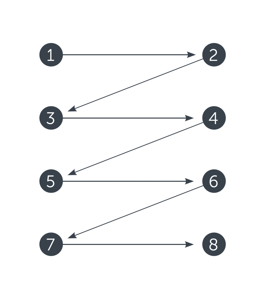
Zig-zag pattern is typical for pages with visually divided content blocks.
![]()
F-pattern natural for pages with the massive presence of copy content
Scannability of web pages is enhanced with a visual hierarchy that enables designers to show the content in terms of its priority and navigates the user from the core zones to the secondary ones. Scannability is one of the parameters to be carefully tested all the time as it has a great impact on the usability of the page and its problem-solving potential.
Remember that patterns are user’s friends
Every creative person feels the urge to apply original and unique solutions and think out-of-the-box all the time. However, make sure not to go too far on that way. Remember that the website is made not for creative contests or galleries of fame but for real users. As we mentioned in the post about social networks design, the power of habit in terms of user experience can be stronger than the wish of revolution. Surely, the dose of a wow-effect is needed, but not so much to knock down the user. On the home page, too much of the design revolution might confuse and scare: if the first page is so hard to understand, a user thinks, what’s going to be next? Study the habits of interaction and typical products for that particular target audience to make their habits their power. Strive for the balance between innovation and traditions.
Make the search field easily accessible
As we said above, search means much, especially for the users coming to the resource with a clear understanding of what they want. A/B testing can support the analysis of its most productive placement on the page layout. It can be a small search field, an icon in the header, or the long horizontal field across the page as we have here in Tubik Blog. The main thing is to make it noticeable and clear so that users didn’t waste their time.
Use different menus and interaction zones
As home pages can provide a variety of links, tabs, fields, and buttons, they should be grouped in different menus and zones instead of being given as the list of links. For example, a double menu in the header can present two layers of navigation. We have shown the example of such a trick in the case study for a bakery website design. The website uses a sticky header that has two levels of navigation. The upper menu shows the links to social networks, the logo, search, shopping cart, and hamburger button hiding the extended menu. The second line of navigation gives an instant connection to the core interaction areas: product catalog, locations for the point-of-sales, news and special offers, information about the service, and contact section. Visual and typographic hierarchy makes all the elements clear and easily scanned providing solid ground for quick interaction right from the home page.
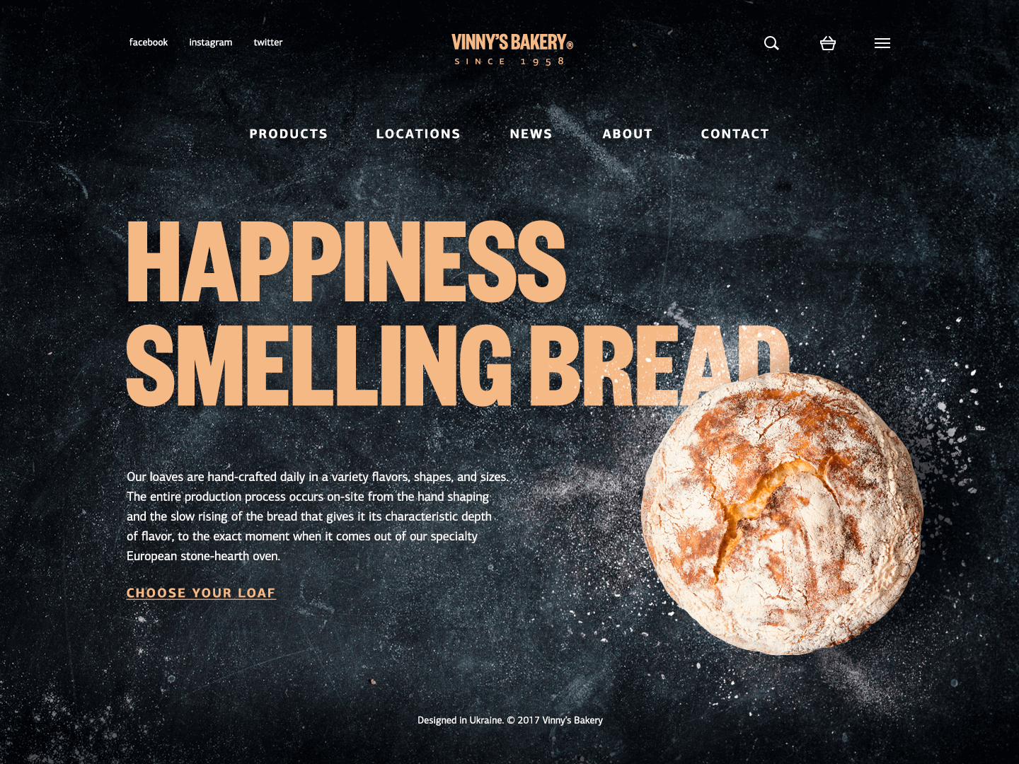
Vinny’s Bakery website design
Make the home page accessible from any point of the website
Home is usually the foundation of the website structure. So, users need to have a chance to get back home from any page they are on. Check it when all the pages are designed not to miss this obvious still vital interaction.
Don’t direct all the outer traffic to the home page
For simple one-page websites, this question is not actual: indeed, they represent only a home page that satisfies one or multiple functions and there is no other place where the traffic could be directed from the outer sources. The same happens if the website is not complex, home is not overloaded with diverse links and navigation elements, so conversion can be reached right from it while other pages play secondary roles. In this case directing all the traffic to the most informative part of the site, which also enables a user to accomplish the necessary action and get what they need, is a good idea.
However, for complex websites and platforms, especially if they satisfy the multiple needs of a broad target audience, this approach can be the step in killing profitability and reducing conversion rates. The user can get scared, distracted, or even annoyed with the amount of information they have to get through to find what they need, especially if focused on a particular narrow goal. Using landing pages in the case when you need to concentrate the user’s attention on something specific can be an efficient way of solving this problem. A landing page is focused on one item, to make it quickly found and reduce delays when the target user seeks specific operations, services, or items. This is an issue of especially high importance in the case of e-commerce websites when unwise design solutions bring poor user experience and financial losses.
Appearance
The third set of tips is concentrated on the page looks. No doubt, the recommendations are applicable for any kind of webpage, still, on the home page, they tend to be more influential.
Be stringent in color choice
Color is the power that can either strengthen or ruin other design decisions. Choosing the color palette, remember that colors influence user perception. Studying color psychology is helpful to make choices that transfer the right message. Attention to traditional color theory will help to find the color combinations that will look elegant and harmonic. One more popular issue is choosing between light or dark background: the solution is mostly based on the type of content the website presents. Text-based websites usually use light and airy interfaces while visual-based ones can apply a dark background to make the images look deeper and more stylish.
Apply recognizable visual prompts and associations
Being full of data, home pages usually include a variety of icons and illustrations. Choosing them, always test their recognizability and check if they build right associations. If there is a risk of double meaning or culture differences of the target audience, supporting the icons or illustrations with a short copy might be helpful.
Mind the typography issues and readability
Choice of fonts and their combination determine not only style but also the readability of the home page. Even more, fonts, as well as colors, are also powerful in forming the mood of the page, from entertaining to business-like. So take your time to test various combinations and find the one which corresponds to the nature of the website as well as other design elements.
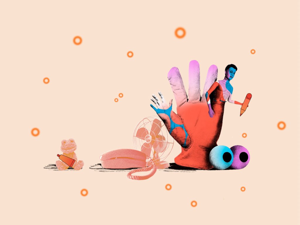
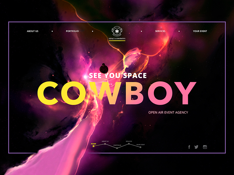
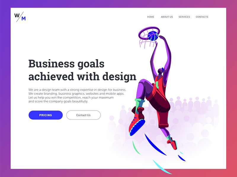
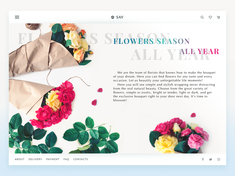
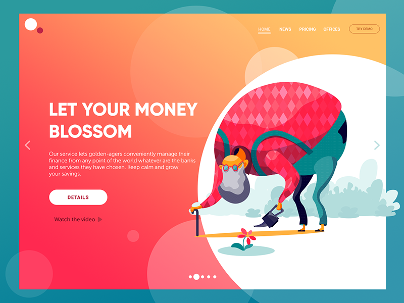
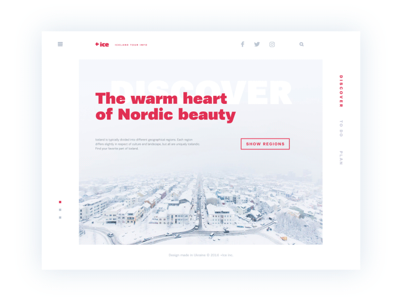
Strengthen the page with a prominent visual
Most users are visually driven and perceive messages given in images faster than words. That is why applying custom theme illustrations, high-quality photos or hero banners is a profitable step for a home page. The image of that kind will work as a quick hook catching users’ attention and transferring the necessary idea. However, overloading the home page with images will make none of them effective.
Think about motion and video
Another way to support interesting experiences on the home page is by applying videos and animations. On the one hand, motion breathes life into the page, makes it more dynamic and lively, always draws attention. On the other hand, it can increase the loading time. Moreover, too much animation annoys users. So, the motion should be added in an unobtrusive way and thoroughly check in terms of its effect on the page functionality.
Test the loading speed
Whatever brilliant, stylish and breathtaking the page is designed, whatever cool and intuitive is navigation and information architecture – all those things won’t work if users have to wait while it’s loading. For the home page filled with various data, too long time of loading means losing the part of the target audience. So, check the speed, optimize the images, make sure video and animation loads up correctly. Caring about this aspect, you respect your users’ time and effort and lay the ground for a positive user experience.
Obviously, not all the list of mentioned tips is actual for every single project: approaches can differ as well as the audience and goals of the created websites. Yet, it may become a helpful checklist for web designers striving for home page usability.
Useful Articles
Small Elements, Big Impact: Types and Functions of UI Icons
How to Design Effective Search in User Interfaces
Best Practices for Website Header Design
Take My Money: UX Practices on Product Page Design
Directional Cues in User Interfaces
Home Sweet Home. Strategies of Home Page Design
9 Effective Tips on Visual Hierarchy
Color Matters. 6 Tips on Choosing UI Colors