One of the key design trends of this year is the diversity of digital illustration. We come across original artworks on websites and landing pages; they effectively support blog articles, product presentations, events, and video production. For the recent year, we’ve created a big bunch of illustrations for not only our clients but also studio projects, Tubik Blog, Dribbble and Behance portfolios, etc. No wonder, among the variety of themes, designers and design process were the central ones. So, in our today’s post, we’ve collected the digital artworks by our graphic designers Yaroslava Yatsuba, Arthur Avakyan, and Marina Solomennikova to share with you bright, catchy, and sometimes cute metaphors, characters, and environments reflecting different sides of the creative process.
Get inspired and catch the vibe!
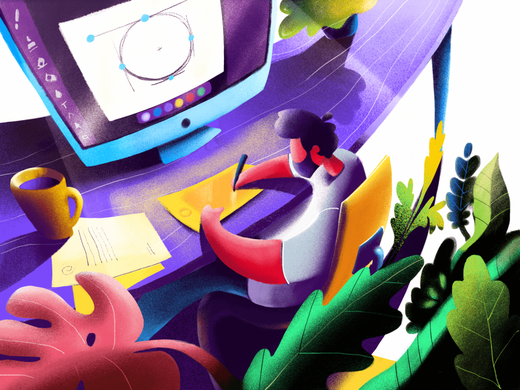
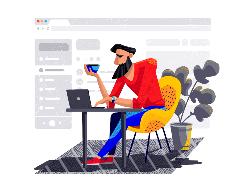
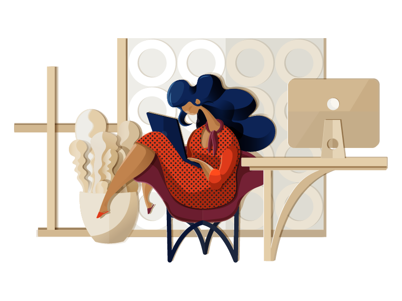
This illustration was designed as a title image to the article telling about the variety of visual content in web design. It is based on the literal method: it reflects a quickly-recognized workspace of a designer with details such as a computer with a graphic sketch on the monitor and a graphics tablet used right at the scene. To make the artwork catchy, the designer uses a bright and rich color palette and adds cozy vibes to the image with interior details, shadows, and textures.
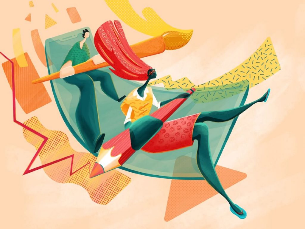
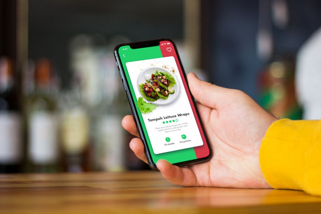
This artwork is devoted to the theme of applying illustrations to user interfaces. The composition is dynamic, proportions are thoughtfully broken to make the image even more artistic. The palette is also quite emotional itself, using a lot of warm colors. The illustration harmonically combines the worlds of digital and traditional art, featuring pencils and brush in the characters’ hand together with a mobile device transferred into aircraft.
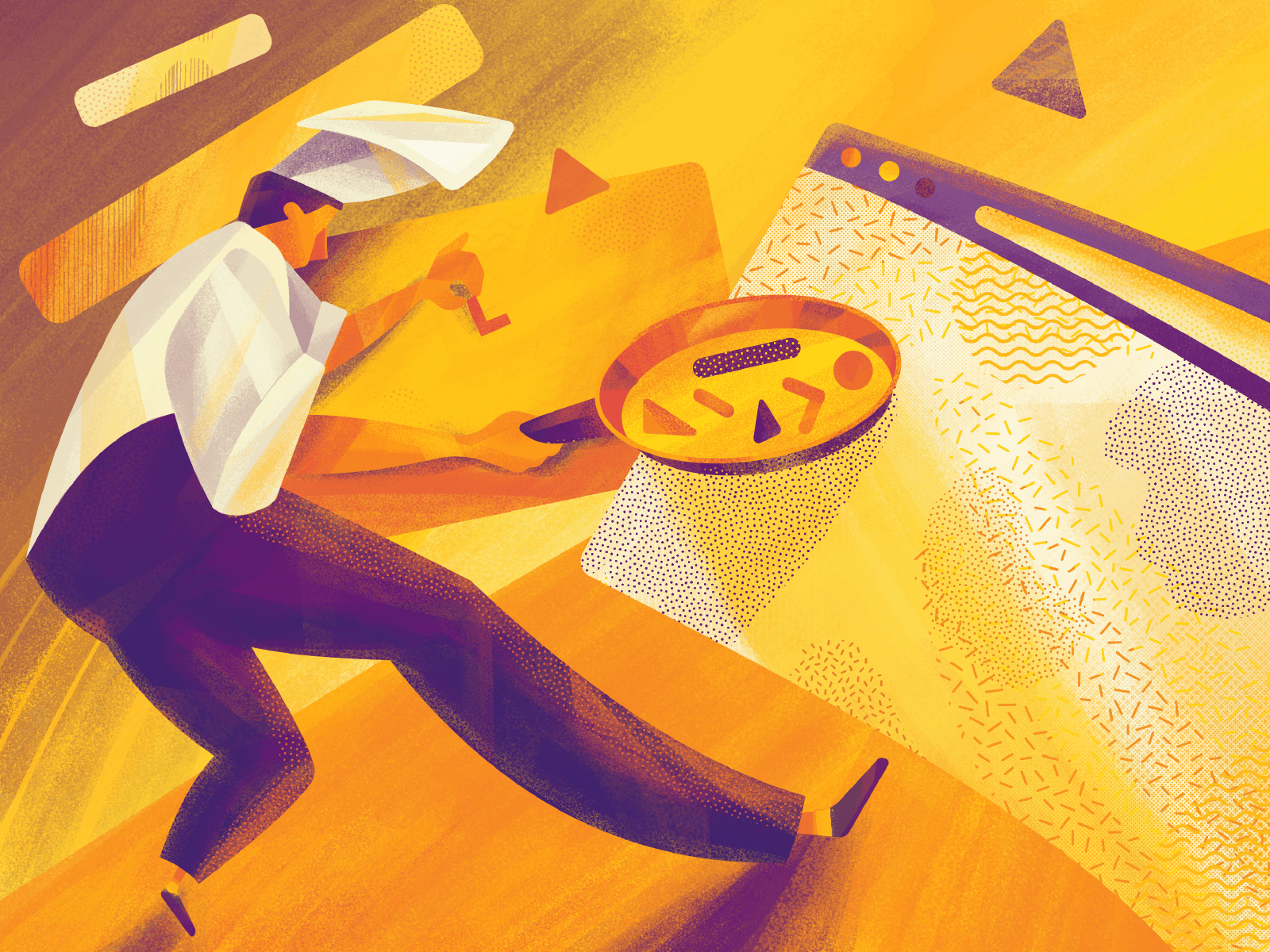
Although the process of UI design often reminds cooking cool stuff of different ingredients, we bet nobody wants their website or app rare or medium. No way. Only well-done! That’s what our fresh and tasty illustration is about. This illustration is based on the allegorical method projecting the design process in a totally different area of human activity.
![]()
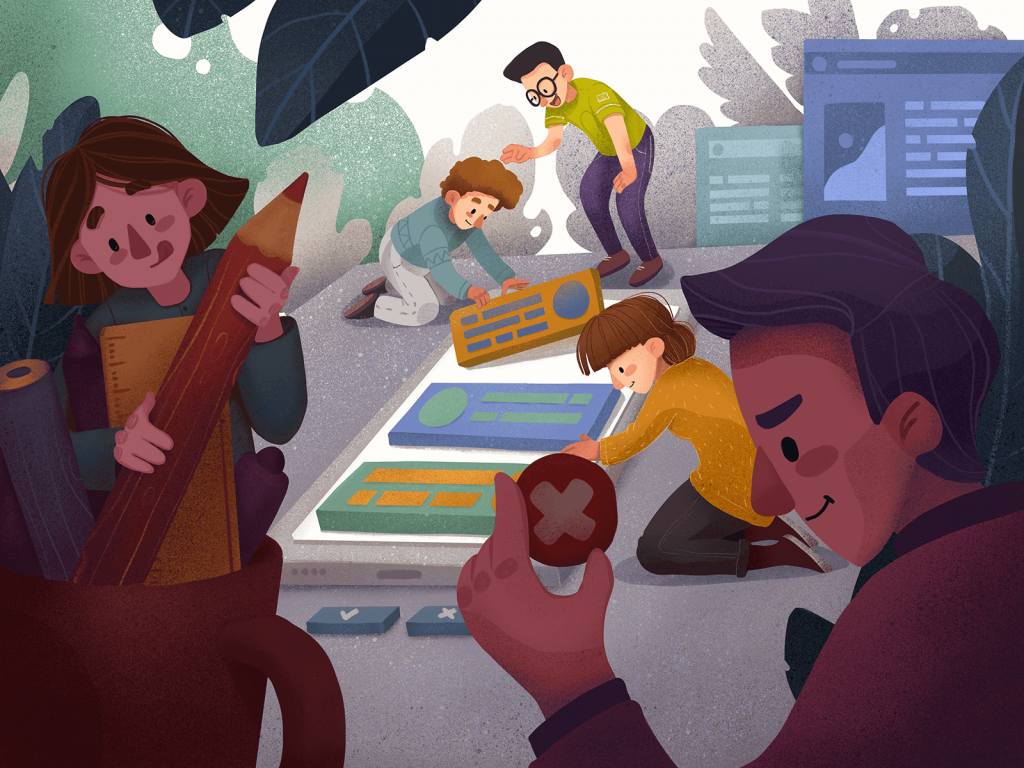
They are small and sometimes we don’t even notice them. Meanwhile, icons are the superpower of the usability: designed well, they make the app or website navigation intuitive. That’s why designers invest so much time and creativity into icons design – and that’s what inspired this illustration. It applies the combination method: characters interact with exaggerated images of icons.
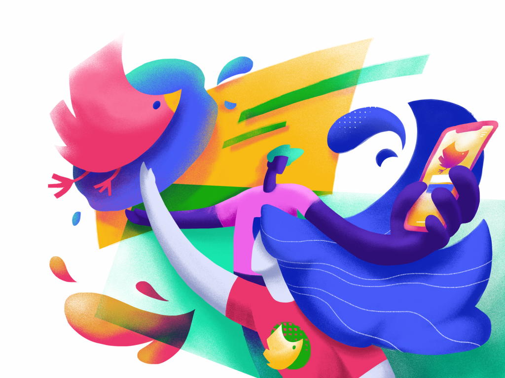
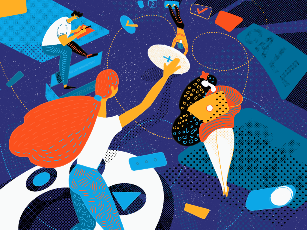
In branding for products, services, and companies, we often come across mascots, personified characters that support the memorability and communication of the brand with users or customers. This illustration presents the whirlpool of mascot power for the article devoted to this theme. The detail symbolizing a bird mascot is featured as a logo on a website header, an image on a splash screen and a graphic element on the branded T-shirt.
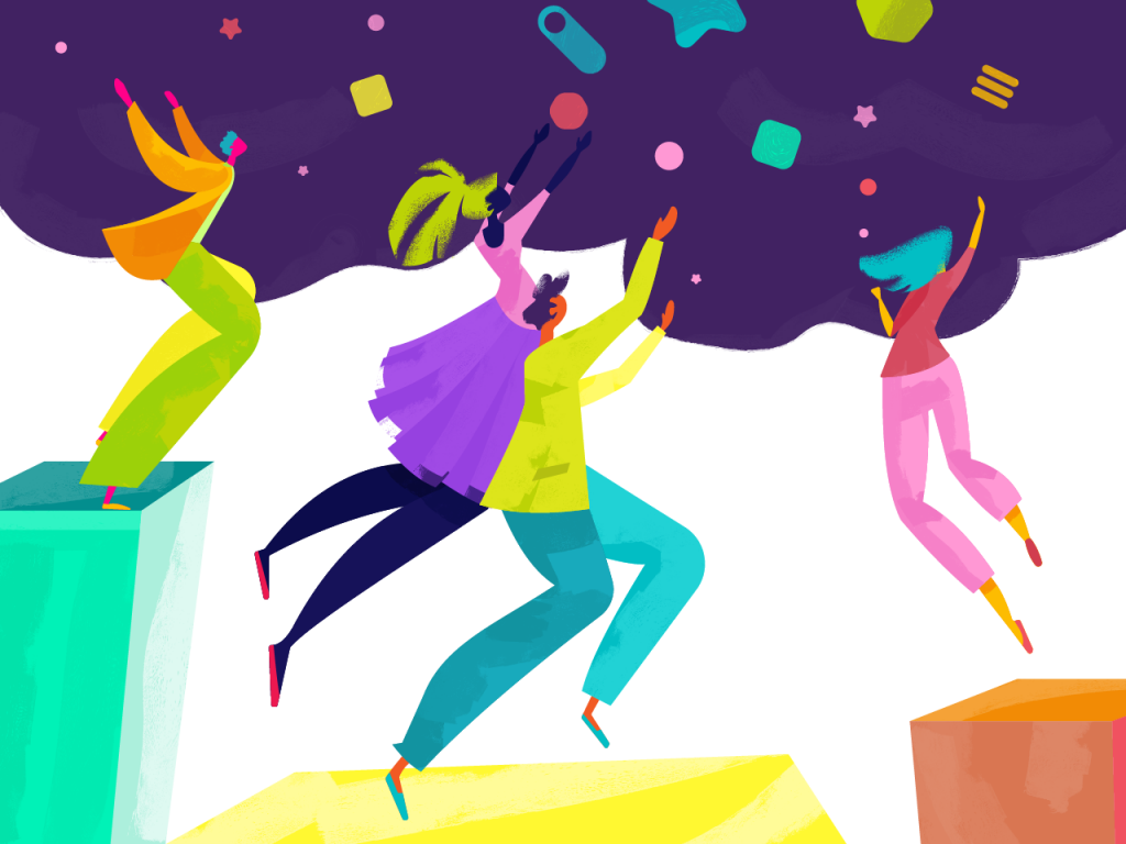
Alone we can do so little; together we can do so much. This illustration for an upcoming blog article is all about the power of teamwork which is a solid foundation for big projects. The designer creates the depth of composition with a distant lighter part and darker elements of the foreground. It uses a bit cartoonish style to set the atmosphere of pure creativity which is typical for children that know no limits.
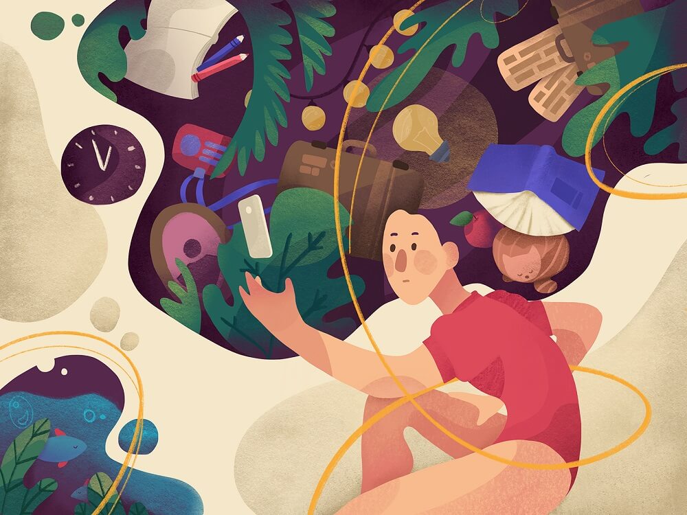
Working as a designer, you sometimes feel like diving deep into psychology to understand users. How do they think? What catches their attention? What are their heads full of? That’s what this illustration reflects. The composition is not too dynamic allowing the viewer to examine all the details. The color contrast of backgrounds creates the feeling of outer and inner worlds of the character, and thin yellow curve lines support their integrity.
In the given illustration for the article about UI animation, the smartphone plays the role of a curtain wall like the one used in a puppet theatre and designers imitate actors, each showing a specific model of motion performance. Here we can see a group composition where all the characters are equally important. Textures are drawn by hand and palette is based on a rich color of the background to draw a user’s eye to the center.
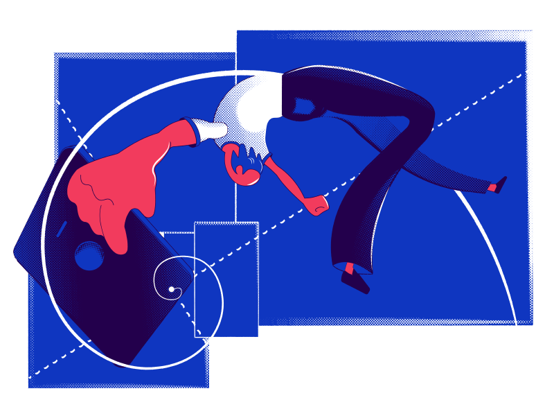
This experimental illustration was created for the article devoted to the theme of negative space in UI design. Unlike most of the artworks in today’s collection, this one exploits a limited palette of bold and contrastive colors. Broken proportions and composition, creative usage of negative space and unexpected combination of elements – all that stuff resulted in an attractive and a bit mysterious illustration showing how much can be found beyond the empty spaces.
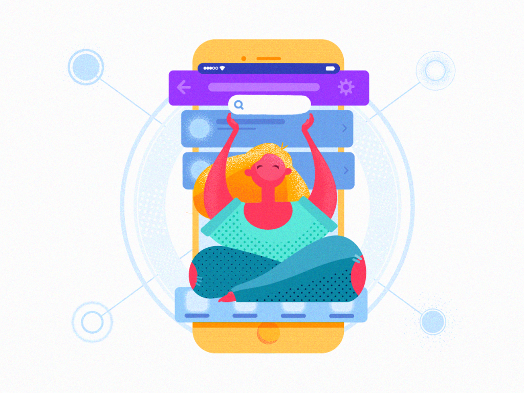
Creating clear and intuitive navigation of a website or mobile app is one of the biggest design challenges. This illustration presents the topic of interface navigation as a process that needs balance and thoughtfulness. So, the metaphor is transferred with a character in a sort of zen yoga pose on the foreground and a mobile interface image as a frame. Light background supports the feeling of balance and serenity while textures make the image soft and eye-pleasing.
One more example of a literal approach is the illustration for an article Gestalt Principles in UI: Principle of Proximity. Simple static composition catches attention with textures and bright color accents. The atmosphere of the design process is supported by a faded but clear background image featuring a user interface.
On the way to a user-friendly app or website, it’s so easy to get caught up in the whirlpool of variants, elements, or options. To transfer this feeling in the illustration, the designer made the composition dynamic and used a catchy color palette. The picture also presented the article about UI design trends.
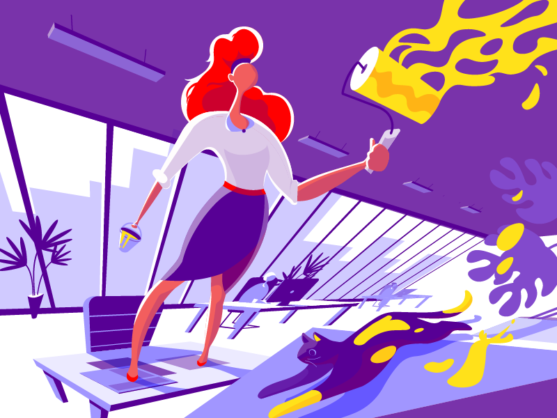
The illustration created for the article 3C of Interface Design: Color, Contrast, Content is another example of allegorical illustration integrating the attributes of different spheres into metaphors about the design process. In it, the keyword “Color” was chosen as a core semantic element and is reflected literally with the process of coloring something with paint. The contrast is reflected in the color palette of the artwork while the content is shown with the elements of the furniture in the office shown in the picture. The cat becomes a bright detail which adds dynamics and humor to the scene.
This illustration is about those for whom design never stops and feels like home where life is bright and elegant. Playing with textures and layers, the designer creates the feeling of the application cut out of paper which has become one of the trends in graphic design this year. The artwork also served as a title image for the article on home page design strategies.
It’s often thought that design is far from science. Yet, practice shows that logic, balance, and precision are vital in creating effective user interfaces for web and mobile. This illustration presented a post devoted to Golden Ratio in UI Design. It features dynamic composition strengthened with a variety of geometric shapes and curves.
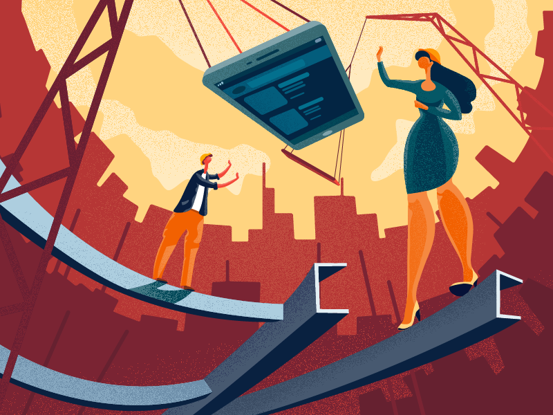
The creative process for web and mobile UI design can be compared with rising a new building: you need to consider tons of factors, think over functionality, structure and “facade” and step-by-step make it live from digital bricks and mortar. That is the metaphor behind the illustration. A background featuring silhouettes of city buildings is based on a catchy contrast and all the composition makes a mobile device the center of attention.
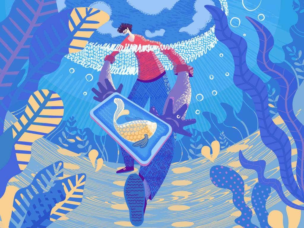
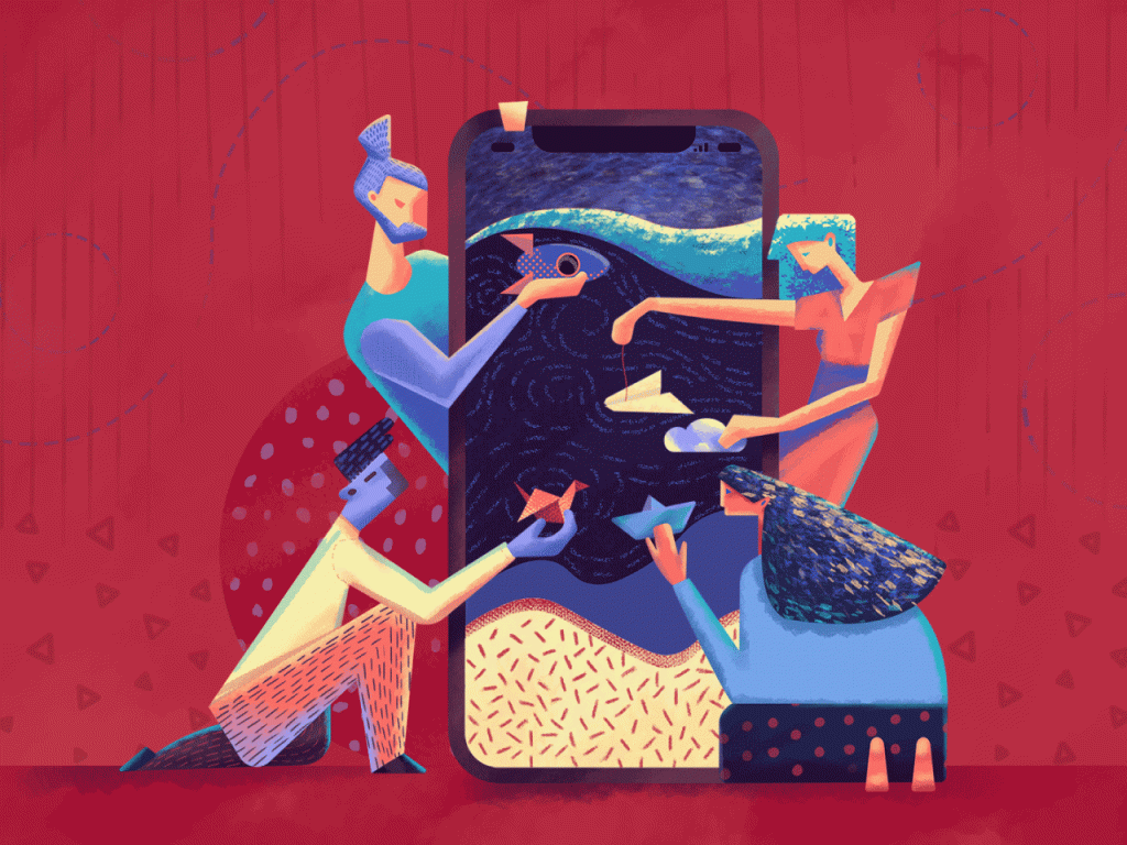
One of the crucial challenges for graphic designers is finding the original style. The artwork was made as a title image for an article on flat illustration that shared practical tips on how to catch this golden fish, so the same metaphor was applied to the main visual.
This digital illustration presented a post with color glossary for designers to share the basic terminology. The character and bright exaggerated splashes of paint immediately set the theme building the bridge between digital and traditional art, and dark background creates pleasant contrast, making the colors even more vivid and deep.
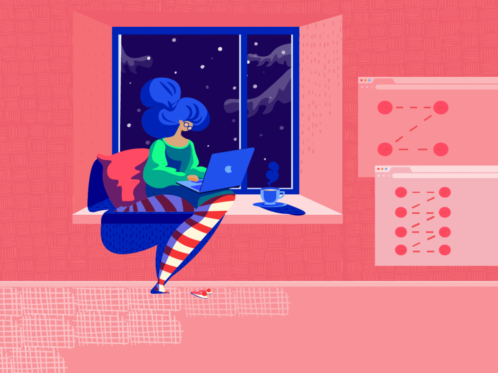
This bright picture is a title image of an article exploring the ways to improve website scannability. The designer took the time to find the cool palette which will look original and create positive emotional feedback. The details of interior and character’s outfit create a cozy homey atmosphere, as it what users feel on well-crafted and easy-to-use websites. And schematic website layouts on the wall of the room set the instant connection with the theme of web design and usability.
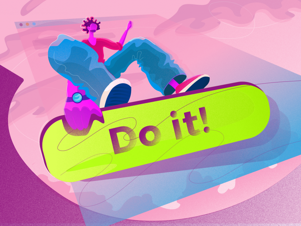
This is a metaphoric illustration devoted to the theme of CTA buttons design in UI. Its plot is based around a character of surfer that reflects the idea of confidence and determination. The designer uses an unusual perspective and this way makes the composition original and attractive.
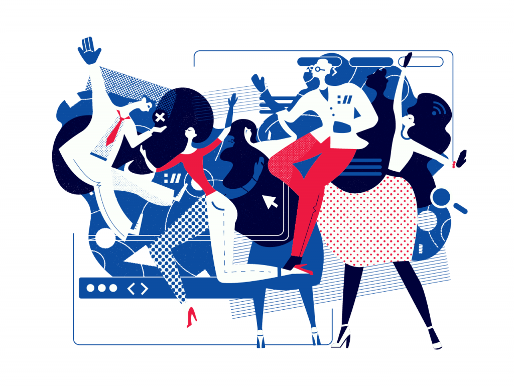
A title illustration for a big review of interactive elements in user interfaces echoes the title of the article that calls them “small stars of big design”. The illustration applies vivid colors and splits the composition with bold color contrast made by the sky part.
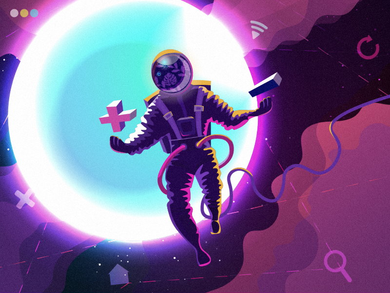
Designers have to make so many decisions and choices that it sometimes seems design is an endless universe. That metaphor inspired the illustration applied as a title image for the blog article about using light and dark background in UI design: with the contrast of plus and minus as well as light and dark it quickly sets the atmosphere of choice.
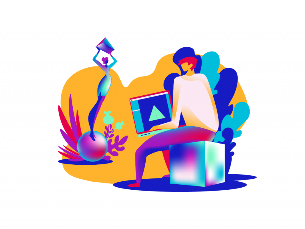
One more creative experiment resulted in the title illustration for the post about the psychology of shapes in design. It is inspired by a famous artwork by Pablo Picasso but features a laptop with a graphic editor software as an attribute of modern art instead of canvas. The gradients and color combinations make the connection with modern times and trends even stronger.
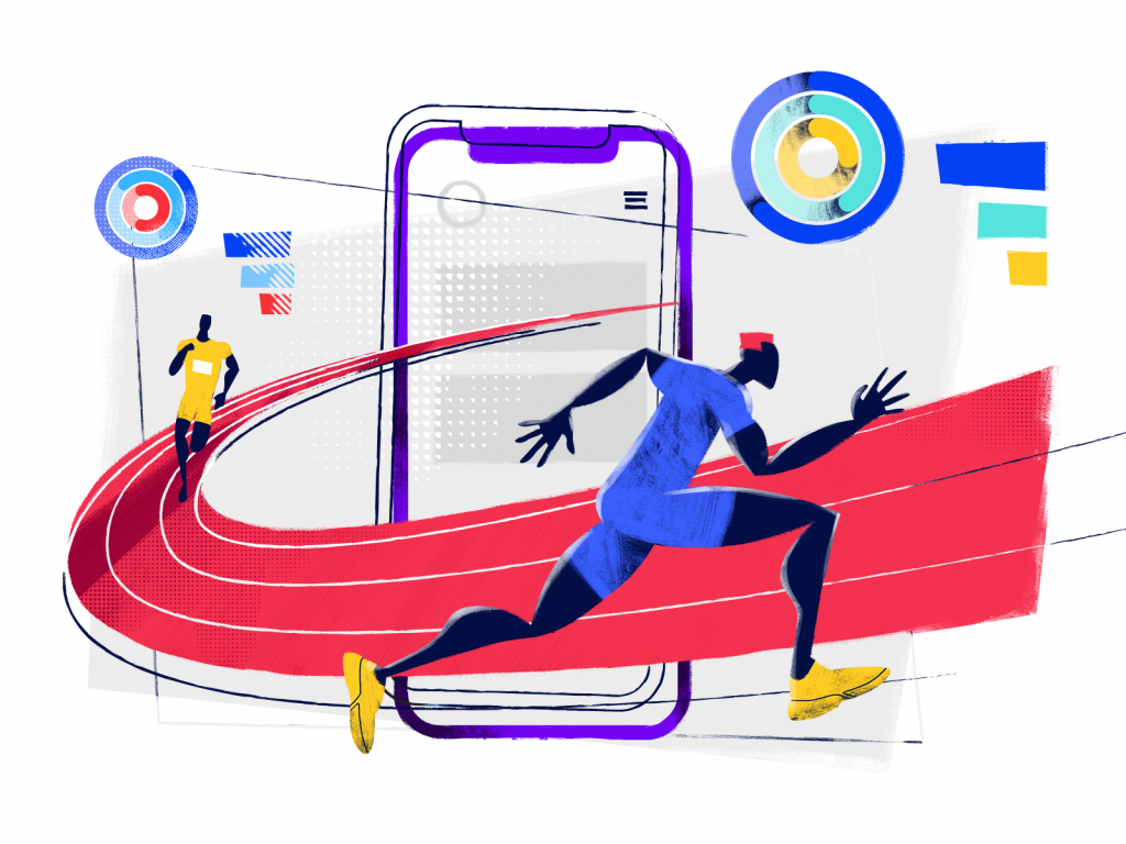
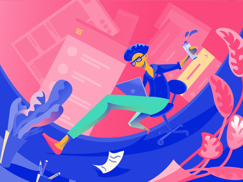
The process of mobile app creation sometimes reminds the big race consisting of sprints, targets, and anticipation of the finish line of the app release on the horizon. This metaphor inspired this illustration, combining UI design and sports dynamics.
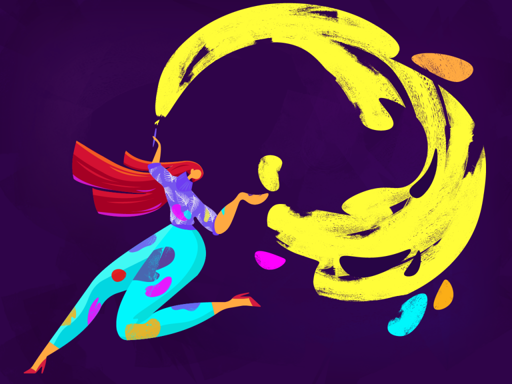
The dynamic composition of this digital illustration is developed around the spiral. Original looks are achieved with an interesting combination of details and textures. It was designed as a title image to the tutorial telling how to create illustrations for an IT blog or website.
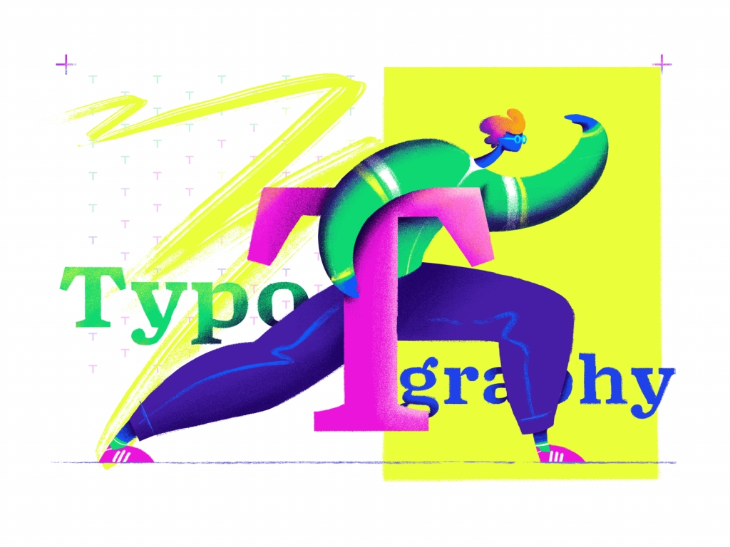
Have you ever felt lost in the variety of cool fonts to select just one or two for your design project? Seems, every UI designer knows that pain. Typography is a cool but challenging game – that’s what inspired our new illustration for an upcoming post in Tubik Blog.
Useful Reading
Here are some handy articles and case studies to continue plunging into the theme of design and graphics for user experience.
Functional Art: 10 Big Reasons to Apply Illustrations in UI Design
How to Create Original Flat Illustrations: Designer’s Tips
Web Design: 5 Basic Types of Images for Web Content
Design Process: How to Create Illustrations for IT Blog or Landing Page
Real Racing. Graphic Design for Mobile Game
Winter Olympics Illustration. Step-by-Step Process
Many Faces of Graphic Design: What Do Graphic Designers Do?
Case Study: Tubik in Paris. Design Process for Narrative Illustration
All the illustrations belong to Tubik and cannot be used without permission or link to the original resource