In one of our previous case studies, we have told you about a logo that Tubik Studio designed for Saily App. To continue this bright design story, today we are going to get you to some backstage of UI redesign for Saily App.
Task
Redesign of UI for the mobile application for local user-to-user e-commerce.
Tools
Sketch, Adobe After Effects, Adobe Illustrator
Process
User Interface
To remind those who might have missed our previous case study, Saily is a local community app allowing neighbors to buy and sell their used stuff. Although it is a sort of e-commerce app, it includes a strong feature of communication between users. One of the essential accents brought out by the Saily App team puts a deep focus on design and culture at the core of everything they do. User interface redesign of the app, accomplished by Tubik Studio designer Tamara, according to the client’s vision of the product needed to have a fun and entertaining feel and look. Bearing it in mind and setting the task to make the product trendy, clear and easy-to-use, the designer created the new image for Saily App, which presented a new visual concept and featured new functional points the clients wanted to add to the user experience.
Tubik Studio designer Tamara working on Saily App screens
In the process of research and analysis of the existing general concept of layout and transitions, the designer concentrated on UI solution which put bright accents at the most important features and provided fast and easy microinteractions. E-commerce is the process that a user needs to feel as clear and fast; in addition, the features should be informative and easily recognizable for a quite diverse target audience.
So, UI design points that must be thought out were the following:
- easily understandable layout and navigation
- recognizable icons
- graphic elements not creating an unnecessary distraction from the main points
- the process of inputting the data about the item as simple and user-friendly as possible
- interface elements showing data about the item not looking overloaded but containing all the necessary information
- efficient communication available from any point of the application
- funny and entertaining graphic elements all harmoniously supporting the same style concept and preferably original to create additional recognizability for the app.
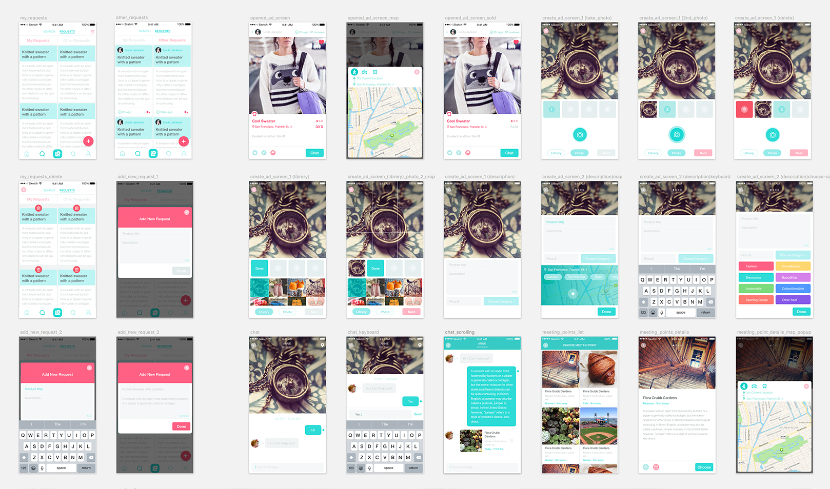
The general stylistic concept, which was chosen to support the idea of funny and uptown interface which should at the same time be informative and useful, moved around the light background and a lot of bright accents in navigation and notification elements of the interface. As it’s easy to see from the grand-list above, due to this decision the screens get a lot of air and light background promotes good readability which is essential in the case of e-commerce app. Moreover, light background gives an efficient field of presentation for any kind of item brought out to sales.
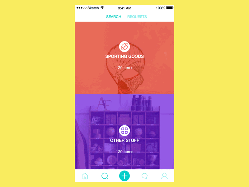
The search followed two directions: actually the search of the actual items and search along the requests that were made by other users. In requests, users left the information about the wished item. Also, the user could save the history of own requests. Requests made by users gave an additional channel of easy matching sellers and buyers letting them know what is actually on-demand at the time. Moreover, requests could be filtered by location and make the process of matching the buyer and the desired item even more efficient. Search field was hidden in the process of reviewing the content not to distract the user and open more space.
One of the decisions made to add some interesting visual features was the colorful highlighting of the content photos to make them look interesting and attract the user’s attention. Colors were used to visually support navigation via color-coding creating conventions and increasing the level of usability. Categories in the navigation were represented with background photos and original icons.
![]()
All the icons for the app were unique and customized so that they could create the harmony of visual perception with all the other graphic elements and at the same time add to the general originality of the visual design of the screens.
Tab bar included the basic navigation items enabling the user to activate feed, search, communication features and add a new item or request.
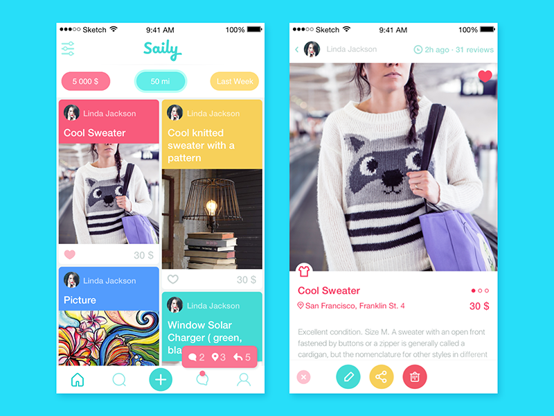
All the items, as you can see, were organized along the cards. The card of the item showed all the necessary information about the thing for sale and enabled the potential buyer to connect with the seller at once. To visually present the item, which users wanted to sell, they could upload and customize one to four photos which the user could add from his/her own device gallery or take a photo right out of the app screen. The sharing function was transferred to the separate screen so that not to overload the card.
One more functional side of the application to mention is the features of chatting and planning. As the app is positioned as a highly social, simple and usable chatting feature was seen among the essentials and organized along the standard and common scheme of native chats without too much experimenting so that even the users without a frequent experience of communication via digital channels could feel comfortable with this chat.
Planning functionality was realized via “meetings” feature which enabled a user to fix the time and day of meeting with the seller/buyer in the app calendar and see this information at the card of the item. In the “meetings” mode the image of the item got smaller and moved to the field of the item description while the bigger image featured the image of the meeting place and data.
So, the user’s feed could switch in three different modes and show the chats, meetings, and requests. In the own card of the item, the seller could also change the different status of the item to inform the users who could potentially get interested in it. Also, the application enabled the user to add some items to favorites not to lose their trace in the great bulk of items.
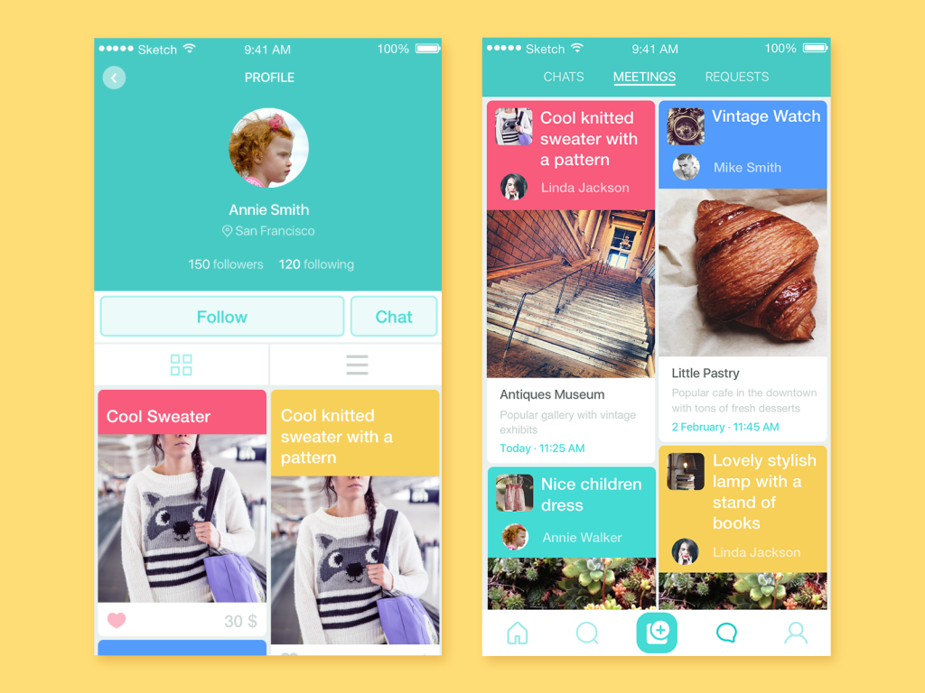
The user’s profile showed basic information like name, location, followers/following and also activation of the chatting function as one of the basics. The preview of the item card included the photo, main description with the category color code, the price and ability to add it to favorites right from the preview.
All UI solutions obtained via numerous discussions and iterations turned around the high level of usability and efficiency which should be supported with all the visual elements available on the screen.
Illustrations
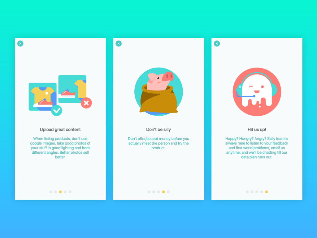
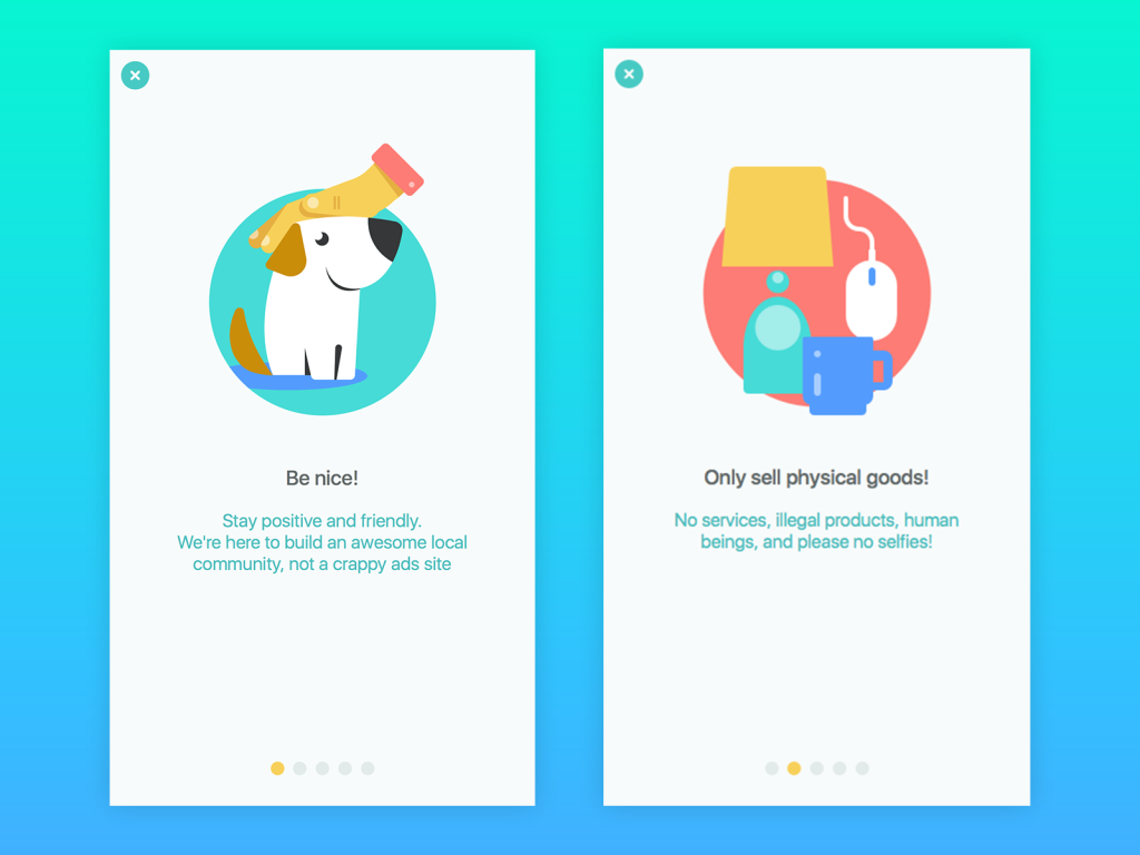
In the previous case study, we have mentioned the Saily brand mascot which is a funny little ghost having its own legend. Logo created for the brand by Tubik Studio designer Arthur Avakyan was just the start of the branding process which continued with the next step of branding in UI design.
![]()
The mascot, as well as the other funny and user-friendly characters, were used in numerous funny illustrations which presenting a sort of entertaining element at the same time became the tool of informing the user about the issues or problems demanding attention.
Also, the team of UI designer Tamara, illustrator Arthur and motion designer Kirill created several animations that livened up the screens, supported general cool style and at the same time had the functions of informing the user about the state of processes such as pull-to-refresh animations or loaders.
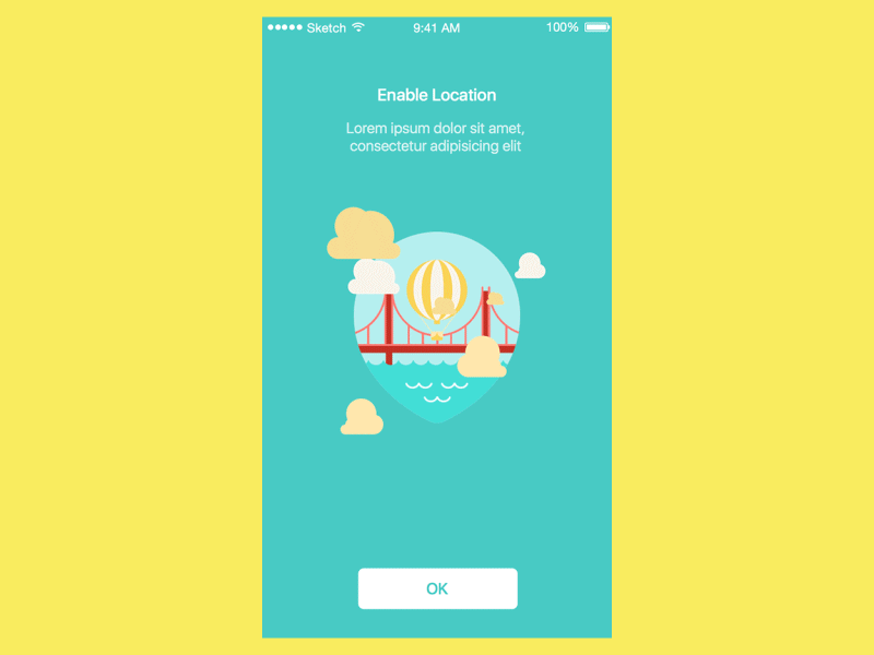
Enable location animated screen
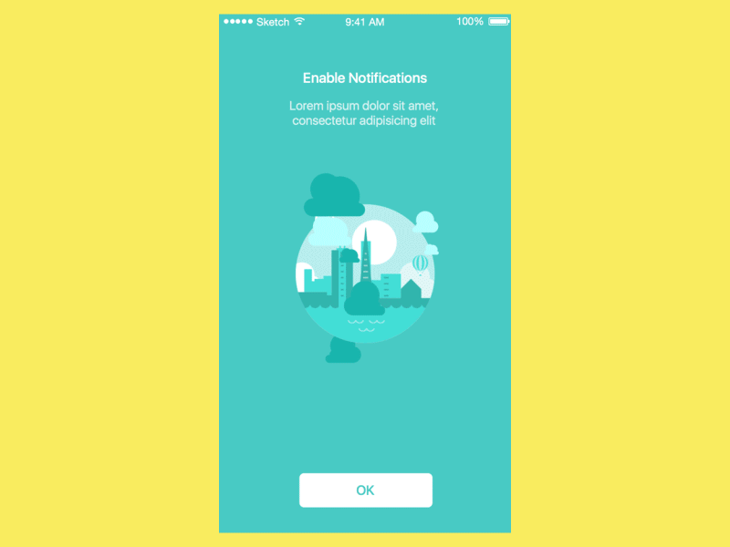
Enable notification animated screen

Pull down to refresh animation
Search Screen Animation
So, the Saily App project became a great and bright challenge for designers to make a trendy, funny and attractive but highly efficient and informative application with user interface aimed at the wide and diverse target audience and having a strong element of socialization.
Useful Case Studies
If you are interested to see more practical case studies with creative flows for mobile UI design, here is the set of them from Tubik.
Nature Encyclopedia. UI Design for Education
Inspora. Brand and UI Design for Virtual Stylist
Bitex. UX Design for Stock Analysis App
Slumber. Mobile UI Design for Healthy Sleeping
Real Racing. UX and UI Design for Mobile Game
Manuva. UI/UX Design for Gym Fitness App
Cuteen. UI/UX Design for Mobile Photo Editor
Tasty Burger. UI Design for Food Ordering App
Watering Tracker. UI Design for Home Needs
Upper App. UI Design for To-Do List
Welcome to read a case study on Saily Logo Design