The mobile app industry is one of the biggest in the digital market. There is no surprise, since many businesses both small and big aim at creating their own mobile app. A powerful application can help to set connection with potential customers as well as bring new solutions to enhance services.
UI and UX design is vital for app performance. Every year people’s expectations about mobile applications grow. They want a mobile app to be fast and easy to use due to the delightful interaction and navigation systems. Moreover, UI design should be appealing and original so that an app could catch users’ interest, make them stay and discover the functionality. Today, we share a case study showing the creative process of UI and UX design for a fitness app. A designer assigned to this project was Tania Bashkatova.

Task
UI and UX design for a mobile gym fitness app.
Process
The client was the Manuva Group company from South Africa. They made a request to design a new product called Manuva — a mobile application for fitness professionals and gym members. The app was aimed at helping people to find personal trainers in various gyms and book a session without being a member of a particular gym. Users would be able to browse for nearest available trainers, gyms, or group classes via a map or a list sorted by distance and closest start time. Moreover, the app could be useful for fitness instructors as a tool for managing clients. The specific feature of the Manuva app was expected to have an in-app payment for a session.
Manuva Group wanted the design for their app to be dynamic and youthful supported with original user onboarding tutorials. In addition, they asked to pay attention to the navigation so that users could find trainer connections fast and without efforts.
UX Design
When all the requests were considered, the designer went to the stage of wireframing. A wireframe is a simplified and schematic visual representation of a layout for app screens and transitions. It is a fast way to plan the information architecture and ensure that developers and clients get a clear understanding of the project structure. Furthermore, in case the client wants to make some changes, a wireframe is much easier to reshape.
Here are the wireframes created for Manuva app. The designer planned the basic layout including login and home screens.
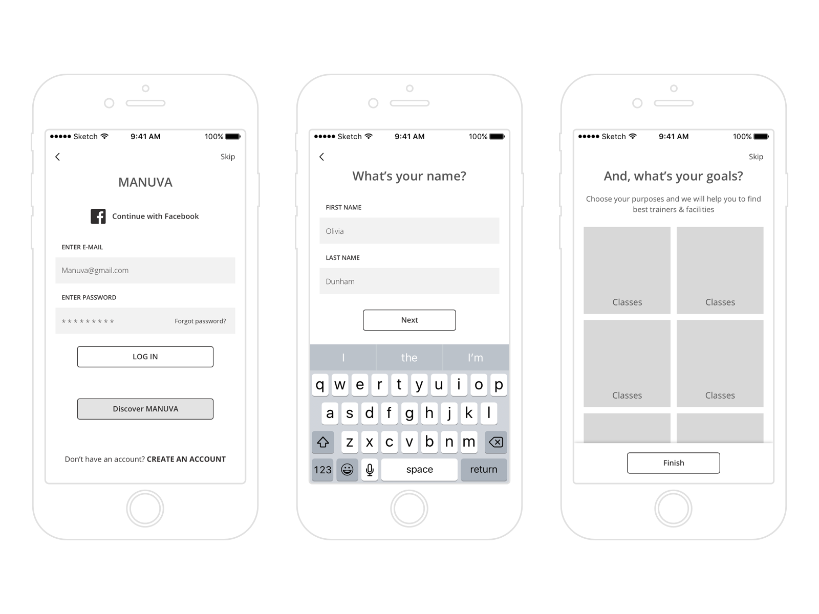
The client asked to include an original feature into a login user interface which would allow users to discover Manuva without registration. That’s why the designer added a button “Discover Manuva” right under the login button providing a choice for users. In addition, to make a profile more personalized the login process also contained a screen where people could choose their goals.
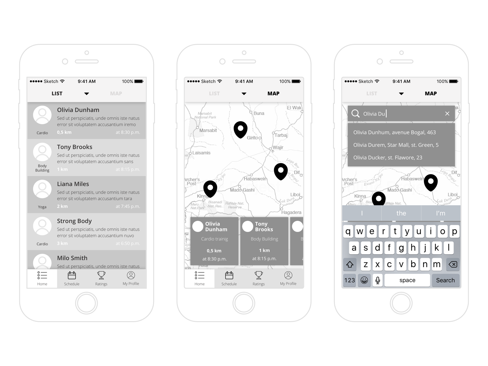
Home screen contained two sections: the list of fitness instructors and the map. This would help users to find trainers conveniently. Also, UI included a tab bar making navigation in the app approachable and clear.
All in all, the wireframing stage helped to outline the visual and typographic hierarchy of the Manuva user interface as well as set the interactive zones and elements and plan transitions and interactions.
UI Design
When the structure was approved, the designer started working on the presentation of the UI elements. One of the tasks was to find an effective color palette for the interface. The thing is that color has a significant influence on our visual perception and the first impression of a product. Inappropriate colors may affect some of the usability aspects such as readability of copy elements and user satisfaction. Moreover, it’s important to consider the preferences of the target audience: people perceive colors differently depending on their age, gender, and culture.
The designer provided the clients with several options so that they could see their app from different perspectives. There were examples with dark and light backgrounds as well as cold and warm color palettes. Let’s see some of the suggested UI concepts.
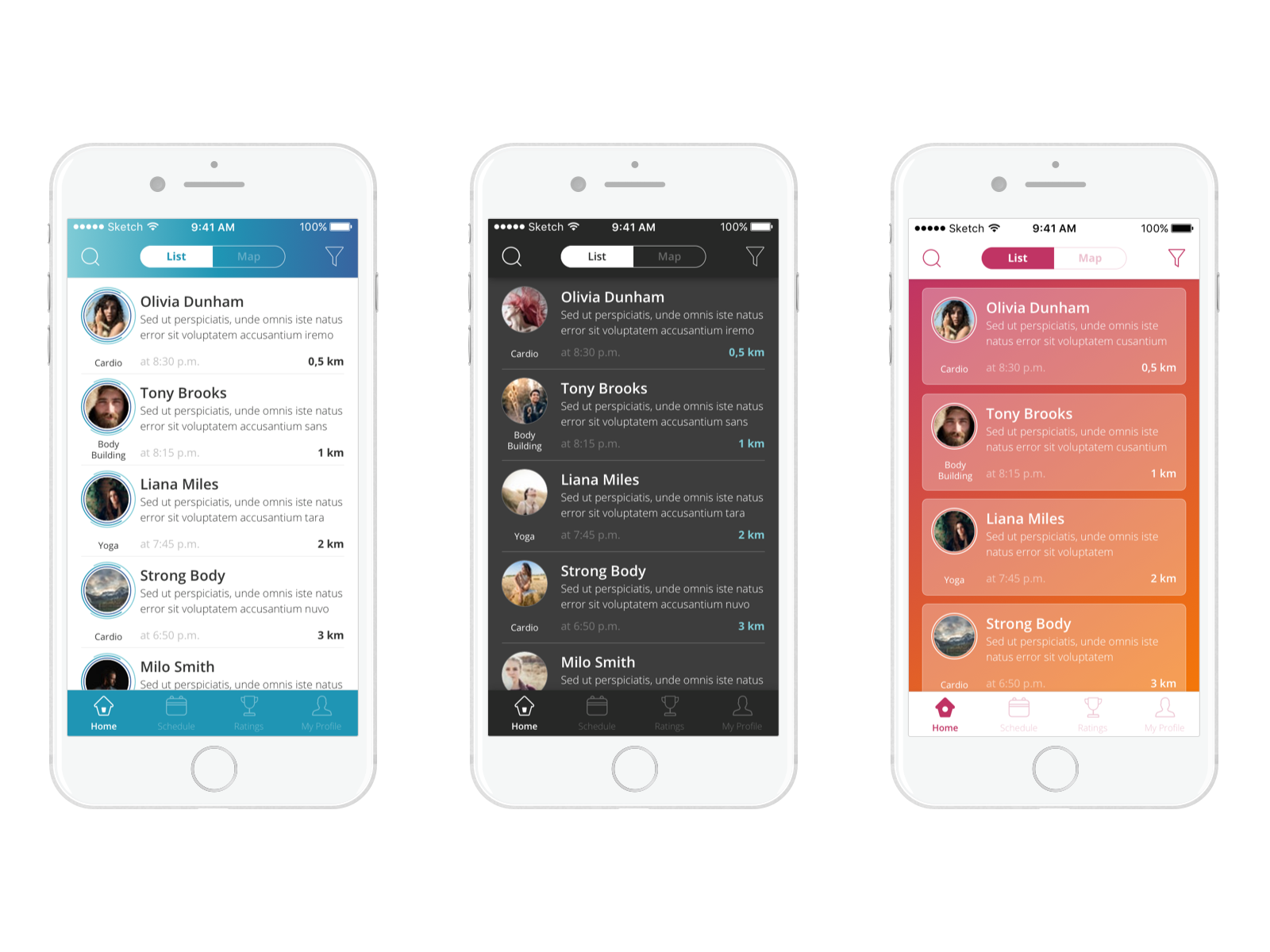
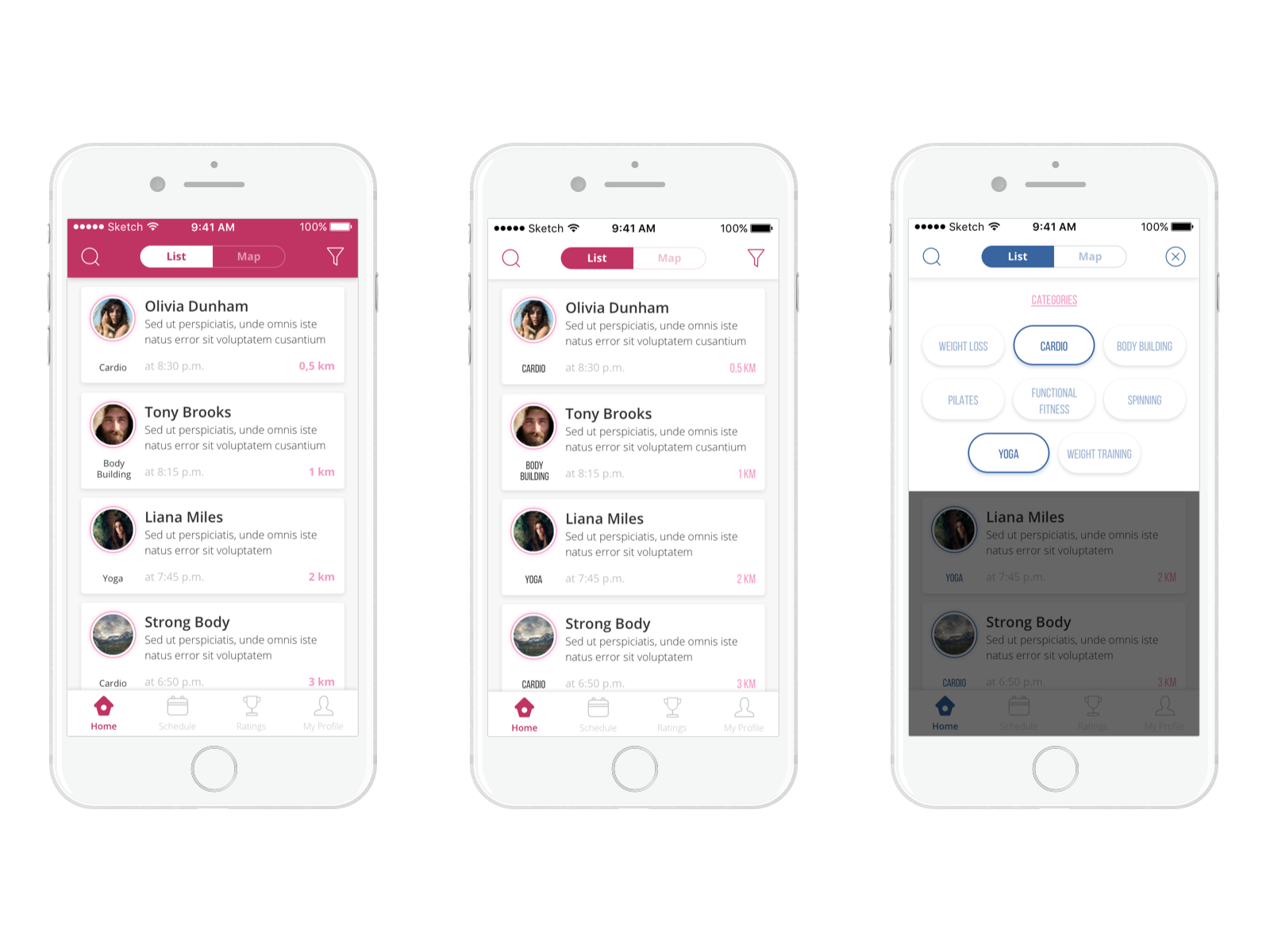
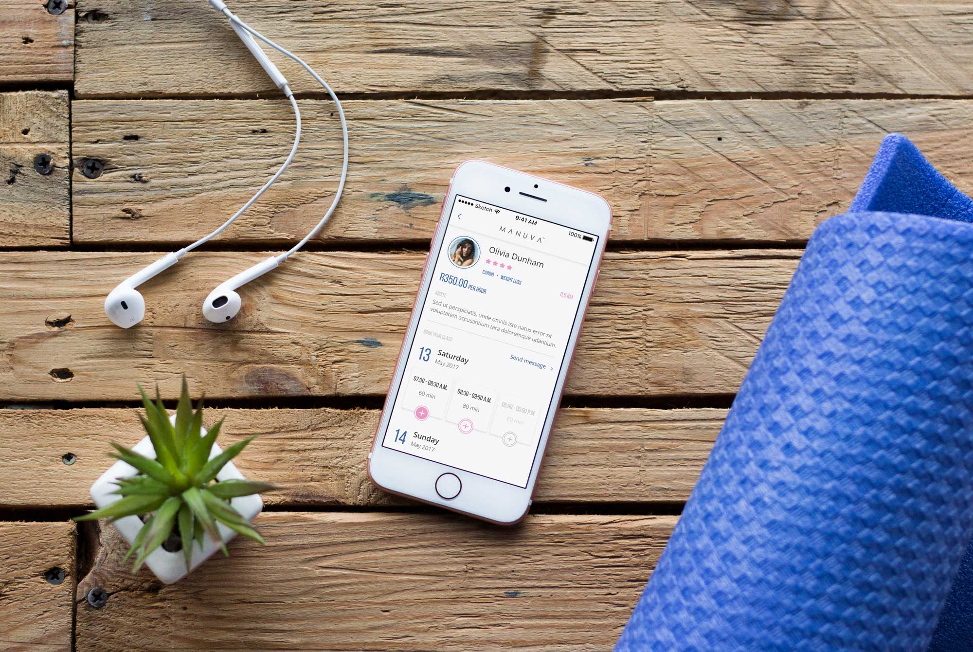
The client chose the UI concept with white background and two contrasting colors — blue and pink. They were expected to be major colors of user interface elements. Moreover, the blue tones corresponded to the colors applied in the Manuva logo which would contribute to better brand recognition. Here are the final UI designs of the fitness app.
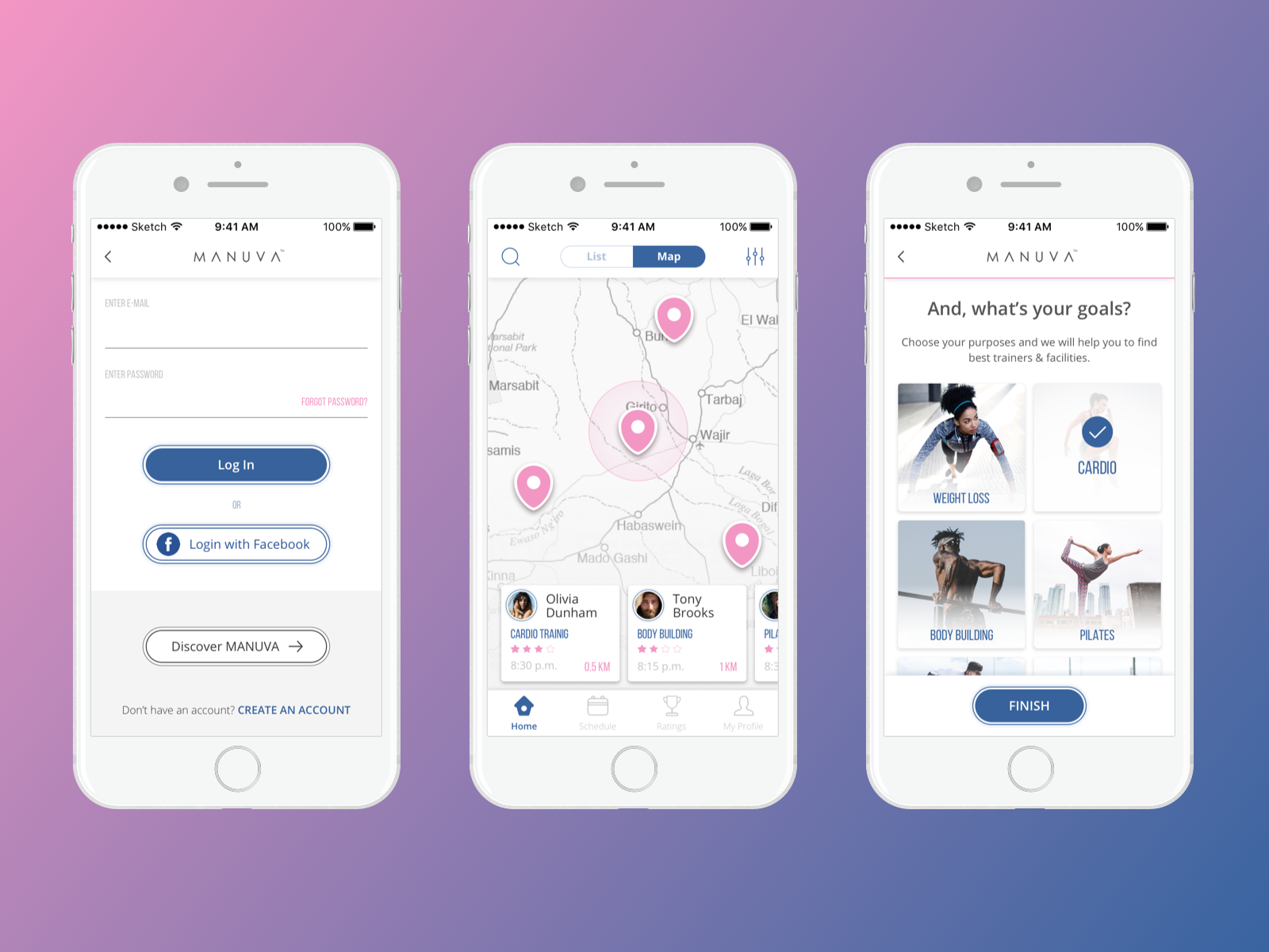
One of the registration screens offered users to choose their favorite sports directions which were followed by the images of sportspeople. Since the Manuva app was an African product, the client asked to apply the majority of photos featuring people of typical African appearance.
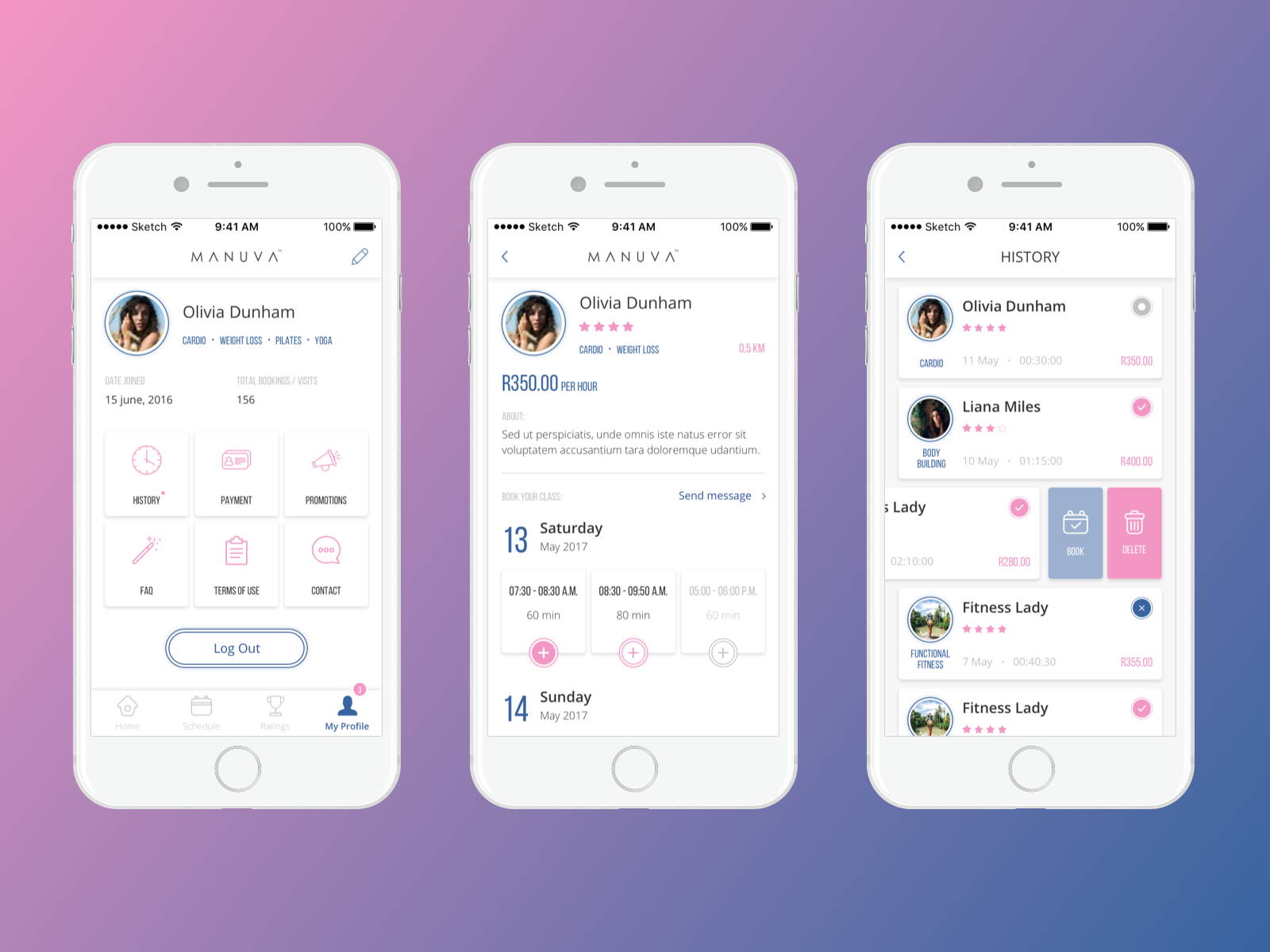
To make the user interface look clear and original, the designer created a custom set of vector icons. Simple and aesthetic icons help users get quickly oriented in the navigation system of the app.
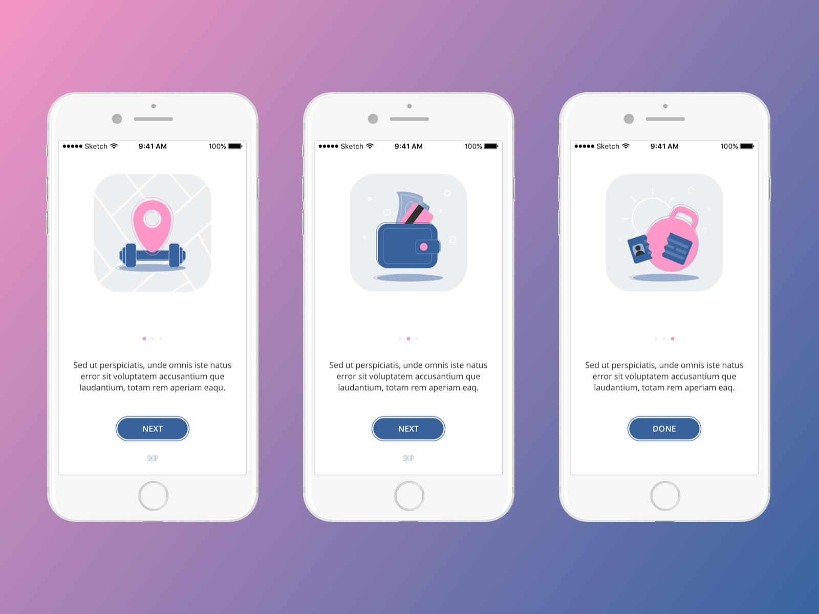
Custom Illustrations for Onboarding Tutorials
The clients also requested to pay attention to the design of onboarding tutorial screens. Just to remind, tutorials appear to users who launch a mobile app for the first time helping them get oriented within unfamiliar features and controls. Onboarding tutorials usually contain short but clear info describing the benefits of the product which make it useful and engage the user to try it.
To make the tutorial UI entertaining and captivating, the client and the designer agreed to add custom illustrations. This task was given to graphic designer Marina Solomennikova. The illustrations were created in a flat style and the colors corresponded to the common color palette applied in UI. Let’s see the result.
Summing up, no matter how many apps exist, there is a way to make yours stand out from the crowd. Innovative features, sufficient user experience, and pleasant UI design can be an effective foundation for a mobile application.
More Case Studies
If you are interested to see more practical case studies with creative flows for UI/UX design, here is the set of them.
Colony. Landing Page Design for Collaboration Platform
Watering Tracker. UI Design for Home Needs
UI Experiments: Options for Recipe Cards in a Food App
Home Budget App. UI for Finance
Night in Berlin. UI for Event App
Big City Guide. Landing Page Design
Vinny’s Bakery. UI Design for E-Commerce
Upper App. UI Design for To-Do List
Health Care App. UI for Doctors
Wedding Planner. UI Design Concept