Photos are one of the ways to keep memories of life events. Having a smartphone people can take thousands of photos everywhere and don’t lose special moments. Mobile applications support people’s interest in photography providing various features such as image editing. Today photo editing products are in high demand the reason why designers are regularly involved in projects of this kind.
Young people are among the common users of photo editing applications. Most girls like taking selfies and beautify them via special effects and components. Today we share a new case showing the design process of a photo editor app for youngsters. UI designer Tania Bashkatova and graphic designer Yaroslava Yatsuba were assigned to this project.
Task
UI and UX design for a mobile photo editing app.
Process
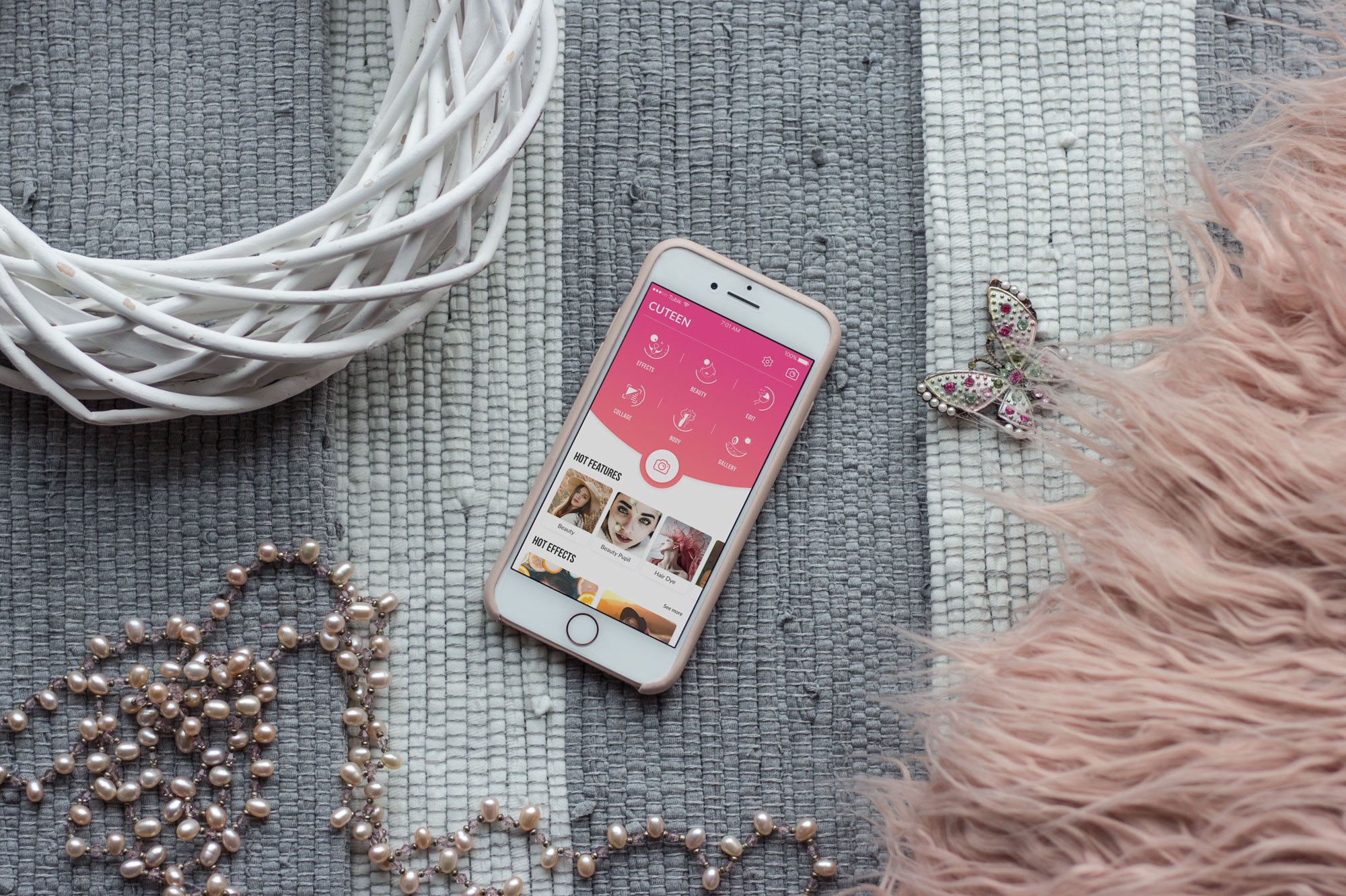
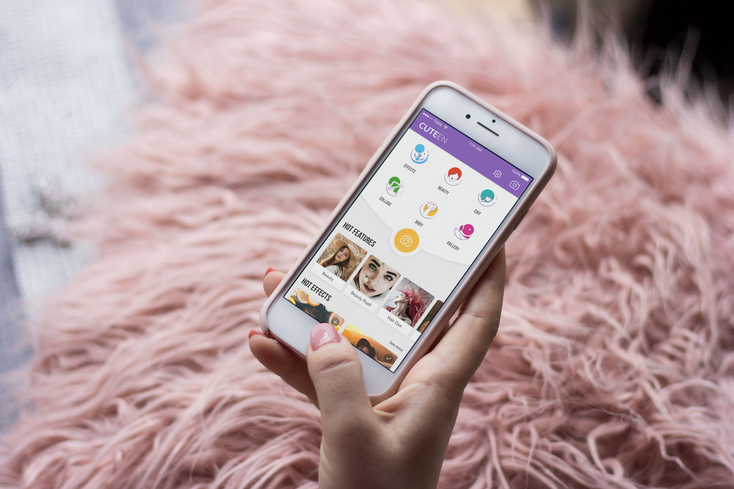
The designer received the task to develop UI and UX for an all-in-one selfie camera and photo editor mobile app for teenage girls and young adult women aged 15-35. The app was named Cuteen and had the slogan “Meet the most beautiful you!”
The major task was to create smart UX representing six basic features of the application and make modern, youthful, feminine, and playful UI design. In addition, our team decided to create a custom set of icons and apply bright color palette in a user interface.
Before the creative process started, the designer had conducted market and user research. This stage helps to gather the core information creating the product which would stand out the crowd and satisfy users’ expectations. Based on the research results and team brainstorming, the designer made her mind upon basic UX solutions and stylistic preferences.
UX Design
The prior designer’s task was to organize and present all the features that way so that everyone could do editing intuitively. To make this process more productive, the designer created wireframes presenting information architecture of the future layout. Wireframing is a simple and fast way to make a schematic visual representation of app screens and transitions. Wireframes help developers and clients get a clear understanding of the layout structure.
The Cuteen app had six basic features that needed to be presented in the most effective way. The designer provided two schemes for the layout. The first one contained a rounded banner and brand name on the top of the screen. The designer worked out several ways of placement for the icons of the basic features as well as the CTA – photo button. It was important to make the CTA button contrasting enough so that users would see it as a major interactive element of the interface.
The scheme had three variations of UI components placement. The first showed the CTA camera button separately from the features while the others presented different ways to make them visually connected in one interactive zone.
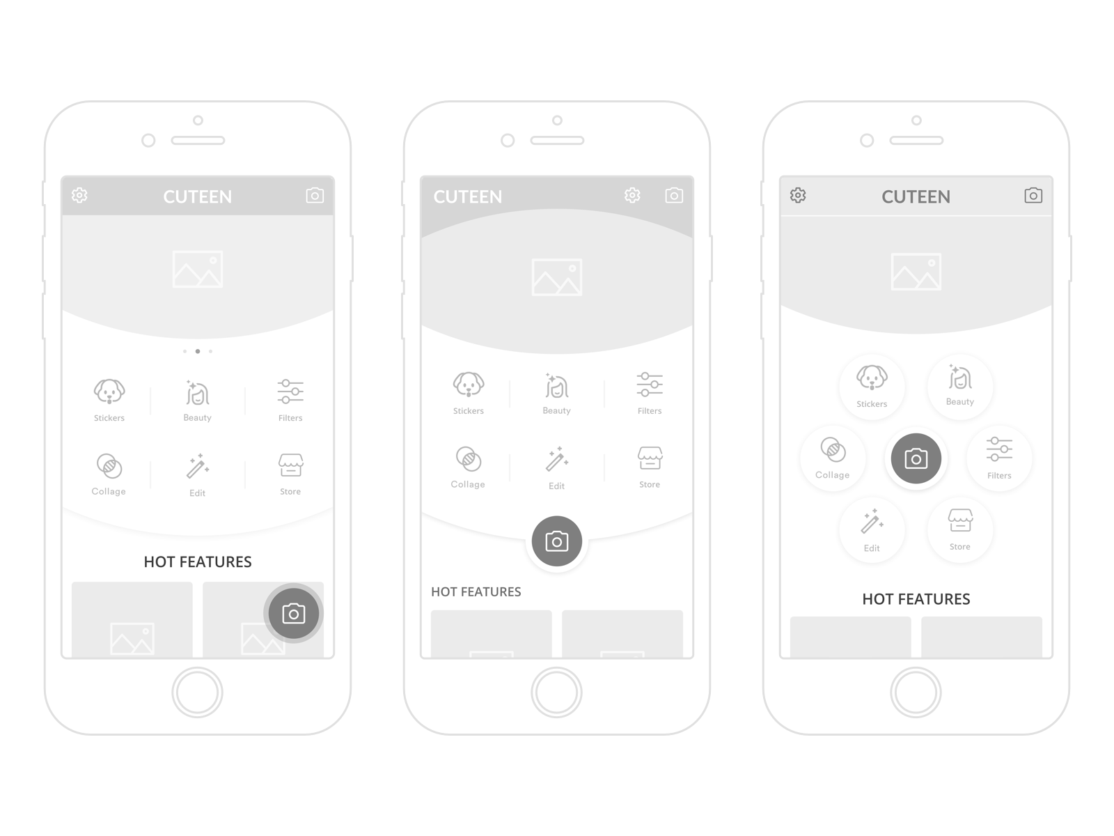
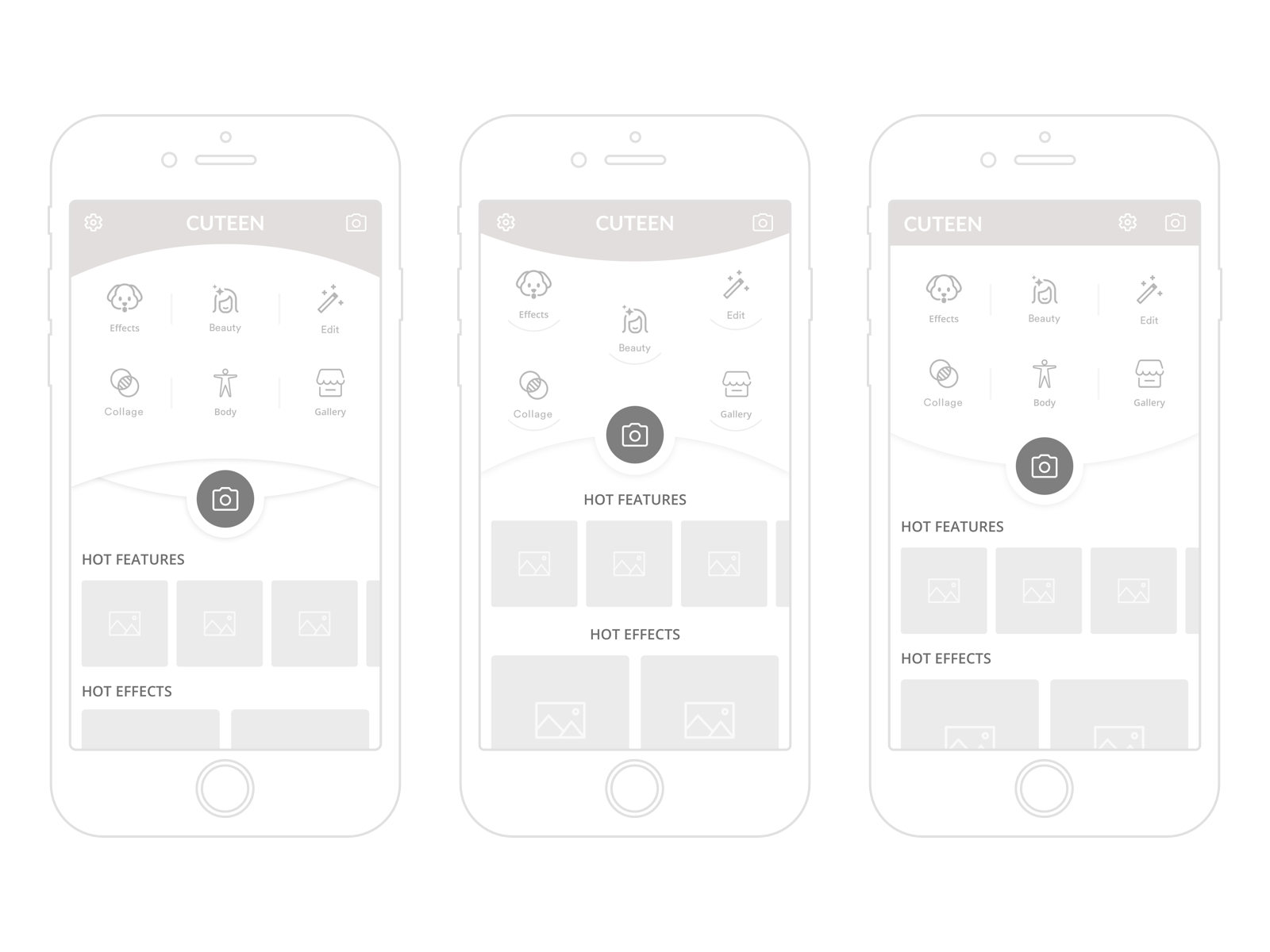
The second scheme was focused on the features presentation. The banners were removed. The icons were placed on the top of the screen and the CTA was in the center. Such a structure allowed for concentrating users’ attention reducing all possible distractions and make the navigation more intuitive. Also, the designer worked out an original feed showing recent and popular effects so that users could apply the best features without efforts.
Both variants had their strengths and benefits so the designer decided to compare two possible schemes for the layout at the UI design stage.
UI Design
The main approach to the UI design included the combination of the fashion and entertainment visual style. Considering the fact that the app was oriented to the young female users, the designer decided to create UI components in a bright color palette along with gradient effects. The central color used for the CTA button and some other UI components was pink. This color is strongly associated with beauty, sensitivity, and youthful femininity, so it is often a good choice if the target audience is mostly girls and young women.
Six feature icons were represented in six contrasting colors. This way each color would associate with a specific feature and users could quickly interact with the app even without reading the copy under the icons. Also, to make the user interface look mild and pleasant for the eyes, the designer used a white background bringing the balance into the visual composition. Let’s look at some screens.
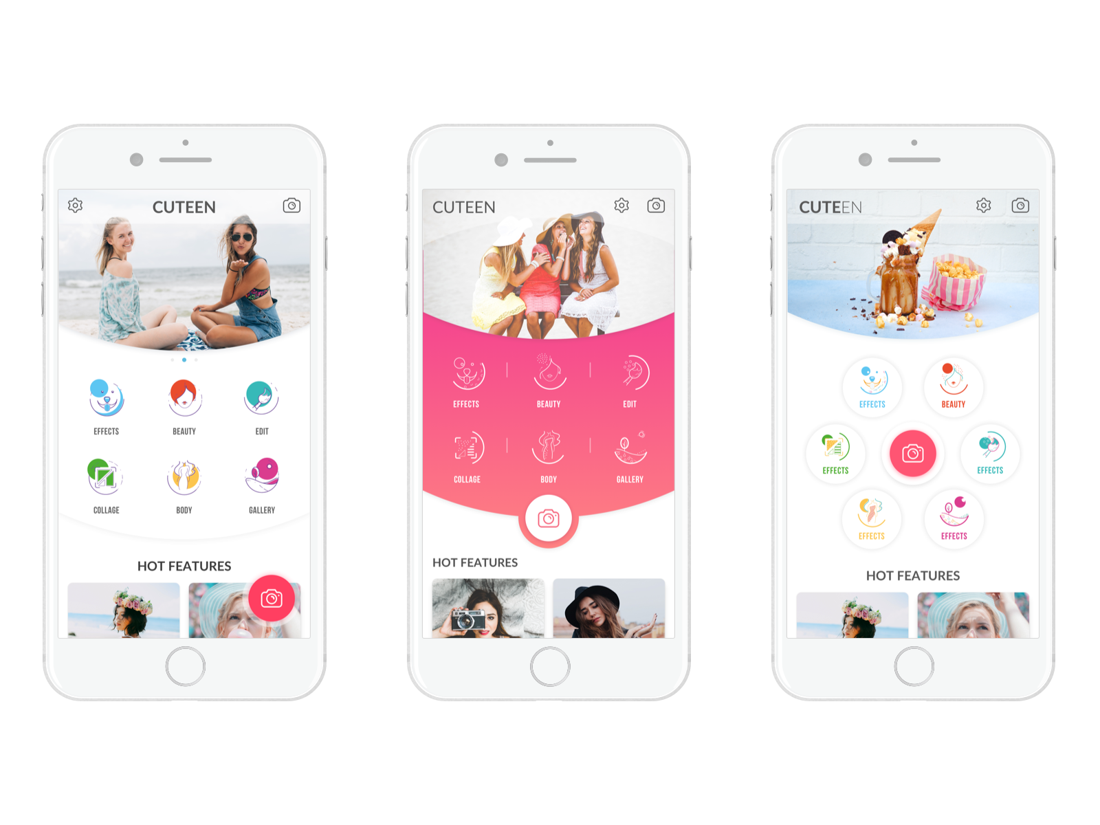
After several creative explorations, the designer chose the scheme without banners and developed the third variant presented in the image above as a default UI solution user will see interacting with the app. This structure makes interactive zones prominent and logically separated. In addition, the second variant was provided as an additional stylistic option in which users could switch any time they need. In this layout scheme users’ attention is focused on the custom icons.
All in all, the user interface of the Cuteen app looked bright and playful with a simple interaction system, original feed, and custom set of icons.
Custom Icons Design
One of the major tasks was to create original icons that would make the product stand out from the competitors. The graphic designer accepted such an interesting challenge.
To save time and let the fantasy do the work, the illustrator started with hand sketching. The designer provided three sets of icons made in different styles and with various concepts for each feature. Here you can see the sketches.
![]()
![]()
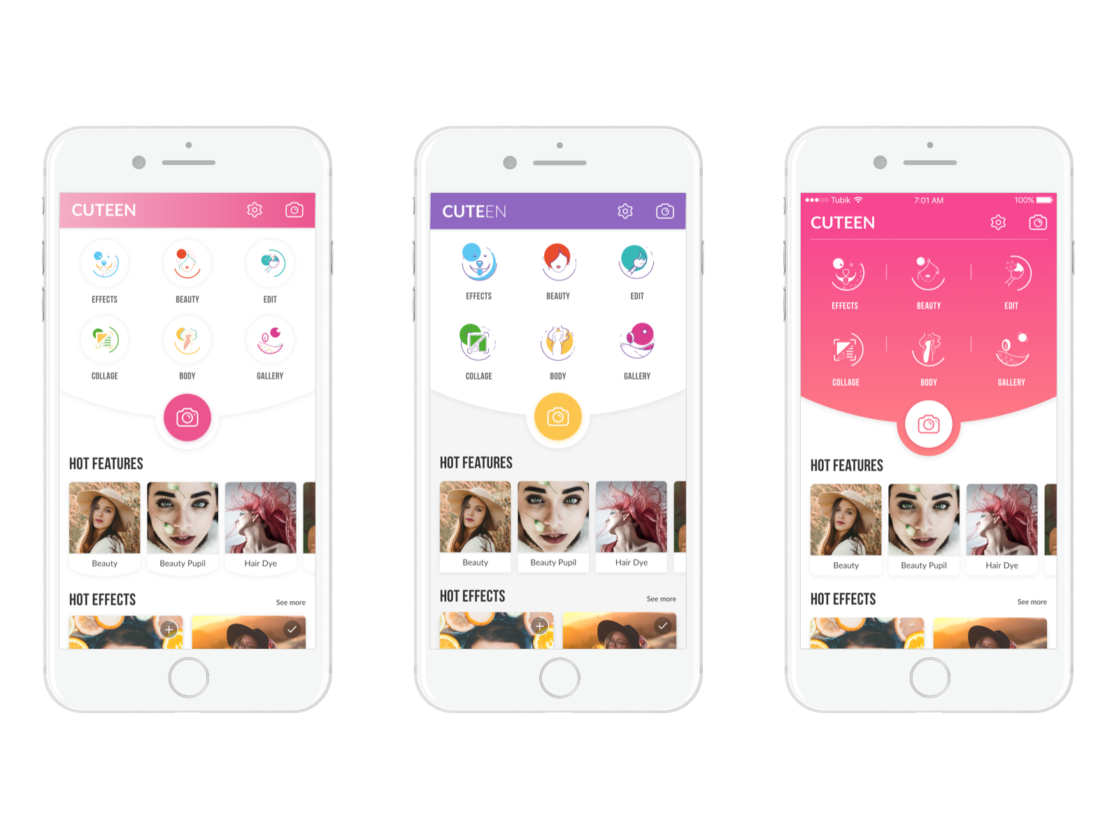
The designers agreed upon the second variant. The sketches were transformed into digital icons and all the details were worked out. Custom icons are an effective part of app recognizability. Moreover, they support the consistency of the basic stylistic solutions in the interface. Here you can see the final results.
![]()
The designer made two types of icons — full and stroke. The first variant was meant for the colorful style of the layout making it look brighter. The stroke minimalistic icons were applied to the basic layout. Using the technique of closure the designers made icons look dynamic so that it could give the feeling of the frozen movement. This technique is based on the human eye’s tendency to see closed shapes. Closure works where an object is incomplete but the user perceives it as a full shape by filling in the missing parts. The technique relates to the Gestalt principles which we described in our article Psychology in Design. Principles Helping to Understand Users.
Summing up, the smallest details often make the mobile app design more powerful so designers should pay attention to all the UI components including icons and buttons.
Useful Case Studies
If you are interested to see more practical case studies with creative flows for mobile UI/UX design, here is the set of them.
Tasty Burger. UI Design for Food Ordering App
Manuva. UI/UX Design for Gym Fitness App
Watering Tracker. UI Design for Home Needs
UI Experiments: Options for Recipe Cards in a Food App
Home Budget App. UI for Finance
Night in Berlin. UI for Event App
Upper App. UI Design for To-Do List
Health Care App. UI for Doctors