Half a year is away – so it’s a perfect time to discuss hot design trends of this year. Let’s review some popular trends in user interface design for websites and mobile applications that are on the top of the wave now.
Full-Screen Background Images
One of the trends found widely on diverse websites is the usage of full-screen background images, be it photos or specially rendered visualizations. This approach makes the screens visually and emotionally appealing. Also, it supports the feeling of the integrity of all the layout elements.
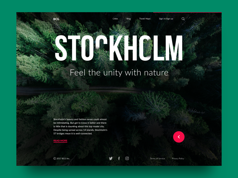
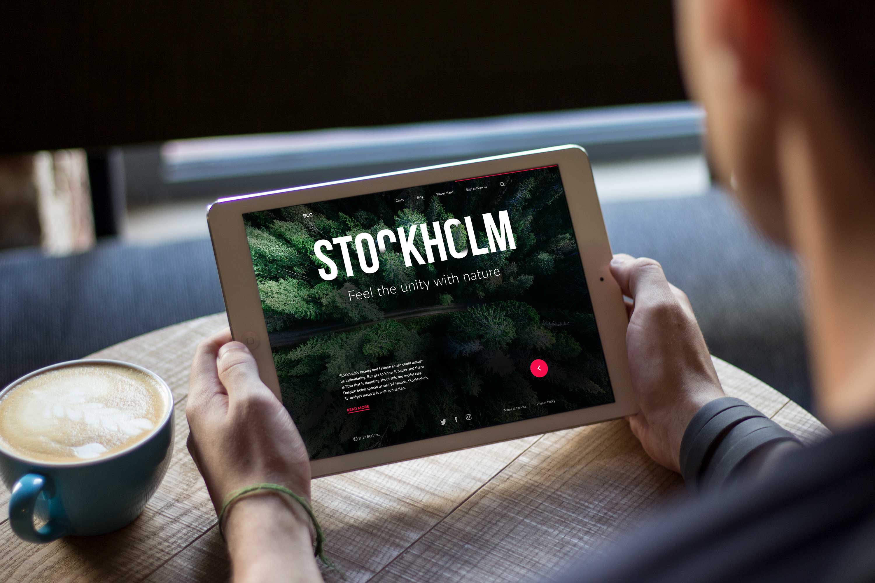
One of the slides for the landing page of the Big City Guide applies the theme photo: the famous and easily recognizable landmark presents the city of Berlin to the users, making the page both elegant and informative.
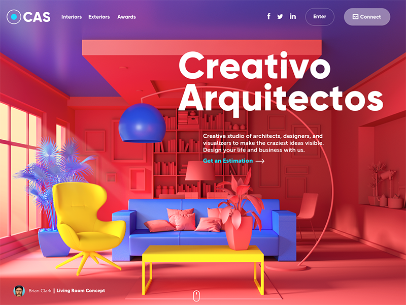
Here’s the home page of the website made for the design studio specializing in exterior and interior design visualizations. The high-quality original graphics created and rendered for the page take all the background area: this way the image immediately sets the theme and presents the company services.
Several Interactive Layers
Creative experiments are constantly carried out by UI designers to find new interesting ways of making the webpage engaging and interactive. One of the growing trends is applying several interactive layers that make scrolling experience and interactions look original.
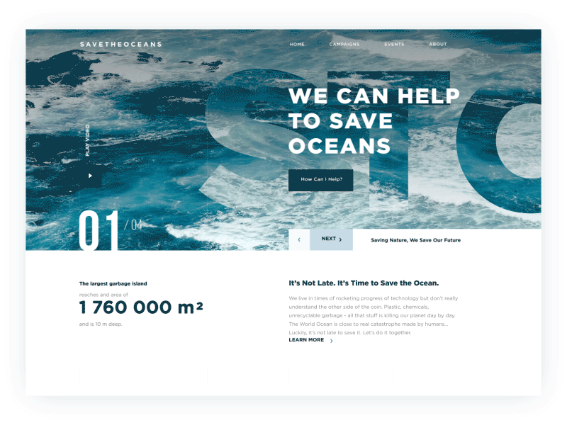
This is the animated concept of a charity website devoted to saving the oceans. The designer makes two layers of the copy move simultaneously when the slides change. By the way, the concept features one more popular trend of using textures and photos as the underlayer of text content, so-called image-filled typography.
Custom Digital Illustrations
Custom digital illustrations haven’t lost their positions; they are getting more and more presence on the web and mobile user interfaces. Made in various styles, custom graphics effectively support the quick perception of the information on the page or screen. What’s more, they set the solid ground for originality.
Websites and apps apply custom mascots, icons, and illustrations to enhance the looks of a page or screen as well as boost usability and intuitive navigation. In addition, images improve the accessibility of UX design pushing the limits of perception for users who have natural problems with text recognition such as, for instance, the dyslexic or non-reading preschoolers.
One more growing trend is creating digital illustrations as title images for blog articles (btw, you can see many of them here on Tubik Blog). It’s definitely a cool trend because it adds aesthetics and beauty to blogs and websites we often read as well as broadens the creative horizons for artists.
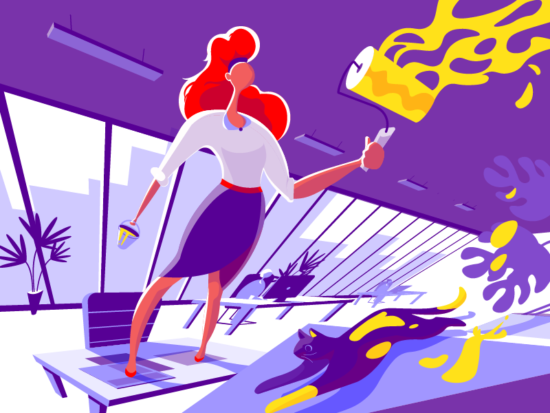
The illustration created for the article 3C of Interface Design: Color, Contrast, Content. The designer chose the keyword “Color” as a core semantic element and showed the literal process of coloring something with paint. The contrast is reflected in the color palette of the artwork while the content is shown with the elements of the furniture in the office shown in the picture. The cat becomes a bright detail which adds dynamics and humor to the scene.
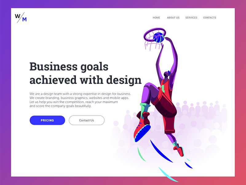
The illustration for the landing page of a digital agency was built upon playing with the keyword “Goals”. The image of a basketball player was perfect for the theme as the moment of hitting the basket is a real reflection of achieving the goal. Rich catchy colors add the feeling of confidence and strength to the illustration.
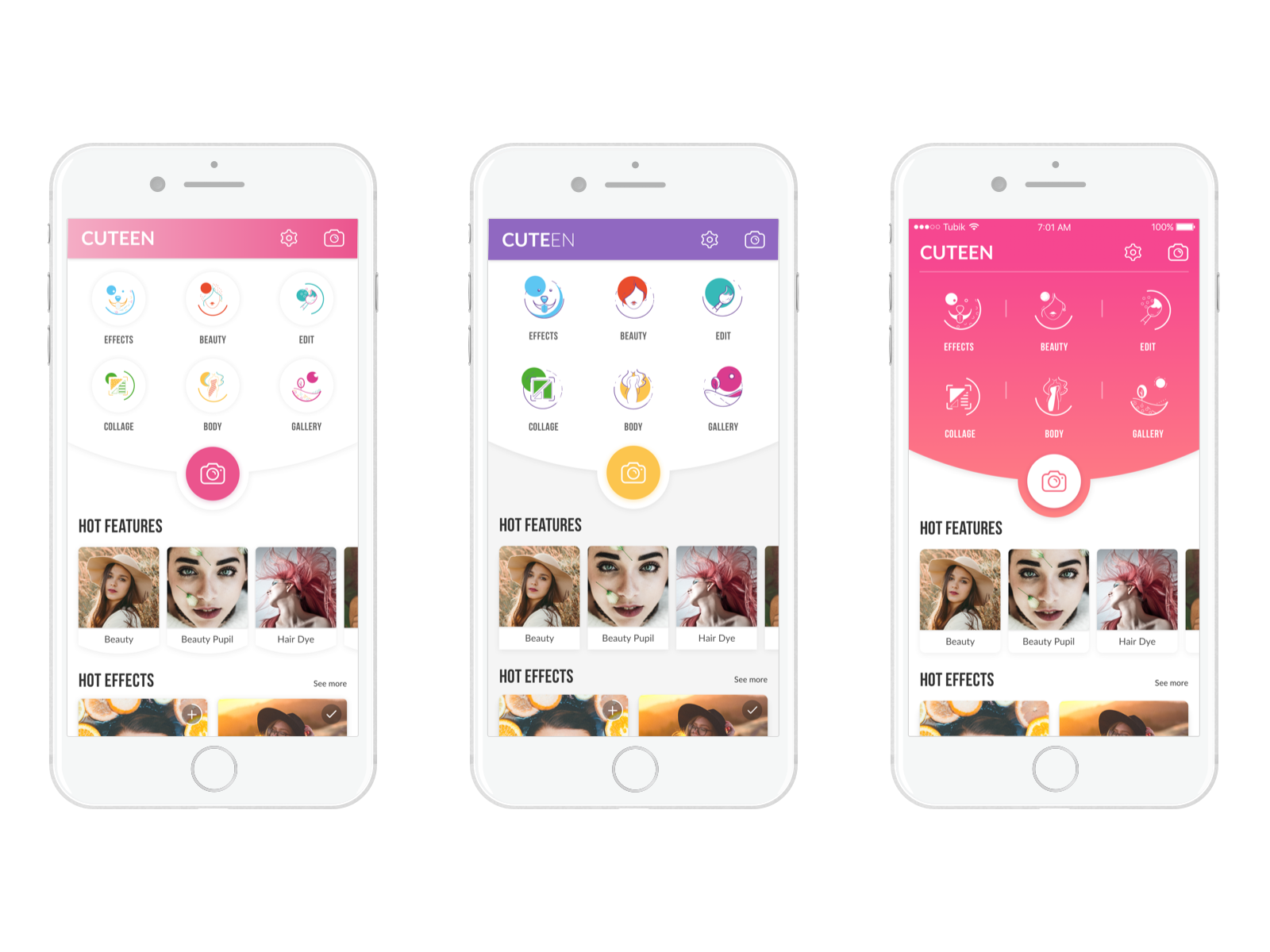
Original icons created for the Cuteen app: custom graphics mark out specific categories of content in a catchy and engaging style. Using the technique of closure, the designer made icons look dynamic so that it could give the feeling of the frozen movement.
Storytelling with Character Design
No doubt, the trend of custom graphics has opened a wider perspective to storytelling in the interfaces. More and more websites and mobile apps turn to specially designed characters showing the story, setting the atmosphere, sending the message or presenting the benefits in the way that corresponds to the mood, tone, and voice of the platform. Original characters help to make the interactions more human-like, set strong visual associations with the real world and instantly transfer the needed mood. What’s more, depending on the composition, the characters may become an effective tool to make the page or screen dynamic and lively.
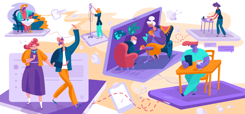
The first set of custom illustrations made by Tubik for one of our recent projects Florence App. It is an online marketplace where self-employed nurses can find high-paying shifts across the UK. Characters create visual storytelling and present the features and benefits of the app.
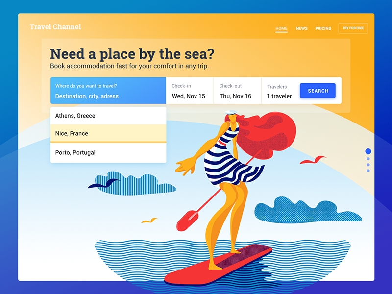
This is a design concept for a simple service helping users to find accommodation by the sea. Theme illustration supports the needed atmosphere and creates a strong emotional appeal.
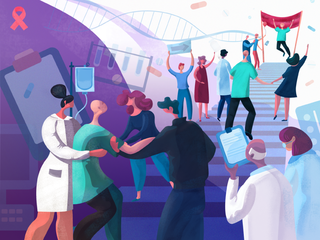
This illustration is deeply social: it’s devoted to World Cancer Day which was marked globally on 4 February. The slogan for this year was “We can. I can” — and this is how the designer saw it, in one illustration showing all the path from pain to life. United, we will fight it!
This animated set of illustrations is an onboarding tutorial for a social network app. Based on storytelling, it aims at showing the functionality and nature of the app in a pleasant-looking and entertaining way which would correspond to the general style of UI design.
Split Screens
One of the hot trends of this year is the active usage of split screens in both web and mobile interfaces. This trend is nothing new – it goes away and comes back in various spheres of design, and now it’s definitely back and alive. The approach is believed to be effective in terms of responsive design as you may play with content variations not missing the consistency. What’s more, it opens the limitless area for color combinations and experiments. Some websites use split screens to present the duality of options of equal importance.
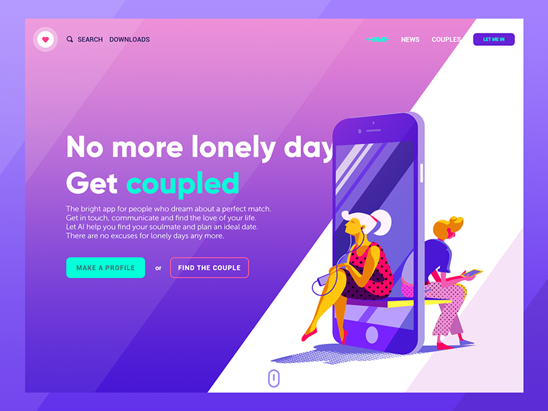
The landing page for a dating app applies a diagonally split screen with color contrast, which creates visual harmony and consistency with diagonal shadows on the theme illustration. It makes the image elegant and impressive.
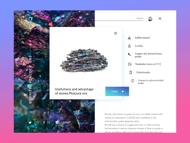
The encyclopedia website applies split-screen for the entry page, this way separating properly readable text part from beautiful photo content.
As for mobile, split screens become a user-friendly trend for interfaces based on the dark or bright background scheme. It is a step towards proper readability in them which is often the issue of debates: applying boxes or spaces with the light background for core data blocks, designers solve this problem and add elegant contrast to the screen or page.
The Vegan Recipe app applies color split on the background when the users are swiping the cards of recipes in the catalog, and also there is a contrast split of bright and light parts where the light one contains copy and is informative. The split parts of the screen are transformed together with interactions keeping the process live and clear.
![]()
The Watering Tracker app uses a horizontally split screen: the upper part with the dark background is favorable for the elegant presentation of charts and visuals while the lower part applies the light background to keep the high level of readability.
Bold Typography
Bold and catchy typography continues to keep its high presence in web and mobile layouts. In most cases, it becomes one of the key design elements and designers pay much attention to keeping it readable and scannable: typographic hierarchy and choice of proper fonts are among the core tasks of every UI design project.
The landing page for the Big City Guide applies the clear visual hierarchy of copy blocks and makes the name of the city the most catchy element of the layout. What’s more, it applies the technique cutting or inscribing the title keyword or a headline into the visual elements on the page. The approach strengthens the harmonic integrity of the layout elements and makes typography felt tightly united with everything in the interface.
The Upper app is simple and minimalistic, it doesn’t use any special custom graphics, so text becomes the core design element. Thought-over and well-balanced bold typography makes it elegant and highly readable.
Buttonless UI
Although buttons are still one of the vital elements of UI design, this year we see more creative experiments on mobile user experience in the perspective of UI interactions without buttons. This approach saves precious space on the screen for more information and it is even believed to be the initial step to the virtual interfaces based on gestures only.
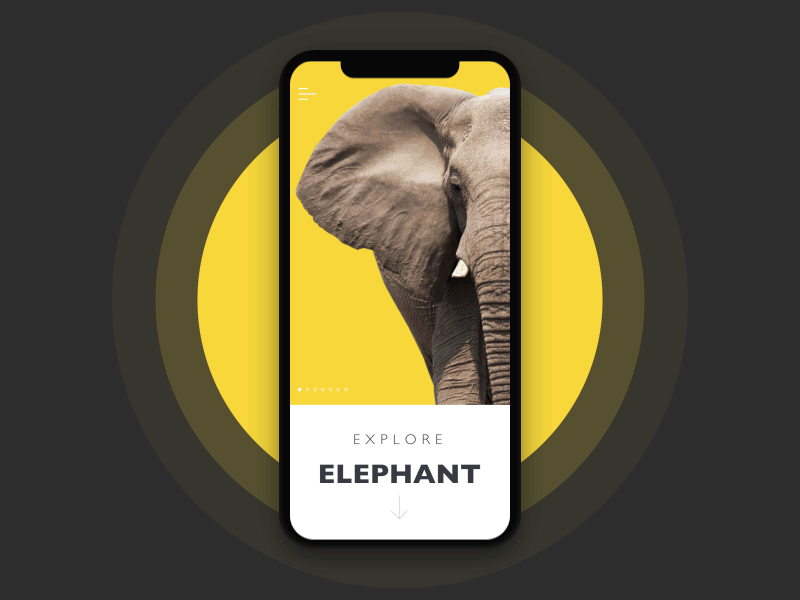
One more educational concept from our team – an encyclopedia app that presents interactive infographics for a variety of themes, this time elephants. All the interactions with the data happen based on gestures without any buttons applied in the layout.
Vibrant and Bold Colors
One more trend in UI design is a great variety of color palettes designers choose for applications and websites, including the bright and dark ones. The diversity of new fonts and typefaces, as well as usability studies, continue pushing the standards. So, designers are trying new combinations which will take advantage of diverse colors but won’t lack in usability. More and more creatives are discovering new horizons combining traditional techniques with innovative approaches in the domain of color choice.
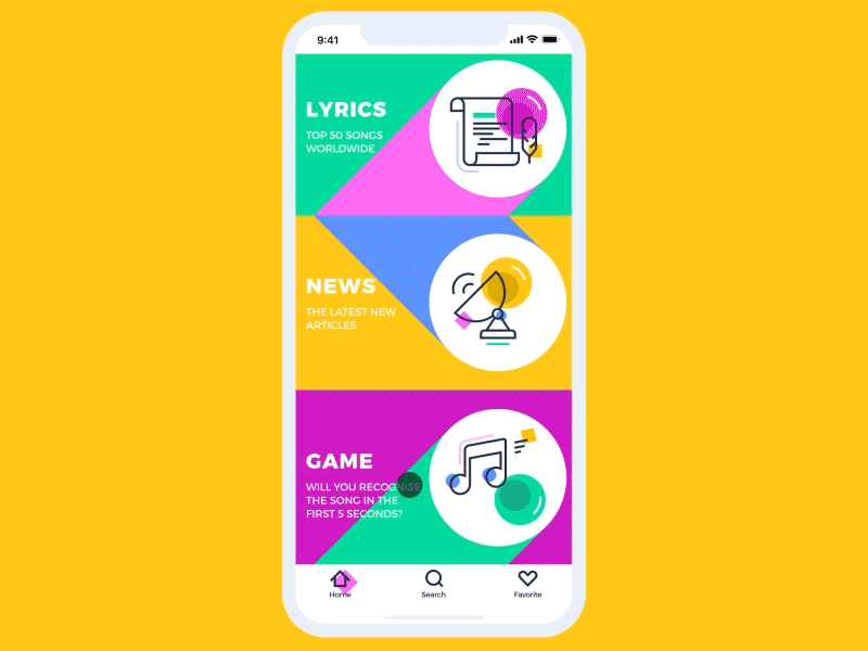
This is a creative concept for Music News App helping collects lyrics, news, and quizzes about music all in one place. UI is presented via a bright color scheme and custom illustrations which make an app look original. The background of a home page applies geometric shapes that change their place and colors when users swipe through the screen.
Engaging Interface Animation
Interface animation is still a hot and debatable topic. Even with a big army of those who find UI animation an unnecessary feature overloading user interface and making it more complicated, most users expect the motion to be an integral part of interaction experience. So, designers and developers seek sophisticated methods to make animation pleasant-looking and problem-solving feature of modern apps and websites. Microinteractions supported by clear finalization via motion create fast feedback for the user and make the experience positive and efficient while navigation simple and intuitive. Animated buttons, switches, toggles, and other interactive elements inform the user in split seconds activating all the potential of fast visual perception.

Here’s the application enabling people to track their expenses and income individually or in a group. The fonts are chosen to provide high readability as the screen is full of various data. Animation creates a stylish transition from the pie chart to the list applying color marking.
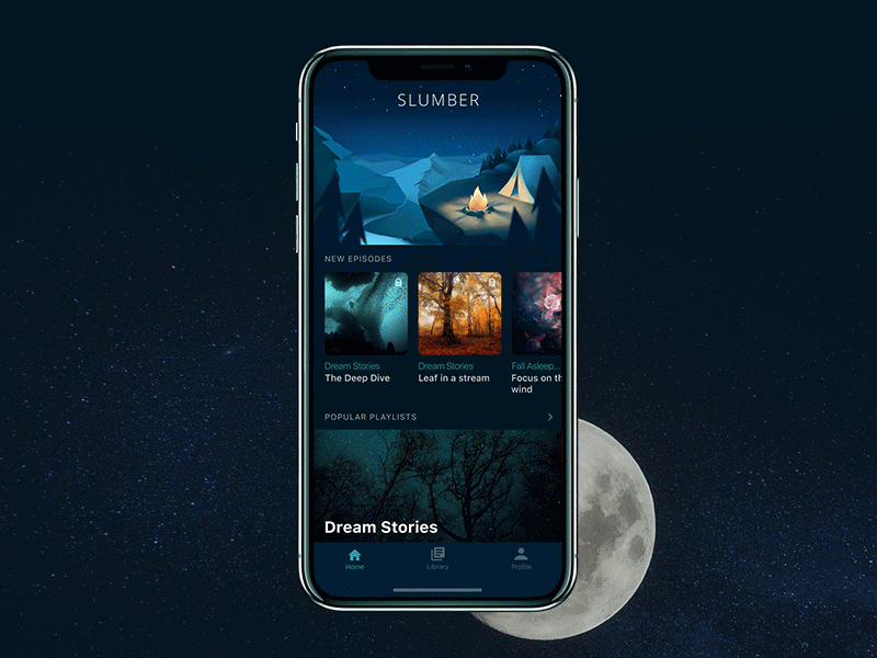
The Slumber app features a nice and catchy point of the main screen – a custom illustration that is animated together with preloader and makes the process of waiting not boring and aesthetically appealing.
Hero Images for Landing Pages
Hero banners are big images catching the user’s attention in the first seconds of interaction with a webpage. They contribute much to the attractive visual presentation of the main content. Hero banners proved themselves as highly effective in setting the mood or transferring the message. Moreover, as well as any other striking graphics on web pages, this is a kind of content that is both informative and emotionally appealing. Prominent hero banners can satisfy multiple goals such as:
- catch users’ attention
- transfer the message visually
- support the general stylistic concept
- set the needed theme, mood or atmosphere
- demonstrate the core benefits or items effectively.
This might be the reason why designers often turn to this technique for the diversity of landing pages today.
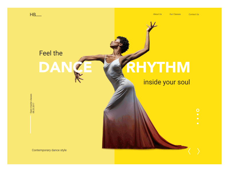
Here is the animated version of the landing page for the dance academy called HeartBeat. The elegant and minimalistic layout shows prominent hero images inspired by the photos of dancers by NYC Dance Project, Paul B. Goode, Andrew Eccles, Paul Kolnik. The animation makes the image catchy and emotionally appealing.
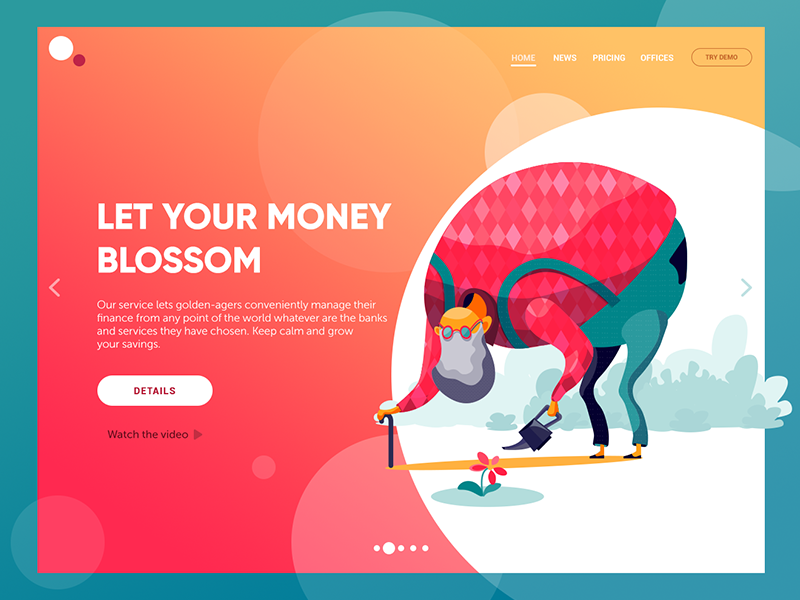
Here’s the concept of a website of financial service helping pensioners manage their finance effectively and grow their savings. The illustration immediately transfers the message keeping it consistent in combination with the tagline and copy block. This way the webpage looks catchy while all the elements in the layout harmonically work together.
Poster Style Pages
The trend for using prominent visual content got one more perspective on web pages that look and feel like posters. In the case of properly chosen images and stylish typography, it allows the page to stand out and attract user’s attention to the offer.
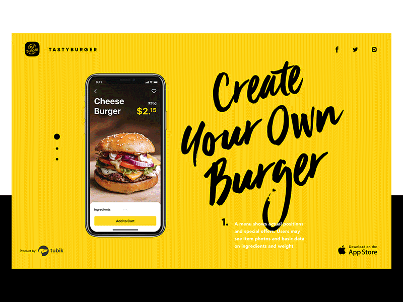
The landing page for the Tasty Burger app is based on the attractive and catchy animation: fresh tasty burger creates a mouthwatering effect to immediately set the theme and emotional appeal, original lettering gives it a poster-style appearance.
Experimental Palettes and Layouts
The trend of color and layout experiments on combining the uncombinable hasn’t lost its popularity, bringing out the fresh original outcome. Anyway, effective color experiments are not just pure creativity: even the most creative and surprising combinations are based on the knowledge of color theory, color psychology, and virtuosity of user interface designers.
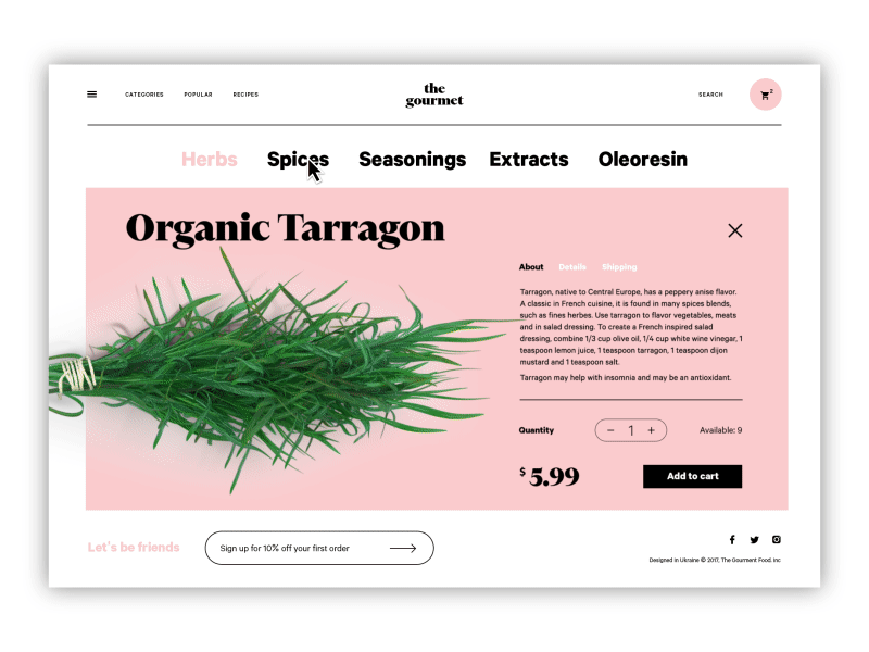
This is The Gourmet website, the e-commerce store selling herbs, oils, and spices. Its user interface features the creative experiment: it applies design techniques traditional in e-commerce for fashion but the type of goods is very different – they are for eating and cooking.
Personalization of User Experience
This year we can see the strong movement to more sophisticated and deep personalization of user experience. It means that designers present more functionality with which users may customize the features according to their personal needs.
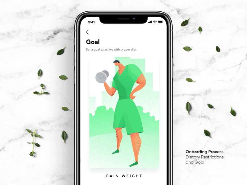
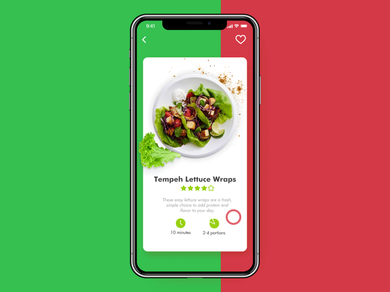
The Perfect Recipe app allows users to set the goals they want to achieve such as losing or gaining weight, keeping a healthy diet and the like. Also, users may mark the ingredients they don’t like so that the app didn’t show the recipes containing them.
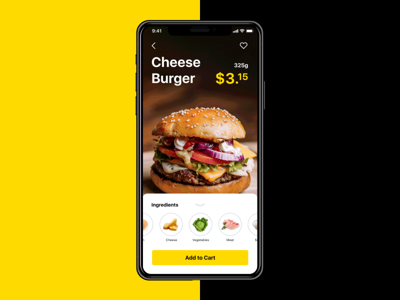
The Tasty Burger app provides users with the opportunity to customize their own burger adding or excluding particular ingredients before making the order.
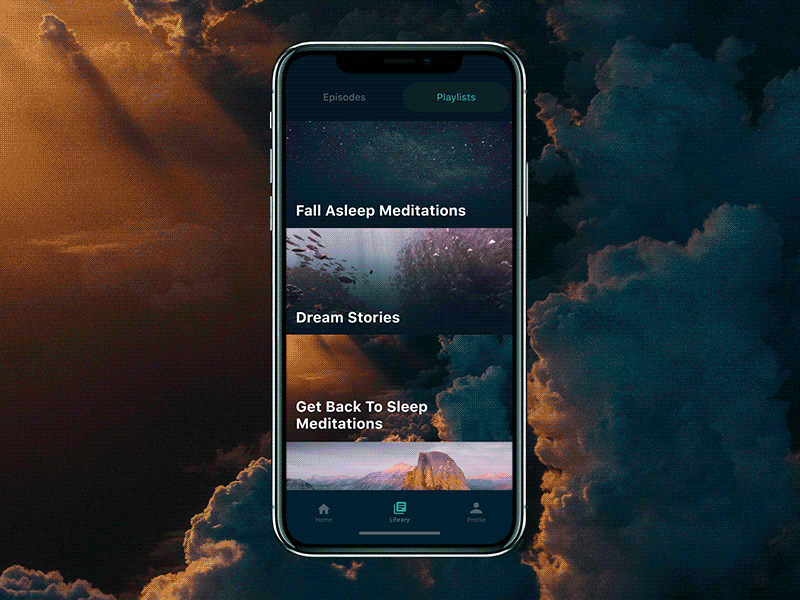
The Slumber app has a simple and clear system of filters that allow a user to choose the most comforting settings and sound combinations to perfect the experience of meditation or sleep. Tuning background effects, users create personalized sounding.
High-Quality Photo Content
The previous UI design examples have also featured one more popular trend of this year – extensive usage of high-quality and artistic photo content. Photography is a good way to impress users with realistic and clear visuals as well as set the needed associations. With rapidly developing photo stock websites, designers have more and more opportunities to find good images; still, for many projects, especially e-commerce ones, the creative teams shoot the original content totally corresponding to the goals of the product. It is especially noticeable in the spheres close to everyday life: fashion, toys, food, drinks, etc.
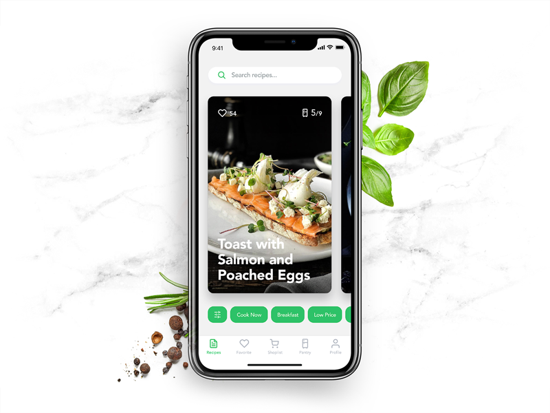
The Perfect Recipe app presents the recipe cards with mouthwatering and stylish photos of meals.
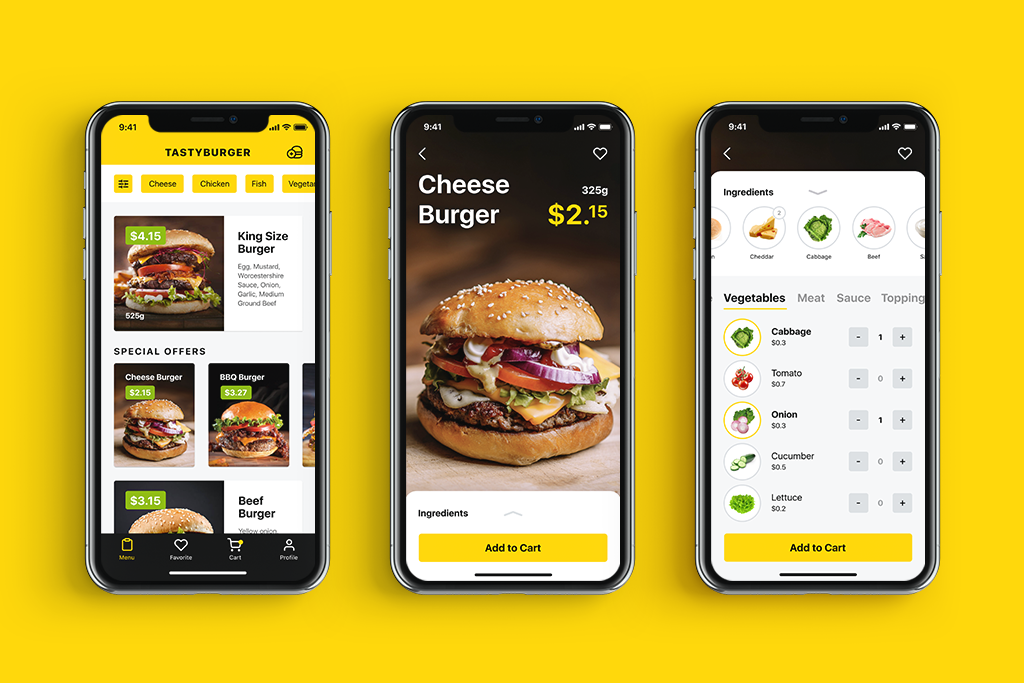
The Tasty Burger app uses photos of real burgers to make the experience positive and inform users of what they are going to buy.
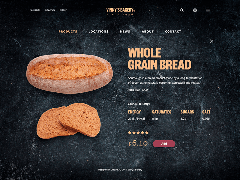
The Vinny’s Bakery website uses high-quality photos of real items to make the online shopping experience close to the real one.
The year 2018 continues to build up the diversity in interface design — and this is what can be called the most user-friendly trend. Millions of users with different tastes and preferences, favorite styles and characters, particular feelings of what is comfortable and looks nice for them, use apps and websites as a part of their daily routine. The more variants of looks and features we design for them, the wider range of diverse options that an endless global community of users will get to find the ones which fit their specific needs and wishes. Time will tell what trends we will see as the most popular at the end of the year.