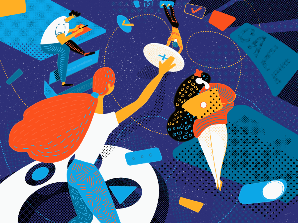
Practice shows that structured data is a great way to work optimization and that is one of the reasons why old good stuff like phone directories, dictionaries, vocabularies and glossaries, databases, and sets of formulas are still applicable and convenient for everyday use. Order and organization make it easy and fast to find everything needed. And today we decided to take a step to this sort of optimization and provide the first set of definitions for some basic terms in the field of UI/UX design.
No doubt, today there are many various publications and online resources providing helpful and informative support for designers and explaining the necessary terms. In our previous articles, we also get involved in this global process while describing practical cases of design. Today we would like to systematize some of the explanations here concentrating on UI/UX design issues enhancing usability and support the definitions with links to the articles where we gave more details on the topic. So, let’s move on!
UX (User Experience)
It is the general attitude and emotional feedback that the user has on different stages of using the product. In terms of digital products, such as websites or applications, UX is a comprehensive term involving all the possible stages of user engagement. UX is based on several key factors such as usability, utility, desirability, attractiveness, the speed of work, etc. If all the logic and possible issues of product implementation into real life are analyzed and designed properly, it forms a positive user experience which means that users are able to satisfy their needs in a fast, easy, and pleasant way. Positive user experience is one of the strongest factors of retaining users.
UX Wireframing
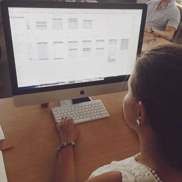
It is the process of creating a general structure of the designed application or website. It’s usually accomplished via the set of schematic screens or pages of a low or middle level of fidelity. The aim of this stage is to set a clear and orderly structure of all the layout, transitions, and interactions on the basis of the user’s problems and pains that the product is going to solve.
In one of our previous articles, we provided a bit of metaphor on that. When we think about building the house, for example, we usually mean the process of the physical appearance of the construction rather than tons of projects, drawings, and calculations made on paper. And yes, physically it’s possible to build the house without any project as well as it’s possible to create the interface out of thin air. However, in this case, you shouldn’t be surprised if one day the house will crack and collapse without any visible reasons as well as the app looking amazing and stylish won’t bring you any loyal users. If you want to have a reliable house, a durable mechanism, a powerful application or a highly-functional website, the recipe is the same – take your time for thorough planning and projecting. This is not going to waste your time, vice versa, it will save your time you would otherwise have to spend on the redesign and attempts to find out why your product doesn’t work properly.
That is the aim of the UX part of the design process. UX wireframing stage should be heavily based on user research, competition research and analysis of all the data obtained. In the outcome, it creates a clear scheme whose complexity depends on the product functionality and reflects all the system of transitions and interactions as well as placement of all the elements of the interface based on their optimal use flow. In some cases, wireframing done in pencil sketching or rough drafts is enough, although preferably it is accomplished with the special tools and software optimizing the design process and increasing performance.
Read more on this topic in our previous article
UI (User Interface)
User Interface is actually a finalized interactive field in which the user interacts with the product. It includes all the tools for increasing usability and satisfying target users’ needs and wishes. All the features of visual perception, as well as sound and tactile feelings, influencing the product use and interaction with it should be analyzed and optimized here to the purpose of the app or a website is designed. For example, such aspects as color palette, types and fonts, shapes and forms, illustration and animation, and so on and so forth are able to affect the performance of the final product greatly in both positive and negative ways.
In general terms, the UX research and wireframing stage are about how the website or application works while UI is how it looks. Both these stages include work on successful interactions, but UX deals more with logic, connections, and user behavior while the UI stage provides the visual representation of all the concept. It means that ideally, the designer should first work on the UX part with the concentration on a layout, making it more powerful, thought-out, clear, and easy to use. Without this vital work, you highly risk creating a pure mess out of the user interface.
After the UX part is tested by a prototype, agreed upon and the concept of layout, transitions, and features are accepted, the designer starts the UI design part. This is the time when a newborn heart and brain of your product is clothed with its skin and bones. Here the product gets its real color scheme, forms, and features of the layout details, styles, animated elements, and so on.
All the UI solutions directly influence the positive or negative user experience, so the processes of UX wireframing and UI design should mutually support each other and follow the same strategy otherwise the efficient solutions of one stage will not work on the other.
Here are some fresh UI design examples for different types of products from the Tubik Studio portfolio on Dribbble:
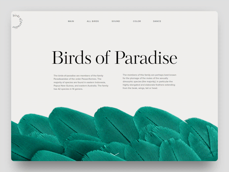
Birds of Paradise Encyclopedia
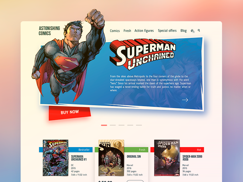
Comics Shop Home Page
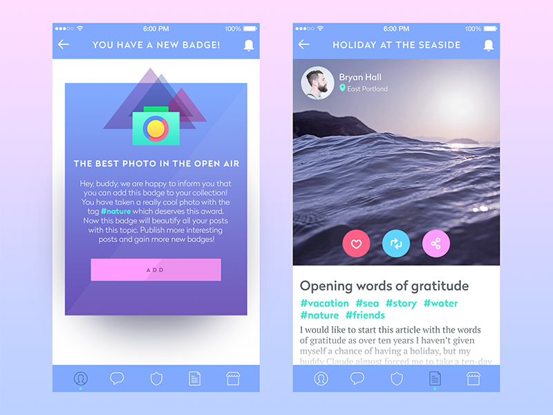
Simple Blog App
Read more on this topic in our previous article
Prototyping
The original concept behind the term ‘prototype’ is the sample model of the product that gives the ability to test it and see if the solutions and decisions made about the product are efficient. Prototypes should not be seen as the analog of the final product as they aren’t those. Their main aim is to enable a designer, a customer, and a user to check the correctness and appropriateness of the design solutions.
The value of prototypes in the sphere of the app and web design has rocketed for the last few years. Actually, it is easy to explain as even the low-fidelity prototype gets the designer, customer, and tester much closer to the looks and functions of the future product than the most elaborate schemes, drawings, and wireframes. Certainly, that doesn’t mean that schemes and wireframes could be eliminated from the process as they are essential in the process of creating design solutions. However, when you want to feel their efficiency and check if nothing has been missed in the design process, a prototype will be a great help.
Considering the fact that a lot of customers see the prototype as something very close to the final version of product design aka “UI in action”, in practice this approach is not effective. Prototyping is much more efficient and useful as the step between UX design and UI design. So, the workflow should have such a sequence: UX – prototype – UI.
The prototypes on the UI stage are created more for the presentation of application general looks than for testing and improving its functional features. And this is the trap in which it is easier to be confused. Prototyping all the details on the final stage of UI in most cases is not so reasonable as it could seem. It will be too time-consuming and in this perspective, it would be better to spend the same time coding a demo-version. Moreover, usability should be thoroughly checked first of all at the UX stage, otherwise, it would be much harder to change inefficient solutions after having accomplished a lot of work on UI. Certainly, it would be amazing to create prototypes both for UX and UI, but by far not all the designers and customers agree to spend so much time on design tasks and want to test and improve the design much faster and cheaper.
Finance tracker app prototype
Read more on this topic in our previous article
Icon
An app or desktop icon is an image that having a kind of symbolic and metaphoric potential that becomes the element of navigation in the process of interaction. In a deeper explanation, an icon is a visual symbol representing some action, thing, person, real or virtual.
In many cases, icons are able to stand up for the text, and this ability makes them so popular in the world of modern design. If you replace the stretch of copy with an icon, it saves the place for other elements of interaction on the app screen or webpage therefore making it more functional without being overloaded. Also, it makes the interaction faster as in most cases people need less time to see and understand the icon than to read and understand the piece of text. Moreover, the icons efficiently move the limits as they enable people who have problems with copy perception and recognition, such as those who suffer from dyslexia or close problems, to interact with the product. And finally, icons can successfully combine the functions of navigation and explanation with being the aesthetic element of the visual representation of the product, supporting the general style, and having their own character.
Read more on this topic in our previous article
Microinteraction
Microinteraction is one particular case of a user’s interaction with the product completing one particular task. For example, when you press the “like” button (anyhow it looks like) and see that your like has been counted (the number has changed, the button changed the color or became inactive, the copy on the button informed you that you have done the action, the copy under the button or other interactive element informs that you are in the list of those who liked, and so on), that is the case of microinteraction. When you fill in the proper text field with the search request and send it to the system, that is one more case. Microinteractions happen when we follow or unfollow someone in a social network, rate the blog post, or set the timer – hundreds of things we do, in most cases not willing to think over those simple steps too much. Microinteractions in most cases aren’t even consciously fixed by the user – and that is actually one of the important tasks for a designer to make them as natural, clear, and fast as possible.
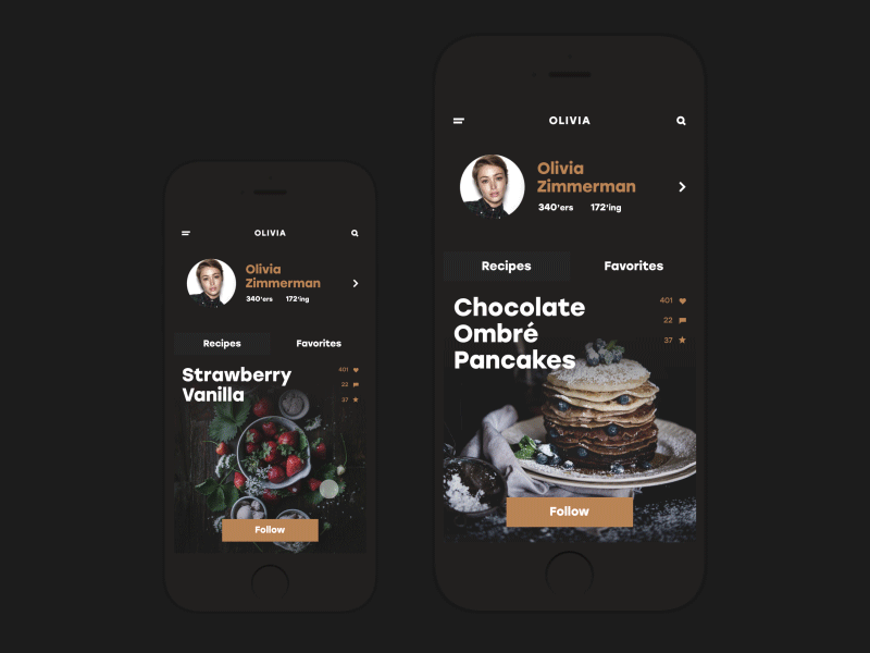
BuonApp
Read more on this topic in our previous article
The first set of our design glossary is ready for those who need it and we are going to continue this practice before long. Don’t miss the new sets. If there are any specific terms you would like to see explained, described, and illustrated, feel free to contact us via direct message on our Facebook page or Twitter, as well as our Quora representative. New definitions are coming soon!