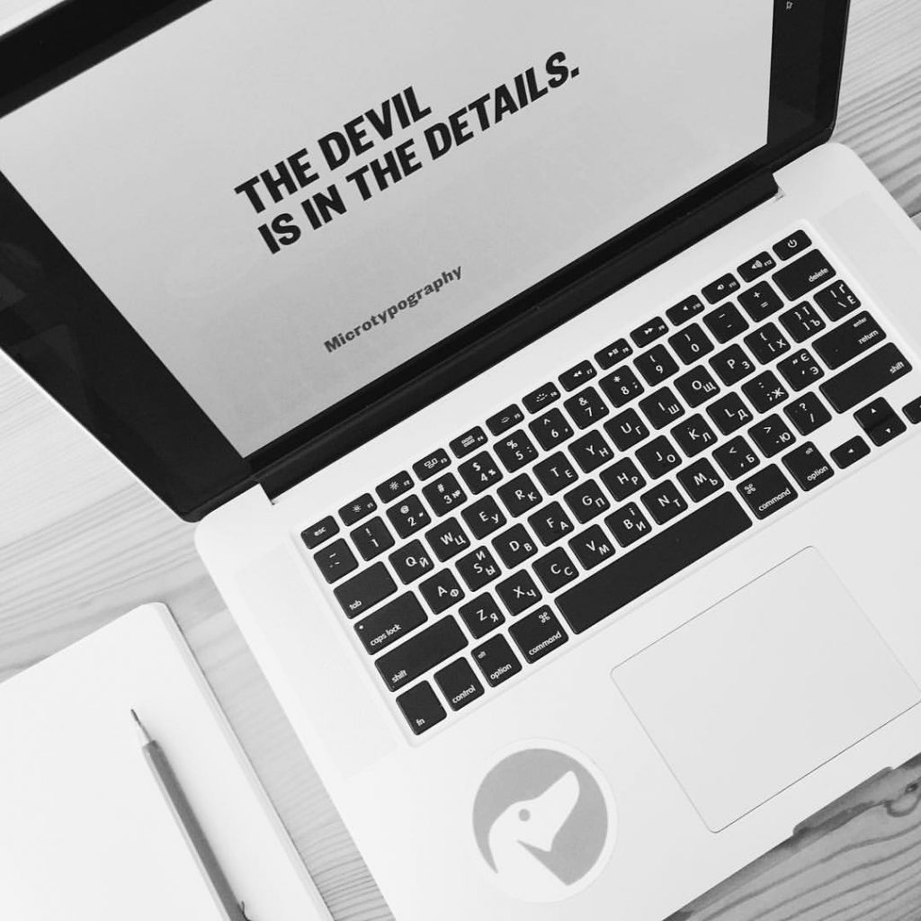
Words are a powerful weapon. They can bring both success and failure depending on how you put them together. They can motivate or confuse, strengthen or weaken, call, or push away. That’s why designing a digital product, it’s vital to remember that high-quality copy is as essential as the details of visual performance.
In one of our previous articles, we’ve already considered the big role of textual content in UI design, covering the definition of copy and its functions in graphic user interfaces. The important point to remember from it here is the words cannot be fully replaced with the graphics whatever amazing, high-quality, and professional they are going to be. Efficient and engaging copy content in user interfaces is defined by two equally significant basic criteria: the quality of writing and the appropriate look. Words and visual elements should mutually support each other, exist in harmony, and provide organic consistency. So, every single piece of copy should be thoughtfully analyzed and created in a way corresponding to the general design concept and enhancing positive user experience via successful interaction.
Could you imagine an interface containing badly-written copy with the same type sizes, fonts, and colors? The chances are big that it would cost users a great effort to solve their problems or get needed information with the product, so they would simply choose another product that is more user-friendly and less time-consuming. Let’s check what types of copy content designers and copywriters deal with creating websites or mobile applications, and think over the points needing special attention.
Visual hierarchy
To organize content in interfaces clearly for users, designers apply a well-known technique called visual hierarchy. It is initially based on Gestalt psychological theory and its main goal is to present the content on the carrier, be it a book page or poster, web page, or mobile screen, in such a way that users can understand the level of importance for each element. It activates the ability of the brain to distinguish objects on the basis of their physical differences, such as size, color, contrast, alignment, etc. In the aspect of creating copy content for web pages and mobile app screens, there are two aspects important to consider: page scanning patterns and typographic hierarchy.
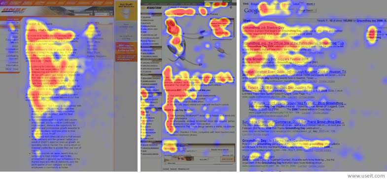
Understanding the importance of visual performance and readability of copy in digital products and its impact on user experience, numerous usability experts explore this issue comprehensively and collect statistics providing valuable data for designers. Lots of studies have shown that before reading a web page people scan it to get a sense of whether they are interested. According to different studies, including the publications by Nielsen Norman Group as one of the pioneers of this field, the UXPin team, and others, there are several popular scanning patterns for web pages, among which “F” and “Z” patterns.
F-pattern is referred to as the most common eye-scanning pattern, especially for web pages with a big amount of content. A user first scans a horizontal line on the top of the screen, then moves down the page a bit and reads across the horizontal line which usually covers a shorter area. And the last one is a vertical line down on the left side of the copy where they look for keywords in the paragraphs’ initial sentences. It usually occurs on text-heavy pages like blogs, news platforms, thematic editorials, etc. How could designers employ this knowledge? First of all, placing the information of key importance or core interest on the most scanned spots and trying to use short catching headlines and bold headers to draw users’ attention.
Z-pattern is applied to pages that are not so heavily concentrated on copy. A user first scans across the top of the page starting from the top left corner, looking for important information, and then goes down to the opposite corner at a diagonal, finishing with the horizontal line at the bottom of the page, again from left to right.
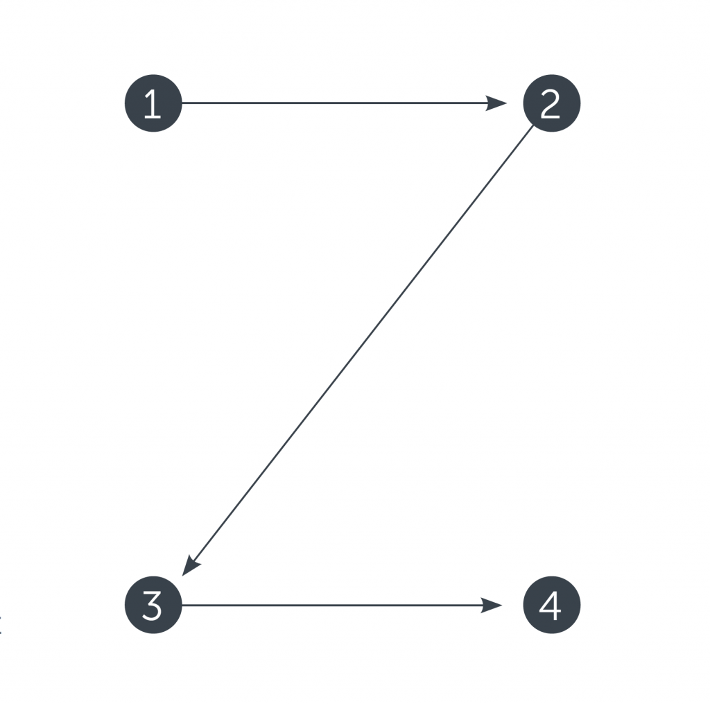
This is a typical model of scanning for landing pages or websites not loaded with copy and not requiring scrolling down the page, which means that all the core data is visible in the pre-scroll area. In this case, designers place core information in the spots of highest attention, such as top corners, and put the other points requiring attention along the top and bottom lines.
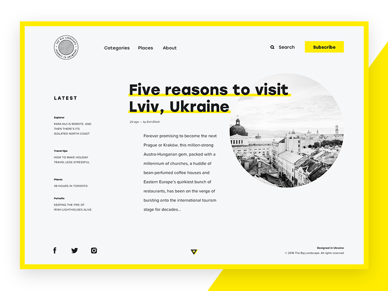
The Big Landscape
Here we can see the design concept for a website that presents the online magazine “The Big Landscape”. The interface is minimalist following the principles of clear visual hierarchy, good readability, intuitive navigation, and aesthetic pleasure from visual perception. The designer followed Z-scanning-pattern placing vital elements such as the logo and CTA button in the corners of the top line while the bottom line informs users about the website creators and provides the ability to contact via social networks instantly.
Typographic hierarchy
Typographic hierarchy is a system that organizes copy content in the best way for users’ perception first of all via modifications and the combination of types and fonts. It is aimed at creating a contrast between the most meaningful and prominent copy elements which should be noticed first and ordinary text information. The contrast is created by regulating type fonts, sizes, and colors as well as their placement and alignment. Typographic hierarchy is presented with common types of copy content used in UI design.
Headlines
A headline is the first thing that users should see in any interface. It is a large, bold word or phrase which transfers and emphasizes the core informative message on the page. It’s essential for headlines to be catchy and short so that they could draw users’ attention and meaningful in order to inform users about the theme and benefits of the content of the page or screen. According to the research published by one of the popular social media sharing platforms Buffer, the ideal length of the headline is 6 words; Jacob Nielsen provides the study which shows that headlines of 5-6 work effectively, not less than extensive headlines presenting a full sentence.
Another point to remember: it’s good when the headline is visually supported by other elements on the page or screen, still, it also should be understandable and meaningful without such context.
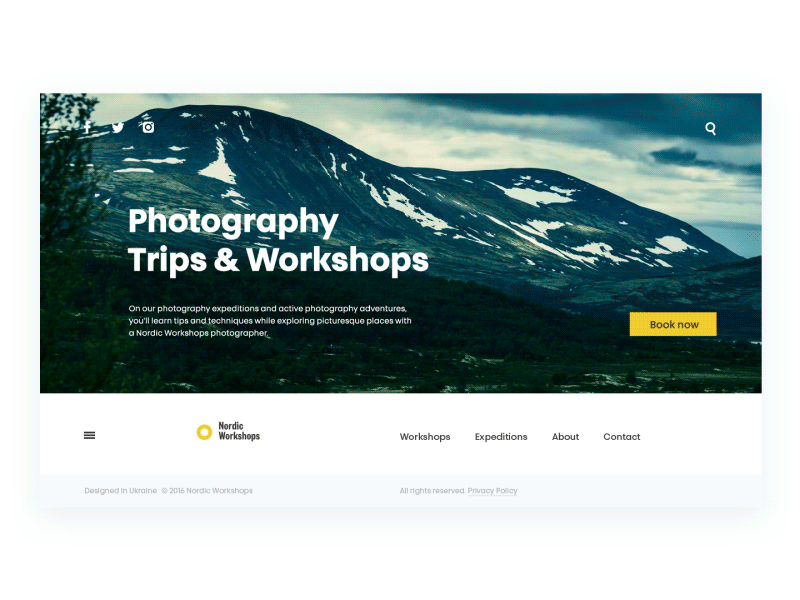
Photography Workshops
Here is the landing page for a company organizing photo tours and workshops for photographers. Functional and stylish minimalism is the basic approach behind the web interface. The bold headline is placed on the left which makes it noticeable but the major accent still remains on the head picture.
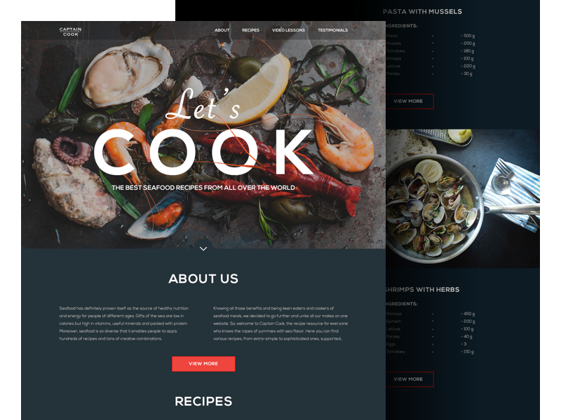
Website on cooking seafood
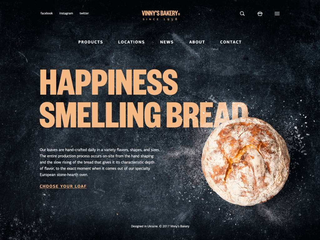
These are two examples of the websites concentrated on providing content around the same theme – food. They both have a minimalist design with centrally located headlines. However, the headlines differ with the message they send to the users as well as the nature of the websites differs in its core: one of them stimulates uniting users around the action (cooking seafood) while the other is focused on presenting the goods (bread and bakery). The first example presents a website collecting recipes of meals with seafood from all over the world, so its headline contains a CTA with a key element – action verb in the imperative form “Let’s cook!”, which dynamically tunes users into the activity. On the other hand, we can see another concept – a website for a small bakery selling homemade bread. The lyrical headline makes users feel warm, sets a strong positive emotional connection, and lets them instantly imagine the smell of bakery products that are sold via the website.
Subheaders
It’s impossible to put all the significant information in a headline, that’s why you need subheaders. These are brief, concise, and catchy phrases that are similar to headlines, although they typically mark out the key points in separate sections while headlines summarize the theme or message of the whole page. Following the principles of visual hierarchy, fonts chosen for subheaders are usually smaller than for headlines but bigger than the rest of the copy. Traditionally, they are also bold and short.
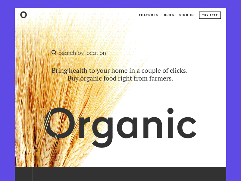
Organic — landing page
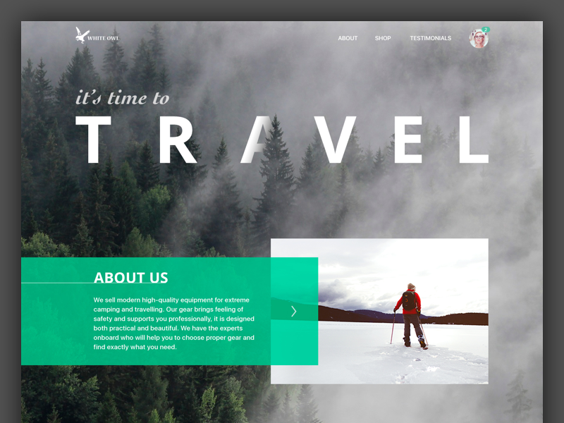
Travel Gear Landing Page
Subheaders play a big role in landing page design. These two concepts for landing pages above are good examples of how subheaders inform users about the data provided in different sections. Bold subheaders point out the main idea of body copy helping users find the information they need easily and quickly.
Body copy
Body copy is usually a part of text presenting the description or some essential information placed in a compact block, usually under a subheader or a headline. Fonts are thinner and smaller than in headlines and subheaders, sometimes they are presented in italic for even more prominent visual contrast.
There is no unified opinion about the best length of body copy. Some content creators support the approach that long copy is more informative and serious-looking, while others claim that only short copy is effective because Internet users never want to read too much. Here in Tubik, we support the approach that the length of the effective and user-friendly copy depends directly on the target audience: users, as well as products, are incredibly different, they have diverse preferences, goals, and wishes when they search for web resources or mobile apps. Both long and short copy have their own pros and cons, and each of them can be appropriate depending on the target audience of the product and its conversion goals.
Short copy is often effective for mobile interfaces and landing pages: their users are usually keen to see concise and highly informative copy content. Moreover, mobile interfaces have a limited amount of space, so too much copy won’t look nice and will demand additional effort for reading, which can be the reason for poor user experience. Long copy is good for web resources that provide users with complex information on specific topics as well as a presentation of the products which aren’t well-known for users and need additional informative support.
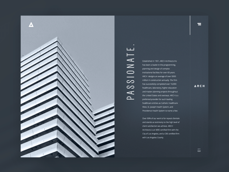
Architecture Firm
Here is an example of a web page where the long copy is useful. It’s a design concept featuring a website for an architectural bureau following a minimalistic and functional approach in creative practice and demonstrating it via website visual performance. The aim of such websites is to tell the company’s story, present professional level, and achievements, so detailed copy works efficiently in this case.
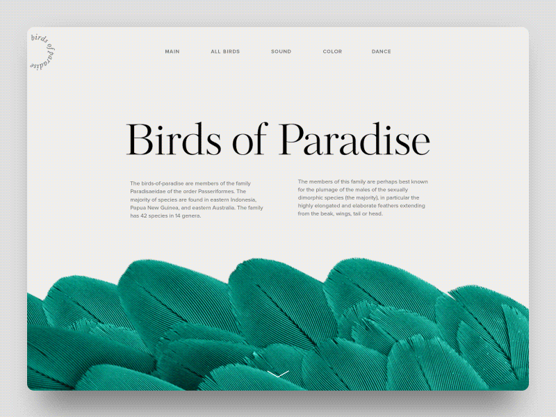
Birds of Paradise Encyclopedia
This design concept also presents a website deeply based on the copy: it’s an educational project setting the online encyclopedia about the specific family of birds. Although it contains a great amount of information presented in the text, this type of content is logically divided into many brief and concentrated copy blocks supported with prominent headlines as well as bright and catchy illustrations. This approach makes interaction with the website more dynamic which is especially effective for a teenage part of target readers that presumably often perceive encyclopedias as boring stuff.
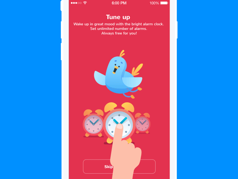
Toonie Alarm tutorial
As we mentioned above, short copy is useful for mobile interfaces since they are limited in space. The interface of a brief onboarding tutorial for the Toonie Alarm app demonstrates how copy is divided into short blocks in order to leave enough “air” on the screen and make copy readable.
Call-to-action elements with copy
The core elements that make the UI interactive are those which contain a call-to-action (CTA). Some call-to-action elements may be represented with icons that don’t require copy using widely and instantly recognized icons such as a telephone receiver for a phone call or the envelope for mail. However, in cases when the image of an icon is not so obvious or can be misleading, it is more effective to use a double scheme, when the icon, button, or link is supported with the copy.
The copy for call-to-action elements consists of one or two words or a linked phrase in a body copy. Verbs in the imperative form are one of the frequently applied mechanisms of engaging users. Designers are recommended to use various techniques of creating contrast, first of all via color, in CTA elements, so that they could stand out in the layout and draw the user’s attention quickly.
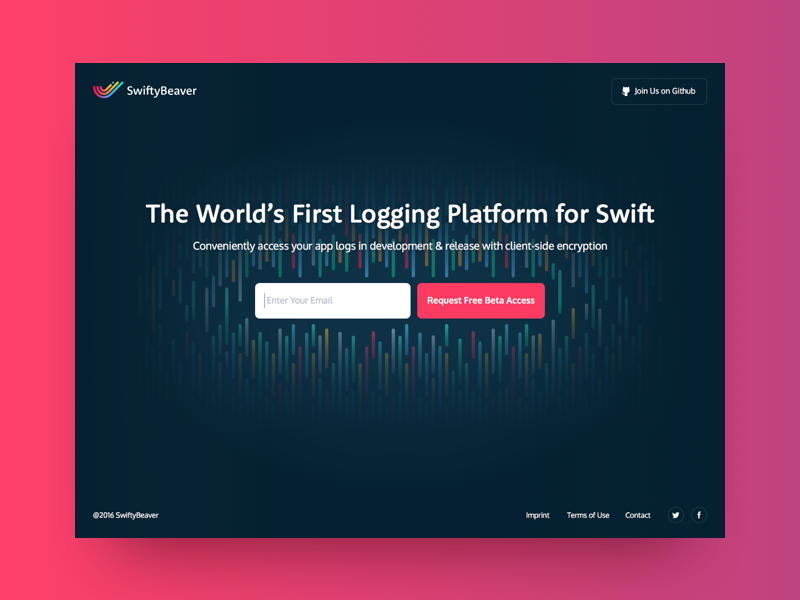
Landing page for SwiftyBeaver
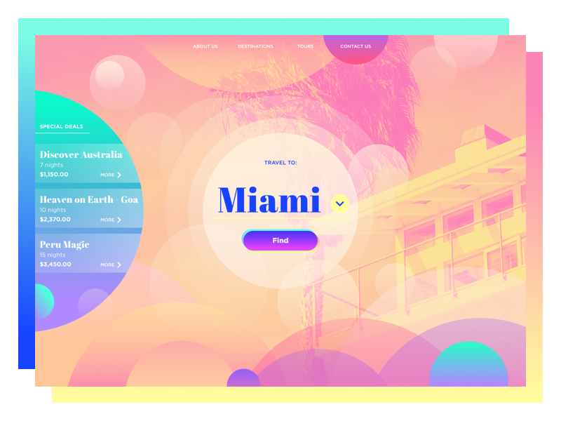
Travel Agency Website
The CTA buttons on these two landing pages are both centrally located, although they employ different types of copy. The first one consists of the four-word-phrase, while the other applies only one word. However, both look good and work effectively since they both contain the verb in the imperative form and inform the target audience about appropriate action solving their potential task on this website.
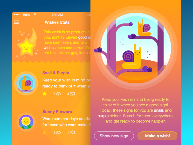
Good Sign App Concept
This is a concept for an unusual Good Sign app that gives you a new sign to look for, and you make your wish every time you see it in real life. Such an extraordinary app has also unusual CTA buttons like “Make a wish”.
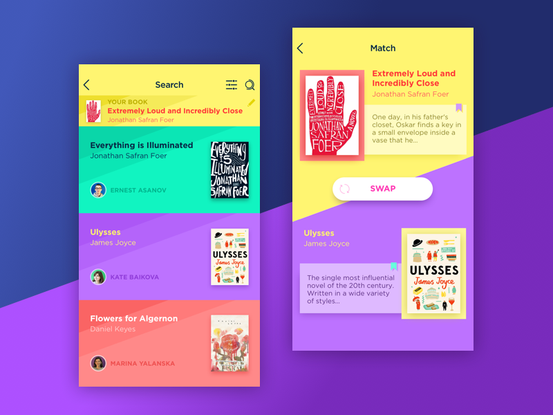
Book Swap App
There’s no need to create CTA buttons exceptionally in bright colors – their main task is to be easily noticeable in the general layout. If the interface is bright and colorful, why don’t you make the contrast with a light background which will make the bright copy even more prominent, like in a concept for the Book Swap app above?
Captions
Caption is the short text under a picture describing its content. In web interfaces fonts are usually small and often italic, and in mobile interfaces, the sizes of fonts depend on the size of a picture.
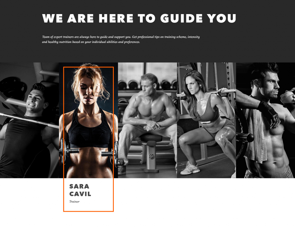
Gym Landing Page
Here is a concept for the landing page of a gym. The captions here have bold fonts that make them easy to read. They are shown only when the picture is hovered which makes interaction more engaging for the users.
Points to consider
All in all, creating quality copy content isn’t that hard if you keep in mind the typographic hierarchy principles. And here are some basic tips on presenting the copy:
- Create catchy headlines. They draw users’ attention and often become the point of decision about whether the user continues interaction with the page or bounces it.
- Make headlines short, but keep them highly informative.
- Subheaders relate to separate sections, so they guide users through the content in the interface.
- Use brief concise copy for mobile interfaces and landing pages.
- Consider using a long copy for web resources aimed at providing informative content.
- Use verbs in the imperative form to encourage people to actions.
- Use contrast colors for call-to-action elements, so that they could draw the user’s attention more effectively. However, don’t forget to test the readability of the text on the CTA elements: it has a crucial impact on usability and conversion rates.
- A caption should preferably describe or add the data that isn’t obvious from the image.
- Give a strong preference to present tenses in captions.
- Always ground your solutions on preliminary user research, and don’t neglect testing different options.
Recommended reading
Here is the collection of recommended articles for further reading in case you would like to read more about the theme.
UX Writing: Handy Tips on Text Improving User Experience
User Experience: How to Make Web Interface Scannable
Visual Hierarchy: Effective UI Content Organization
Types of Copy Content in User Interfaces
Visual Perception: Icons vs Copy in UI
How to Make User Interface Readable
Our next publication will continue the comprehensive theme of visual hierarchy and its effective practices in web and mobile interfaces. Don’t miss!