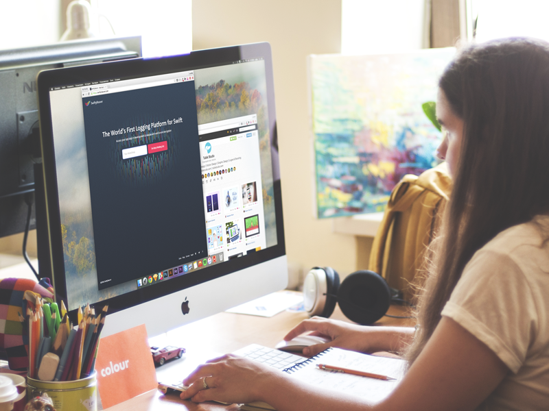
Today we would like to present you a new case study on UX and UI design. This time it is a full design path for SwiftyBeaver project.
Task
Design of the user interface for the logging platform uniting the efforts of Swift and Objective-C developers, UX designers, app analytics experts, and product owners.
Tools
Sketch, Adobe Illustrator, Adobe After Effects.
Process
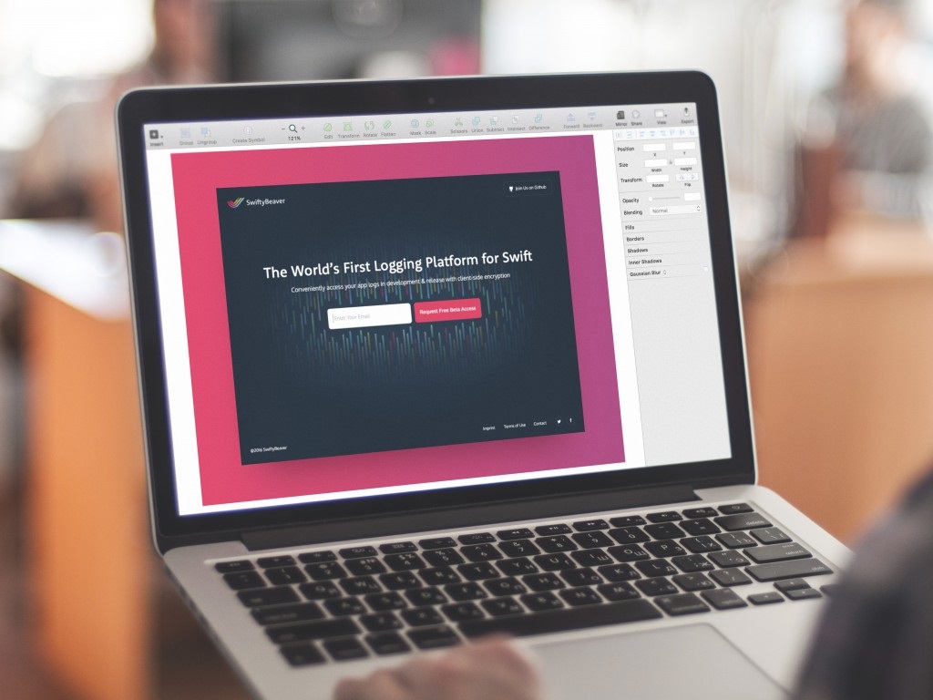
SwiftyBeaver is a native Mac application presenting the integrated logging platform for Apple’s Swift programming language, also supporting Objective-C. First of all, it is aiming at developers as its basic target audience. The product supports all the devices belonging to the Apple device family. The user interface designer had to consider the basic and advanced needs of people involved in the developing process to make it easier, faster, and more productive. The assignment to work over design solutions was given to one of Tubik Studio UI/UX designers Ludmila Shevchenko who says that the project was really a memorable task totally different from everything she had accomplished before. To get a more detailed description of the product and its functionality, welcome to read its presentation on Medium. And now let’s look a bit closer at some steps of user interface design for the product.
In software engineering logging should be mentioned among key factors of developers’ routine. It is an integral part of the development process helping developers to understand flow, logic and state of an application. Log entries inform them about the state of the application as well as the issues of its actual operating. Therefore, a user interface for this sort of product needs to support the high level of visibility for changes, intuitive navigation, and presentation of big data bulks with a high level of readability and visual marking of key details. The basic objective was to design a platform that will be easy to use, informative, supporting broad functionality for professionals, and seamlessly integrated with any Apple device.
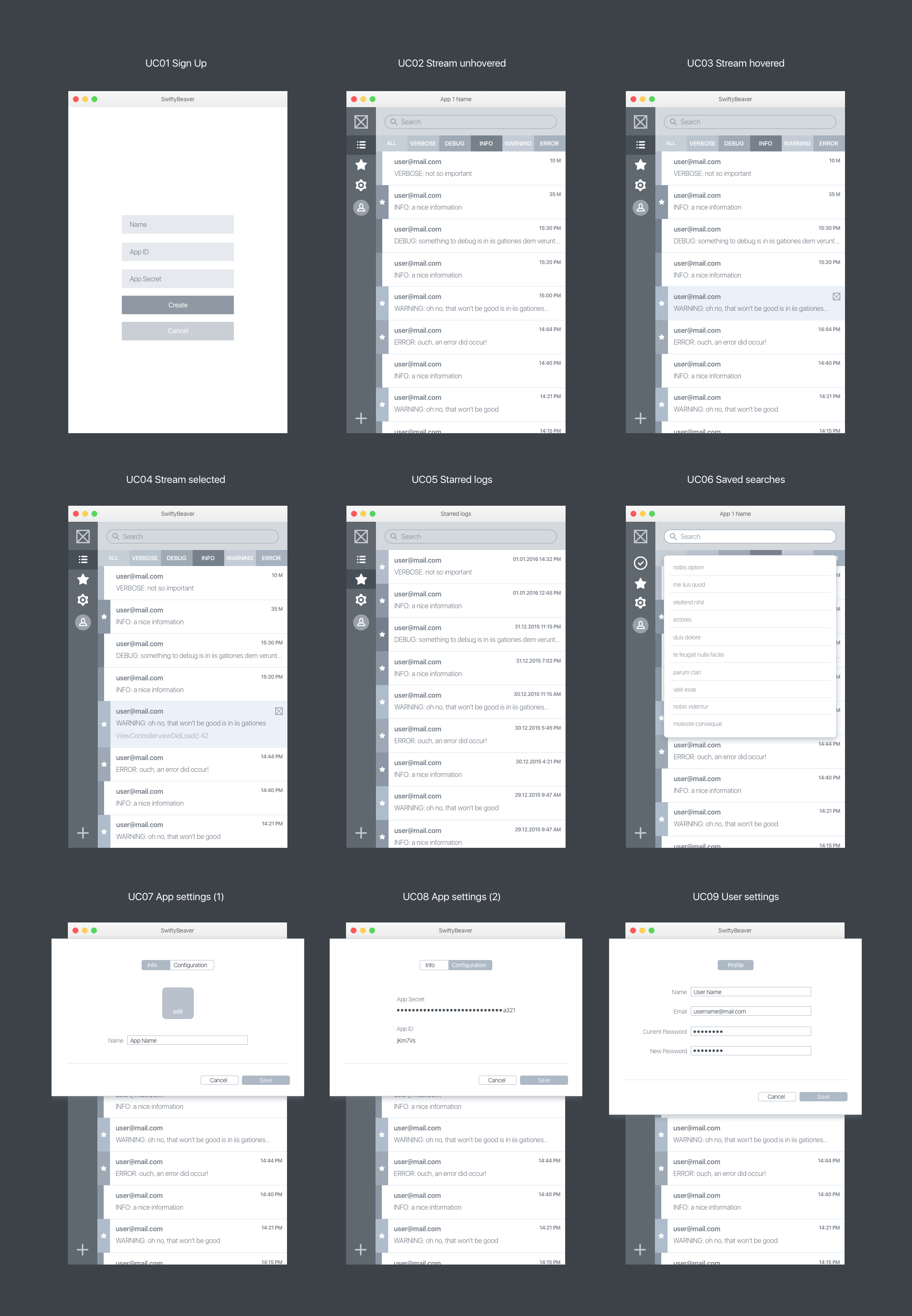
At UX design stage the designer worked over layout and navigation design solutions concentrated around three basic issues:
– the way log entries should be shown in the stream, as a general feed or separated by filters
– the method log entries or the part of the stream history will be saved
– the channels of creating code or working over the existing code.
Obviously, this part of the design process, based on specific knowledge about the field, needed tons of discussions and tight collaboration with a client, the founder, and CEO of SwiftyBeaver Sebastian Kreutzberger. Being a developer himself, he brought out the idea which was deeply user-centered and problem-solving in terms of application for developing process, thus his detailed explanations of the operations were helpful for setting convenient and efficient layout, transitions, and navigation of the interface at UX wireframing stage. A thorough analysis of the target audience and the unique selling points of the product allowed paying attention to the practical aspects of the product’s functionality.
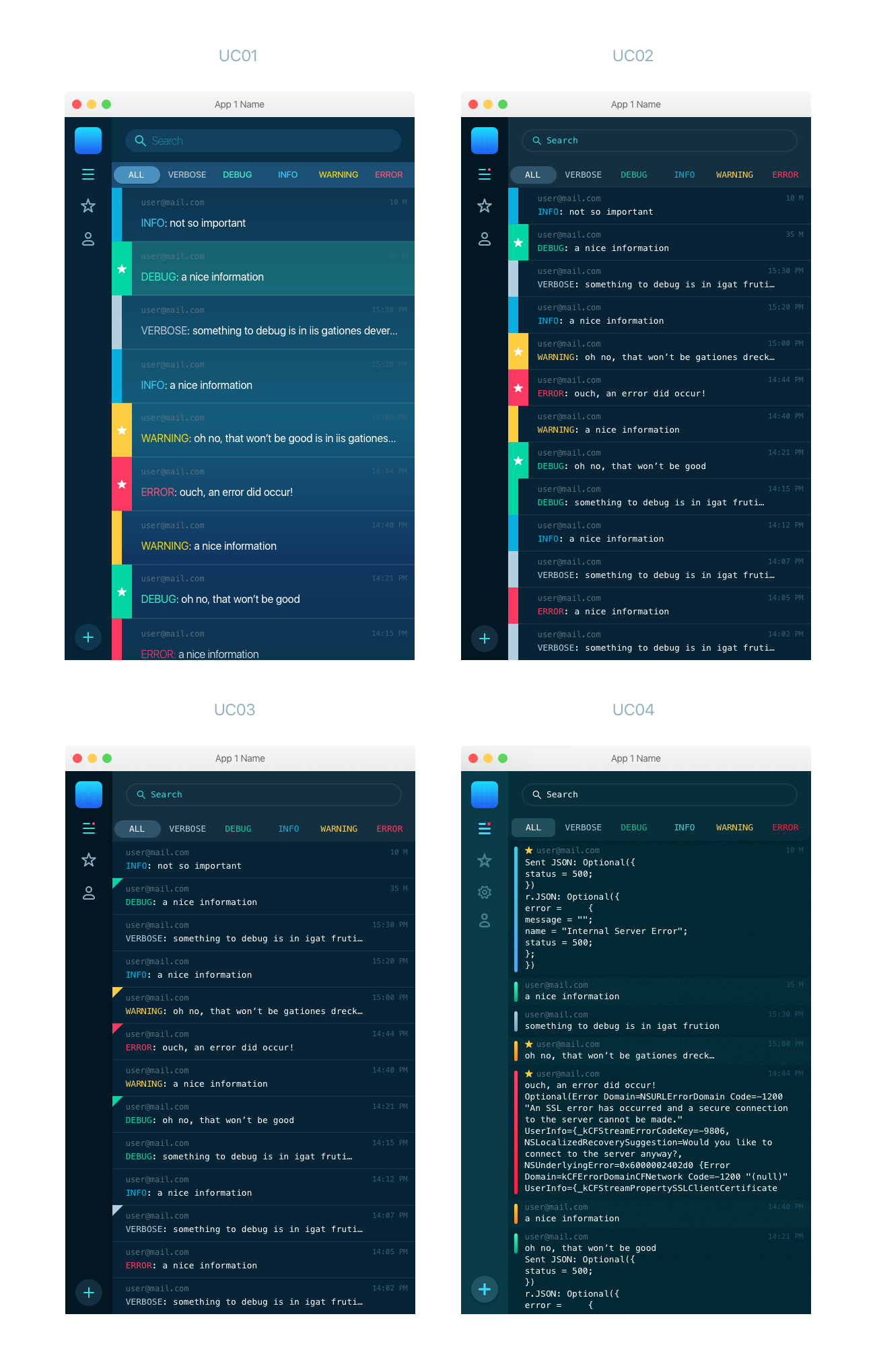
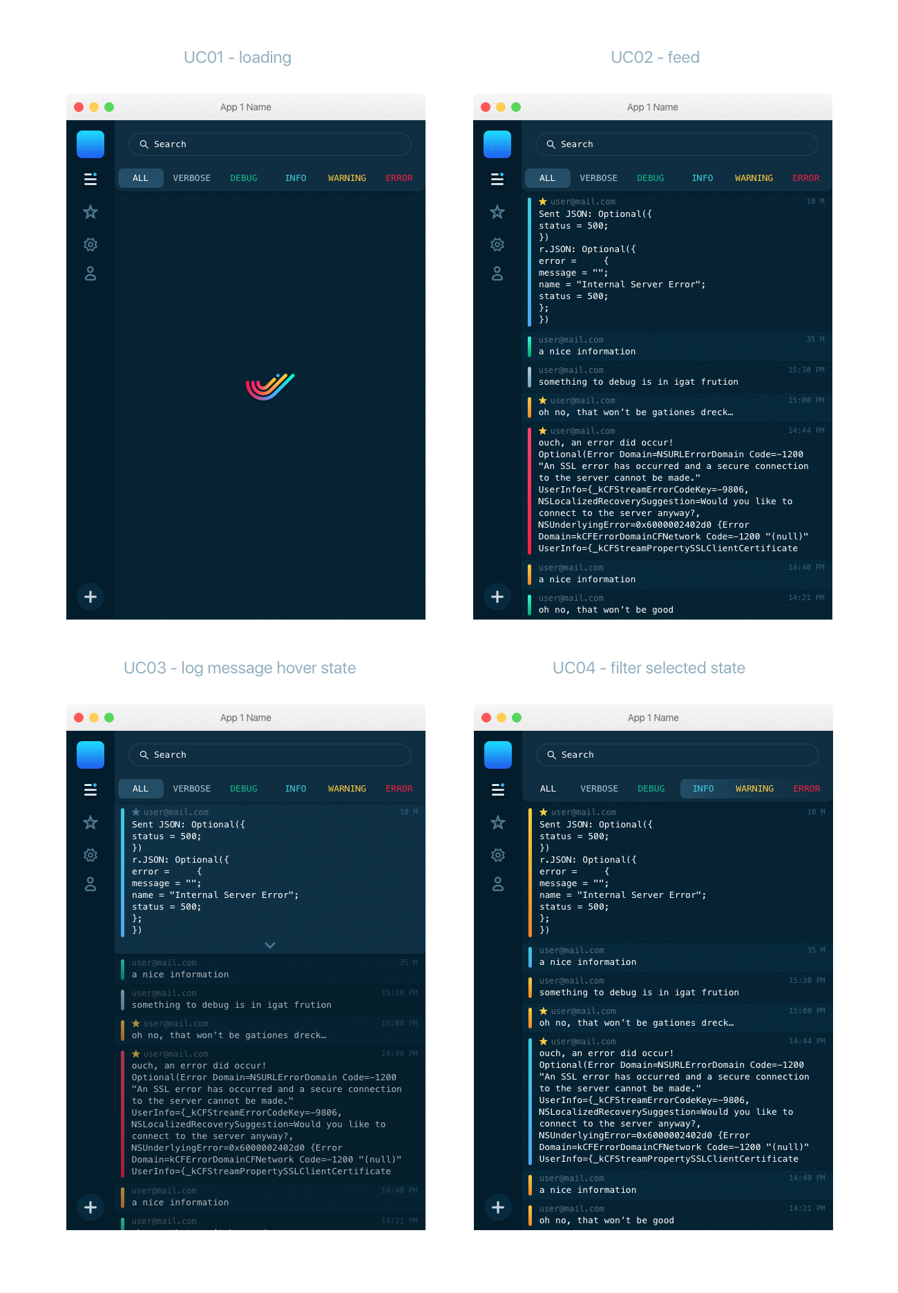
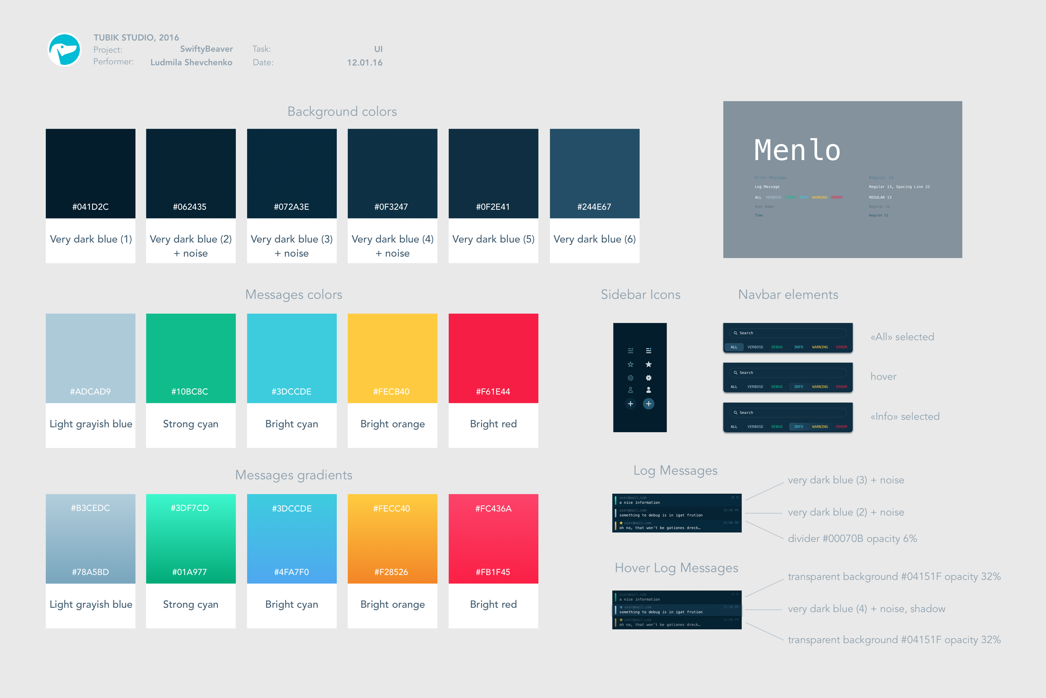
The UI design was concentrated around two major challenges: to present data efficiently in a way that will be quite traditional for developers but at the same time to make it a bit more engaging and stylish via non-distracting design elements and animation. Therefore, the design concept was based using dark background common for coding platforms and software as well as bright color accents and gradients to add some style and make important accents noticeable.
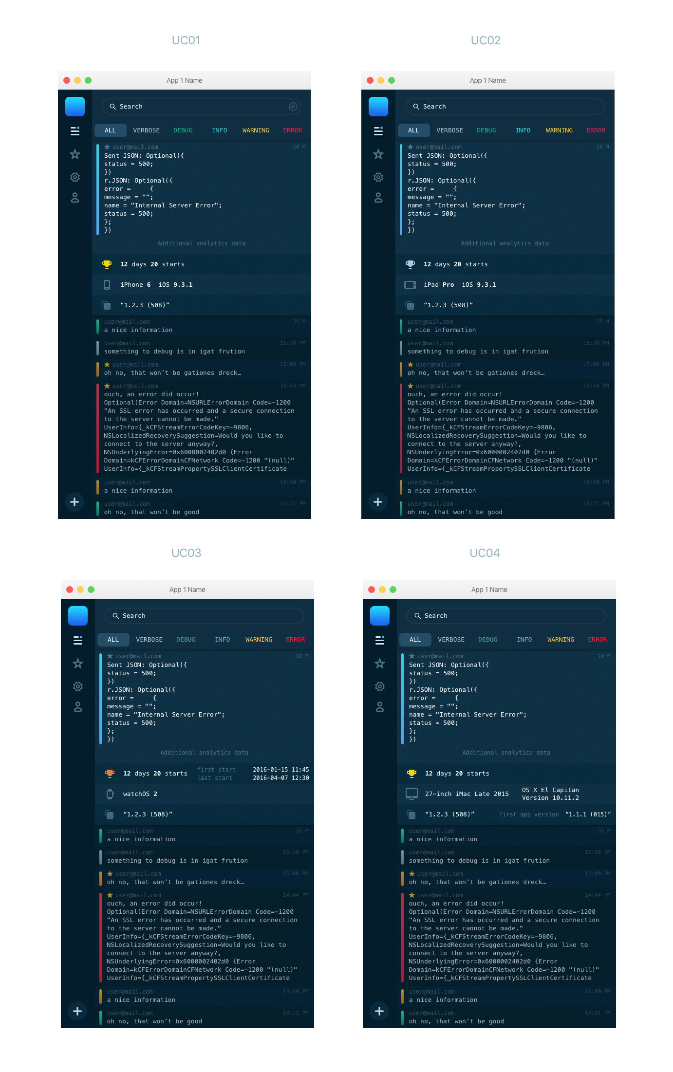
So, the visual presentation was not the only thing about colored elements. Using common color marking recognizable for developers, the platform supported easy navigation and visibility of key elements. Colors marked types of logging entries both in the names of categories and the streaming feed. The designer offered four UI concepts on this basis, with different fonts and variants of visual marking entries and errors.
Having agreed upon the general stylistic concept with the customer, the designer moved on in course of layout simplification. The interface of the product is data-driven, therefore, it has to exclude any sort of distraction and avoid repetitive elements to prevent the interface from being cluttered. So, it was decided to exclude the copy featuring the type of log entry in the fields of messages. Only color marker was left becoming the central element of the connection between log entry and the categories whose names were provided in the upper part of the screen.
The provided set of screens featured different concepts for visual presentation of color markers and entries saved by the user. Understanding the importance of navigability for the interface of such high practical value and information intensity, the designer tried to use the maximum of conventions power. The markers using the colors easily decodable by developers were also supported by the star sign as a popular and clear marker of saving the object to favorites or elements needing further attention later.
Among all the versions, the final decision was made upon the most minimalistic one. It used colored lines along the message body and small yellow star for saved entries. All the colored elements, as well as the background color and shades of hovered elements, were carefully tested to get a high level of visibility and pleasant-looking efficient contrast.
One more key element of design that needed deep attention was a choice of fonts. Actually, in the design process around any interface, the choice of an appropriate font has a great influence on general usability and presentation of the product. However, in such a specific interface as SwiftyBeaver, which is highly concentrated on the textual material, the weight of font choice got even bigger. Moreover, the product is not rich in graphics materials such as icons or illustrations, so font becomes a major element of visual design for the product. The designer took her time to test various solutions and select the font which would be both beautiful and easily readable for users.
The background was accomplished in different shades of very dark blue which appeared to be more harmonic and smooth in creating pleasant contrast than black color. To make the entries text more readable, the background behind them is changing slightly in shades one by one: it marks the limits of every entry but without unnecessary distraction for the user. Hovered elements were highlighted while the others were dimmed. Slight gradients made the color markers look more stylish.
The aspect of entry length also was an object of deep consideration. There was such a way to go: the stream could show the fields of fixed height and if the entry was longer it could be hidden showing only a part of the message and opening full view on click. However, after research and testing, this solution wasn’t found effective. It was decided to show the full text of each entry as it was more user-centered and excluded additional operations and clicks. Therefore, the designer paid deeper attention to the slightest aspects of the kerning and spacing of the lines and work with efficient copy placement.
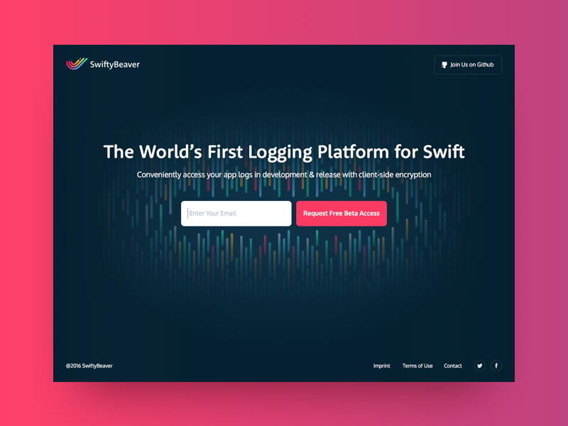
The work on the landing page for the product was also an interesting and challenging design task as far as the product doesn’t offer a lot of visual material for user engagement and attraction. Therefore, the main accent again was made around the colored accents echoing the design solutions of the application interface layout.
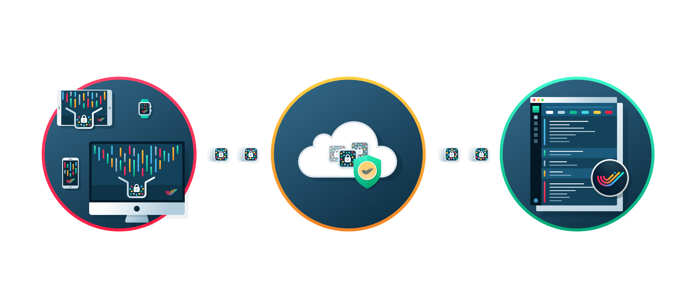
In addition, Ludmila accomplished graphic design task which resulted in illustrations presenting the features and benefits of the product.
Another design task accomplished by Tubik Studio for SwiftyBeaver was work on the logo design for the app.
![]()
We tell about it in our next case study. Don’t miss!
Useful Case Studies
If you are interested to see more practical case studies with creative flows for UI design, here is the set of them from Tubik.
Slumber. Mobile UI Design for Healthy Sleeping
Letter Bounce. UI Design for Mobile Game
Real Racing. UX and UI Design for Mobile Game
Real Racing. Graphic Design for Mobile Game
Bitex. UI Design for Stock Analysis App
Manuva. UI/UX Design for Gym Fitness App
Cuteen. UI/UX Design for Mobile Photo Editor
Tasty Burger.UI Design for Food Ordering App
Watering Tracker. UI Design for Home Needs
Night in Berlin. UI for Event App