Icons in user interfaces are the elements that cannot be overestimated. Small and meaningful, they solve numerous problems. They become little keys to usability and intuitive navigation. And only designers know how much time and effort is needed to make them simple, helpful and expressive.
Guru of user experience design Steve Jobs said: “Details matter, it’s worth waiting to get it right.” Obviously, icons are on the top of details making interface usable and navigable. So, today let’s discuss what are their types and how they can be used in interfaces.
Definition
In general terms, an icon can be defined as an image that has a high symbolic value and is used for the purpose of communication. Icons present signs which are informative and support data exchange between the informer and addressee alongside with words and sentences: while copy is served with letters or characters, icons communicate via the images showing pictorial resemblance with an object of the physical world. In computing and digital design, icons are pictograms or ideograms used in the web or mobile interface to support its usability and provide the successful flow of human-computer interaction.
Diving into the benefits of icons, one of the most important among them is the ability to replace the text. In one of our earlier articles, we gave details about the relations of copy and icons and their influence on usability. The process of the research showed that usage of recognizable and clear icons had a great potential in strengthening navigation as most people perceive images faster than words. However, even the slightest misperception can become the reason for poor UX so the solutions on the type of icons should be carefully tested to reach the good balance of icons and copy for a particular target audience.
History
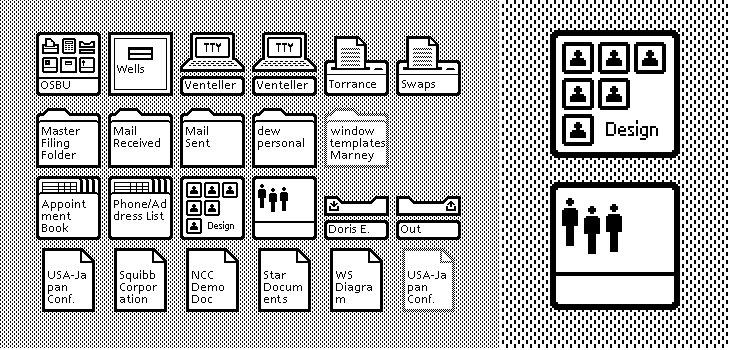
Obviously, icons weren’t invented by interface designers. As an object of communication, they have a long and diverse history rooting in ancient times. They are found in maps, signs, schemes, manuals and many other sources of information. However, with the advent of new technologies and graphical user interfaces, icons experienced the new twist of progress. Historically, Xerox is mentioned in credits for creating the first icons for a graphical UI in the early 1970s: the icons were implemented in a machine called Xerox Alto which was very expensive and didn’t really go to the wide masses. Still, that was the beginning of a long story: in 1981, Xerox Star was released and it’s referred to as the first consumer computer which used icons as a part of its interface. In particular, it applied the icons of folders and trash bins that have been used so far.
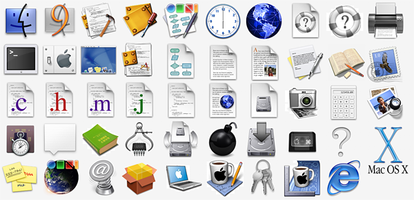
Another milestone easily remembered on this way is presented with the color icons Apple revealed first in 1991 and then later with their further updates for Macintosh. They featured another approach to the style when icons combined functionality and informative capacity with attractive and harmonic appearance.
These days icons are presented in digital design with numerous packs and sets in all the themes and styles possible. Although there are many ready-made packs, the database of icons is growing all the time in search of new solutions appealing to users.
Talking about the classification of icons, we can mark out several aspects of grouping them on types.
Types Based on Functions
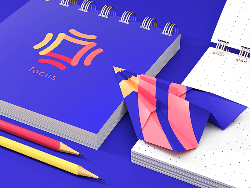
Clarifying icons
These are the icons aimed at explanation. They are visual markers explaining particular features or marking out categories of content. In some cases, they are not the layout elements of direct interaction; also, you can often find them in combination with copy supporting their meaning. This trick activates multiple elements of perception in one interaction providing better recognizability for call-to-action elements. People, who instantly understand the symbol transferred with the icon, won’t pay the big attention to the copy. The same will happen to those who have problems with fast copy recognition. However, using the copy together with the icon decreases the risk of misunderstanding or wrong interactions for people who can possibly misinterpret the meaning of the image.
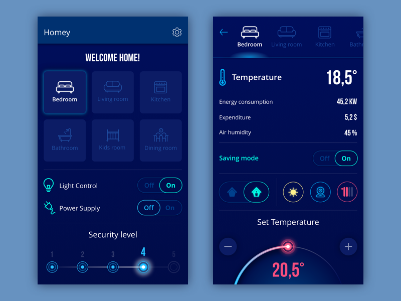
Homey App
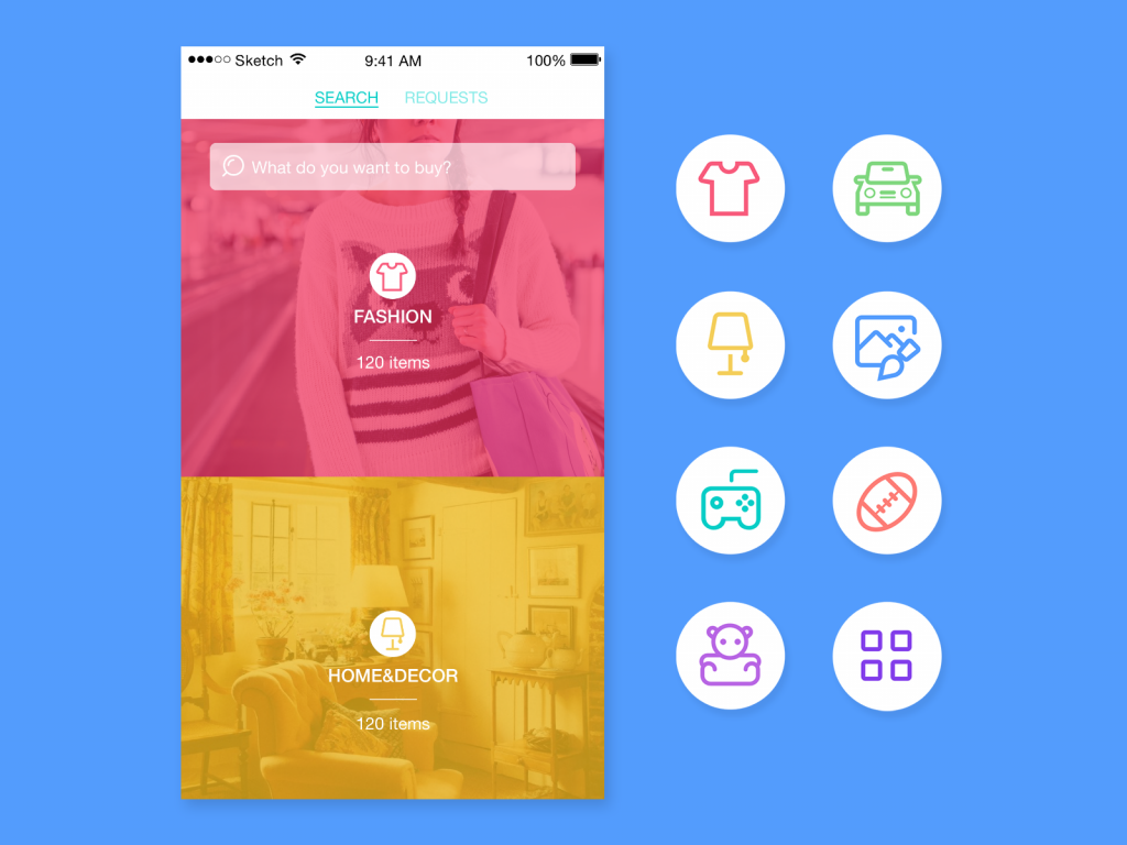
Category icons for Saily app
Interactive icons
The icons of this type are directly involved in the interaction process and are the core supporters of navigation. They are clickable or tappable and respond to the user’s request doing the action symbolized by them. Their main goal is to inform users about the functions or features behind the buttons, controls and any other elements of interaction.
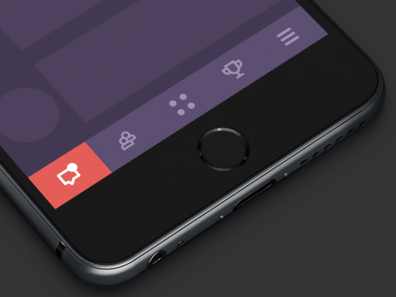
Tab Bar interactions
Menu interaction concept
Decorative and entertaining icons
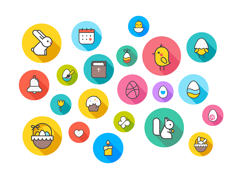
The icons of this type give more about aesthetic appeal than functionality. However, this aspect is also significant and needs to be considered as the style and appearance corresponding to the target audience preferences and expectations set the solid ground for high desirability. Applied wisely, it is one of the features that can not only attract but also retain users and add much to the positive user experience. Decorative icons are often used to present seasonal features and special offers.
Easter and spring-themed icons
App icons
App icons are the interactive brand or function signs that present the application on different platforms supporting the original identity of the digital product. In most cases, it features the logo of the app designed according to the requirements set for this kind of icon. However, it also can apply something else, for example, a mascot or an abstract combination of corporate colors. The effective solution is usually based on thorough market and competition research with the aim of creating an original icon that won’t get lost on the screen full of other app icons.
Icons for native apps of HUAWEI EMUI 10
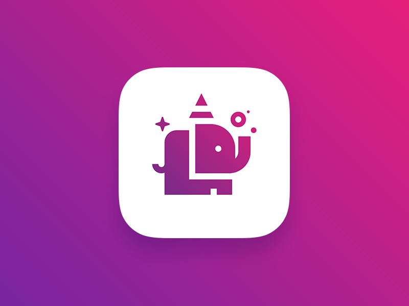
Elephun App Icon
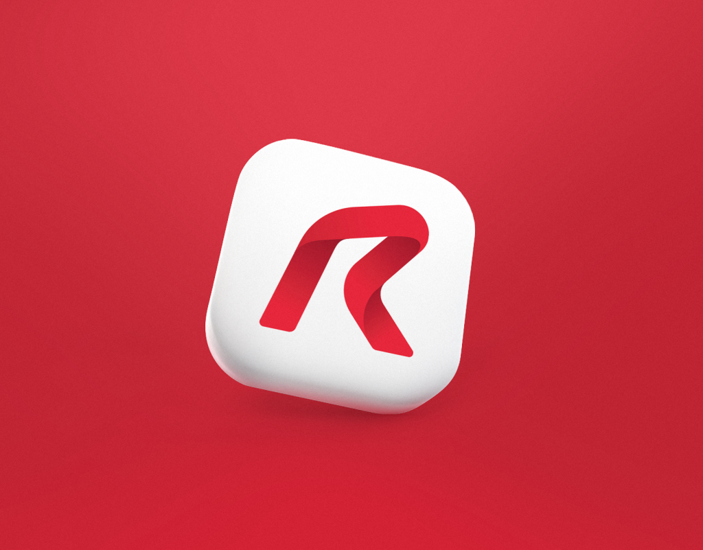
Reborn app icon
Favicon
Favicon, also known as URL icon or bookmark icon, is a special type of symbol which represents the product or brand in the URL-line of the browser as well as in the bookmark tab. It allows users to get a quick visual connection with it while they are browsing. This interface element proved itself effective for productive website promotion and good recognizability of its visual identity.
Types Based on Visual Performance
Glyph icons
The term “glyph”[glif] has come to design from the field of typography. The word takes its roots from the Greek word which means “carving”. Originally, the term presents an elements symbols or pictogram which is included in the set of symbols agreed upon many users (readers, writers, etc.): it presents a readable character enabling people to write it.
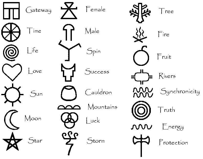
In the sphere of typography, it is a certain graphic representation of an element of written language within a particular system of writing or particular typeface: it can be a grapheme, or part of a grapheme, or sometimes several graphemes in combination (a composed glyph). Here’s the set of ancient Celtic glyphs, for example.
In modern digital design, the word “glyph” reinvented its meaning but not into a sort of revolution. It is used to define a graphic symbol that provides the appearance or form for a character: it can be an alphabetic or numeric font as well as a symbol picturing an encoded character. Talking about icons, glyph icons are first of all described as a typographic symbol that represents something else, not letter or number. Among popular examples, you will also find the “@” symbol representing the preposition “at”. For example, here is the set of icons for material design from Google.
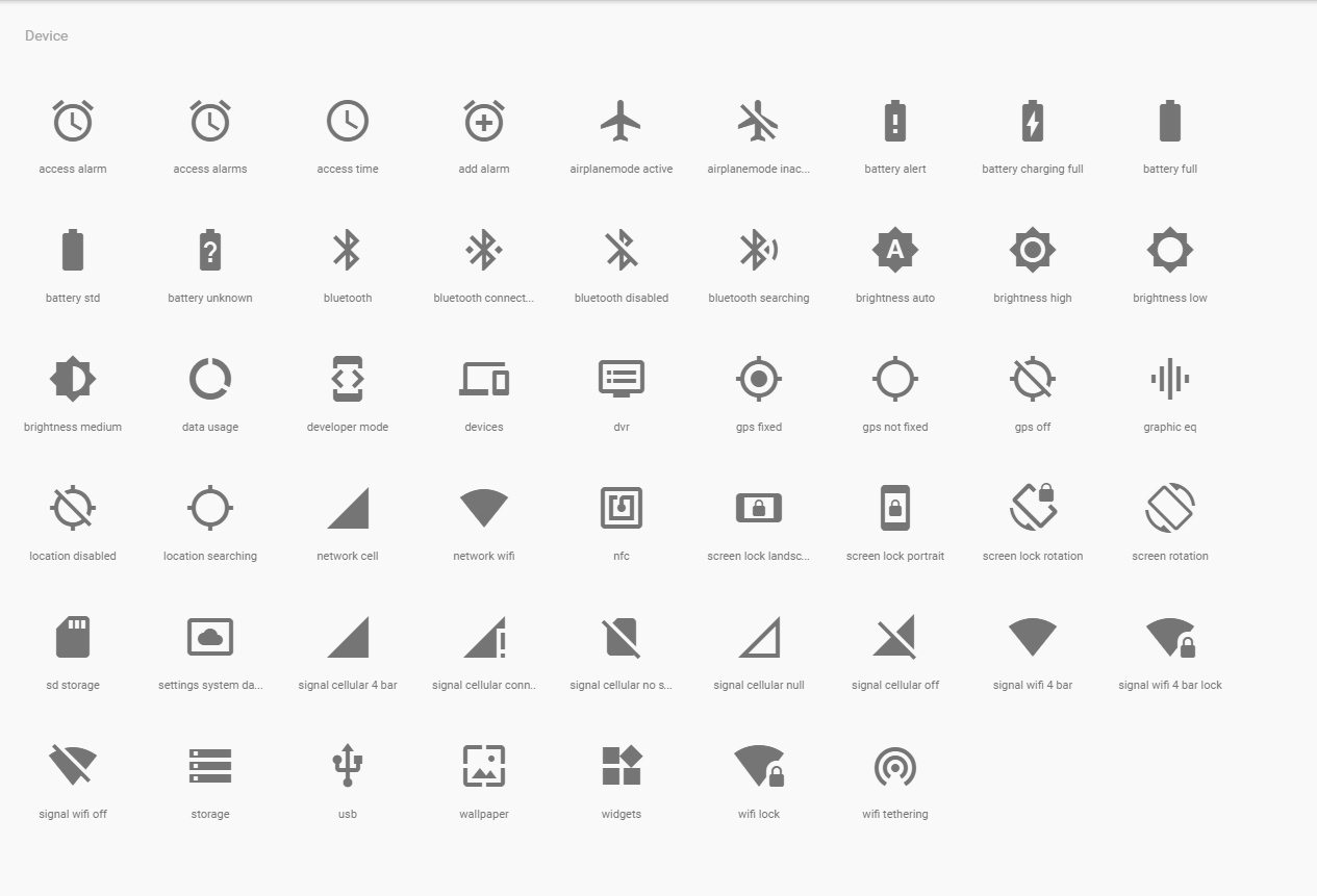
Glyph icons use simplified and universal shapes and images to be recognizable and flexible in terms of responsive design. They play a big role in the issues of navigation for a digital product.
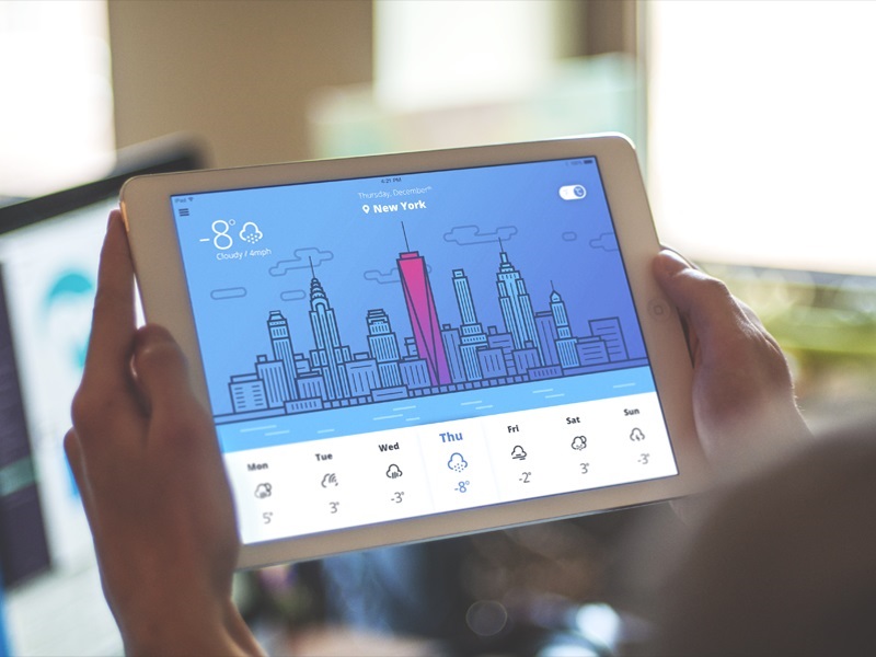
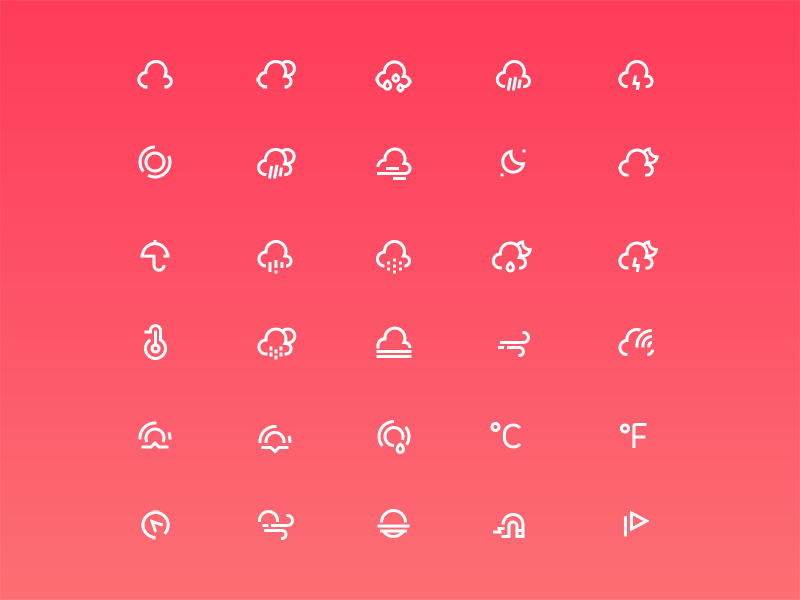
Weather icons
Flat and semi-flat icons
Flat icons are usually a bit more complex than glyph: they can apply color combinations, filling of the elements and present a bit more complicated images. Nevertheless, they are also focused on simple and recognizable visual metaphors quickly transferring the required meaning. The most prominent feature which actually has inspired the name of this direction is applying flat 2-dimensional visual details as the opposite to highly realistic and detailed skeuomorphic images. Flat style allows designers to be more flexible in applying the expressive power of colors and shapes not losing in the legibility of the presented items.
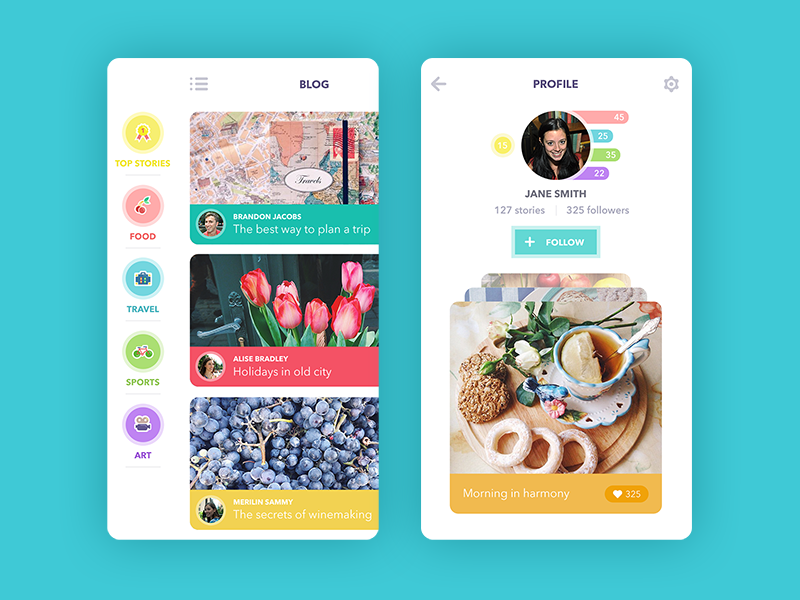
Blog App
Skeuomorphic icons
Skeuomorphism is the design direction somehow opposite to flat. It is based on the idea of reflecting images in 3D look very close to the original natural look of the physical objects. It was popular for GUI of different types and functionality several years ago. But then it was gradually replaced with flat design in UI which is simpler and therefore more flexible and practical for the needs of digital interfaces. Nevertheless, the skeuomorphic icons are still widely used in the game design and app icons in the game sector.
SVG icons
SVG icons, decoded as Scalable Vector Graphics, are responsive icons built on XML-based 2D vector images. They are designed and integrated according to an open standard developed by the World Wide Web Consortium (W3C) since 1999 and supported by all major browsers. SVG icons are growing their popularity as today websites are used on the diversity of platforms and devices and need to be responsive to provide positive UX.
Types based on applied image metaphor
This direction of the icons typology is based on the research provided by the famous expert in usability Jackob Nielsen and revealed in his article for Nielsen Norman Group. In this perspective, icons can be divided into three core types according to the type of metaphor they reflect.
Resemblance icons are the symbols directly depicting a physical object the icon represents. These are, for example, the magnifier for search, the shopping cart, the envelope for mail, etc.
Reference icons are the symbols depicting an object on the basis of analogy. For instance, a picture of a clamp representing a file-compression utility (because it squeezes) goes to this group.
Arbitrary icons are the symbols that currently do not set direct connections with the objects and their recognizability is based on convention and power of habit. This is when we should remember about floppy disc representing the “Save” function: although initially it was a reference icon, for many users now it doesn’t work like that – they just know the meaning solidly connected to this image for many years.
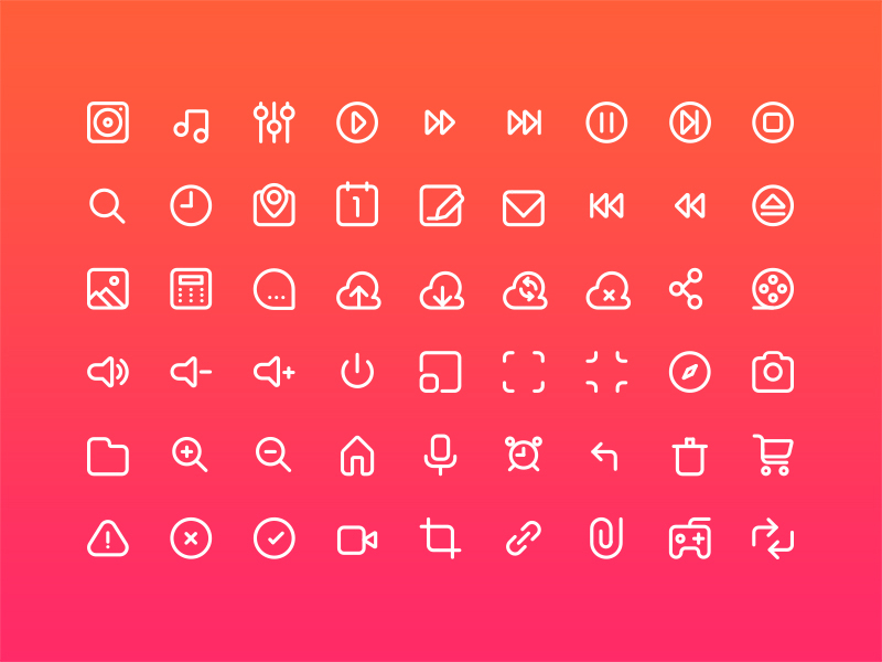
Multimedia Icon Set
Key Features of Effective Icons
In one of our previous articles devoted to the role of icons in user interfaces, we have already described all the essential features making the icons efficient, so today let’s just quickly recall them.
- clear – the meaning of the icon is understandable and accessible to the target audience
- meaningful – the icon transfers the informative value
- recognizable – the visual symbol applied in the icon is presented in the form which can be recognized and decoded correctly by users
- simple – the icon isn’t overloaded with non-essential graphic elements which allows it to be quickly perceived and understood without too much effort
- original and noticeable – the icon stands out among other similar elements of the interface which is especially actual for the app icons
- scalable and flexible – the icon saves its unity, integrity, and legibility in different sizes and resolutions
- attractive – the icon satisfies aesthetic expectations and sets harmonic visual appeal
- non-offensive – the icon doesn’t have hidden meanings or misperceptions which could feel offensive or rude for any part of the target audience
- consistent – the icon corresponds to the general stylistic concept of the layout it is applied for.
Recommended reading
Here is a bunch of articles for further exploration of the topic:
How to Make Your App Icon Stand Out
UI/UX Design Glossary. Navigation Elements
How to Design Effective Search in User Interfaces
Basic Types of Buttons in User Interfaces
Visual Dividers in User Interfaces
Directional Cues in User Interfaces
Error Screens and Messages: UX Design Practices
Iconic Simplicity. The Vital Role of Icons
Visual Perception: Icons VS Copy in UI
Icon Classification: Resemblance, Reference, and Arbitrary Icons