The year is going away so fast: seems each day just melts away like a snowflake. Traditionally, before the holidays start, it is high time to turn away and revise what deserves to be remembered.
We have already reviewed the most popular trends and tools for developers in 2016, today the theme will be continued with significant design trends that couldn’t be left without attention. No doubt, this design year was globally dynamic, creative, full of news and events. Having worked over diverse design projects and tasks as well as in-house studio products here in Tubik Studio, we prepared our list of trends in design for web and app interfaces, which got popular this year, illustrating some of the mentioned points with works by studio designers. Let’s get started.
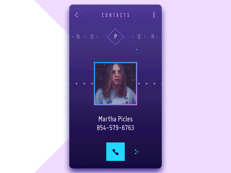
Flat design
Flat design has significantly grown its presence and diversity this year, both in interface design and branding. The design approach is known for its minimalist and concise use of visual expressive means and has established itself as a style favorable for enhancing usability and visual harmony of user interfaces. The most prominent feature which actually has inspired the name of this direction is applying flat 2-dimensional visual details as the opposite to highly realistic and detailed skeuomorphic images.
The features of flat design supporting its steady popularity in interface design include:
- the simplicity of shapes and elements
- minimalism
- functionality
- bold and highly readable typography
- clear and strict visual hierarchy
- close attention to details
- the thoughtful appliance of bright colors and contrast supporting a quick visual perception
- avoiding textures, gradients and complex forms
- applying the principles of grids, geometric approach, and visual balance.
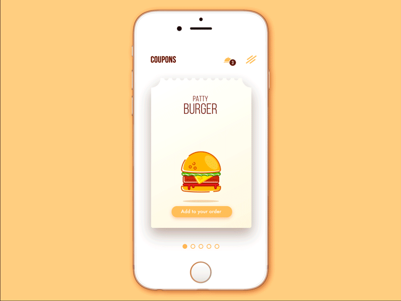
Here in Tubik, we have checked the high potential of flat design for interfaces on practice, with not only numerous outsource projects, but also the iOS app Toonie Alarm, designed and developed by studio team. Thoughtful integration of flat design via diverse interface elements, including icons, illustrations, buttons, tabs and the like, proved itself efficient for making UI bright, attractive, clear, intuitive and easy-to-use.

Moreover, this year flat design has set the strong link between branding and UI design, mutually supporting each other in digital products. One of the fields broadly strengthening this trend was creating logos and app icons flat and simplified. This trend has featured itself not only in brand new projects, but also for well-established websites, apps, companies and products, which have presented new redesigned logos and corporate style visuals redesigned according to the principles of flat design.
Conversational UI
Another broadly discussed trend is conversational UI which has been the object of hot debates and theme for many speeches and case studies this year. Basically, the term “conversational UI” is connected with interfaces that enable users to communicate directly to the system in a way imitating conversation with people. In the vast majority of cases, this sort of UI involves voice manipulation and recognition as the part of an interaction.
More and more products are featuring this sort of functionality: some want it just because it’s trendy and fashionable while others find real ways to engage it for problem-solving objectives. Most often it is realized by chatbots providing a flair of talk to the users. In automated dialogues of this kind, depending on the nature of the product and style of talk which is seen appropriate for the target audience, conversational UI can effectively involve both verbal (language) and non-verbal (emoticons, pictograms etc.) means of communication.
Among the advantages of conversational UIs, one of the frequently mentioned is automation of some basic and repetitive operations saving people’s effort for more creative and complex task. It can enhance the usability of the product and even make it proactive, giving prompts to the user and improving interaction with the product. Still, there is the trap to overload the product with this sort of communication, based on standard situations and issues while missing non-typical cases or questions which need different solutions. Moreover, by far not all target users are ready to communicate in that way, so this design solution needs to be grounded on extensive user research and testing from the early stages of user experience design. Conversational UI can easily give zest to a user interface. Yet, if it’s not analyzed and tested well, conversational UI can do the opposite and spoil user experience by poor interaction.
Anyway, this year UI designers have thought over new perspectives of applying conversational UI, in particular in combination with AI technologies, and this trend will definitely grow showing new rays of creativity next year. Conversational UI isn’t just another fad: it is the trend providing total or partial changes to certain areas of interaction design and giving alternative approach to problem-solving and decision-making processes.
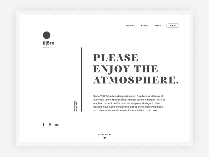
Minimalism
This year has given the great bunch of applications and websites designed on the principles of minimalism. They support positive user experience by providing clear and simple interfaces, full of space and air, focused on content and navigation. Minimalist interfaces are characterized with thorough attention to visual elements, not numerous but always transferring a particular message. Minimalist interfaces, both for web and app, also feature sophisticated work with typography and visual hierarchy supporting instant scanning and skimming the content of the page or screen. Moreover, interfaces of this sort usually provide a high level of legibility and readability.
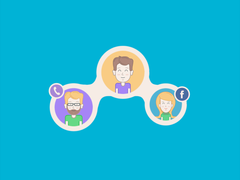
Custom graphics
Desire of originality sprung out in UI design in the area of custom graphic design of all kinds. More and more interfaces apply custom mascots, icons and illustrations that fulfill multiple goals: adding originality to the visual design concept, enhancing usability, strengthening navigation and marking out the content depending on its nature and functions. Graphic details play a crucial role in usability and accessibility of the product and even the slightest changes can bring significant results, speeding up visual perception and understanding interface elements or transitions.
Visual perception is one of the most productive and quick ways through which people are able to obtain information and get it processed by the brain. It influences so many aspects of life that neglecting the issue while creating products for users would be extremely unwise. That is why the aspect of applying visual elements of high functionality in the interfaces such as icons and their impact on the general efficiency of the product has been an actual topic in the global design community for a long time. In addition, images push the limits of perception for users who have natural problems with text recognition such as, for instance, the dyslexic or non-reading preschoolers.
As for custom illustrations or icons, created for specific products, made according to the preferences and needs of the particular target audience and with a view at certain business goals, they are able to make the product work more efficiently solving users’ pains and satisfying wishes. Perhaps, that is one of the most popular reasons why this trend got so popular in 2016 presenting interesting interfaces with custom graphics of diverse styles and performance.
Another side of this trend is the evolving field of wallpapers for desktops and mobile devices featuring original graphic artworks on a variety of topics. It also can be characterized as user-friendly trend giving users the choice of means for self-expression and satisfying personal aesthetic needs.
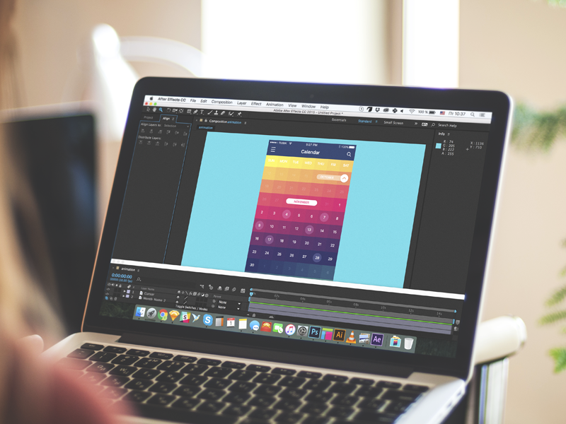
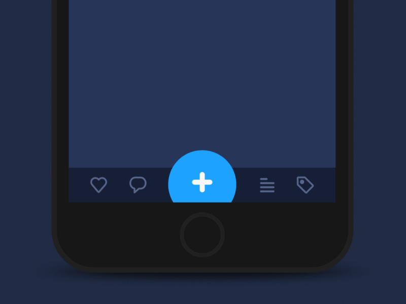
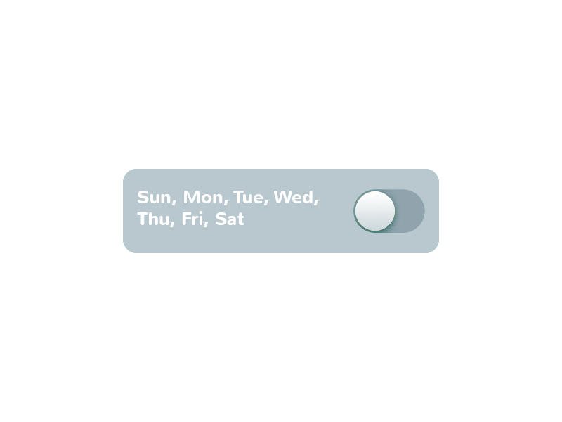
Animated microinteractions
Interface animation is one more hot and debatable topic of this year. Although there is a big army of those who find animation an unnecessary feature overloading user interface and making it more complicated, most users expect motion as an integral part of interaction experience. So, designers and developers work over more and more sophisticated methods to make animation pleasant-looking and problem-solving characteristic of modern apps and websites.
One of the frequent methods of adding motion to UI are animated details featuring microinteractions. Microinteractions supported by clear finalization via motion create fast feedback for the user and make the experience positive and efficient while navigation simple and intuitive. Animated buttons, switchers, toggles and other interactive elements inform the user in split seconds activating all the potential of fast visual perception.
As we mentioned in the earlier article, animation in the interface can create pleasant illusion close to natural interaction with physical objects which often doesn’t need too much cognitive process. For example, if you pull the object, press it, move out the tab, the movements should feel natural. Most users won’t be able to see this sophisticated work accomplished by designers: they will take it for granted and the fact it makes them comfortable will be the biggest praise for design solutions.
Scroll animation
Scroll animation also got new vibes and perspectives of artistic realization. Thought-out movement of layout elements while the webpage is scrolled enhances user experience significantly and creates the harmonic feeling of one integral smooth interaction rather than perceiving several separate parts or blocks of the page. Moreover, this sort of interactions is aesthetically pleasant and engaging, and these emotions are a good factor of retaining users. This year, full of new updates in design tools and software, showed great practices of sophisticated work on scroll animation.
Animated tutorials
Tutorial is a vital part of onboarding users for most mobile applications. Certainly, a wide variety of means and techniques are applied to make it clear, engaging and informative as it is a strategically important element of involving users into further interaction with a digital product. This year designers combined traditional techniques with new popular findings: in particular, custom illustrations and animation brought new vibes to app tutorials, making them more dynamic and enhancing their informative potential.
Diversity of landing pages
Surely, landing pages were discovered much earlier than 2016, still, this year has brought the new lap of their development and diversity. More and more businesses and social projects take advantage of using them for effective presentation of special services, sales, offers or issues that need focusing user’s attention. Landing pages have also grown their presence in the Net as the effective method of promotion for native mobile apps. Accomplished wisely and thoughtfully, grounded on user and market research and testing, broad usage of landing pages can be also seen as the other user-friendly trend, providing users with necessary information and interactions in clear and accessible way saving their time and effort. From the business perspective, they also work well, giving businesses the flexible tool for original and effective presentation.
Brutalism
The trend of brutalism in digital design has rocketed this year getting more and more expressions and diversity. It is often characterized as a web design style aiming at breaking standards and predictable design techniques. The websites created in this manner are a sort of rebellion to sophisticated designs with thought-out symmetry and harmony, complex layouts and accents of aesthetic visual performance. Vice versa, brutalism is based on simple and raw appearance, in most cases not loaded with many visual details and sometimes even close to a plain HTML page. Used wisely, for the appropriate goals and audience, this approach can bring the high level of originality to the website and make it really stand out from the crowd.
Custom grid
According to Internet Live Stats, there are over 1 billion websites in the World Wide Web today. This milestone was first reached in September of 2014, as confirmed by NetCraft in its October 2014 Web Server Survey, and first estimated and announced by Internet Live Stats. The number had subsequently declined, reverting back to a level below 1 billion due to the monthly fluctuations in the count of inactive websites before reaching again and stabilizing above the 1 billion mark starting in March of 2016. With more and more websites coming into play, designers have to be more and more creative to not only make them attractive and harmonic but also give them a feeling of uniqueness and original appearance. That is one of the reasons, why experiments with grid also won their place in the list of general design trends of the leaving year. The custom grid is the way to save the feeling of harmonic layout and placement of the elements with a higher level of flexibility and originality. However, this sort of experiment requires thorough research and in many cases, the final result comes via several iterations tested and analyzed in terms of usability and visual perception.
Bold and catchy typography
2016 could also be mentioned as the year of further rigorous practice on typography in the global design community. It brought the world loads of new nice typefaces both universal and created with a view to particular objectives or products. Typography continued its progress as one of the crucial aspects of efficient web and app design, and one of the trends in this domain was practices of applying bold and outstanding typography for web pages, catching users’ attention and instantly informing them about the core message. In particular, this approach got its development in the sector of landing pages whose quick and dynamic presentation of core data to users has a great influence on conversion rates.
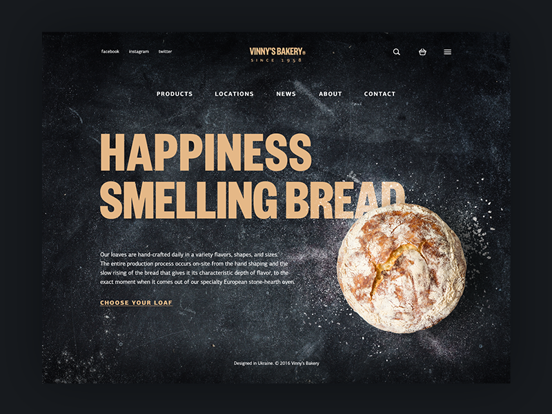
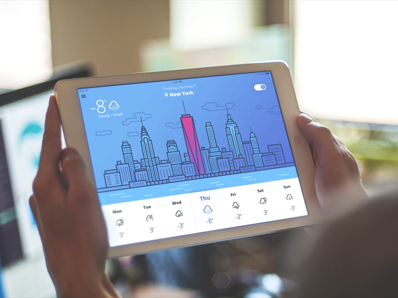
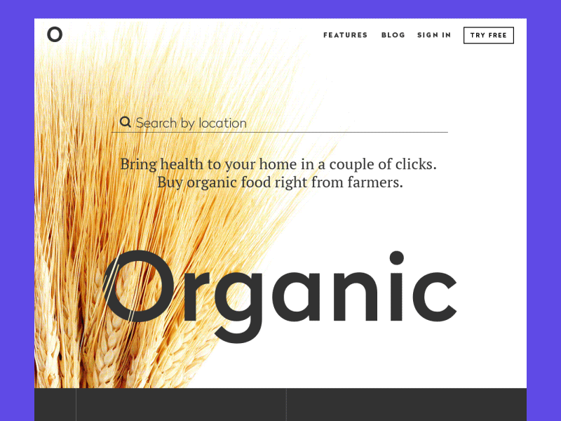
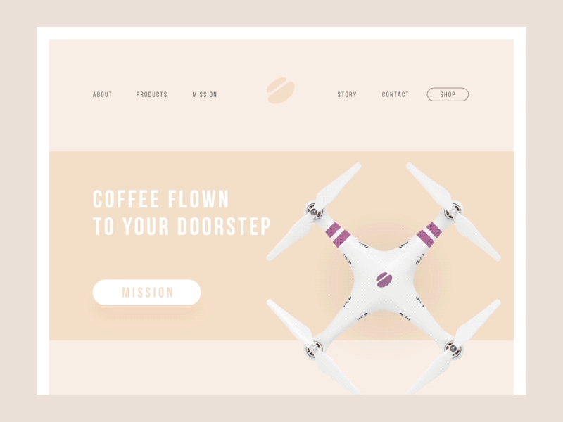
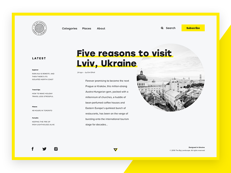
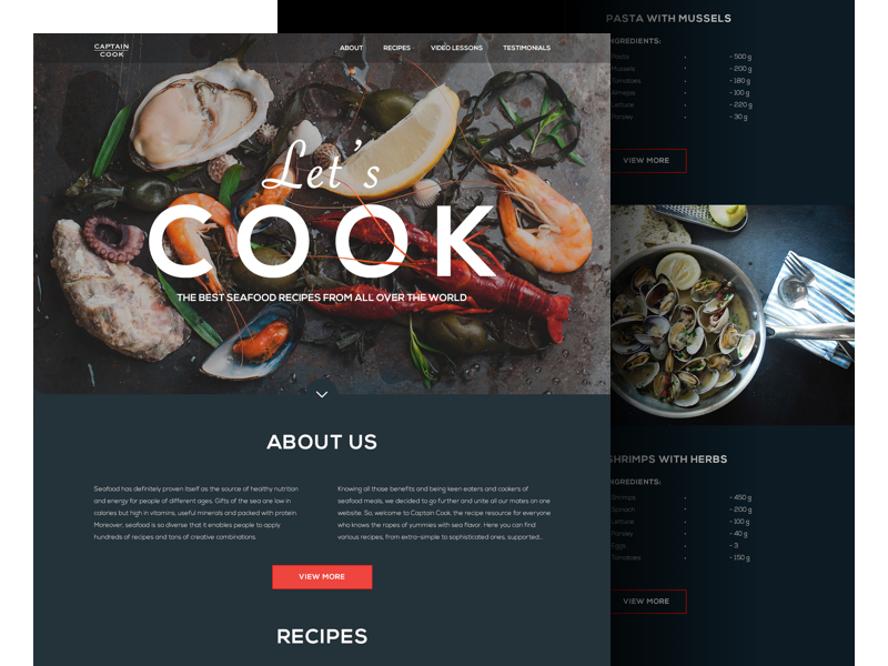
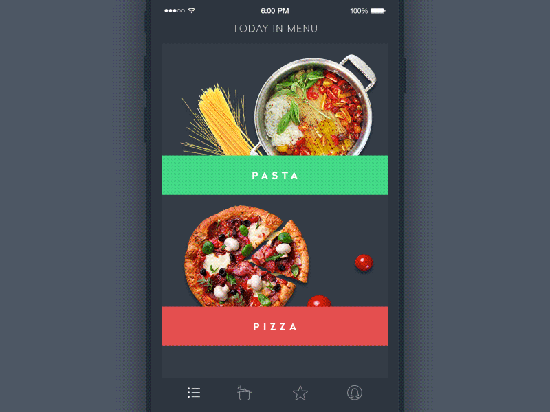
Large thematic image
One more trend often found in various designs for interfaces is applying prominent images, which could be either photos or illustrations, as the central visual element of the general composition. Important thing is that the image is never just a placeholder of nice looks: it presents a powerful way to strengthen the informative potential of the page or screen, set the theme instantly and focus user’s attention on the significant details. Needless to say, it takes much designer’s effort to choose the one successfully transferring the necessary message and supporting the general stylistic concept.

Handwriting lettering
Custom handwriting lettering also got popular as a design trend and is often used for marking out significant details and images in an original way. Special lettering made by professional designers looks fresh and unique, refreshing visual performance of the webpage or screen. On the other hand, being applied in UI design, it demands additional effort to be tested in the layout as it can happen that hand-crafted lettering looks great separately, but doesn’t work effectively in combination with other elements of the interface.
Real content instead of Lorem Ipsum
This year has featured growing attention to content, its quality and performance. In user interfaces, content and design and interconnected parts that should successfully support each other instead of fighting for users attention. That makes more and more designers prefer applying real content instead of well-known Lorem Ipsum, even in cases of creative stages or presentation of design concepts. It gets designers, clients and users closer to real experience and more natural feel of interactions.
Videos explaining or presenting products
Due to easy access to reviewing videos via YouTube, social networks and other platforms of product presentation, video explainers have quickly established themselves as a popular trend. Naturally, it wouldn’t be logical to neglect such a powerful source of connection with clients and users, so 2016 has brought a great variety of videos presenting the products, companies and services, explaining their benefits and special offers, showing the engaging flow of interaction and connection. They took over the responsibilities of the picture which is worth a thousand words: video explainers quickly show the most important features of the product and let the users know what deserves their attention first of all.
Example of video explainer designed by Tubik Studio for Toonie Alarm
Example of promotional year-in-review video for Opera designed by Tubik Studio
Bright and dark color palettes
No secret, color is one of the most powerful and influential factors in UI design. One more trend in UI design deserving a place on the list for this year is the great variety of color palettes designers choose for applications and websites. The diversity of new fonts and typefaces, as well as research of usability studies, allow going beyond standards and trying new combinations which will take advantage of diverse colors but with it won’t lack in usability. More and more creatives are discovering new horizons combining traditional techniques with innovative approaches in the domain of work with color.
To sum up, we can certainly say that in the sphere of UI design 2016 has been the year of creative search and experiments, still, most of them were focused on usability and desirability of the final products. No doubt, 2017 will not lose its chance to polish these trends and open the new ones.
Welcome to read the review of popular trends and tools for developers in 2016
Don’t miss the updates: design trends in 2017 and hot UI trends in 2018 summer