Today we would like to discuss a topic which goes far broader than pure design issues. It lies on the crossroads of design, marketing, user research, psychology and other spheres dealing with people, their behavior, and solving their problems. Today we are talking about landing pages. Let’s think about the most popular questions often asked about landing page design.
What is a landing page?
Landing page in its basic wide meaning is the term used for analytics to describe any page where the user started his or her journey around your site, in other words, where a user lands on the website. However, today the other, more specific meaning is used much more often to define a landing page. Behind this term, people understand the special web page created for the presentation of the specific product, service, features or options so that the visitor could get the necessary information quickly and easily not being distracted.
That is why the analysts say a landing page is in most cases much more efficient than the home page. Home page can have too many options and getting through all of them to find the particular product the user can get distracted from making the decision, lose interest or even get annoyed.
What is conversion and why is it important?
Talking about the sphere of design for businesses and products, especially in terms of their marketing and promotion, the word conversion is perhaps the most popular and widely used. In its most general definition, conversion means transformation, and depending on the field this word is applied for, it will be used for different objects.
Initially, in terms of e-commerce, where landing pages have perhaps the widest field of application, the conversion is the index showing how many visitors actually moved to the end of the way they were offered actually buying a product. So, for e-commerce conversion transforms visitors (users) into buyers.
However, nowadays landing pages go far beyond e-commerce, therefore understanding of conversion also gets broader. In modern terms of comprehensive and numerous functions and needs, which users are able to fulfill with online resources and digital products, the conversion is the rate of cases when visitors did the action they were called to. And that can be not only buying something.
In terms of a landing page, conversion can be also fixed in case of:
- moving to direct use of a product
- subscription
- transition to the other page
- downloading an app or a file
- providing some information
- answering the question in the survey
- starting free/discounted trial use of a product
- browsing a library
- reading a more detailed description of the product or service etc.
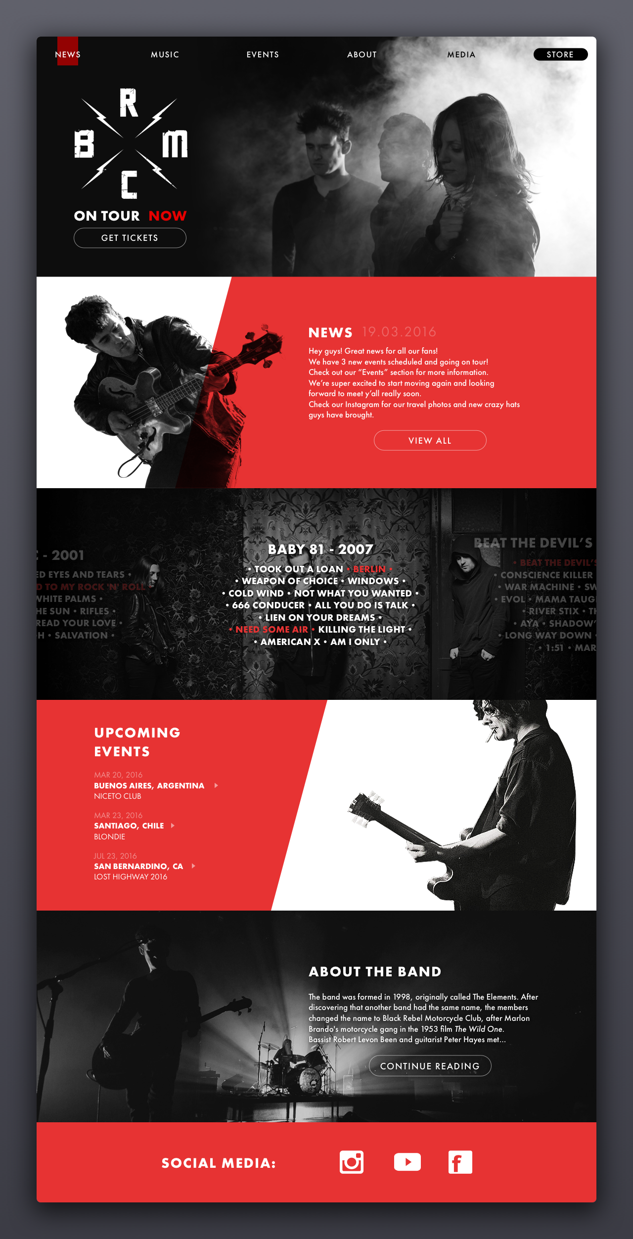
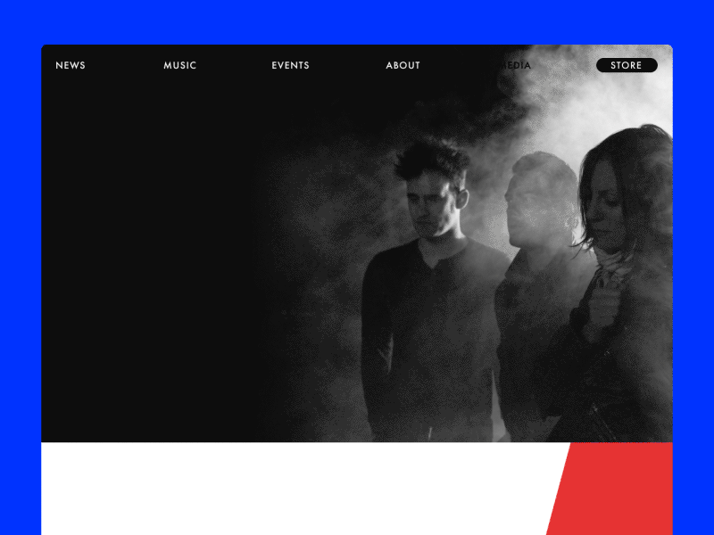
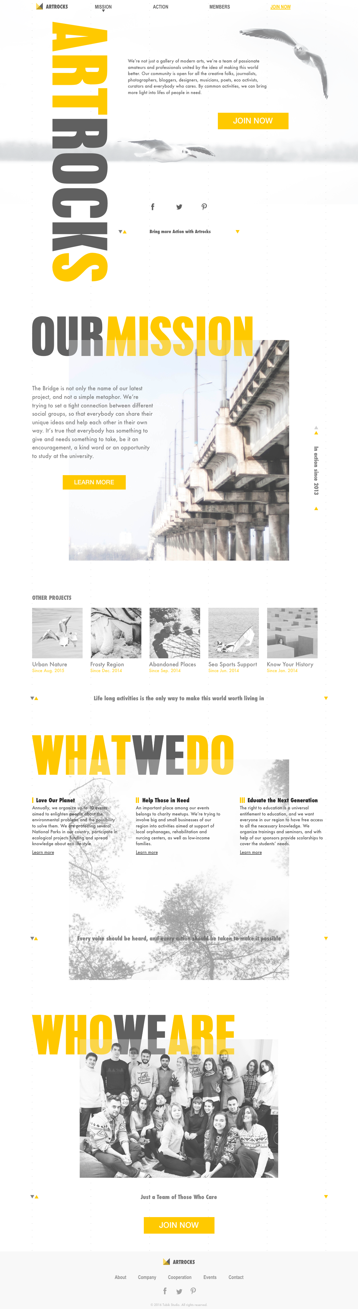
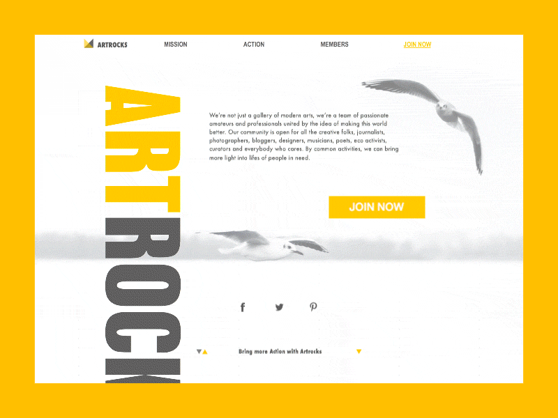
Here we can see the concept of a landing page. It presents a website of a rock group. Different blocks of the page provide different calls to action not overloading the user with the information. Therefore, a visitor needs split seconds to scan the page and find the necessary section that enables visitors to see more about the topic of particular interest.
Conversion means that your page transforms passive users into active. They don’t just observe the information given to them, but also do the action which is offered by this page. So, the conversion is one of the most important indices of page efficiency which is vital for business. Landing pages are focused on engaging visitors with data performance and stimulating them to make the action which in the vast majority of cases is a part of a business plan.
Jeff Eisenberg, a successful businessman and head of an advertising agency, gives a brilliant thought about the importance of conversion: “It’s much easier to double your business by doubling your conversion rate than by doubling your traffic”. His words are proved by the practice of numerous businesses that direct target users to landing pages providing specific data and saving their most precious resource – time.
Why is a landing page needed?
As we mentioned in the case study about designing a landing page, it is easy to answer this question with a little metaphor. Imagine, you are going to visit, let’s say, New York, to walk around Manhattan. That is the dream of your life. Finally, you find the service which offers to take you to New York City fast and cheap. Great, isn’t it? You pack your bag, you charge your camera, you get up full of admiration as the dream of your life is going to get real. And then you are taken by those amazing people who offered you the realization of your dream to the entrance point of New York City. They leave you there to find Manhattan or any other place you want by yourself. How do you like it now? Who knows, perhaps you will be not so happy after an exhausting journey around the huge city looking for the place you want. Wouldn’t it feel great to be taken right to the destination, fresh and ready to admire and absorb positive emotions? Wouldn’t you as a customer be happier to reach your goal faster and easier? Sure, yes.
That is actually what a landing page does. When a person obtains the information from the outer source about the specific product, feature, information or service and clicks through the link to its provider, sure, he or she doesn’t dream to spend a lot of time looking for desired product or page among all the links and information provided on your homepage. The user wants to «land» directly at that very place which will make possible for him or her to get what they want as fast as possible and getting enough (but not too much) information to support their decision-making process. So, creating a well-thought-out landing page is really vital to strengthen marketing strategy and increase conversion rates.
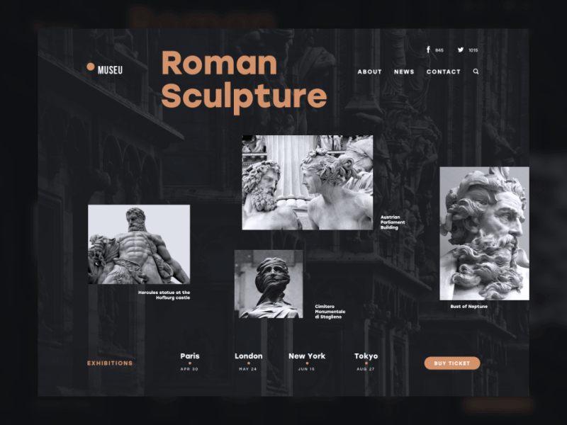
As a practical example, here is the design concept Museu. It presents a landing page promoting art exhibitions. The idea behind it is to make this sort of promotion aesthetic and unobtrusive for the user as well as highly informative. The balance of minimalism and utility appealing is kept by means of style, color, and motion.
In the book “Landing Page Optimization: The Definitive Guide to Testing and Tuning for Conversions” by Tim Ash, Maura Ginty, and Rich Page, the authors provide a concise set of rules which designers and marketers should remember about creating a digital interactive product. It’s high time to recall them now:
The Rules of Web Awareness:
- If the visitor can’t find something easily, it does not exist.
- If you emphasize too many items, all of them lose importance.
- Any delay increases frustration.
These thoughts make the solid ground for using landing pages in the case when you need to concentrate the user’s attention on something important, to make it noticeable and easily available. Landing page is a tool to emphasize one item, to make it quickly found and to reduce delays in cases when the target user seeks for specific operations, services or items. As the author of the highly informative article “The ultimate guide to designing landing pages that convert” Cameron Chapman mentions, “One of the biggest mistakes a marketer can make is sending traffic from any kind of advertising or PR campaign to their home page. Your home page likely has little direction or direct connection to the campaign sending traffic to it. That can leave visitors confused.”
What does a landing page consist of?
Actually, a landing page is a field for broad creativity and depending on the target audience and objectives behind it, it can be very different. There isn’t a single guide for the fixed scheme and construction of a landing page, but there is a basic thing that should be provided by any landing page. It doesn’t matter what size is the page, how many parts it includes, how many visual elements it uses, the most important thing for any page is that it should provide VALUE.
In general, typical landing pages often have:
1) General idea of the presented object (product, service, activity, etc.) with a call-to-action element. Users need to be provided with the basic description of the benefits, preferably not too detailed but concise and useful. The aim of this element is to inform the user and provide a clear and noticeable opportunity to actively use this information via a call to action element which can be presented with a button, link, contact form, subscription field, etc.
2) Testimonials and signs of trust. People usually tend to trust more to what is already used or tried by other people and recommended as worth attention. Therefore, testimonials from clients, considerable numbers of followers in social networks, awards and certificates can have a great impact on conversion rate.
3) Description of the main features. This block of information can be used as additional information supporting the description of basic functionality. It supplies a visitor with more details about the product or service, its abilities and technical characteristics, its influence on life and productivity and the like. It certainly makes the landing page longer and requires more attention from users so applying this block should be always thoroughly analyzed.
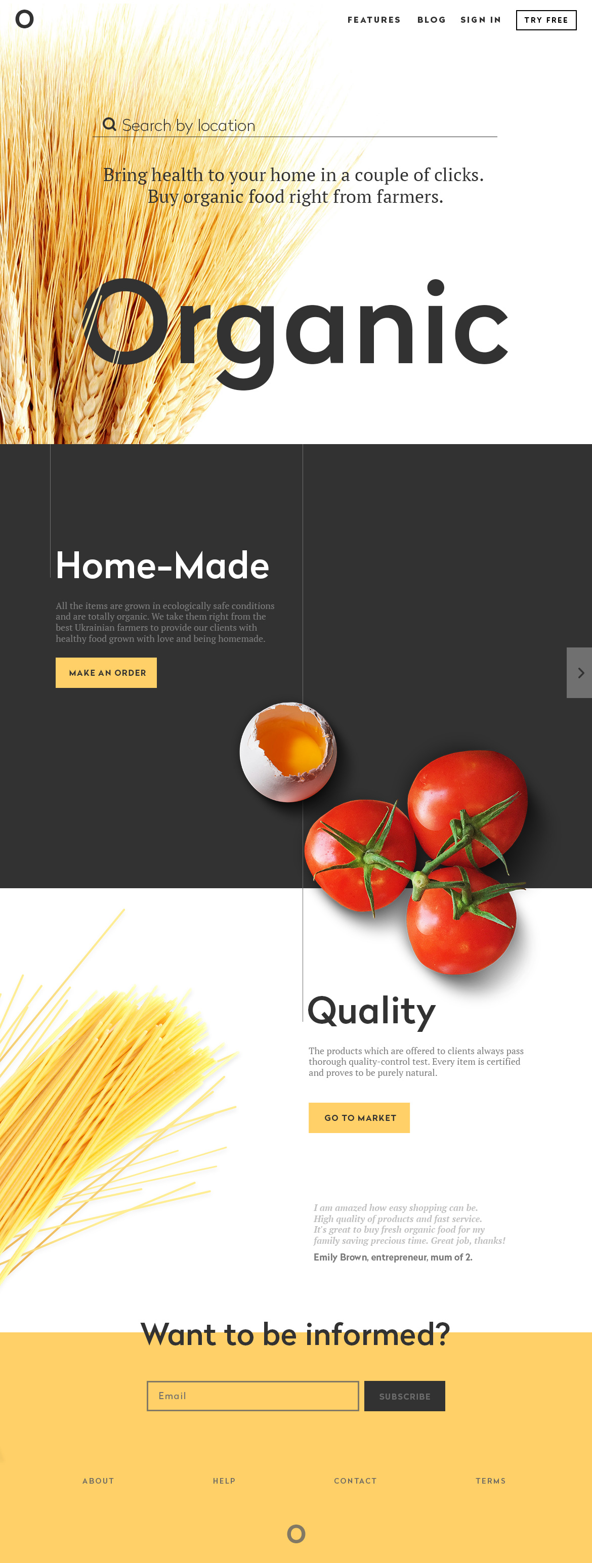
The example provided above is the concept of a landing page. As you can see, it involves all the elements mentioned above. The aim of the page is to promote a shop selling organic food. It is composed in several blocks presenting the name of the shop, products, highlighting some important aspects of service, call to actions and testimonials. The designer sets the purpose to make it informative but not overloaded, appealing but not aggressive. To make the experience more attractive and engaging, the process of scrolling the page was livened up with animation and the visual elements were selected to support the general theme and provide the immediate visual perception of a basic idea.
What are the important aspects of an efficient landing page?
Target audience analysis
No landing page should be designed without a solid basis of research and analysis. Landing page is not an object of pure art, it is a part of the promotion and presentation strategy. Designers working on a landing page should keep in mind that any marketing campaign comes from the definition of the goals and target audience. So, a landing page should be designed as a virtual bridge connecting the target customer with a product or service. For a webpage with high conversion rates, design decisions have to be based on an analysis of the target audience’s preferences, abilities, and psychological characteristics. Design of a landing page that will work for everyone is a utopia, standing far from real business achievements and results.
Market and competition analysis
One more aspect the designer should dedicate time and effort to is the analysis of the competition. Earlier we have already considered the connection between UI/UX design and advertising basics in the article “10 advertising basics to apply in web and app design” and one of the points was devoted to the aspect of competition analysis. As far as the landing page is actually an active part of the marketing process, the analysis of the market is inevitable for a good result. Knowing the competitors, you will be able to create original ideas of presentation that will not get lost among other numerous products and services.
Copy
Famous guru of advertising David Ogilvy said: “Every word in the copy must count.” This is a simple but unavoidable truth if you deal with a landing page. The decision on the amount of copy used on the page should be the aspect of thorough research and testing as it directly and highly influences conversions.
However, it doesn’t mean that every landing page should contain a minimal number of words. If it presents a famous company product or service or informs about special offers, sometimes short and concise text is enough to encourage users. However, if a new unknown product or service is presented, it is important to provide users with more information persuading them to follow a call to action.
The provided example shows the design concept of a landing page for a non-profit organization. It uses considerable copy blocks and supporting visual elements to set the understanding of the club activity.
Branding elements
It is obvious that elements of branding such as a logo, corporate colors and typefaces, slogan and other identity traits should be strongly presented on a landing page. They should provide a strong connection of a presented product, service or activity with the company or brand visual and verbal identity. This improves the efficiency of the general marketing strategy.
Visuals
As it was explained previously in the post about visual perception in UI, people, in general, have incredibly broad abilities to perceive visual marks, recognize and proceed data even transformed in images of a high level of abstraction. In the vast majority of cases, people fix and perceive pictorial elements like icons and illustrations faster than words. A great proportion of users are visually-driven creatures by nature. As it is shown in all the examples provided higher, using attractive and informative graphics in landing pages enables users to catch the idea and scan the page much faster and saves their time as well as involves their aesthetic perception in the process.
USP and CTA
These are two magic words to make a landing page efficient. USP (Unique Selling Point) is the most important benefit (or set of benefits) people can get with your product. CTA (Call to Action) has to encourage people to realize the conversion. An effective landing page quickly informs a user about unique selling points and provides noticeable, clear and easily-available calls to action. Design solutions and techniques for actionable CTA are worth the separate detailed discussion which we will start here in Tubik Blog soon in our next articles.
Short loading time
One of the aspects influencing design solutions for landing pages should be the reasonable time of page loading. Users do not like to lose their time, and landing page is not a piece of unique something that will be an exception. Don’t make the visitors wait. All the design solutions should be thought-out carefully not to overload the page and prolong its time of loading unnecessarily.
Video Presentation
The video presentation can become a very good way to present a product without making users read long copy blocks. It involves all the senses of perception in the process. Video can make the page active and interesting. However, there is a pitfall to remember: the video has a considerable impact on page loading time. So, it should be really worth watching to become a design element of an efficient landing page.
Responsive design
Several years ago one of the articles on Think with Google provided interesting facts and statistics about the importance of responsive design for web products. Among them, we can learn that:
- 61% of users said that if they didn’t find what they were looking for right away on a mobile site, they’d quickly move on to another site
- 79% of people who don’t like what they find on one site will go back and search for another site
- 50% of people said that even if they like a business, they will use them less often if the website isn’t mobile-friendly.
Perhaps, today those numbers are even higher as more and more people are using mobile technologies on an everyday basis. Neglecting this aspect may negatively influence conversion rates.
Absence of distraction
As it was mentioned above, the landing page should concentrate people’s attention around a particular object. So, it should get rid of any elements that can distract the user’s attention and highlight the parts directly influencing the conversion. The fewer additional links are used, the better. Call to action elements should get the fastest and highest level of attention. In this case, the user will get the best navigation to the goal.
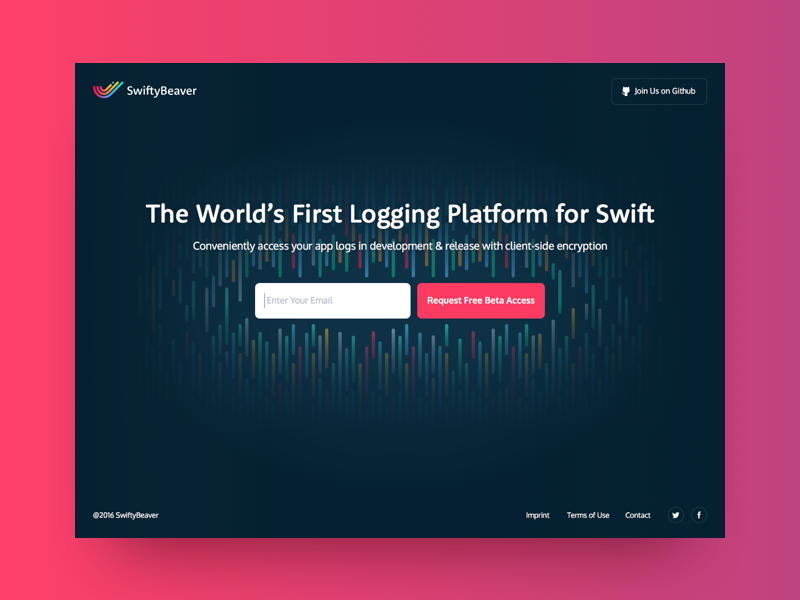
Here is a landing page for the SwiftyBeaver native Mac application. As we can see it is designed in a minimalistic manner and concentrates users’ attention on short copy about the product’s functionality and CTA enabling to request free beta access. Although the page provides other important links, they are designed in a way not distracting from the main elements providing conversion.
Why should you test your landing page?
In one of our earlier articles, “Basic Grammar for Designers. Must and Mustn’t in Design,” as well as in practical case studies, we have already mentioned the importance of testing. Experts in usability say and practice proves that it’s impossible to be fully objective about the project you work on, especially if it’s a long-term one. Moreover, the designer is not a magician turning into anyone who will use the product to understand the best way of doing anything. Therefore, creating an idea is not enough. You should test it to grab real practical data and improve your product.
Let’s also remember David Ogilvy, who said: “The most important word in the vocabulary of advertising is TEST. Never stop testing, and your advertising will never stop improving.” Testing the landing page enables us to understand users’ behavior and fix the solutions that are not effective and user-friendly.
Studies based on practical landing page testing prove that even such a small change as a color of a CTA element or placement of a logo on the page, let alone the copy of the headline and CTA or length of general informative copy blocks, have a huge impact on conversion rates. Collecting statistics and analytics data and their careful analysis is a good way to effective design solutions providing high conversions and sales.
Recommended materials
For more insights into user experience design, we could recommend the following articles for those who would like to know more:
Home Sweet Home. Strategies of Home Page Design
Best Practices for Website Header Design
9 Effective Tips on Visual Hierarchy
Take It Easy: Tips for Effort-Saving User Interfaces.
8 Typography Tips For Designers: How to Make Fonts Speak
How to Make User Interface Readable
Basic Types of Buttons in User Interfaces
3C of Interface Design: Color, Contrast, Content
Negative Space in Design: Practices and Tips
How to Make Web Interface Scannable
Welcome to read or download our free e-books “Design for Business” and “Problem-Solving Web Design“