Content is a constituent that can make any digital product valuable. Informative copy and well-thought visual elements of UI design are able to create the foundation for the successful product. However, even good content may fail in case it is structured badly. One of our previous articles was devoted to the basic points of information architecture and today’s post continues the topic.
In a nutshell, information architecture (IA) is a science of structuring content of the websites, web and mobile applications, and social media software. IA study aims at organizing content so that users would easily adjust to the functionality of the product and could find everything they need without big effort. Nowadays, when the user-centered approach in design is a top trend, many designers learn the principles of information architecture science which are believed to be a foundation of the powerful design. There are many experts working on IA development now, so loads of various techniques appear. Our article presents four efficient IA methodologies commonly used in design.

Content inventory
Before you start constructing a layout of the product, you need to understand what elements your project will consist of. One of the first stages of building information architecture is called content inventory. The technique considers creating a list of the components for the future design project. The inventory list usually includes various elements such as title, author/provider, meta elements (keywords, description, tags), copy, images, audio, video, and document files.
A content inventory list assists designers at the different stages of the workflow. First of all, the list helps identify the essential content components so that designers could plan the product structure. Knowing all the constituents, designers can place them properly. Furthermore, it’s an easy way to discuss the structural peculiarities of the project with your clients. It is much faster and easier to edit the list rather than modify the design project when it’s been started. Finally, the list of components can help designers deeply comprehend the content that results in creating appropriate connections between elements so that the design of the product would look integral.
Wireframing
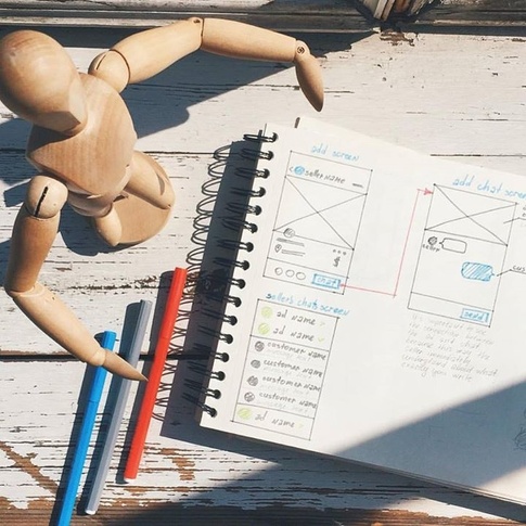
Information architecture is something like a blueprint of the layout that needs to be generated by a visual scheme. The majority of designers constantly use the well-known technique called wireframing helping to create a simplified and schematic visual representation of a layout for digital products. Wireframes are similar to architectural blueprints: they are usually black and white illustrations, sometimes with bright marks or spots to outline specific areas or points, that give a clear vision of the project structure and connections between different parts.
Wireframing is a fast and cheap technique to plan the information architecture of the page or screen. Designers use wireframes to outline the visual and typographic hierarchy of user interfaces, set the interactive zones and elements, plan transitions and interactions, organize the general layout markedly for the target audience. Since a wireframe is focused on the structure, not the visual and emotional perception of the details, designers try to keep it simple. They mostly limit it to monochromatic color schemes, with boxes and lines representing copy, pictures and all the interactive elements on the page.

Wireframing gives numerous advantageous opportunities not only for designers but for the whole development team and clients too. First of all, a wireframe is the first visual representation of a designer’s abstract idea. This step ensures that the developers and the clients get a full understanding of the project’s design. Furthermore, developers can clearly see the placement of the elements on the page. Some software for creating wireframes allows seeing all the sizes and spacing by clicking a single button that saves time for both design and development teams.
Organization structures and schemes
In our article “Information Architecture. Basics for Designers” we’ve defined four essential components of IA: organization systems, labeling systems, navigation systems, and search systems. The organization systems are the groups or the categories in which the information is divided. It helps users to predict where they can find certain information easily. To categorize the design components effectively, designers apply the technique of division into specific structures and schemes.
There are three main types of content structures: Hierarchical, Sequential, and Matrix.
Hierarchical. In one of our previous articles, we’ve mentioned the well-known technique of content organization called visual hierarchy. It is initially based on Gestalt psychological theory and its main goal is to present content on the carrier, be it a book page or poster, web page or mobile screen, in such a way that users can understand the level of importance for each element. It activates the ability of the brain to distinguish objects on the basis of their physical differences, such as size, color, contrast, alignment, etc.
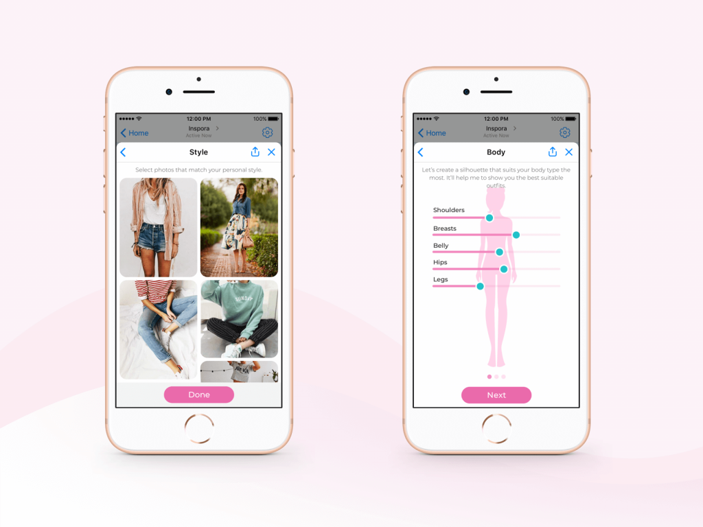
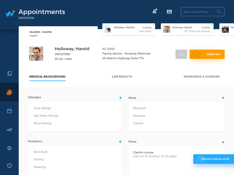
Sequential. This structure creates some kind of a path for the users. They go step-by-step through content to accomplish the task they needed. This type is often used for retail websites or apps where people have to go from one task to another to make the purchase.
Jewellery E-Commerce App
Matrix. This type is a bit more complicated for the users since they choose the way of navigation on their own. Users are given choices of content organization. For example, they can navigate through the content that is ordered according to date, or some may prefer navigation along with the topic.
Content can be divided according to the organization schemes which are meant to classify the design components into certain groups. Here are some of the popular schemes:
Alphabetical. Content is organized in alphabetical order. This scheme works best when users know exactly what they’re looking for and know how to describe or name the object of the search, so it can serve as a navigation tool for the users.
Audience. The type of content organization for separate groups of users. As an example, there are many educational resources that divide the information according to the skill level of the learners.
Chronological. This type organizes content by date and time. It’s often used on news websites, event apps, and blogs.
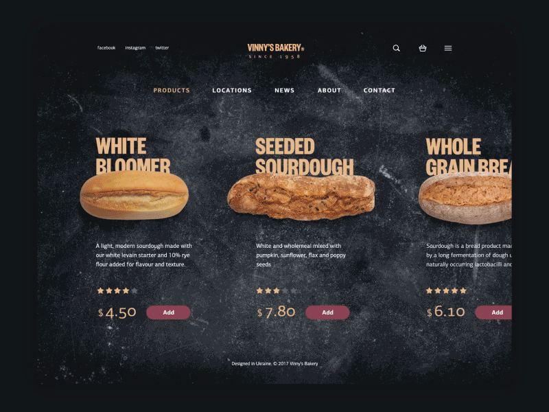
Topic. Content is organized according to the specific subject. For instance, online book shops divide the products according to genres.
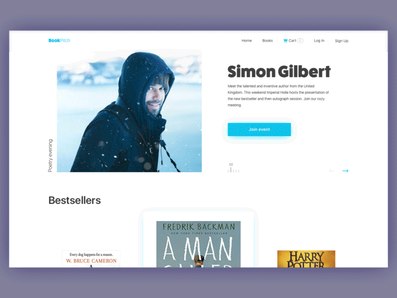
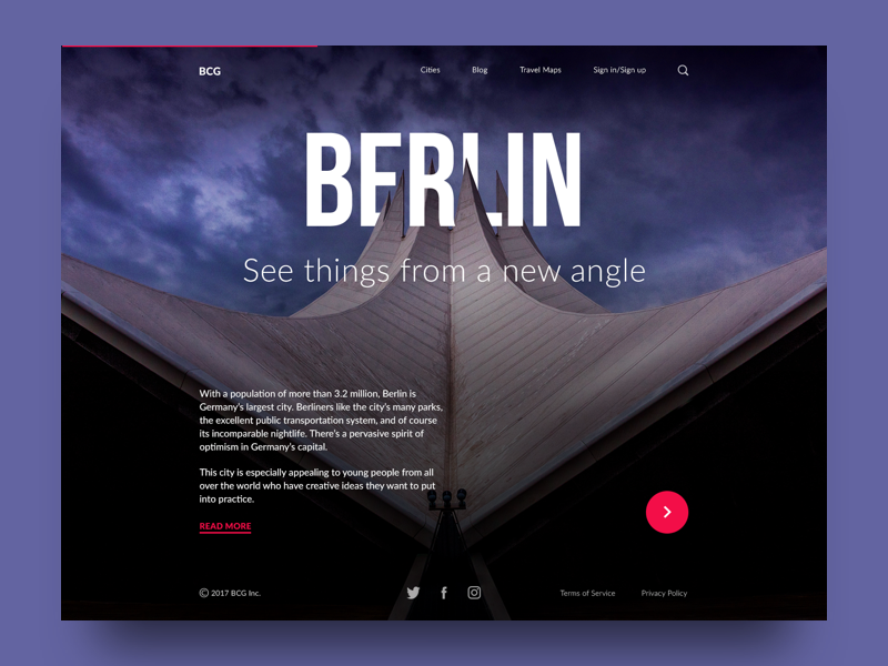
Bookshop Website
Content organization models
Designers have been working on the development of the information architecture field for a long time and so far they have established some efficient models of the content structure. Knowing them, designers can choose appropriate information structure for a product. Let’s take a look at the most common models.
Single page model
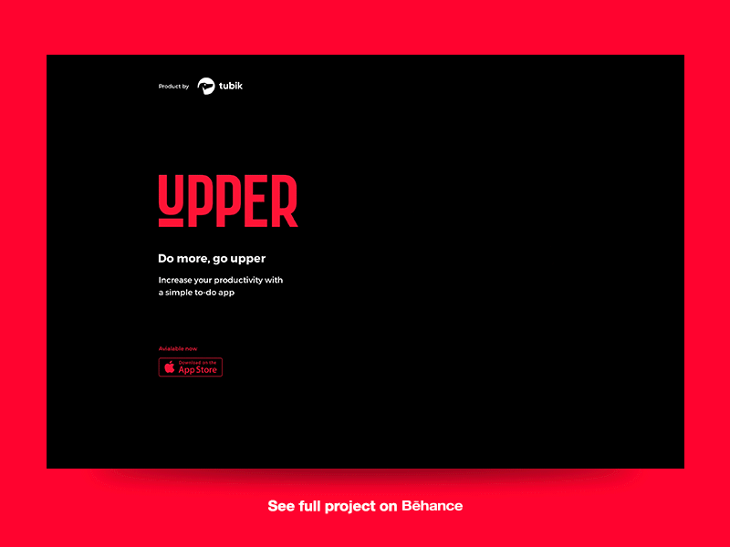
When the digital product requires a minimum of the content, the single-page model is a perfect choice. Websites for a single product and with focused purpose often apply this type of data structure. As an example, we can consider design for the website promoting the brand new application. Its purpose is to make users upload the app, so generally, it provides a limited amount of copy with the focus on the button “Available on App Store”.
Flat model
This model works best for small websites or landing pages. In the flat structure, all the pages are equal and they are put at the same level of navigation, so they are interchangeably accessible for the users. This type of information structure is good for the websites which have a limited amount of the content and it’s not going to grow anytime soon. It may be a good idea to apply the flat model to the design of a startup company.
Index model
The index structure is one of the most commonly used. All the pages are equally similar to the flat model but the navigation system differs. Index model allows users to access pages via the page list which is available on every page of the product. This way, the index model may contain more content and remain usable and simple for users since they can skip useless pages.
Strict hierarchy model
The model received its name, not by chance. It’s called “strict” because it gives users only one way to access the subpages: from the main page. This structure is a good choice for digital products that have a specific purpose. For example, e-commerce websites use the structure so that the users wouldn’t skip the important information about their new offers. Also, educational platforms may apply the model in order to make the educational process gradual.
Co-existing hierarchy model
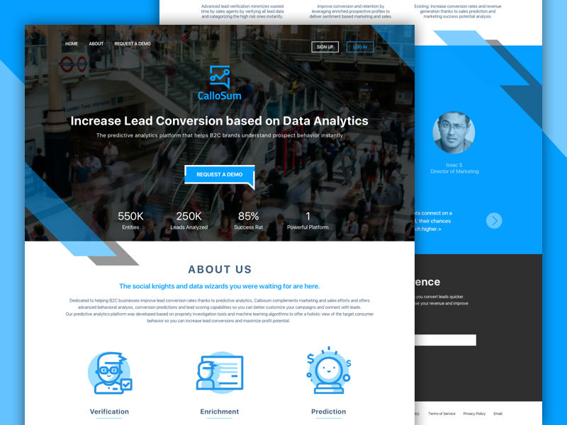
This kind of information structure is probably the most difficult to apply. It combines the ideas of a few models. Similar to the index model, it provides users with various ways to access the content still it aims at guiding people through a certain path so that they would take expected actions. That’s why to create such a structure, designers need to have a bit of experience in this area. However, it may be worth trying.
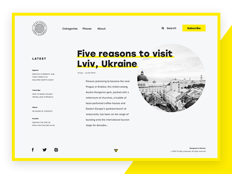
The Big Landscape
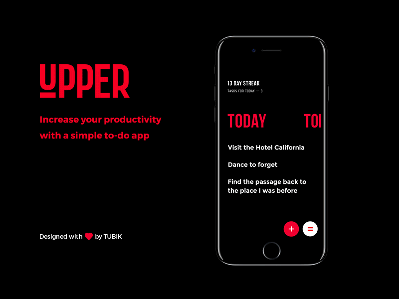
Daisy model
This type of content structure is common for educational websites and apps as well as the others which require users to complete certain tasks. The daisy structure is built that way so users return to a homepage (sometimes other specific points) after they accomplish the tasks. For instance, many to-do apps automatically return users to the main screen when they point the task as complete.
Information architecture is vital for the powerful design but it needs to be done right. The various IA techniques we’ve discussed above can be combined and applied depending on the product and the clients’ requirements. Moreover, they are constantly improved since the design field never stays still, so many new methodologies may appear soon. Our next article will continue the topic of IA so stay tuned!
Recommended reading
Here are more articles and design examples for building beautiful and usable interfaces:
Web Design: 5 Basic Types of Images for Web Content
How to Make Web Interface Scannable
Hit the Spot: Design Strategies for Profitable Landing Pages
From Zero to Hero: Look at Hero Images in Web Design
Visual Dividers in User Interfaces: Types and Design Tips
Directional Cues in User Interfaces